Posts in wedding invitations
Grass and Stone

Addie had always been drawn to letterpress. Having few letterpress options in Greensboro, they found Parklife Press when searching for studios in the 
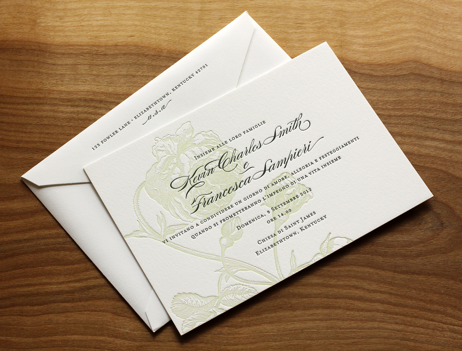
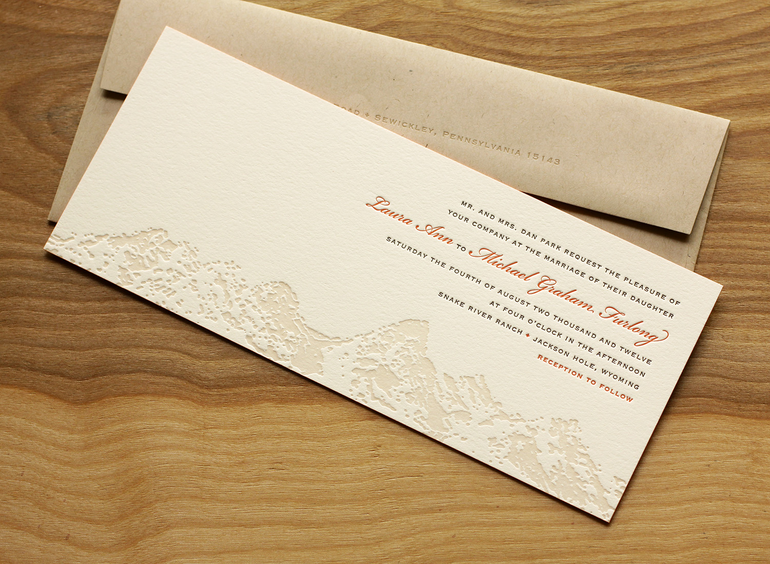
Durham area. Working under a tight deadline and having little time to spare, they were pleased when Parklife's website showed a "clear design aesthetic as well as up front design details and pricing options," and felt that the format prepared them for a seamless consultation with Travis. They were immediately drawn to the Parker design because it was clean and simple, and they loved its use of typography.

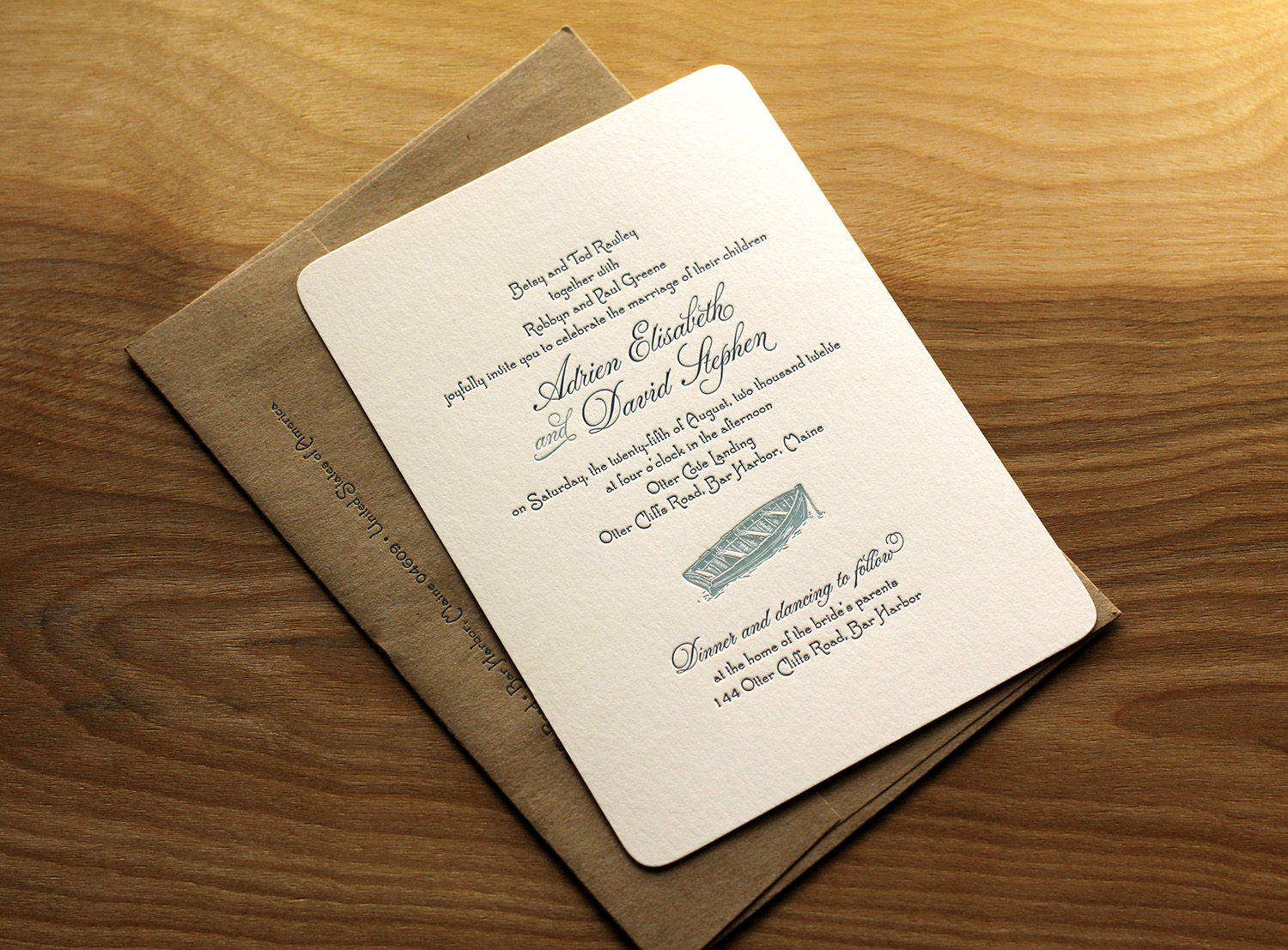
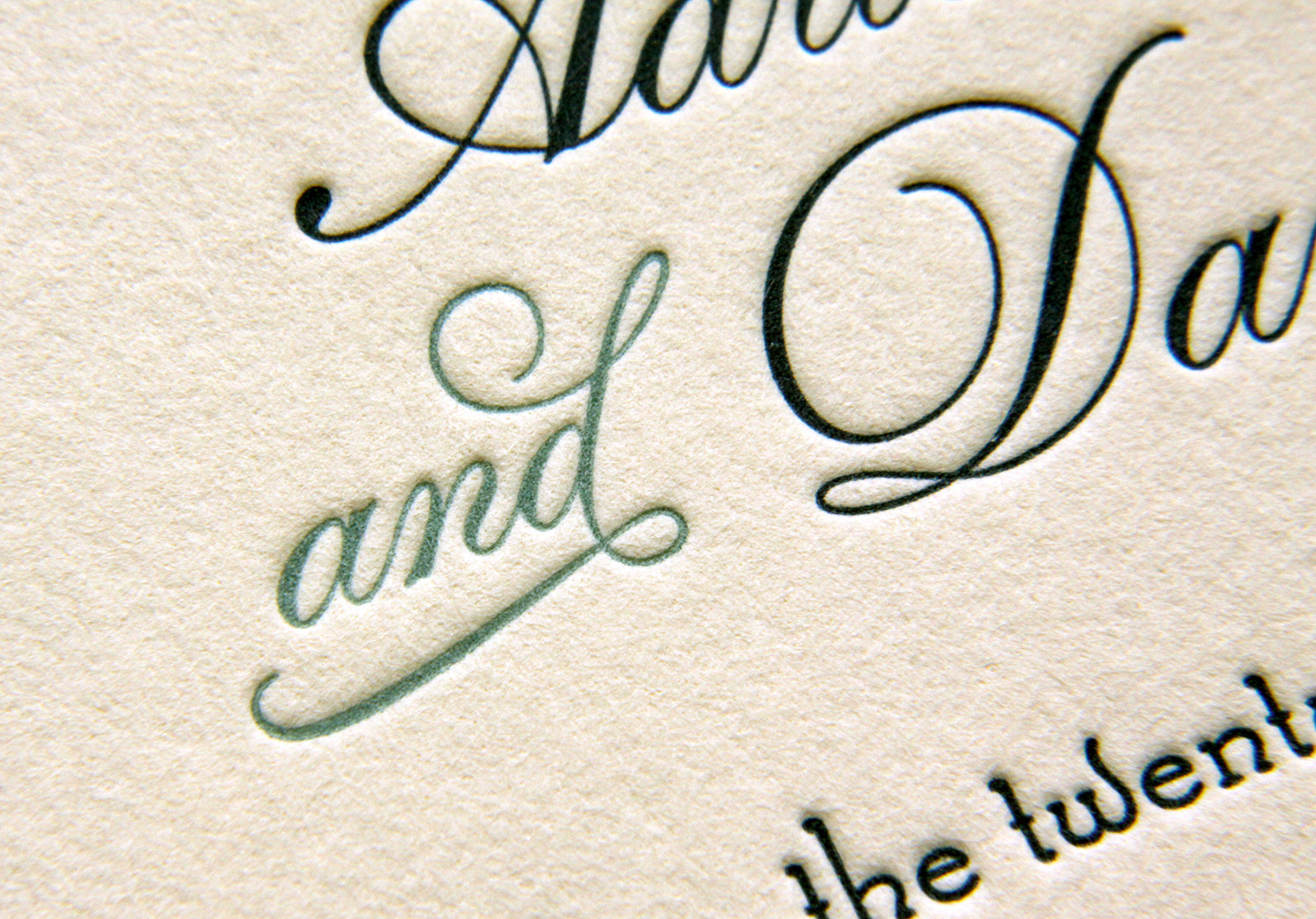
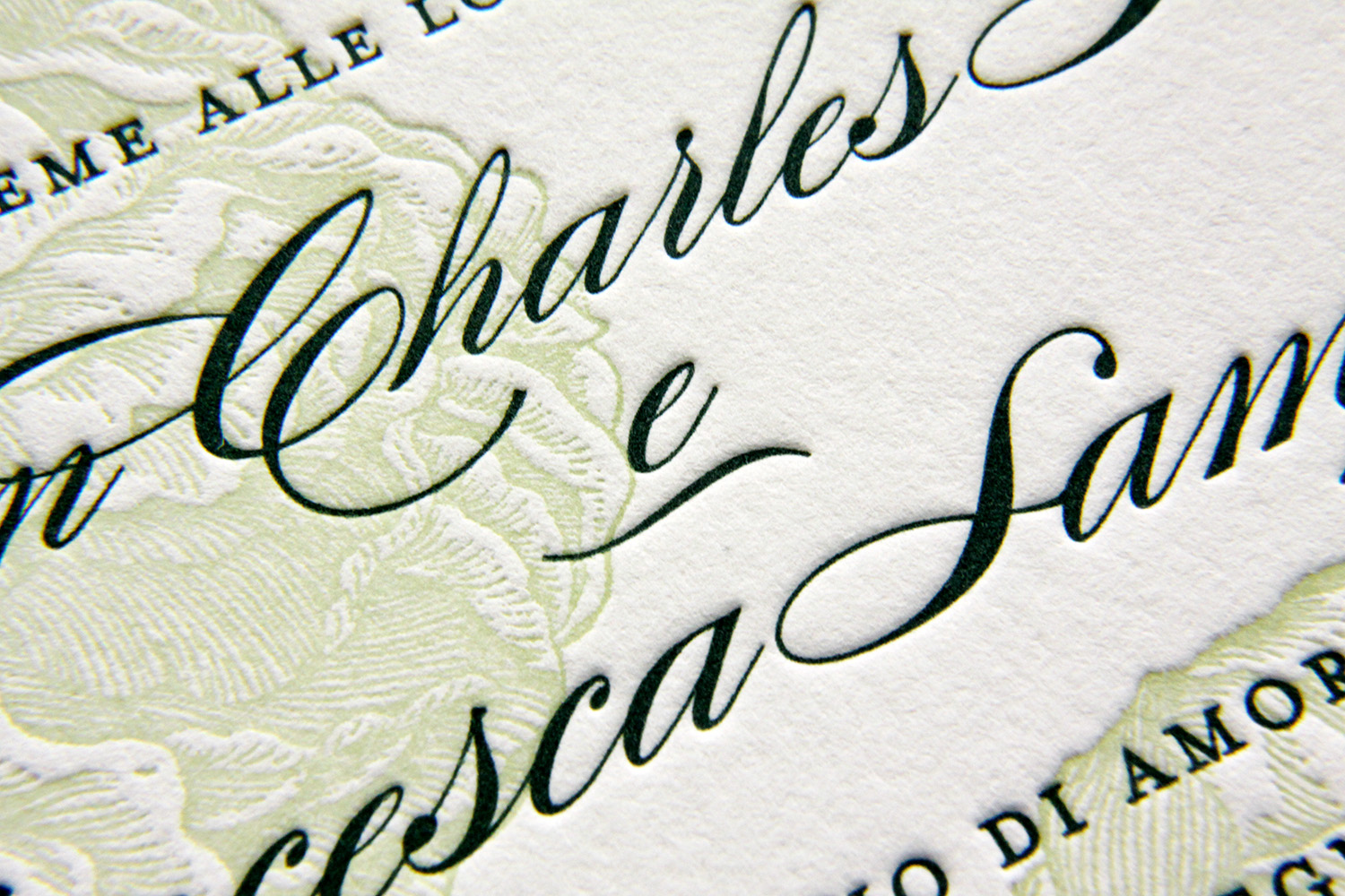
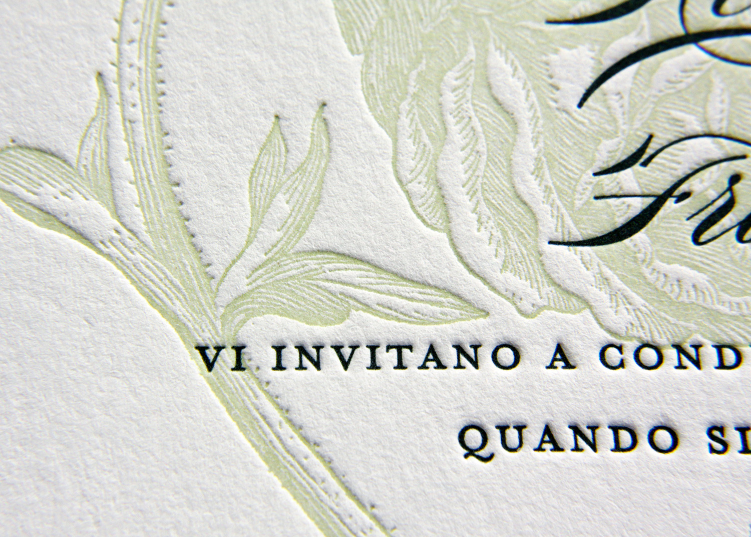
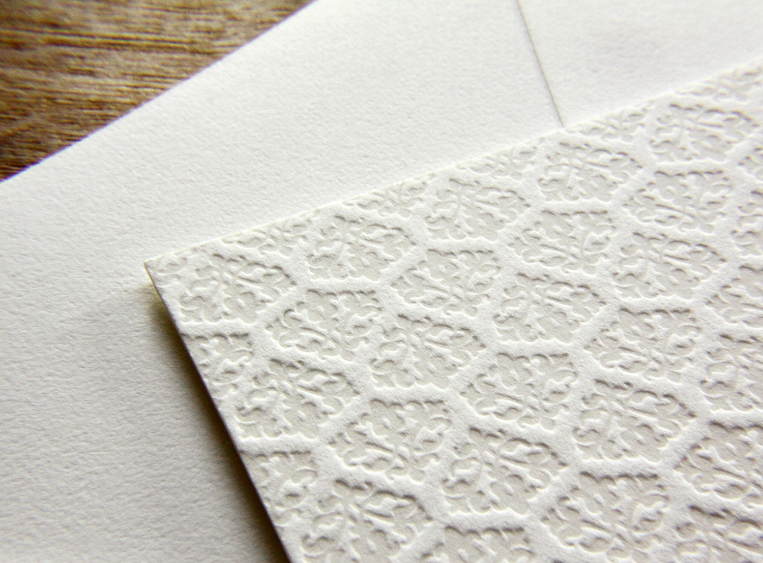
They used grass and stone inks throughout. The green, used sparingly — for their names, the RSVP postcard-style return address, and for the invitation's edge painting — was a nice touch for their not-quite-spring wedding in March. "It felt really fresh and added just enough pop," Addie says. They ended up using the colors and color names as a thematic springboard — "grass and stone" became a motif at their wedding, with centerpieces of planters of grass, and stone-colored bridesmaids dresses.

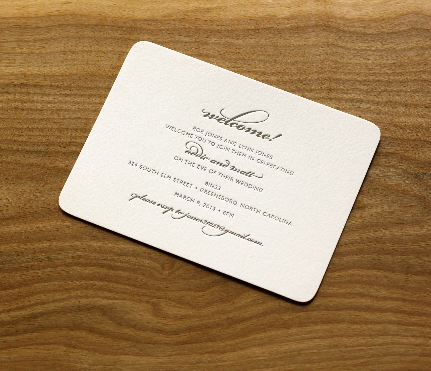
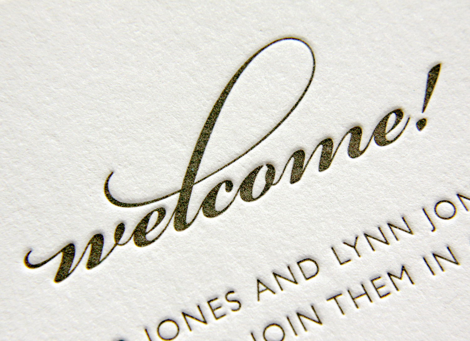
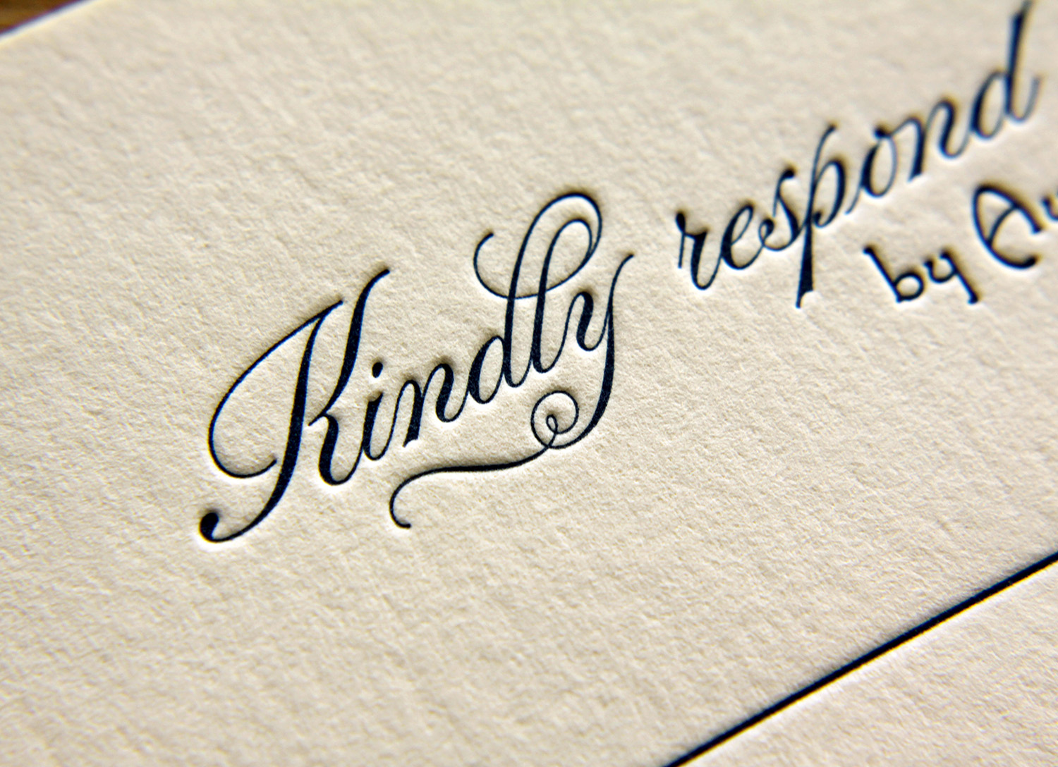
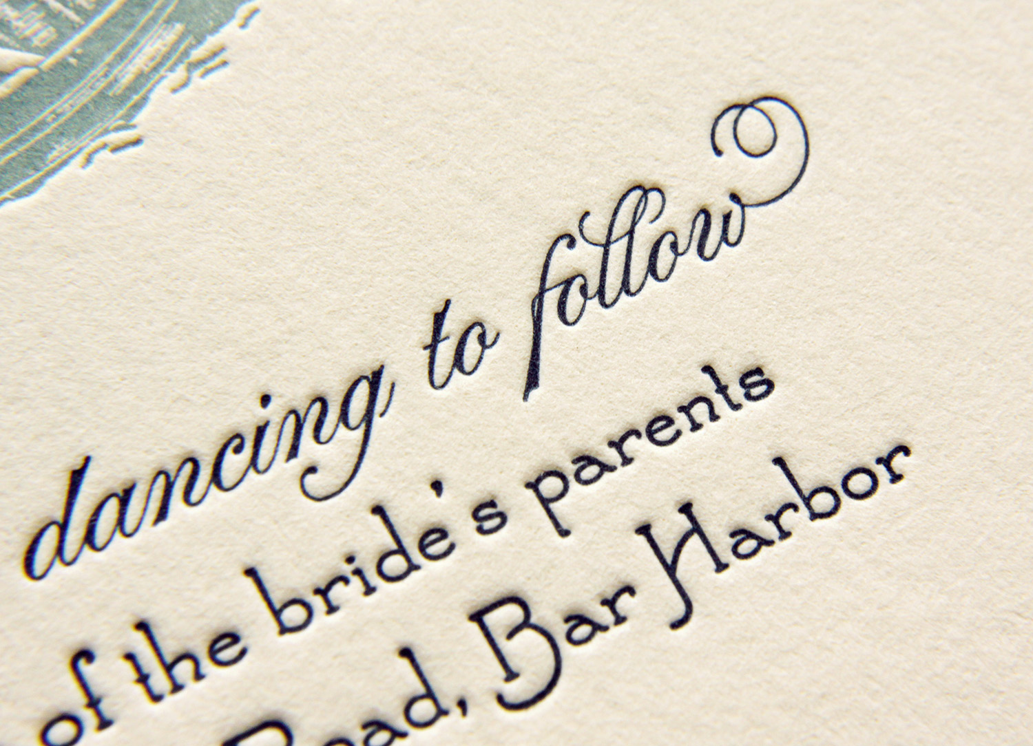
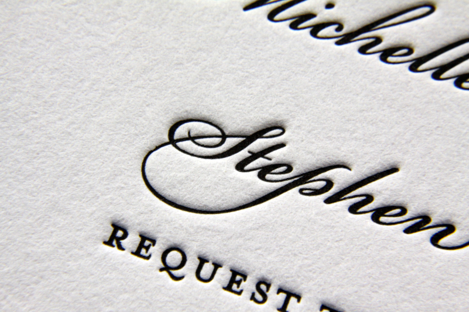
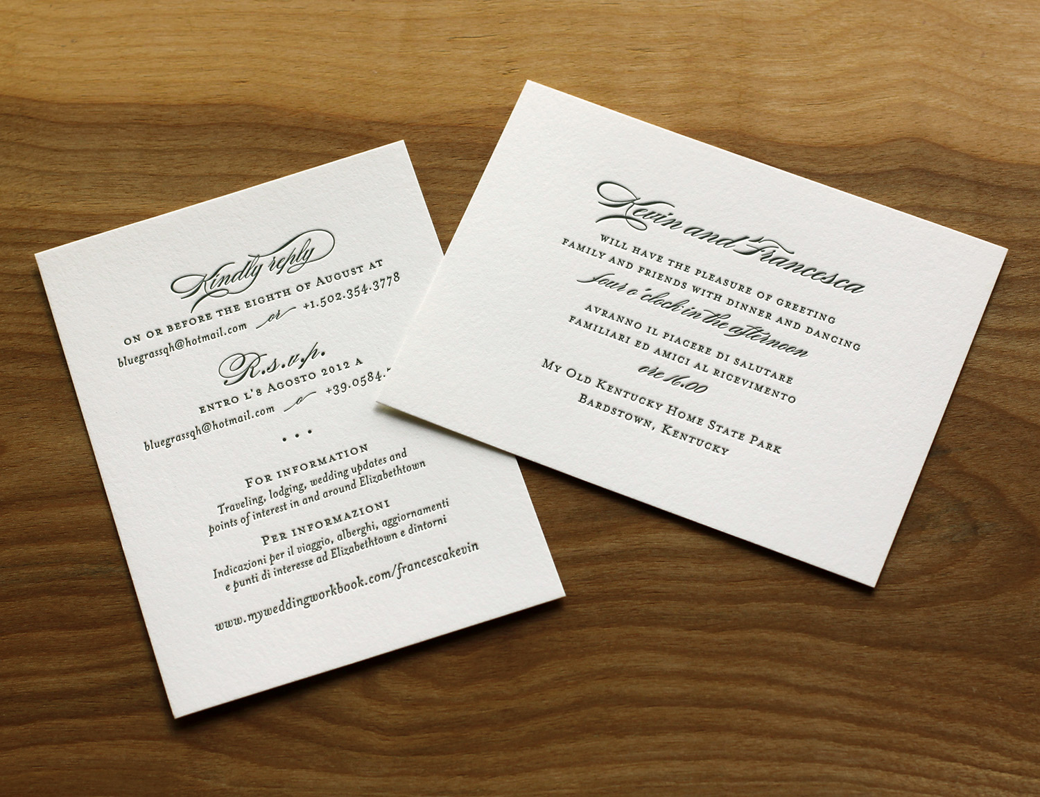
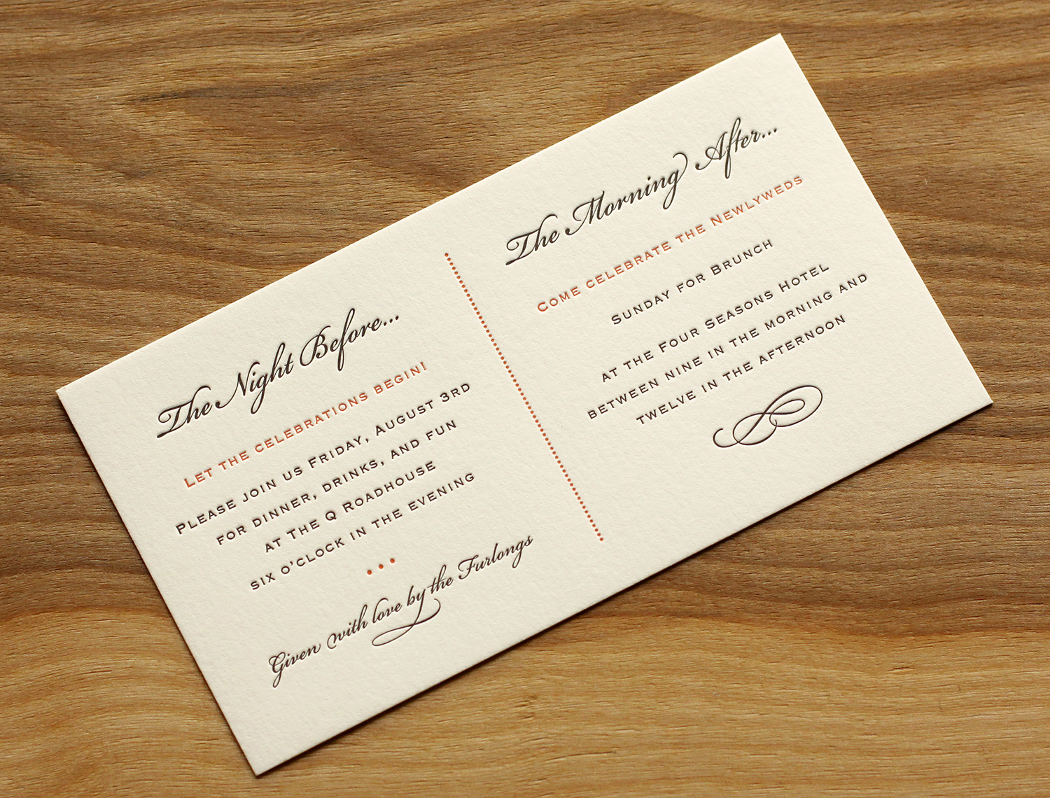
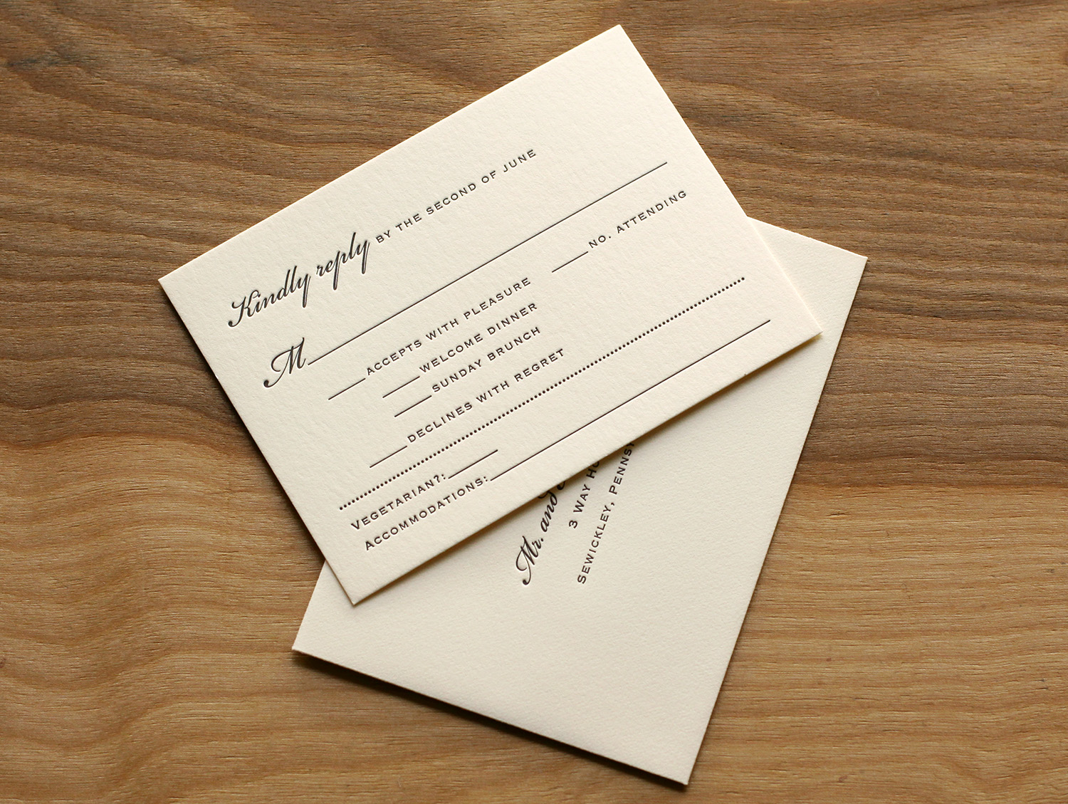
The RSVP and welcome cards provided another showcase for the dramatic pop of typographic embellishment. This particular script font comes with an extensive set of alternative characters and ligatures, providing lots of options for the designer. Choosing which to use and where is key. Addie noted, "Travis gave great suggestions on how and where to add flourish to our names without it being over the top. We trusted him completely!"

Twist of Lime

Meghan and John knew they wanted letterpress invitations for their wedding, and had even seen Parklife's work before — a friend of theirs worked with Travis and used a similar invitation design. So when it came time to plan their wedding, they were a step ahead. Based on Whirl, the design features a conventional text layout with an off-center design bleeding off the corner. The motif is also repeated on the main envelope flap, as well as the RSVP and events schedule cards.

The swirly motif, when printed in pale lime ink, becomes springy and botanical, perfect for a late-spring wedding.

Photos by Sarah McCarty Arneson
(Bar) Harbor-side Wedding

In her words, Adrien and her mother "always had a 'thing' for wedding invitations." When envisioning the big day, invitations were job one — and an important job, at that. According to Adrien: "We believe they fully set the tone for the wedding, long before the actual day arrives. They create all the anticipation for the guests in the days leading up to the party. We were willing to spend the money on custom letterpress invitations because we believe in the art of creating invitations in such an old fashioned way."

The feel for their wedding was old-fashioned, ocean-side, farmhouse. For her own invitations, she said she knew she wanted the feel to evoke a style of "simple, yet classy" and "formality, without pretentiousness." They started with the Sand Dollar design.

Adrien and David got married at her family's home where she grew up. It was within walking distance to the ocean, and the ceremony was held seaside. The artwork ended up being a simple choice, for in Adrien's words, "We have always been on the water, in the water, around the water.  Dave proposed in a rowboat, and we thought a dory on our invites would be a great icon for that, as well as where we were getting married." She sketched a few ideas and Travis took it from there. 

Having few letterpress options in Maine, Adrien found Parklife Press online. And the oceanside wedding was exactly as personal and distinctive as they had hoped, said Adrien. "We had a wonderful day, it was perfect."

Photos by Sarah McCarty Arneson
Timeless Black on White

Michelle and Stephen weren't familiar with letterpress when they began planning their black tie wedding, but a love of elegant invitations had been instilled in Michelle an early age. Her grandmother used to frame beautiful invitations she received, and Michelle had always admired those with simple black calligraphy on a white note card. Parklife's Vignette fit that vision perfectly: striking black ink against bright white paper, set off and framed with a blind deboss border.

The script font had a few flourishes, with one particularly unusual and interesting one: the ligtature connecting the cursive capital "S" and "p" in Stephen's name. A classic dingbat was used to add some visual interest and to separate blocks of information. It also tied all the pieces together — it was used on the invitation, the main envelope's return address, the RSVP card, and the accommodation information card.

Photos by Sarah McCarty Arneson
Amore e matrimonio: Italiano e Inglese

Kevin and Francesca were looking for an invitation to echo the embroidery on the bridal gown. They found what they were looking for, basing their set on Parklife's Franklin design. The springy floral motif was also reflected in the design of the wedding cake and in the floral arrangements.

The other major requirement for the invitations was that they speak to two audiences, which had, as Francesca put it, "different traditions and etiquette requirements." The floral artwork was printed with a single plate in light celadon ink. But for the forest green text, two different plates were used — one in English and one in Italian. The enclosure cards were bilingual to speak to both audiences — one card invited guests to the reception, the other gave RSVP directions and other information. "Everyone invited, from every country we touched, made the comment that they'd never seen such a simple yet elegant touch and attention to details in the invitations."

"The invitations  for our wedding were probably one of the best things of the wedding organization," Francesca said. "We could not be any more pleased by the success of the first step of the best day in our lives. We have been recommending Parklife Press to whomever asks for refined letterpress work."

Photos by Sarah McCarty Arneson
Grand Tetons

Laura and Graham love skiing and love the mountains. Both their families were very connected to Jackson Hole — a beautiful spot in Wyoming nestled in the valley of the Teton Range — and so they knew they wanted to have their wedding there. They also wanted to incorporate the famous landscape in their invitations. They loved the tea-length card because it's unusual and distinctive, and also because they knew the proportion would highlight the mountain range illustration.

Travis worked with Laura to create the custom Teton art, and it was used on the invitation and on the program cover. Espresso and sherbet inks worked beautifully with the extra thick ecru paper, and corresponded with the wedding colors (brown was a featured color in the wedding, and the floral centerpieces had a pop of orange). The edges of the invitation card and the program cover were painted to tie together the sherbet accent ink used throughout.

The set included a card inviting guests to the other events (a Friday night dinner and a Sunday brunch), and the RSVP card covered replies to these events as well as the wedding itself. It also had space to request a vegetarian menu and note lodging plans.

Laura became familiar with Travis' studio while she was at business school in nearby Chapel Hill. She was amazed by his work, and said that "selecting who to do my invitations was the easiest part of planning."  "Everyone loved the invitations," she said. "I got many compliments."

Photos by Sarah McCarty Arneson
Winter Wonder

Trish Burton was helping her daughter plan a winter wedding, and was looking for winter-themed ​invitations. She was familiar with letterpress, as she had used it for her other daughter's wedding, but was unable to find any designs in her area that felt right. After finding Parklife Press and communicating with Travis, she had the idea to adapt the Pinkney design by using a tinted white ink instead of pink. Because the color of the white ink and the color of the paper are so similar, this look has the appearance of a blind deboss (an impression made without ink) but in fact it adds just enough color to make the texture pop. She predicted the change of ink color would make the springy, floral invitation convey a lush and dense snowfall instead. Quiet elegance, perfect for the winter-themed wedding in January.

​The text was done in slate — a cool gray ink that paired well with the pearl white paper stock — coordinating beautifully with the wedding's theme colors of icy blue and pewter.

The bride and groom, who each have stressful careers and work long hours, were grateful to have Trish make the arrangements. Trish, in turn, was eager to take away as much of her daughter's wedding-planning stress as possible. And her pursuit of a fitting winter-themed invitation for her daughter's happy day was successful — Trish said she lost count of the number of friends who complimented them.

Photos by Sarah McCarty Arneson