Letterpress Business Card Roundup

Time for another business card roundup! After you're done here, you might want to check out previous roundups from 2013, 2014, and just this past January.

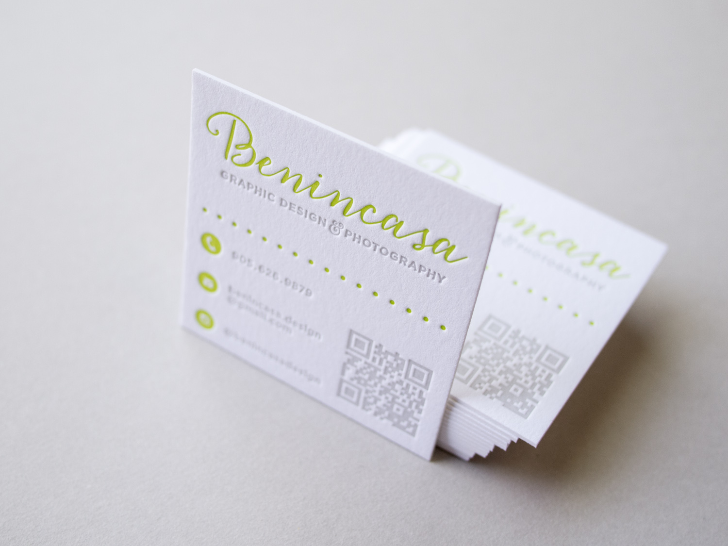
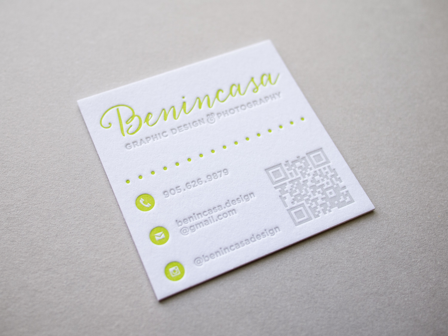
Canadian designer and photographer Amanda Benincasa (benincasadesign.com) designed these cards, complete with a letterpress QR code. We printed them with custom green and gray inks on thick 600g Fluorescent White Lettra.

For long-time Parklife collaborator, Chad Martin of The G Brand (see more of his design work here and here), we printed these duplexed business cards with black ink on 300g Lettra for the front and gold ink on 2-ply Rising Museum Board for the back.

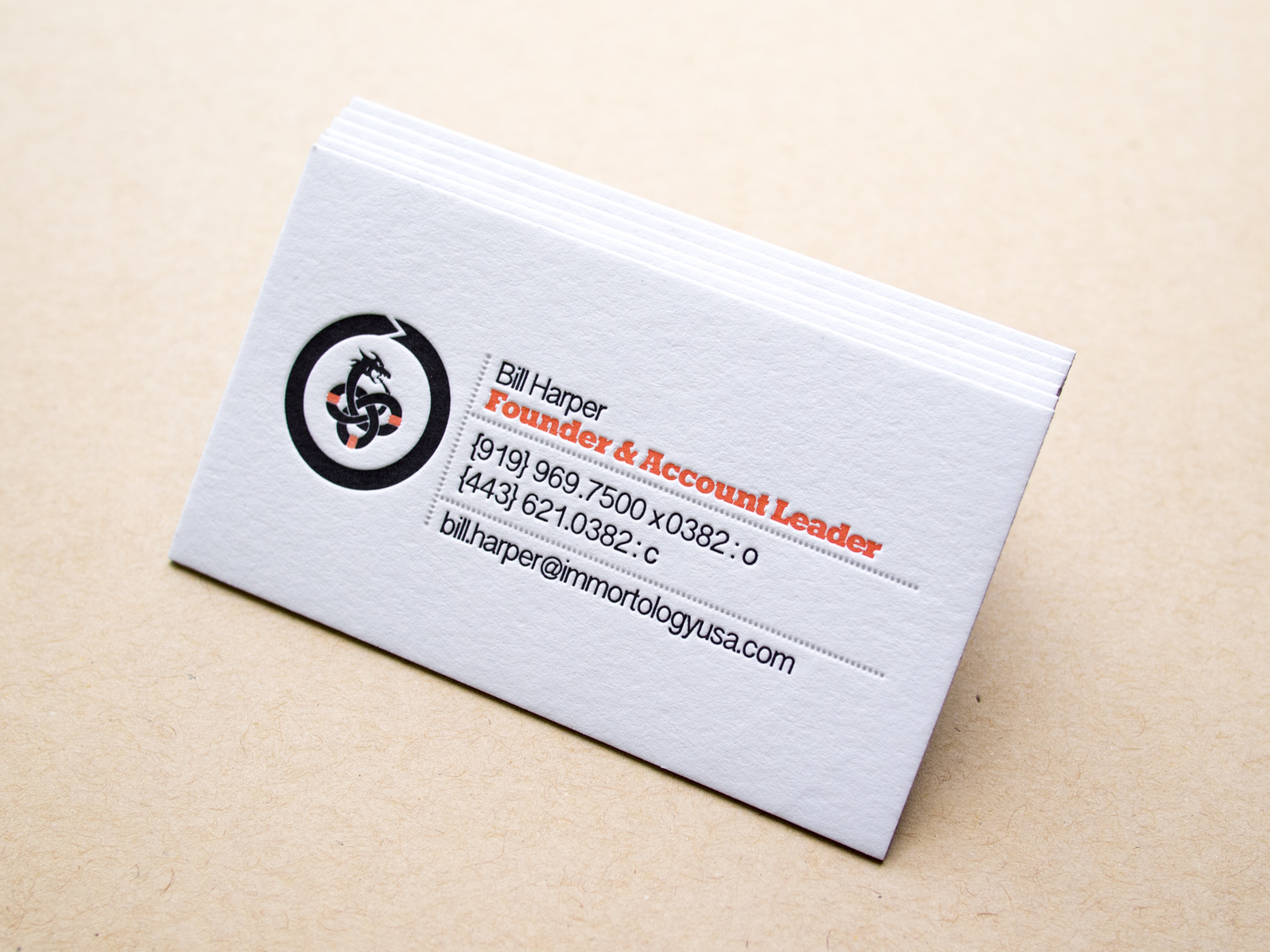
Like pretty much everyone (Parklife included), Gritchelle recently relocated to Portland. We printed these cards for our new neighbor on 300g Fluorescent White Lettra.

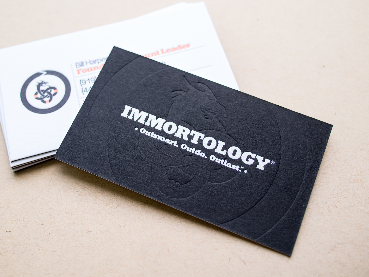
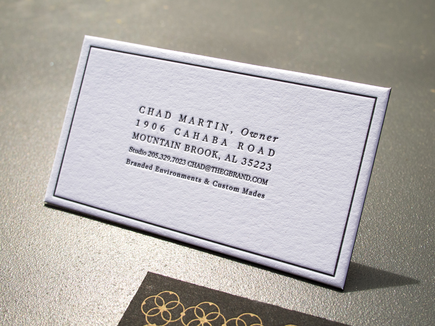
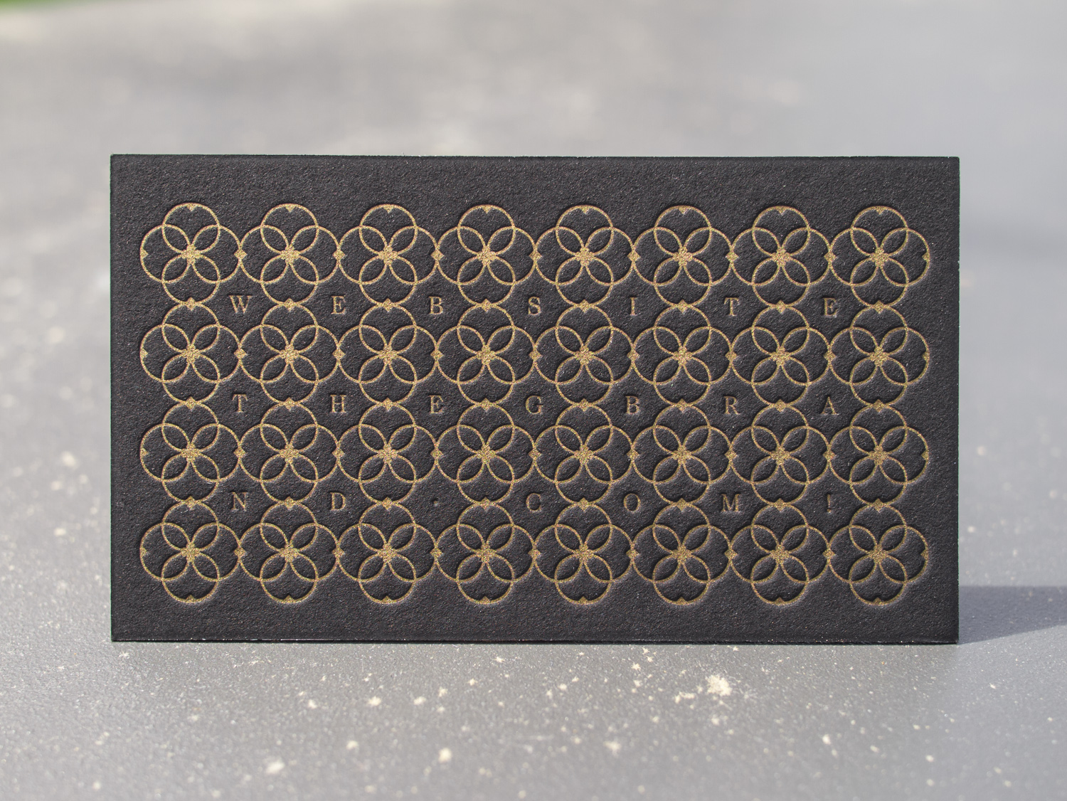
Some super-deluxe cards for Chapel Hill brand gurus, Immortology: Three inks on 300g Lettra for the front and white foil + a blind deboss on 350g Ebony Colorplan for the back.

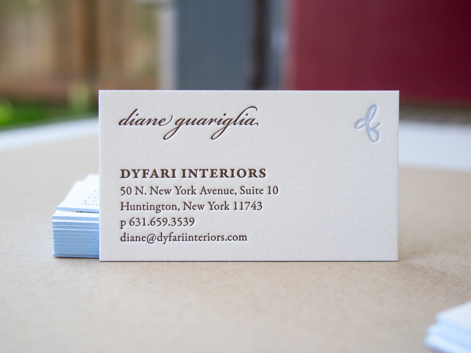
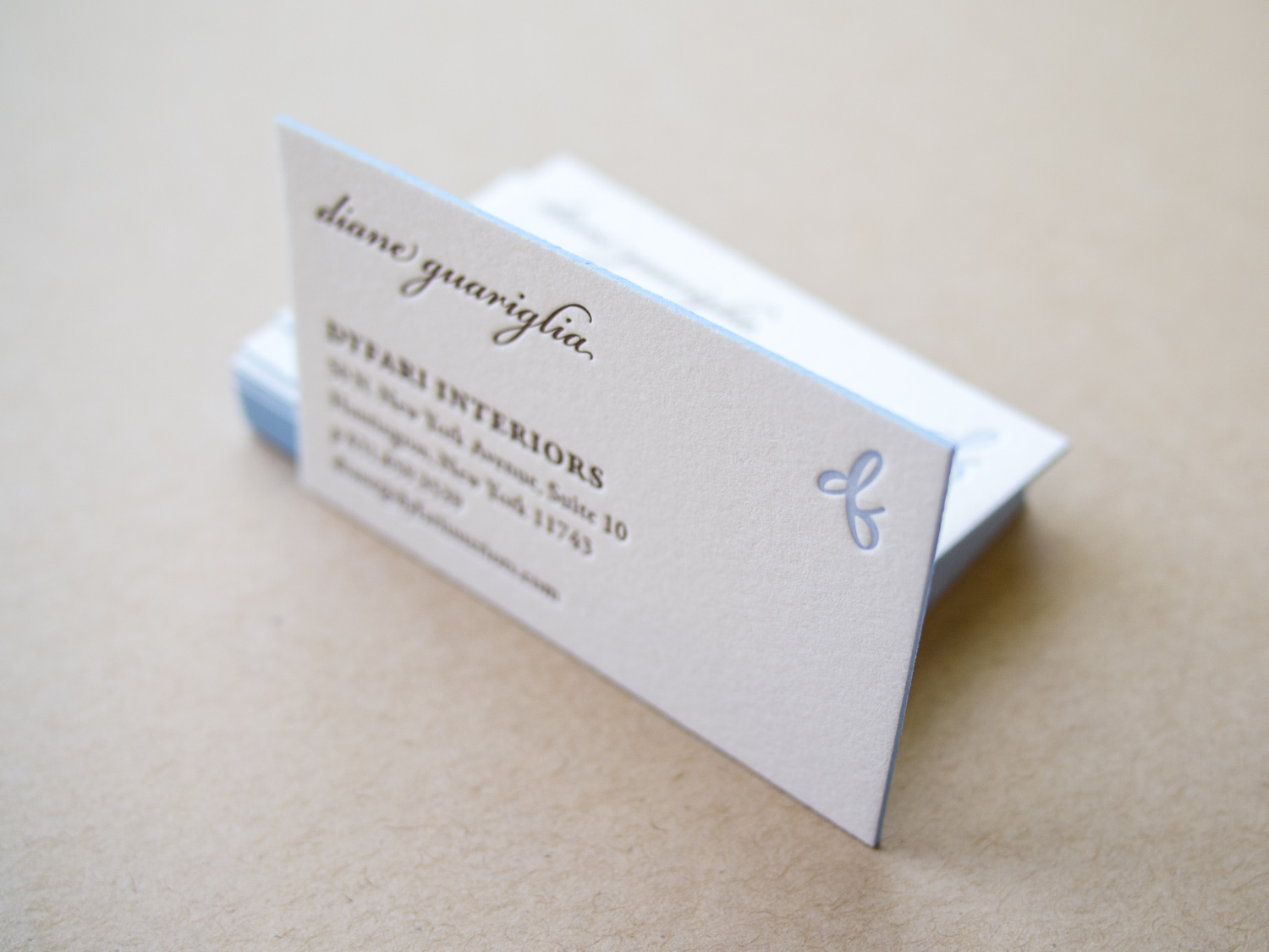
Finally, a business card reboot for Dyfari Interiors featuring Espresso and Periwinkle inks with Periwinkle edge paint on 600g Pearl White Lettra. This is the third iteration in a series of cards we've printed for Diane, starting with this version in 2010.

Foil, Door Tags, and Alligators

It's great when we get to work with a wedding client from the very beginning – starting with the save the dates, moving on to the invitations, and then following through to the wedding day pieces. We did this for Elisa and Alexander, shifting the design vision slightly throughout the process while still maintaining a cohesive aesthetic.

For the save the date, we printed tinted white and Espresso inks on an oversized 600g Pearl White card, tucking the text in the corner and emphasizing the dandelion motif.

Photo by Sarah Arneson

Moving to the invitation set, we got a bit more elaborate and less minimalistic. The alligator-print-lined envelopes housed a gatefold card, guarded by a pair of blind-pressed gators. Inside was a 3-ink + gold foil invitation on thick Fluorescent White paper, a 2-ink + foil pre-party card, and a 2-ink reply card with a lined reply envelope.

We unfortunately don't have photos of the (awesome) programs, menus, and place cards, but we did snag a shot of these custom die-cut hanging door tags that the bride and groom gave to their guests staying at the venue.

Anniversary Foil

For us, 2015 has been the year of foil. Check out these awesome foil stamped employee recognition cards we printed for Canada's Ian Martin Group.

All six sets were printed with gold foil on 600g Ecru Lettra paper, then finished with gold edge paint.

Mid-Century Modern Floral

This lively set was based on a 60's style botanical motif printed in two shades of green. Designed by the bride (between her cake-baking sessions), the set was printed with two custom inks on 600g fluorescent white stock.

PLP_20141201setV2-0394.jpg

First, a square save the date card — emphasis on the date. The playful greens grow inwards from all sides. The "save the date" is in a handwritten-style script, and the date is in large bold text.

Next, the invitation itself. The flowers and vines border the top and bottom, giving an appearance of open white space on the sides. On closer inspection, an edge of stippled dots accents the two sides, and the spaces between the flowers, creating a casual but grounded border to the artwork frame.

Finally, an information card, to answer crucial questions about accommodations, dress code, and gift registries. This piece uses only a couple of the floral elements, at top and bottom. Together, these three pieces are great example of how use of color and motif can tie together distinct pieces — each has a different layout, and all are reinforced by the common design elements.

The floral elements of the set's design bring to mind Scandinavian mid-century modern influences. And the lemongrass and avocado colors are similarly evocative of the mid 20th century. All the designs were provided to us by the client, and there are so many parts to love. So here's a collection of detail shots.

One last note, as a brief digression from the design … remember when putting your invitation together that you can say whatever you want to say. This goes especially for information cards. In addition to basic events/travel/lodging details, it's a great place to convey anything you need to the guests. If there are some conditions (a ceremony on a grass lawn, possibility of unpredictable weather, etc.) feel free to say it! Be conversational, be you. We love the way this couple addressed their invitees, and the dress code below is just one example. The warm and chatty tone made it very personal, and goes perfectly with the whimsical graphic style of the artwork.

Photos by Sarah Arneson
Letterpress Stationery for Palette & Parlor

As we were moving Parklife Press from North Carolina out to Oregon last summer, Ivy and John were bringing their Chapel Hill furniture studio into full swing. We're no longer in the same town, but that doesn't mean we can't still work together. 

We printed note cards and business cards with custom inks on 300g Fluorescent White Lettra paper with die cut corners and matching A6 envelopes.  A nice complement to P&P's simple aesthetic.

Custom Monogram in Santa Fe

Ah, the blind-pressed monogram. Hard to go wrong when you use a lightly tinted white ink with a deep impression on thick cotton paper.

We carried the variations of the monogram through to each piece — an accommodations card with a tear-off reply card, a menu, table numbers with a blind chevron pattern and inkjet numbers, and programs with silver ink on navy cotton paper.

Most letterpress inks are transparent, so we can't print light ink on dark paper. But silver is an exception — it's about 75% opaque. Not quite as opaque as foil, but not as pricey either.

Photos by Sarah Arneson
Botanical Postcards

This two-sided client-designed save the date postcard combines light warm gray letterpress ink for the front with flat inkjet printing on the back.

The botanical image has wonderful ornate detail while the R+B monogram on the back is simple and clean. The two styles work beautifully together.

When printing two-sided, we can use letterpress for both, but it's sometimes nice to flat print one of the sides like we've done here. That way the impression from one side doesn't interfere with the impression from the other.