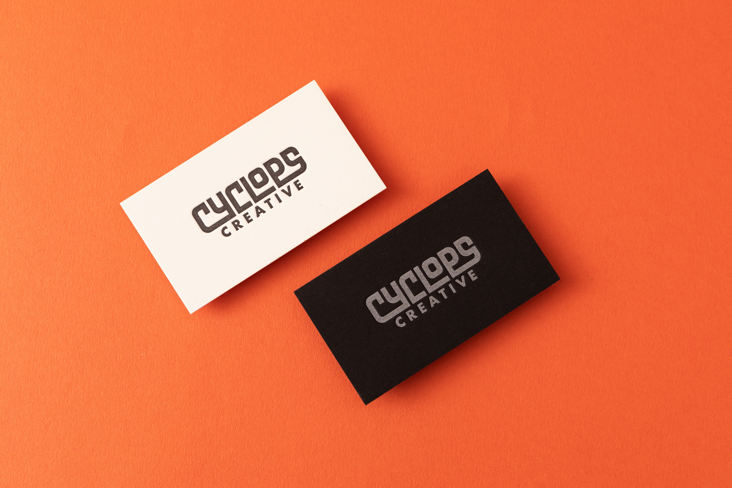
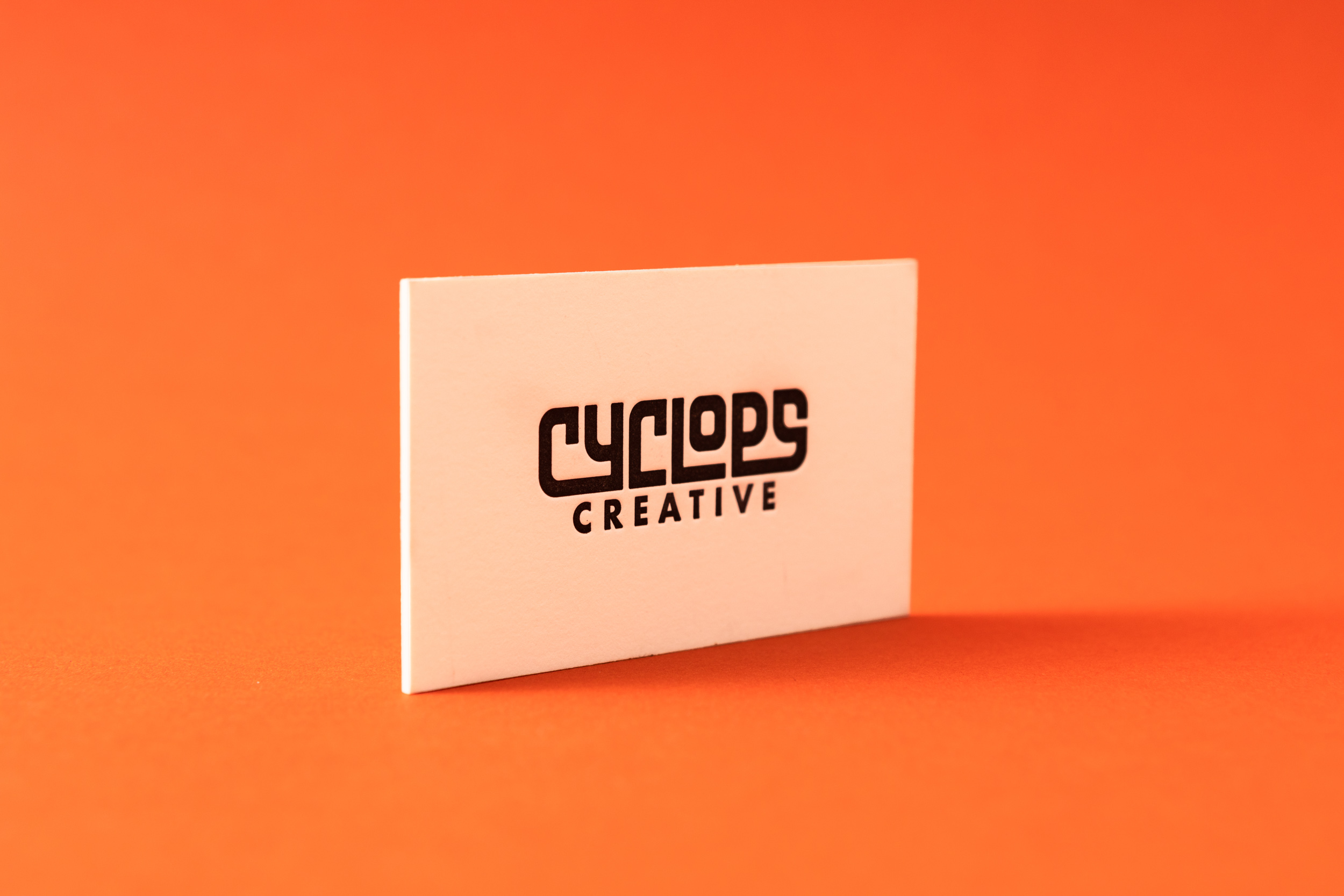
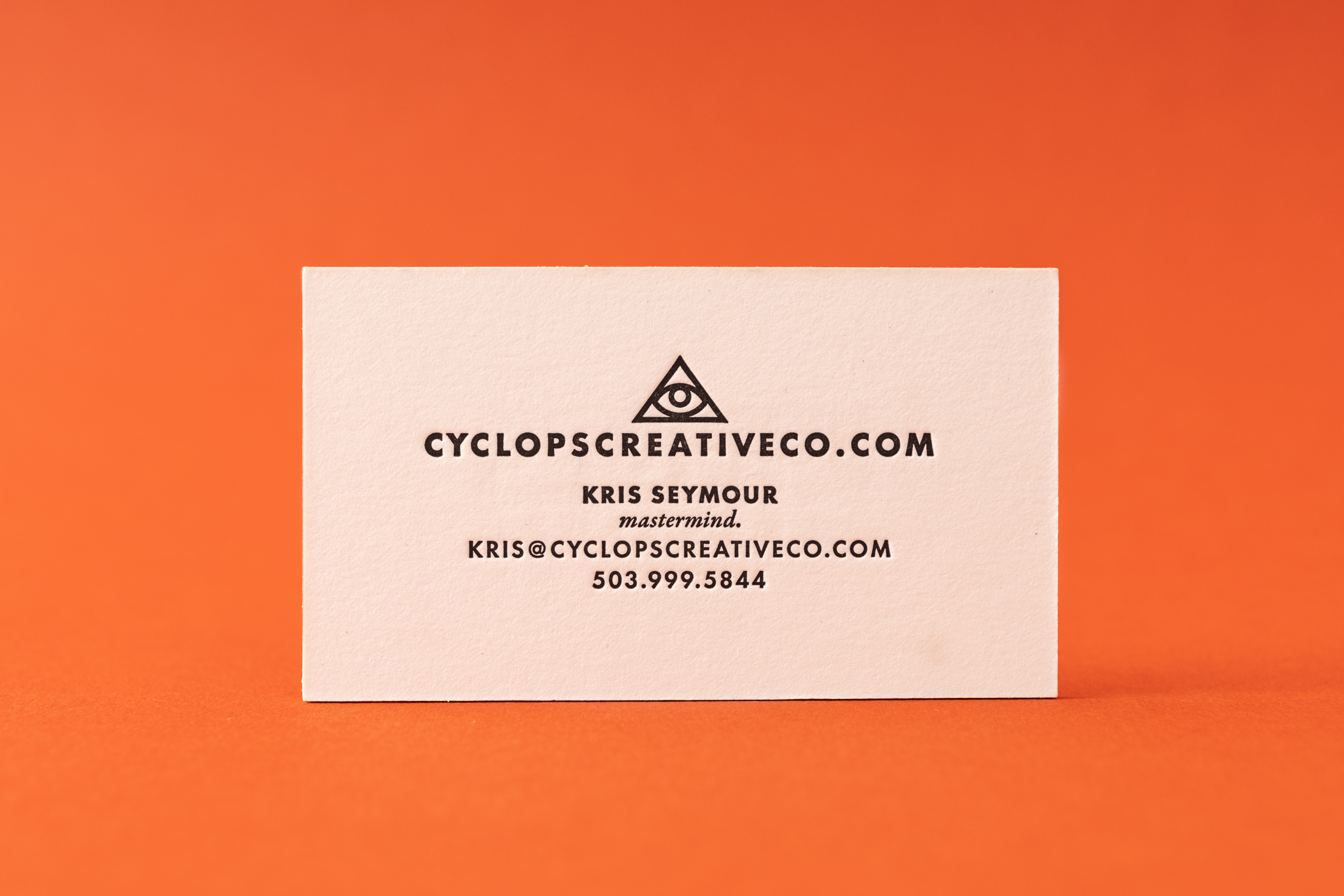
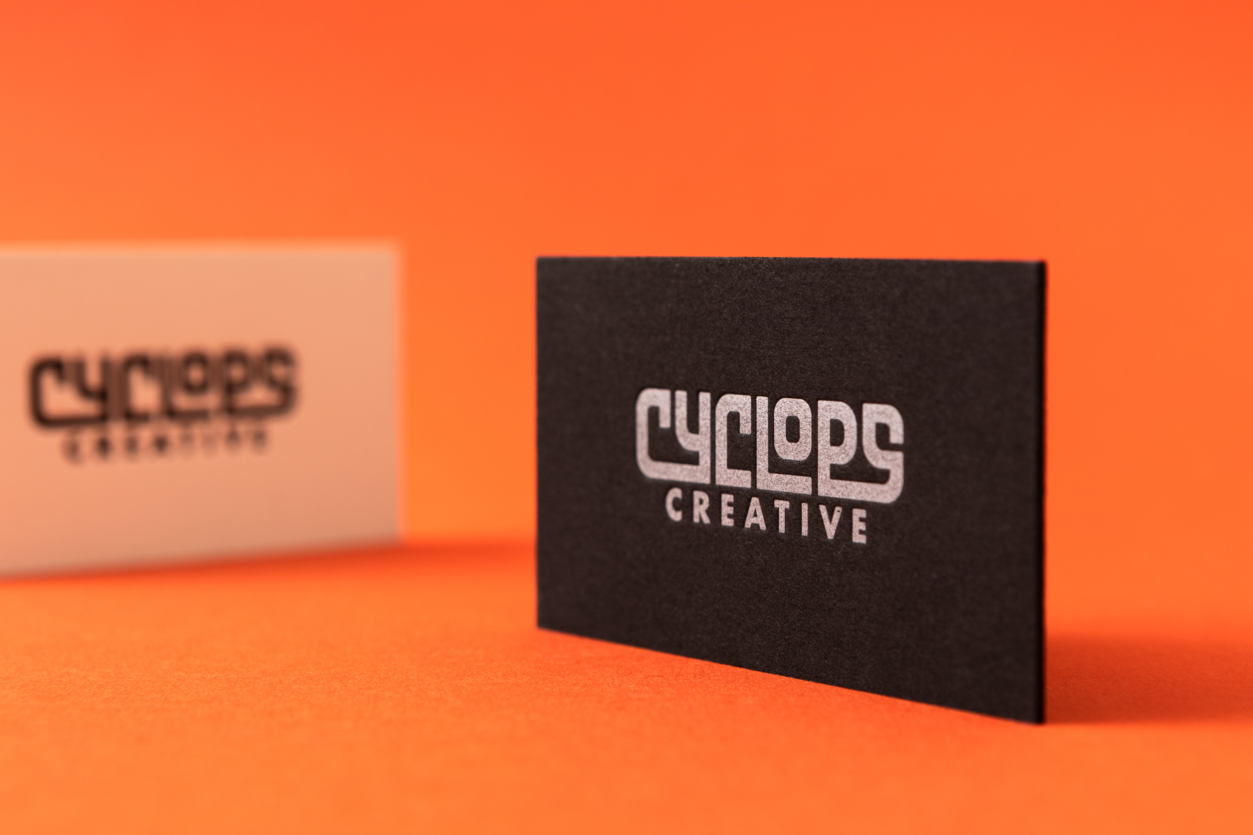
REALLY thick business cards for Kris Seymour of Cyclops Creative. We did two versions, one with black ink on Antique paper and one with silver ink on black.
VERSION 1
PAPER 60pt Antique Rising Museum Board
INK Black
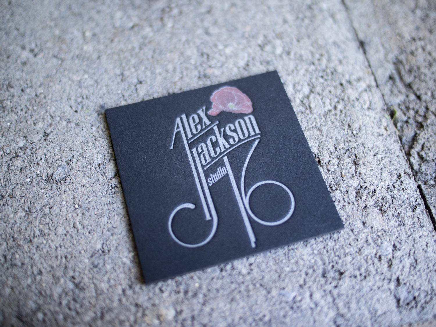
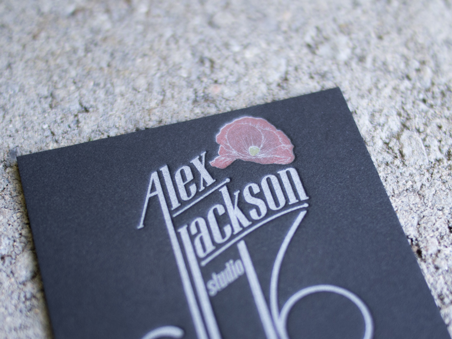
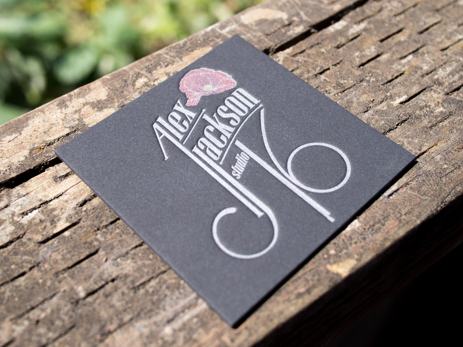
VERSION 2
PAPER 60pt Black Rising Museum Board
INK Silver
Photos by Gritchelle