Winter Wonder
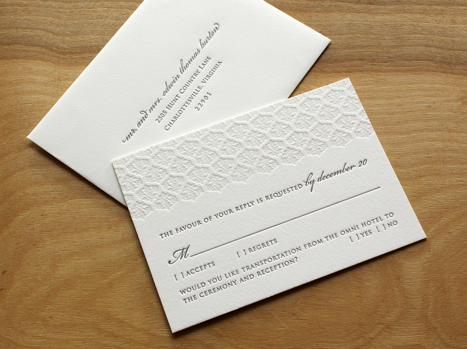
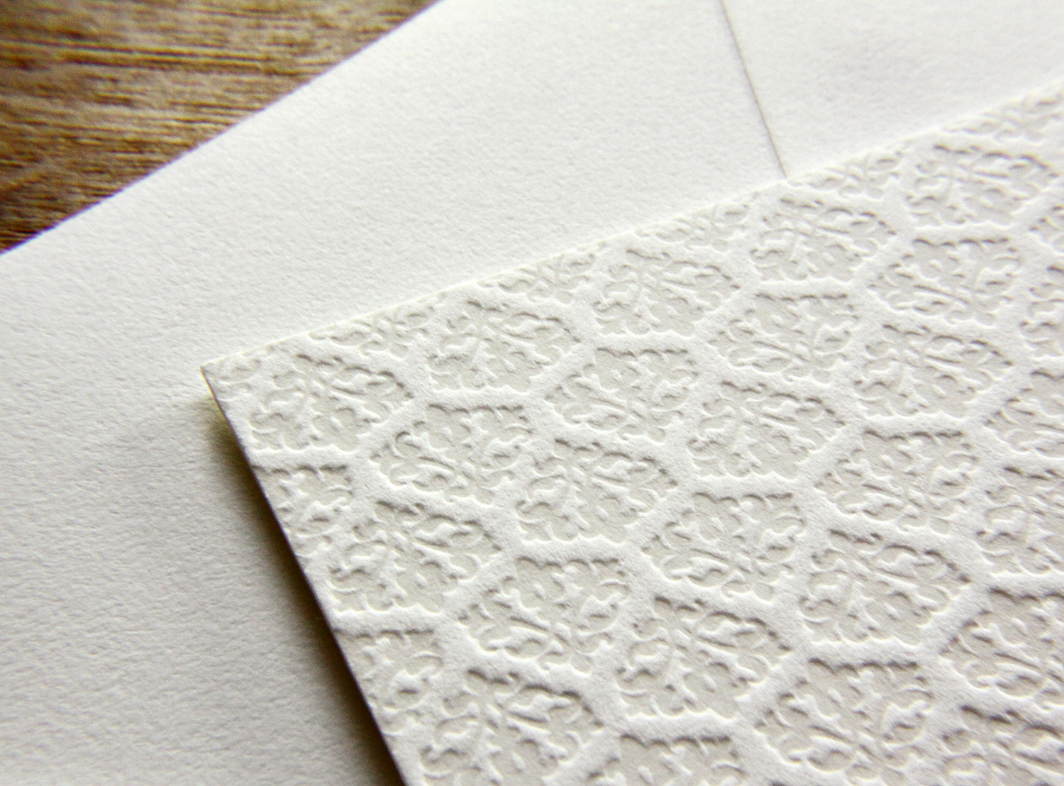
Trish Burton was helping her daughter plan a winter wedding, and was looking for winter-themed invitations. She was familiar with letterpress, as she had used it for her other daughter's wedding, but was unable to find any designs in her area that felt right. After finding Parklife Press and communicating with Travis, she had the idea to adapt the Pinkney design by using a tinted white ink instead of pink. Because the color of the white ink and the color of the paper are so similar, this look has the appearance of a blind deboss (an impression made without
ink) but in fact it adds just enough color to make the
texture pop. She predicted the change of ink color would make the springy, floral invitation convey a lush and dense snowfall instead. Quiet elegance, perfect for the winter-themed wedding in January.
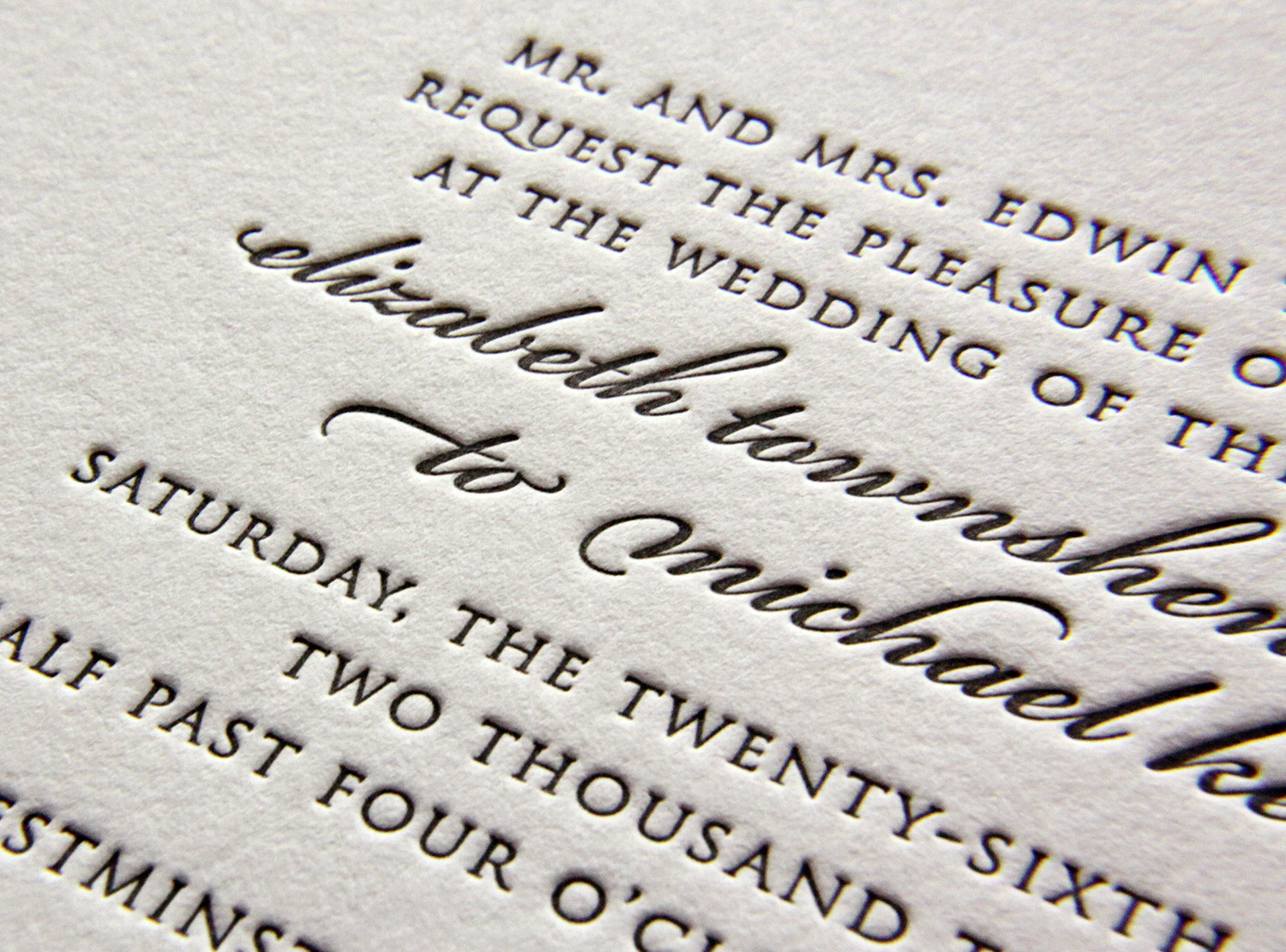
The text was done in slate — a cool gray ink that paired well with the pearl white paper stock — coordinating beautifully with the wedding's theme colors of icy blue and pewter.
The bride and groom, who each have stressful careers and work long hours, were grateful to have Trish make the arrangements. Trish, in turn, was eager to take away as much of her daughter's wedding-planning stress as possible. And her pursuit of a fitting winter-themed invitation for her daughter's happy day was successful — Trish said she lost count of the number of friends who complimented them.