Posts tagged Pearl White
Belvedere in Lavender

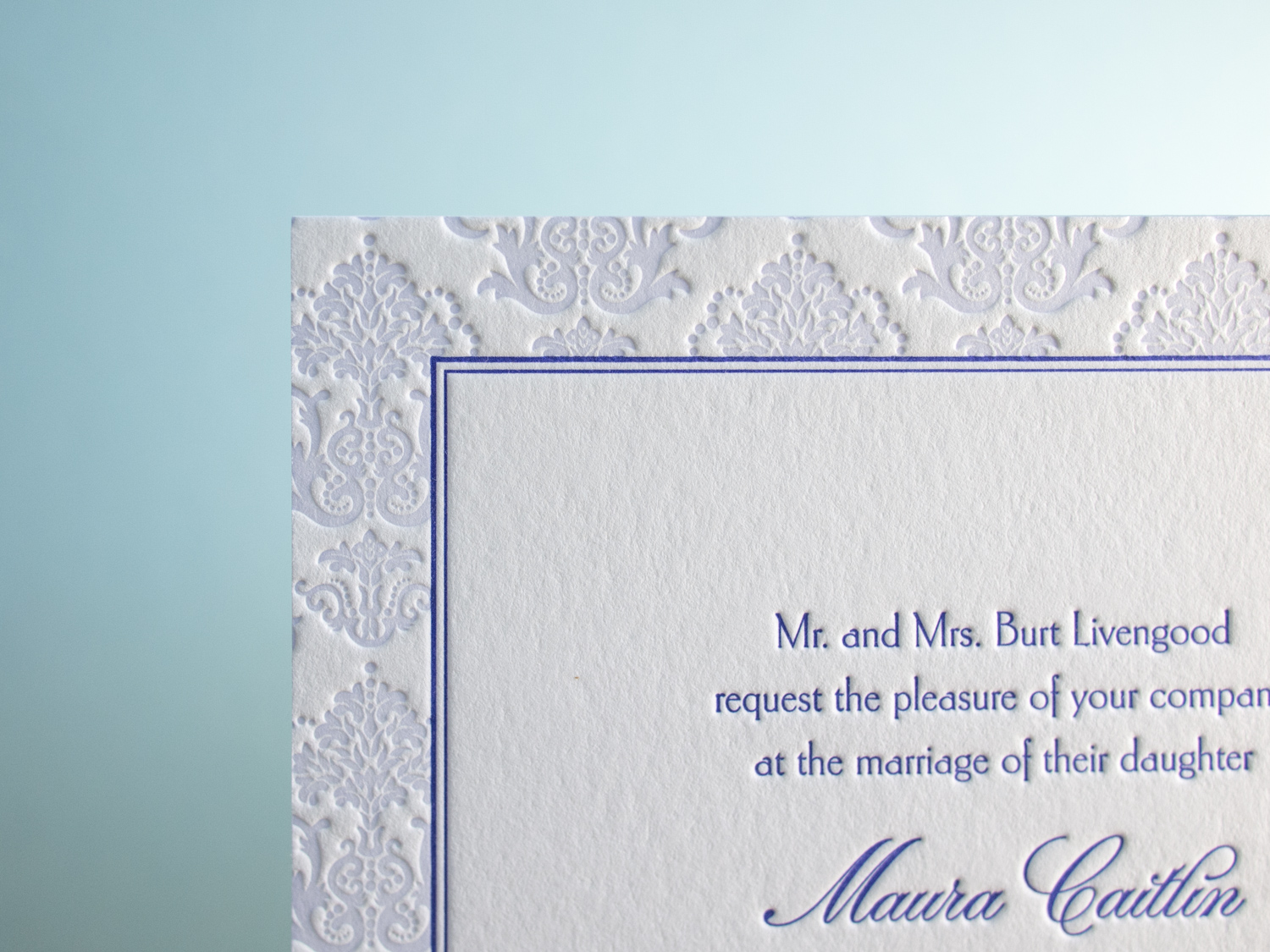
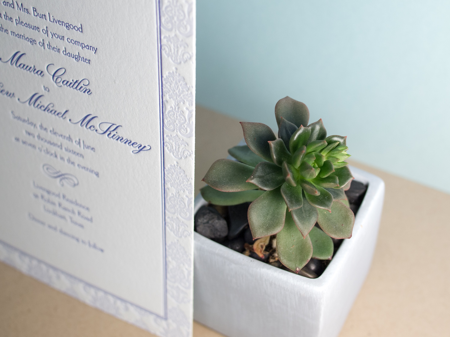
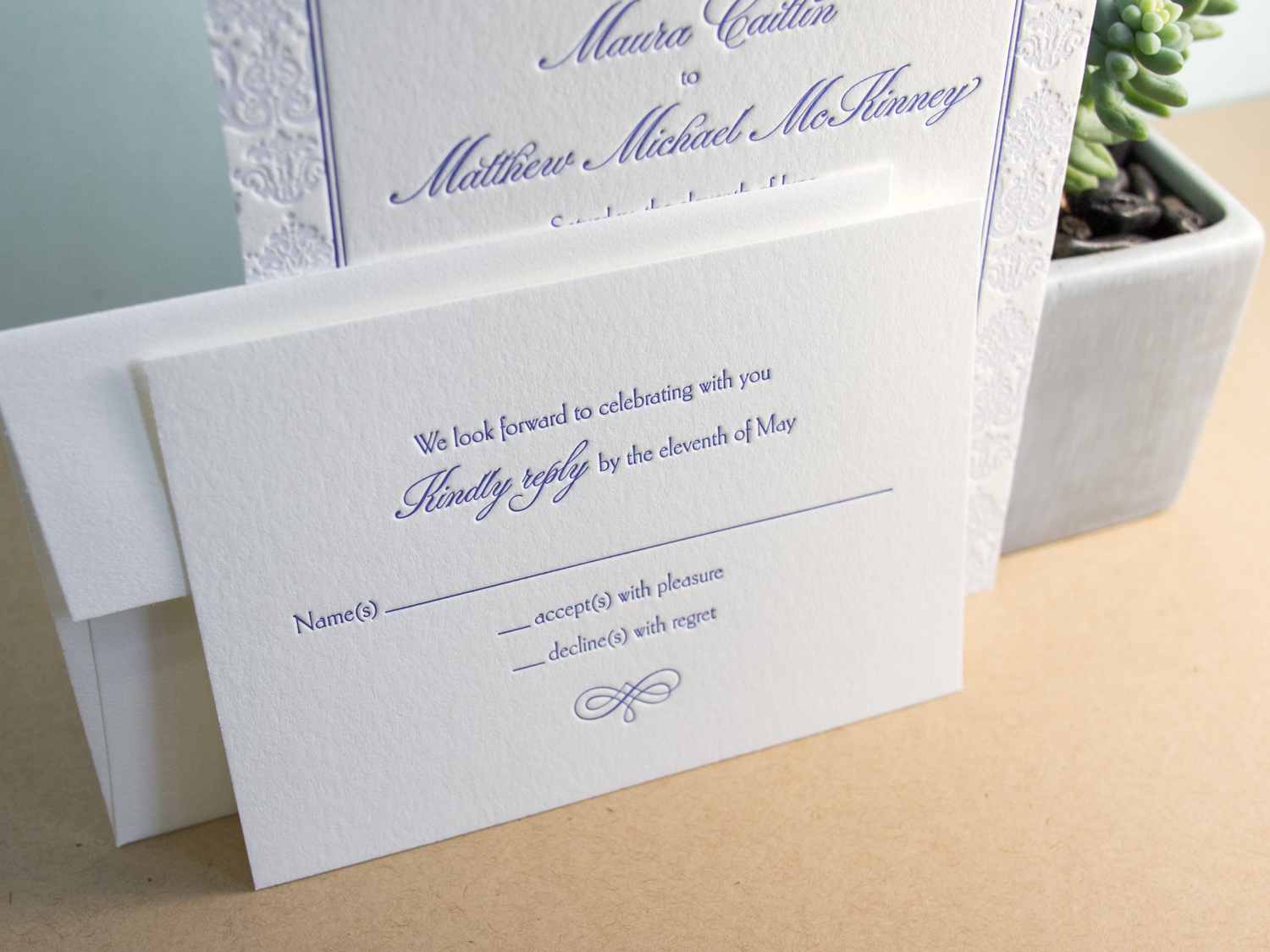
Our Belvedere invitation is traditionally rather formal — printed with a graphite ink and a blind impression for a bold but stark feel. But Maura and Matthew wanted something a little more playful and a touch more Downton Abbey. So we swapped out the Mrs Eaves text and Burgues Script for the more lighthearted combo of Carlton and Parfumerie, punched up the color with two shades of lavender, and opted for a prim and proper flourish motif.

Golden Black Squares for MA Allen Interiors

Another awesome duplexed card. This one's for interior design firm, MA Allen Interiors. We actually printed wedding invitations for the firm's founder back in 2010, and she came back to us for business cards after opening her Raleigh firm.

On the front we've got gold foil on 30pt black museum board — and on the back, the same gold foil on our pearl white 300g (21pt) house cotton paper.

Our Letterpress Halloween Card = 15% Off Business Orders

Our 2015 Letterpress Halloween Card

Whoa. Check out this hot-off-the-press Halloween card — designed and printed right here at our Portland studio. On the outside it features a medium gray ink and a 50/50 mix of transparent and opaque white on 65# Neenah Astrobrights Cosmic Orange. And on the inside it's the same gray ink plus a custom orange on 90# Pearl White Lettra. All hand duplexed of course.

Oh, and what exactly is going on inside? It's 15% off any business-related custom printing now through the end of November. That could mean business card, holiday cards, letterhead, or maybe some letterpress coasters for your company's New Year's Eve bash.

We mailed these out to a select bunch of loyal customers, but figured the whole world should be clued in too. The whole world reads this blog, right? Probably.