A Handful of New Letterpress Business Cards
We've added some great new cards to our business gallery. Take a look...
These double-sided cards for Cedarly, a media and web branding company in North Carolina, feature their logo printed with a tinted white ink. We could have just as easily blind-pressed the logo (no ink at all), but the tinted white helps it pop a bit more. This technique works beautifully with the logo's leaves and with its clean typeface, highlighting the deep impression of the thick 600g paper. On the other side of the card, the information is perked up with tiny icons in blue, which help distinguish at a glance the different methods of contact. We finished the card with painted edges, picking up the accent color.


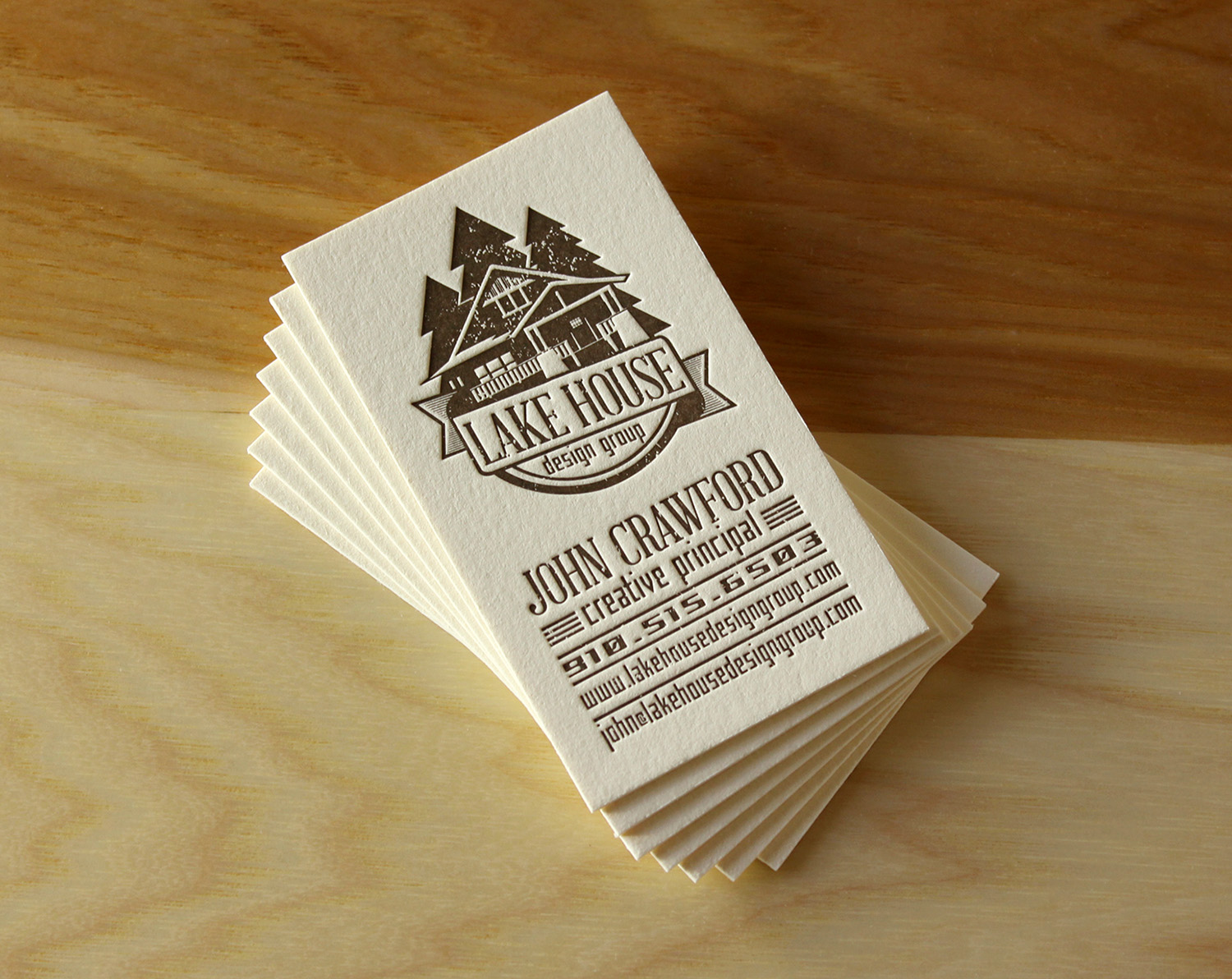
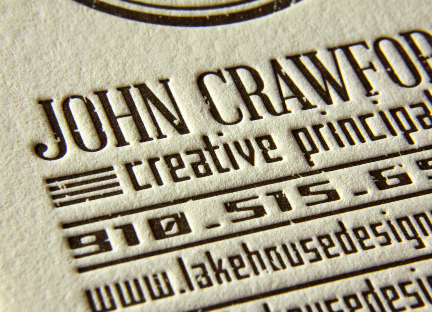
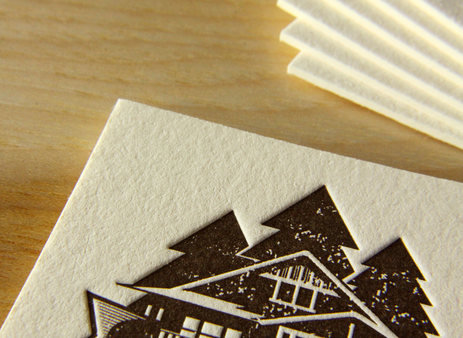
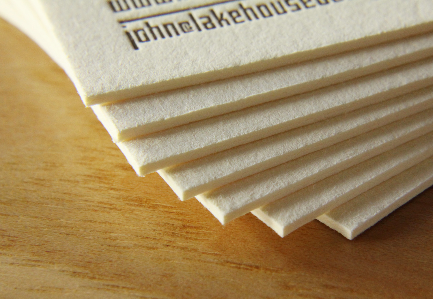
John, the creative principle at Lake House Design Group, designed these rustic but modern cards. The logo style, the palette of the ink and paper colors, and the distressed typeface work together to evoke the familiarity and nostalgia present in the firm's name.
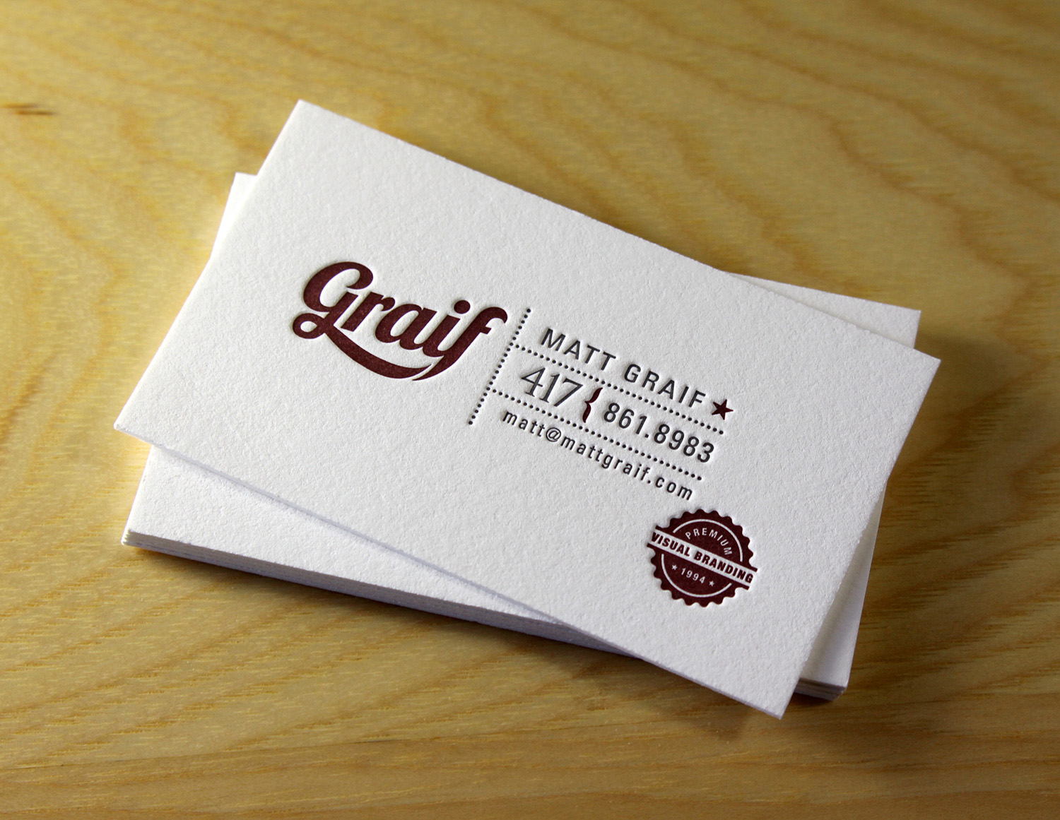
Matt Graif, a graphic designer in Missouri, submitted this excellent design for his business card that we printed for him on 600g fluorescent white Lettra.


This dramatic card for Eli Powell, a photographer in Boulder, Colorado, uses white space to its advantage. With the card's less-common vertical orientation and the artwork bleeding off the bottom, the design focuses squarely on the photographer's name but hints at sweeping landscapes and large, open skies. In blue ink on crisp, fluorescent white card stock, the snow-capped mountains are brought to life with just a few abstract shapes, connecting Powell to his region and to his clientele.


And finally, a card for Jean Woods Madge, a realtor at Distinctive Properties in Durham. Travis worked with her to create a new logo and a new look for her business cards, which were printed on 300g ecru white cardstock. The logo itself is distinctive and interesting, and the card layout was complete with a nice combination of script and serif typefaces.


