For us, 2015 has been the year of foil. Check out these awesome foil stamped employee recognition cards we printed for Canada's Ian Martin Group.
All six sets were printed with gold foil on 600g Ecru Lettra paper, then finished with gold edge paint.
For us, 2015 has been the year of foil. Check out these awesome foil stamped employee recognition cards we printed for Canada's Ian Martin Group.
All six sets were printed with gold foil on 600g Ecru Lettra paper, then finished with gold edge paint.
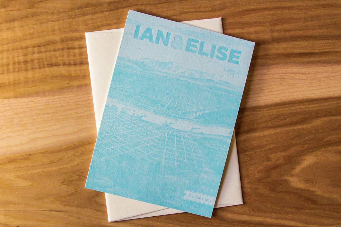
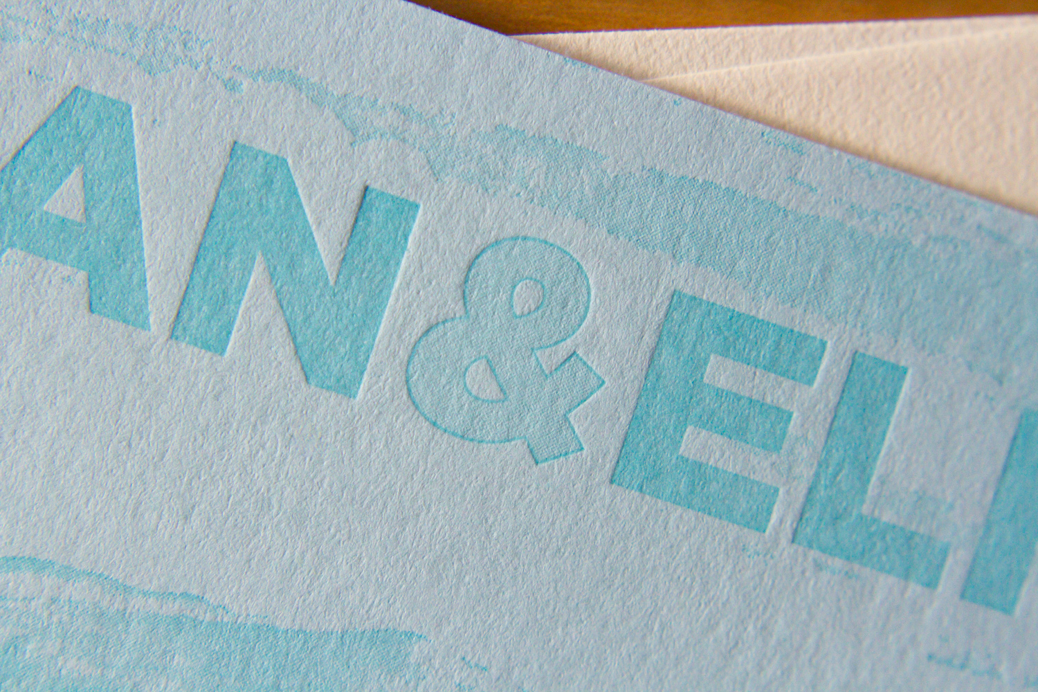
Here's a lovely wedding set for Parklife's favorite brother and his favorite new wife. For the save the date we used two custom inks on thick 600g ecru paper.

For the invitations, we carried through the same inks, paper, along with a few variations on the Gotham typeface.

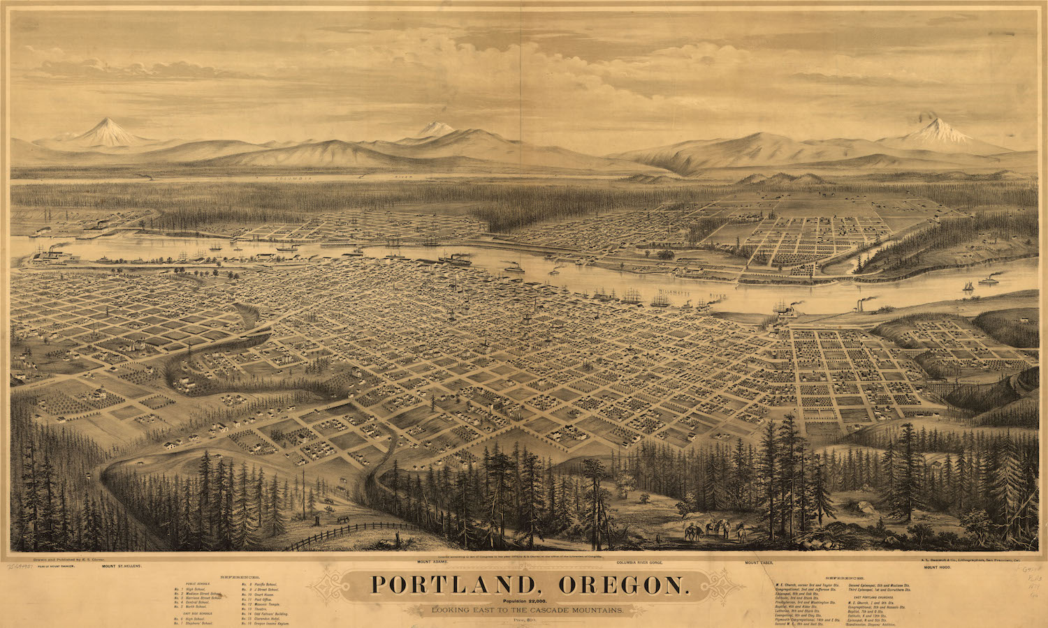
On the back of the invitation we added a hand-duplexed backing that's letterpress printed with a tonal ink and a fine halftone screen. The image is adapted from an early nineteenth century drawing of Portland.
Alan and Keith were getting married on their farm in Virginia and wanted to balance the solemnity of the event with the rustic quality of the setting. The grooms-to-be had created an online video save-the-date for their guests, but for the invitations, they decided that letterpress would help underscore the formality of the occasion.
The invitation, according to Alan, had to convey several things at once to set the tone: a sense of formality (despite the fact that the reception was to be held in a barn, it was not going to be a casual event); the fact that the ceremony itself was going to be quite traditional; and the occasion's overall blend of elegance and rusticity. In his words, "we needed an invitation that tempered the formal and traditional with some sort of country element."
They felt the Californian design was almost there, but wanted to use a different oak tree image. The oak was their chosen motif, partly for symbolic reasons — the mighty, strong, sheltering, beautiful oak is an apt metaphor for a lifelong commitment — but it held literal meaning, as well. The couple planted a pair of young oaks on their farm, and are planning to watch them grow old together. As Alan said, "we hope we can look back on them one day and say, 'those were planted the year we got married.' "
Alexandra and Michael were planning a black-tie, traditional Catholic wedding, and wanted their invitation to reflect that style. Alex was drawn to the Fountain design — seeing how the layout's simplicity put the elaborate font on display, she was, as she put it, "hooked."
Deceptively simple in design, the typeface features intricate and playful ligatures and flourishes. The extra thick invitation cards were edged in gold, and that subtle sparkle was echoed by the envelopes' antique gold liners.
Alex found Parklife Press on the Martha Stewart Weddings website. As with any wedding, there were many decisions to be made — but when it came to the invitations, whether to use letterpress was never really a question. "My Mom is a calligrapher and has instilled a reverence to paper products in me that I was sure to embrace in our wedding planning process." The effect was everything she and Michael were looking for: formal and traditional, with impact.
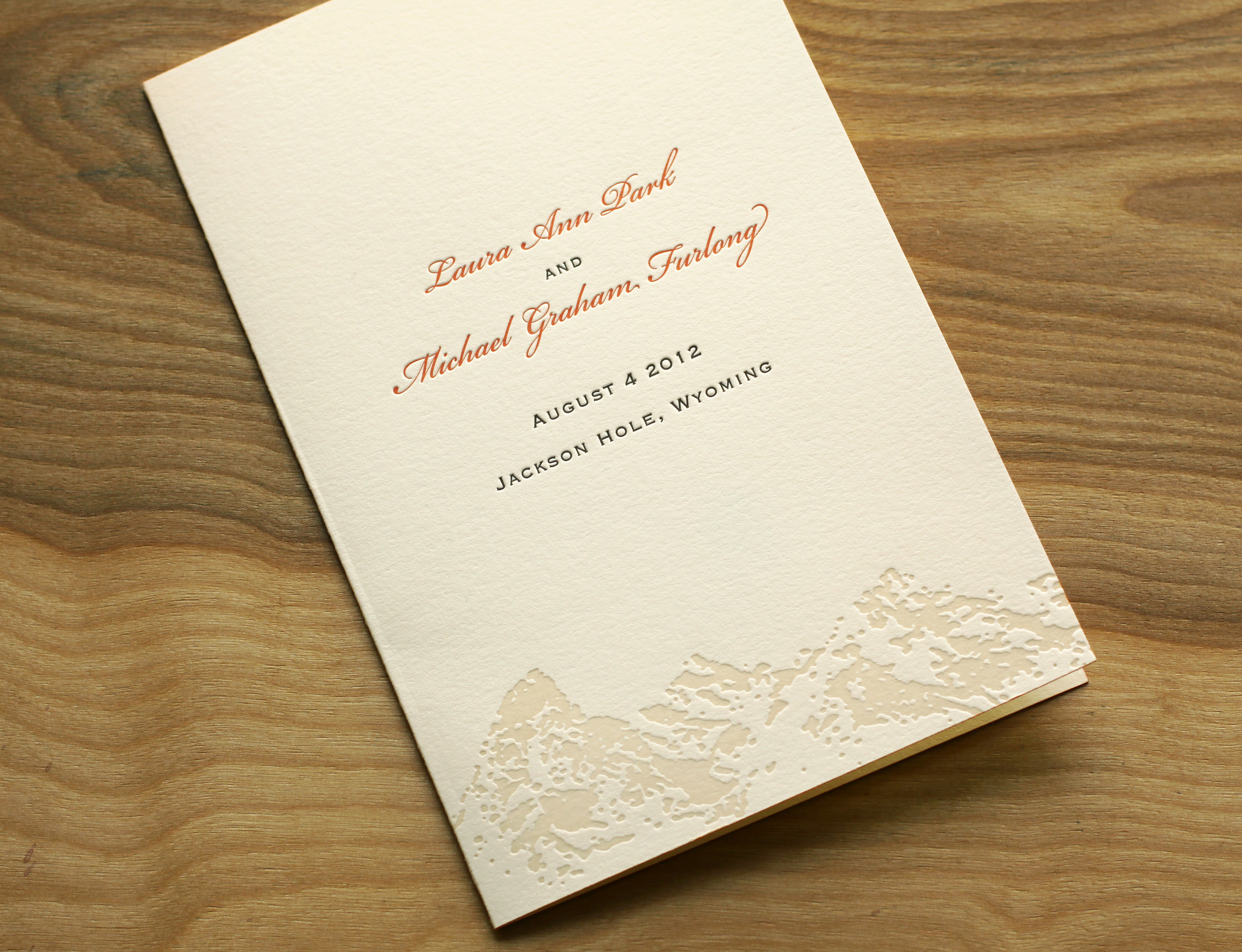
Laura and Graham love skiing and love the mountains. Both their families were very connected to Jackson Hole — a beautiful spot in Wyoming nestled in the valley of the Teton Range — and so they knew they wanted to have their wedding there. They also wanted to incorporate the famous landscape in their invitations. They loved the tea-length card because it's unusual and distinctive, and also because they knew the proportion would highlight the mountain range illustration.
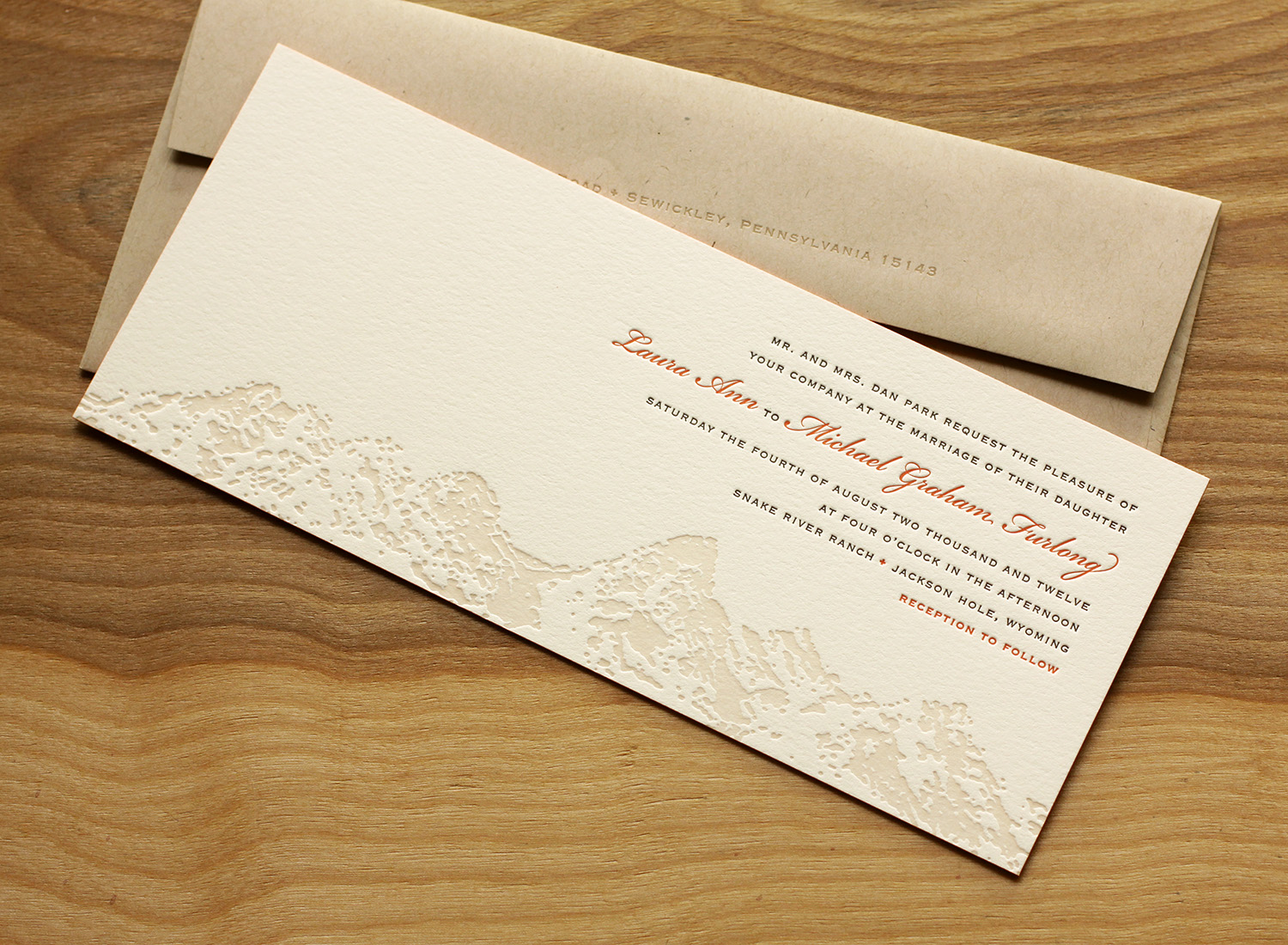
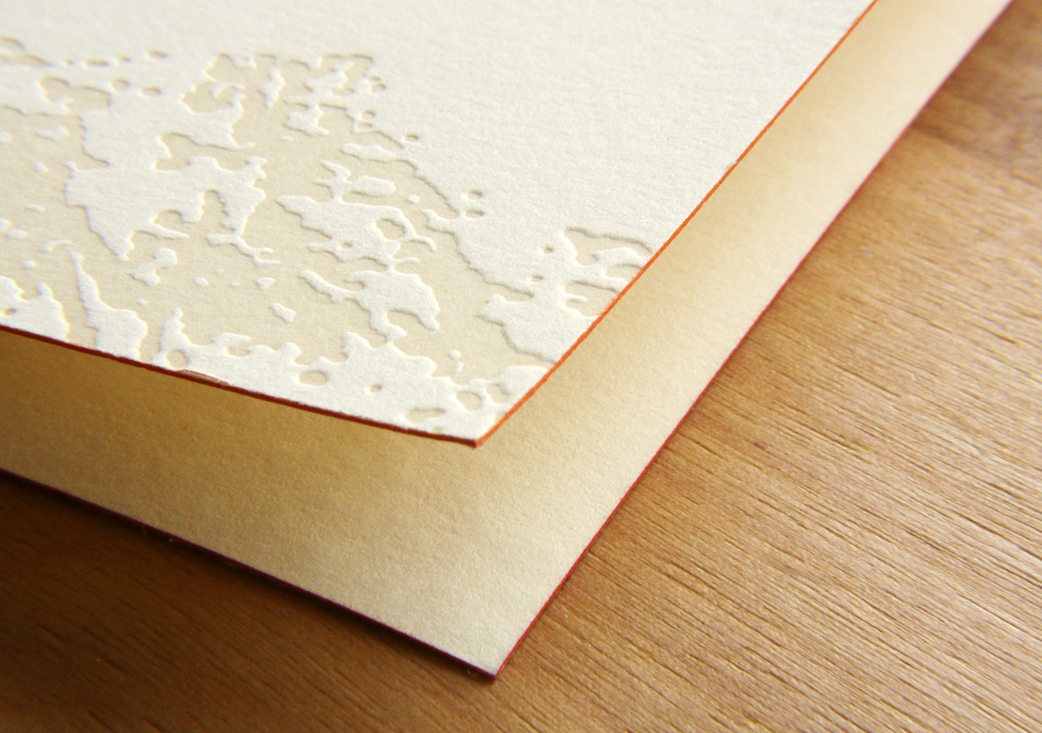
Travis worked with Laura to create the custom Teton art, and it was used on the invitation and on the program cover. Espresso and sherbet inks worked beautifully with the extra thick ecru paper, and corresponded with the wedding colors (brown was a featured color in the wedding, and the floral centerpieces had a pop of orange). The edges of the invitation card and the program cover were painted to tie together the sherbet accent ink used throughout.
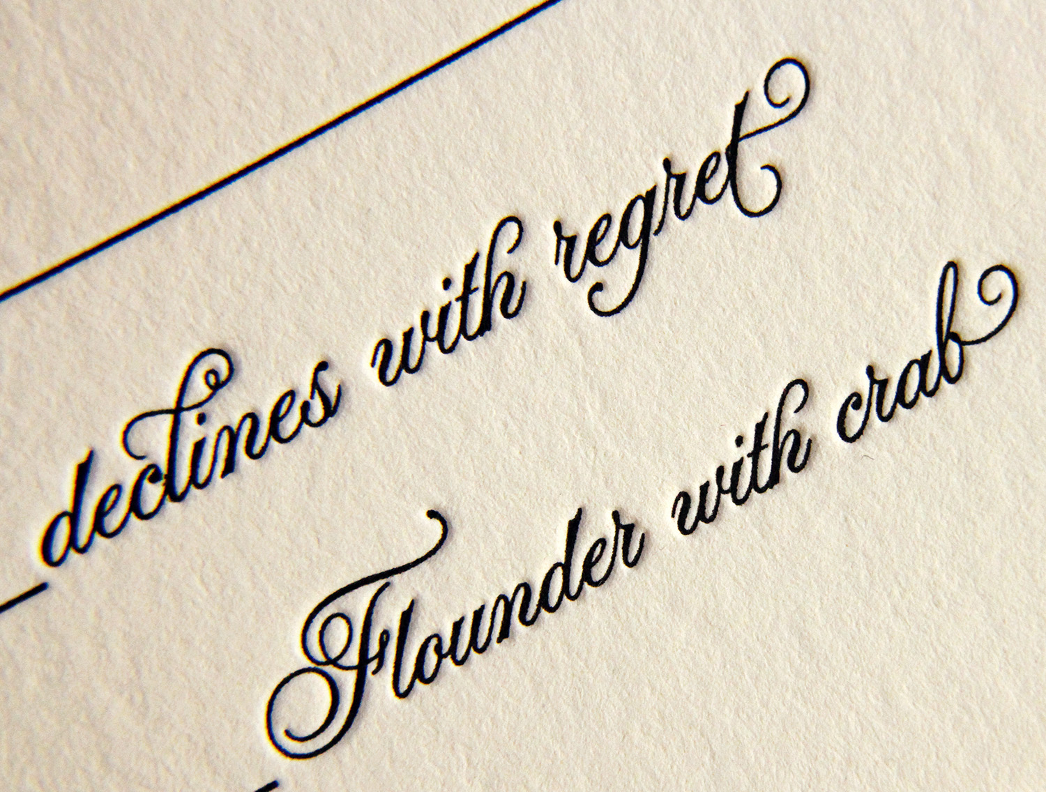
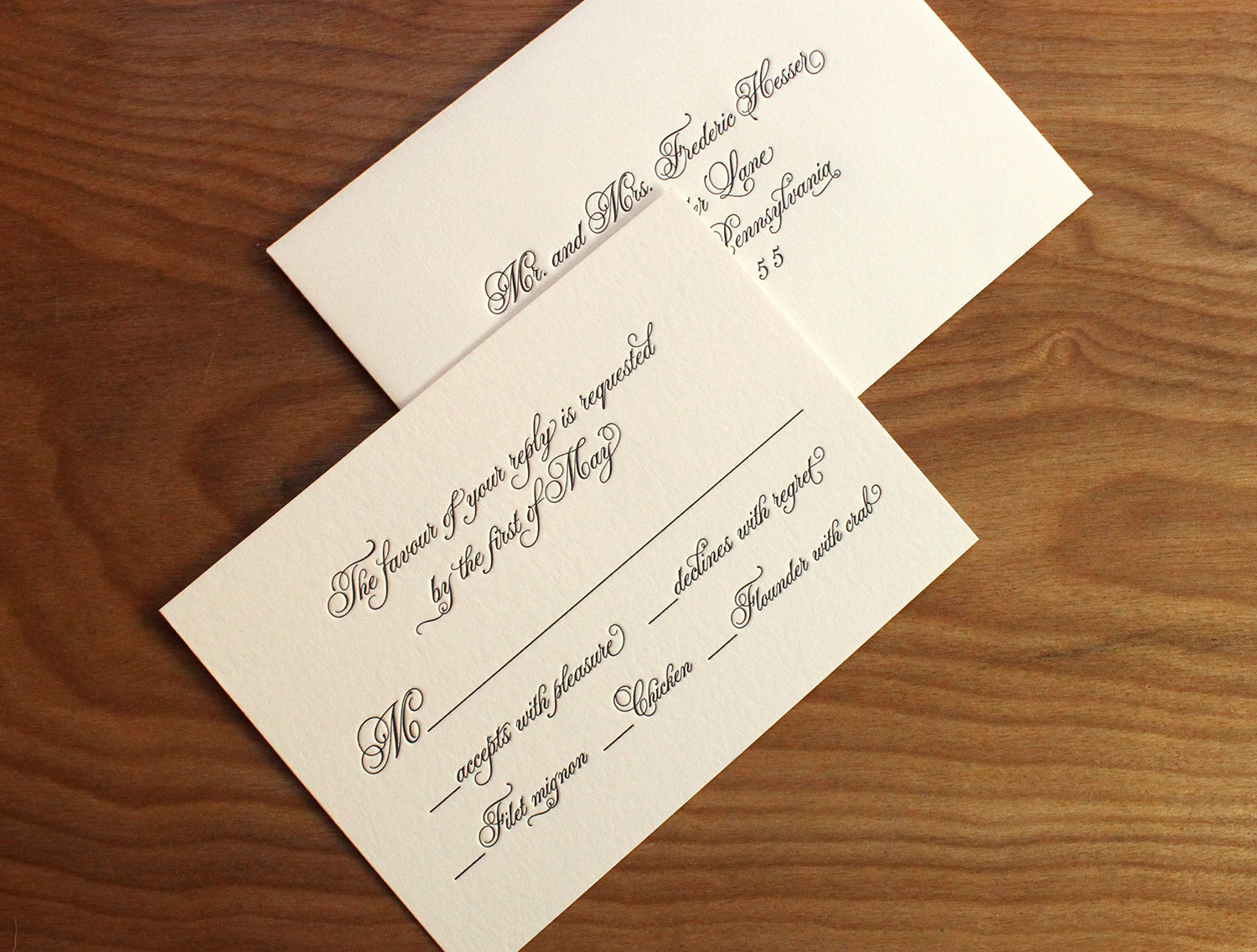
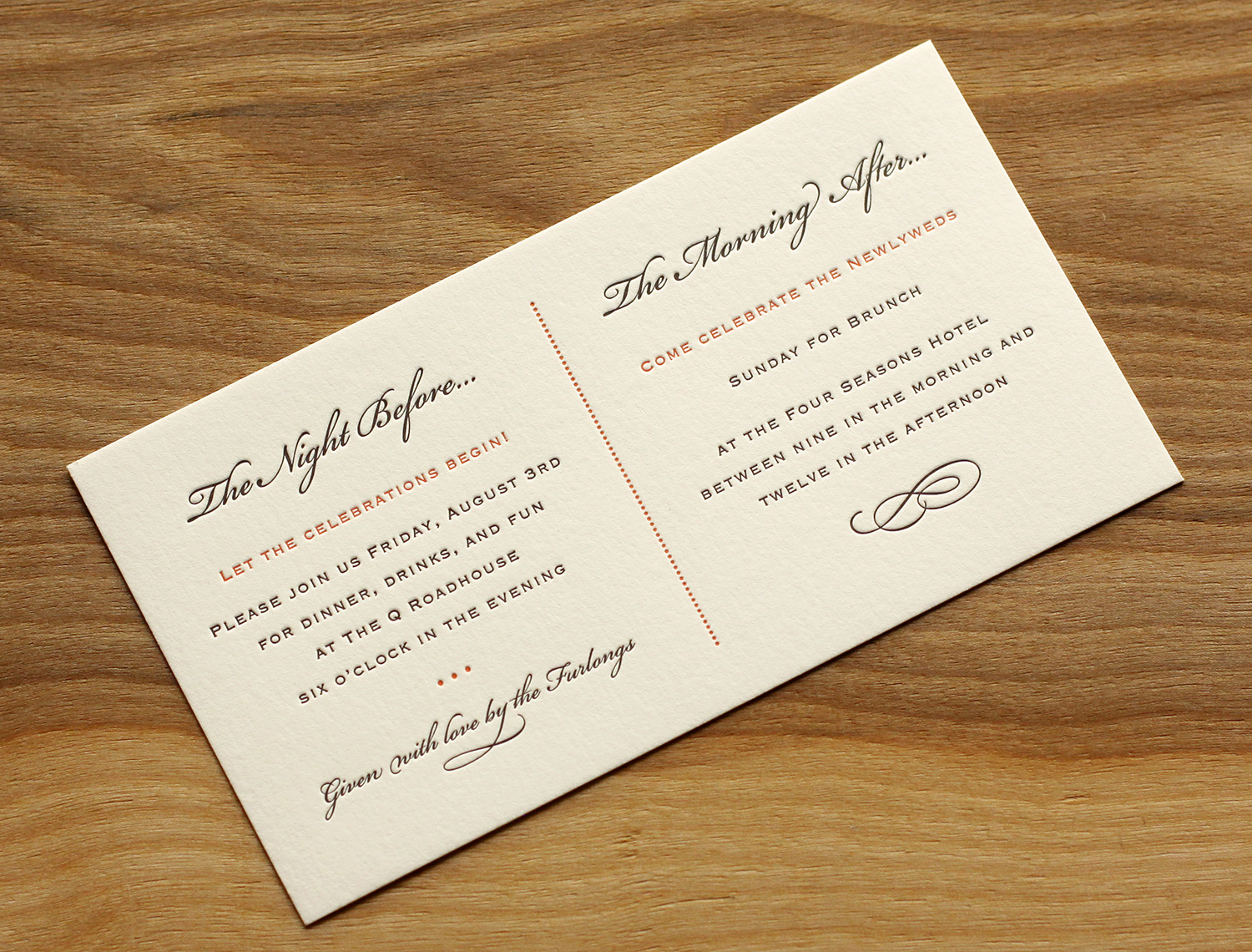
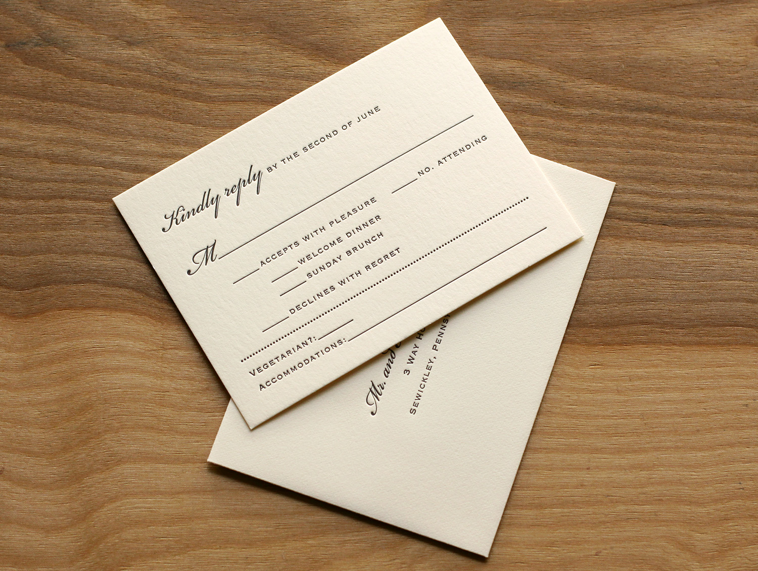
The set included a card inviting guests to the other events (a Friday night dinner and a Sunday brunch), and the RSVP card covered replies to these events as well as the wedding itself. It also had space to request a vegetarian menu and note lodging plans.
Laura became familiar with Travis' studio while she was at business school in nearby Chapel Hill. She was amazed by his work, and said that "selecting who to do my invitations was the easiest part of planning." "Everyone loved the invitations," she said. "I got many compliments."
We've added some great new cards to our business gallery. Take a look...
These double-sided cards for Cedarly, a media and web branding company in North Carolina, feature their logo printed with a tinted white ink. We could have just as easily blind-pressed the logo (no ink at all), but the tinted white helps it pop a bit more. This technique works beautifully with the logo's leaves and with its clean typeface, highlighting the deep impression of the thick 600g paper. On the other side of the card, the information is perked up with tiny icons in blue, which help distinguish at a glance the different methods of contact. We finished the card with painted edges, picking up the accent color.
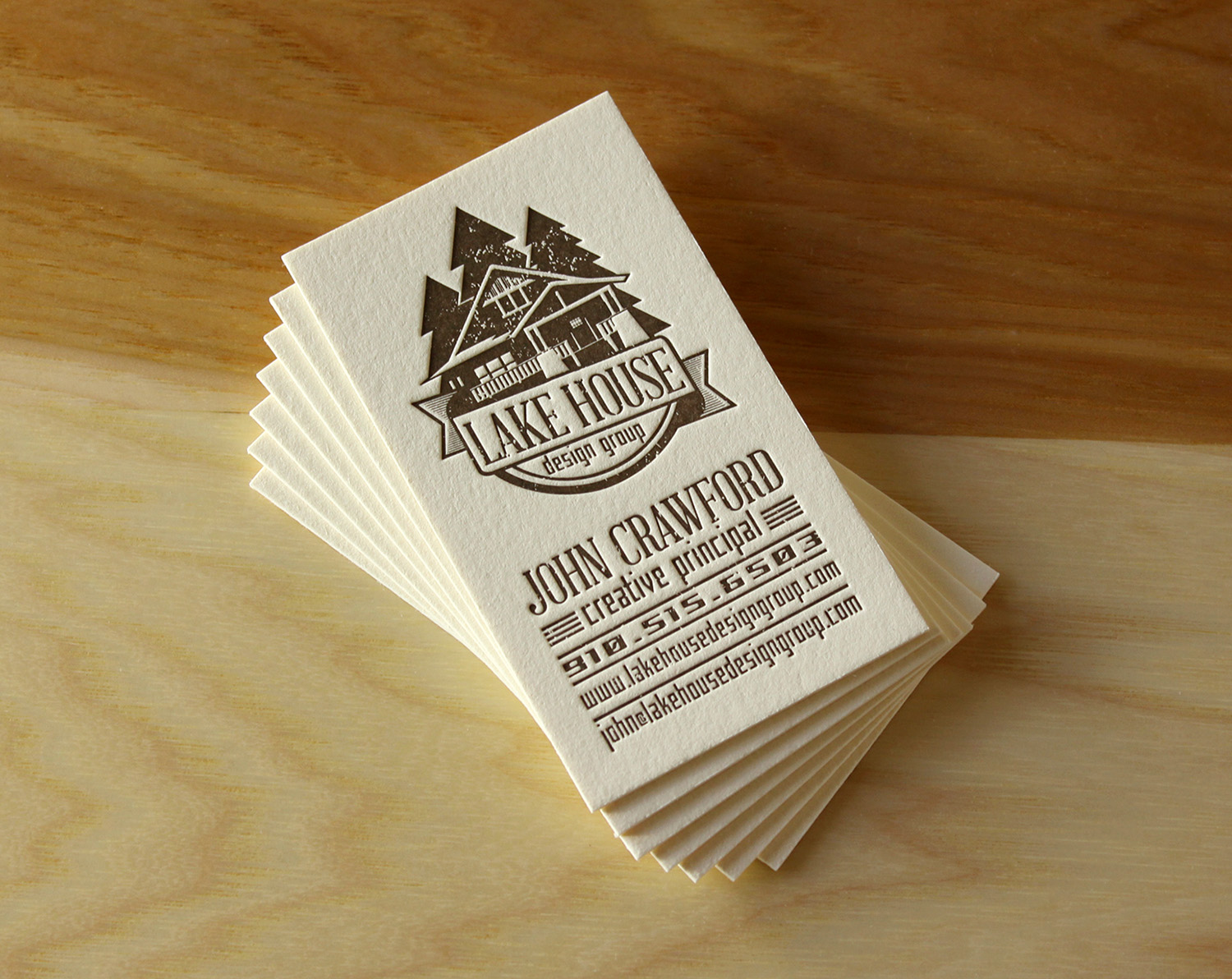
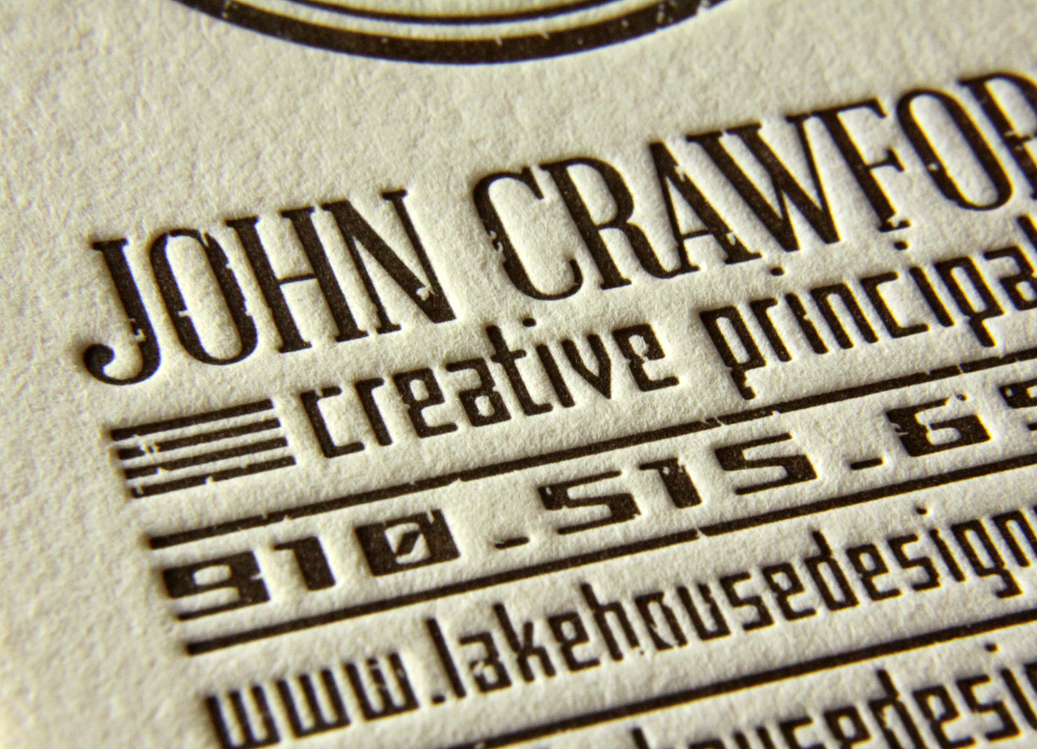
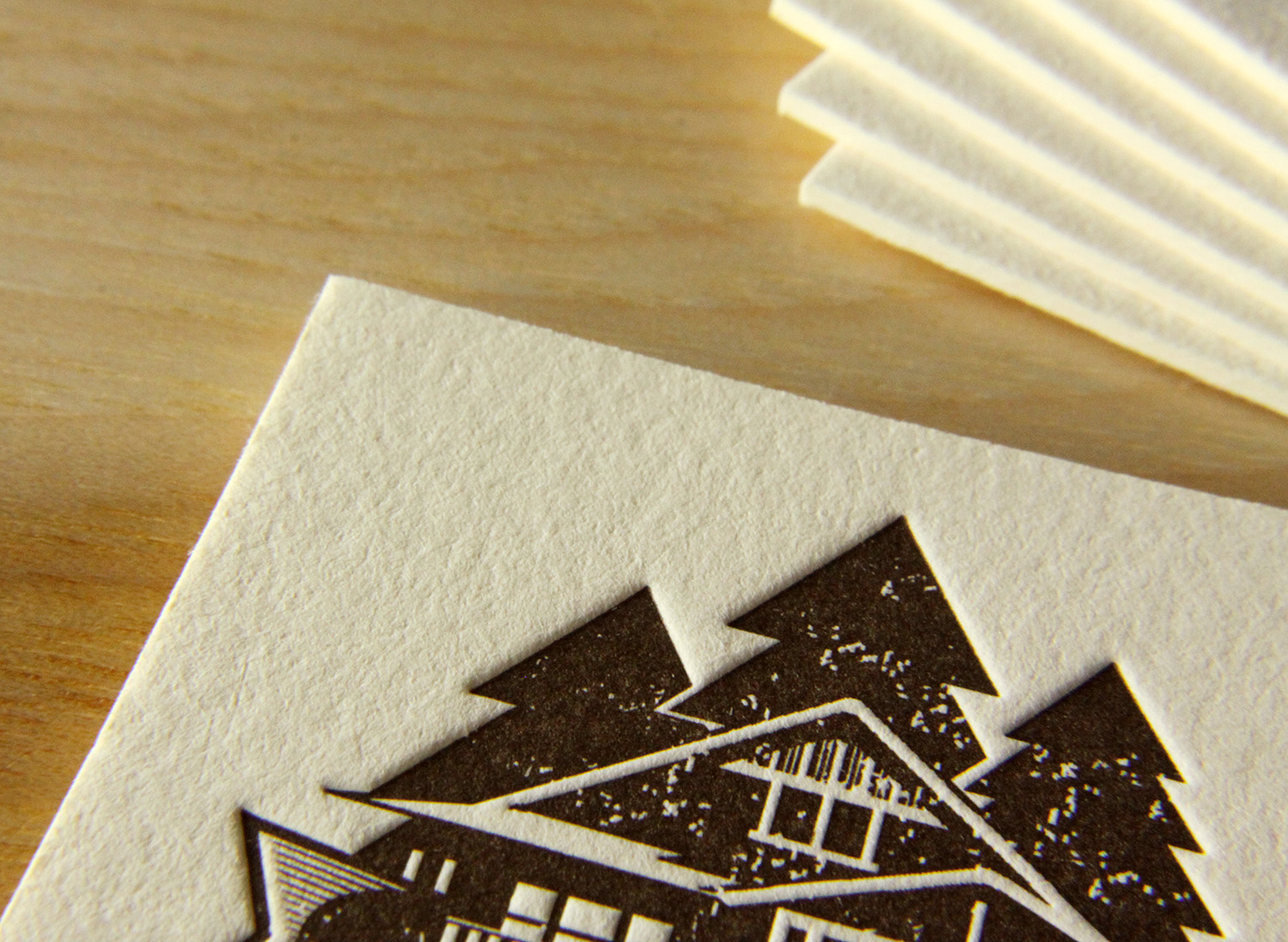
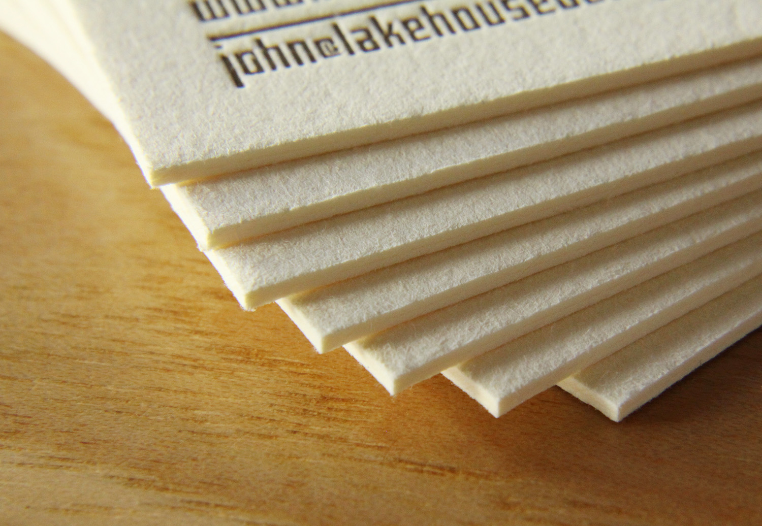
John, the creative principle at Lake House Design Group, designed these rustic but modern cards. The logo style, the palette of the ink and paper colors, and the distressed typeface work together to evoke the familiarity and nostalgia present in the firm's name.
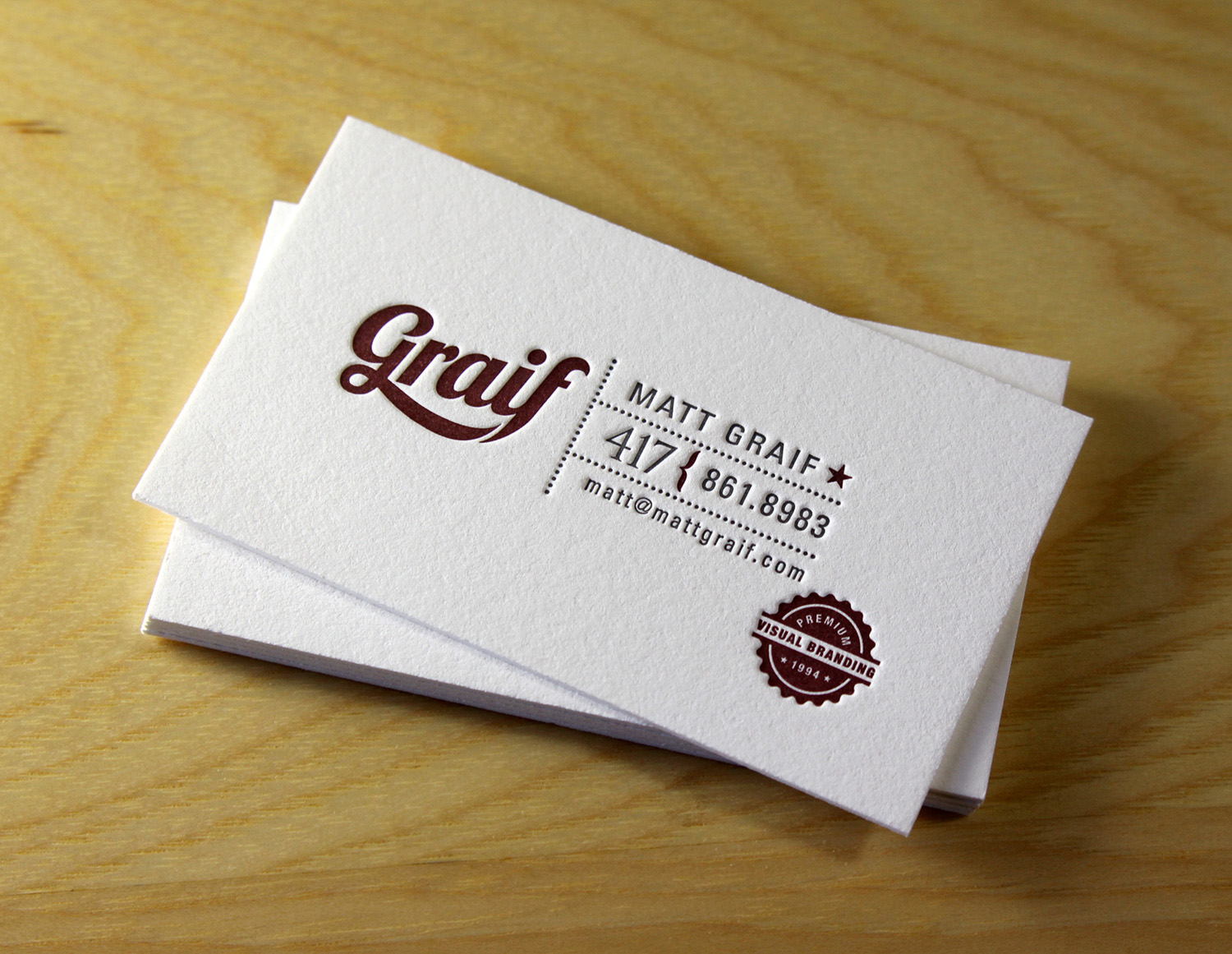
Matt Graif, a graphic designer in Missouri, submitted this excellent design for his business card that we printed for him on 600g fluorescent white Lettra.
This dramatic card for Eli Powell, a photographer in Boulder, Colorado, uses white space to its advantage. With the card's less-common vertical orientation and the artwork bleeding off the bottom, the design focuses squarely on the photographer's name but hints at sweeping landscapes and large, open skies. In blue ink on crisp, fluorescent white card stock, the snow-capped mountains are brought to life with just a few abstract shapes, connecting Powell to his region and to his clientele.
And finally, a card for Jean Woods Madge, a realtor at Distinctive Properties in Durham. Travis worked with her to create a new logo and a new look for her business cards, which were printed on 300g ecru white cardstock. The logo itself is distinctive and interesting, and the card layout was complete with a nice combination of script and serif typefaces.