Posts in wedding invitations
Amore e matrimonio: Italiano e Inglese

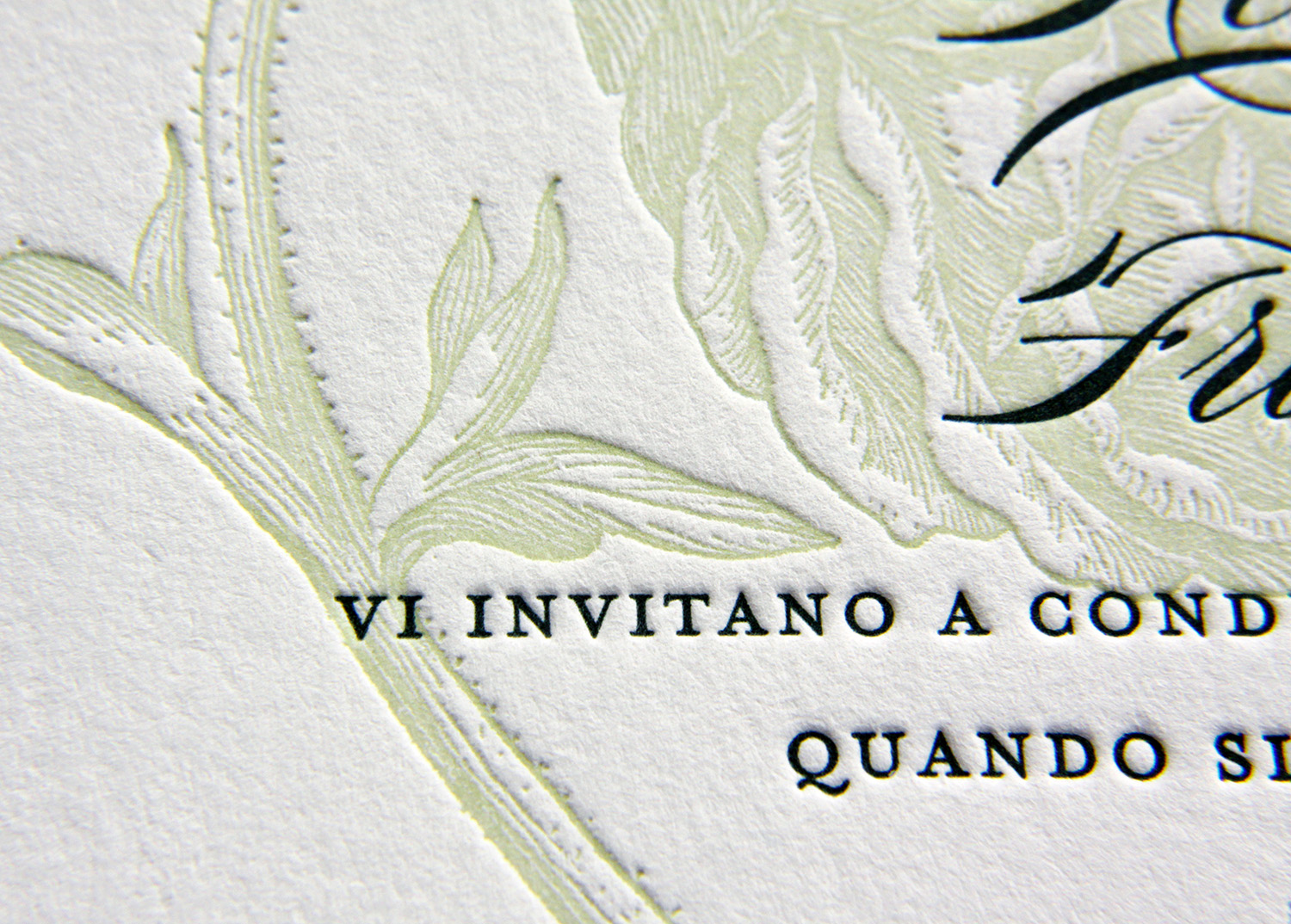
Kevin and Francesca were looking for an invitation to echo the embroidery on the bridal gown. They found what they were looking for, basing their set on Parklife's Franklin design. The springy floral motif was also reflected in the design of the wedding cake and in the floral arrangements.
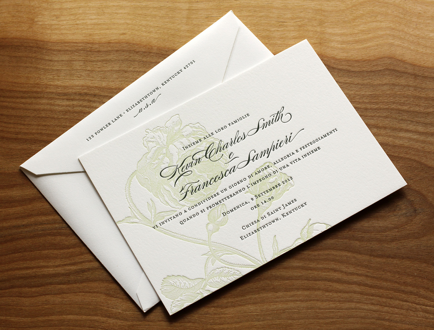
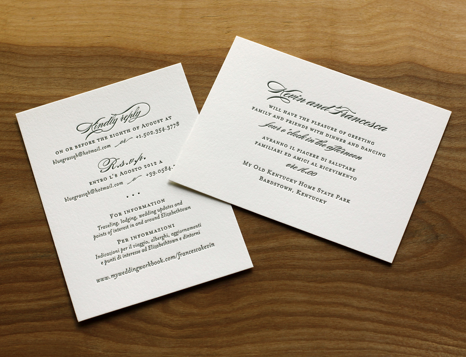
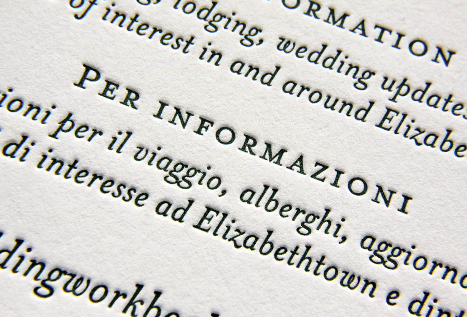
The other major requirement for the invitations was that they speak to two audiences, which had, as Francesca put it, "different traditions and etiquette requirements." The floral artwork was printed with a single plate in light celadon ink. But for the forest green text, two different plates were used — one in English and one in Italian. The enclosure cards were bilingual to speak to both audiences — one card invited guests to the reception, the other gave RSVP directions and other information. "Everyone invited, from every country we touched, made the comment that they'd never seen such a simple yet elegant touch and attention to details in the invitations."
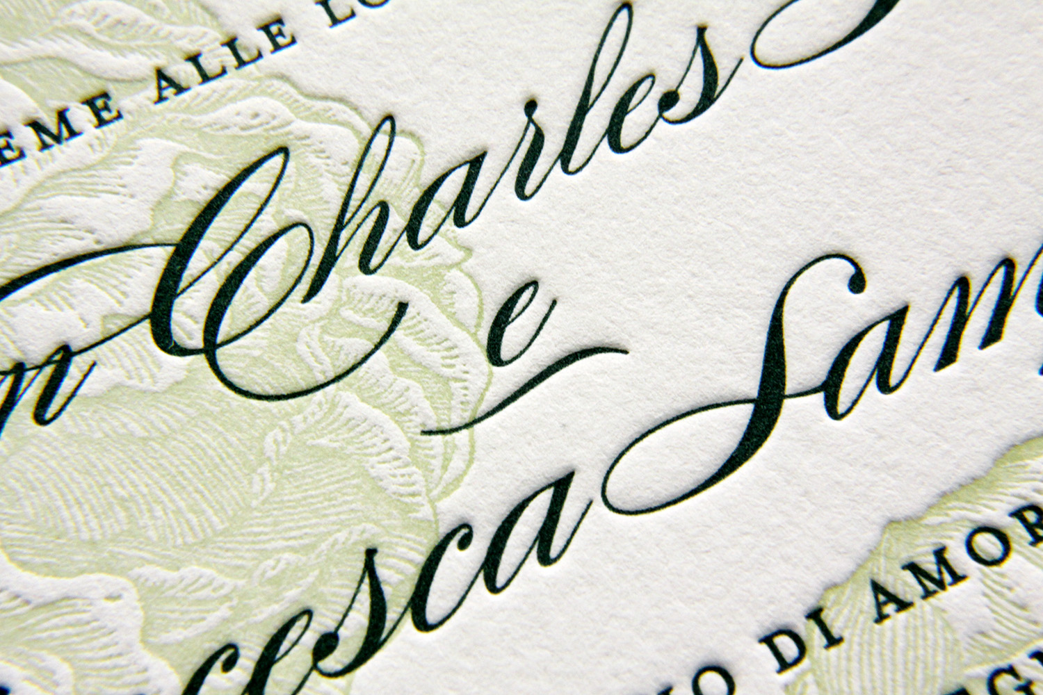
"The invitations  for our wedding were probably one of the best things of the wedding organization," Francesca said. "We could not be any more pleased by the success of the first step of the best day in our lives. We have been recommending Parklife Press to whomever asks for refined letterpress work."
Photos by Sarah McCarty Arneson
Grand Tetons

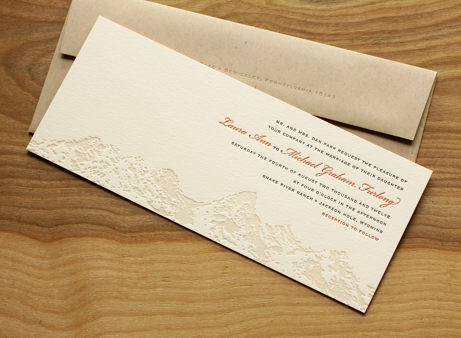
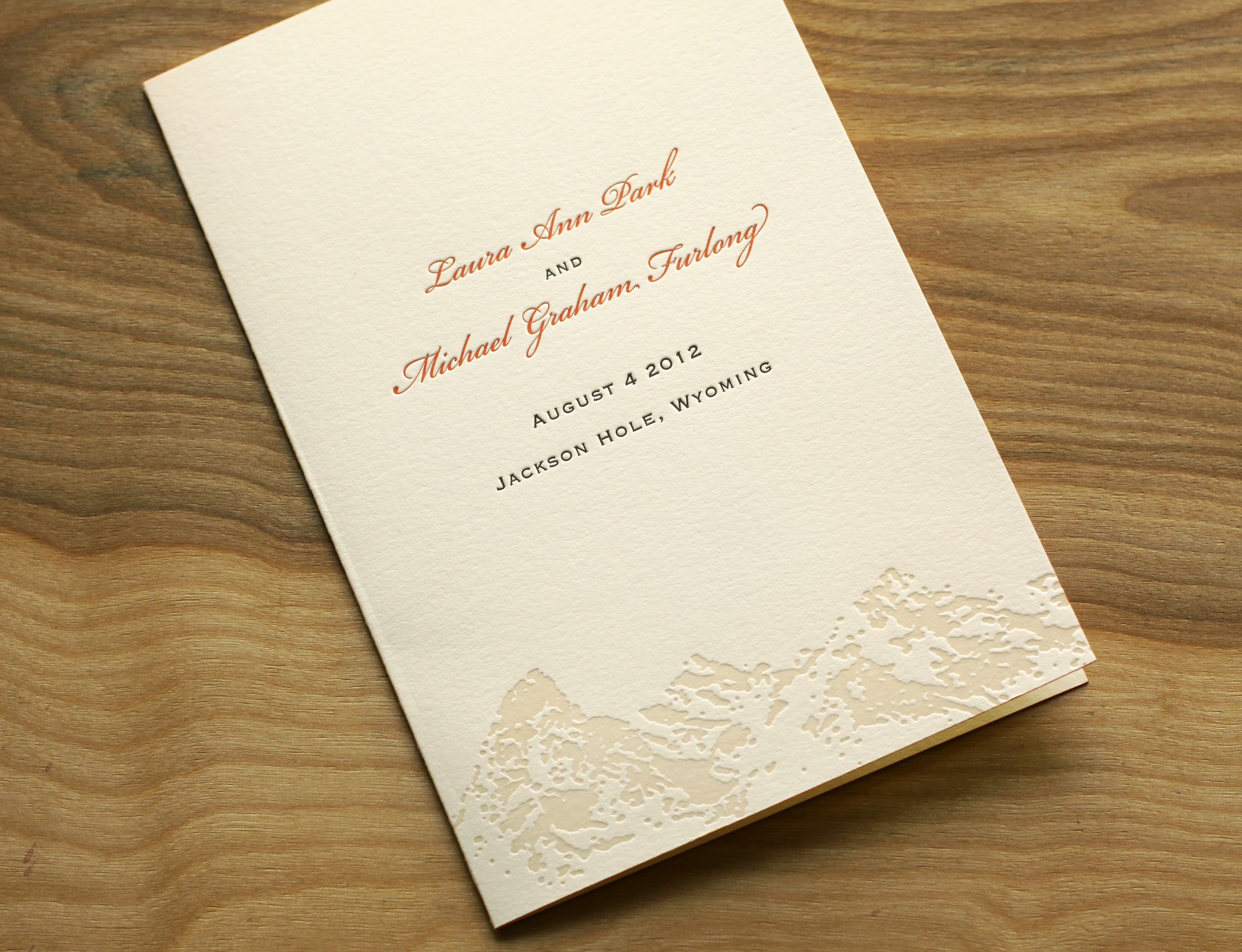
Laura and Graham love skiing and love the mountains. Both their families were very connected to Jackson Hole — a beautiful spot in Wyoming nestled in the valley of the Teton Range — and so they knew they wanted to have their wedding there. They also wanted to incorporate the famous landscape in their invitations. They loved the tea-length card because it's unusual and distinctive, and also because they knew the proportion would highlight the mountain range illustration.

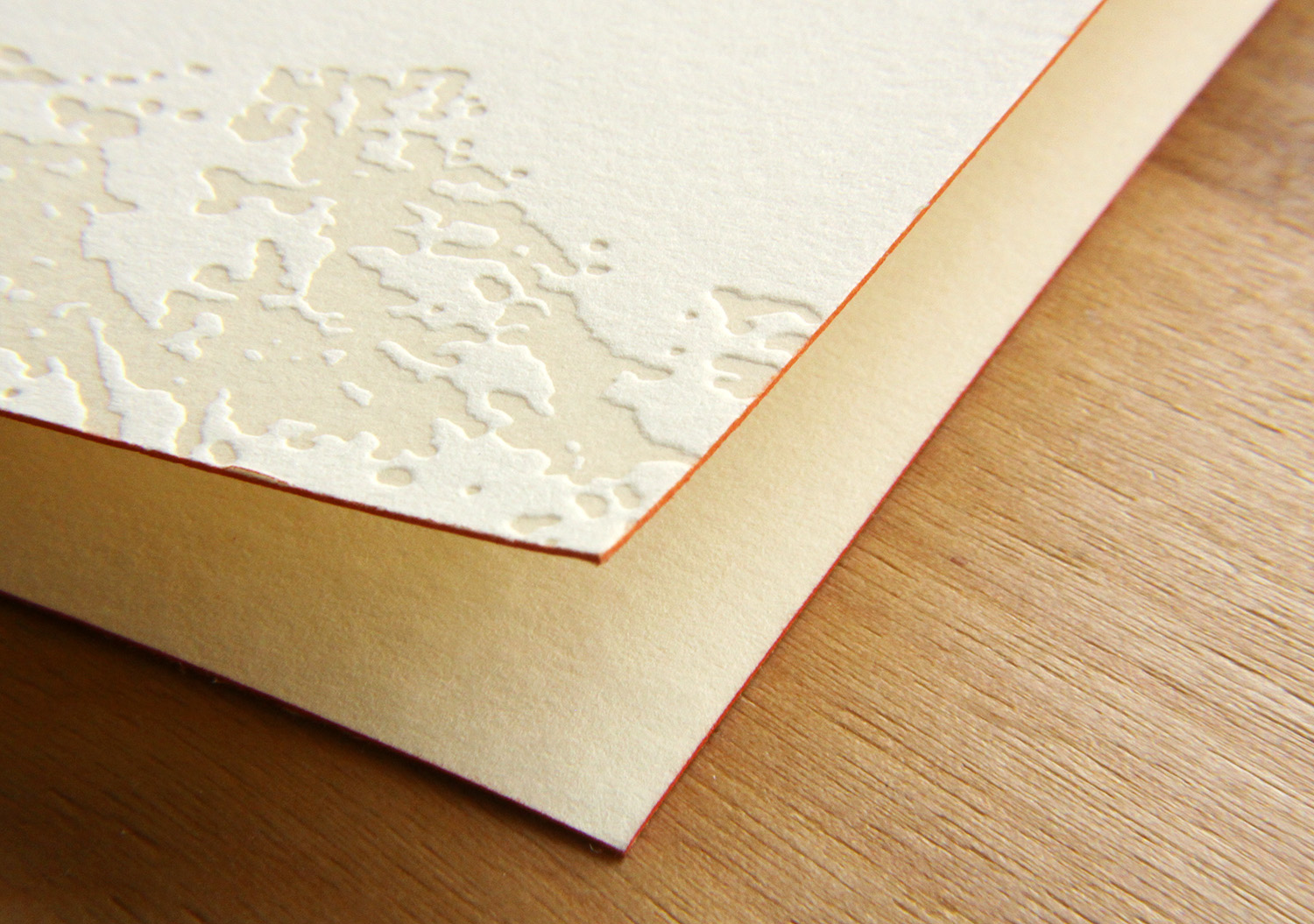
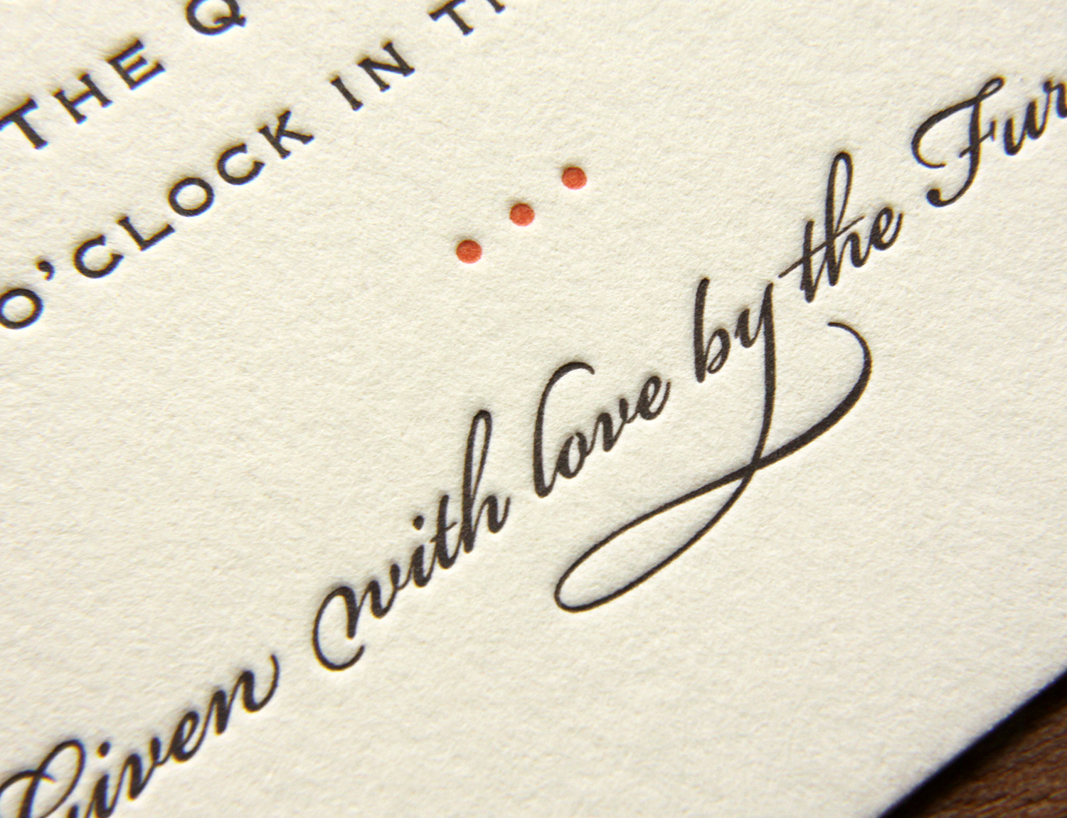
Travis worked with Laura to create the custom Teton art, and it was used on the invitation and on the program cover. Espresso and sherbet inks worked beautifully with the extra thick ecru paper, and corresponded with the wedding colors (brown was a featured color in the wedding, and the floral centerpieces had a pop of orange). The edges of the invitation card and the program cover were painted to tie together the sherbet accent ink used throughout.

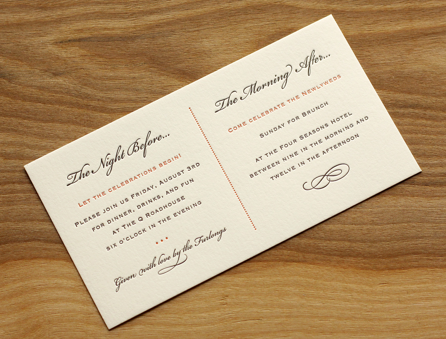
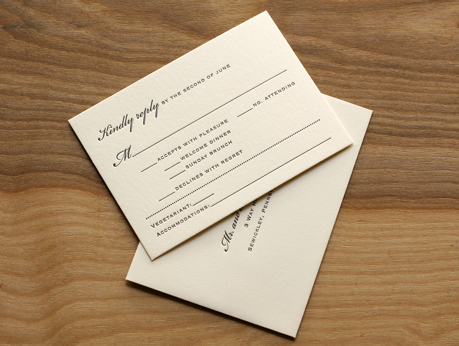
The set included a card inviting guests to the other events (a Friday night dinner and a Sunday brunch), and the RSVP card covered replies to these events as well as the wedding itself. It also had space to request a vegetarian menu and note lodging plans.

Laura became familiar with Travis' studio while she was at business school in nearby Chapel Hill. She was amazed by his work, and said that "selecting who to do my invitations was the easiest part of planning."  "Everyone loved the invitations," she said. "I got many compliments."

Photos by Sarah McCarty Arneson
Winter Wonder

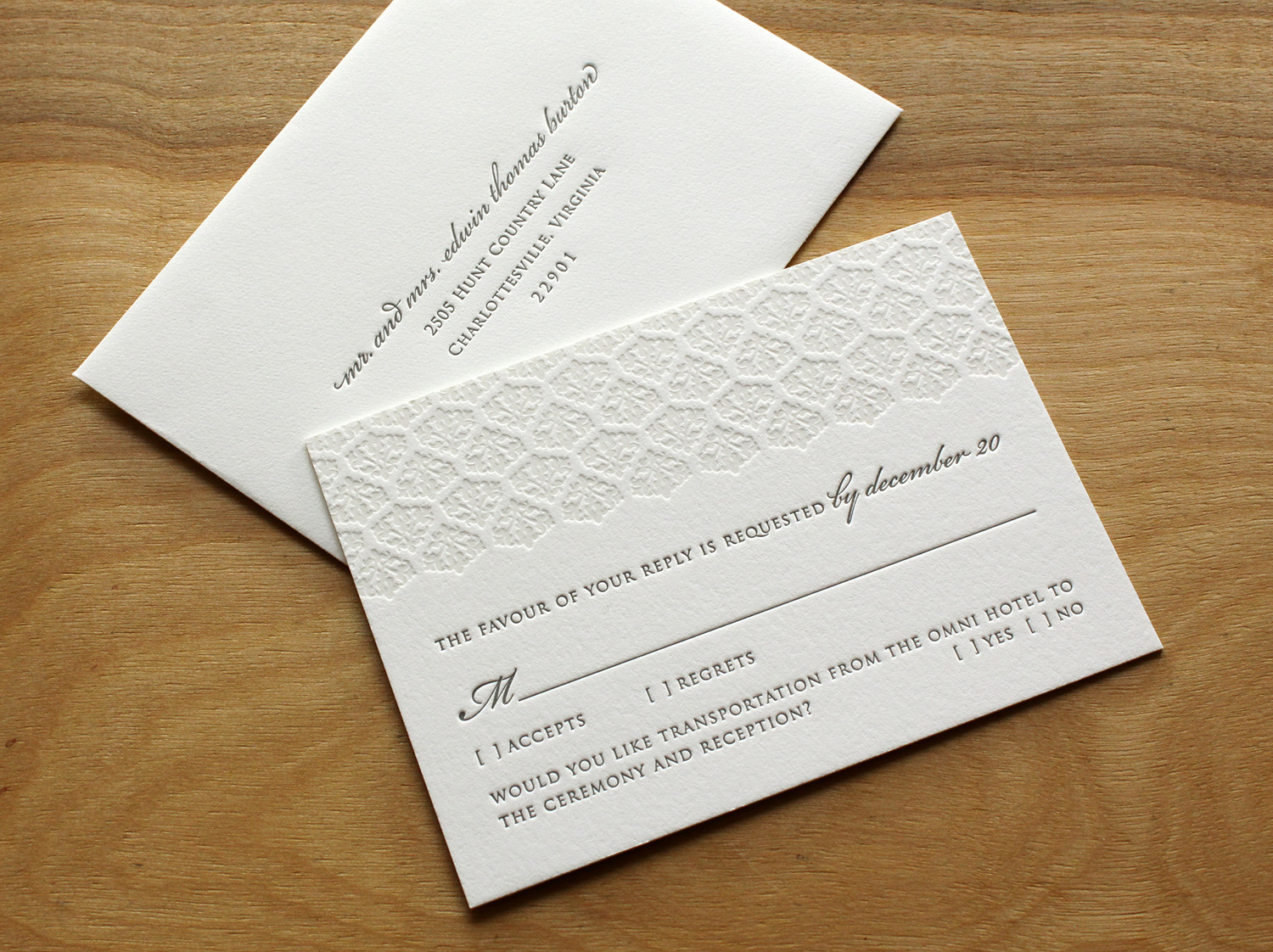
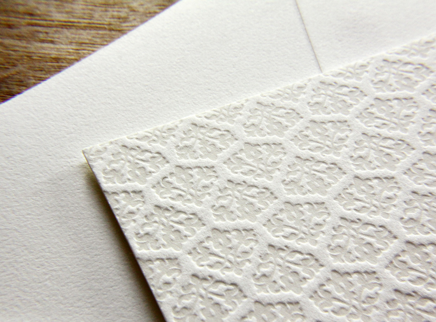
Trish Burton was helping her daughter plan a winter wedding, and was looking for winter-themed ​invitations. She was familiar with letterpress, as she had used it for her other daughter's wedding, but was unable to find any designs in her area that felt right. After finding Parklife Press and communicating with Travis, she had the idea to ​adapt the ​Pinkney design by using a tinted white ink instead of pink. Because the color of the white ink and the color of the paper are so similar, this look has the appearance of a blind deboss (an impression made without ink) but in fact it adds just enough color to make the texture pop. She predicted the change of ink color would make the springy, floral invitation convey a lush and dense snowfall instead. Quiet elegance, perfect for the winter-themed wedding in January.

​The text was done in slate — a cool gray ink that paired well with the pearl white paper stock — coordinating beautifully with the wedding's theme colors of icy blue and pewter.

The bride and groom, who each have stressful careers and work long hours, were grateful to have Trish make the arrangements. Trish, in turn, was eager to take away as much of her daughter's wedding-planning stress as possible. And her pursuit of a fitting winter-themed invitation for her daughter's happy day was successful — Trish said she lost count of the number of friends who complimented them.

Photos by Sarah McCarty Arneson
New England Coast

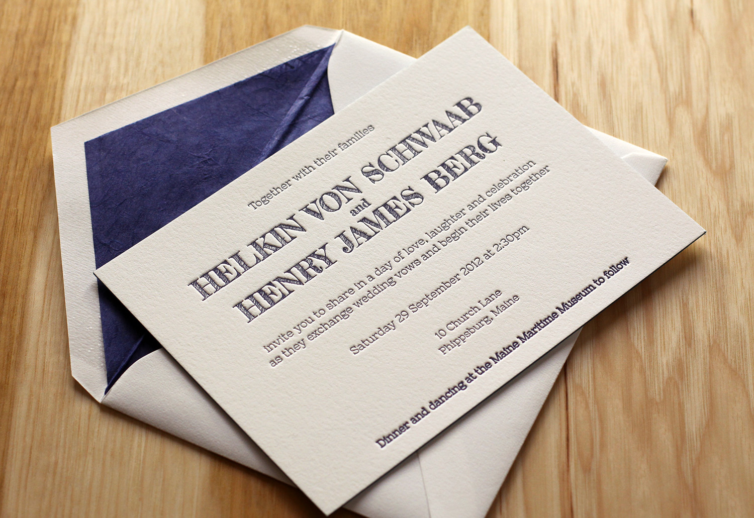
This was a set we printed for a couple in Maine who designed their own invitation. It was printed on Pearl White paper and featured bermuda edge paint. Helkin and Jamie both work in the online world so they planned to provide most of the details on the Web — but they still wanted a "classic, yet unique print piece." The invitation directed guests to RSVP by email and to visit a website for all other wedding-related information.

A final detail: Thai Unryu tissue envelope liners to match the set's midnight ink. The soft, natural look of the tissue evoked wind-rumpled water. Paired with the hand-drawn look of the font, the invitation captured the casual elegance of a seaside wedding.

Photos by Sarah McCarty Arneson
Joyful Blue

Emily found Parklife Press through the wedding-planning site Snippet and Ink. A librarian and archivist by trade ("I totally geek out for all things paper"), she loved the idea of of letterpress for their invites.   ​

She also loved the simplicity of the Bookplate design in particular. She felt the painted edges were "an amazing, thoughtful touch," and that the look "really conveyed everything I wanted our wedding day to be."  

The invitation set featured a simple, text-based design which was printed in the dust ink, with azure accents. The couple carried the dust and azure colors through to the rest of the wedding. One of the bridesmaids, a graphic designer, created programs and menus using the same color scheme. And the bridal party members all were garbed in shades of blue, including the bride — her gown was a very pale tint of their signature color.

Emily adds that she and Sean got "about a billion" compliments on the invitation. "I have a copy of it framed in our apartment. Every time I see it, I get a thrill."

Autumn Paisley

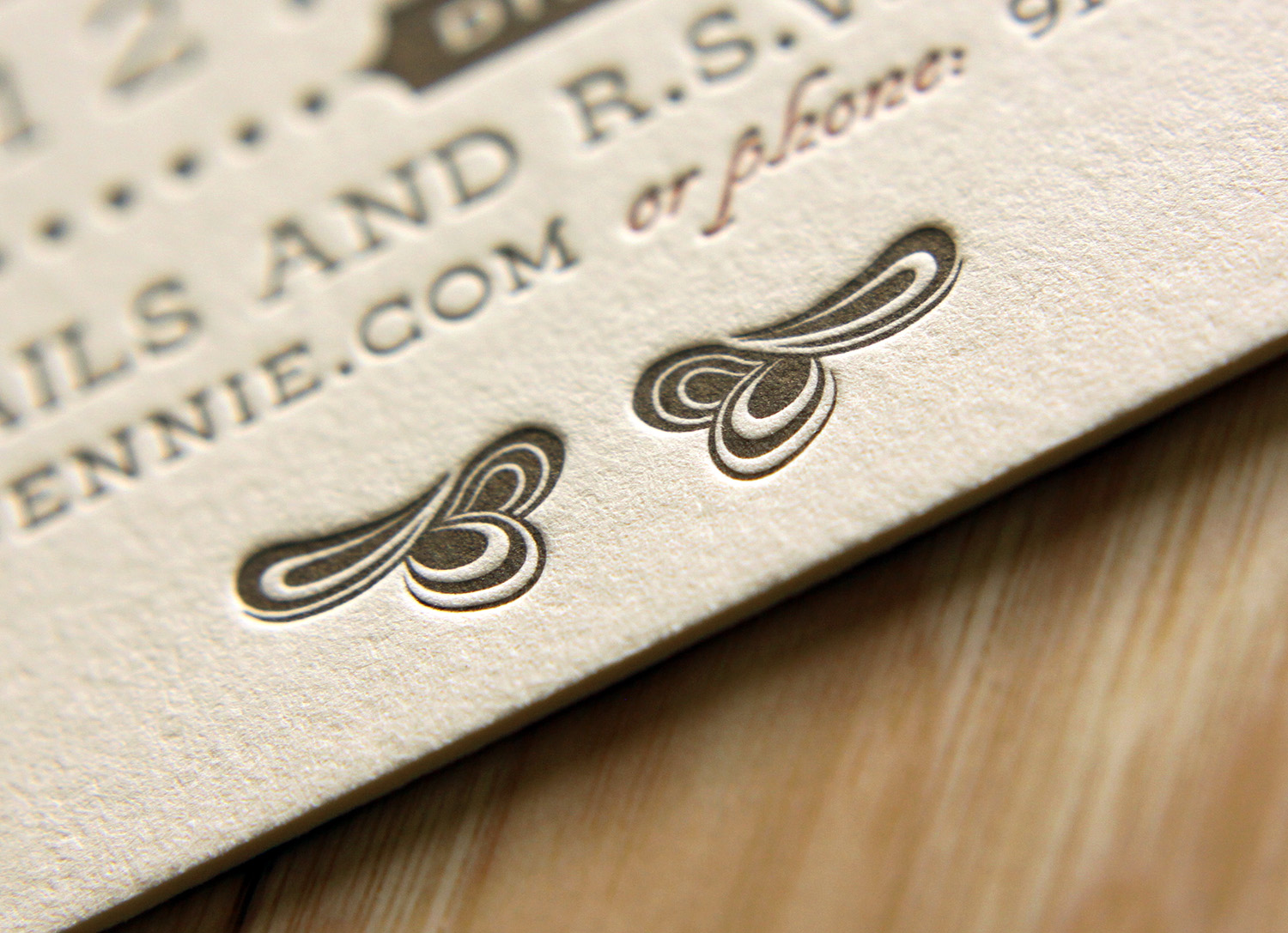
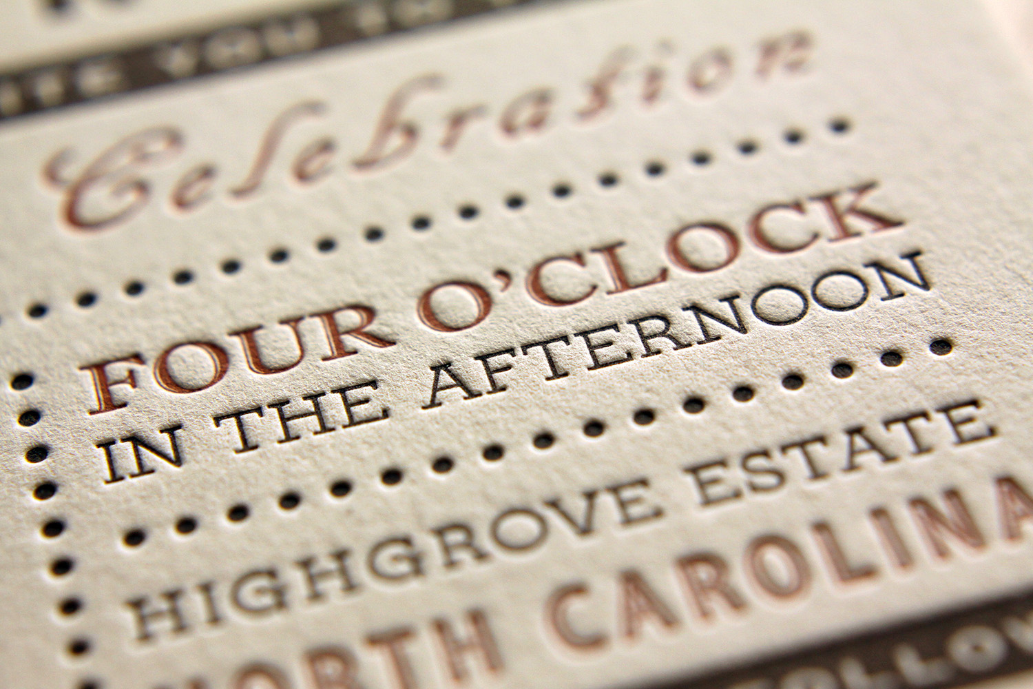
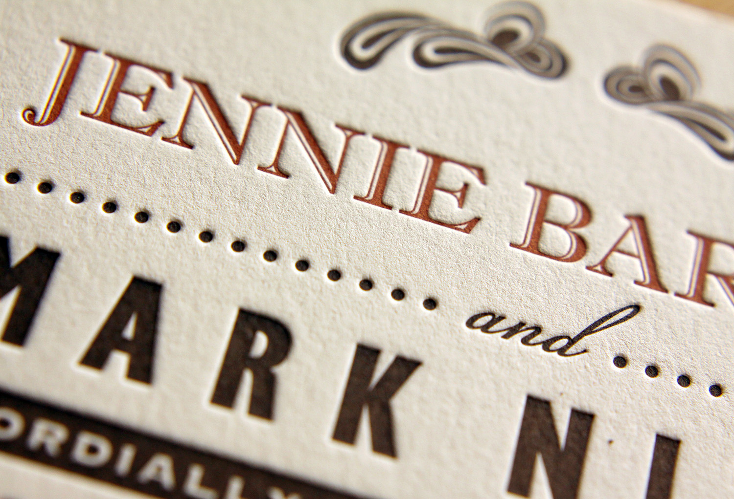
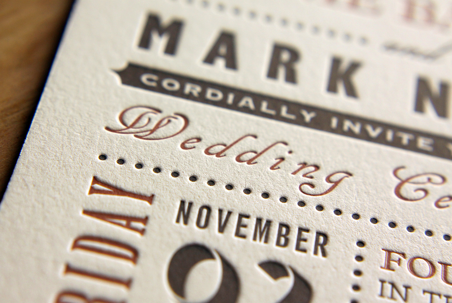
Jennie and Mark found the perfect necktie for him to wear at their autumn wedding — the pattern was a stylized paisley in orange and brown, with some lilac. That purchase turned into the inspiration for their wedding invitation. They loved letterpress, and after searching a bit for a good, independent printer, they found Parklife Press.

A friend designed the card for them, using the motif of the modern paisley swirl at top and bottom. They were excited about a single-page invitation, which gave guests contact information to RSVP and directed them to their wedding website for details.

invite_JennieHIGHGROVE_0233 web.jpg
Photos by Sarah McCarty Arneson
A New Year's Swirl of Silver and Gold

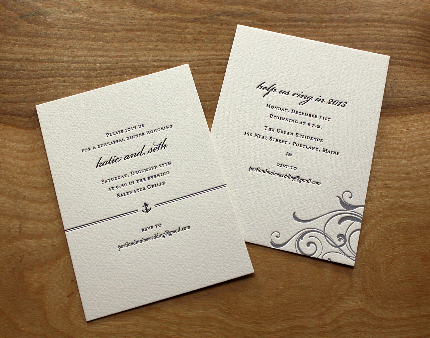
Katie and Seth were getting married on the eve of New Year's Eve, in Portland, Maine. They wanted a simple, elegant look — and getting married so close to holidays, they knew they wanted invitations that looked wintery without looking Christmas-y. They found the Whirl design and knew it would work well with their wedding colors of ivory, gold and silver. Katie was pleased with how, in her words, "Travis took the brief information I gave him about our 'vision' and turned that into our wedding invitations."

They used black text with gold artwork and gold typographic accents on the main invitations and the RSVP card. The wedding party was similarly attired in black tuxedos and floor-length metallic gowns. The set was printed on soft white Somerset paper and paired with oversized Arturo envelopes.

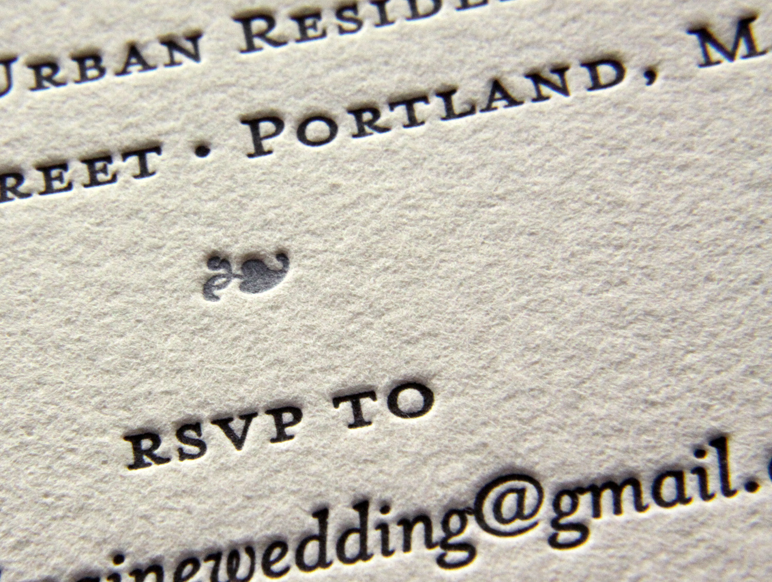
The corresponding invitation for the rehearsal dinner was done in all black. It was simple and a bit more more casual — with a graphic nod to the nautical setting — but the look was tied to the overall design by the type layout and paper stock. Rounding out the long holiday weekend of celebration, another card invited guests to a New Year's Eve party. That piece featured swirls and typographic accents printed in silver.

Katie's mother, who lives in Oklahoma, found Parklife Press through a Google search. Katie and Seth were happy she did; they live in Durham and were happy to support a local business. Katie's reaction when she first saw their invitations: "When I picked them up and saw them, I literally was obsessed with them. They could not have been more perfect!"

Photos by Sarah McCarty Arneson