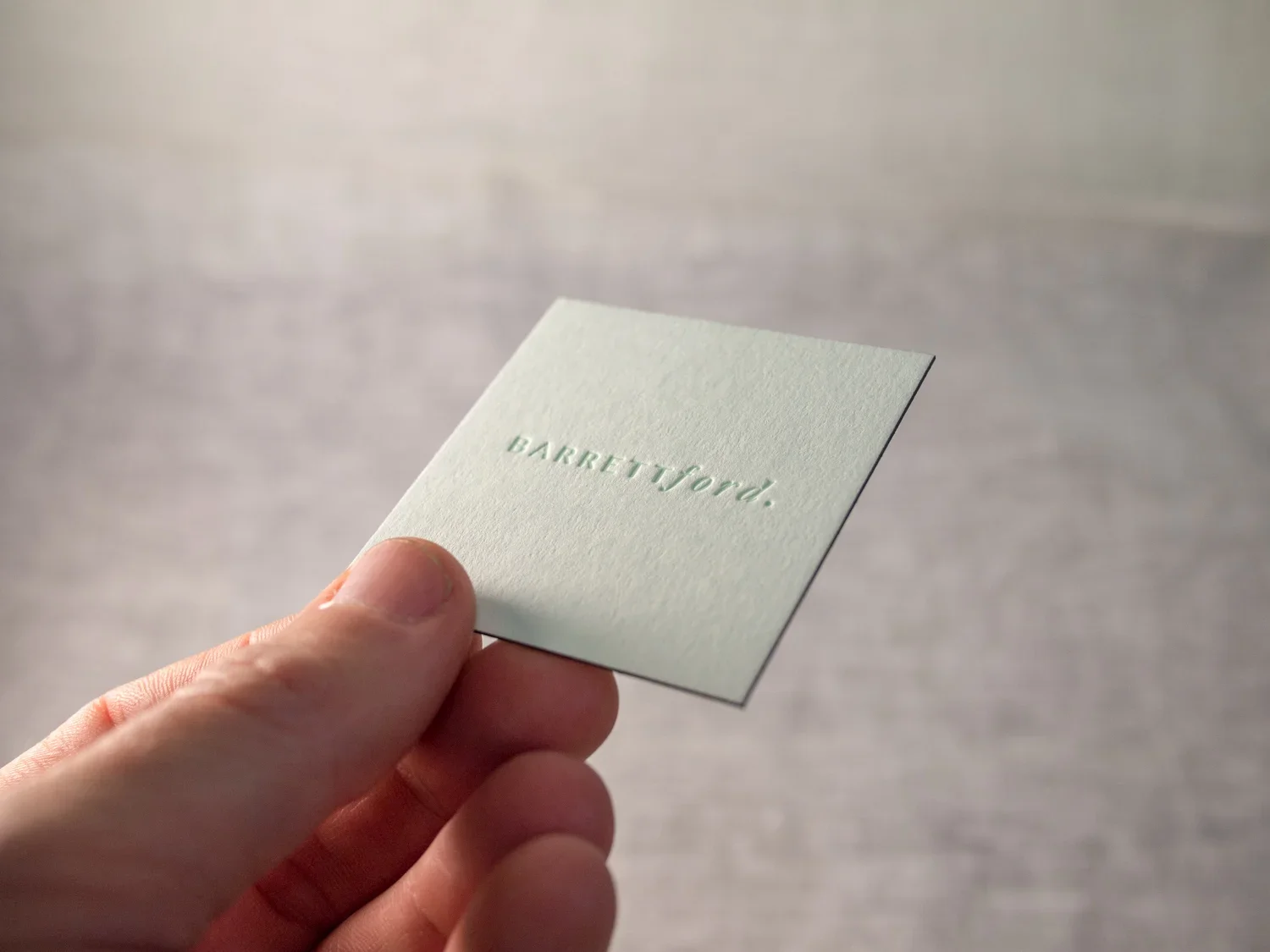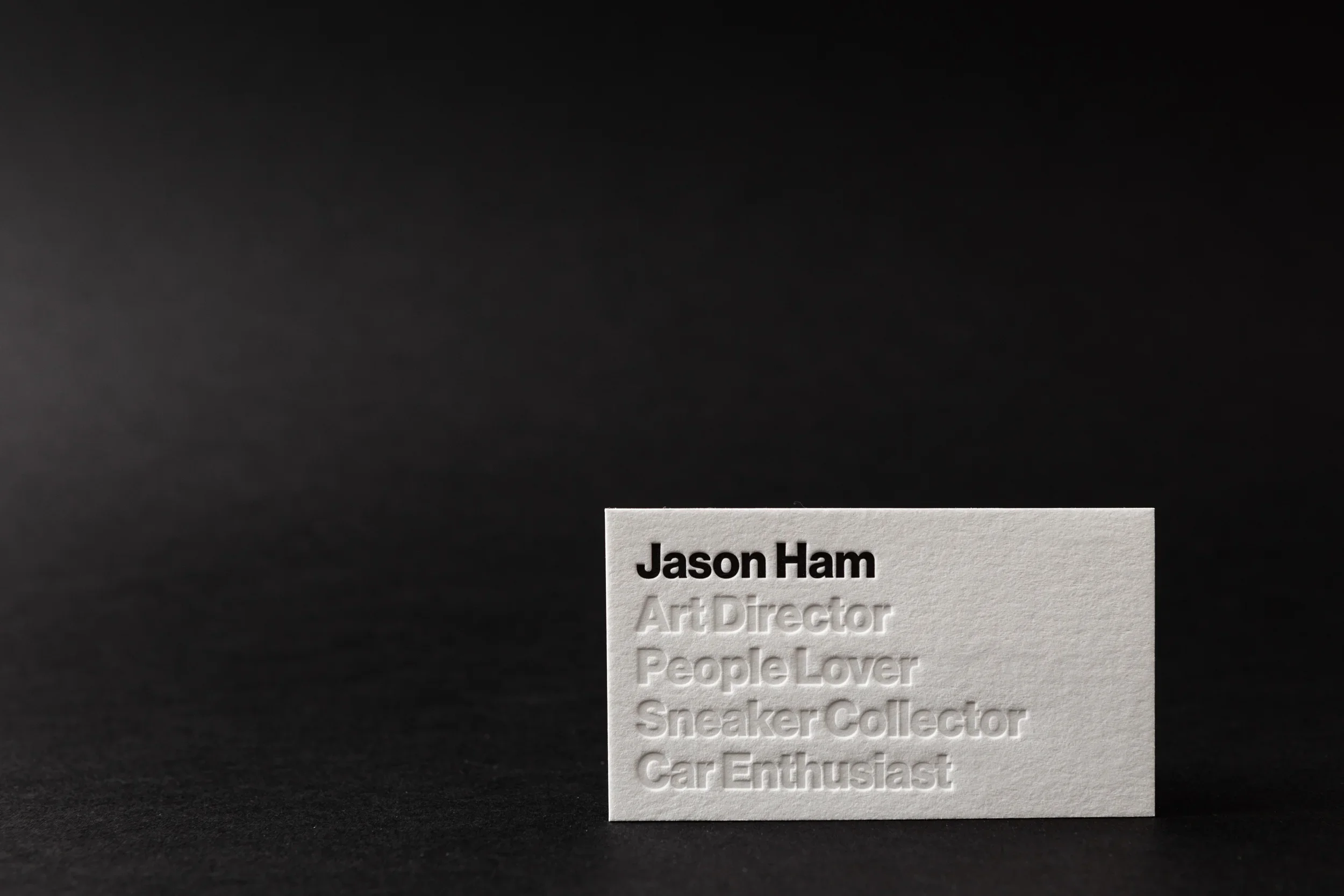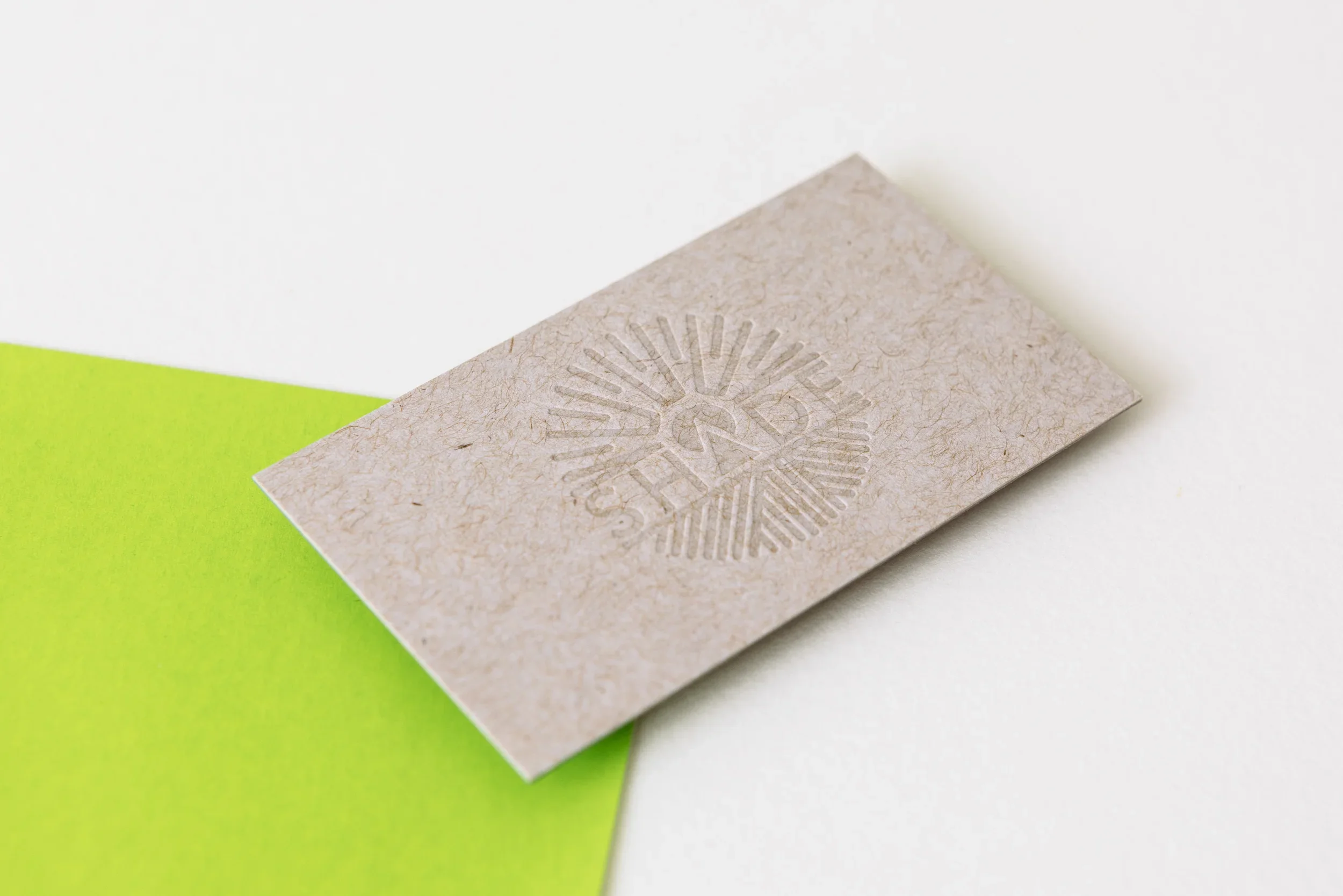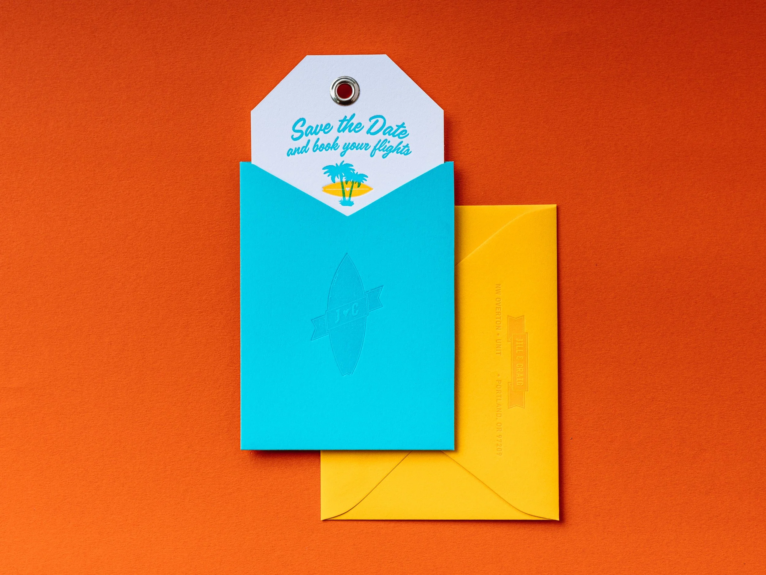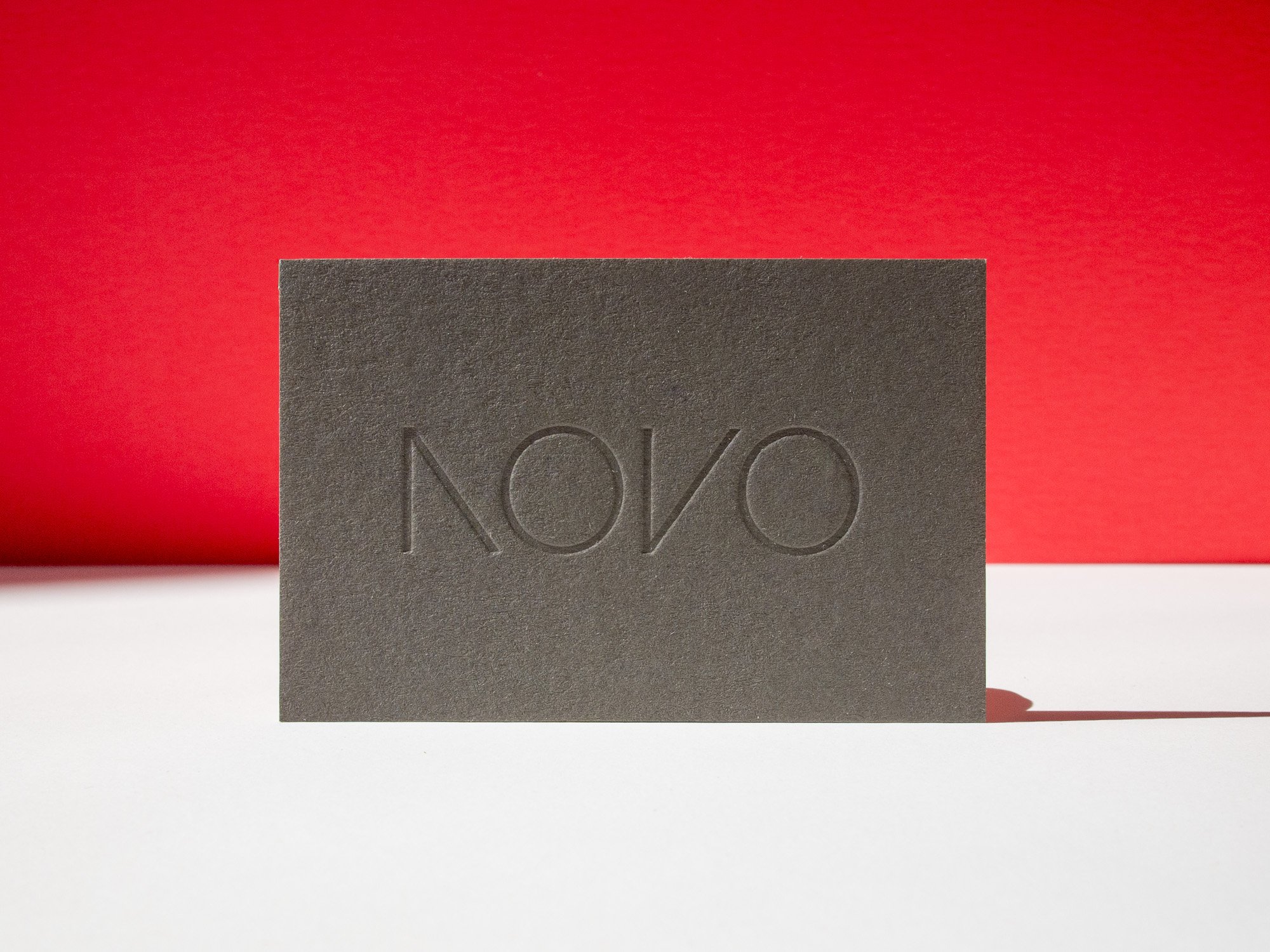
Has it only been six years? In 2020 we worked on our first project for Neiter Creative: a set of super simple but striking business cards for their client, NOVO, a Nashville design + build firm. Since that first job we’ve collaborated with Neiter on over 90 projects (!) — holiday cards, product tags, magazine sleeves, presentation folders, and more than anything else, business cards. In this post I’ll feature just a few favorites that capture Neiter’s minimalistic, powerful, but approachable aesthetic.
Novo
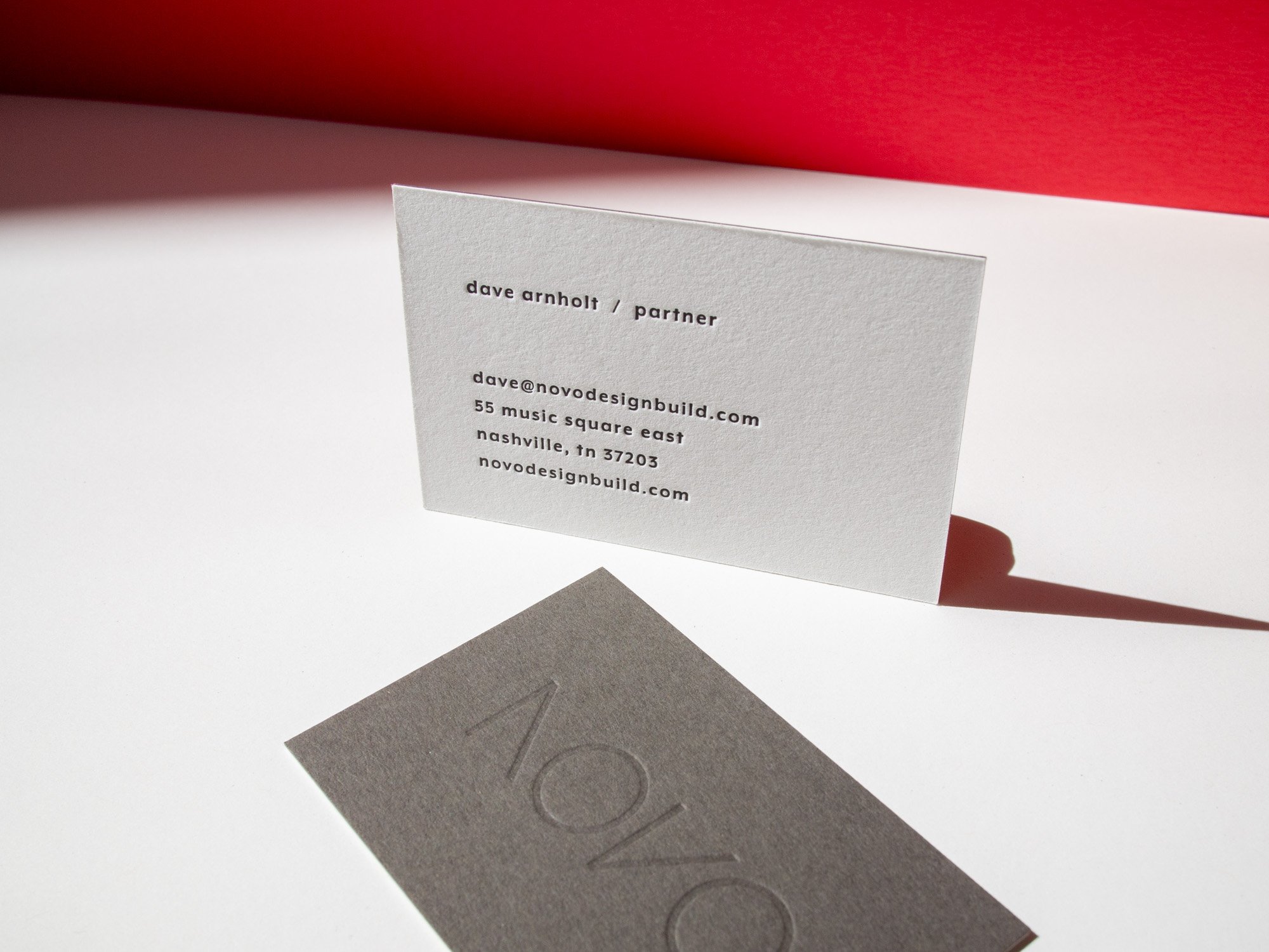
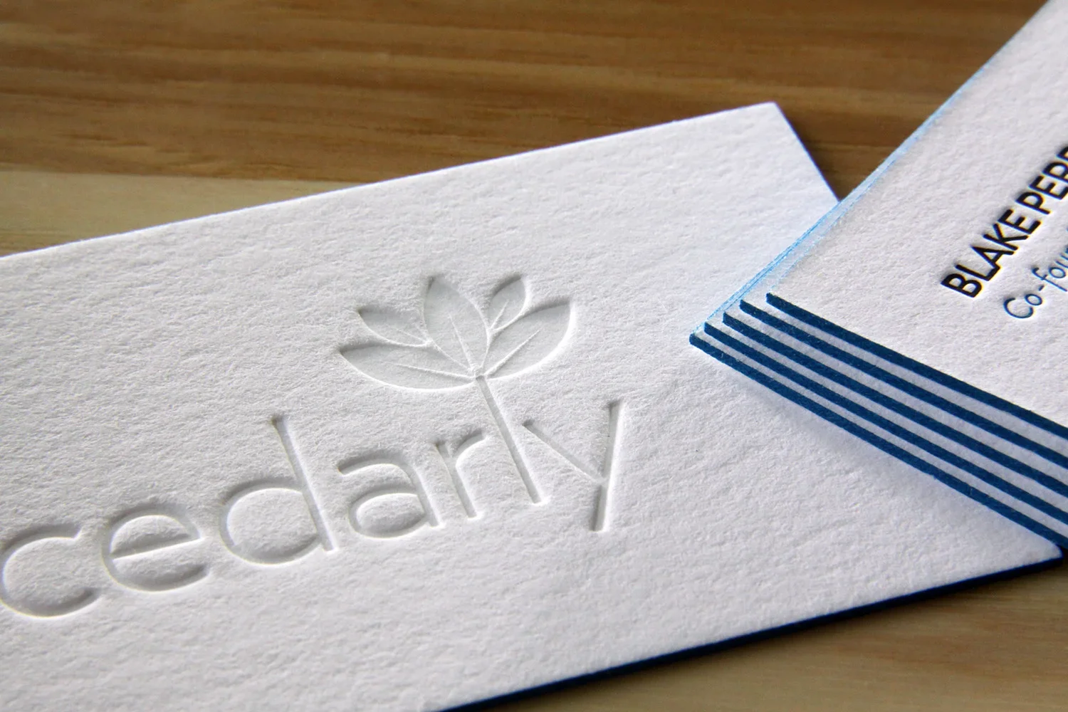
As with most of the pieces you’ll see in this post, Neiter Creative designed this as a duplexed card — two separate sheets of card stock letterpress printed first, then glued together, and then trimmed. That means the front and back can be printed on different stocks, and it also means there’s no hint of letterpress impression show-through on the opposite side of the card.
FRONT Tonal letterpress on 300g Keaykolour Sombre Grey (sadly discontinued!)
BACK Black letterpress on 300g Lettra Fluorescent White
KATIE DAVIS DESIGN
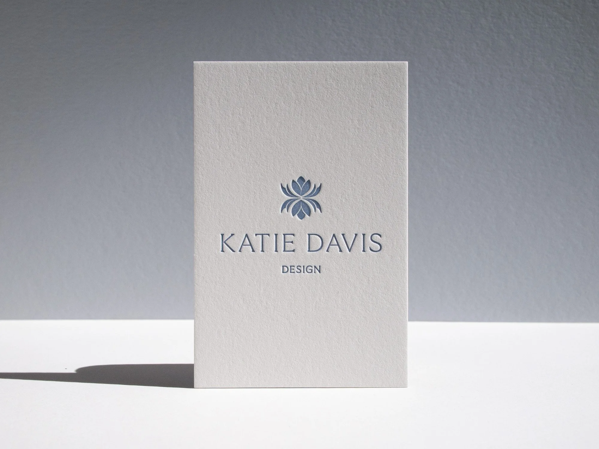
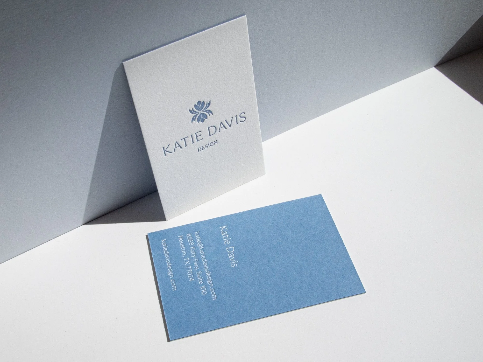
Another hallmark of Neiter’s business card design: European sizing. Notice that the ratio is a little more stout than an American card. To me this ratio feels more balanced, especially in a vertical orientation.
FRONT Pantone 645U letterpress on 320g Savoy Brilliant White
BACK White foil on 270g Colorplan New Blue
HOLLAND INTERIORS
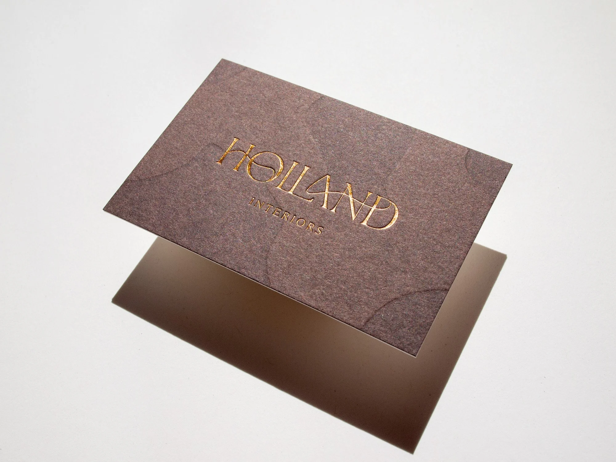
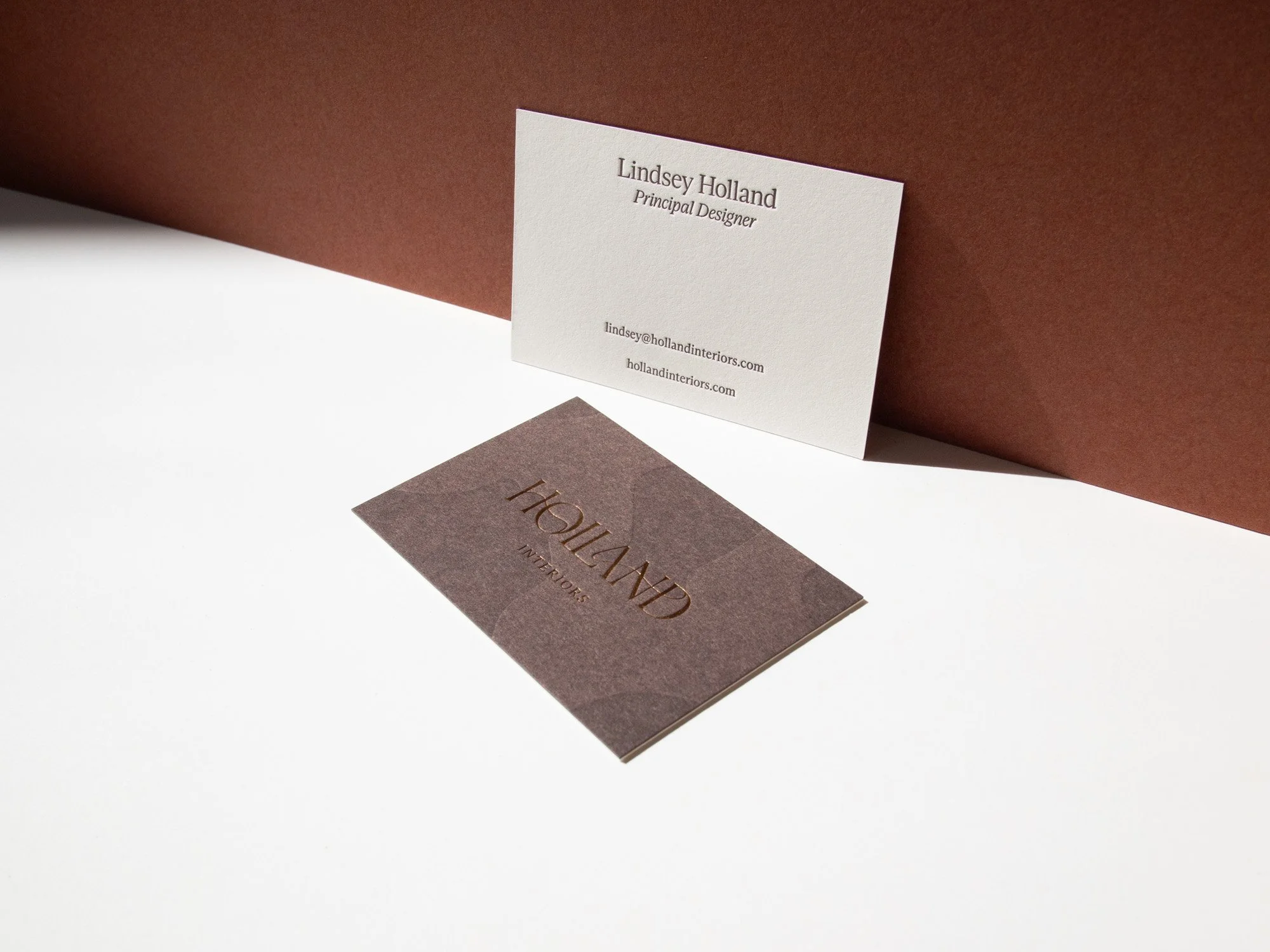
I love this one, particularly the way that the swooping logo follows the contour of the tonal letterpress background impression.
FRONT Tonal letterpress + Bronze foil on 300g Gmund Chocolate
BACK Pantone 2449U letterpress on 320g Savoy Natural White
Kara Adam Interiors
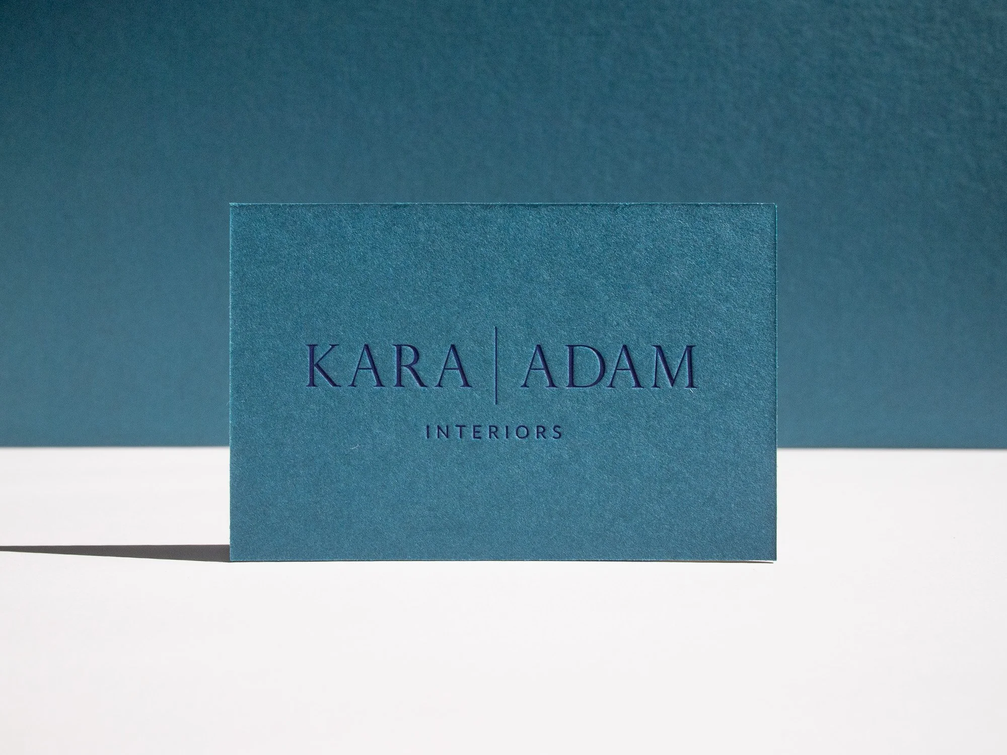
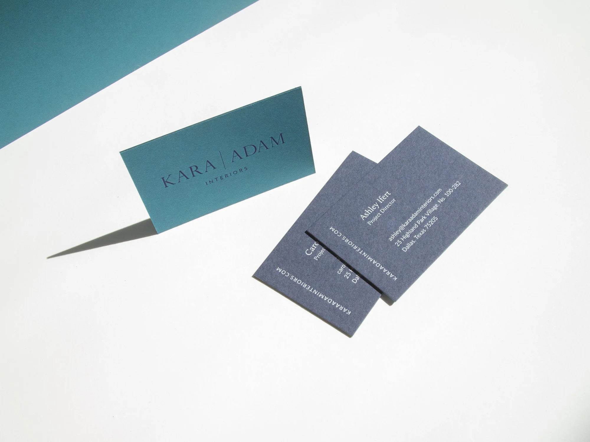
Such a great paper color combo for this duplexed card: teal and navy stocks, both made by German paper mill Gmund. For the Kara Adam logo we used matte pigment foil instead of letterpress ink which gives a super opaque almost chalky look to the impression.
FRONT Matte Navy foil on 300g Gmund Dark Teal
BACK White foil on Gmund Dark Navy
Meg Lonergan
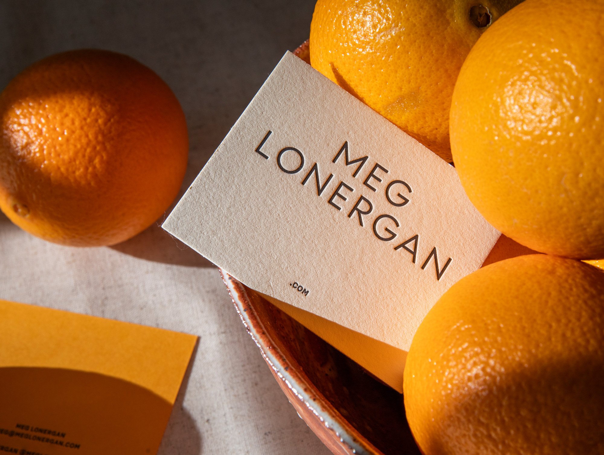
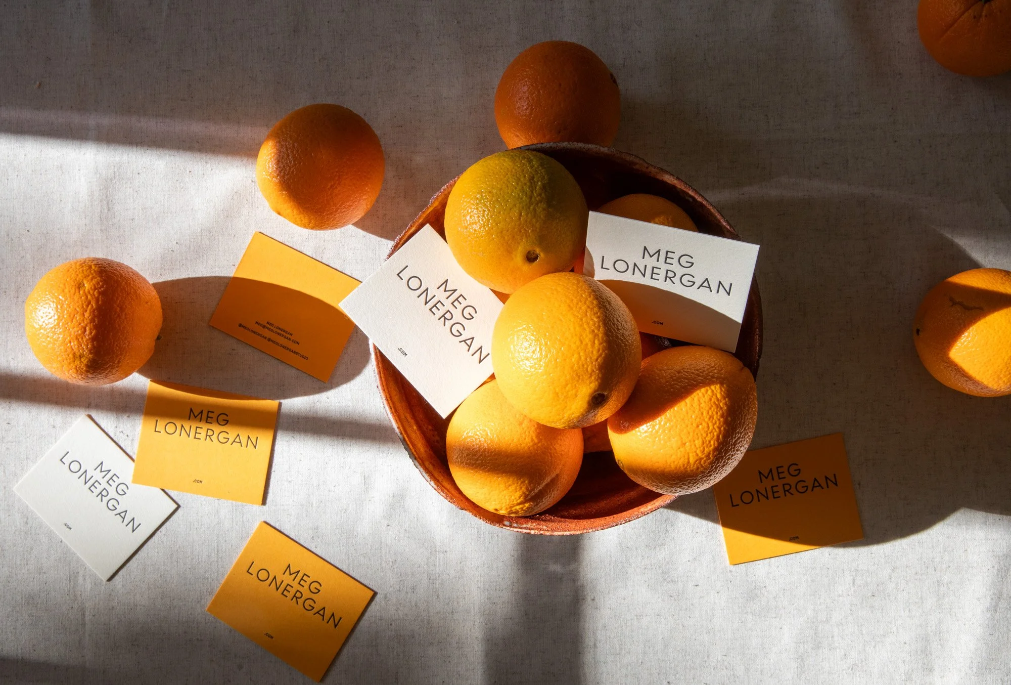
XL cards for Meg Lonergan Interiors. We printed a batch on pillowy 100% cotton Lettra Ecru and another on Gmund Sun Glow. Thanks to Jo Neiter for these amazing photos!
FRONT Black letterpress on 300g Lettra Ecru and 300g Gmund Sun Glow
BACK Black letterpress on 300g Lettra Ecru and 300g Gmund Sun Glow
Jay Baker Architects
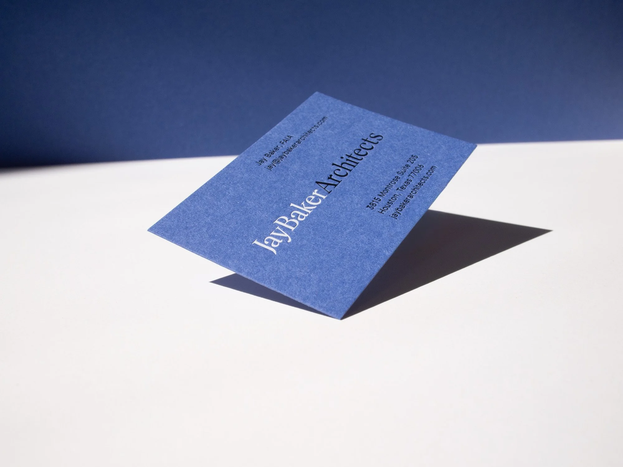
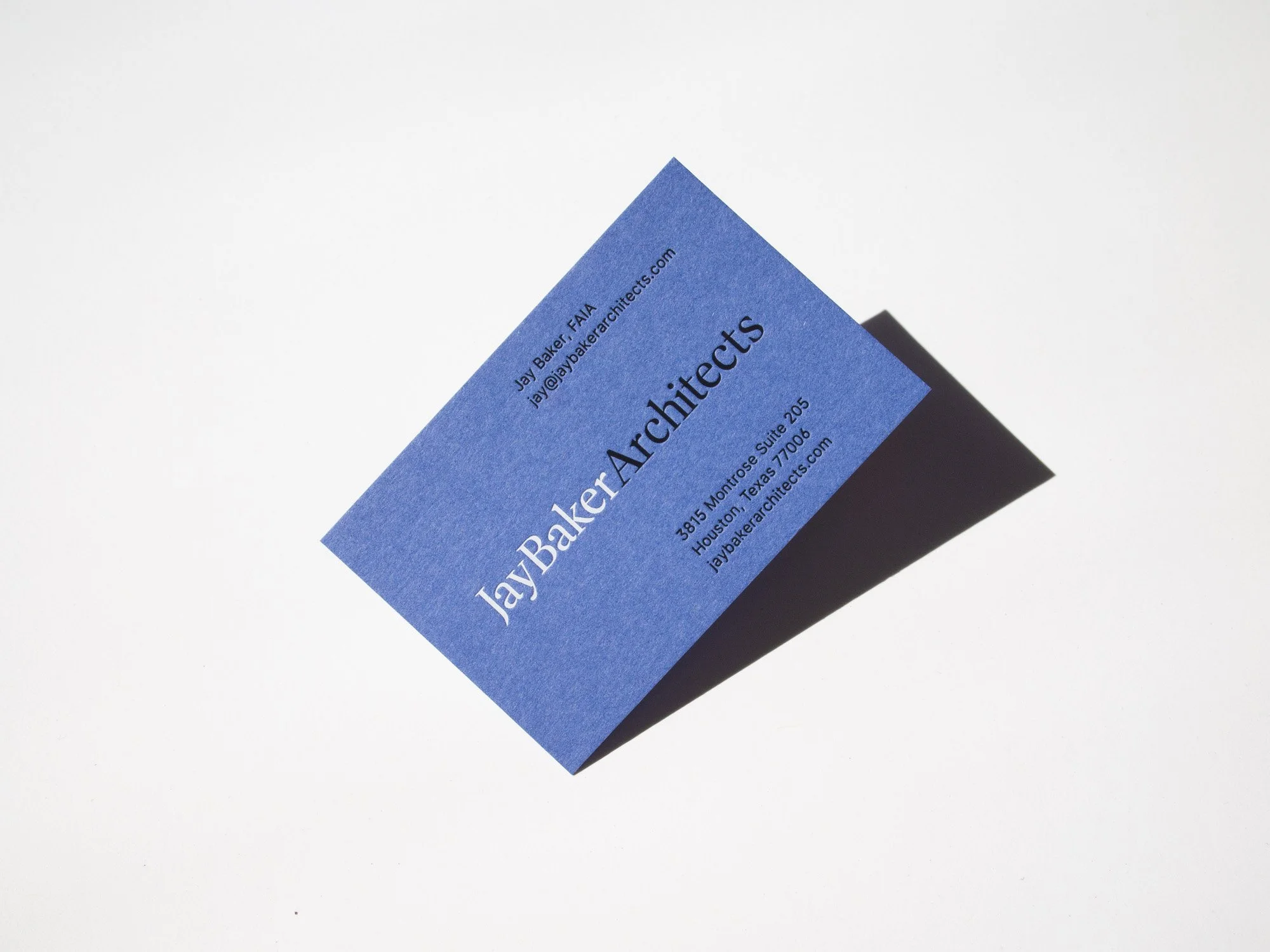
The rare Neiter single-ply card! White and black matte foils on Gmund Used, a German-made 100% recycled paper.
FRONT Matte White foil + Matte Black foil on 300g Gmund Used Blue
NICOLE ZARR
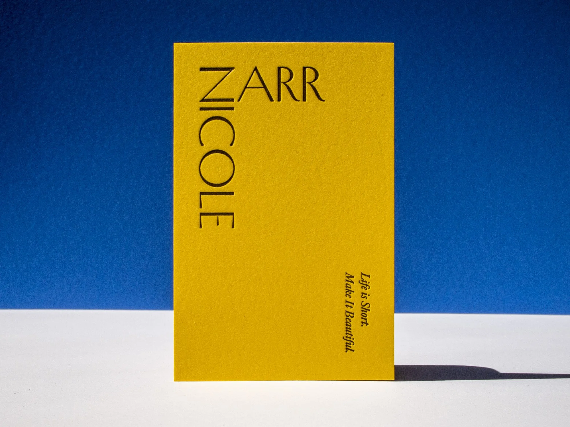
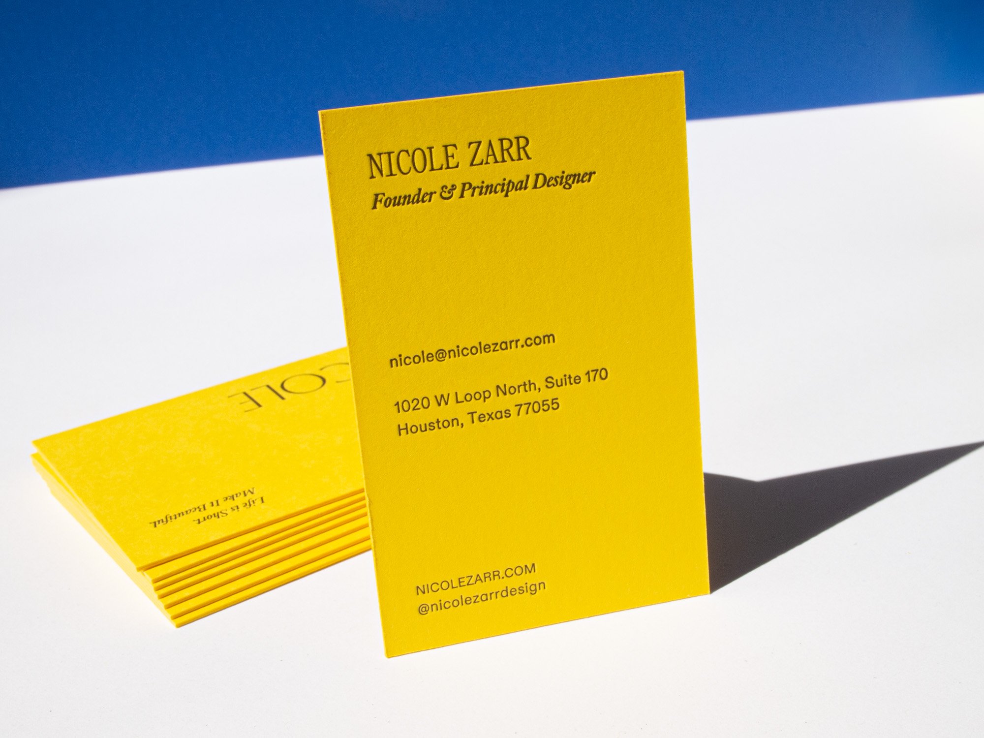
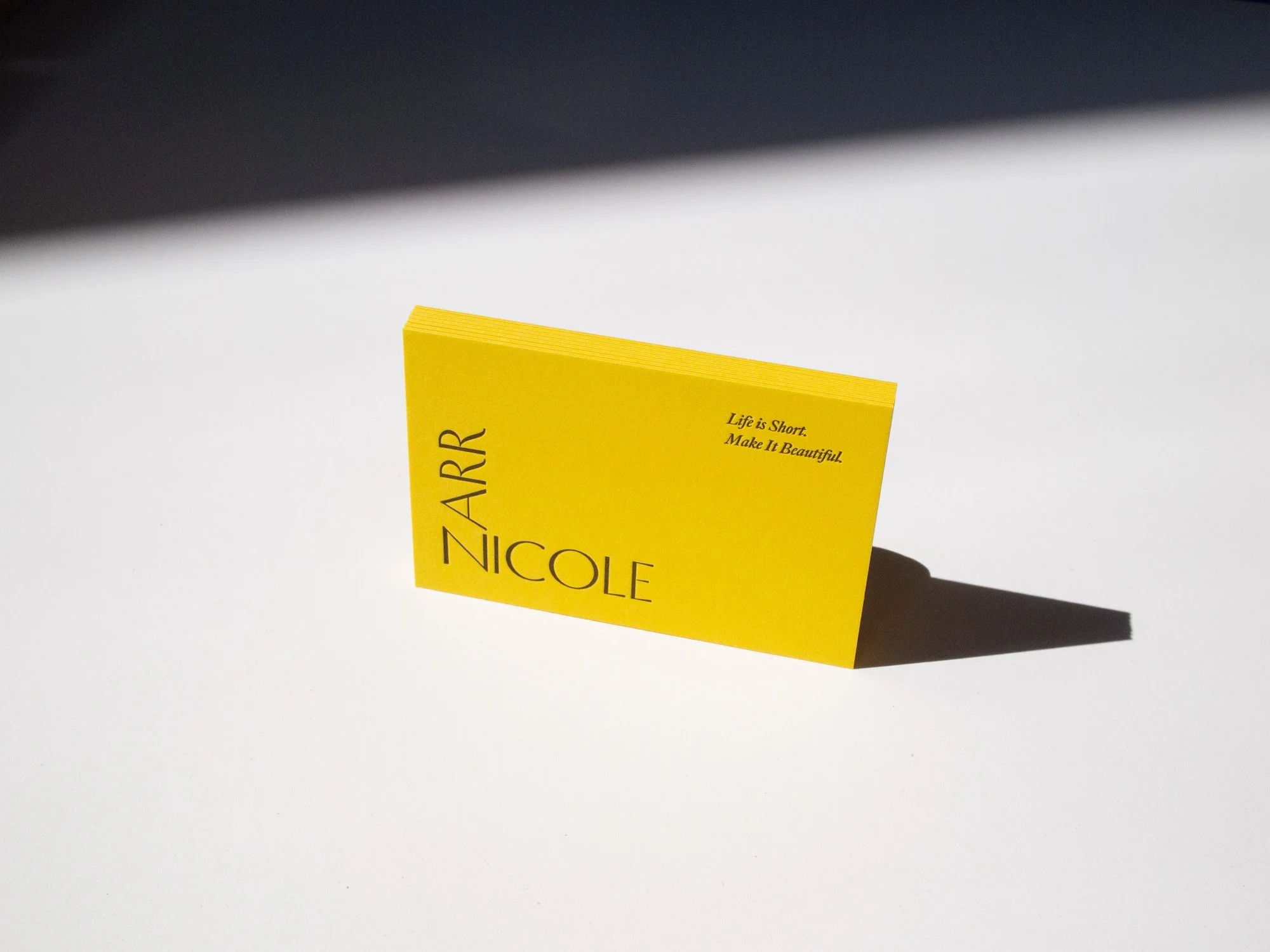
This card for Nicole Zarr is duplexed with two layers of the same stock so that we’re not seeing any impression show-through and the impressions aren’t flattening each other.
FRONT Pantone 2320U on 300g Lessebo Sunflower
BACK Pantone 2320U on 300g Lessebo Sunflower