Posts tagged slate
NEW 2019 Letterpress Wedding Invitations

Five new letterpress wedding invitation designs are out! Let’s take a look:


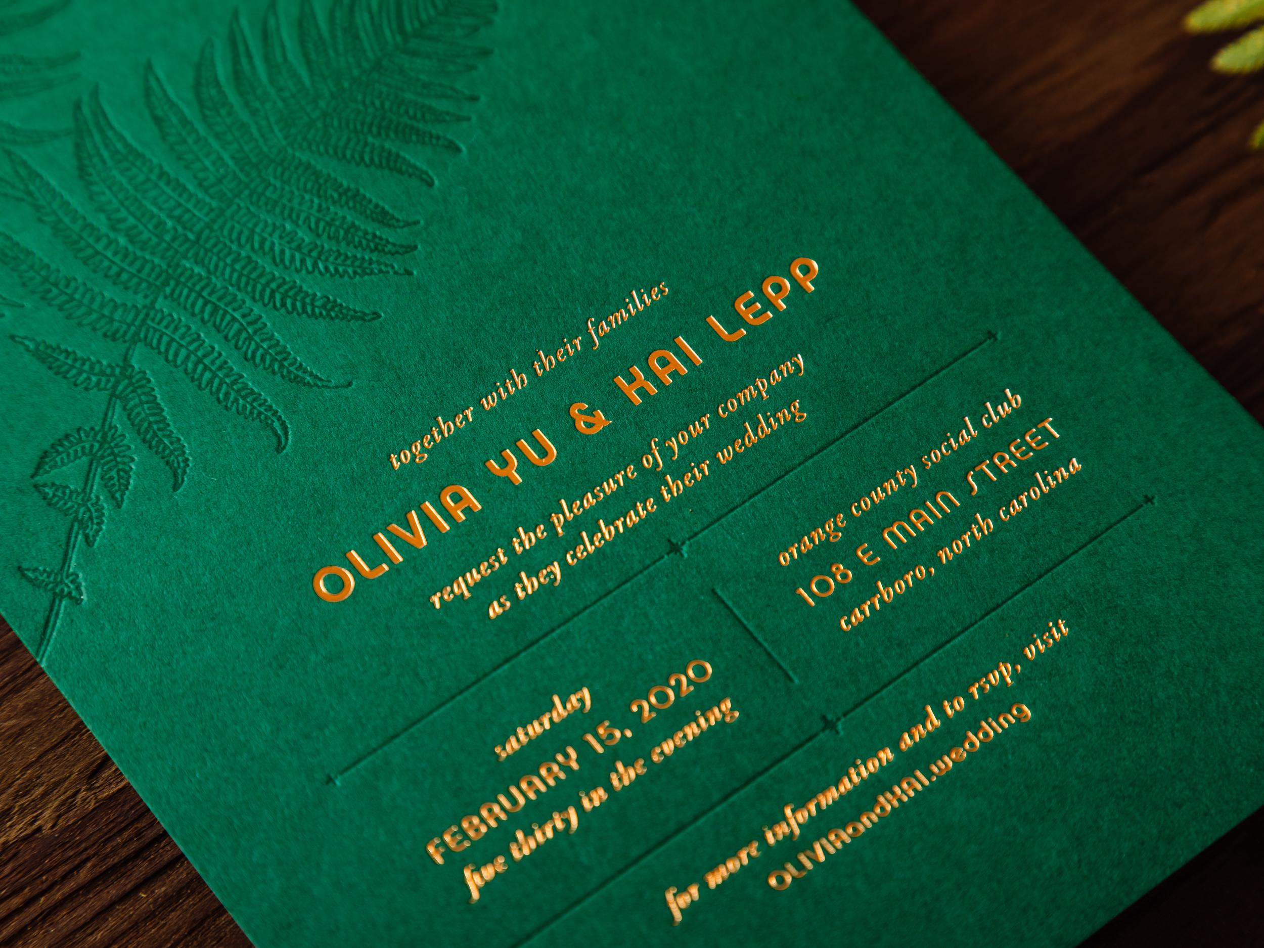
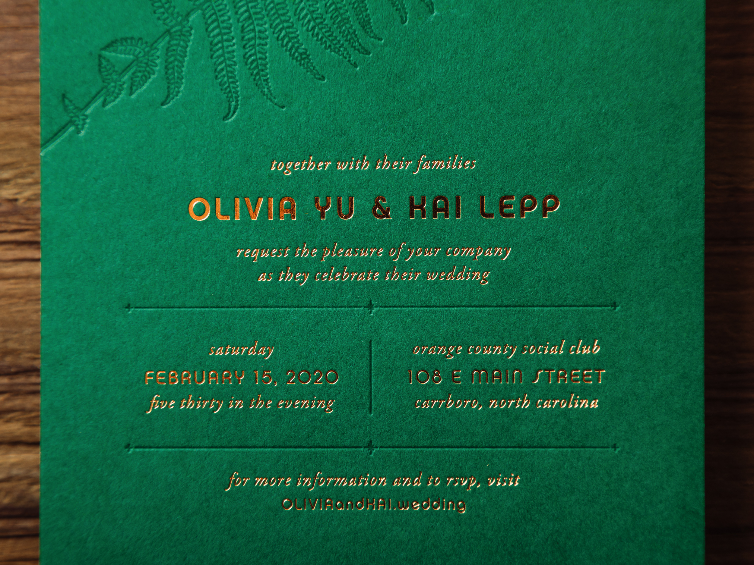
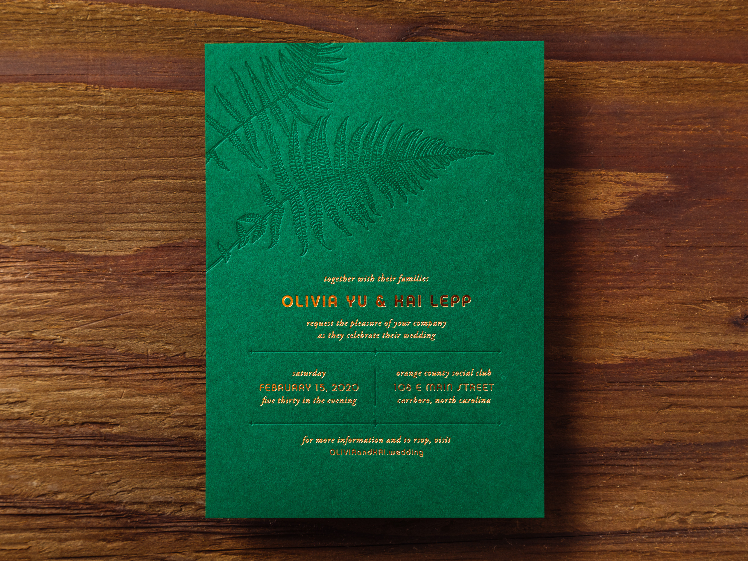
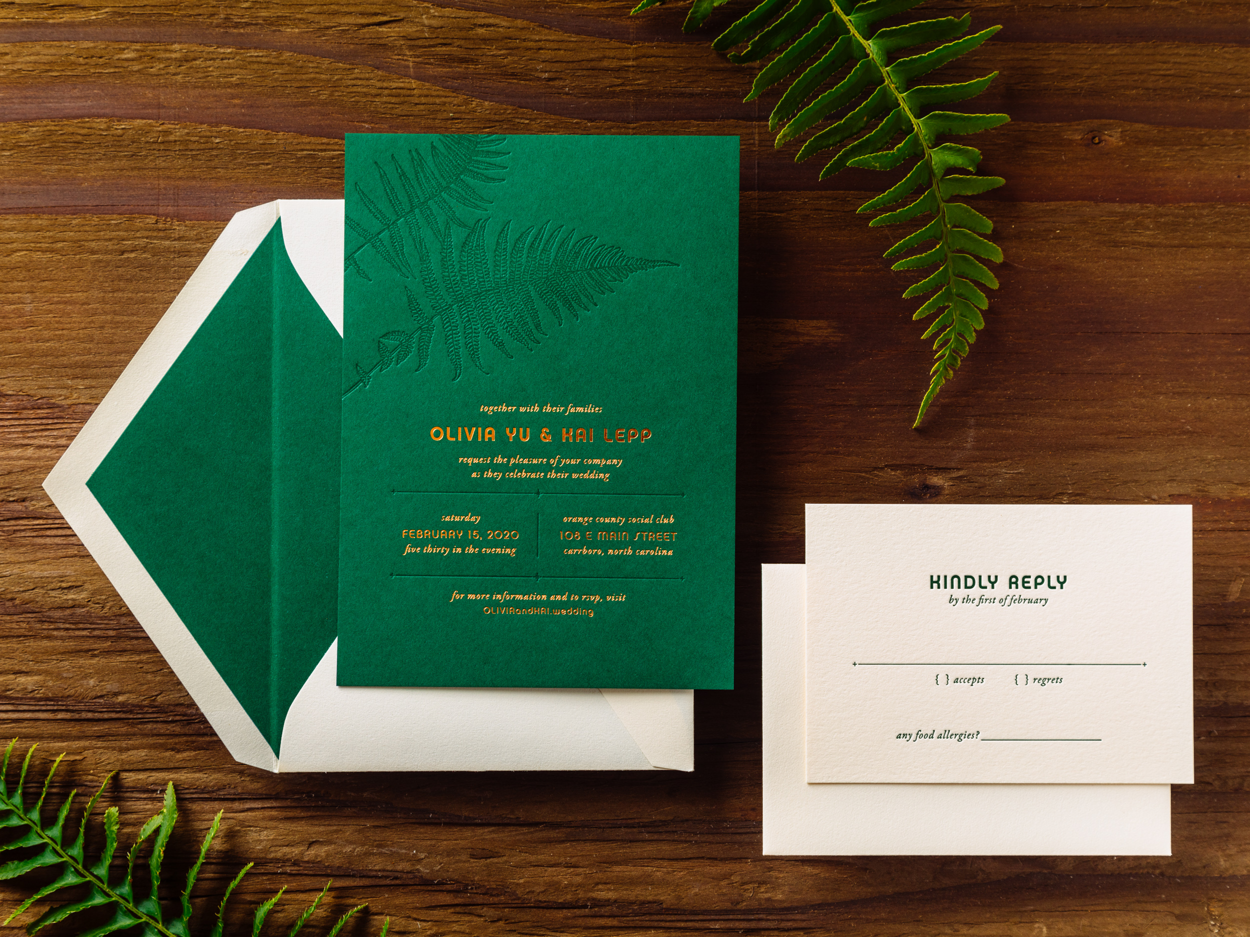
FERN

Tonal green-on-green letterpress with crisp copper foil, Fern is one of three new 2019 designs on our Parklife Colors paper. Great for island weddings, rainforest rehearsal dinners, deep woods baby showers, you name it.  We like to pair the Forest green invitation with Ecru reply cards and envelopes for easier writing. But if you prefer Forest paper and envelopes all around, that's an option too.
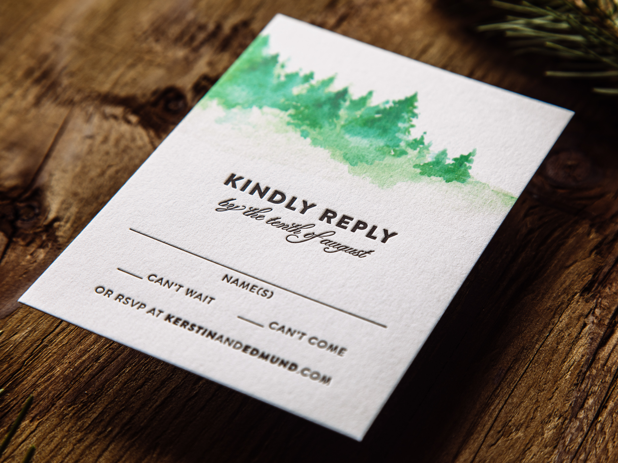
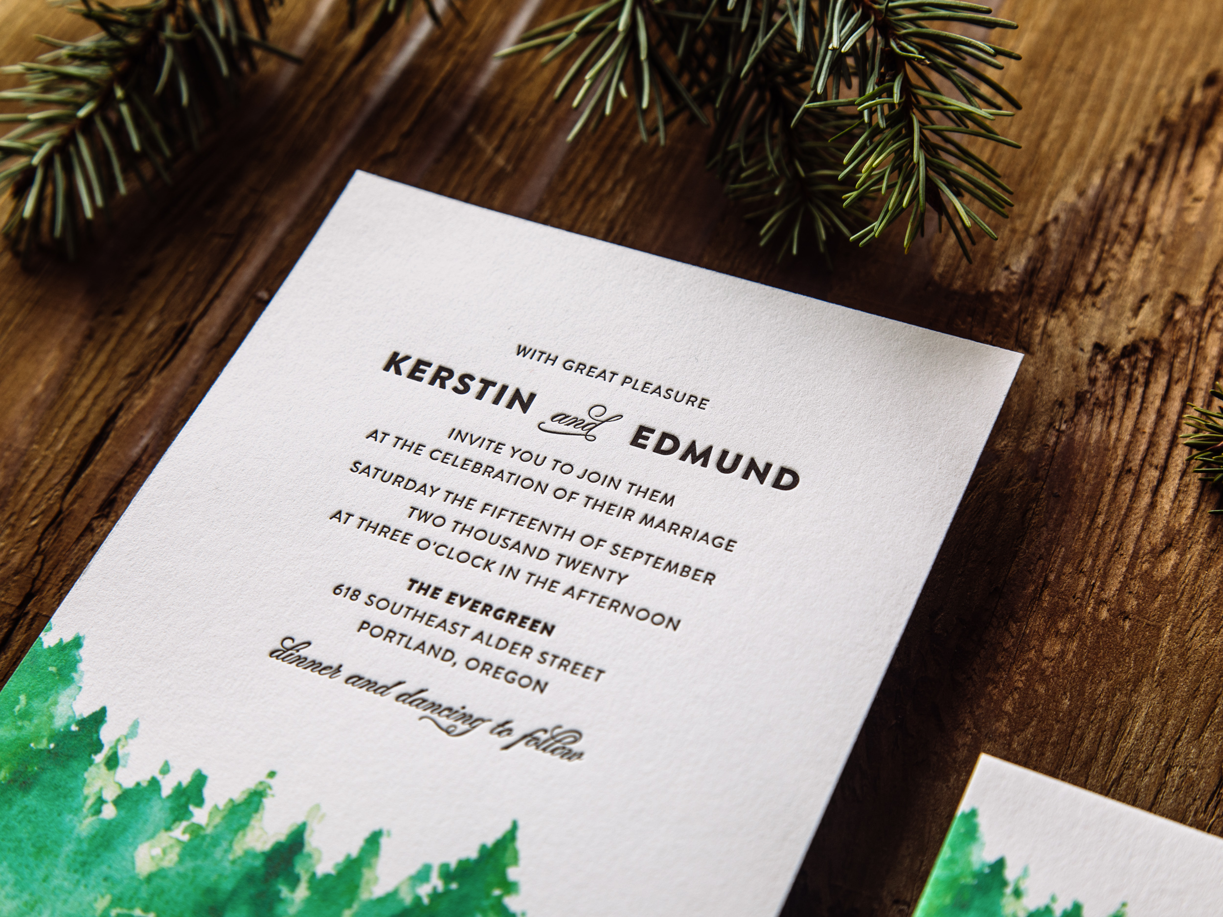
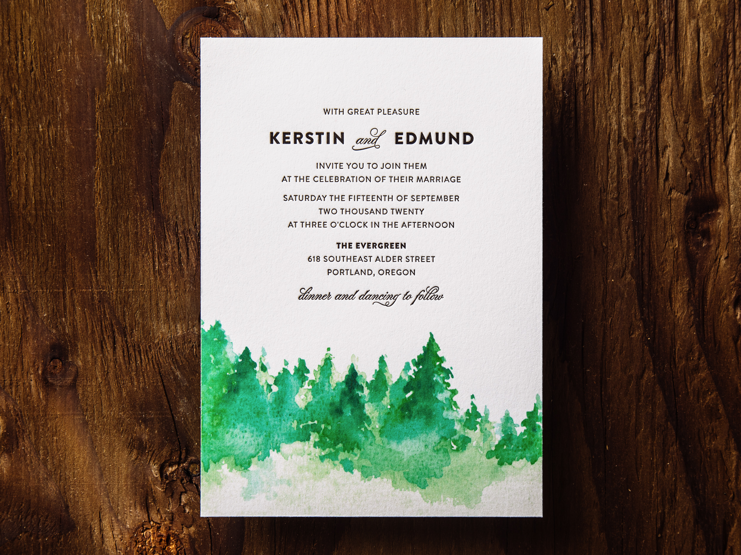
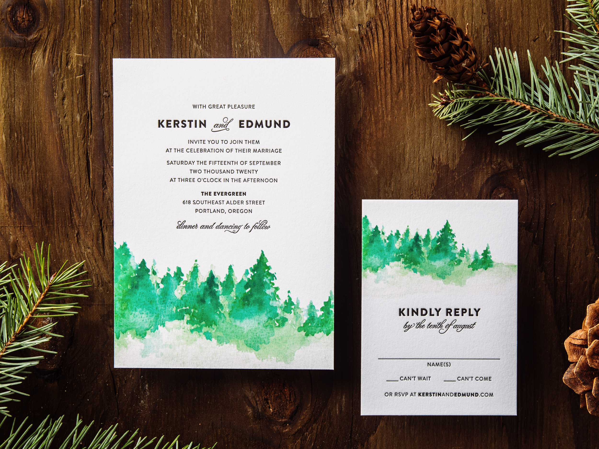
TIMBERLINE

Timberline pairs a soft matte inkjet-printed watercolor image with stark black letterpress type on our house cotton paper. Great for the Pacific Northwest, or anywhere pine trees are found. An inkjet run is priced the same as one letterpress ink, so the Timberline set is priced as a two-color design.
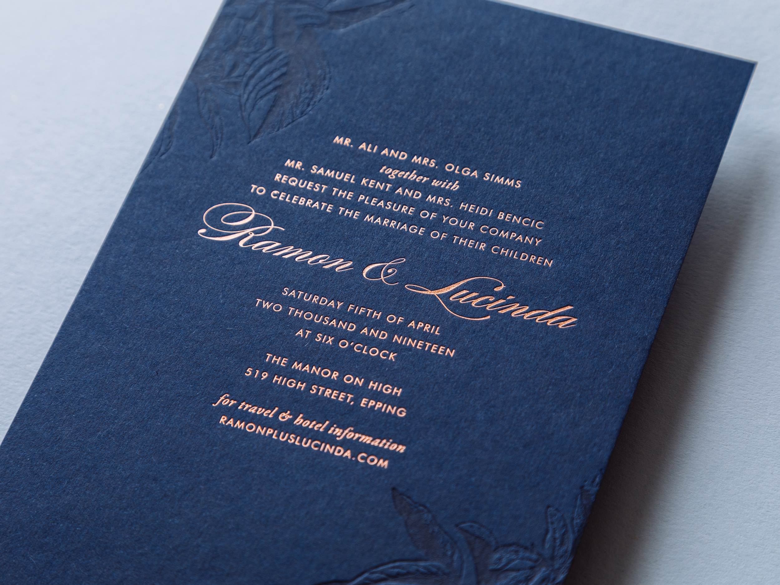
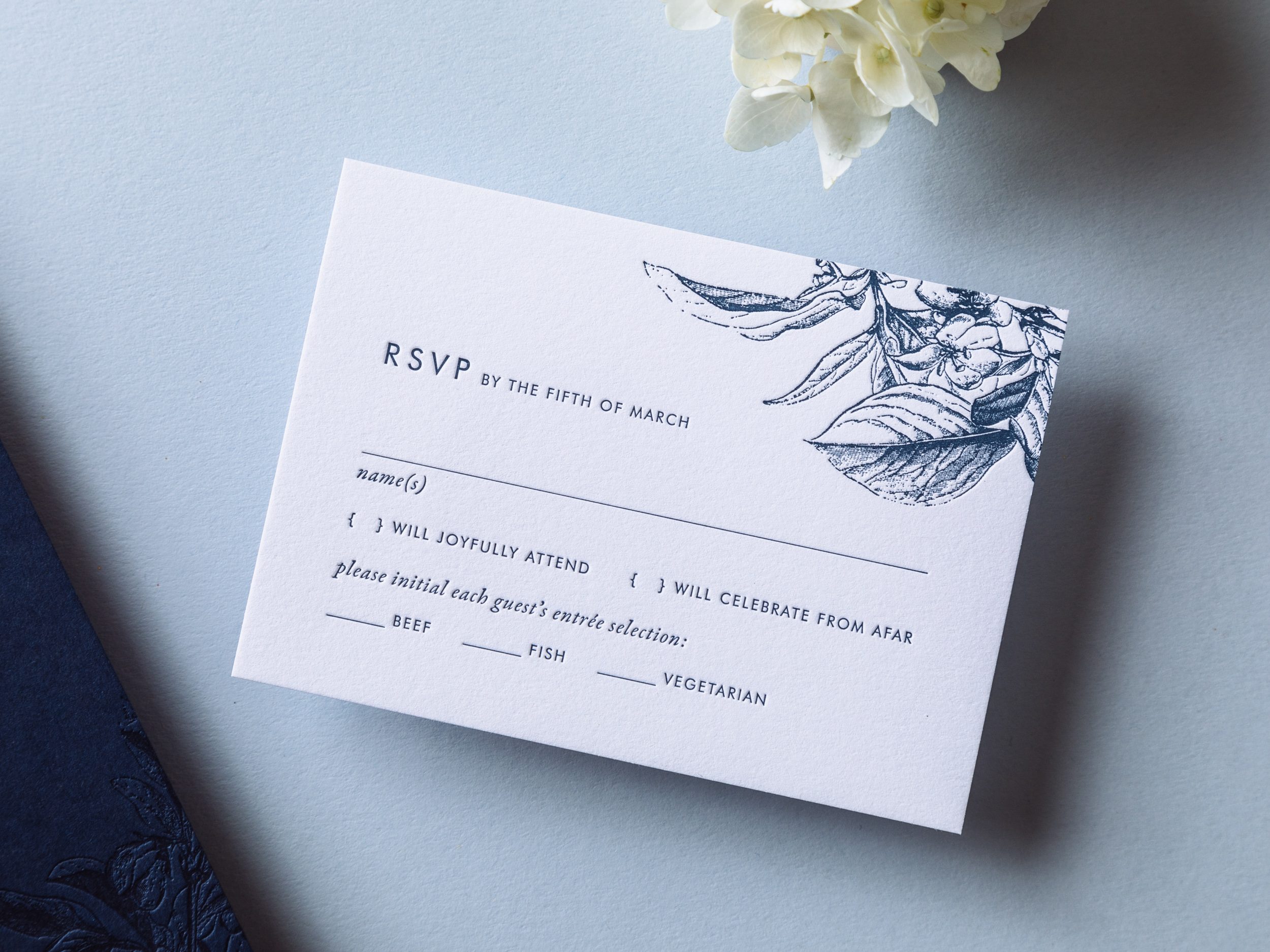
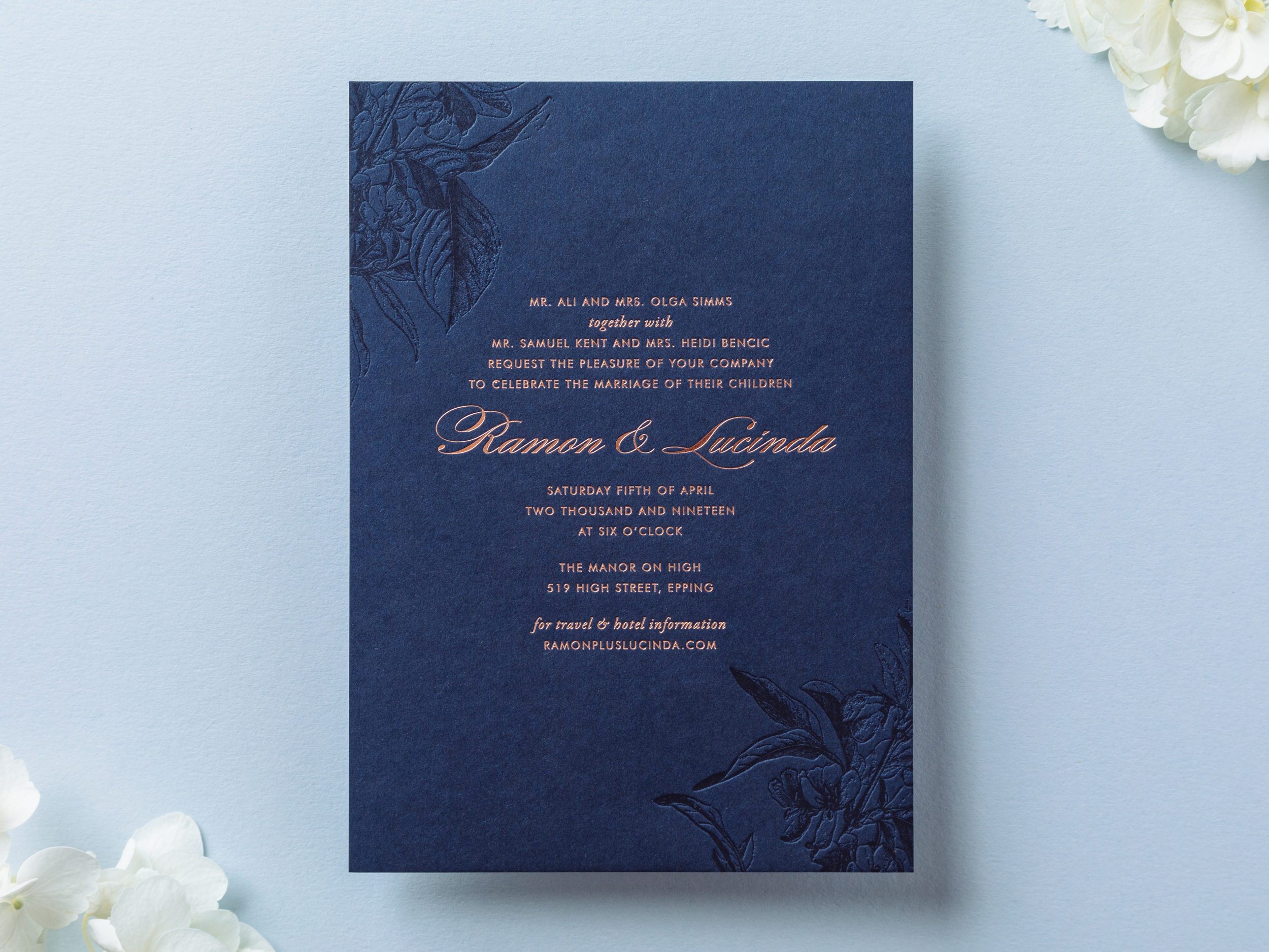
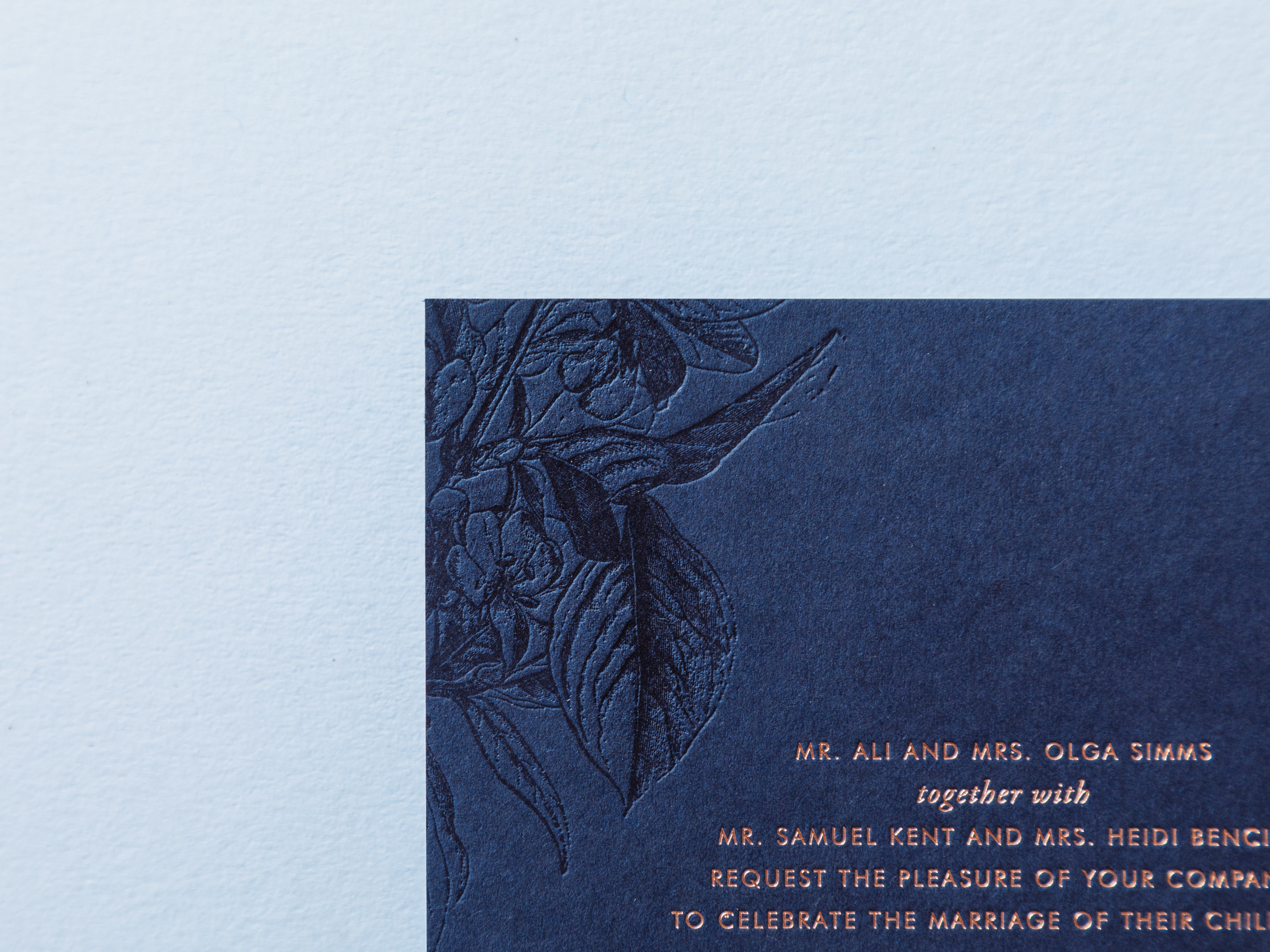
NIGHTSHADE

Tonal navy-on-navy letterpress cherry blossoms alongside rose gold foil text. This one can be adapted with other sorts of flowers too. Let us know what you have in mind! As with the Fern design, we can use either dark Parklife Colors paper or white cotton paper for the reply cards and envelopes (for easier writing).
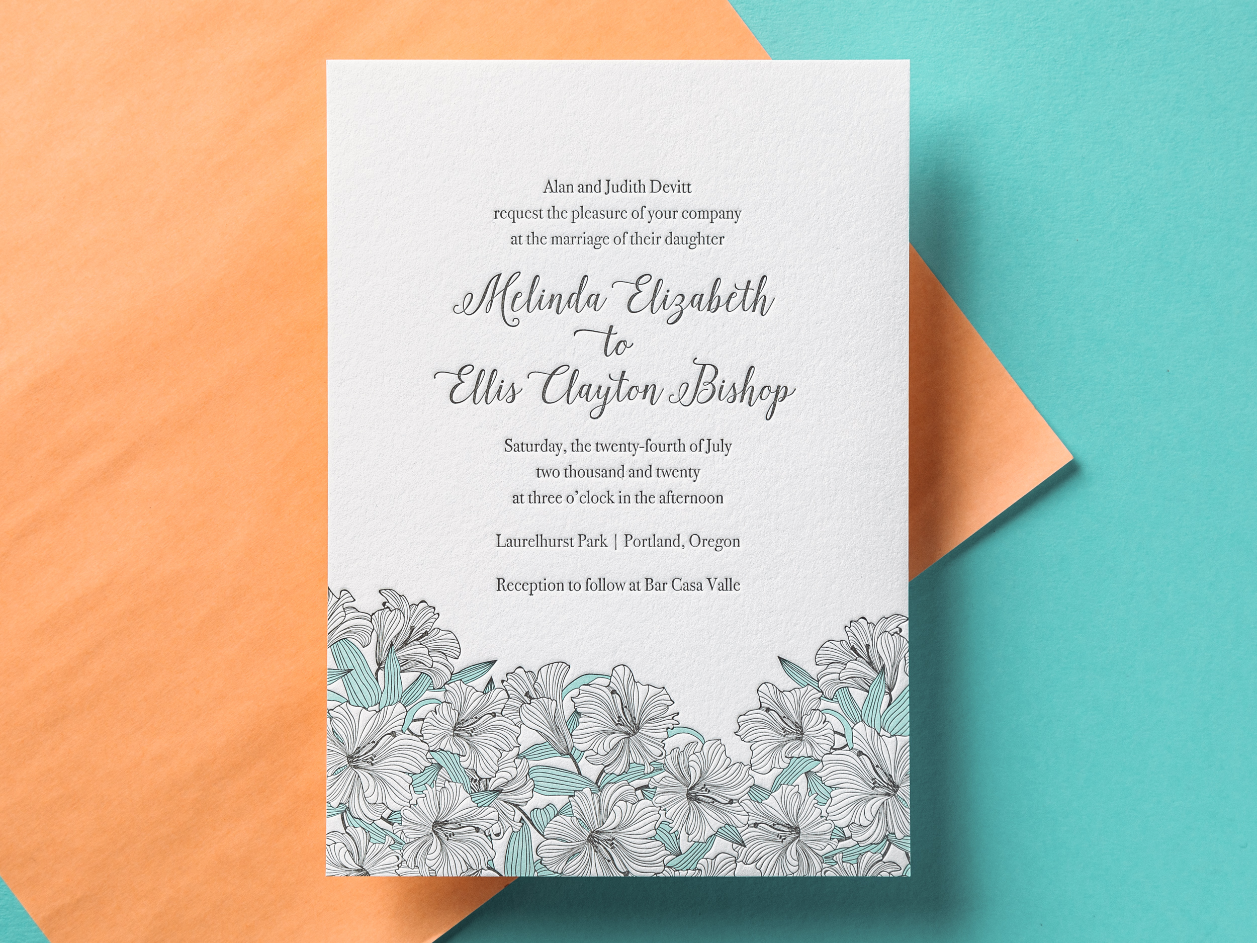
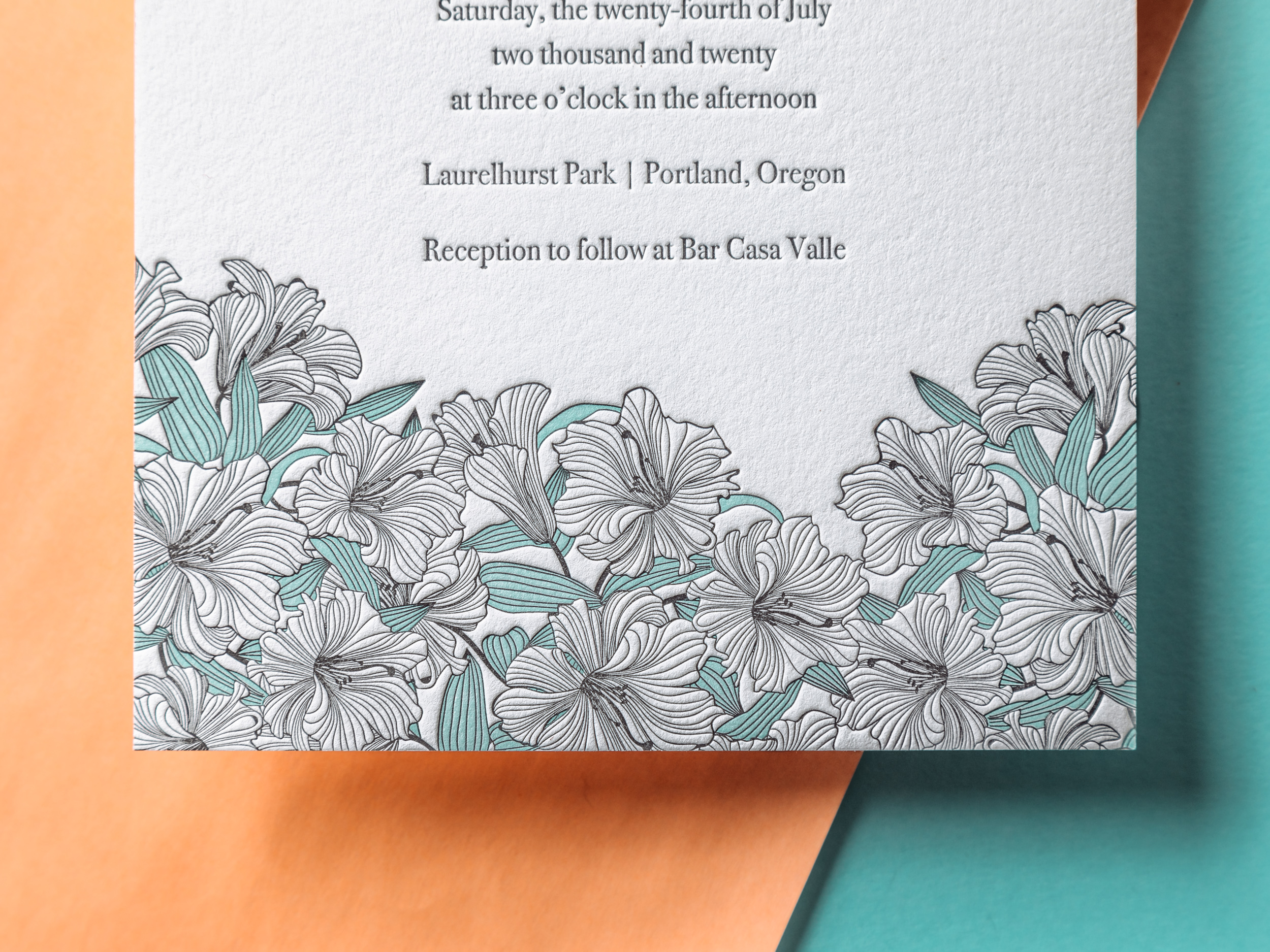
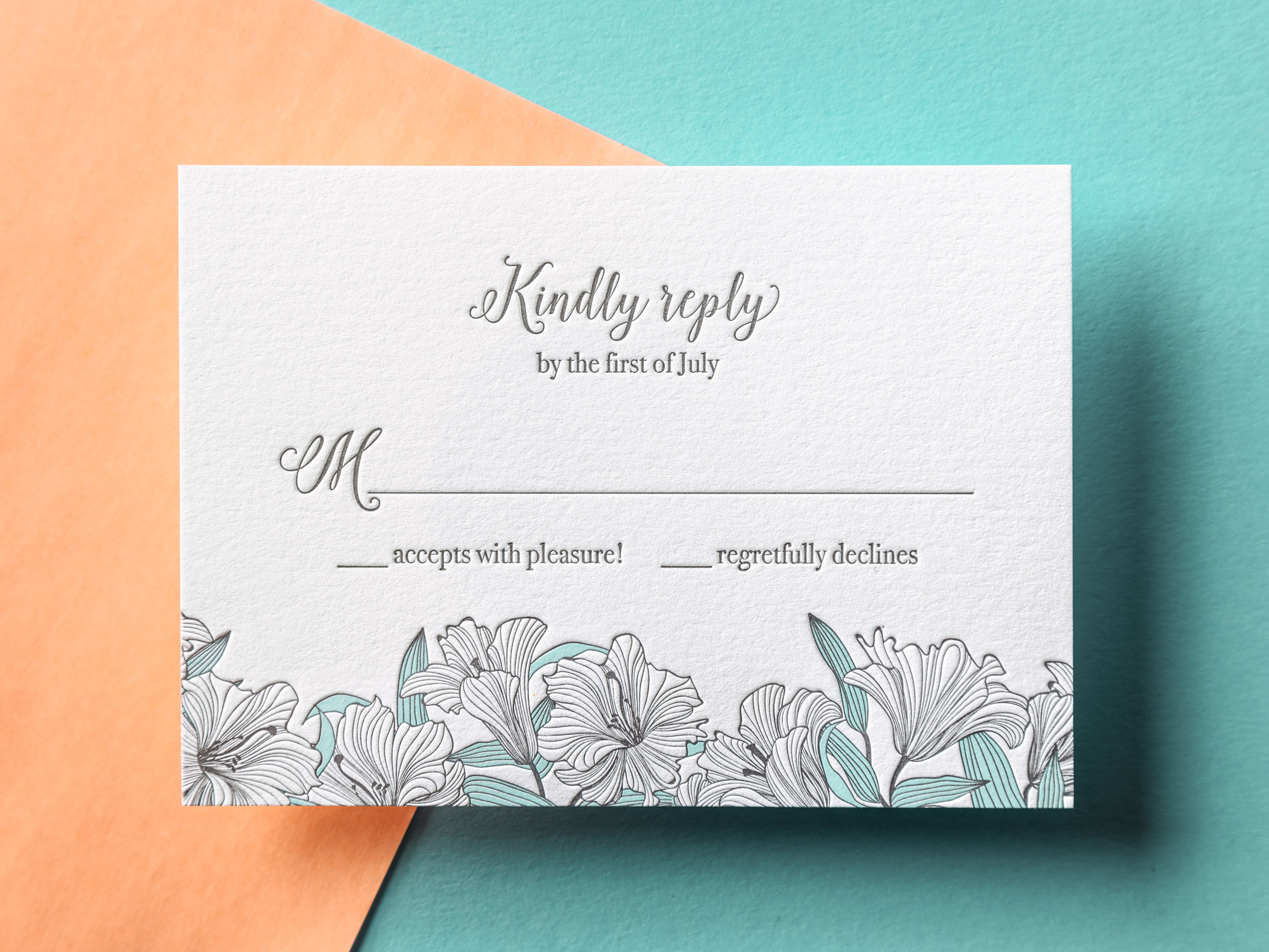
VERANDA

Airy, playful, and charming, our Veranda wedding invitation pairs nicely with any outdoor spring or summer event. If you like, swap out the seafoam ink for another light/bright color to suit your taste.
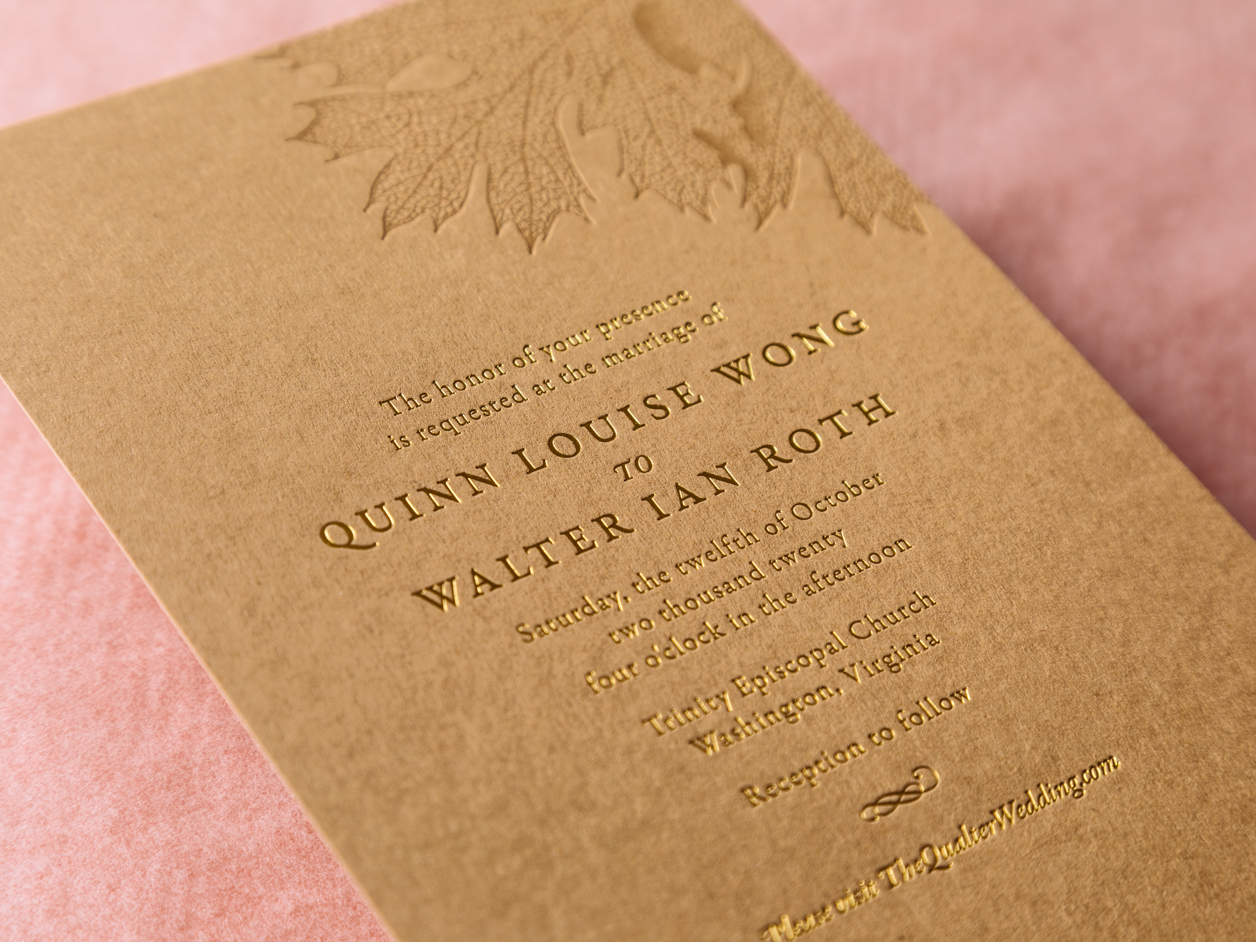
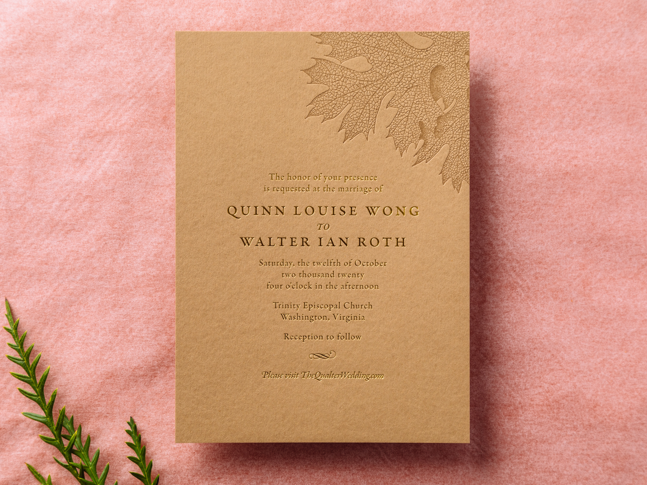
HARVEST

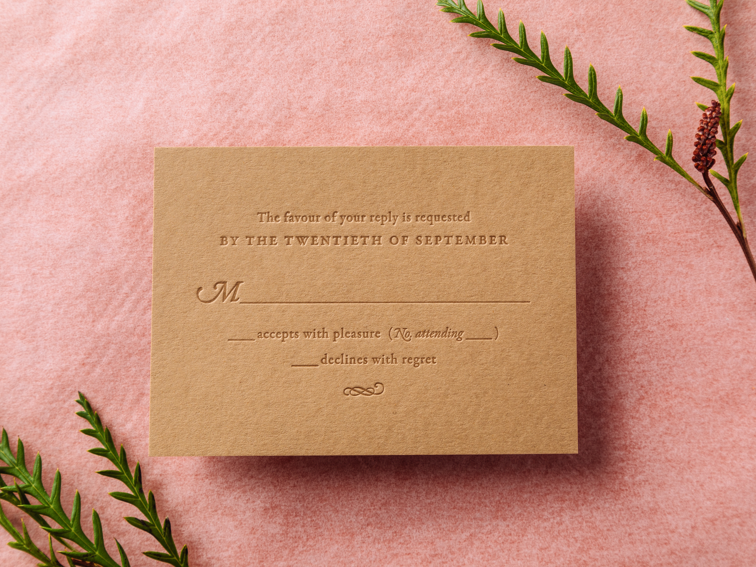
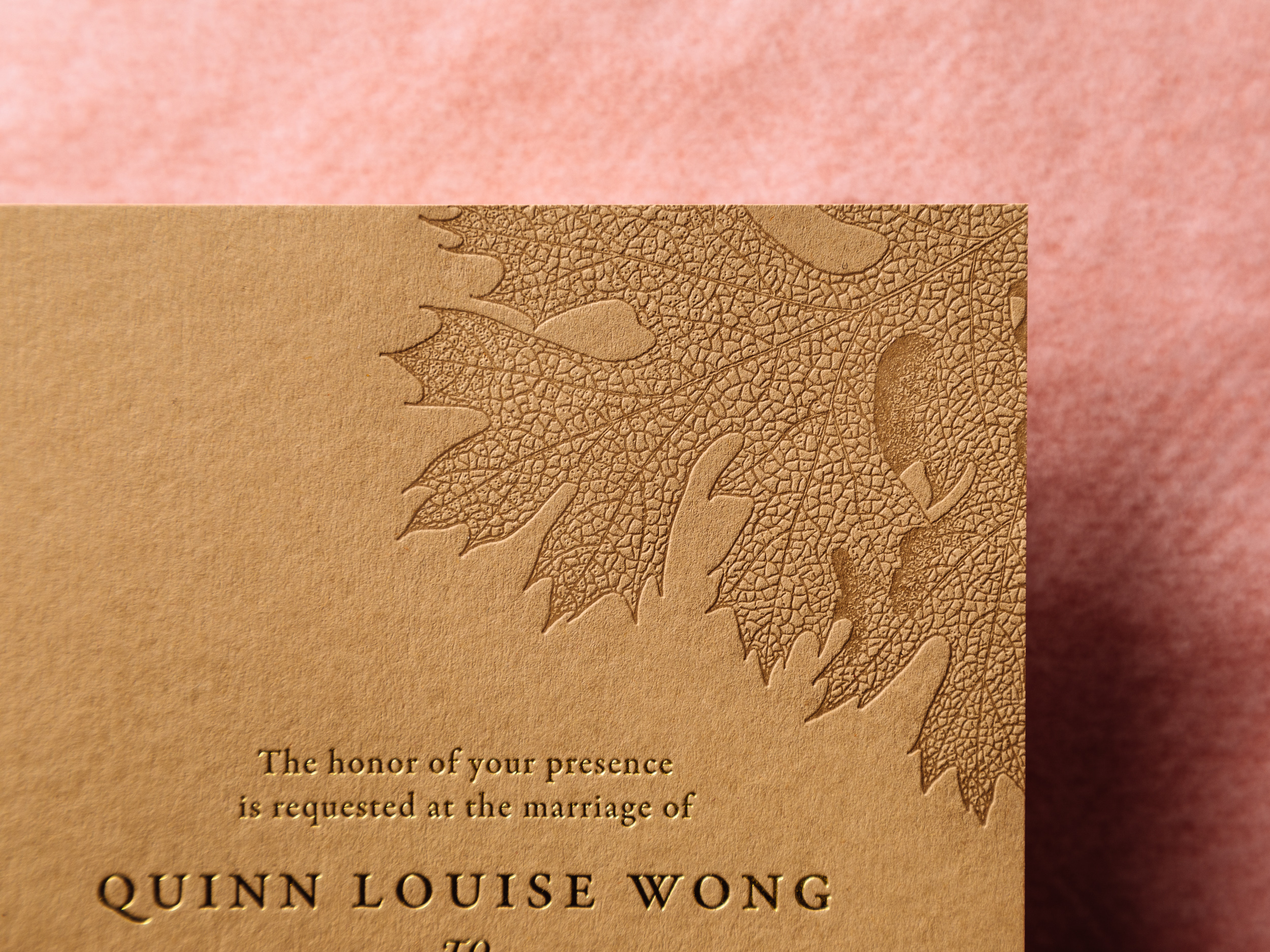
Gold Shine foil and Dust letterpress ink on 300g Harvest paper. The detail in the oak leaf on this one is amazing! Harvest is lovely with gold foil, but can also be printed with letterpress ink (Cocoa, Espresso, and Black are great options) and you'll save a little money. We can pair these with Harvest-colored envelopes or with our white cotton envelopes if you'd prefer.
Photos by Gritchelle
Calistoga Oak

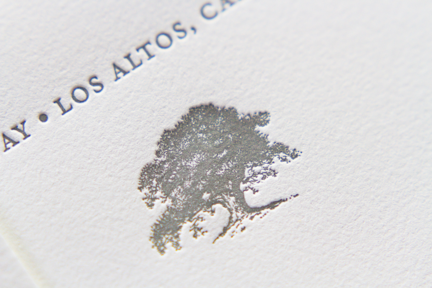
This design is a testament to inspiration and collaboration, and to taking aspects from different designs to create your your dream union of design elements. To follow that metaphor, this set is a sort of marriage of the Californian and Vignette designs, with some art adopted from an earlier set.

The oak tree illustration is simple, yet incredibly detailed. Trees are common motifs for wedding invitations: they can represent vitality, strength, shelter, looking to the future. And they can also, of course, be more literal: depictions of the venue — in this case, a ranch in Calistoga, California — or they can be emblematic of a place special to the couple. The tree motif can embody all of these characteristics and connections.

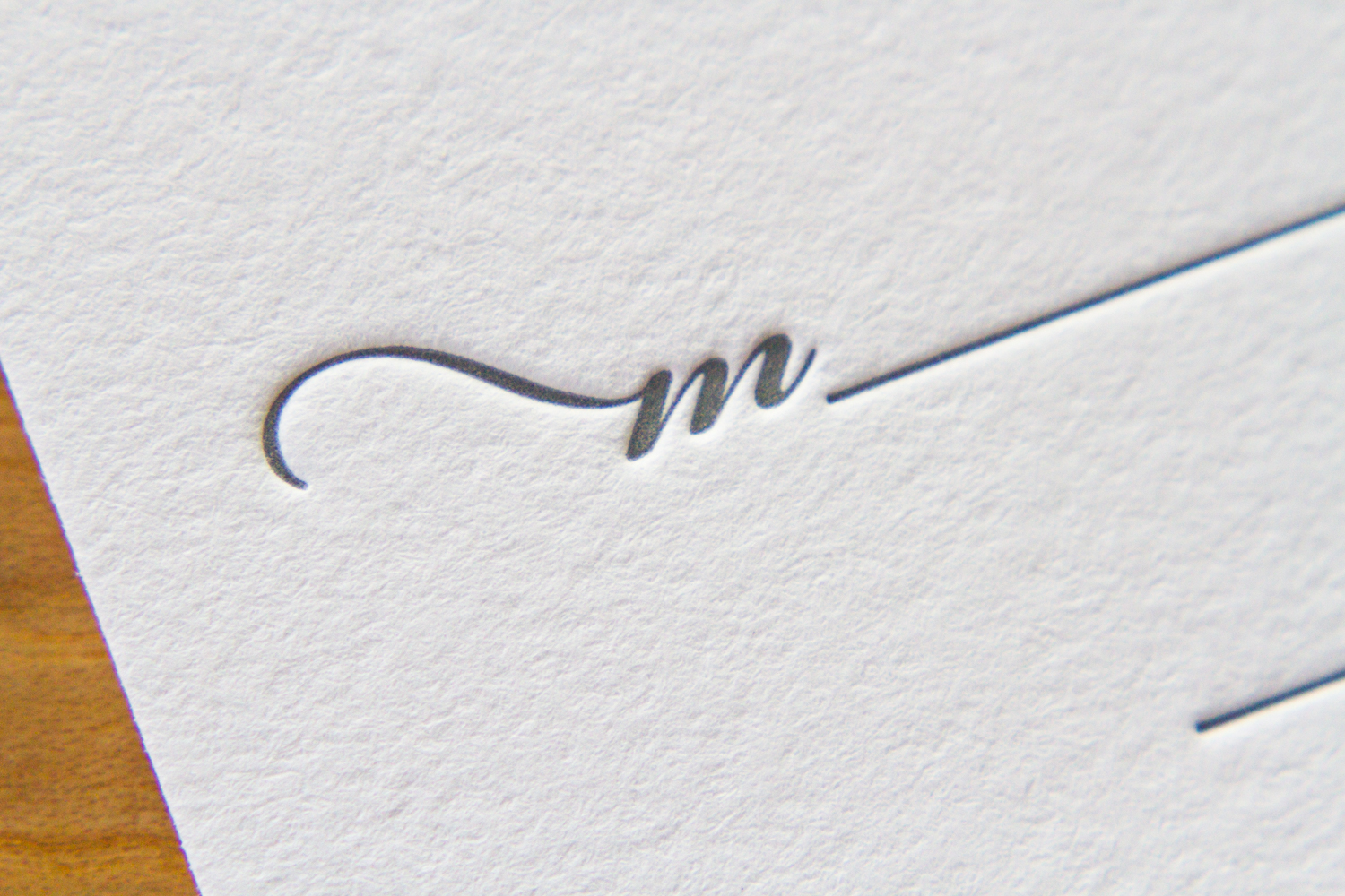
This design is so clean and sophisticated. Because it has a lot of white space and isn't overly ornate, the little details really shine. The script has wonderful (in some case, overlapping) flourishes, and the custom double border really highlights the texture of the thick paper stock.

Photos by Sarah Arneson
Winter Wonder

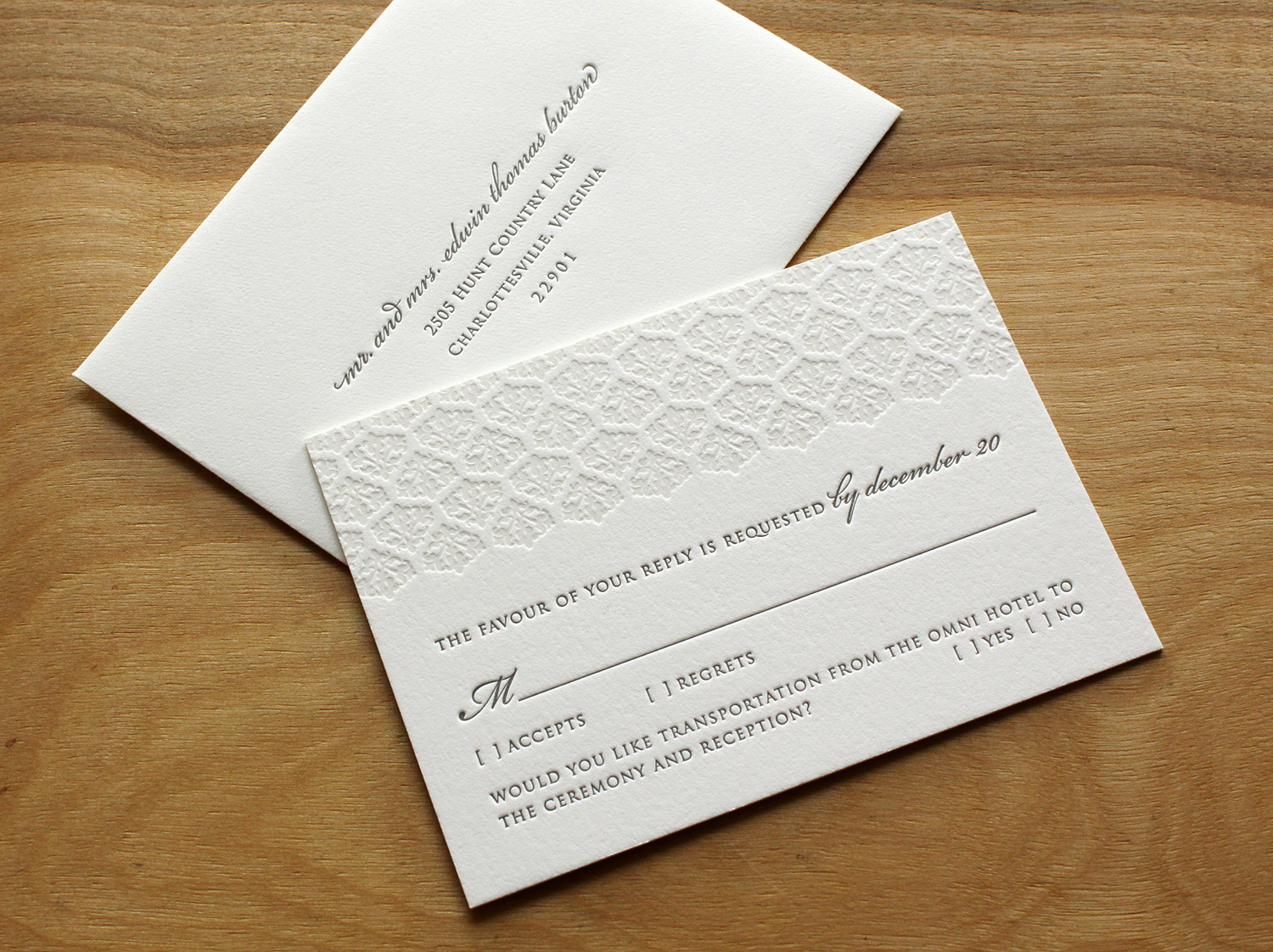
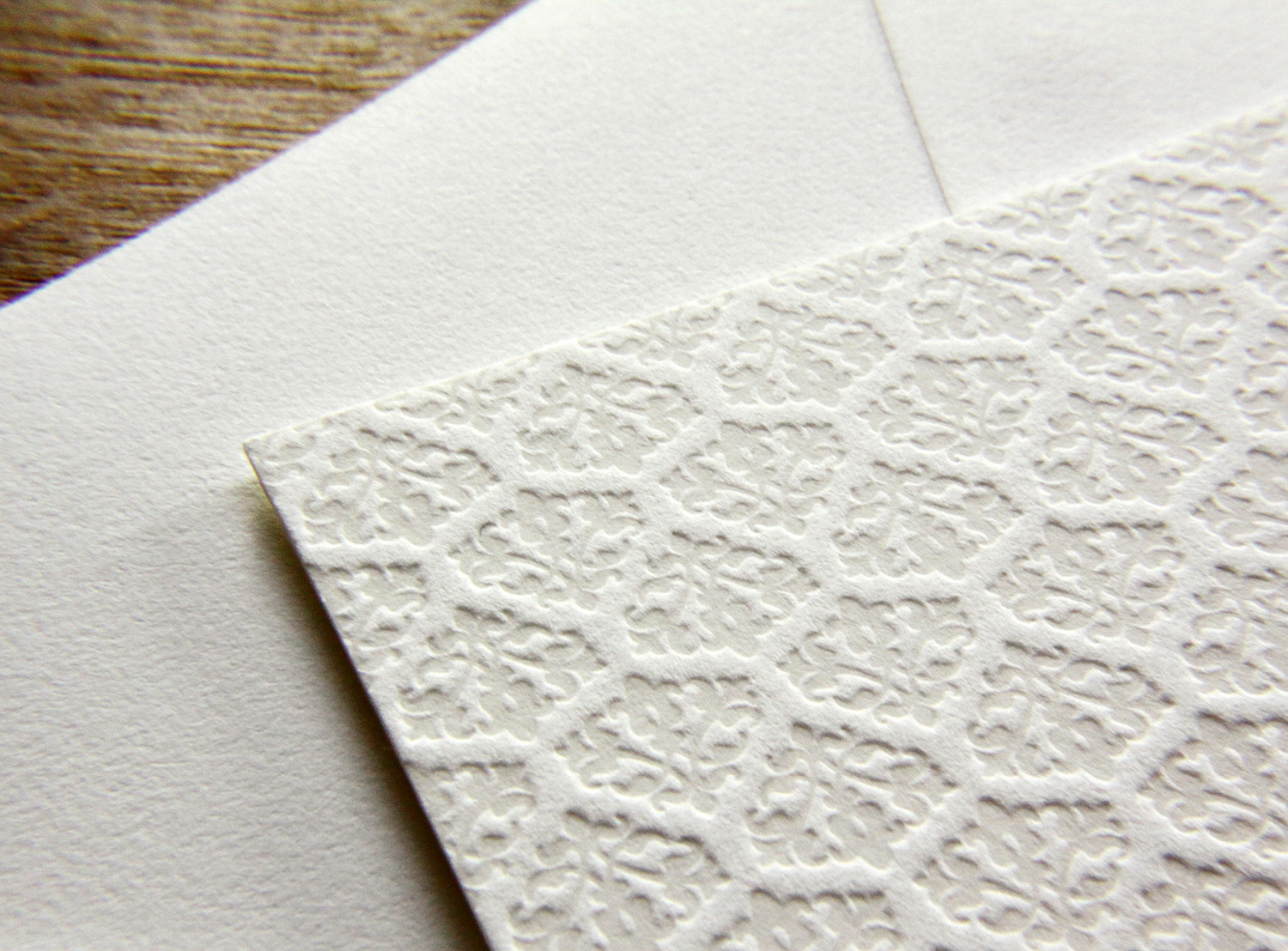
Trish Burton was helping her daughter plan a winter wedding, and was looking for winter-themed ​invitations. She was familiar with letterpress, as she had used it for her other daughter's wedding, but was unable to find any designs in her area that felt right. After finding Parklife Press and communicating with Travis, she had the idea to adapt the Pinkney design by using a tinted white ink instead of pink. Because the color of the white ink and the color of the paper are so similar, this look has the appearance of a blind deboss (an impression made without ink) but in fact it adds just enough color to make the texture pop. She predicted the change of ink color would make the springy, floral invitation convey a lush and dense snowfall instead. Quiet elegance, perfect for the winter-themed wedding in January.

​The text was done in slate — a cool gray ink that paired well with the pearl white paper stock — coordinating beautifully with the wedding's theme colors of icy blue and pewter.

The bride and groom, who each have stressful careers and work long hours, were grateful to have Trish make the arrangements. Trish, in turn, was eager to take away as much of her daughter's wedding-planning stress as possible. And her pursuit of a fitting winter-themed invitation for her daughter's happy day was successful — Trish said she lost count of the number of friends who complimented them.

Photos by Sarah McCarty Arneson
Scripted Bookplate

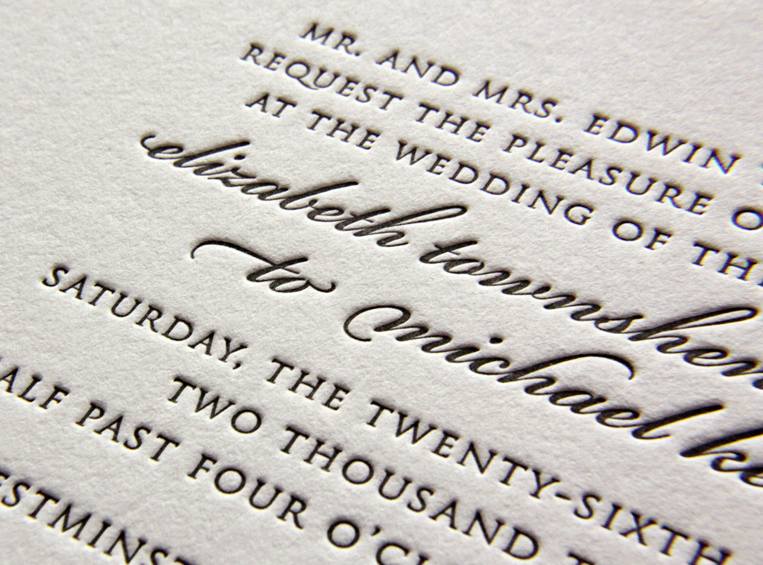
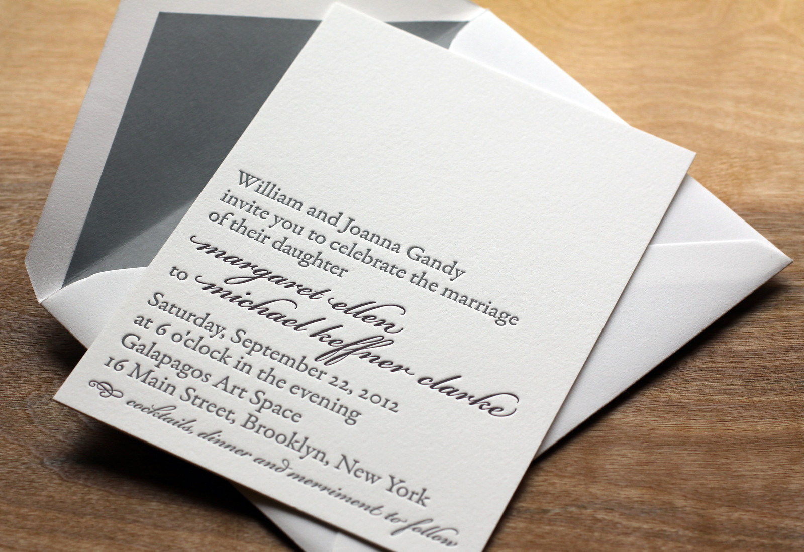
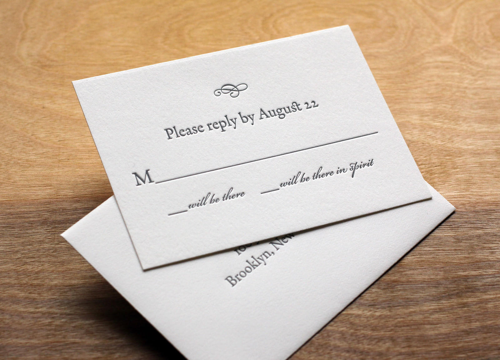
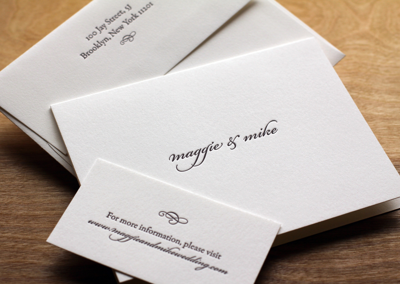
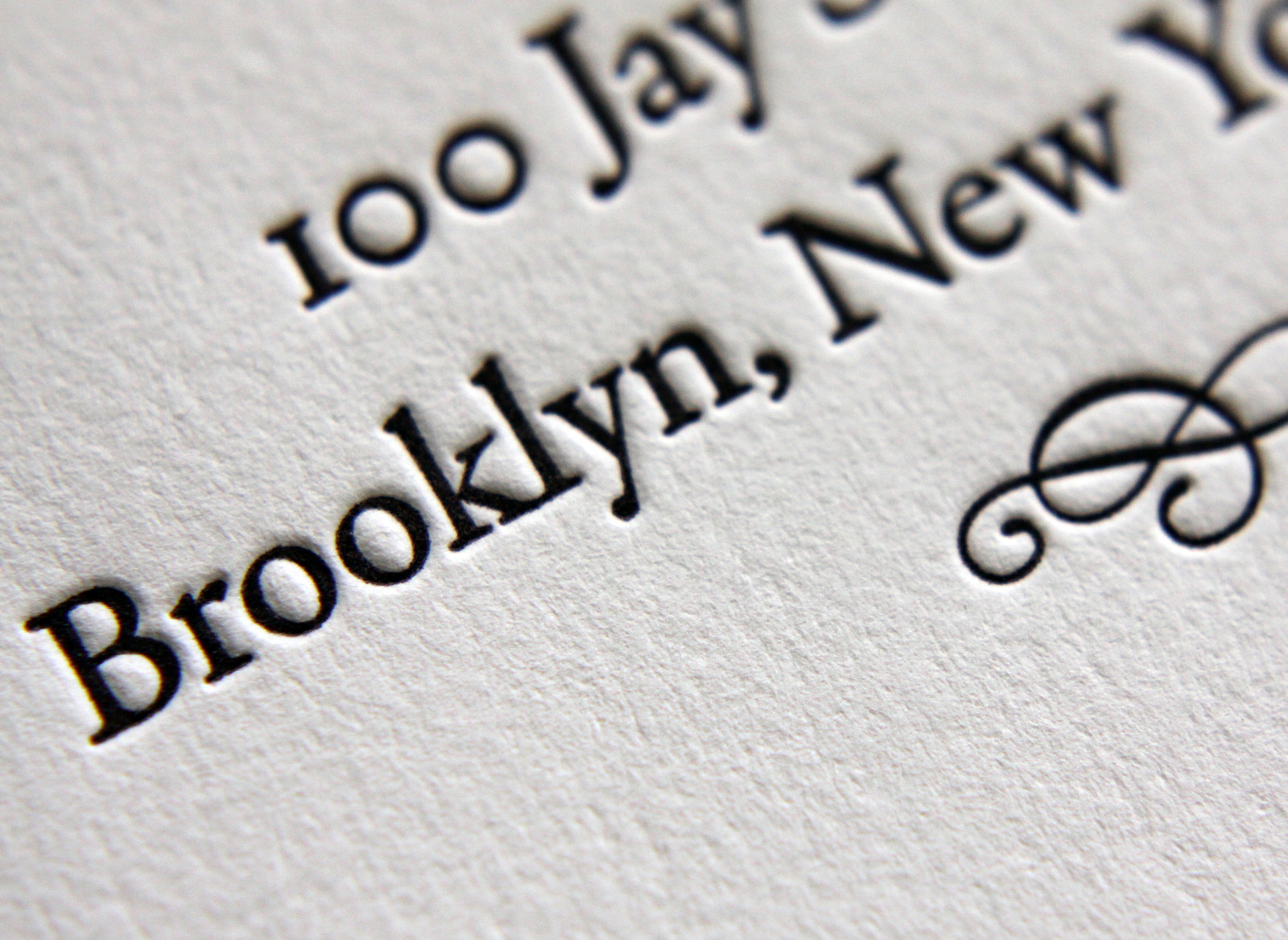
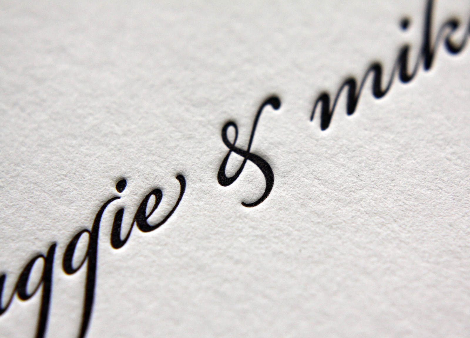
In this variation on our Bookplate invite Maggie and Mike softened the look a little bit by adding some Bickham Script type in Deep Plum ink for their names and the reception line. Slate envelope liners to match the Slate ink give the set some added polish.

Rather than over-stuff the envelope with accommodations info, directions, etc, the couple opted to keep things simple with a business-sized card directing guests to their wedding website.

Photos by Sarah McCarty Arneson