Formal, with Flourishes
Alexandra and Michael were planning a black-tie, traditional Catholic wedding, and wanted their invitation to reflect that style. Alex was drawn to the Fountain design — seeing how the layout's simplicity put the elaborate font on display, she was, as she put it, "hooked."


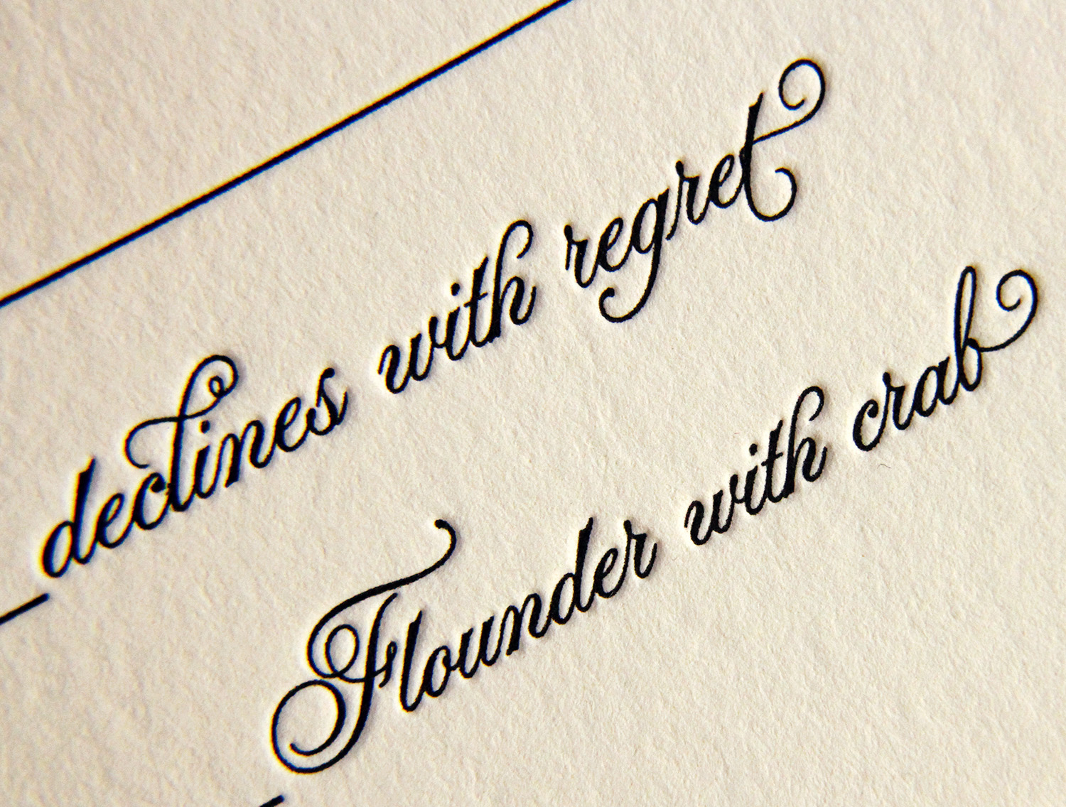
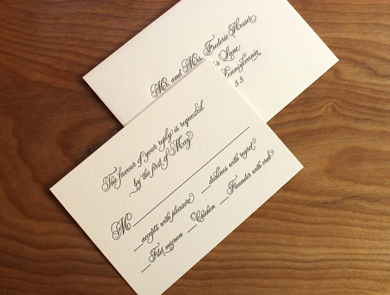
Deceptively simple in design, the typeface features intricate and playful ligatures and flourishes. The extra thick invitation cards were edged in gold, and that subtle sparkle was echoed by the envelopes' antique gold liners.


Alex found Parklife Press on the Martha Stewart Weddings website. As with any wedding, there were many decisions to be made — but when it came to the invitations, whether to use letterpress was never really a question. "My Mom is a calligrapher and has instilled a reverence to paper products in me that I was sure to embrace in our wedding planning process." The effect was everything she and Michael were looking for: formal and traditional, with impact.