Posts tagged envelope liner
NEW 2019 Letterpress Wedding Invitations

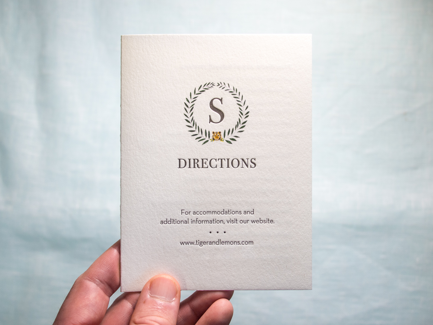
Five new letterpress wedding invitation designs are out! Let’s take a look:
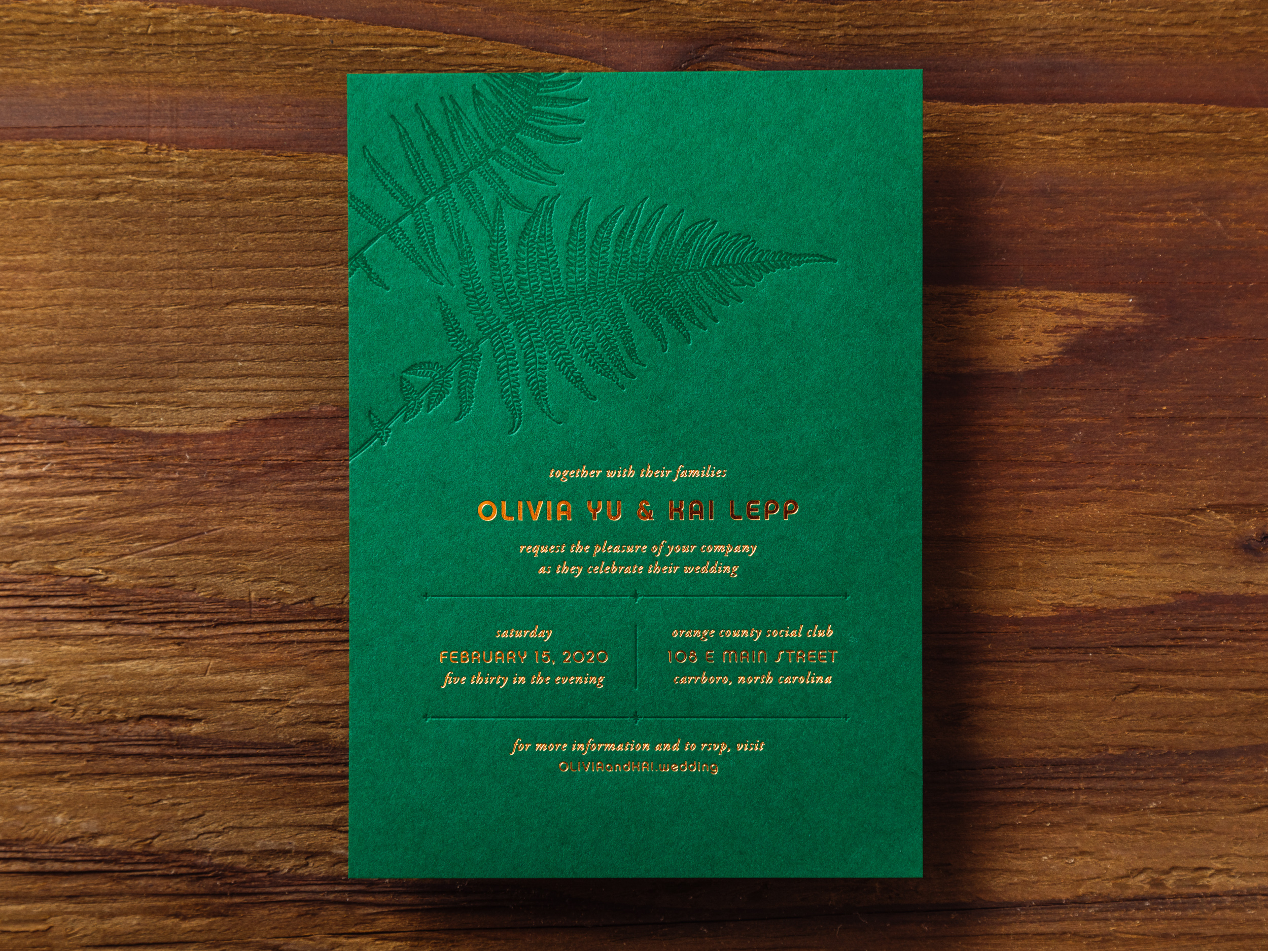
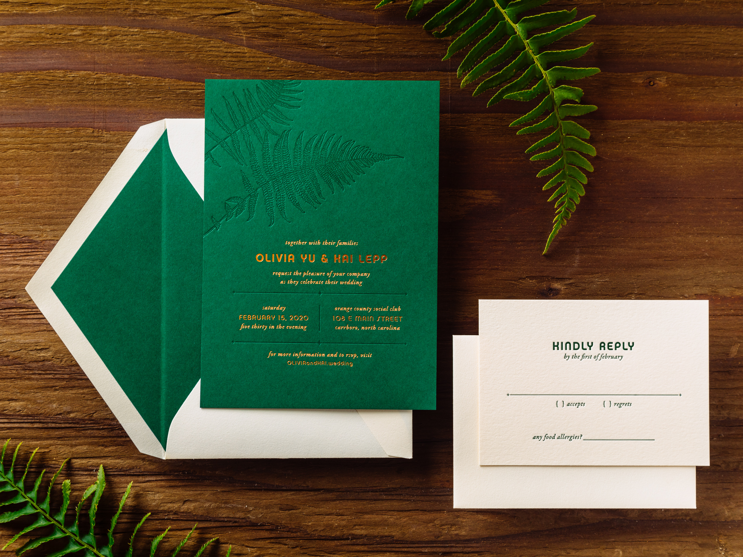
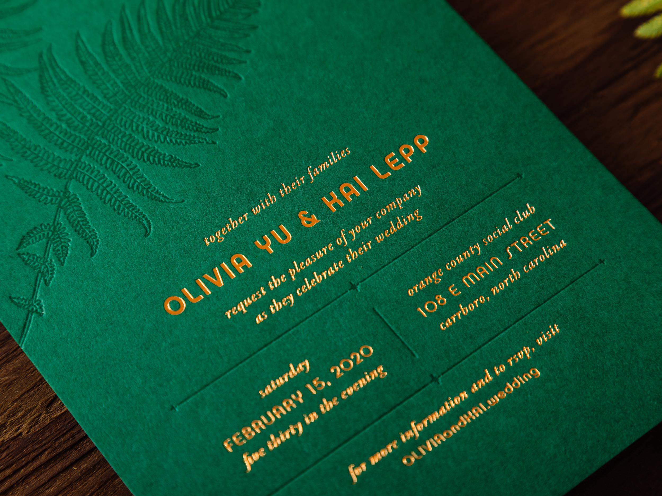
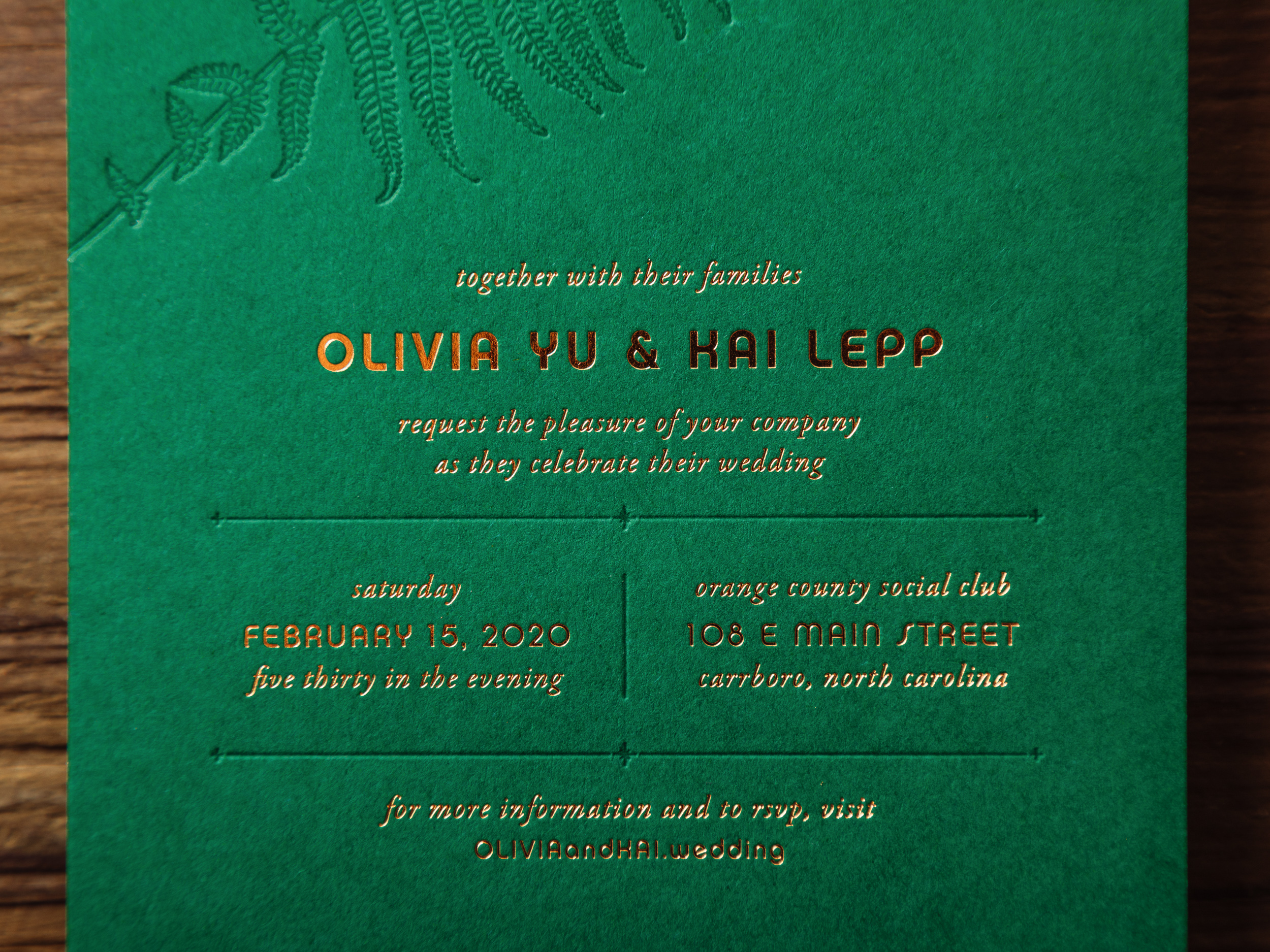

FERN

Tonal green-on-green letterpress with crisp copper foil, Fern is one of three new 2019 designs on our Parklife Colors paper. Great for island weddings, rainforest rehearsal dinners, deep woods baby showers, you name it.  We like to pair the Forest green invitation with Ecru reply cards and envelopes for easier writing. But if you prefer Forest paper and envelopes all around, that's an option too.
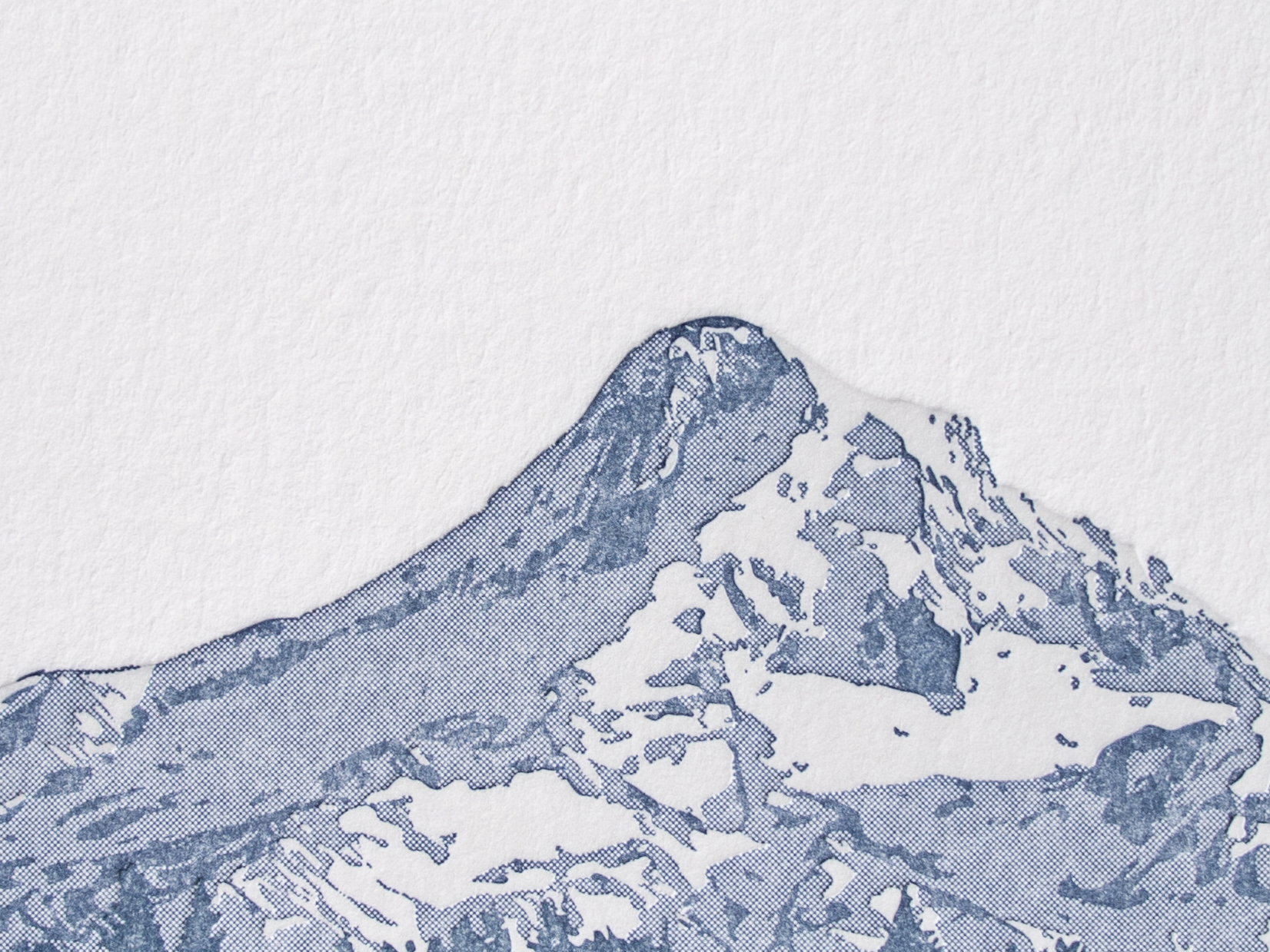
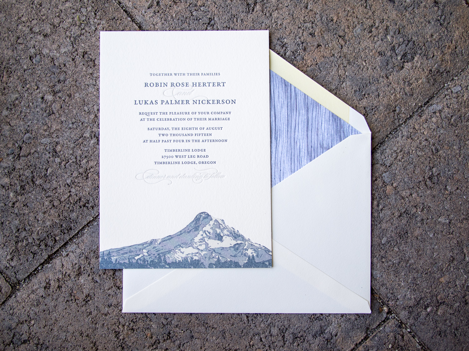
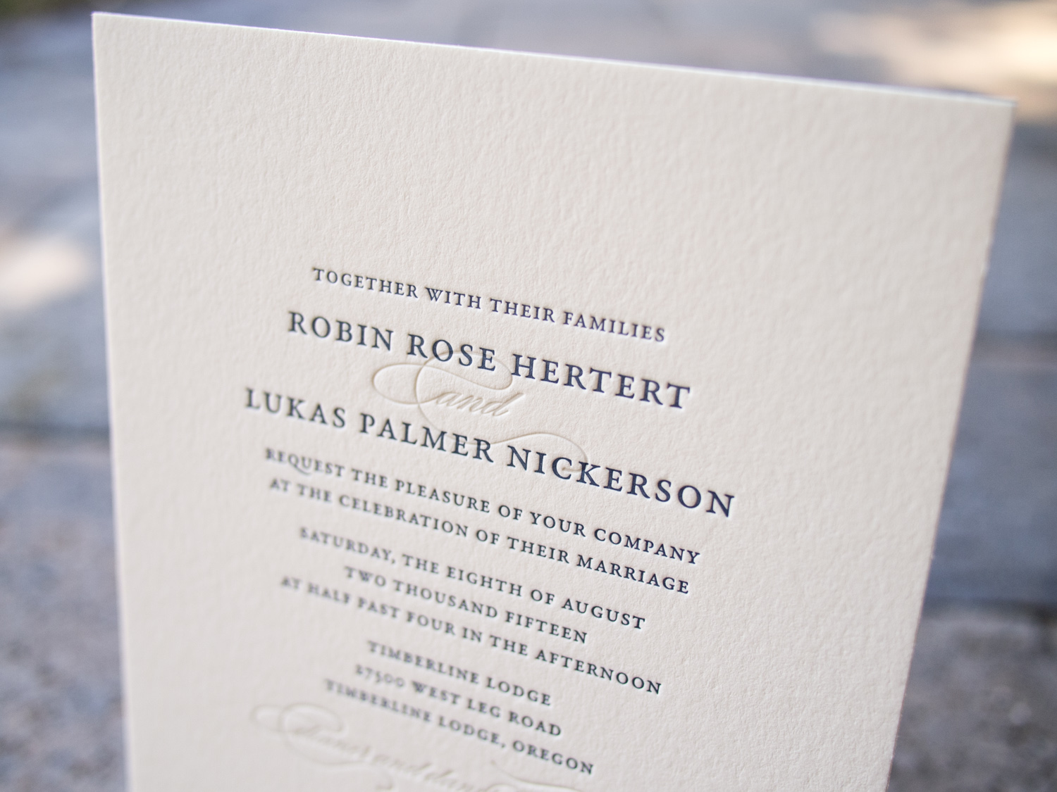
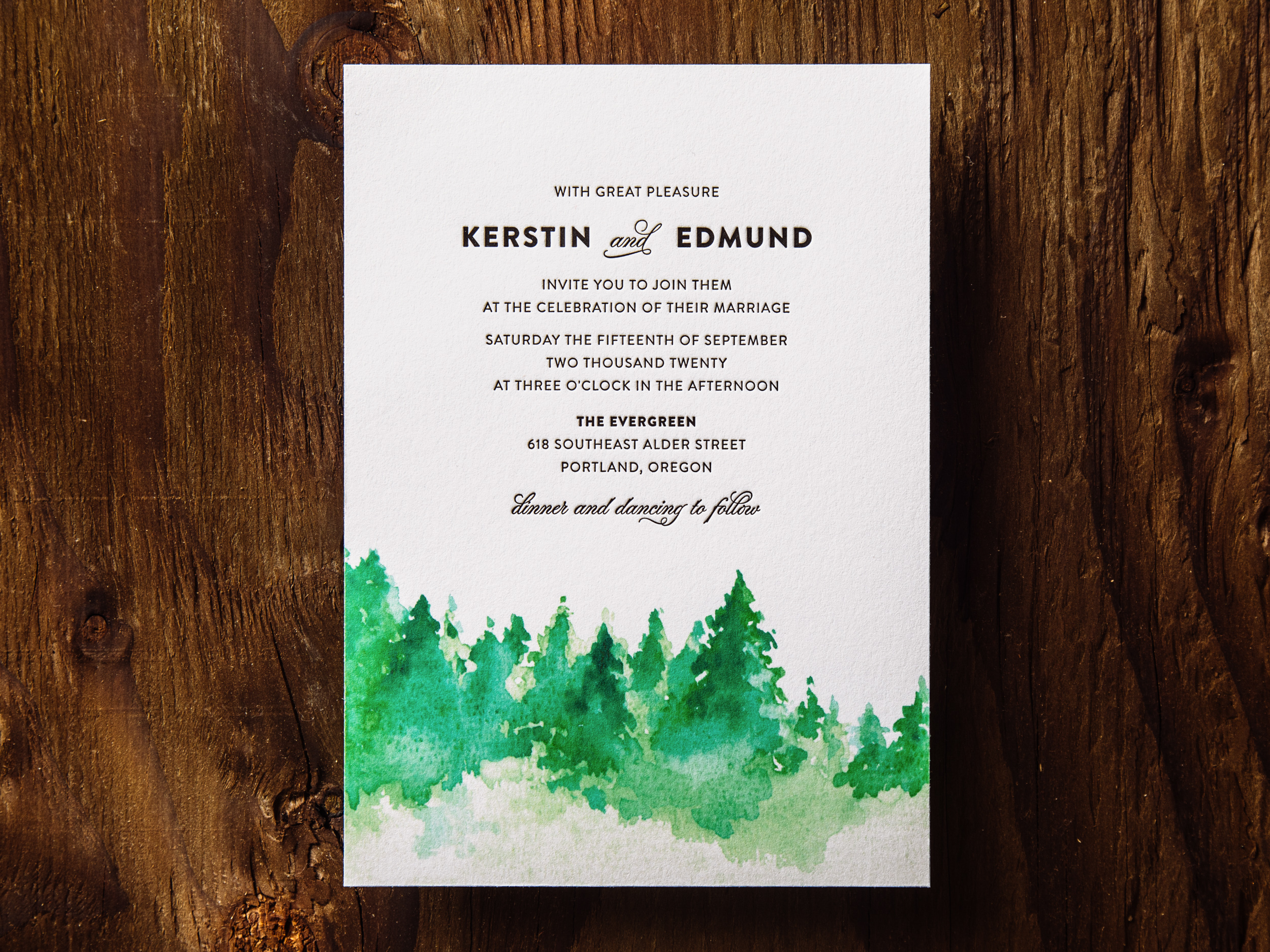
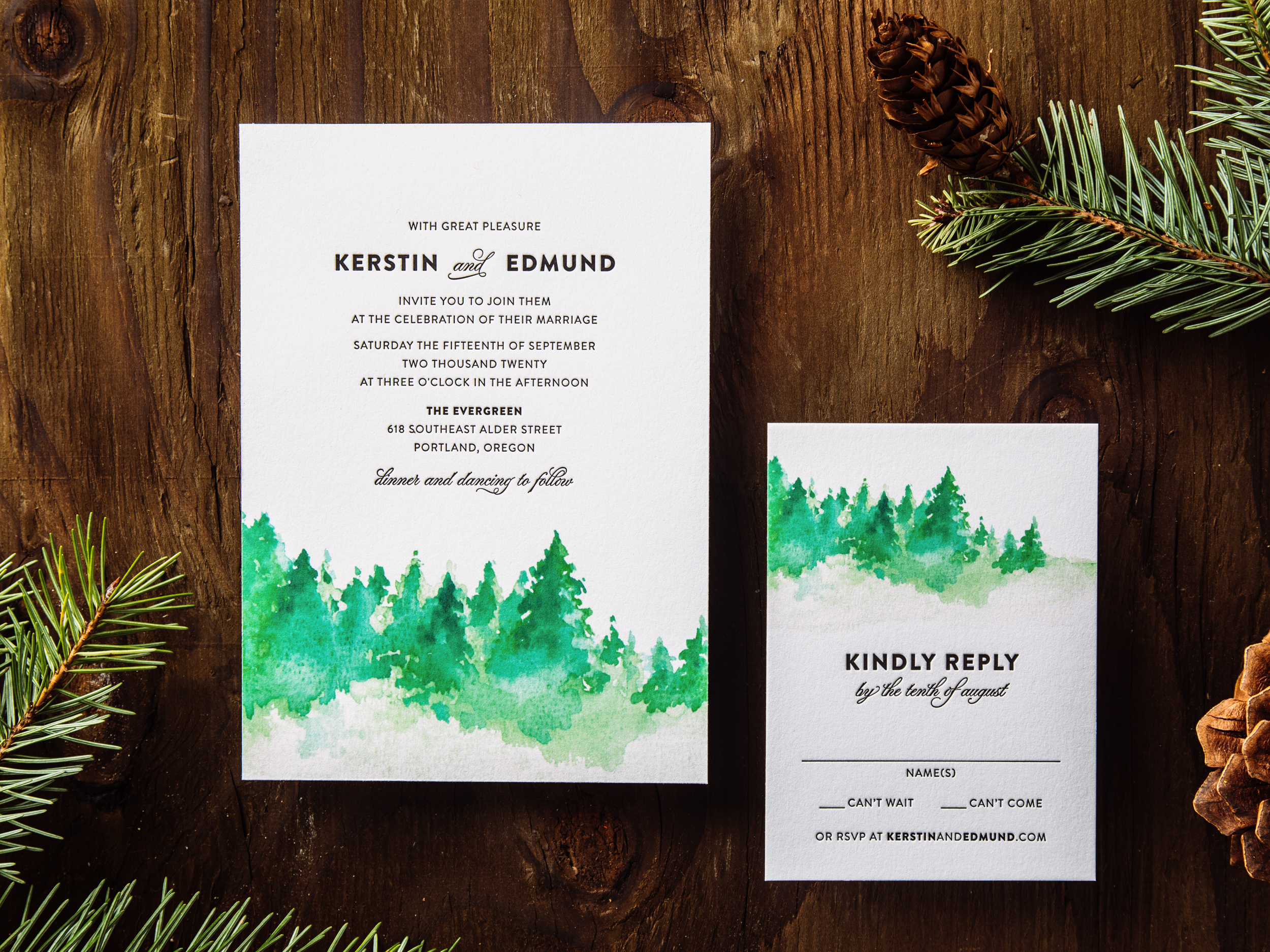
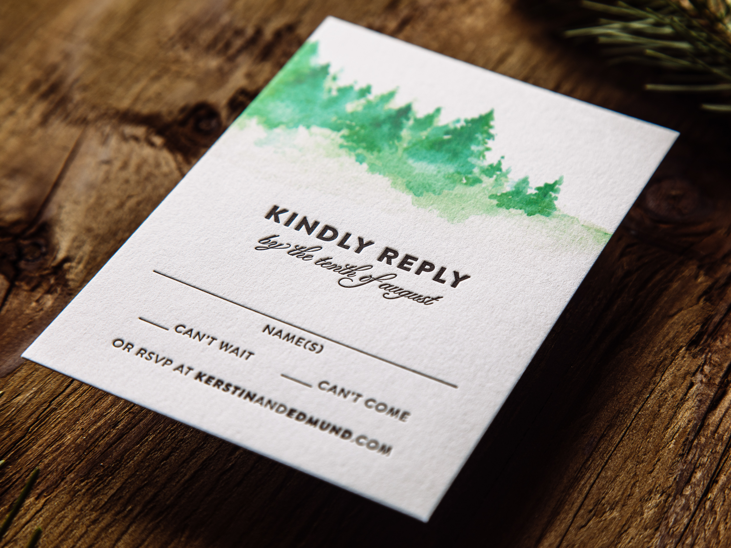
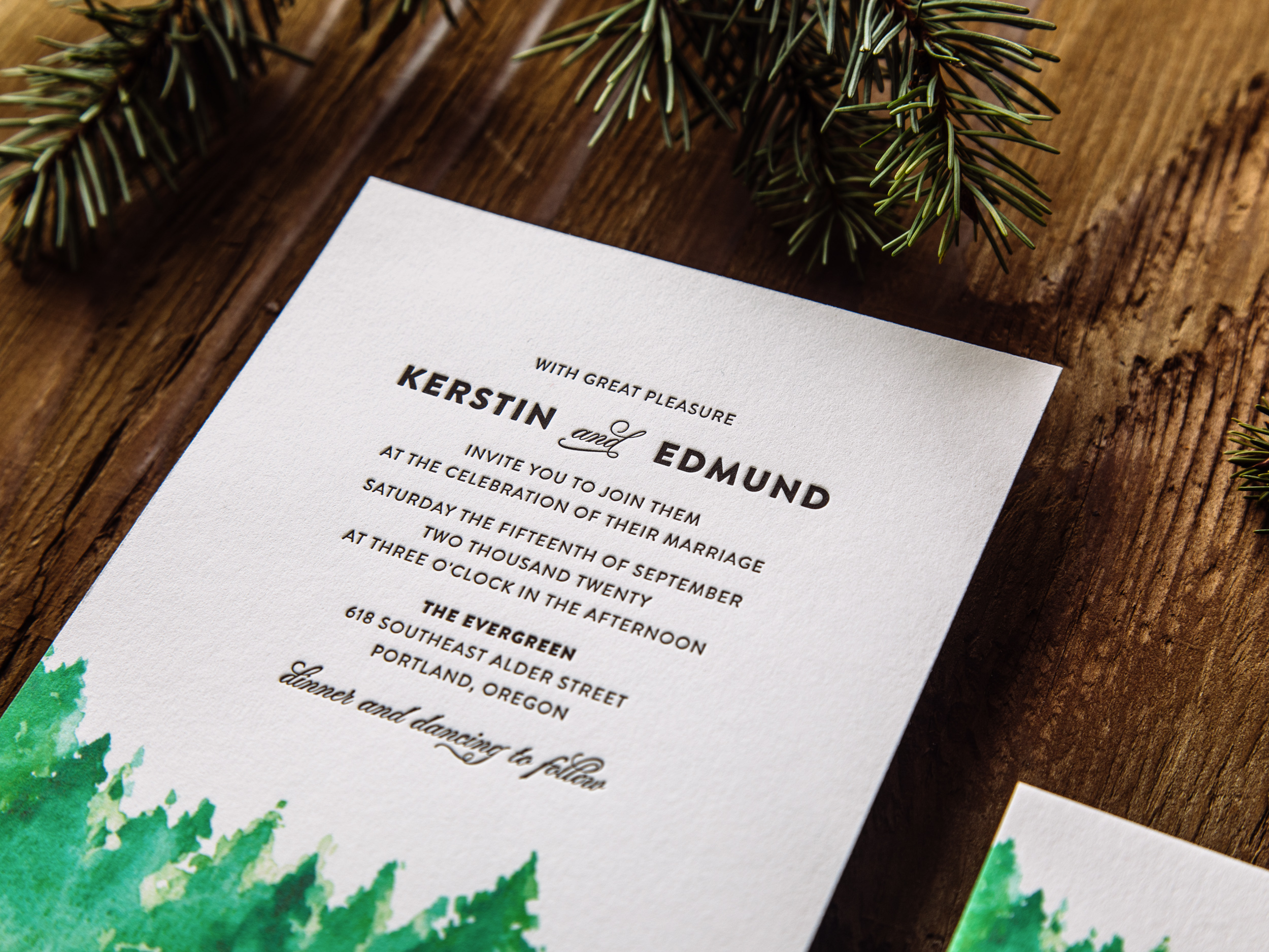
TIMBERLINE

Timberline pairs a soft matte inkjet-printed watercolor image with stark black letterpress type on our house cotton paper. Great for the Pacific Northwest, or anywhere pine trees are found. An inkjet run is priced the same as one letterpress ink, so the Timberline set is priced as a two-color design.
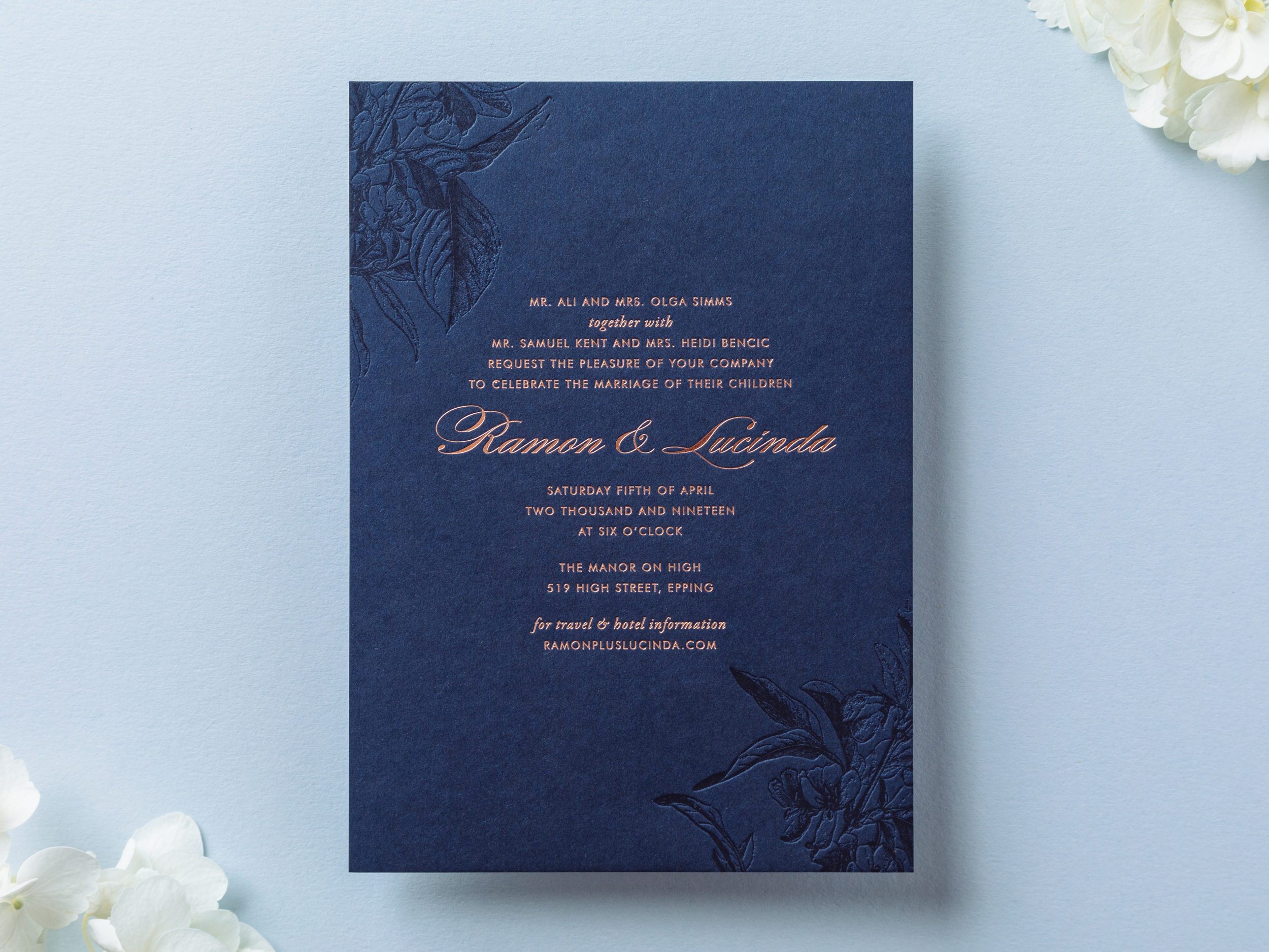
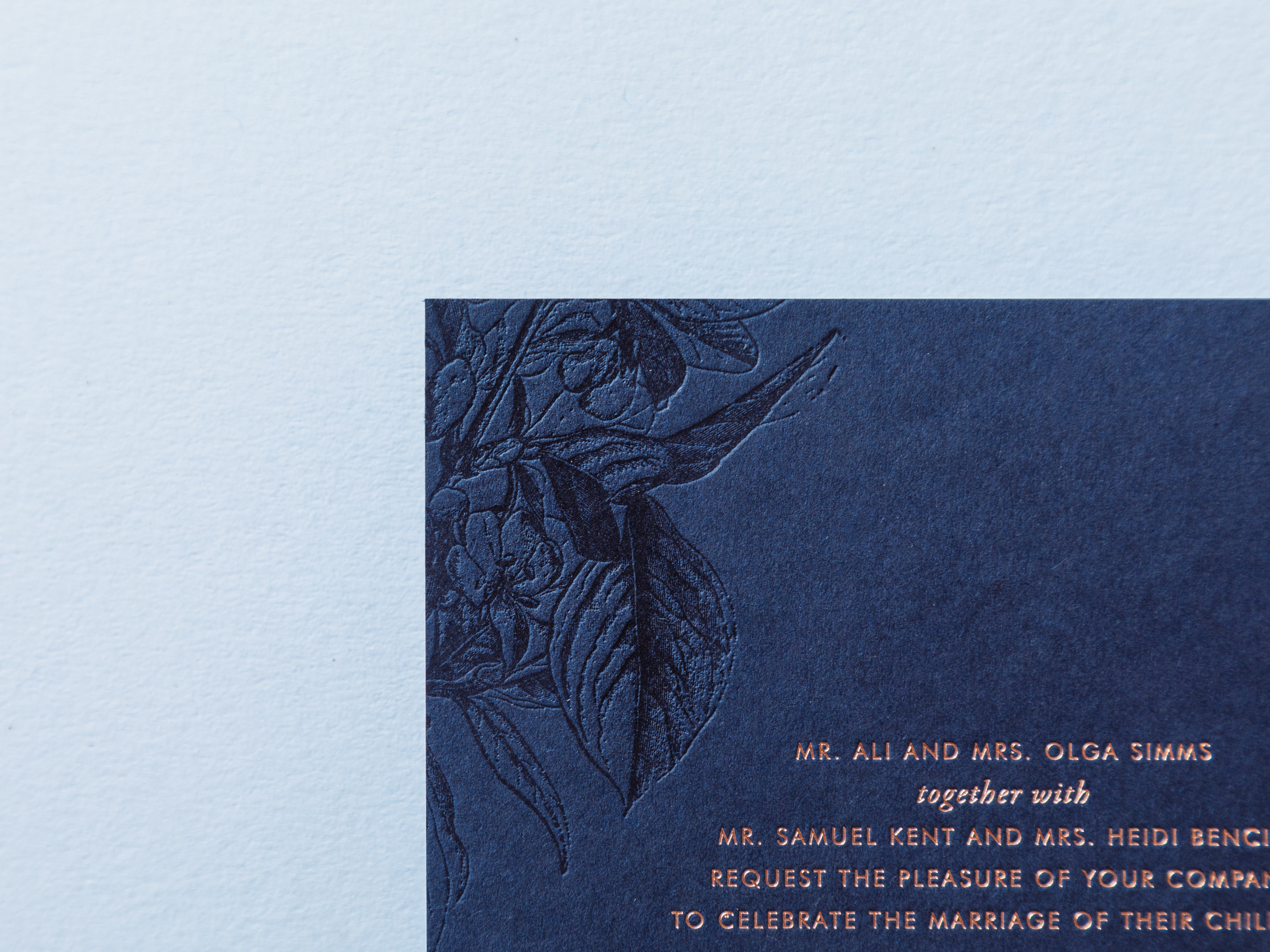
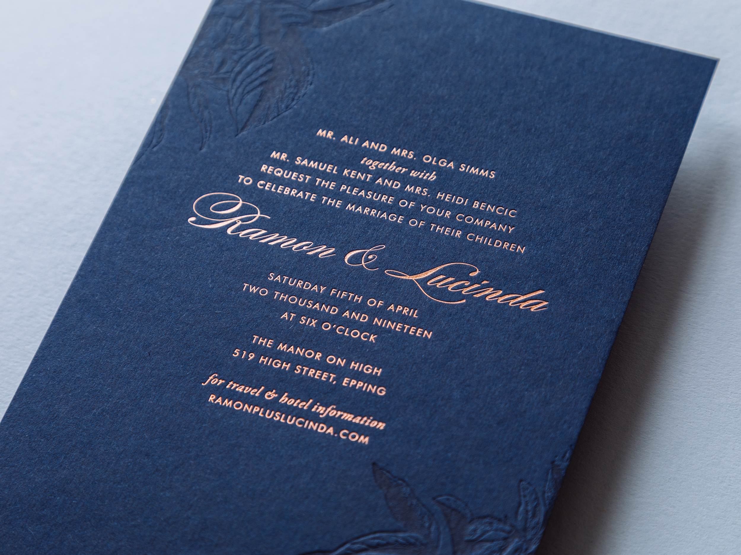
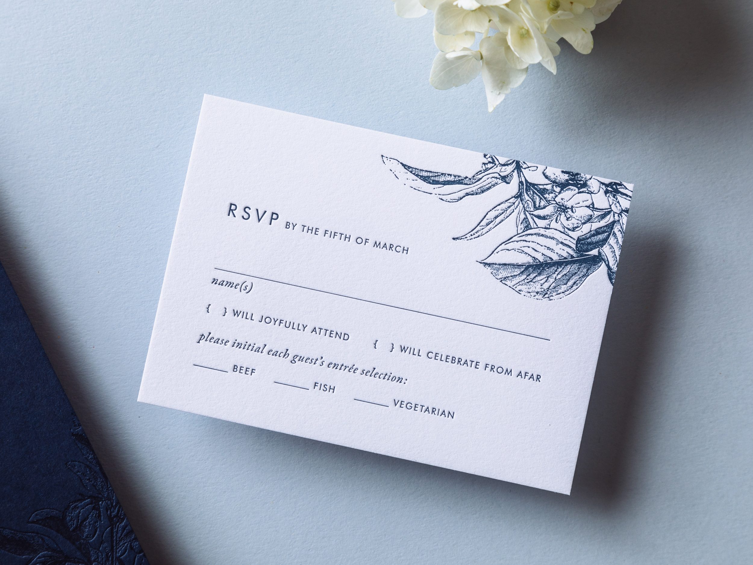
NIGHTSHADE

Tonal navy-on-navy letterpress cherry blossoms alongside rose gold foil text. This one can be adapted with other sorts of flowers too. Let us know what you have in mind! As with the Fern design, we can use either dark Parklife Colors paper or white cotton paper for the reply cards and envelopes (for easier writing).
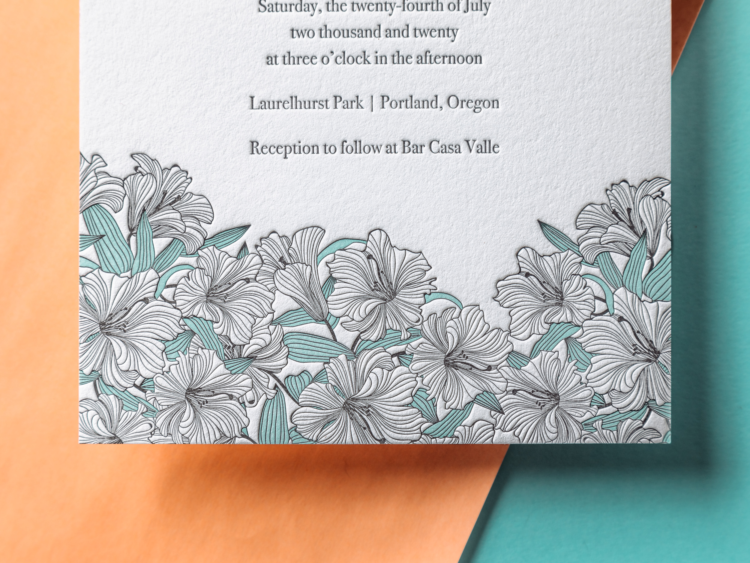
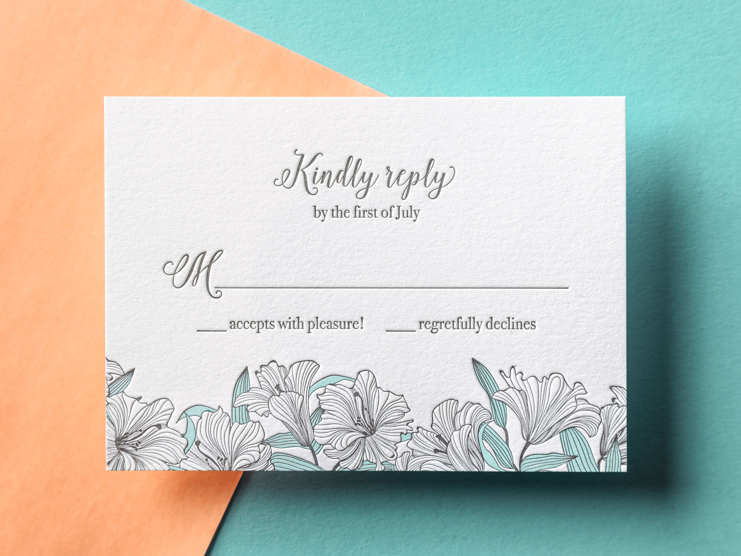
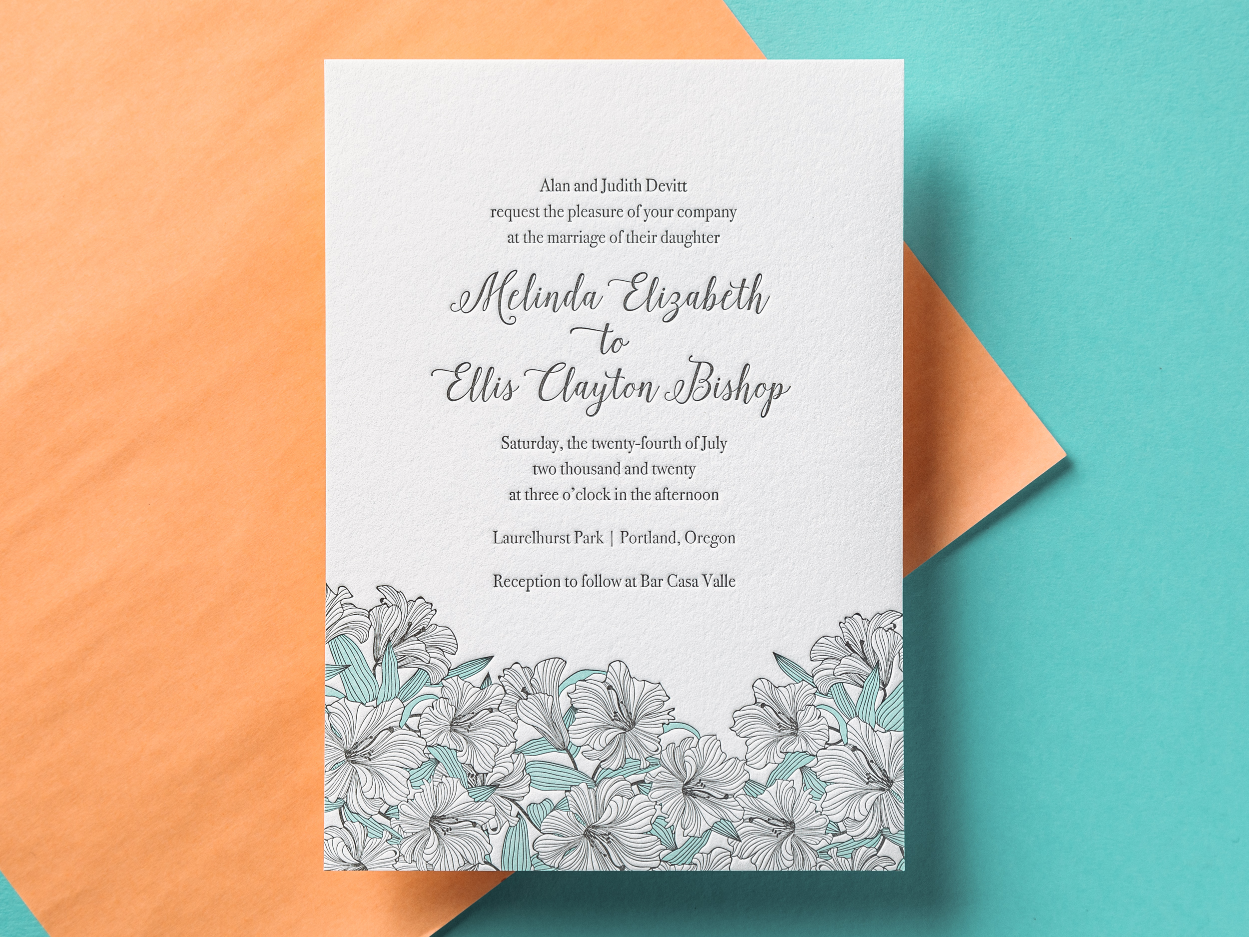
VERANDA

Airy, playful, and charming, our Veranda wedding invitation pairs nicely with any outdoor spring or summer event. If you like, swap out the seafoam ink for another light/bright color to suit your taste.
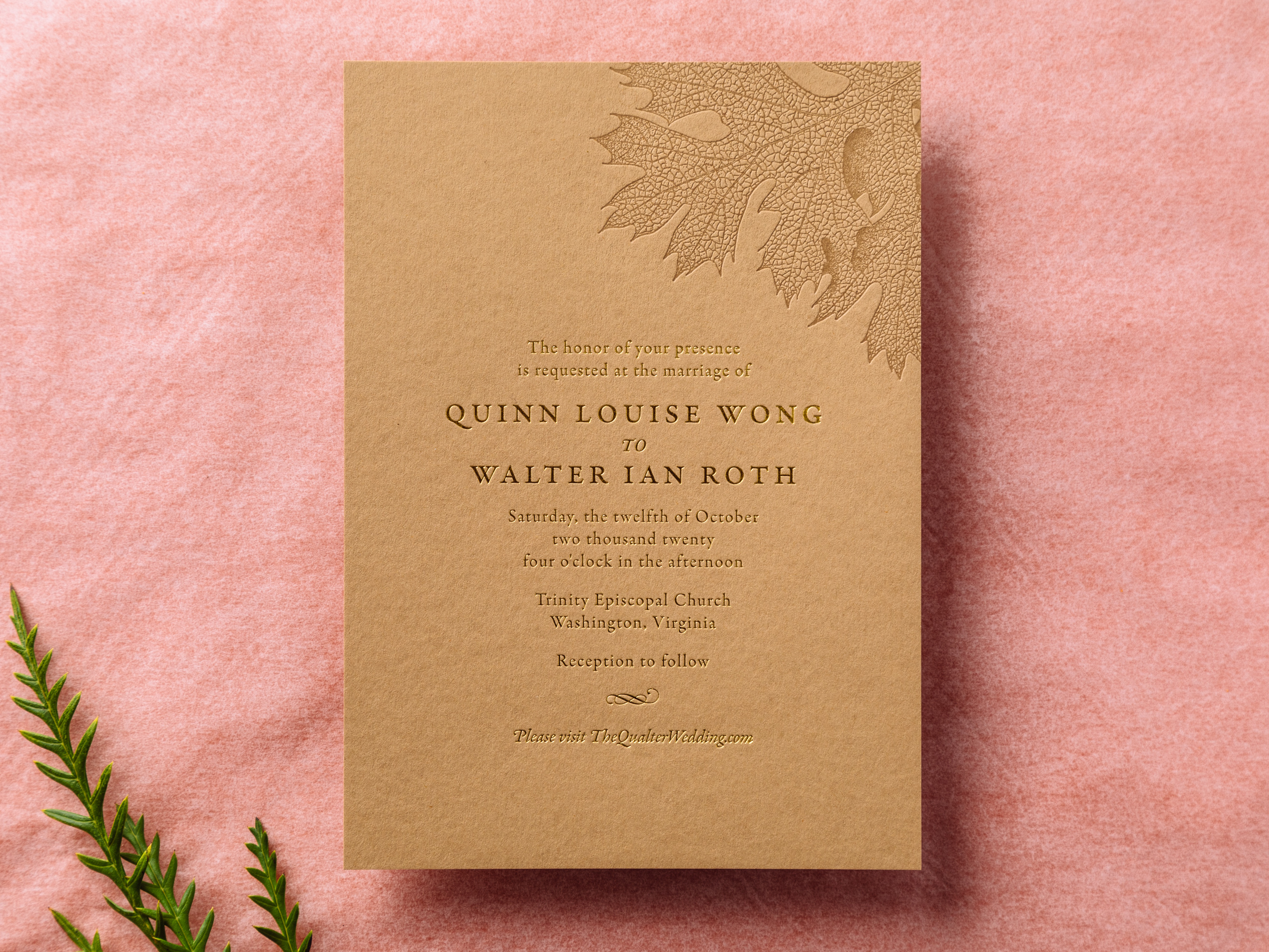
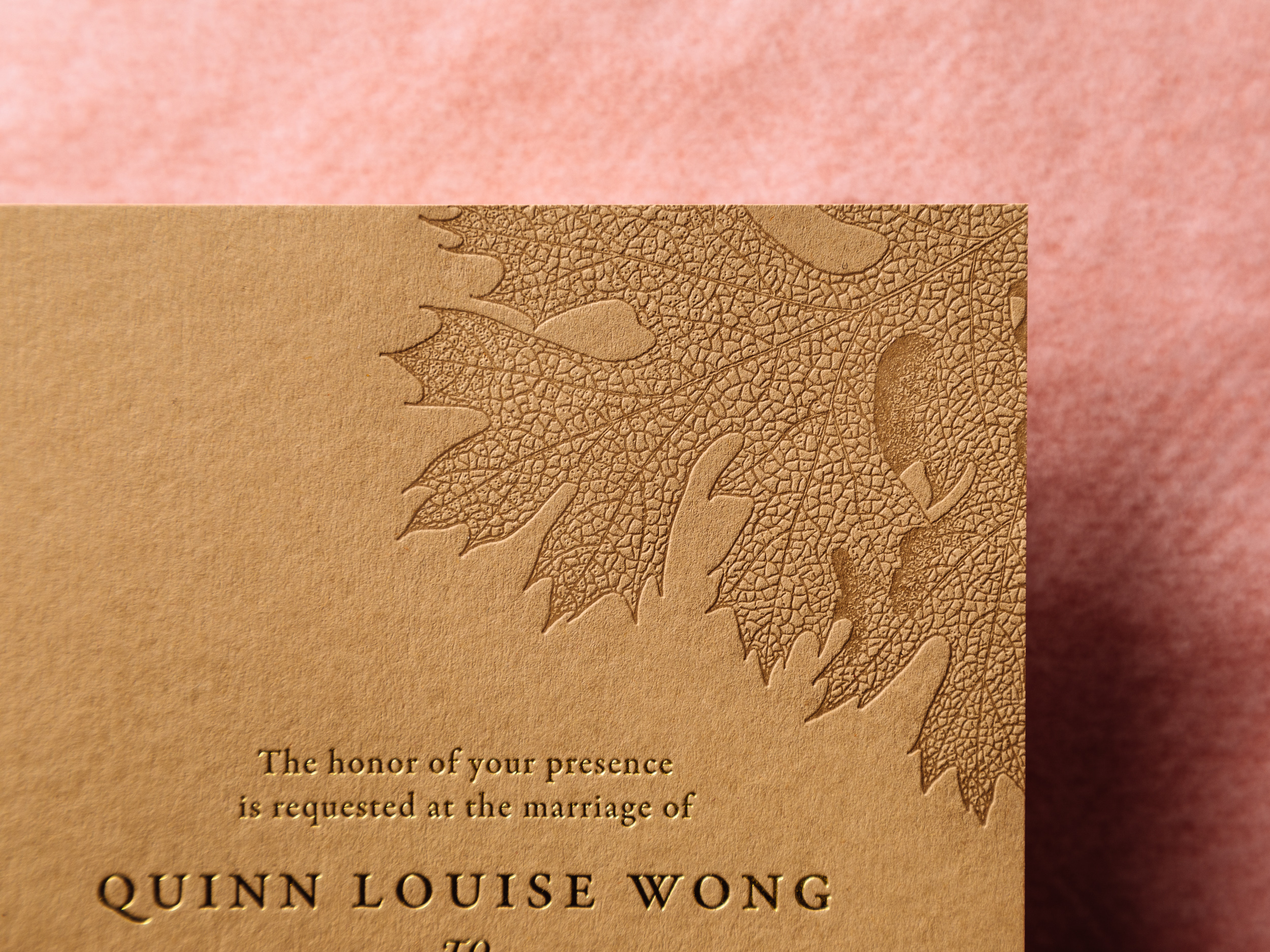
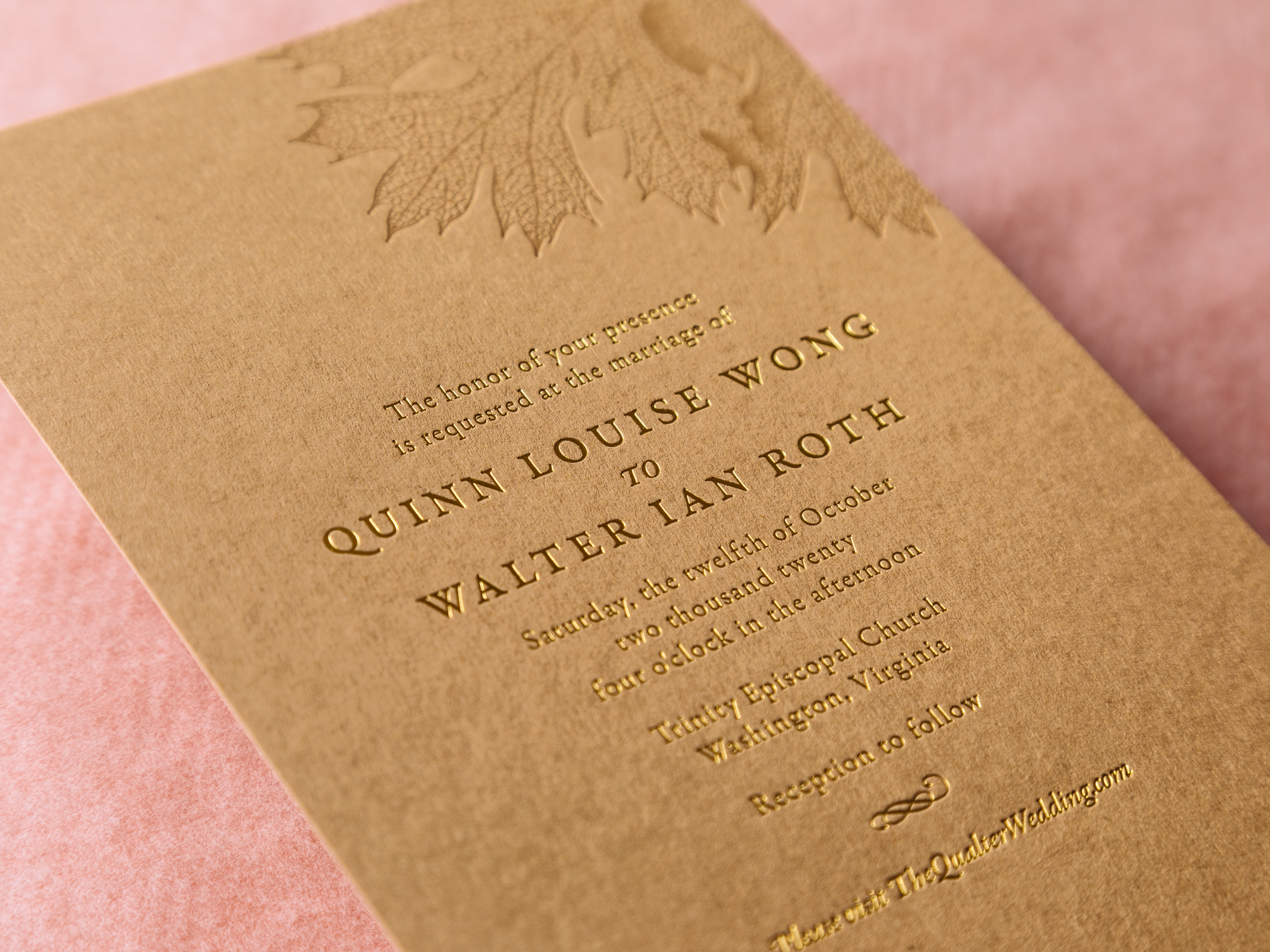
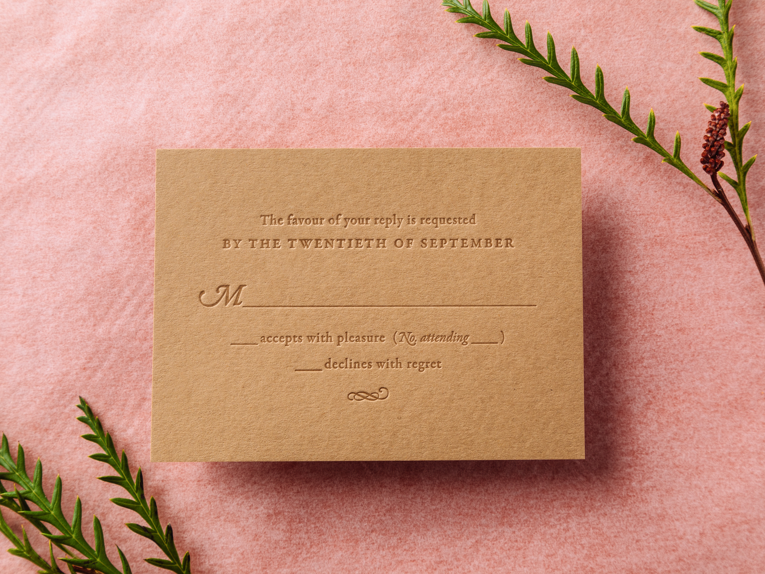
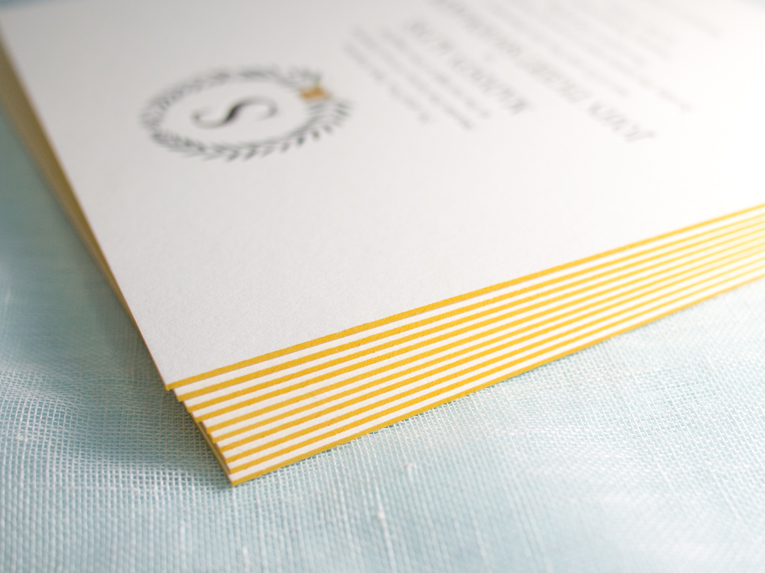
HARVEST

Gold Shine foil and Dust letterpress ink on 300g Harvest paper. The detail in the oak leaf on this one is amazing! Harvest is lovely with gold foil, but can also be printed with letterpress ink (Cocoa, Espresso, and Black are great options) and you'll save a little money. We can pair these with Harvest-colored envelopes or with our white cotton envelopes if you'd prefer.

Photos by Gritchelle
Tigers & Lemons

These oversized square invitations feature our Tungsten letterpress ink along with a digitally printed "tigers & lemons" wedding seal provided by the couple.

As they put it, “Tiger” is the bride’s term of endearment for the groom as he is the fourth Shoemaker to hold “Tigert” as his middle name. “Lemons” is the groom’s term of endearment for the bride as she is “the lemon to his lime.”

The invitation is printed on our thick 600g Pearl White paper with bright gold edge paint, and it's paired with a metallic gold liner. The typeface combo is great: All caps Bodoni with sans serif Neutra Book.

We also printed mini directions booklets using the same ink combo, but on our lighter-weight 300g stock.

New Parklife Invitation Style: Paige

Occasionally we design a custom invitation for a client, and we love it so much we decide to keep it for ourselves. This one, originally designed for Paige and Clayton's January wedding, will soon be added to Parklife's wedding collection.

The new Paige invitation set is printed with black ink and a blind impression on 300g Ecru White paper, paired here with a subtly metallic black envelope liner. Fonts are Neutra Caps and one of our favorite scripts, Parfumerie.

Ontario Blossoming

Gabriel & Aida saw two of our most popular wedding invitations, our Ontario and Blossom styles, and asked, "why choose?". Why not Ontariossom? Or Blosstario? 

With our help, they combined the modern typefaces and sleek black / white / silver color scheme of our Ontario style with the classic floral motif from our Blossom design.

A Mount Hood Wedding

Perhaps you saw our 2013 blog post detailing the underused letterpress technique of halftone screens. In short, we can use tiny dots and on-paper ink mixing to create the illusion of gradations and multiple ink colors.

For Robyn and Luke's Timberline Lodge wedding, we used just two inks (a very light gray and a dark blueish-gray) to create a photo-realistic image of Oregon's Mount Hood.

To accompany the invitation, we printed an info card with a tear-off reply postcard (this one with a halftone bird because, hey, put a bird on it), a small rehearsal dinner invite, and a custom woodgrain-lined envelope.