Mapping Napa
Nick and Hadley were drawn to the ever-popular Bookplate, and chose a color palette of fresh green paired with a soft gray (apple and dust inks). Their set included a map, custom-designed by Parklife Press, to guide their guests around the Napa Valley wedding events.
The set is comprised of three pieces printed on extra thick, 600g paper: an invitation, an RSVP card with a printed return envelope, and a map to the wedding site. The map shows both an overview of the area in Napa — with all-points directions and major roads — and a detail section of the Inn and resort grounds, noting entrance and parking areas and the specific reception hall.
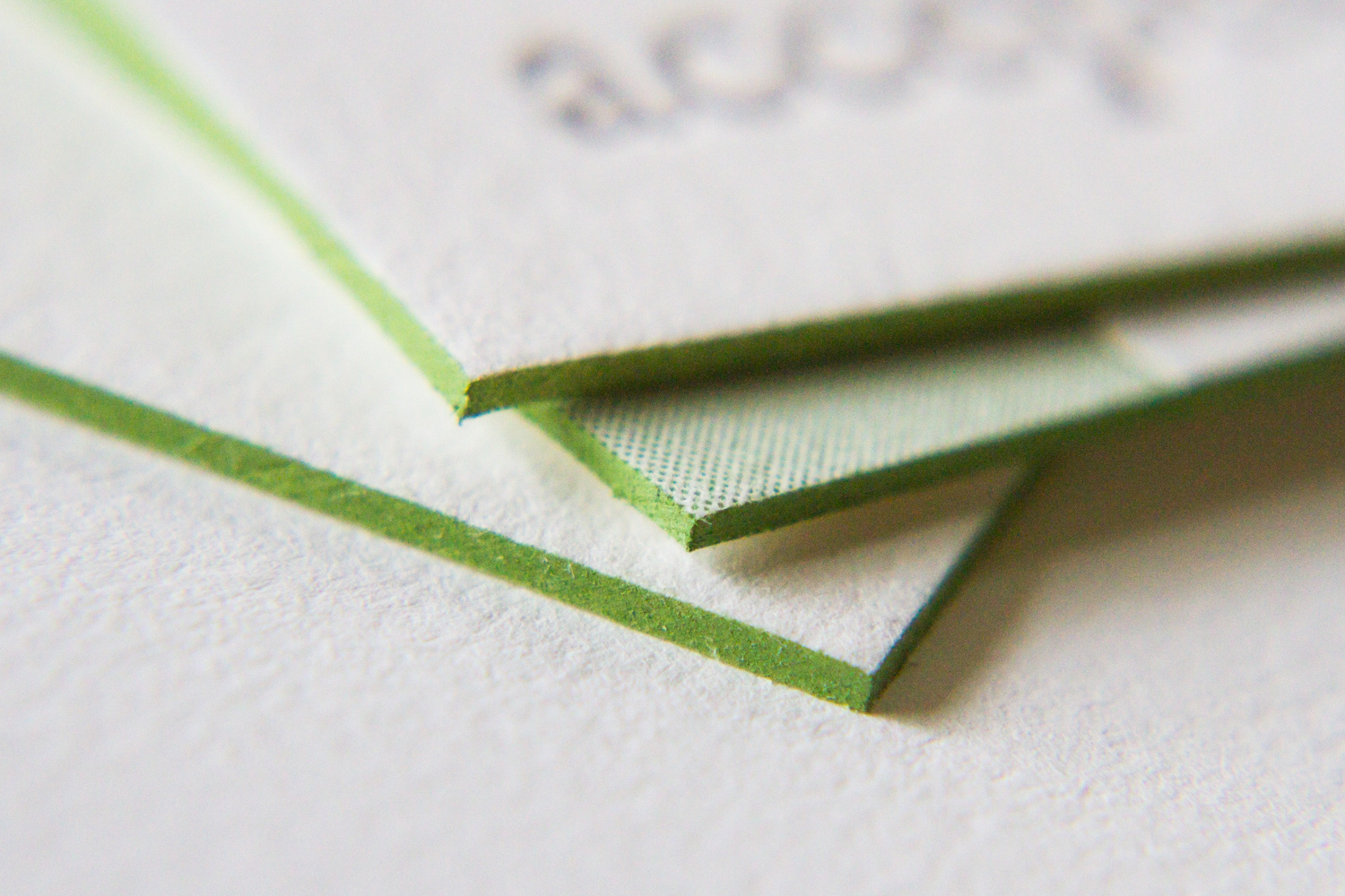
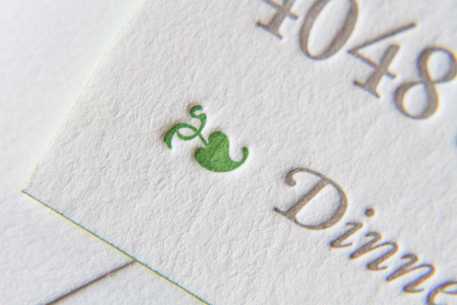
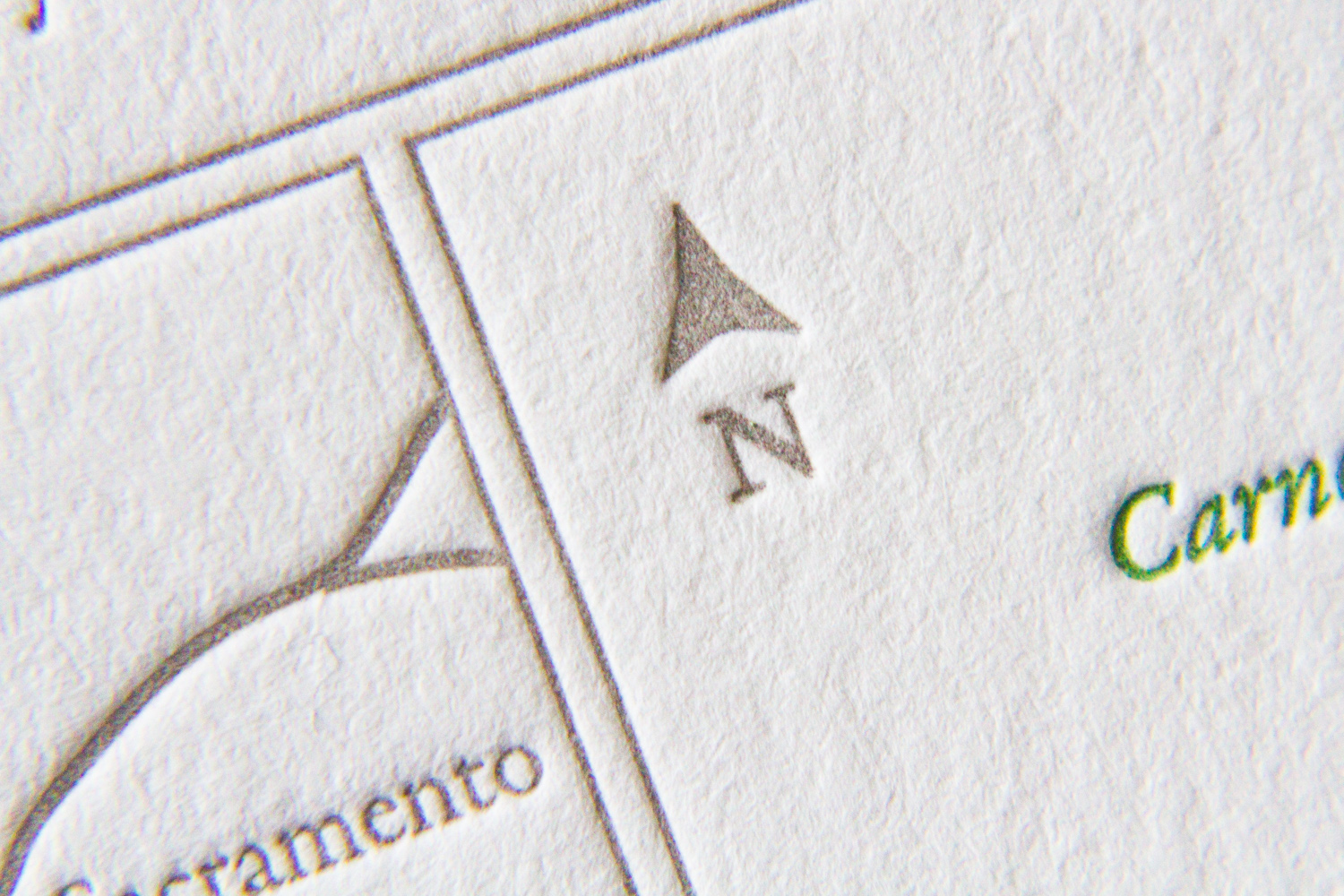
Bookplate has always been a popular style for Parklife Press; its clean, simple design — with plenty of white space — really highlights the beauty of the typography, and the color pop on the couple's names really draws the eye. And perhaps because the design is so elegant and uncluttered, the tiny flourishes pack a (visual) punch. Below, the edge painting on each the piece (the invitation, RSVP card, and map) shows off the extra-thick paper stock and unifies the color theme; the tiny green dingbat preceeding "Dinner to follow" draws attention to the reception note while adding visual interest; the typeface's blink-or-you'll-miss-them ligatures lend an old-world charm to a very modern design; and the extra-thin double rules on the map divide the sections in a beautifully understated way.
Bonus points for any fellow print nerds who noticed that our map design delivered two shades of green for the price of one, with the water — the Pacific Ocean, San Pablo Bay, and San Francisco Bay — shown in what appears to be a lighter tint. How did they do that, you ask? What alchemy have these mad geniuses wrested from their printing press? Short answer: a halftone screen. Longer answer here.


