Everyone has a smartphone, right? Or a car with some fancy navigation system? After all, it's 2014! Through the magic of satellites, people can just enter an address, then follow along as their moving-blue-dot avatars progress to their destination.
OK, for one thing — that isn't true. Smartphones are everywhere, but even if every last person had one, not everyone necessarily uses the map function with any regularity. But that isn't the point. What's most important: even the most sophisticated screen navigation can't include giant arrows pointing out tips and contextual information such as, "be sure to take the SECOND entrance into the country club for Kirsten's and Guillermo's reception! The parking is considerably more convenient, and the woodland paths — while charmingly rustic — can be tricky to navigate after dark!" Generalized maps can never provide such insights as, "please note that there is a guest block reserved in the hotel where Philip and Adam's reception is being held. If you were to stay there, you'd have a very short elevator ride from the ballroom to your hotel room. All other blocks reserved would involve a subway or cab ride between the open bar and your bed." A custom map and directions card gives an overview of the area, and it shows event-specific locations in relation to major landmarks.
As we discussed in recent post about wedding programs, it's best to keep your all your guests in mind when figuring out what information should be printed and shared. You can't show everything on a simplified, targeted map, but remember that you're mostly writing it for the out-of-towners. So even if the guest list for your Brooklyn wedding is heavily populated by your Park Slope friends, don't assume that all your guests will know what it means that your reception is at a restaurant in DUMBO. Your guests are going out of their way to come witness your milestone and celebrate your joy; for them, the high stakes of getting to the church on time (or to the meadow, or to the city-park pergola) are high. Especially in what may be — for any one of your guests — an unfamiliar place. A custom map can give guests an overview (literally) of the events' distance from major thoroughfares and airports and hotels, and that information can inform guests' travel and lodging decisions.
You can give an overview of a larger area, pointing out venue locations and listing addresses — like this one, above, showing the Mount Vernon area (with the Potomac River printed in a blue halftone screen).
Or you can show a tighter view, depicting a maze of city streets, like the one below.
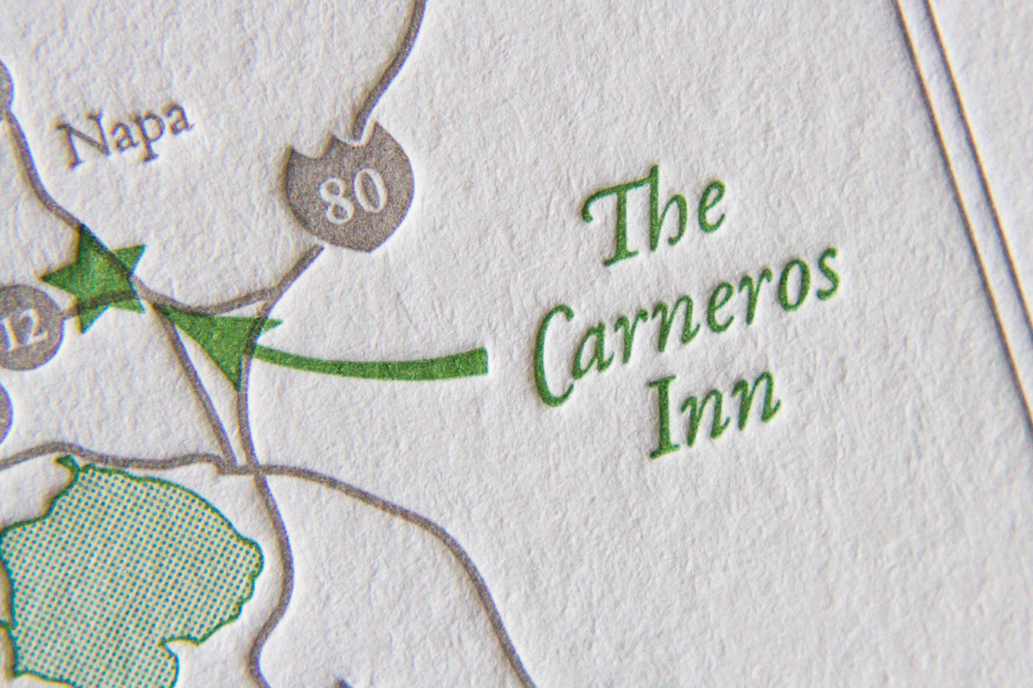
Or you could do both overview and detail inset. This one was was featured in a recent post, Mapping Napa.
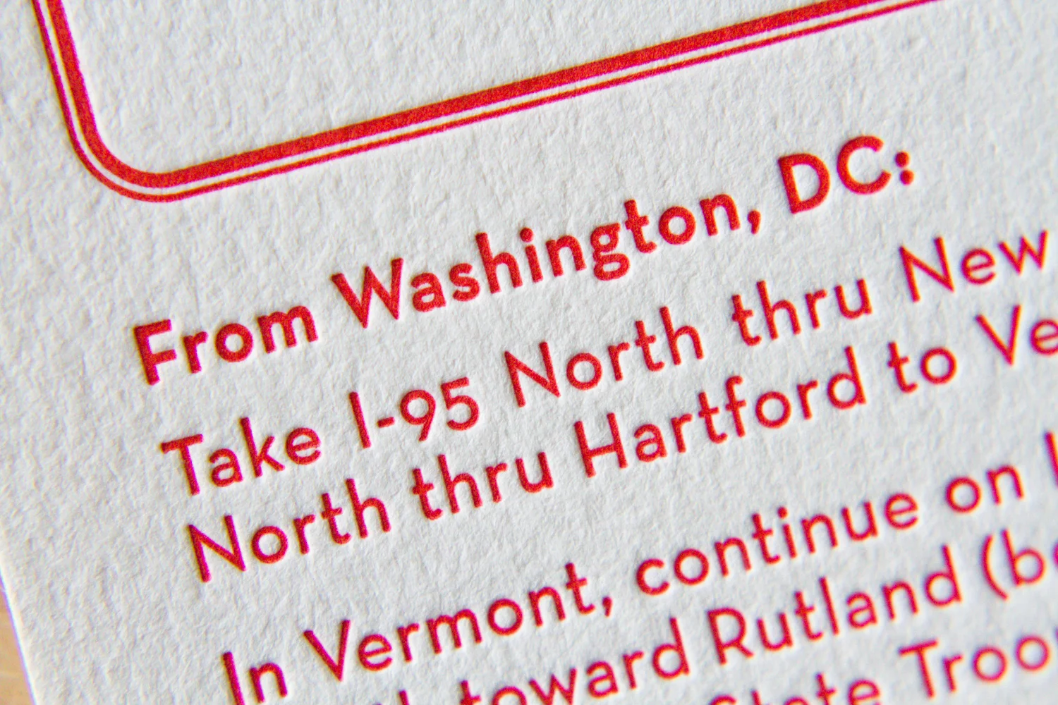
It's also very helpful, where space allows, to give written directions, or even list a URL where guests can find more information. (A wedding site, if you have one.)


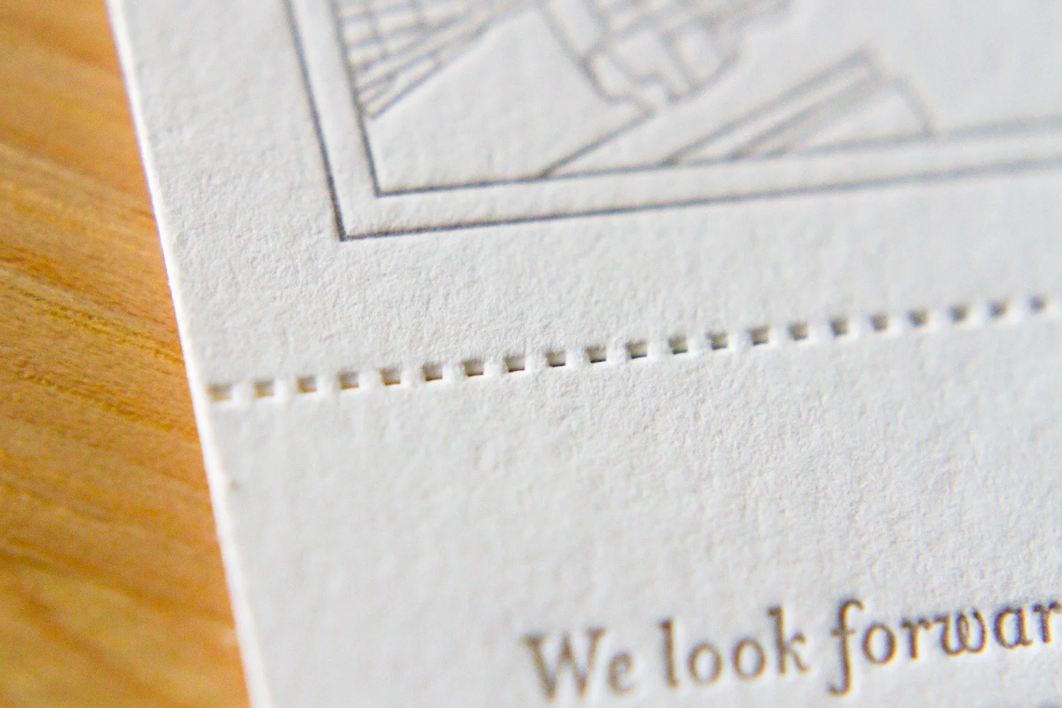
The clever piece below served two functions: it's a useful map including all the relevant venue locations and addresses, printed along with an RSVP postcard. The two sections are divided by a perforation — guests could tear the response card and mail it back, saving the map and events information for future reference.


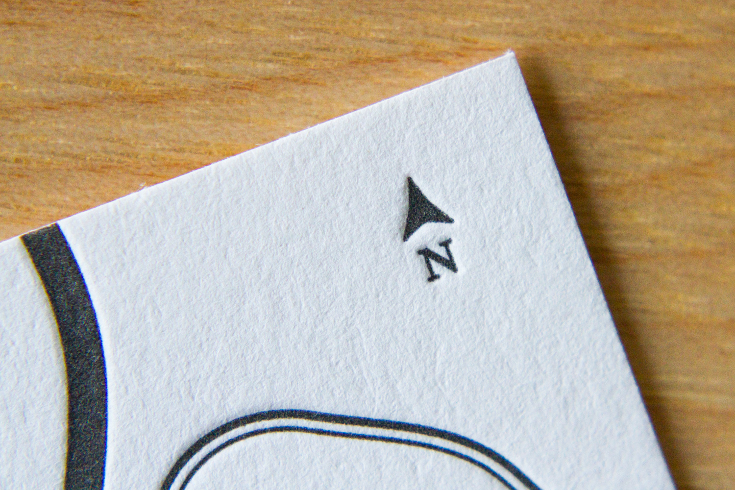
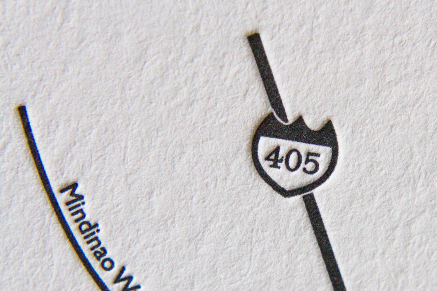
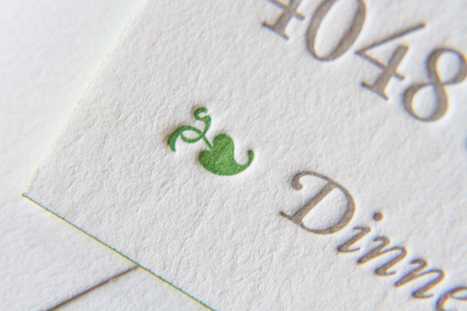
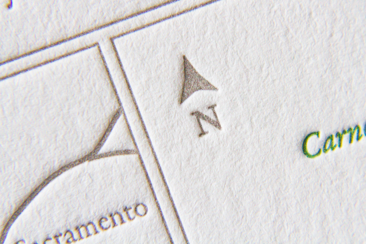
And did we mention it's a great design opportunity? Look at those sweet compass points! And those route markers and dotted rules! And the hearts and stars!
A nice custom map will look spiffy, and is a great courtesy to your guests.