This custom set is adapted from our Mount-Hood-inspired Peak invitation, but without the peak.
PAPER Oversized 300g Somerset Soft White
INK Tungsten & Dust
ENVELOPE LINER Dust

This custom set is adapted from our Mount-Hood-inspired Peak invitation, but without the peak.
PAPER Oversized 300g Somerset Soft White
INK Tungsten & Dust
ENVELOPE LINER Dust
Nick and Hadley were drawn to the ever-popular Bookplate, and chose a color palette of fresh green paired with a soft gray (apple and dust inks). Their set included a map, custom-designed by Parklife Press, to guide their guests around the Napa Valley wedding events.
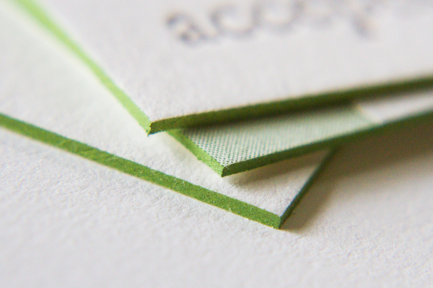
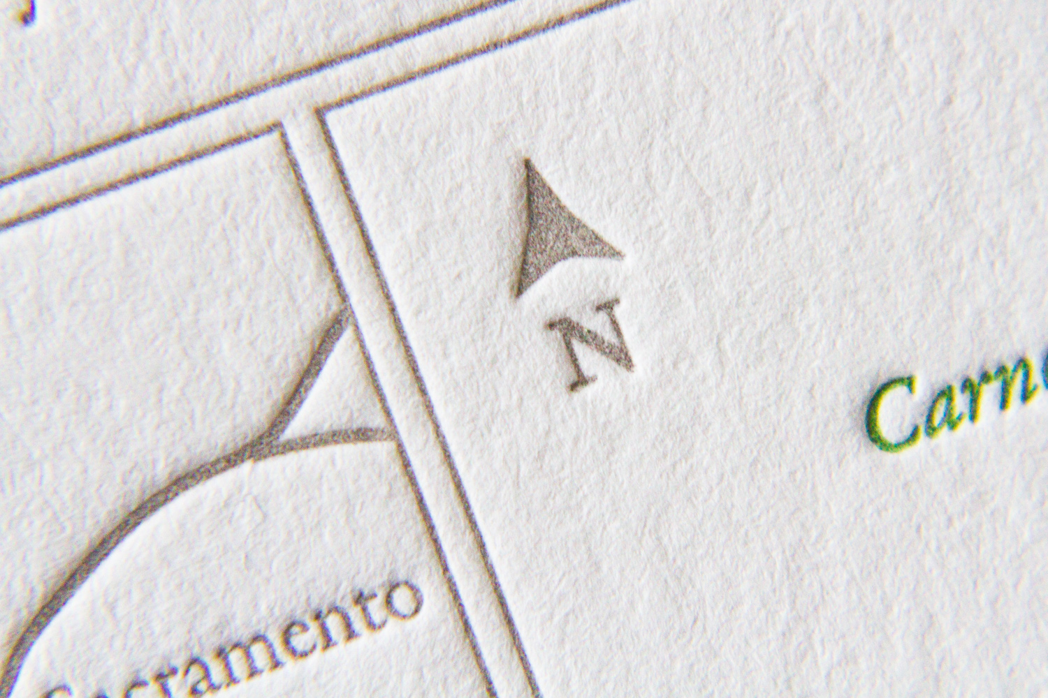
The set is comprised of three pieces printed on extra thick, 600g paper: an invitation, an RSVP card with a printed return envelope, and a map to the wedding site. The map shows both an overview of the area in Napa — with all-points directions and major roads — and a detail section of the Inn and resort grounds, noting entrance and parking areas and the specific reception hall.
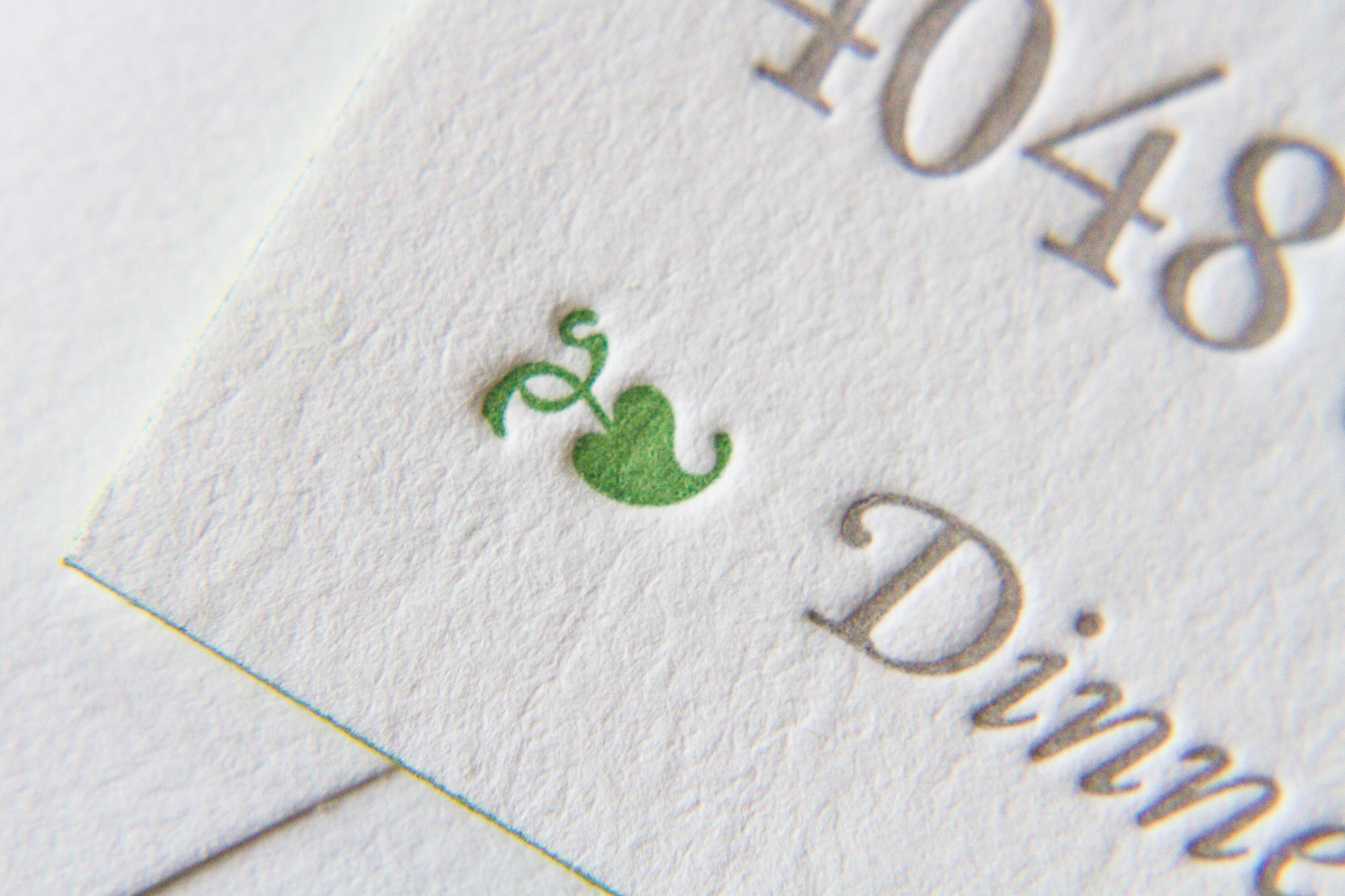
Bookplate has always been a popular style for Parklife Press; its clean, simple design — with plenty of white space — really highlights the beauty of the typography, and the color pop on the couple's names really draws the eye. And perhaps because the design is so elegant and uncluttered, the tiny flourishes pack a (visual) punch. Below, the edge painting on each the piece (the invitation, RSVP card, and map) shows off the extra-thick paper stock and unifies the color theme; the tiny green dingbat preceeding "Dinner to follow" draws attention to the reception note while adding visual interest; the typeface's blink-or-you'll-miss-them ligatures lend an old-world charm to a very modern design; and the extra-thin double rules on the map divide the sections in a beautifully understated way.
Bonus points for any fellow print nerds who noticed that our map design delivered two shades of green for the price of one, with the water — the Pacific Ocean, San Pablo Bay, and San Francisco Bay — shown in what appears to be a lighter tint. How did they do that, you ask? What alchemy have these mad geniuses wrested from their printing press? Short answer: a halftone screen. Longer answer here.
Emily found Parklife Press through the wedding-planning site Snippet and Ink. A librarian and archivist by trade ("I totally geek out for all things paper"), she loved the idea of of letterpress for their invites.
She also loved the simplicity of the Bookplate design in particular. She felt the painted edges were "an amazing, thoughtful touch," and that the look "really conveyed everything I wanted our wedding day to be."
The invitation set featured a simple, text-based design which was printed in the dust ink, with azure accents. The couple carried the dust and azure colors through to the rest of the wedding. One of the bridesmaids, a graphic designer, created programs and menus using the same color scheme. And the bridal party members all were garbed in shades of blue, including the bride — her gown was a very pale tint of their signature color.
Emily adds that she and Sean got "about a billion" compliments on the invitation. "I have a copy of it framed in our apartment. Every time I see it, I get a thrill."
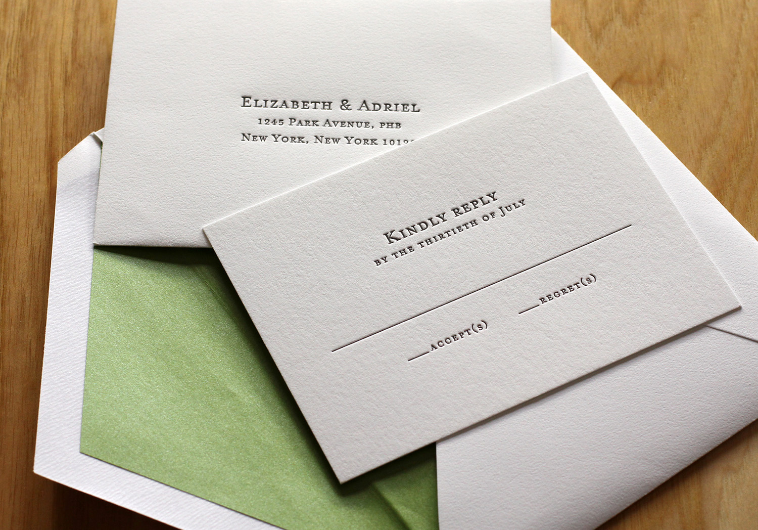
After seeing the Parker invitation design featured in Martha Stewart Weddings, Liz and Adriel were drawn to the classic look of the invitation. They knew they wanted letterpress invitations; in Liz's words, they were "choosing to send physical invitations in a digital world," so the texture of the imprinted text and the feel of the paper was critical to their selection.

The couple chose a minimalist response card so that guests could add personal notes and unique replies. They received lovely good wishes, drawings and jokes from loved ones; the response cards became keepsakes. They personalized the design of the invitation by adding their names in Hebrew (offset from the main text in Dust ink). The invitations were edged in Grass and the envelopes were lined with a matching metallic paper. The green and white matched their wedding colors and flowers. Finally, the couple ordered simple, elegant cards to be used as thank you notes after the wedding.