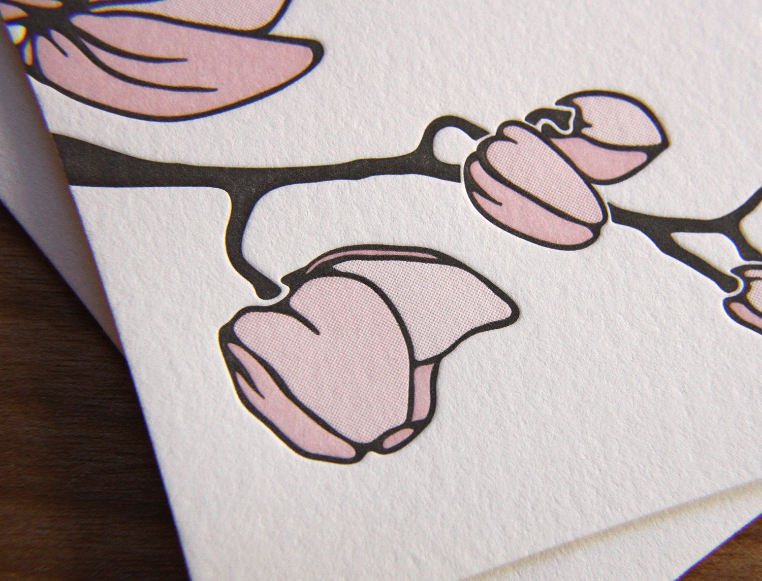
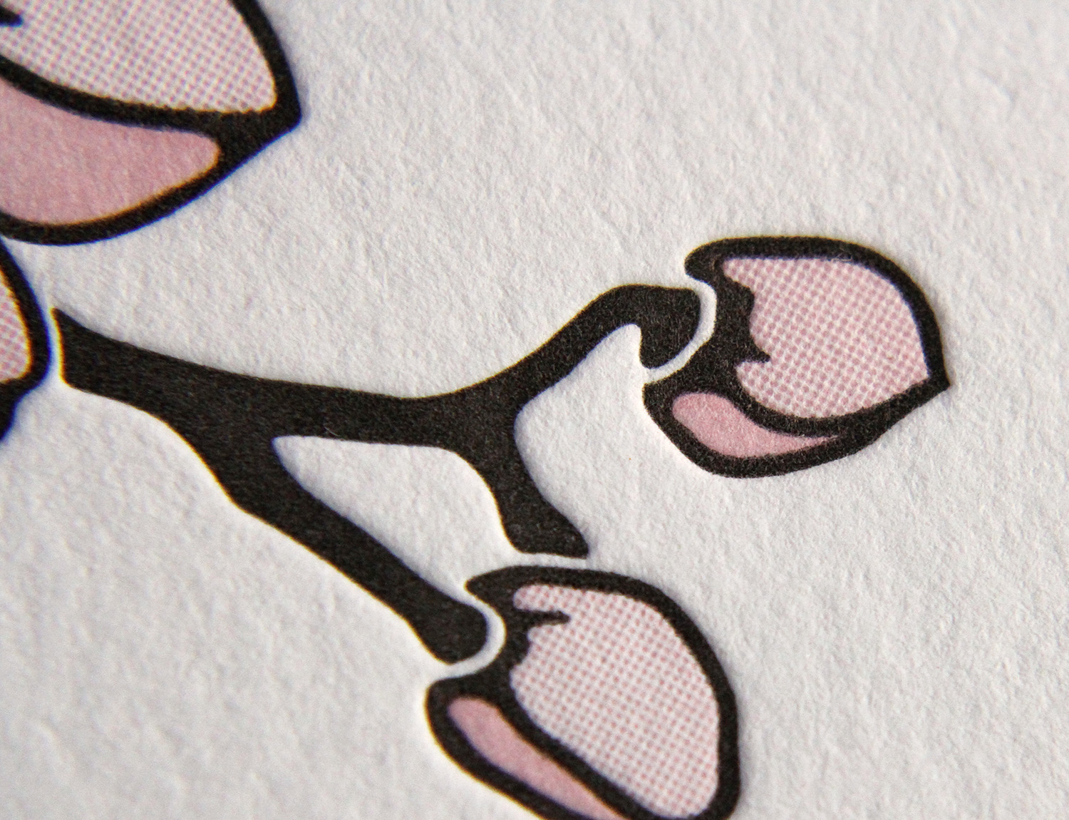
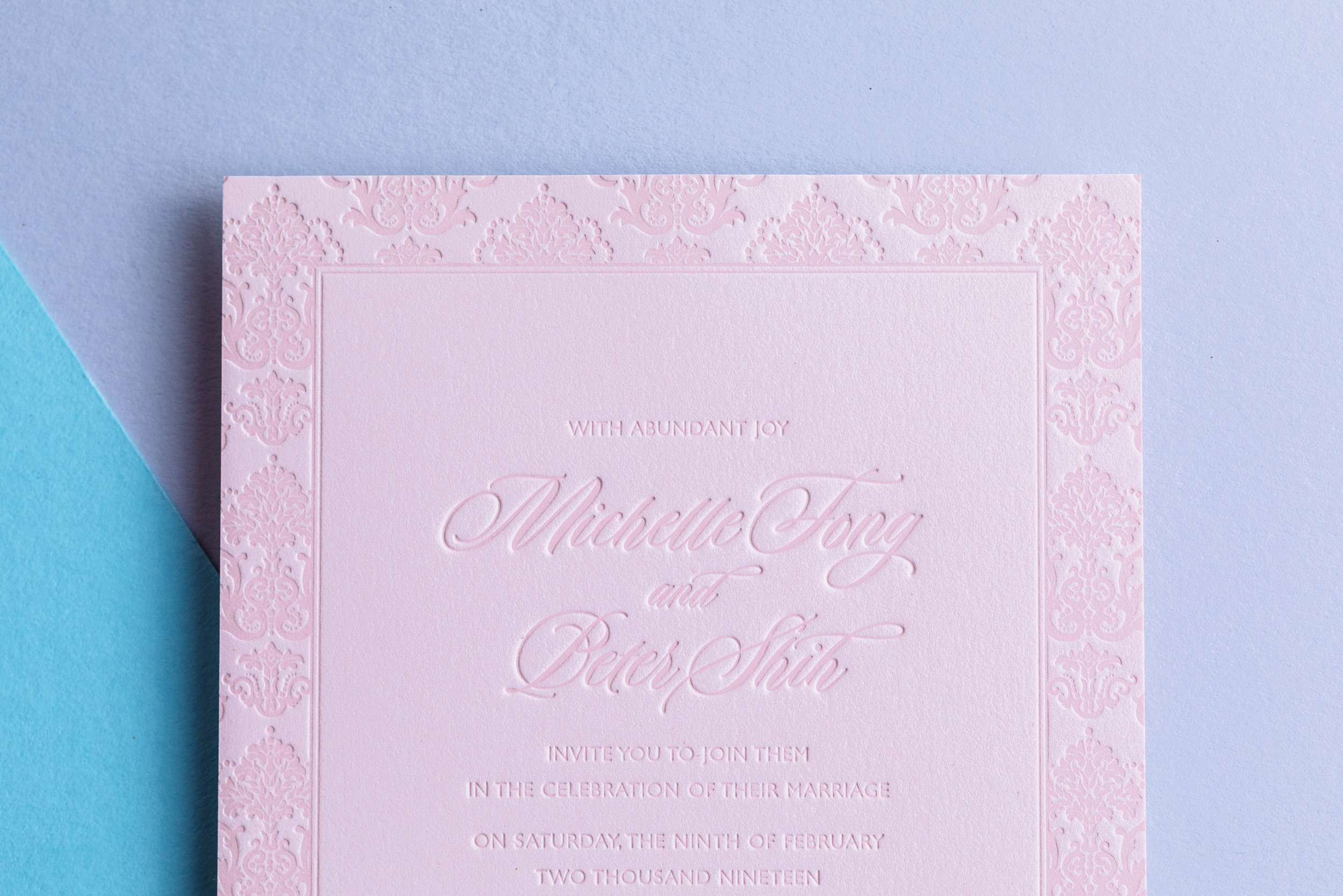
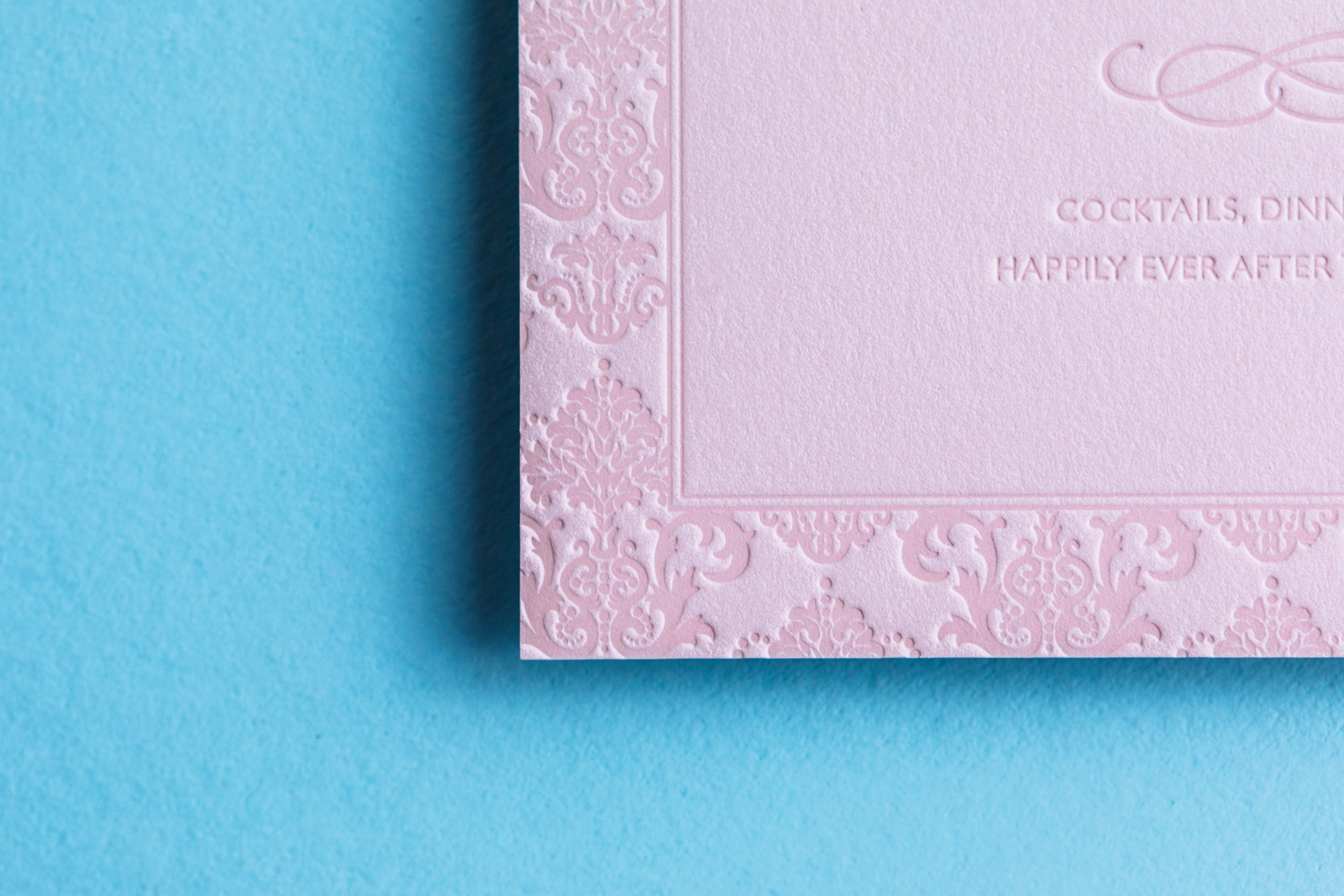
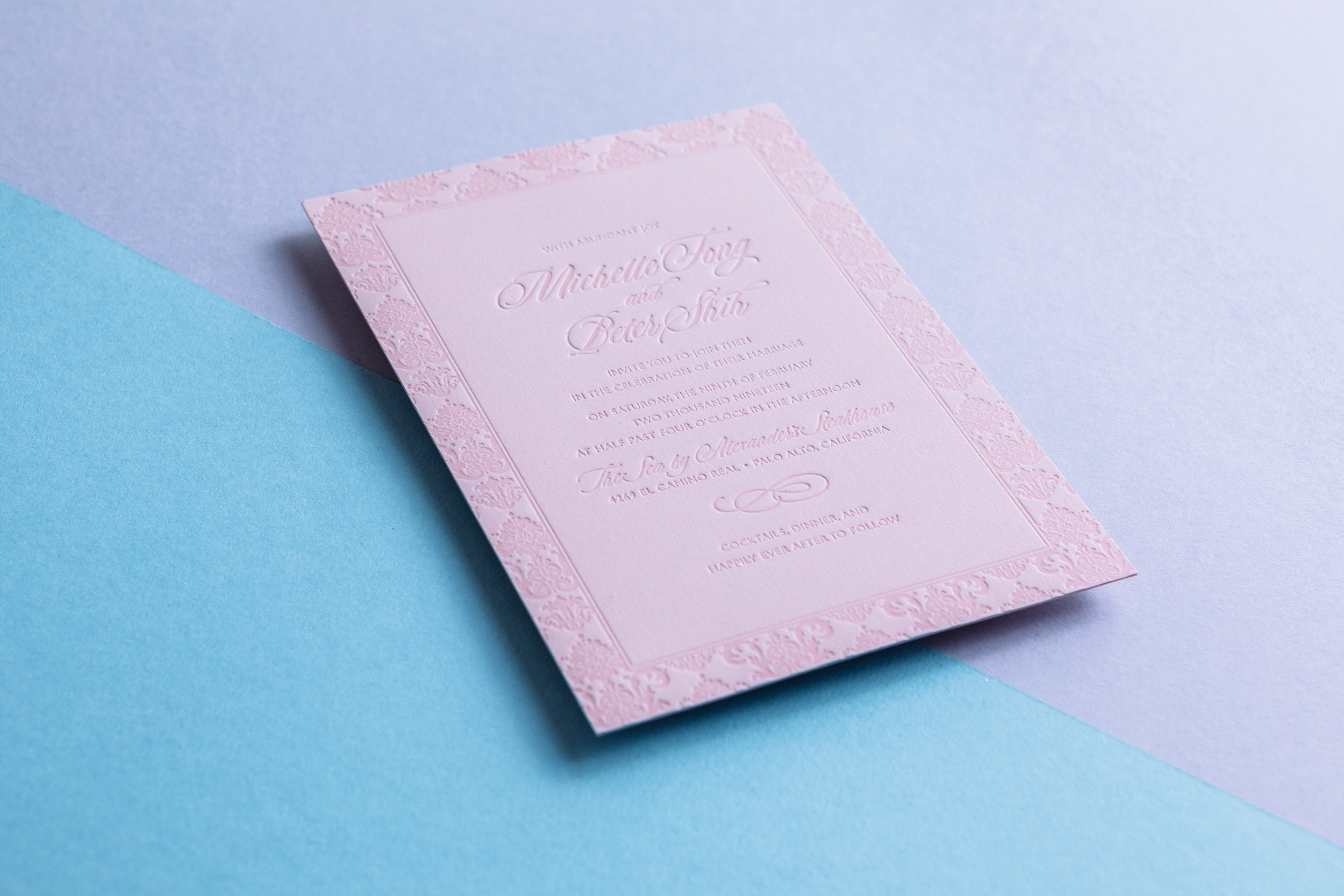
This is a custom adaptation of our Belvedere invitation design. Super-subtle pink-on-pink with Duende and Gill Sans type.
PAPER Custom duplexed 640g Pink Strathmore Impress
INK Blush
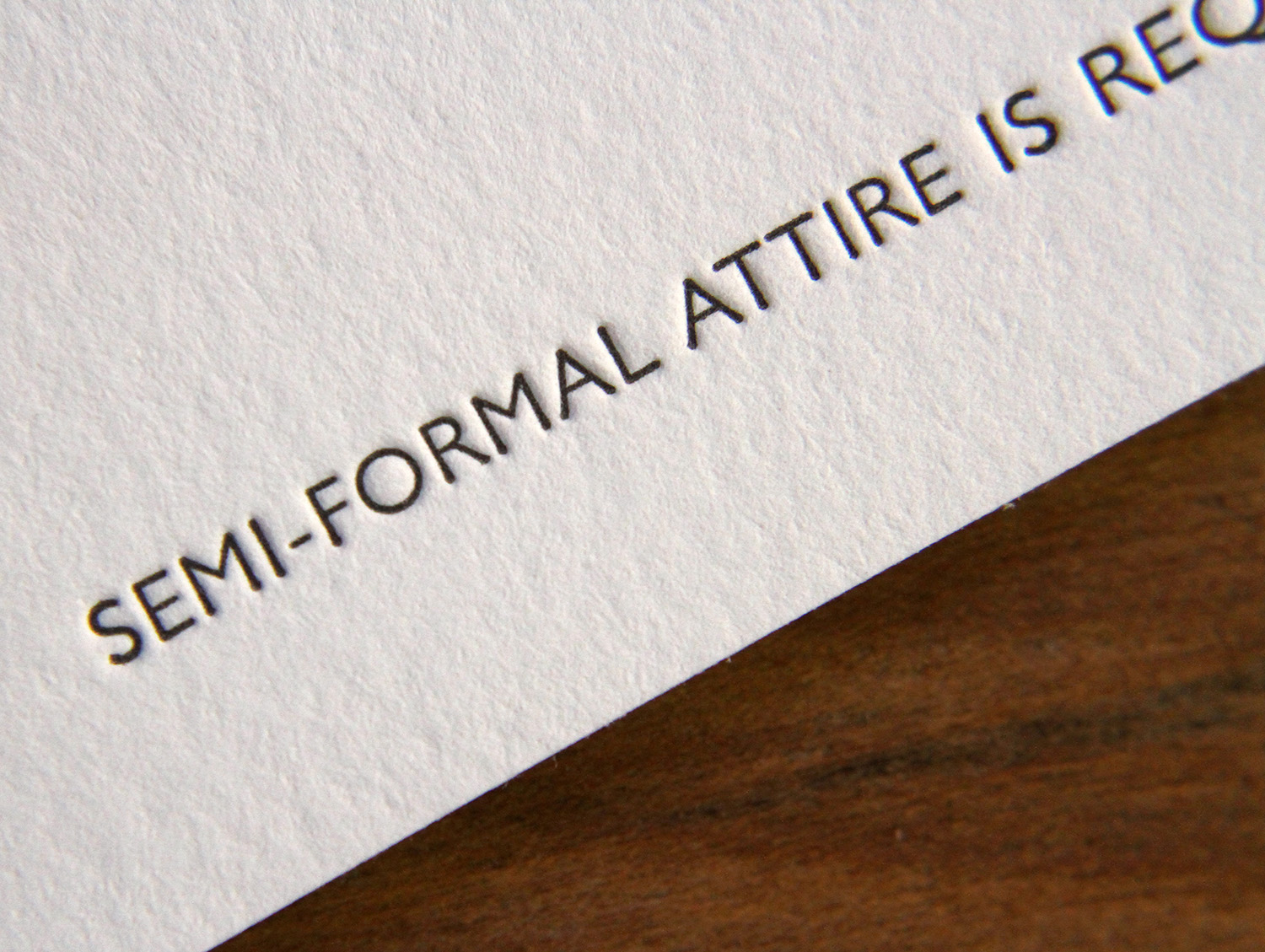
TYPE Duende, Gill Sans Caps
Photos by Gritchelle