Posts tagged halftone screen
A Mount Hood Wedding

Perhaps you saw our 2013 blog post detailing the underused letterpress technique of halftone screens. In short, we can use tiny dots and on-paper ink mixing to create the illusion of gradations and multiple ink colors.

For Robyn and Luke's Timberline Lodge wedding, we used just two inks (a very light gray and a dark blueish-gray) to create a photo-realistic image of Oregon's Mount Hood.

To accompany the invitation, we printed an info card with a tear-off reply postcard (this one with a halftone bird because, hey, put a bird on it), a small rehearsal dinner invite, and a custom woodgrain-lined envelope.

Lavender & Mint in Scappoose

Here's a lovely wedding set for Parklife's favorite brother and his favorite new wife. For the save the date we used two custom inks on thick 600g ecru paper.

For the invitations, we carried through the same inks, paper, along with a few variations on the Gotham typeface.

On the back of the invitation we added a hand-duplexed backing that's letterpress printed with a tonal ink and a fine halftone screen. The image is adapted from an early nineteenth century drawing of Portland.

Photos by Sarah Arneson
Shades of Blush

David and Allyson's invitation set was based on Petal, which features an original illustration by Parklife Press. The text, set in all-caps Gill Sans, is set off by the lightly-flourished script of their names. The asymmetry of the single, flowering branch — printed in tungsten and blush inks — provides a fresh and cheerful balance to the clean and modern design.

The branch design from the invitation was carried through on the RSVP card.

Letterpress is typically created with solid areas of ink impressions using individual, premixed colors. But here, by using halftone screens (read our post about letterpress and the halftone process here), three shades of pink were achieved using only one ink. This branch of blooming buds would still be pretty with solid, 100%-strength blush ink, but the design would lack depth; it wouldn't be as delicate, or as interesting.

Letterpress and Halftone Screens

What prints best with letterpress? The short answer is: Text, line art, and fairly small areas of solid color.

A few typical examples...

Does that mean you can't use tints of your chosen ink to create shading within one design? Or do color mixing of any kind? Not at all. It just requires a different kind of printing preparation: a halftone screen. This means taking artwork that has shading or gradations and converting it to a pattern of dots. The patterned screen allows the printer to mimic lighter shades of the same color, or to combine inks in layers to create the appearance of blended colors.

Below, brown and red inks are used for one of Pinehurst's Christmas cards, which is printed each year by Parklife Press. The two inks are used at 100% everywhere except the illustration's background, where a lighter shade of the red was needed to create a soft, peaceful night sky.​ We could have printed this as a third ink color, but it would have added to the cost.

There are many different patterns of halftone screens, but the simplest is a grid of evenly spaced dots. Smaller dots are further away from each other (thus have more white space between them), creating the appearance of a lighter shade of the ink's full color. The dot size changes, but grid stays the same. So the larger the dot is, the closer to each other they appear … like cookies that melt into each other when placed too close together on a pan. The blank space between gets smaller and smaller, resulting in an overall darker appearance of color.

Our new Petal invitation (shown below) uses two inks — yellow and brown — but through halftone screens, it has the appearance of three shades of yellow. The shading gives the artwork a depth and a softness that wouldn't have been possible using only 100% yellow for the blooms.

Likewise, this invitation set uses black and a deep red for the text, which looks striking together with the paper color. But the cherry blossom illustration would have lost something if it didn't show a range of pinks in the flowers' petals. 

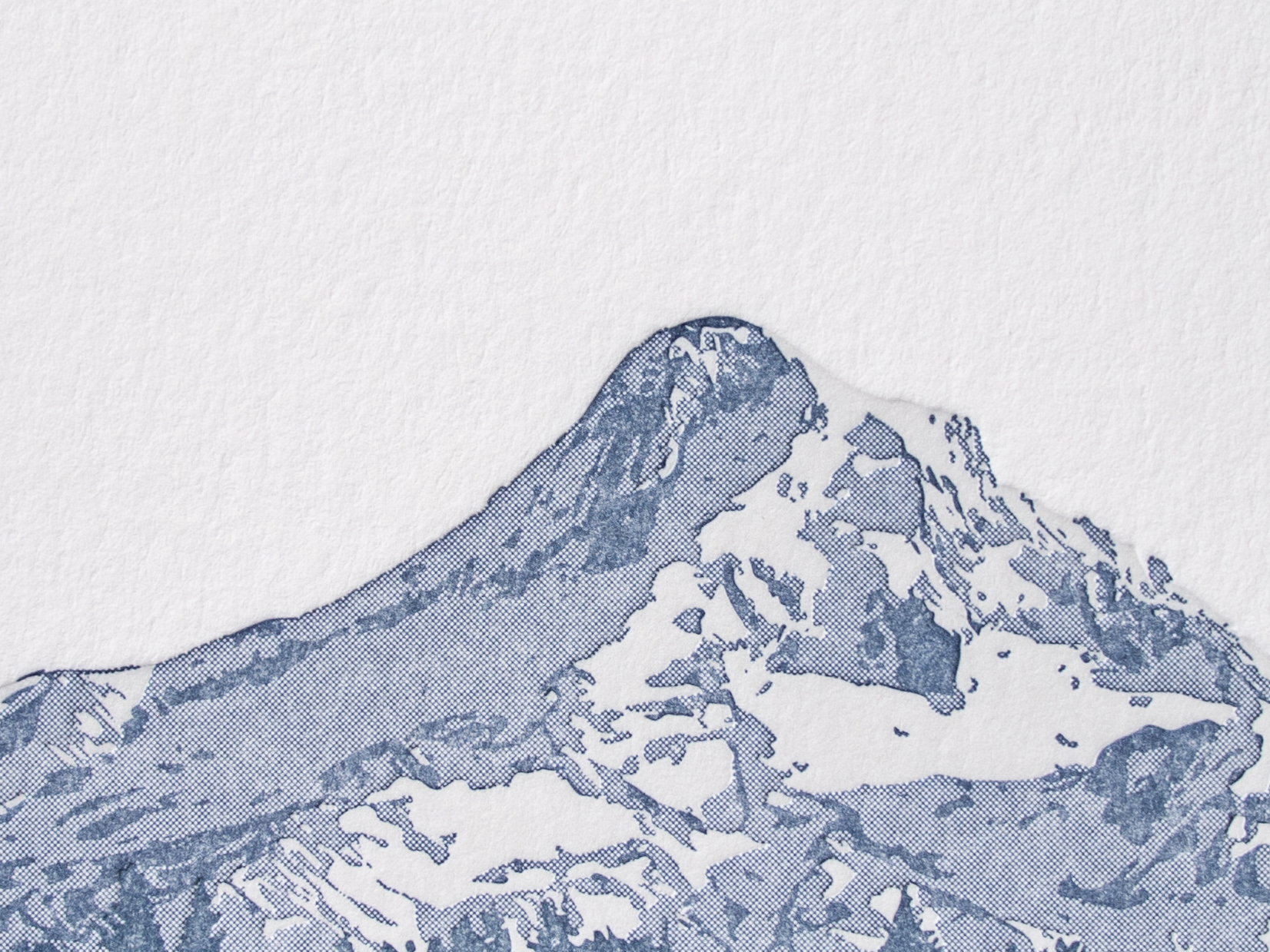
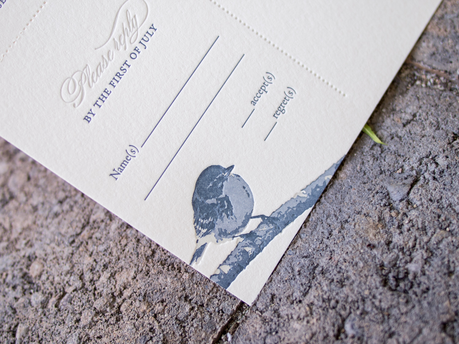
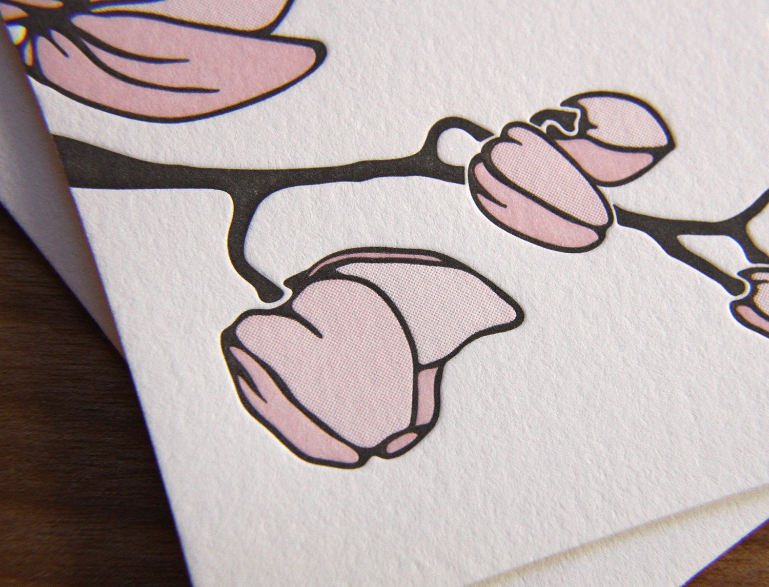
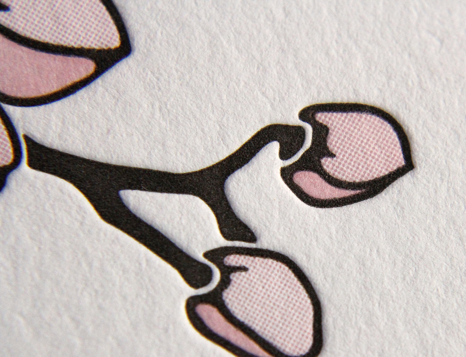
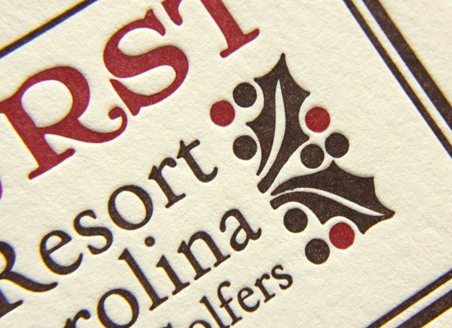
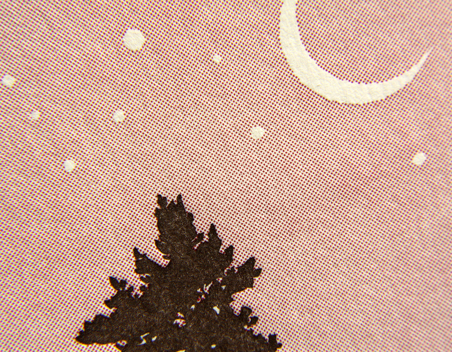
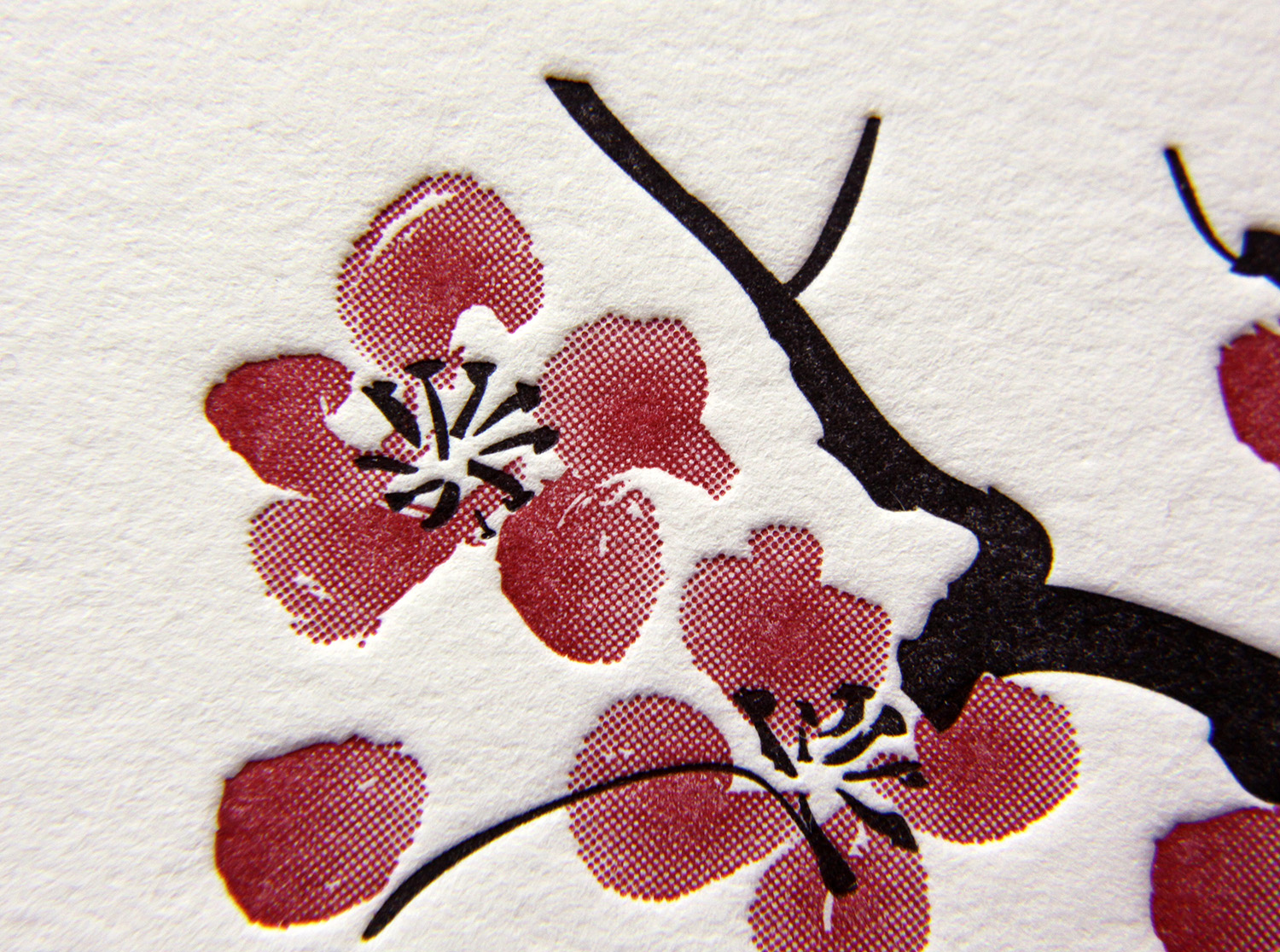
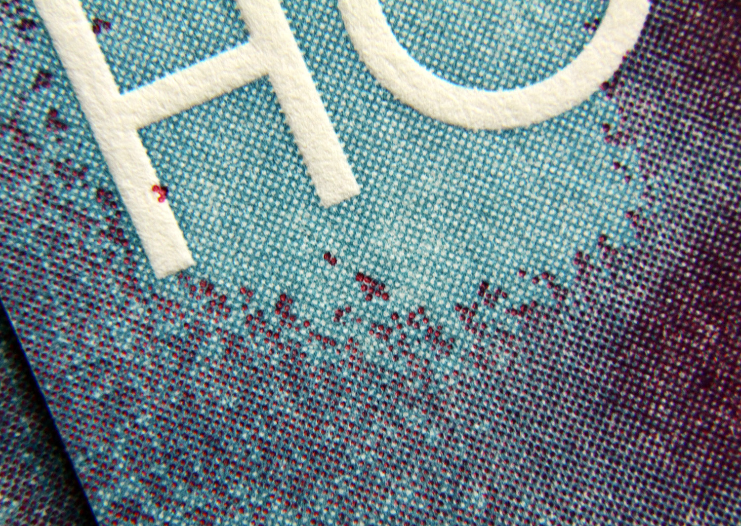
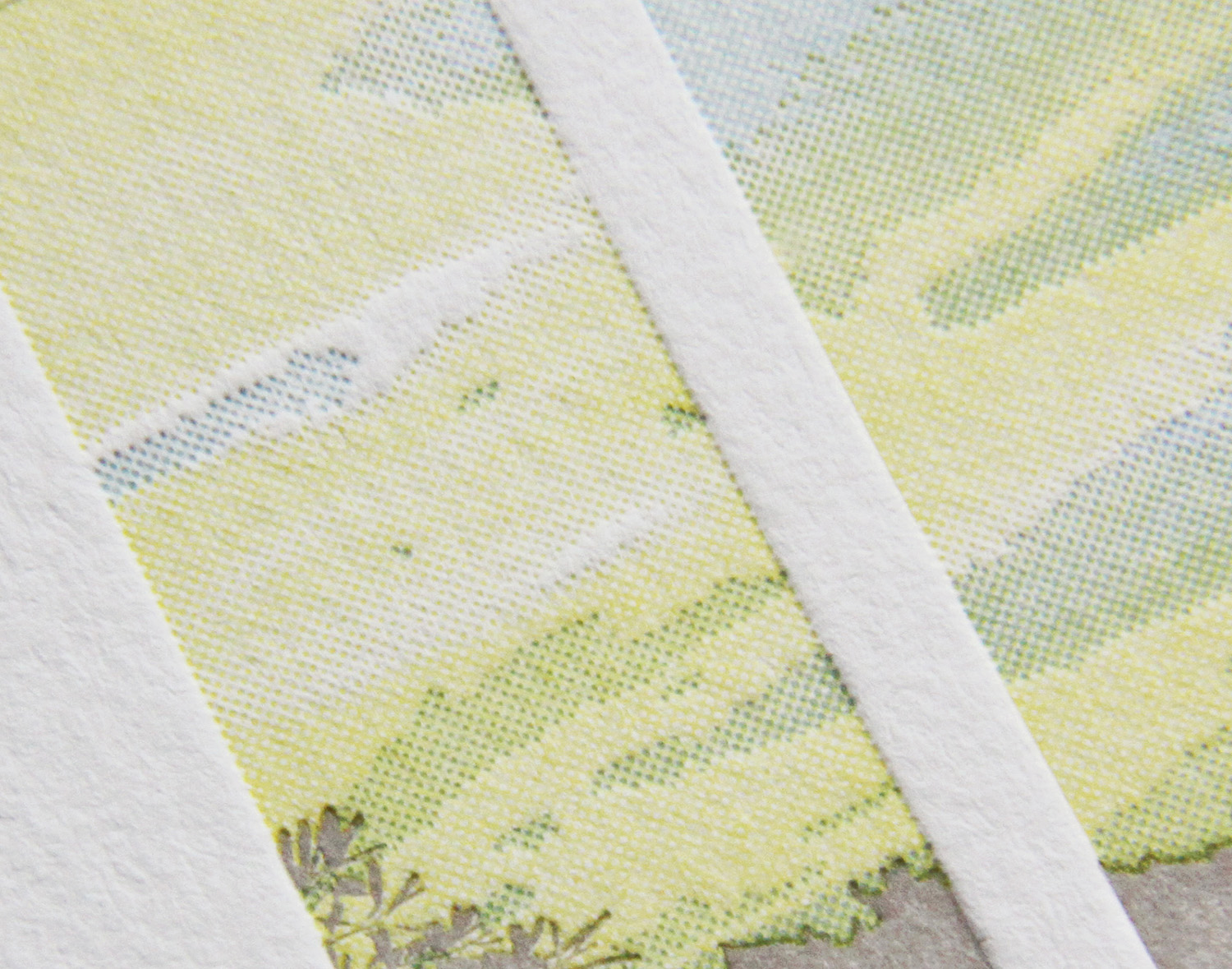
We all learned in grade school that mixing colors together creates new colors. Halftone screens don't actually mix the colors, but when layered on top of each other, they create the appearance of blended colors, so the artwork looks to have a greater color range than it actually does. It's like a technique used by Impressionist painters (and more specifically, pointillist painters) — laying down adjacent dabs of color, leaving the "mixing" to occur in the eye of the viewer.

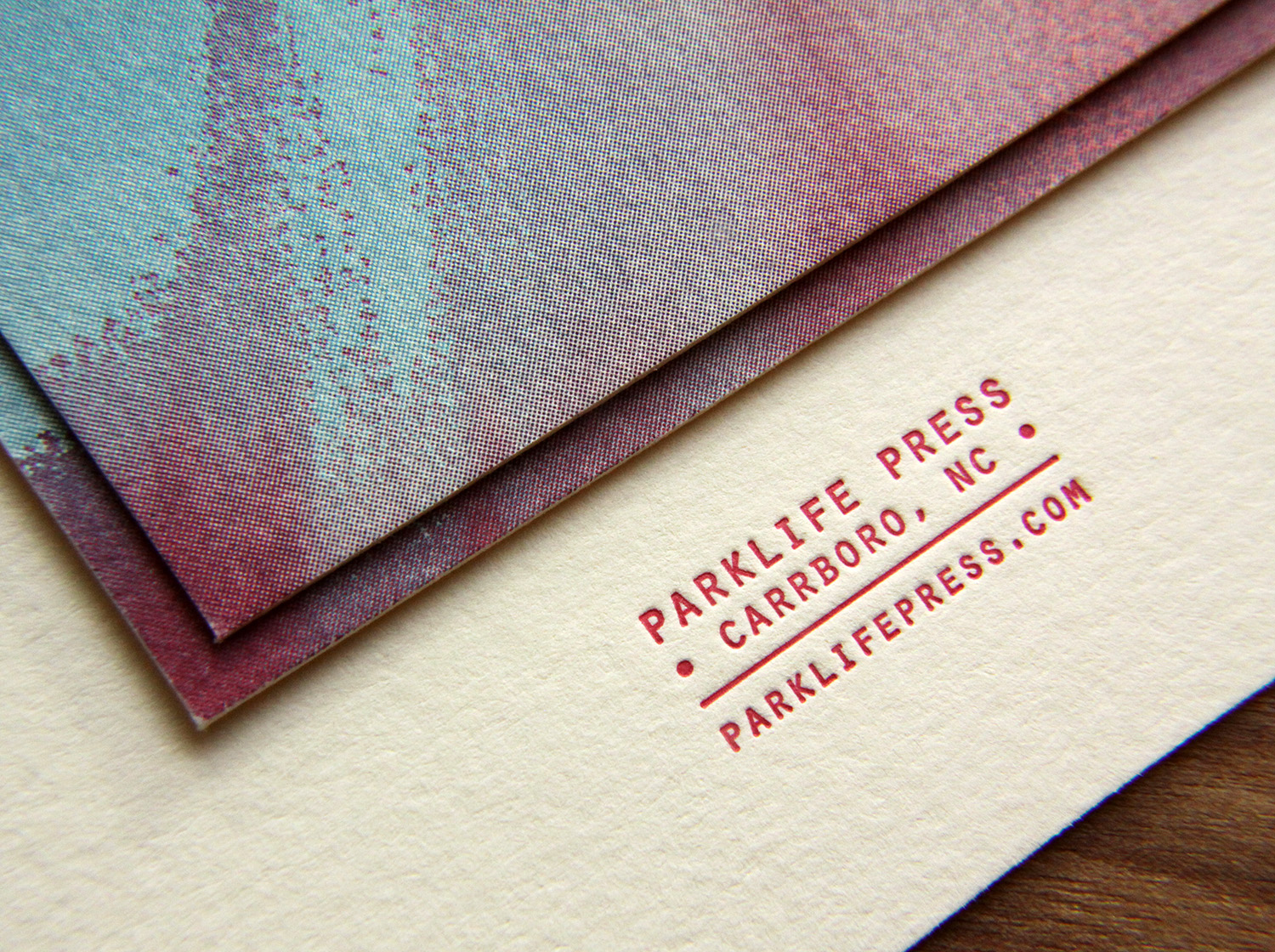
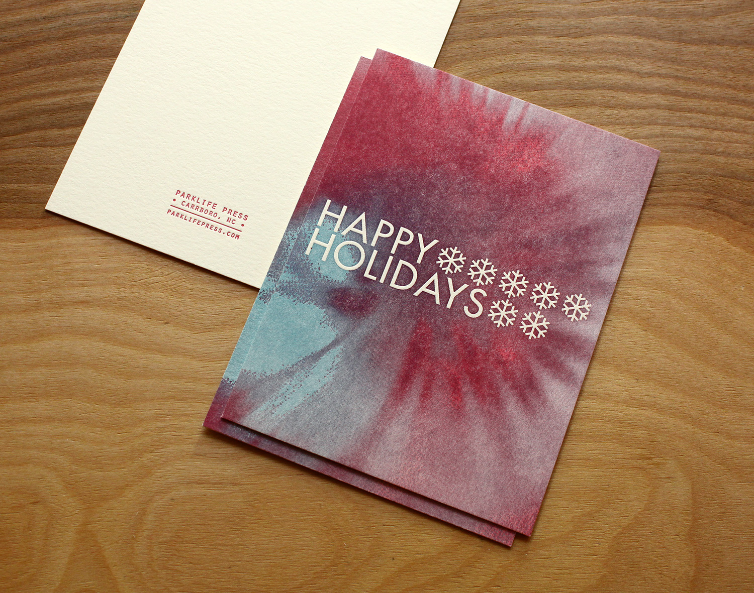
Below, blue and red ink screens create a swirl of blue, red and purple shades, suggesting a tie-dye effect.

And below, a rehearsal dinner invitation with a windowpane illustration comes to life with just three inks. Using gray ink at 100% for the tree line, and blending the white background with screens of pale blue and yellow, the image captures the the hazy summer sky at twilight — perfect for the couple's evening event.

Letterpress printing was invented in the mid-15th century and remained the standard form of printing until the development of offset printing in the 20th century. Halftone screens came much later — the first successful commercial use wasn't until the 1880s. So while letterpress printing wasn't specifically designed to print shades and gradations of color, you shouldn't let that limit your vision. It can be done — and quite successfully — by incorporating halftone screens.

Photos by Sarah McCarty Arneson