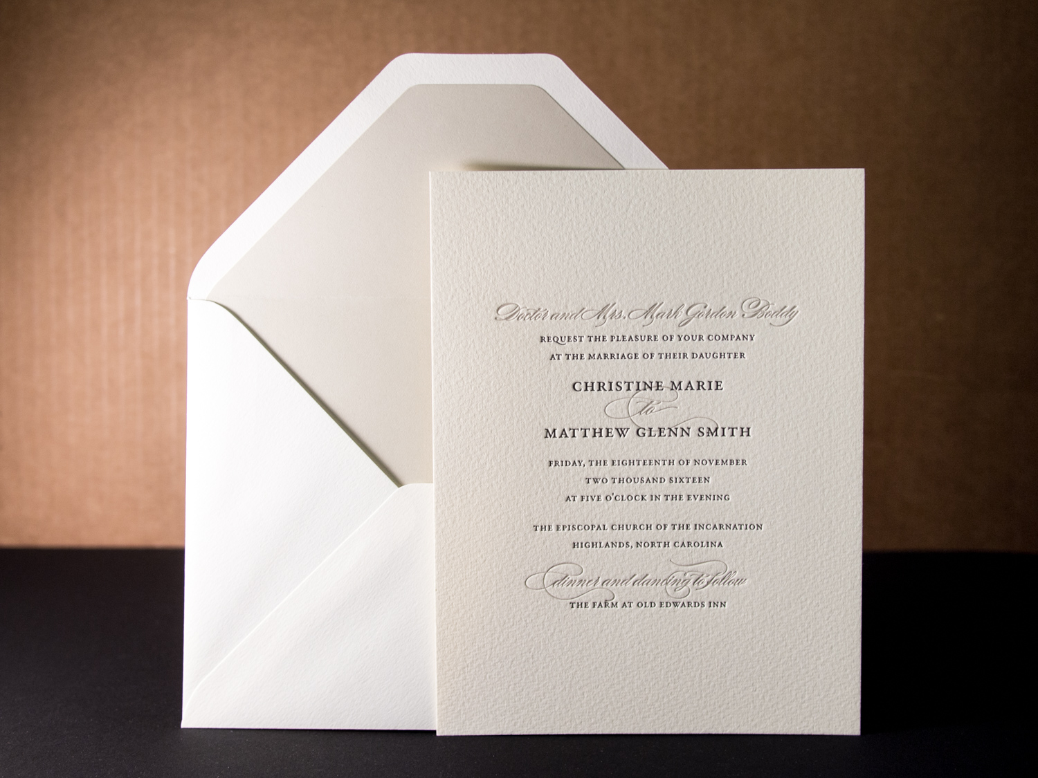
This custom set is adapted from our Mount-Hood-inspired Peak invitation, but without the peak.
PAPER Oversized 300g Somerset Soft White
INK Tungsten & Dust
ENVELOPE LINER Dust

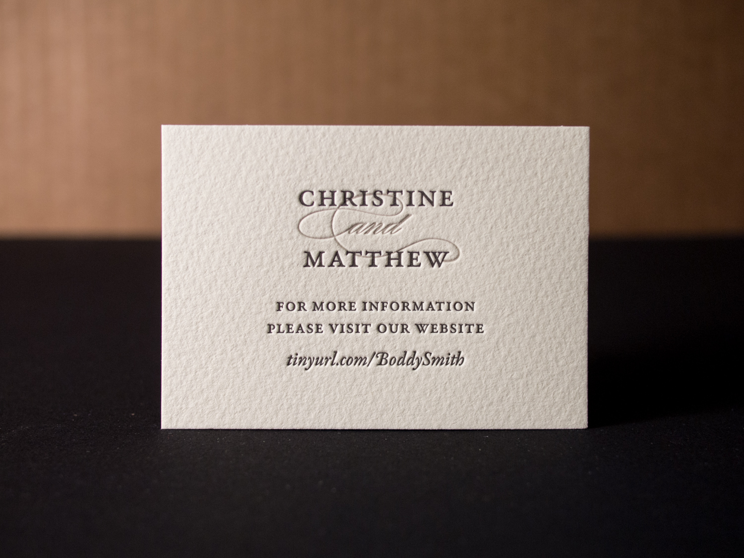
This custom set is adapted from our Mount-Hood-inspired Peak invitation, but without the peak.
PAPER Oversized 300g Somerset Soft White
INK Tungsten & Dust
ENVELOPE LINER Dust
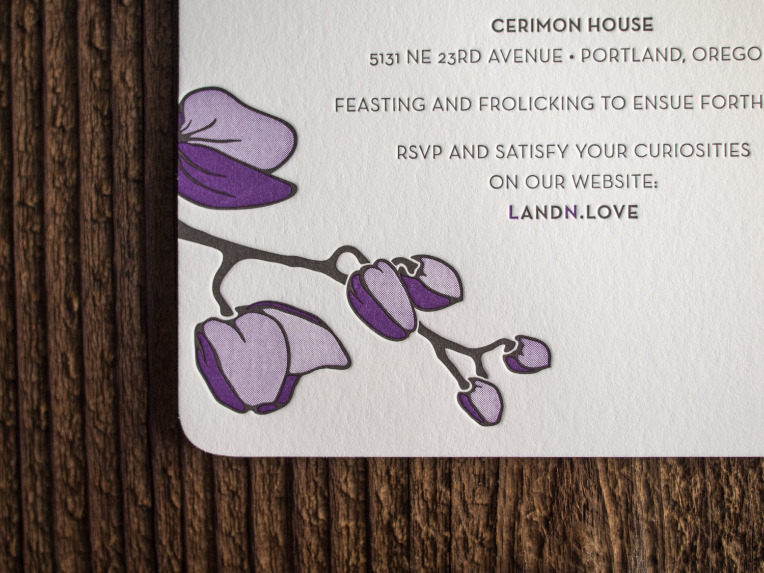
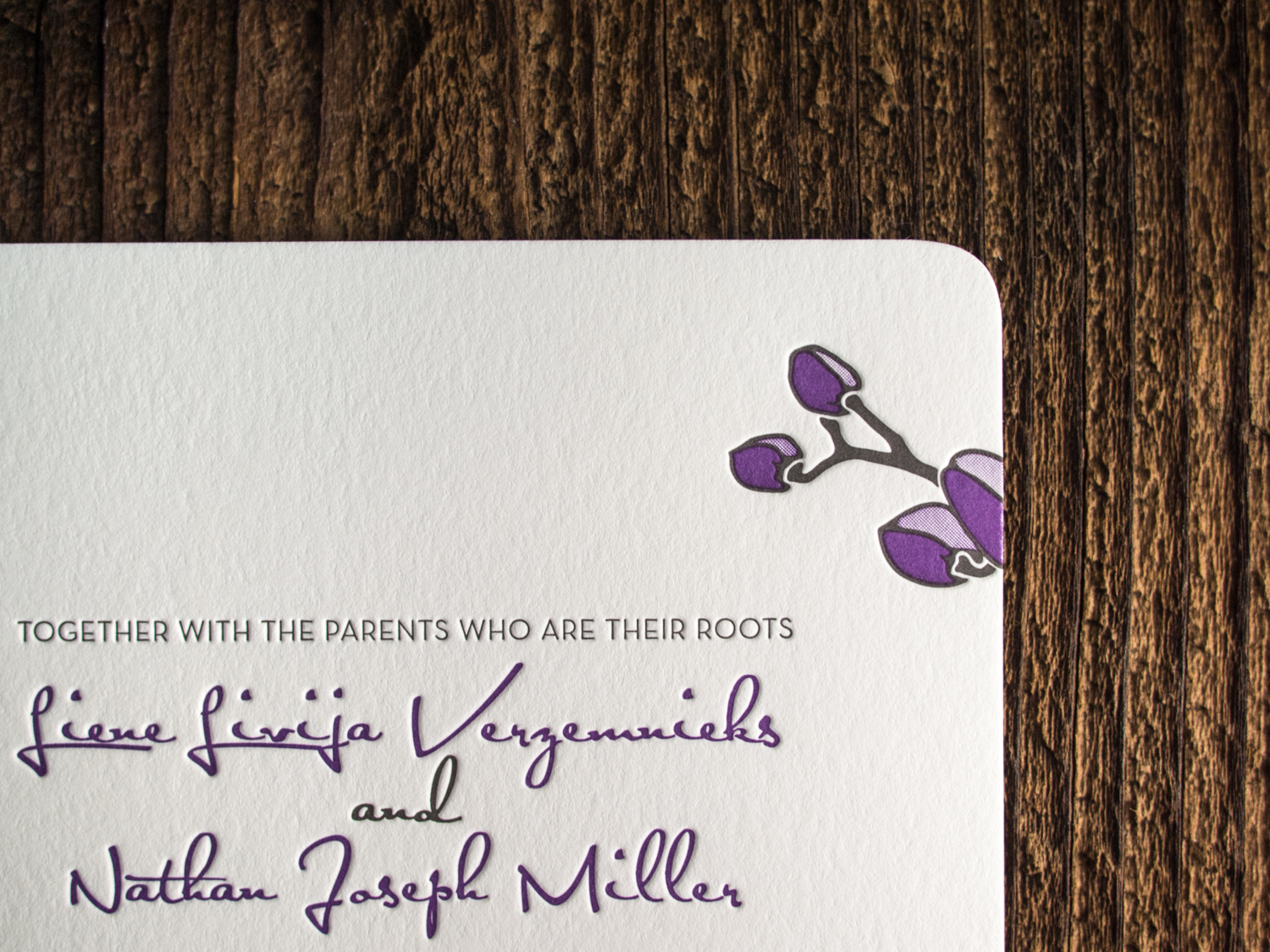
For fellow Portlanders Nathan and Liene, we created a customized variation on our Petal invitation. We kept the round corners and multi-tone orchid art, but changed the fonts, orientation, and inks.
For us, 2015 has been the year of foil. Check out these awesome foil stamped employee recognition cards we printed for Canada's Ian Martin Group.
All six sets were printed with gold foil on 600g Ecru Lettra paper, then finished with gold edge paint.
David and Allyson's invitation set was based on Petal, which features an original illustration by Parklife Press. The text, set in all-caps Gill Sans, is set off by the lightly-flourished script of their names. The asymmetry of the single, flowering branch — printed in tungsten and blush inks — provides a fresh and cheerful balance to the clean and modern design.
The branch design from the invitation was carried through on the RSVP card.
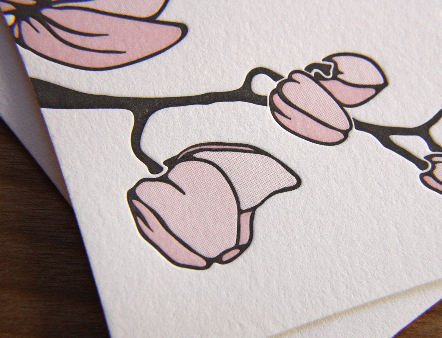
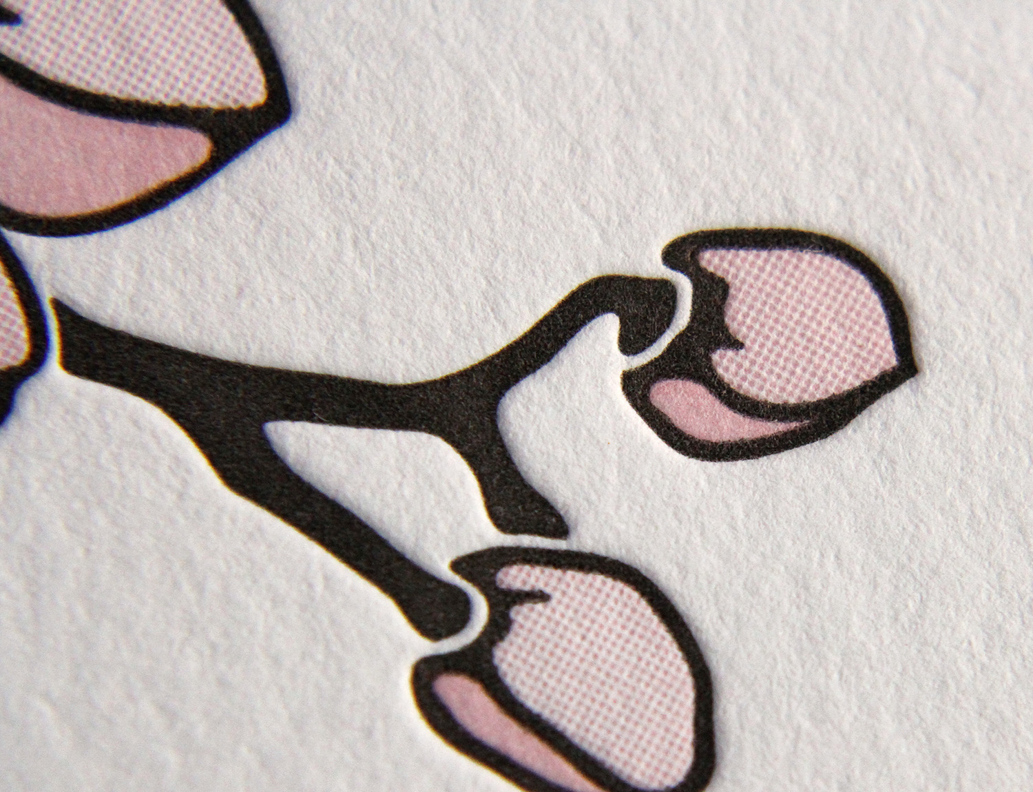
Letterpress is typically created with solid areas of ink impressions using individual, premixed colors. But here, by using halftone screens (read our post about letterpress and the halftone process here), three shades of pink were achieved using only one ink. This branch of blooming buds would still be pretty with solid, 100%-strength blush ink, but the design would lack depth; it wouldn't be as delicate, or as interesting.
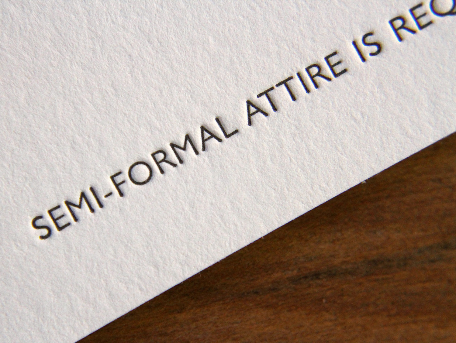
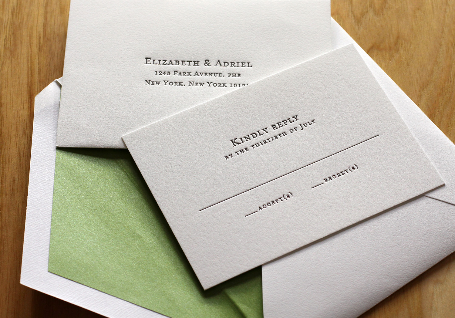
After seeing the Parker invitation design featured in Martha Stewart Weddings, Liz and Adriel were drawn to the classic look of the invitation. They knew they wanted letterpress invitations; in Liz's words, they were "choosing to send physical invitations in a digital world," so the texture of the imprinted text and the feel of the paper was critical to their selection.

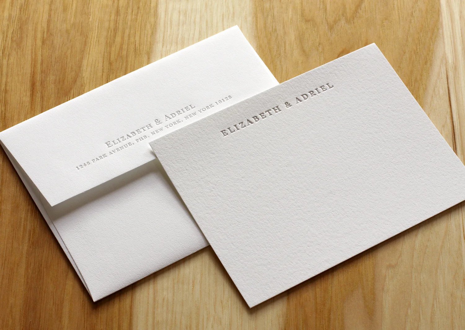
The couple chose a minimalist response card so that guests could add personal notes and unique replies. They received lovely good wishes, drawings and jokes from loved ones; the response cards became keepsakes. They personalized the design of the invitation by adding their names in Hebrew (offset from the main text in Dust ink). The invitations were edged in Grass and the envelopes were lined with a matching metallic paper. The green and white matched their wedding colors and flowers. Finally, the couple ordered simple, elegant cards to be used as thank you notes after the wedding.
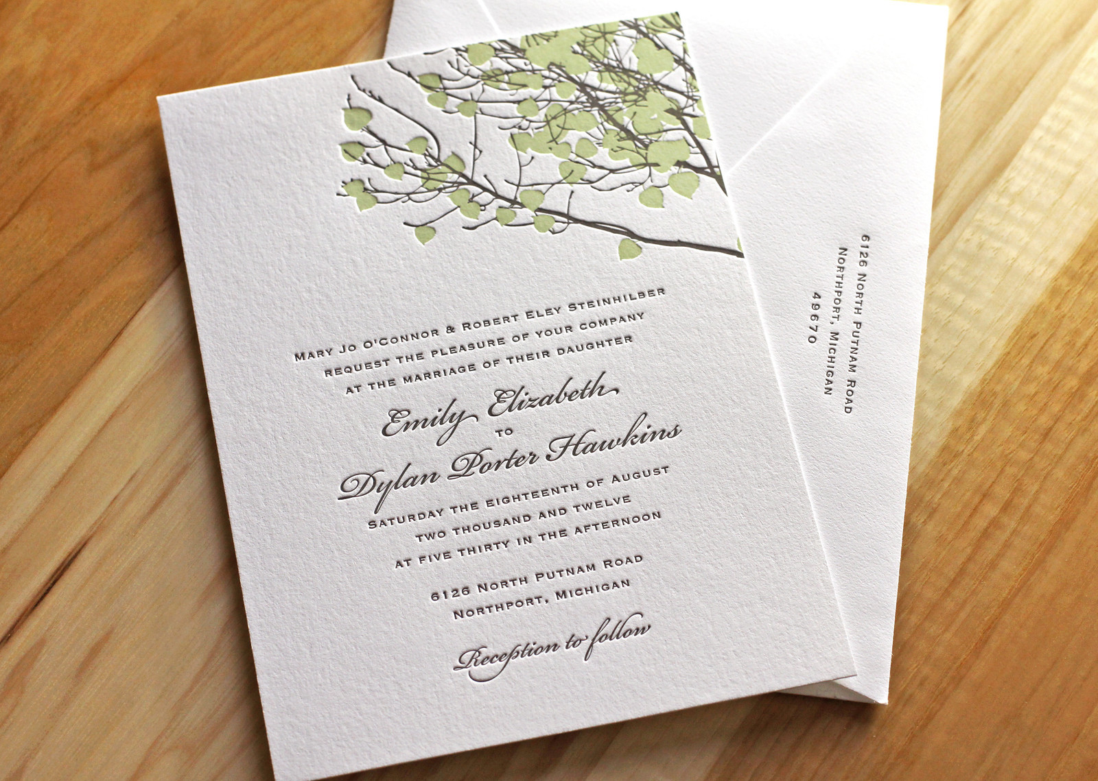
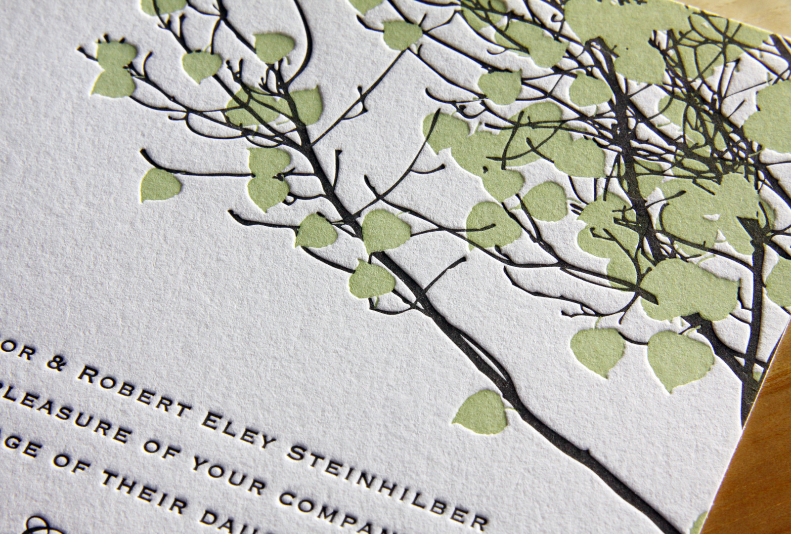
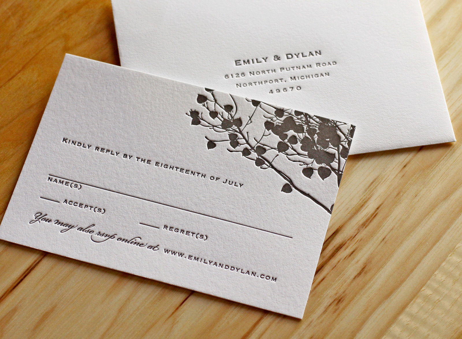
Emily and Dylan's adaptation of our Vail invitation is great. We changed the Tangerine ink to Light Celadon and opted for Fluorescent White paper instead of Ecru and the look, once warm and autumnal, became bright and fresh -- perfect for their summertime wedding.
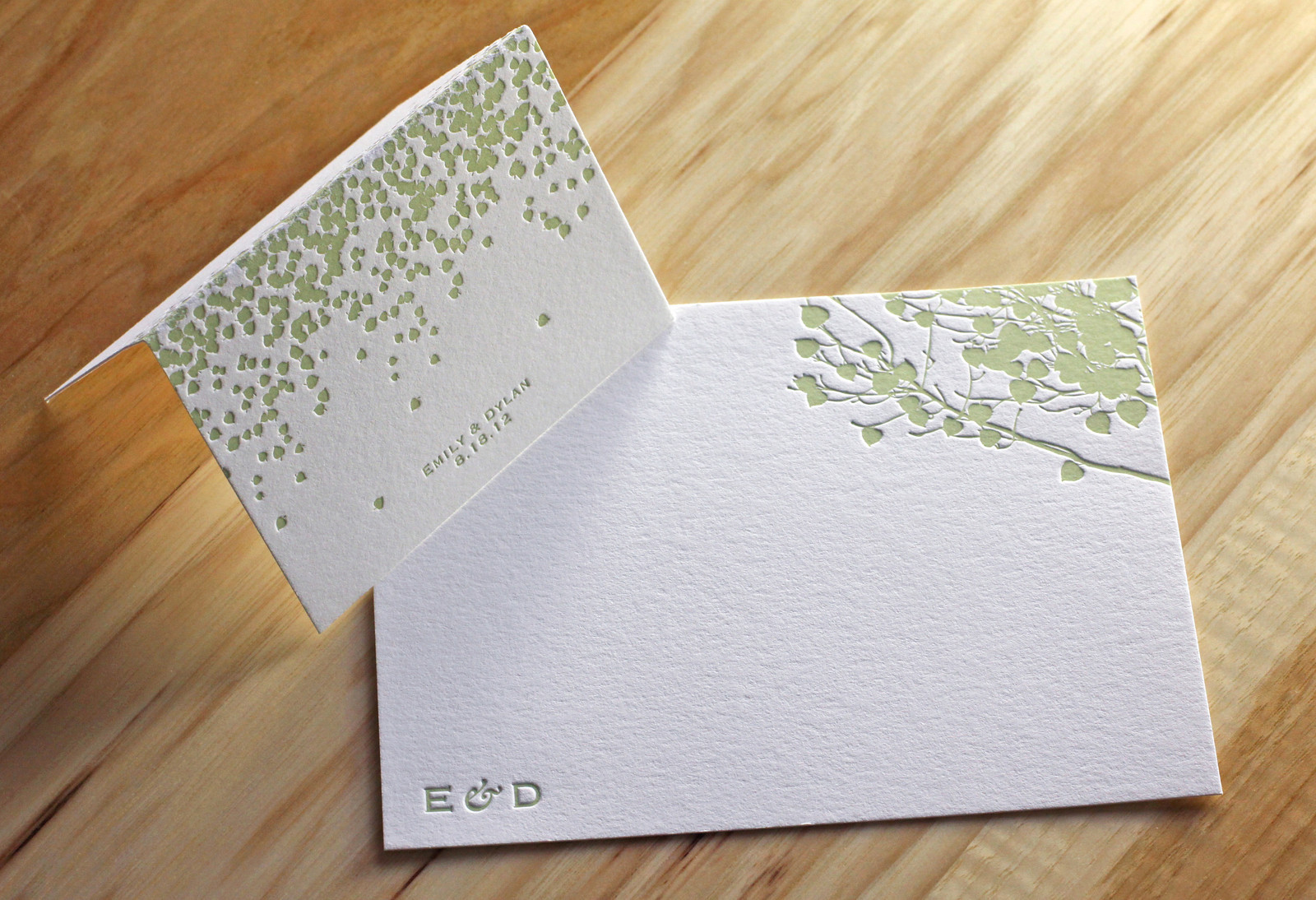
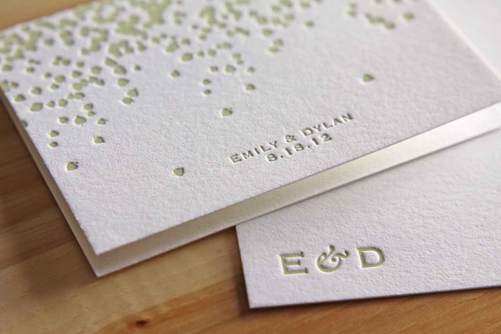
We carried the look through to the place cards and thank you notes as well, keeping the same theme without simply repeating the same artwork.