Posts tagged map
Rose Gold In Rhode Island
IMG03630.jpg

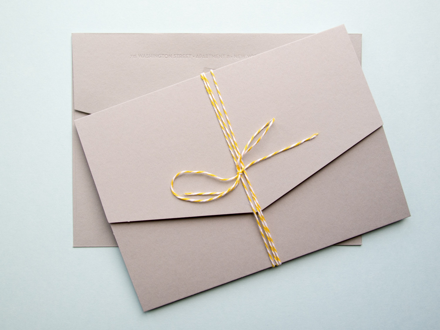
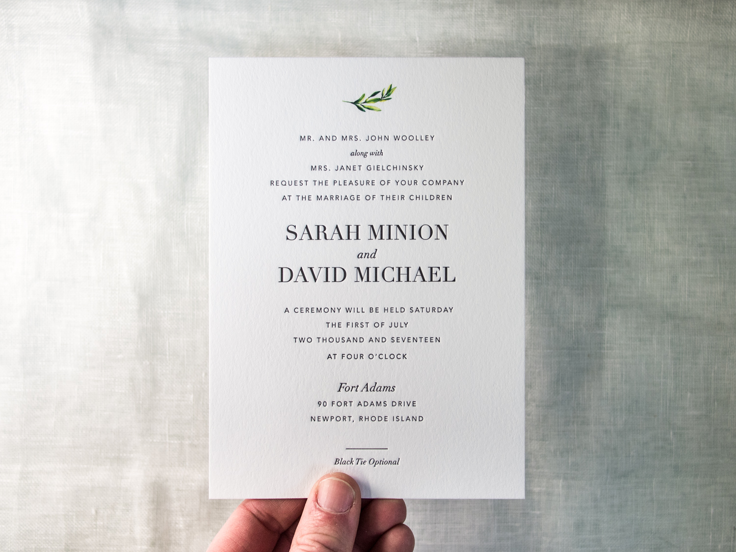
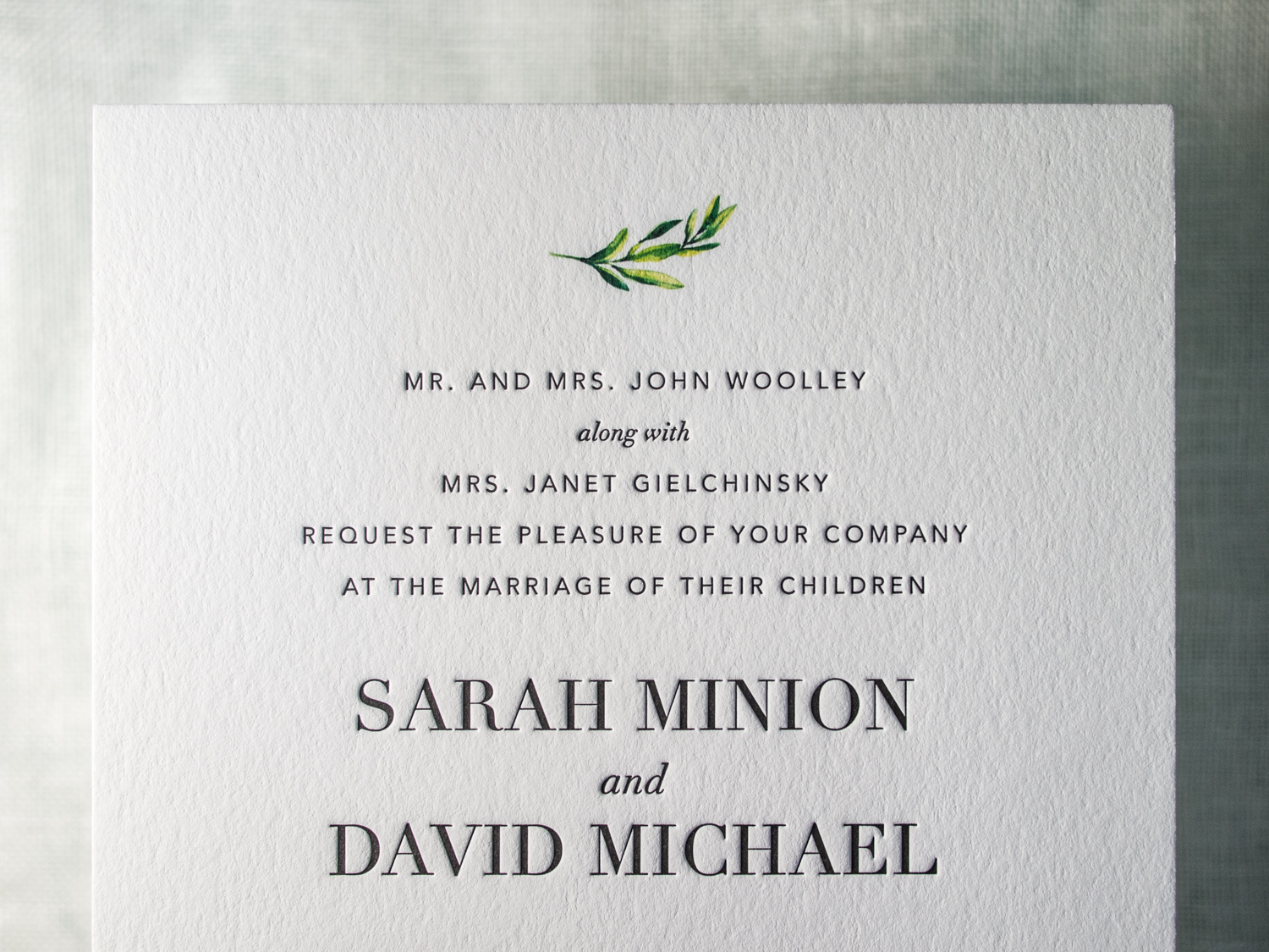
The simplicity of this beautifully modern bride-designed invitation set is deceiving! The production of this 5-piece suite required letterpress ink, foil stamping, inkjet printing, and duplexing.

The invitation features a mix of serif and san-serif letterpress text along with a small floral motif that we added in an inkjet run.

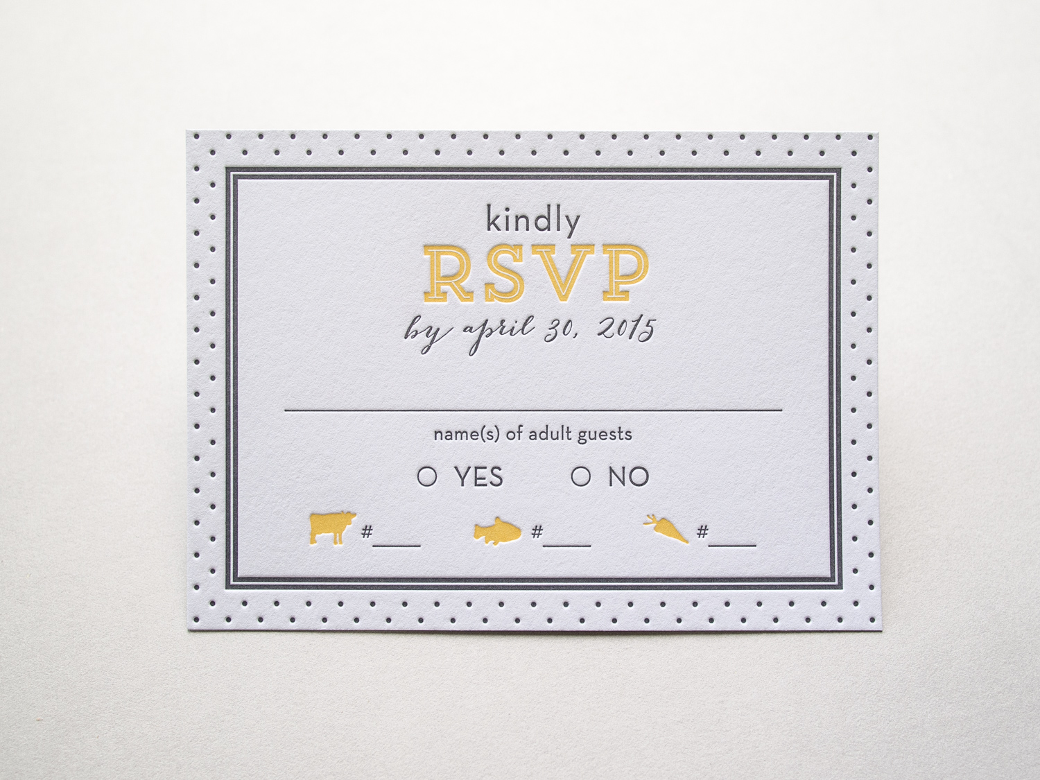
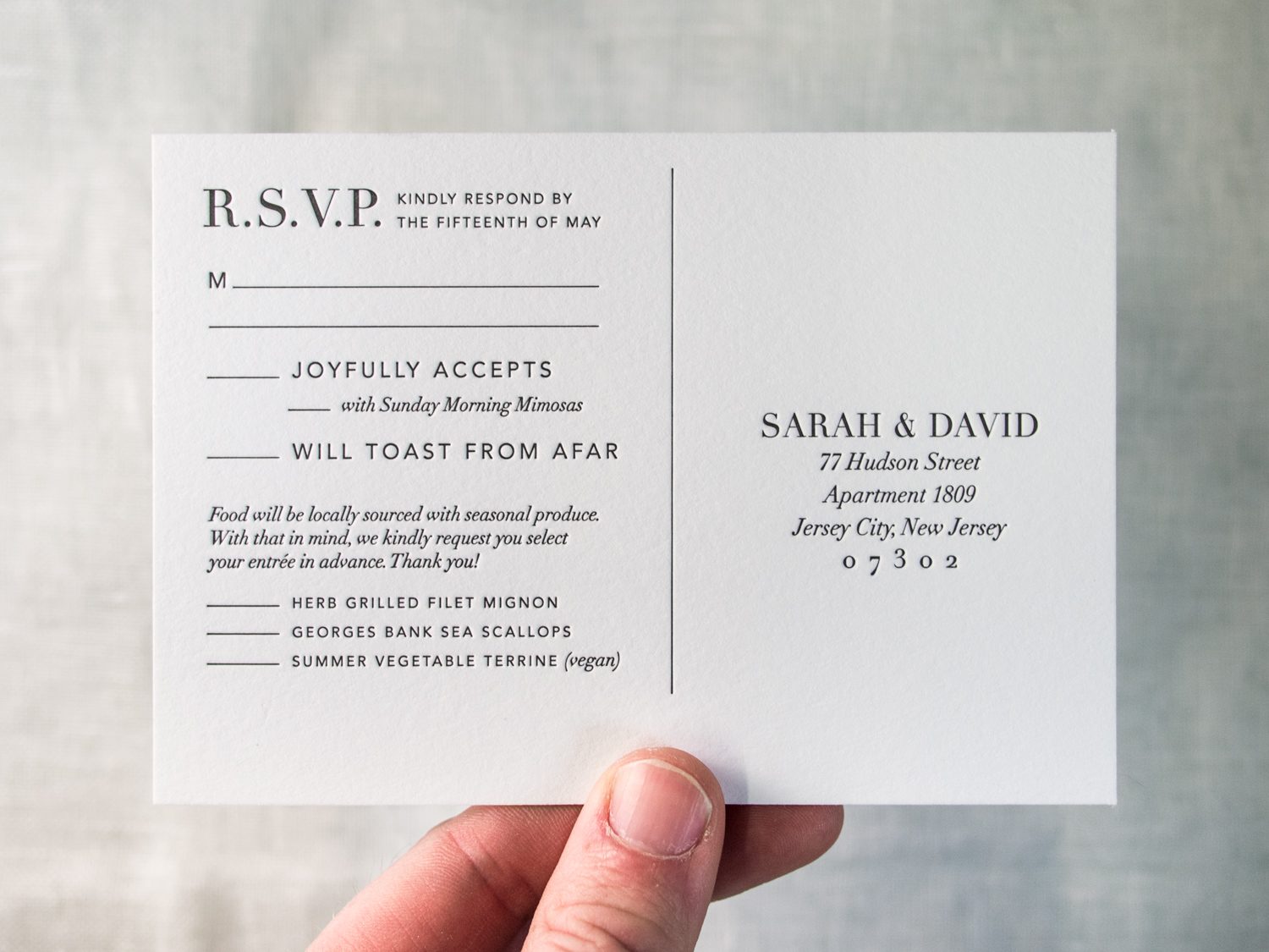
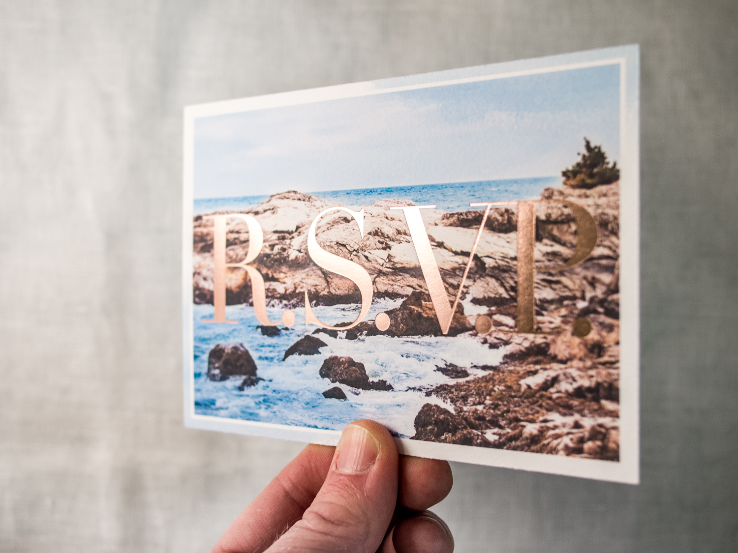
The reply postcard is a bit trickier, created from two 300g sheets, one letterpress printed and one inkjet printed and then foiled over the top. Then we duplexed and trimmed to create a single thick 600g card.

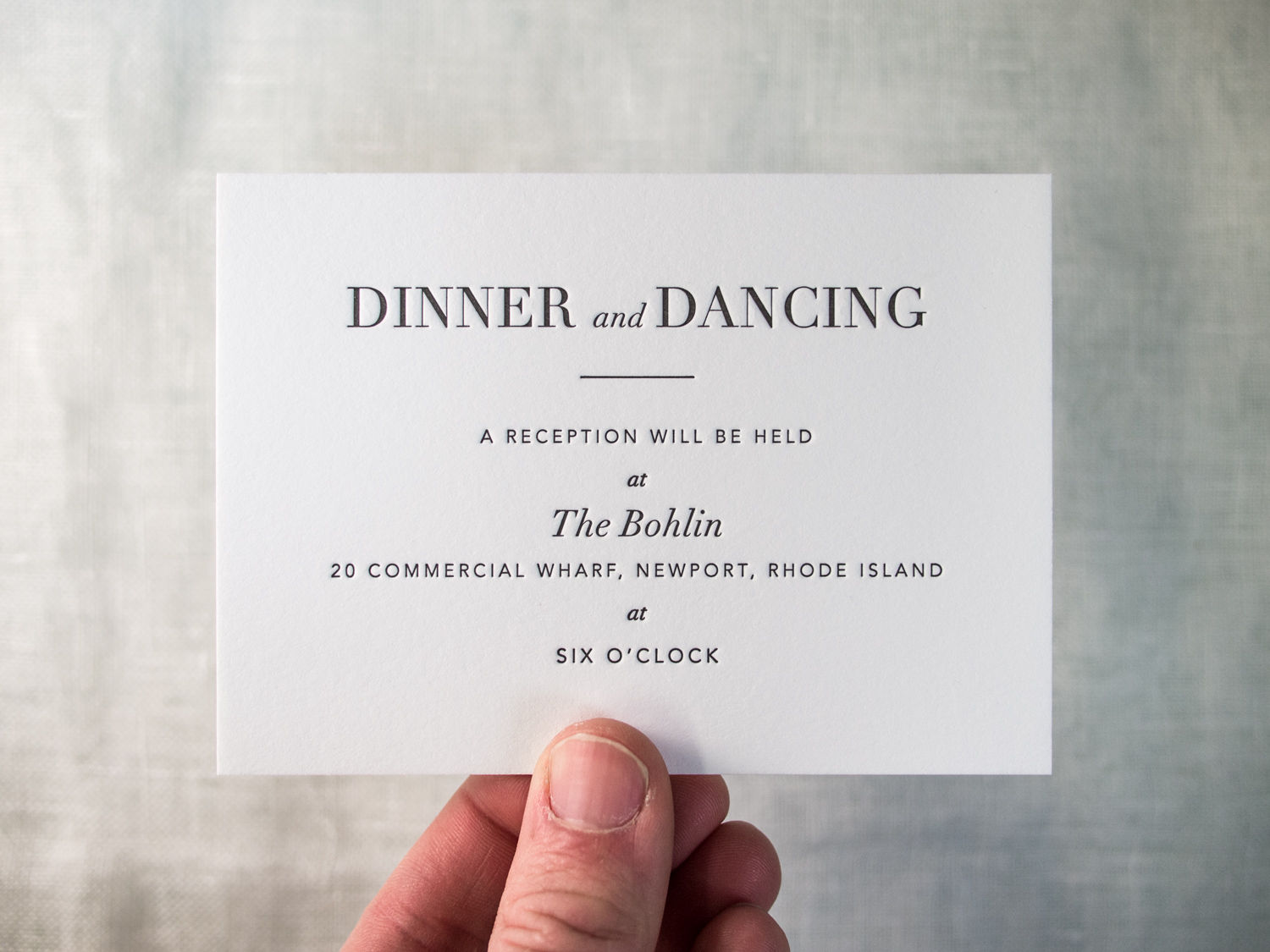
On to the agenda card! This one's printed with letterpress ink on the front and inkjet on the back of a single 300g sheet.

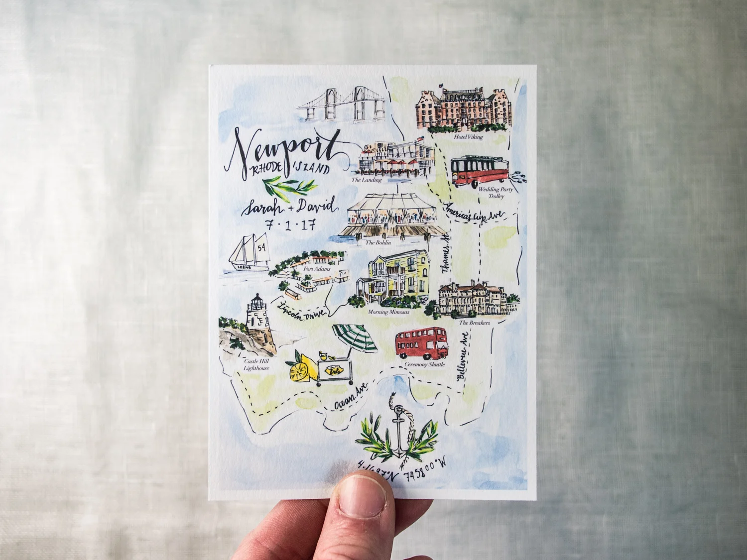
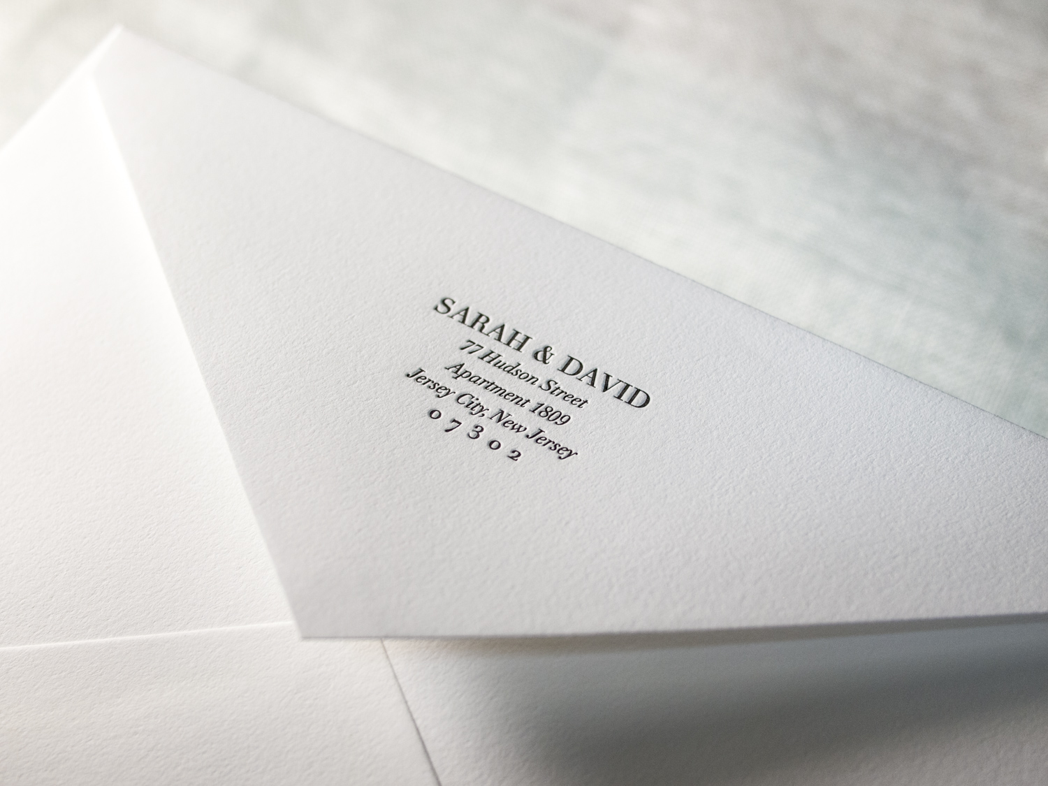
Finally, the reception card, travel insert, and envelope were more straightforward. Simple gray letterpress ink on 300g paper and a 120g cotton envelope.

New York Garden Wedding Whimsy

It can be tricky to create a wedding invitation suite that's colorful, playful, and exciting, while still conveying the sophistication of the event itself. While working with Terisa and Tom, the goal of maintaining that balance was always at the front of our minds. 

Ok, sure, the save the dates leaned a bit toward the whimsical end. We printed and hole punched a thick 600g note card, and then tied custom-printed balloons for the guests to inflate. Details of the event were on the balloon (and on the website for the faint of breath).

For the invitations we kept the yellow and gray color scheme and the Bombshell / Neutra / Trend Slab typeface combo, but left out the balloons (time to get serious).

We carried a similar look through to the reply card, a custom designed map, and a rehearsal dinner invitation with its own color scheme and tear-off reply card. The set was then placed inside a gray tri-fold pouch, tied with twine, and sealed in a matching gray envelope.