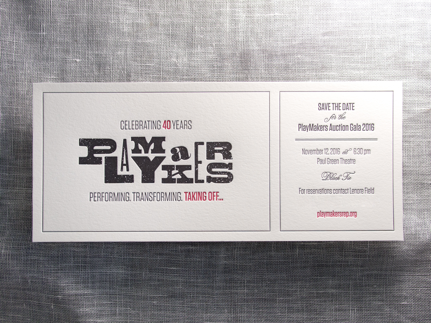
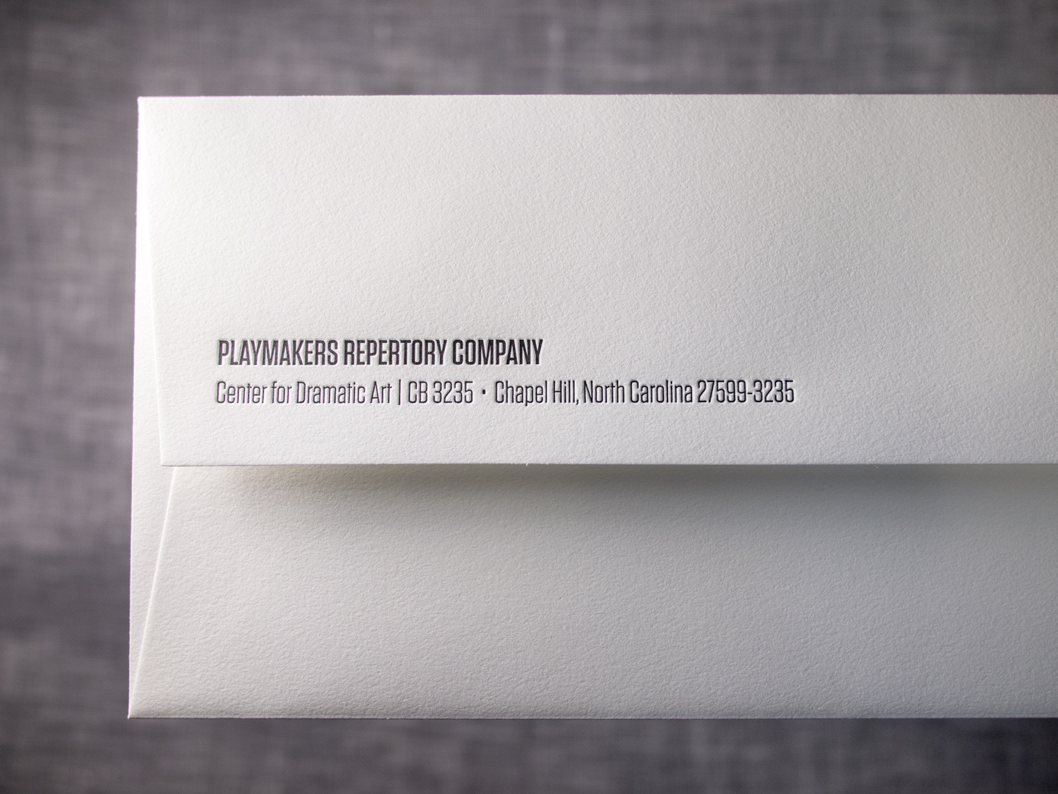
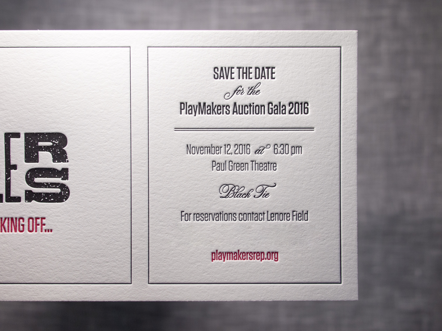
Posts tagged save the date
New York Garden Wedding Whimsy

It can be tricky to create a wedding invitation suite that's colorful, playful, and exciting, while still conveying the sophistication of the event itself. While working with Terisa and Tom, the goal of maintaining that balance was always at the front of our minds. 

Ok, sure, the save the dates leaned a bit toward the whimsical end. We printed and hole punched a thick 600g note card, and then tied custom-printed balloons for the guests to inflate. Details of the event were on the balloon (and on the website for the faint of breath).

For the invitations we kept the yellow and gray color scheme and the Bombshell / Neutra / Trend Slab typeface combo, but left out the balloons (time to get serious).

We carried a similar look through to the reply card, a custom designed map, and a rehearsal dinner invitation with its own color scheme and tear-off reply card. The set was then placed inside a gray tri-fold pouch, tied with twine, and sealed in a matching gray envelope.

Foil, Door Tags, and Alligators

It's great when we get to work with a wedding client from the very beginning – starting with the save the dates, moving on to the invitations, and then following through to the wedding day pieces. We did this for Elisa and Alexander, shifting the design vision slightly throughout the process while still maintaining a cohesive aesthetic.

For the save the date, we printed tinted white and Espresso inks on an oversized 600g Pearl White card, tucking the text in the corner and emphasizing the dandelion motif.

Photo by Sarah Arneson

Moving to the invitation set, we got a bit more elaborate and less minimalistic. The alligator-print-lined envelopes housed a gatefold card, guarded by a pair of blind-pressed gators. Inside was a 3-ink + gold foil invitation on thick Fluorescent White paper, a 2-ink + foil pre-party card, and a 2-ink reply card with a lined reply envelope.

We unfortunately don't have photos of the (awesome) programs, menus, and place cards, but we did snag a shot of these custom die-cut hanging door tags that the bride and groom gave to their guests staying at the venue.

Mid-Century Modern Floral

This lively set was based on a 60's style botanical motif printed in two shades of green. Designed by the bride (between her cake-baking sessions), the set was printed with two custom inks on 600g fluorescent white stock.

PLP_20141201setV2-0394.jpg

First, a square save the date card — emphasis on the date. The playful greens grow inwards from all sides. The "save the date" is in a handwritten-style script, and the date is in large bold text.

Next, the invitation itself. The flowers and vines border the top and bottom, giving an appearance of open white space on the sides. On closer inspection, an edge of stippled dots accents the two sides, and the spaces between the flowers, creating a casual but grounded border to the artwork frame.

Finally, an information card, to answer crucial questions about accommodations, dress code, and gift registries. This piece uses only a couple of the floral elements, at top and bottom. Together, these three pieces are great example of how use of color and motif can tie together distinct pieces — each has a different layout, and all are reinforced by the common design elements.

The floral elements of the set's design bring to mind Scandinavian mid-century modern influences. And the lemongrass and avocado colors are similarly evocative of the mid 20th century. All the designs were provided to us by the client, and there are so many parts to love. So here's a collection of detail shots.

One last note, as a brief digression from the design … remember when putting your invitation together that you can say whatever you want to say. This goes especially for information cards. In addition to basic events/travel/lodging details, it's a great place to convey anything you need to the guests. If there are some conditions (a ceremony on a grass lawn, possibility of unpredictable weather, etc.) feel free to say it! Be conversational, be you. We love the way this couple addressed their invitees, and the dress code below is just one example. The warm and chatty tone made it very personal, and goes perfectly with the whimsical graphic style of the artwork.

Photos by Sarah Arneson
Botanical Postcards

This two-sided client-designed save the date postcard combines light warm gray letterpress ink for the front with flat inkjet printing on the back.

The botanical image has wonderful ornate detail while the R+B monogram on the back is simple and clean. The two styles work beautifully together.

When printing two-sided, we can use letterpress for both, but it's sometimes nice to flat print one of the sides like we've done here. That way the impression from one side doesn't interfere with the impression from the other.

Lavender & Mint in Scappoose

Here's a lovely wedding set for Parklife's favorite brother and his favorite new wife. For the save the date we used two custom inks on thick 600g ecru paper.

For the invitations, we carried through the same inks, paper, along with a few variations on the Gotham typeface.

On the back of the invitation we added a hand-duplexed backing that's letterpress printed with a tonal ink and a fine halftone screen. The image is adapted from an early nineteenth century drawing of Portland.

Photos by Sarah Arneson
Kindly Save the Date

Halloween's over, midterm elections are in the rear-view mirror, and we're barreling toward Thanksgiving (which, in our modern era, is a blink away from Christmas and New Year's). Then, the recovery from all that, followed by the dull expanse of winter. HOW DID IT GET TO BE FEBRUARY ALREADY, you ask? Well, take a breath; we're not there. Yet.

But if you plan to send out invitations sometime this winter for a spring or summer (or fall) wedding, then you might want to start thinking about getting your nearest and dearest to mark your wedding date on their calendars. (Oh, hey — now that we mention it, we're having a sale on save the dates. Serendipity!)

The “official” rule would be to send the save the dates 4 to 6 months before your wedding. But like with any other wedding guideline, it really depends on the situation. Some people order them a year ahead, others 3 months. But it tends to be more important to send them early if you have a lot of guests who’ll need to travel.

To get started, above is a quick round-up of some save the dates from past sets we've written about. (If you'd like to explore them further, check out the posts here, here, here, and here.)

Now, on to our featured save the dates …

Customarily, save the dates are related to the invitations, design-wise. But they're usually much less formal, so people often opt to have a little fun with them. Parklife Press provides custom design work, included free (to a point) with a print order.

Here's a card that was designed for a pair of librarians. It was done on pearl white stock with midnight and fog inks. It resembles a library book check-out card, complete with an old-school typewriter font and custom monogram "stamp."

There is a lot of leeway in what's included on card, but the most common elements are pretty straightforward. The couple's names, some version of the phrase "save the date" ("mark your calendars," "reserve the date," etc.), and ... you guessed it: the date.

Then, add some version of the words, "formal invitation to follow." If you have a wedding website that has event details, including the URL is helpful.

Some — like this one with a pale blue pinstripe and floral dingbat design — include the date, place, notice of invitation-to-come, but also include the accommodation information for those who like to make arrangements ASAP.

The card has lovely details — from the repeated floral vine to the scalloped pinstriped background to the repeated square dingbats — the set shows off the custom inks on the fluorescent white stock. It's based on Playbill design. We can create a save the date based on any of our plentiful invitation designs.

The card above, based on the Belvedere design, is more formal than some; it matches the invitation instead of just coordinating with the design elements. Note the large, swoopy dingbat, and and the custom border with floral motif impression offset by a double frame.

Location of the wedding is a frequent inspiration for save the date card motif. This is a playful one which focuses the well-known venue. The wedding will be held at historic Pinehurst Country Club in South Carolina. The card — printed in cheerful apple and sherbet inks on pearl white stock — features the club's logo and founding date.

We're closing out this save-the-date round-up with a square card printed with espresso and white inks on pearl white stock. It's illustrated by breeze-blown dandelions and the words "Love is in the air."

And as you look over the detail shots of the lovely illustration, keep in this in mind: Days, weeks and months can float away as easily (and quickly) as seedlings in the wind. So, you know … get those save the date cards printed.

Photos by Sarah Arneson