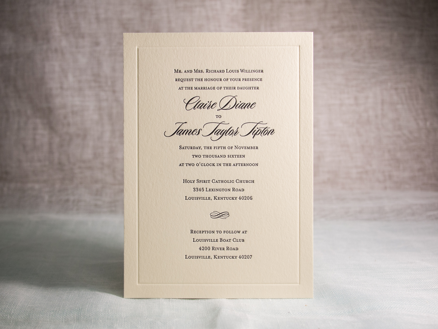
This is a variation on our popular Vignette invitation design featuring black ink and the lovely Duende script font.
PAPER 300g Ecru White
INK Black & Blind Impression
TYPE Duende & Mrs Eaves Small Caps
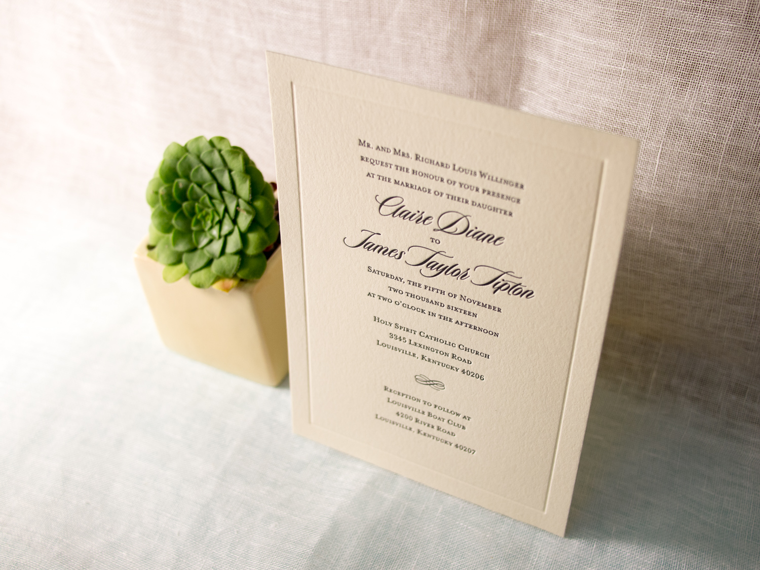
This is a variation on our popular Vignette invitation design featuring black ink and the lovely Duende script font.
PAPER 300g Ecru White
INK Black & Blind Impression
TYPE Duende & Mrs Eaves Small Caps
Another great set based on the on the Vignette style. The main invitation features beautiful, understated typography printed in stone ink and set off by a custom double border. The pieces are gathered in a belly band featuring the couple's initials printed on gray cotton Pescia paper.
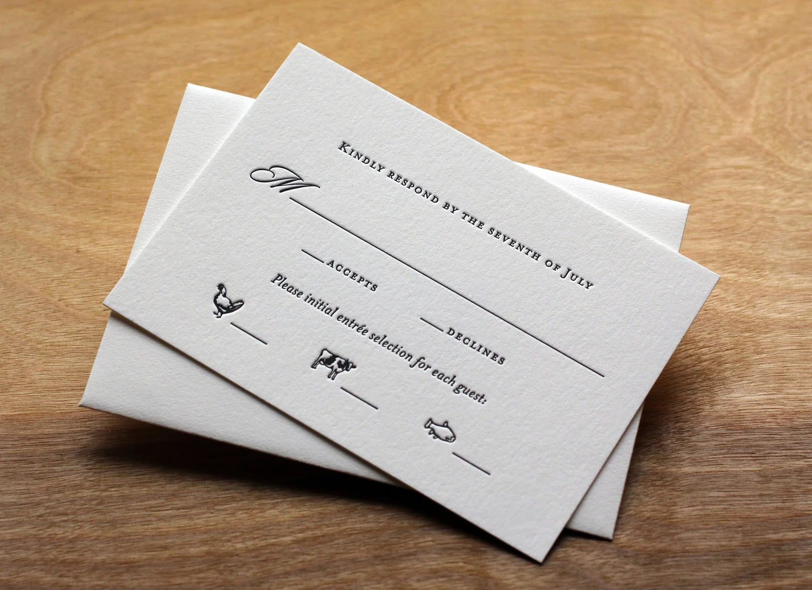
The RSVP card includes a menu choice for the reception dinner.
The swirled dingbat is a design element carried throughout the pieces, appearing on the main invitation, the belly band, and the RSVP card. The belly band also features the couple's wedding website, where guests can find travel and lodging information. The border design is created by a blind deboss — where an impression is made without ink transfer — which subtly highlights the thickness and texture of the paper stock.
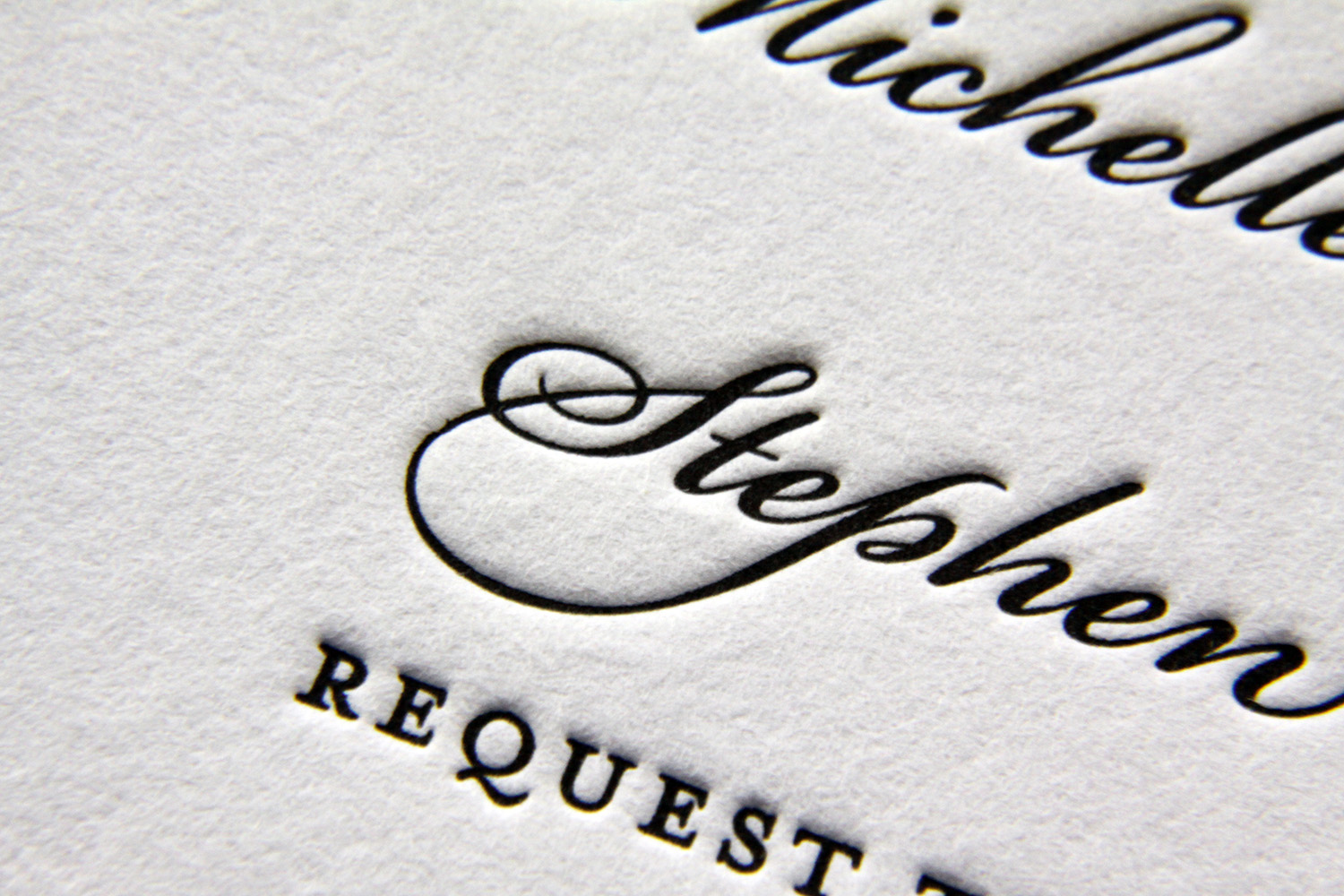
Michelle and Stephen weren't familiar with letterpress when they began planning their black tie wedding, but a love of elegant invitations had been instilled in Michelle an early age. Her grandmother used to frame beautiful invitations she received, and Michelle had always admired those with simple black calligraphy on a white note card. Parklife's Vignette fit that vision perfectly: striking black ink against bright white paper, set off and framed with a blind deboss border.
The script font had a few flourishes, with one particularly unusual and interesting one: the ligtature connecting the cursive capital "S" and "p" in Stephen's name. A classic dingbat was used to add some visual interest and to separate blocks of information. It also tied all the pieces together — it was used on the invitation, the main envelope's return address, the RSVP card, and the accommodation information card.
Kristin and Alex's set was a lot of fun to print. We started with save the date coasters featuring custom pen and ink drawings (by Travis) of the wedding venue printed on our 600g cotton paper. Save the dates are often less formal and more playful than the actual invitations, so it seemed like the perfect place to use the image.
We finished the set with a chipboard rehearsal dinner invitation and a tear-off reply card.