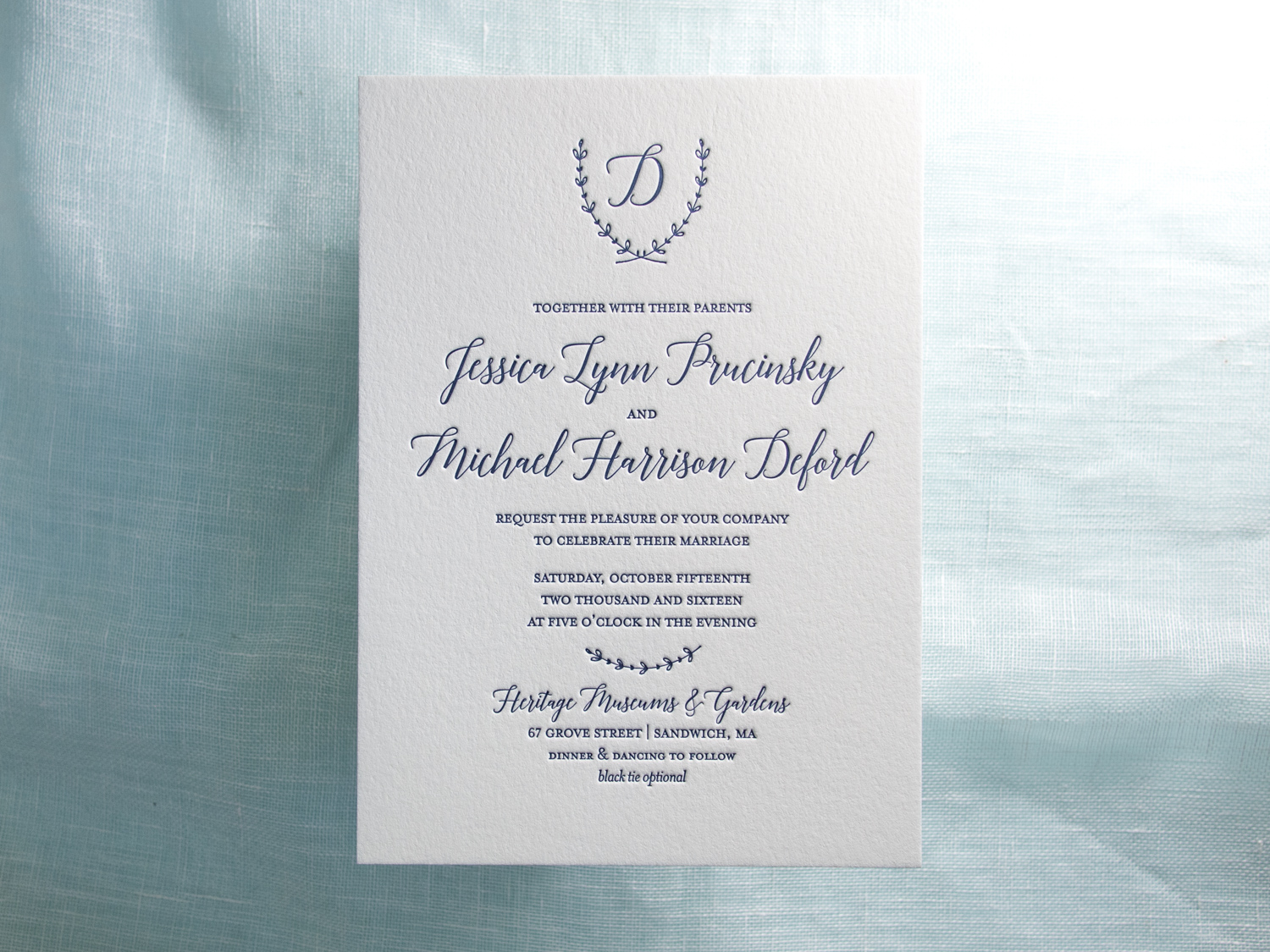
Simple but spectacular one-color invitations designed by the bride, Jessica, and printed by us.
PAPER 300g and 600g Pearl White
INK Midnight
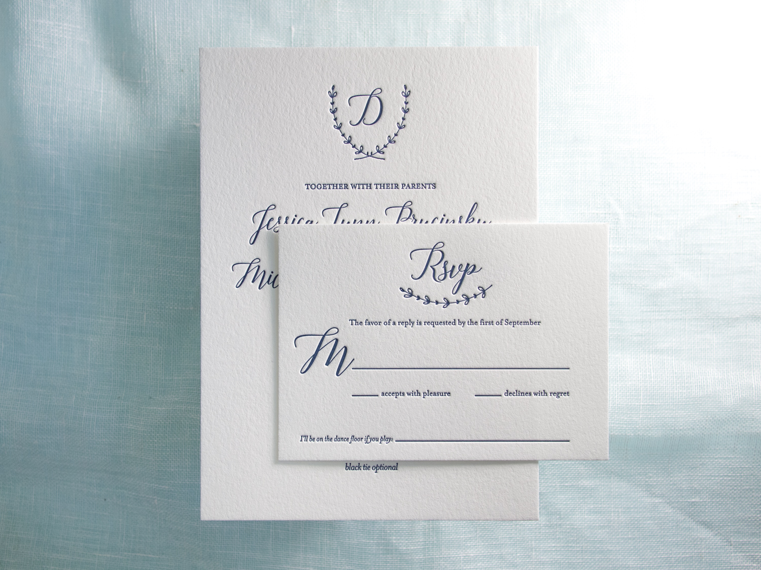
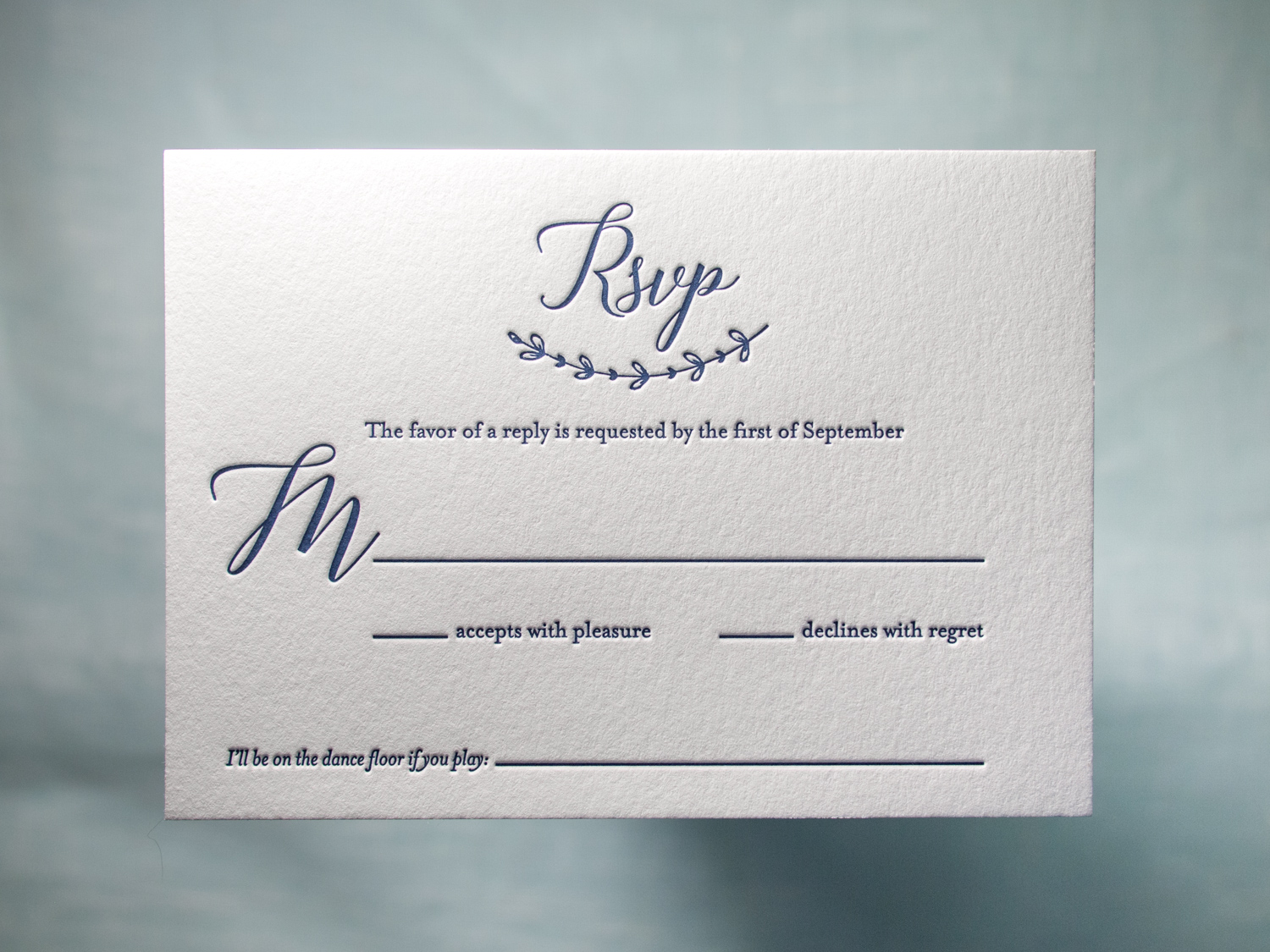
Simple but spectacular one-color invitations designed by the bride, Jessica, and printed by us.
PAPER 300g and 600g Pearl White
INK Midnight
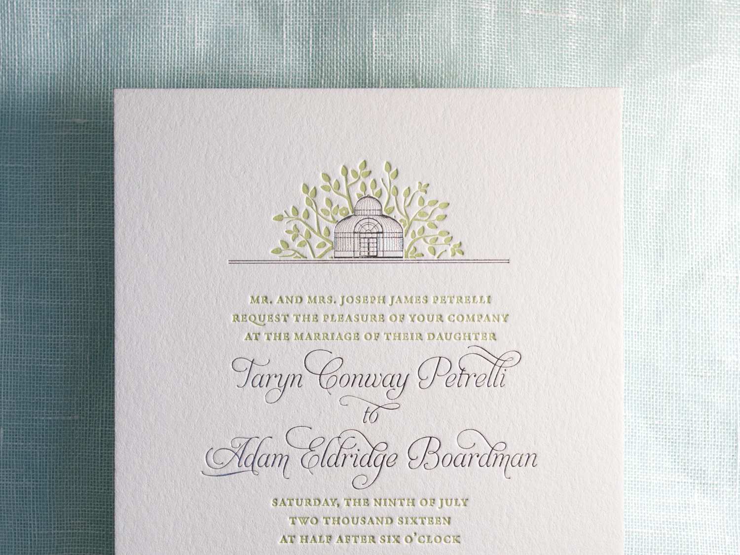
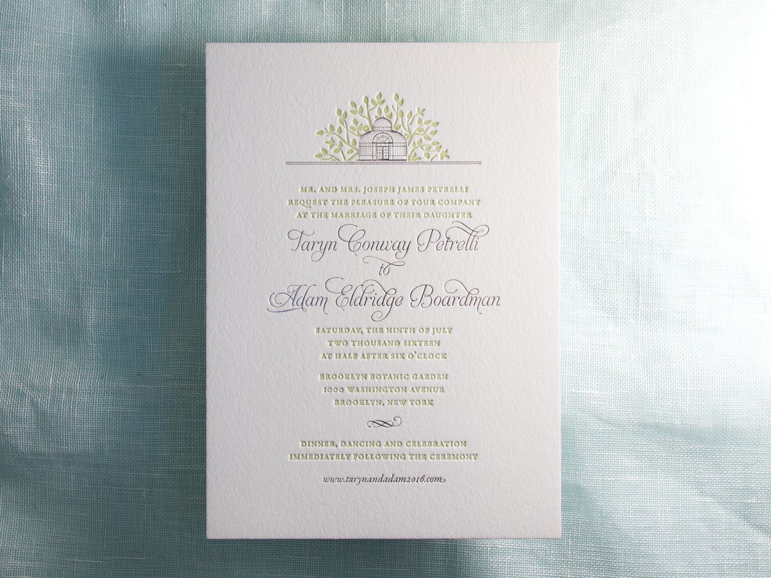
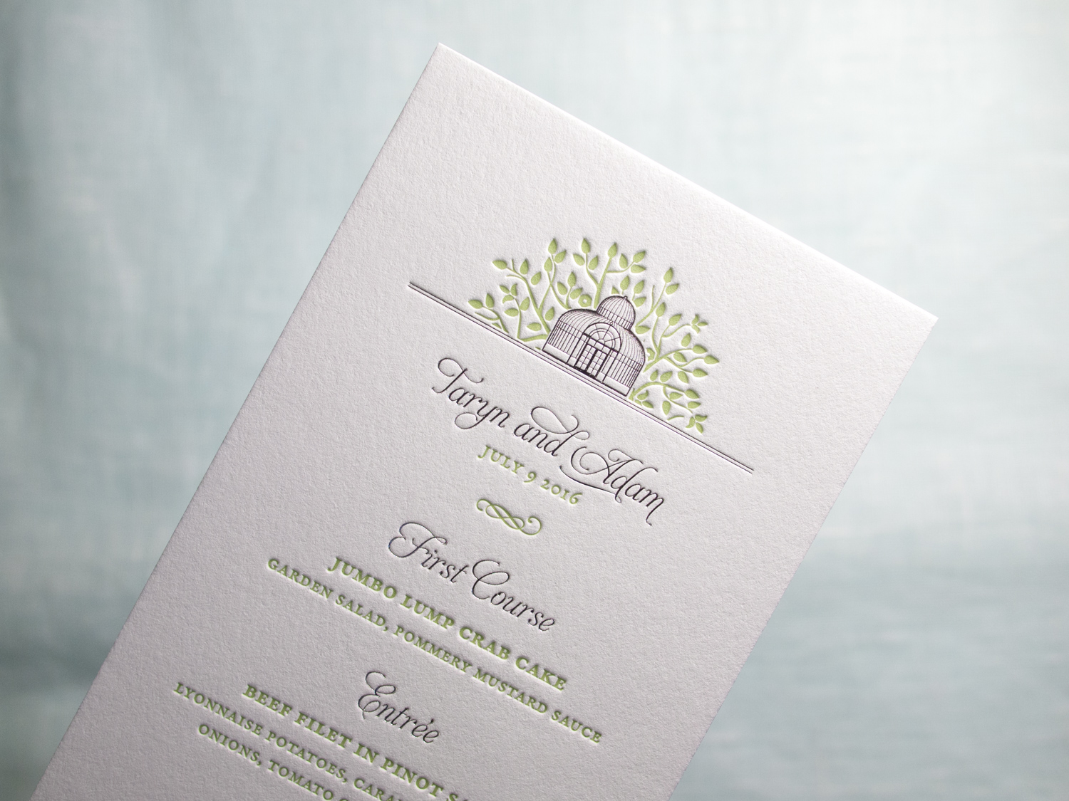
For Taryn and Adam's wedding in the Brooklyn Botanic Garden, we designed a custom foil + letterpress motif based on the garden's Palm House. Take a look at the inspiration:
Photo by Brookelyn Photography
We carried parts of the artwork through to reply cards, menus, programs, and even the envelopes.
PAPER 600g Fluorescent White
INK Light Celadon
FOIL Silver Shine

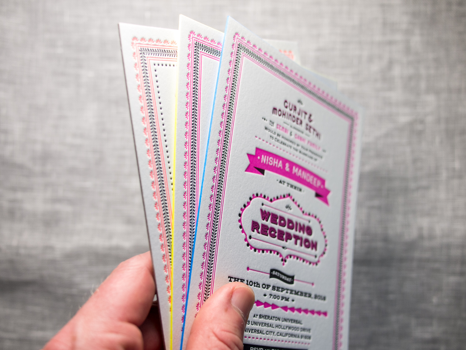
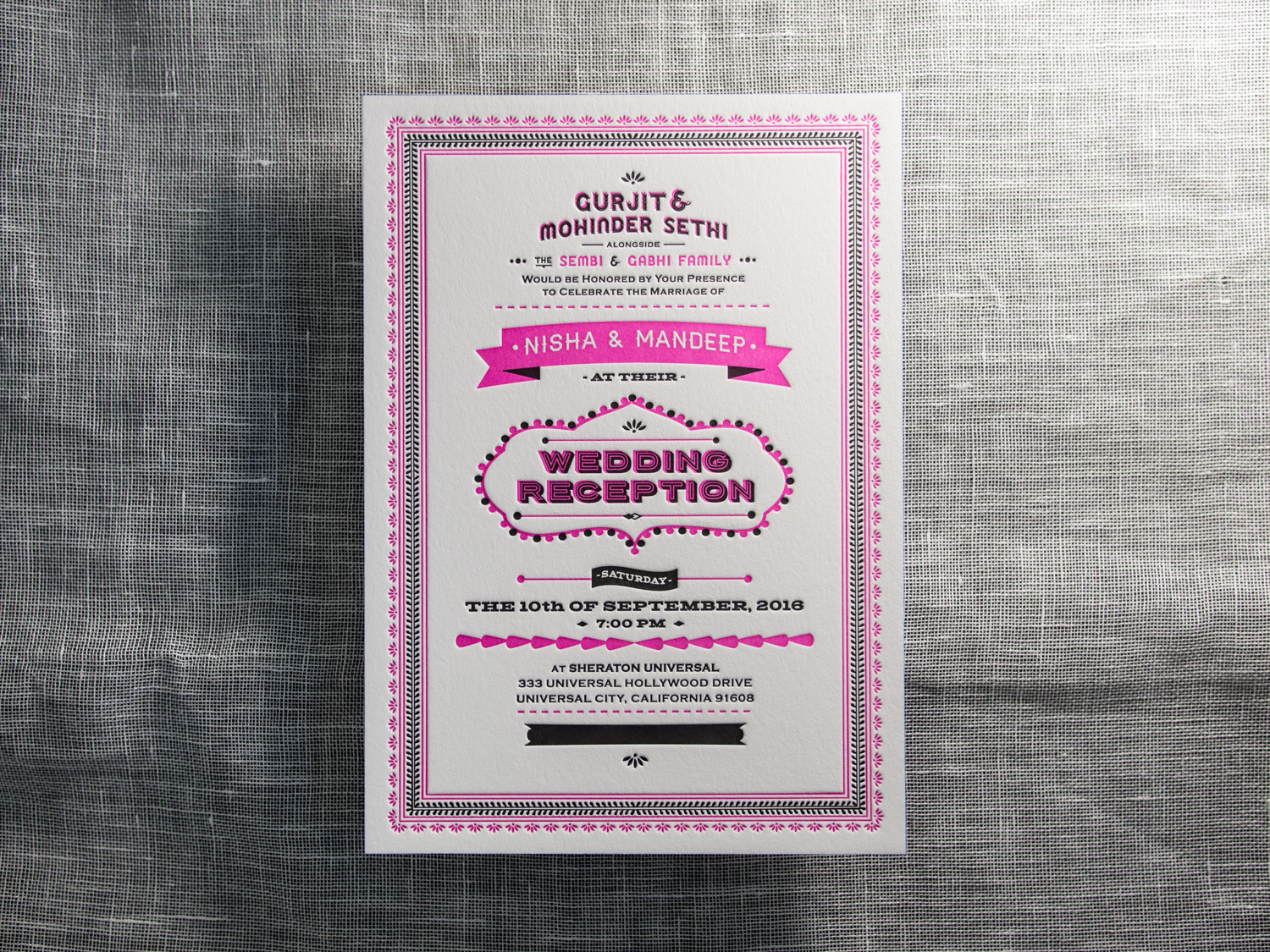
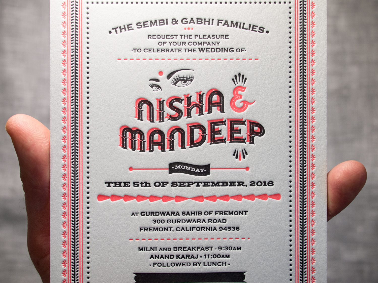
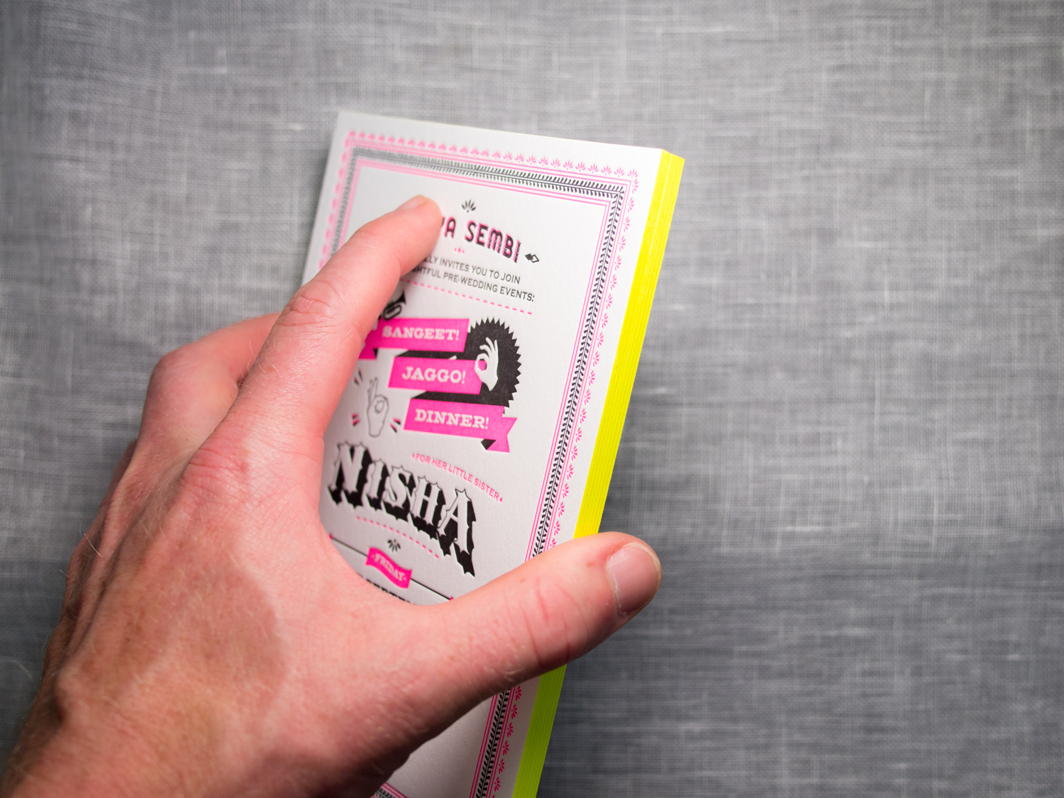
These might be my favorite client-designed invitations this year. The bride, Nisha, designed three different invites for her various California wedding festivities.
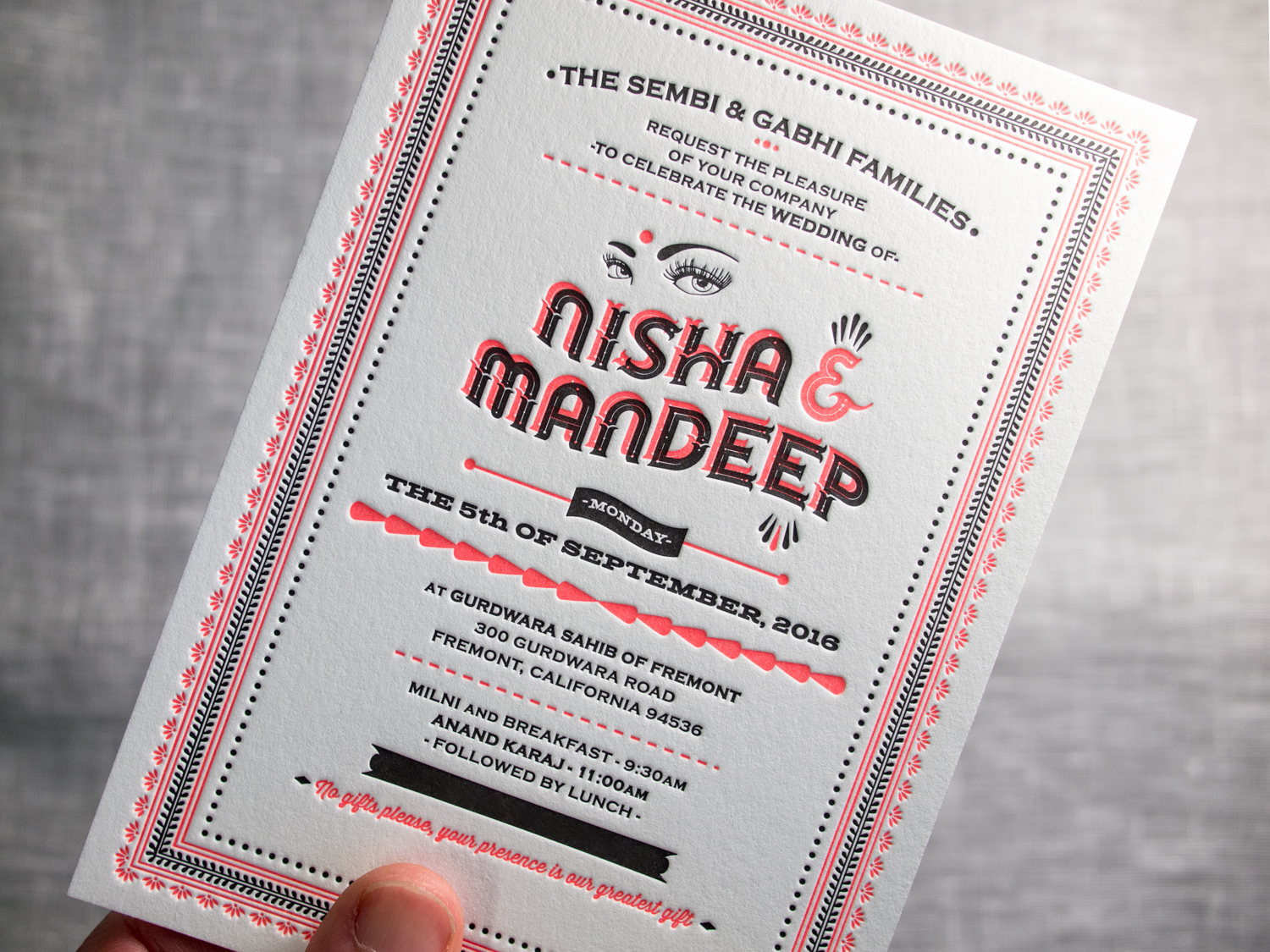
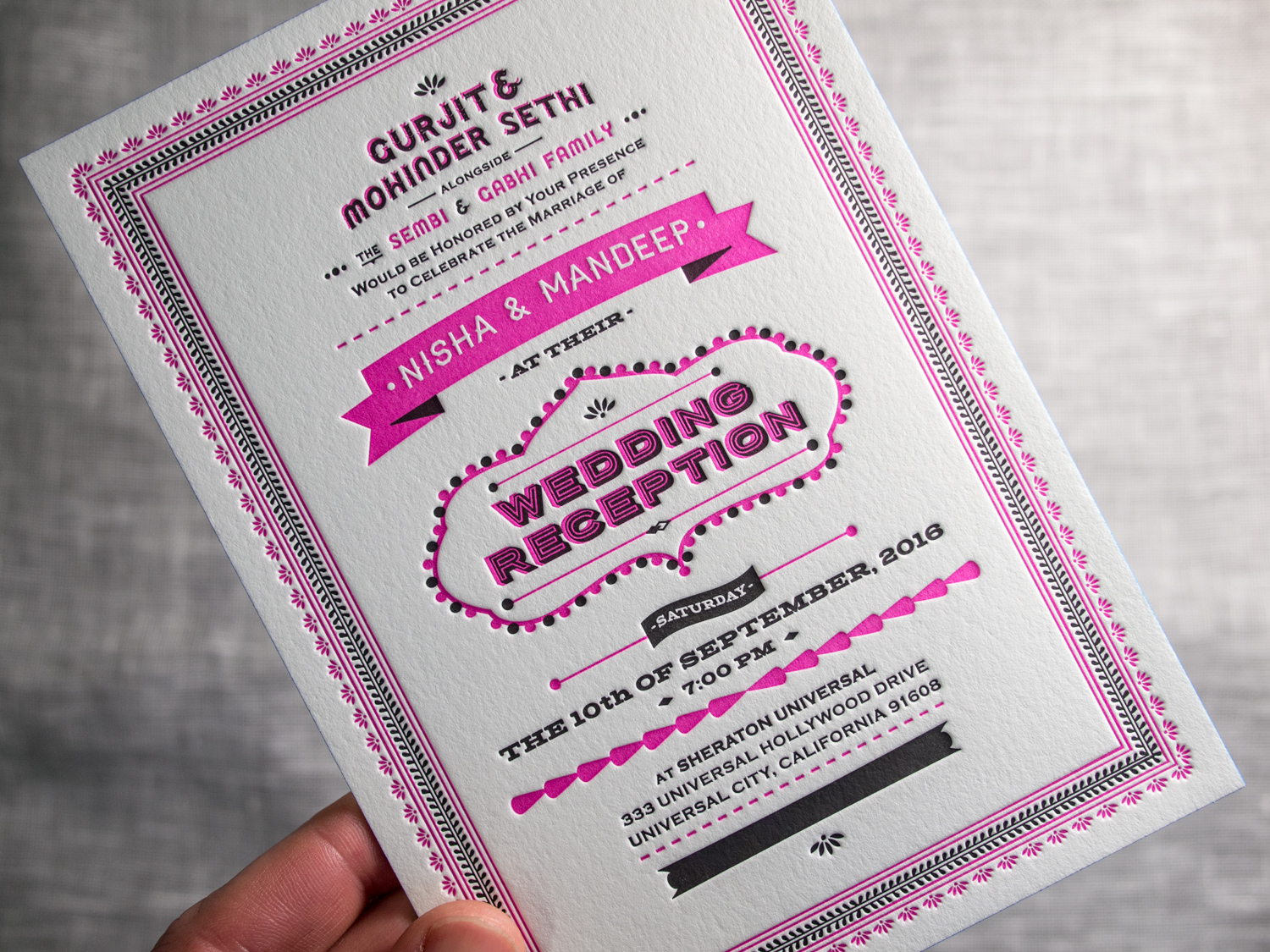
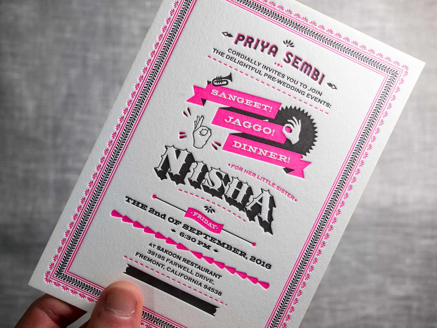
All three have a common feel — employing the same border art, black ink, and copperplate type. But Nisha used different title art for each and we printed them with three different fluorescent letterpress inks — neon orange, deep magenta, a bright pink. We finished each set with three different edge paints — electric blue, highlighter yellow, and metallic silver.
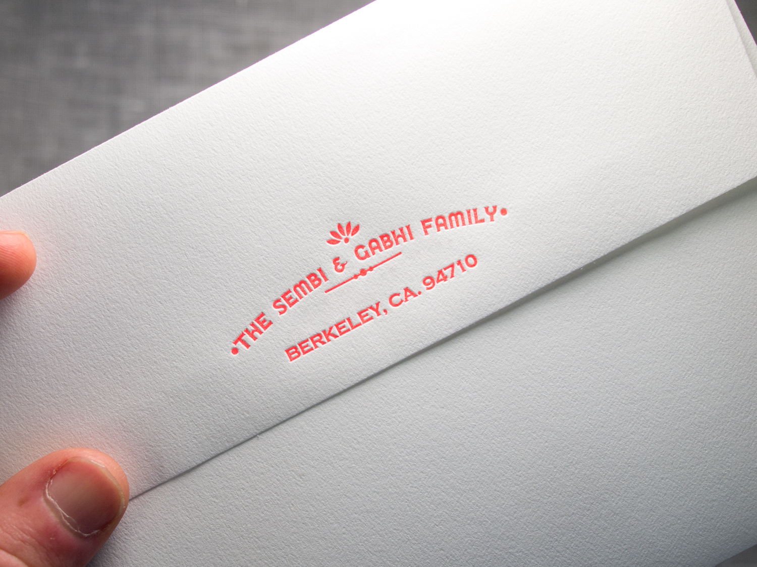
Finally, we used the neon orange ink to print the flap of the fluorescent white envelope.
And what the hell, how about a few more photos...
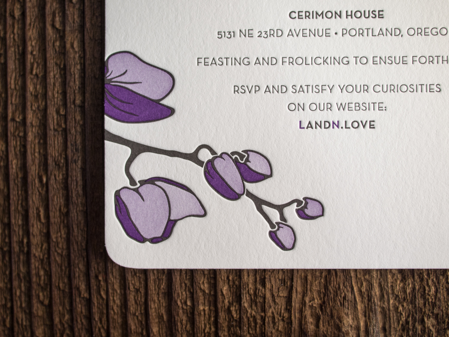
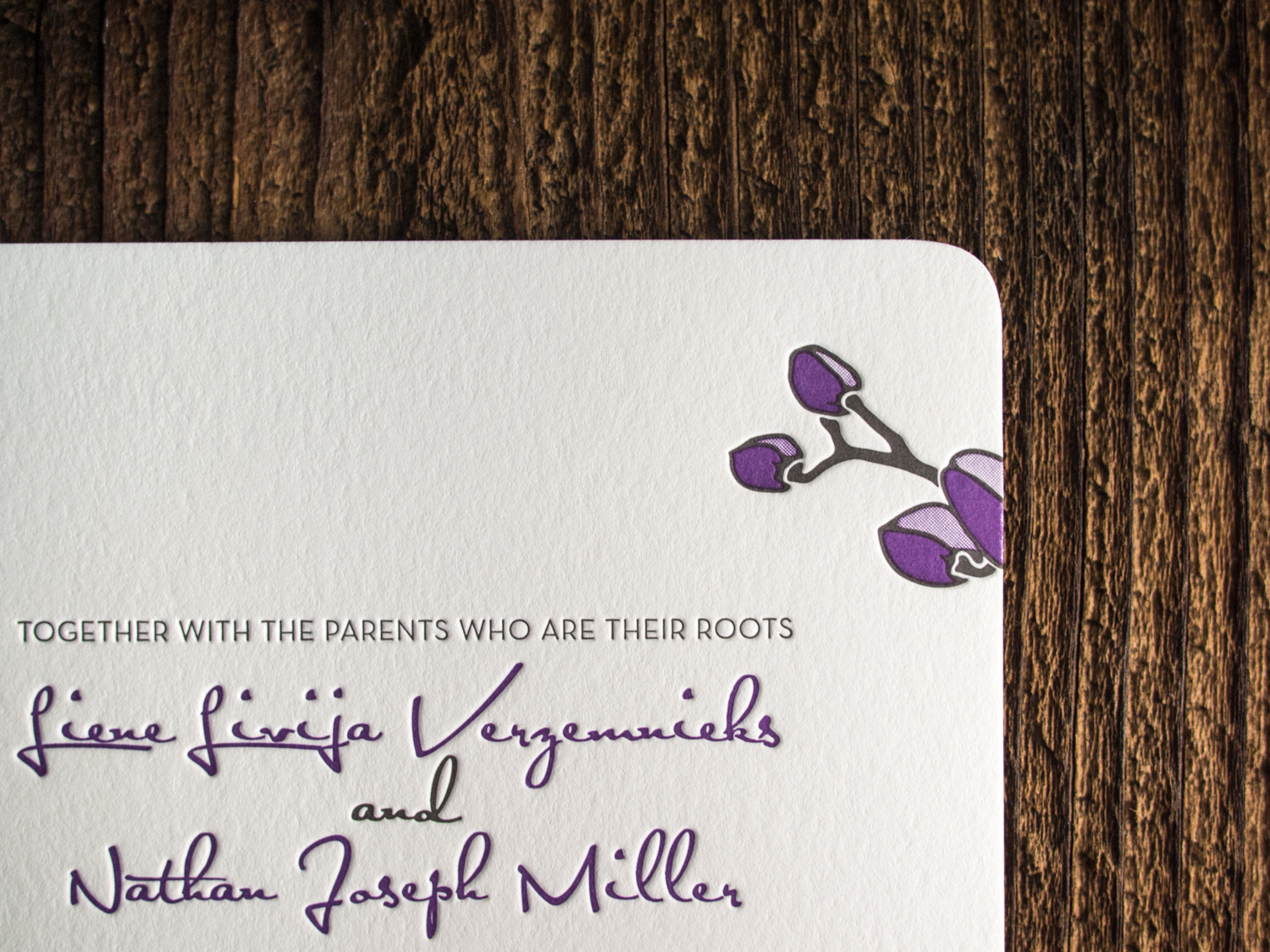
For fellow Portlanders Nathan and Liene, we created a customized variation on our Petal invitation. We kept the round corners and multi-tone orchid art, but changed the fonts, orientation, and inks.
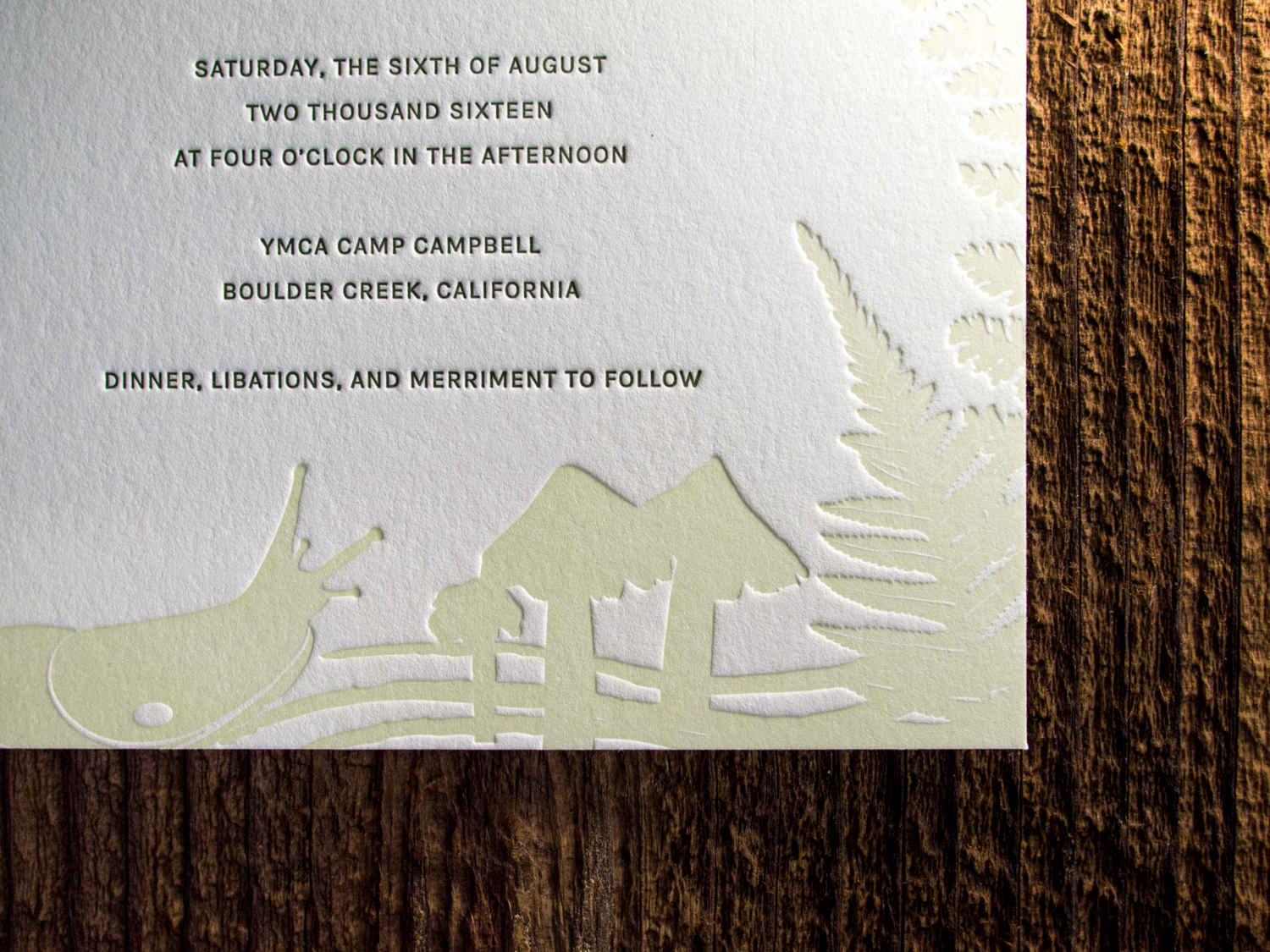
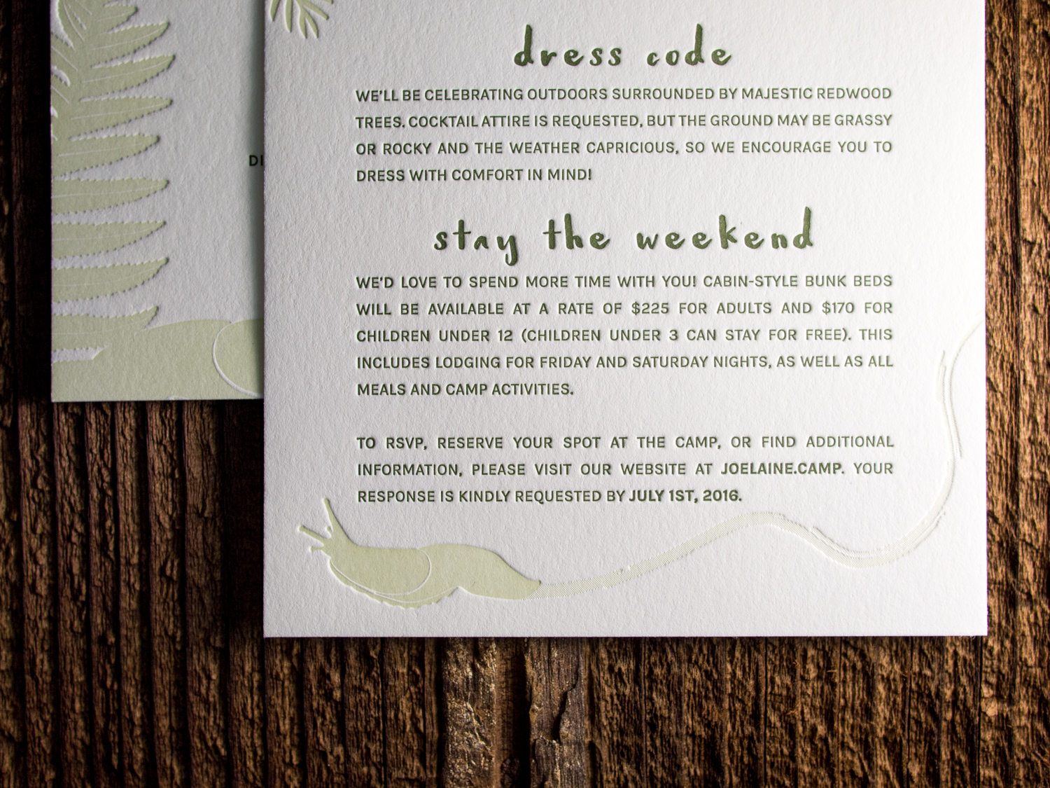
This is one of our favorite client-designed wedding sets of the summer. Elaine and Joseph's invites mimic the lush forest that surrounded their venue in the Santa Cruz Mountains, complete with ferns, pinecones, and slugs.
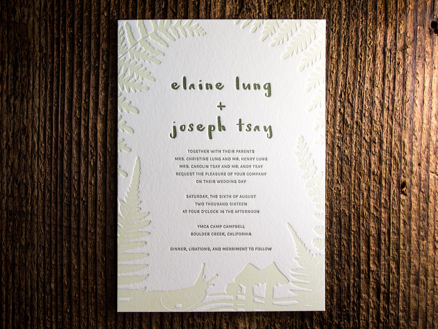
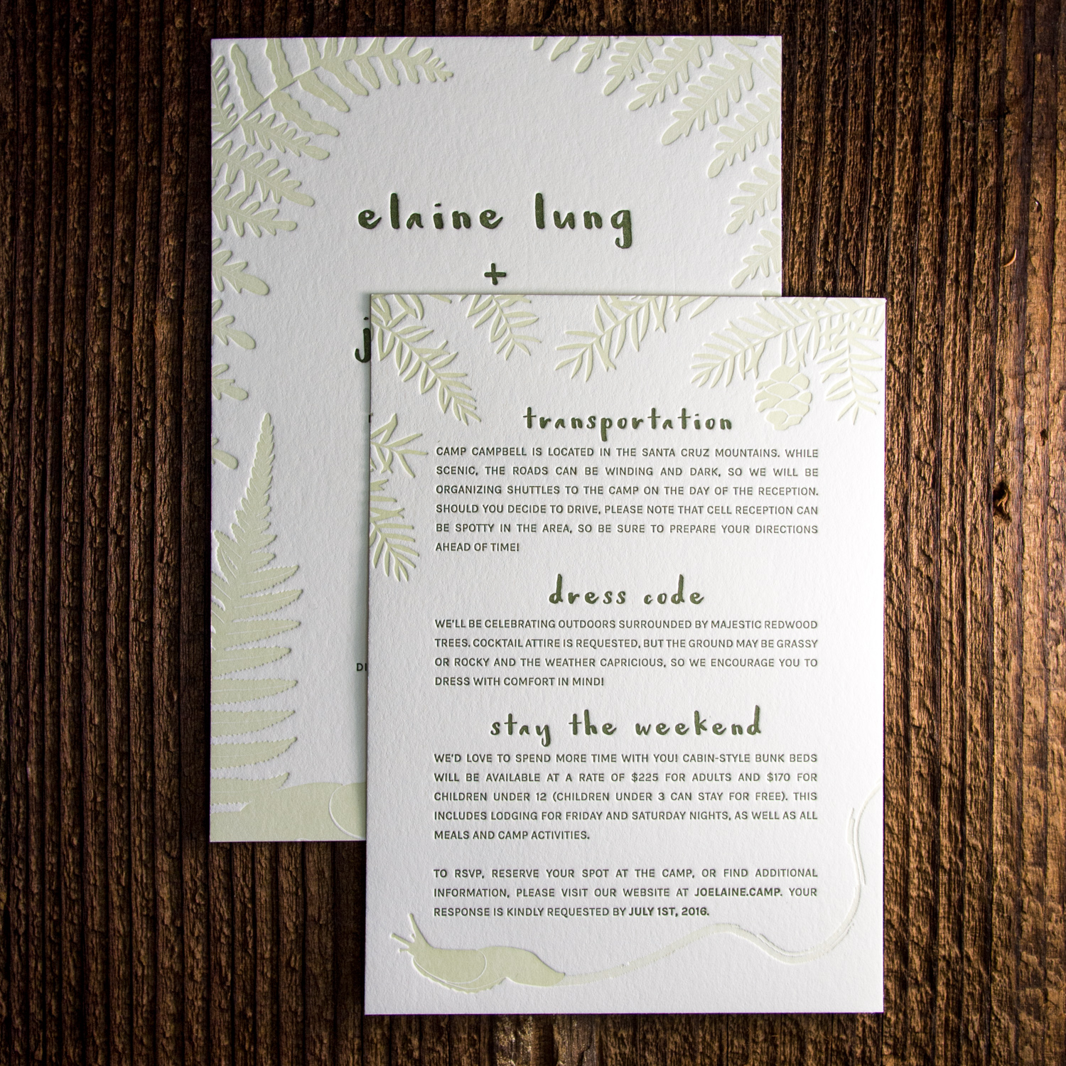
We mixed a custom dilution of our Light Celadon ink to let the deep impression of the artwork really stand out.
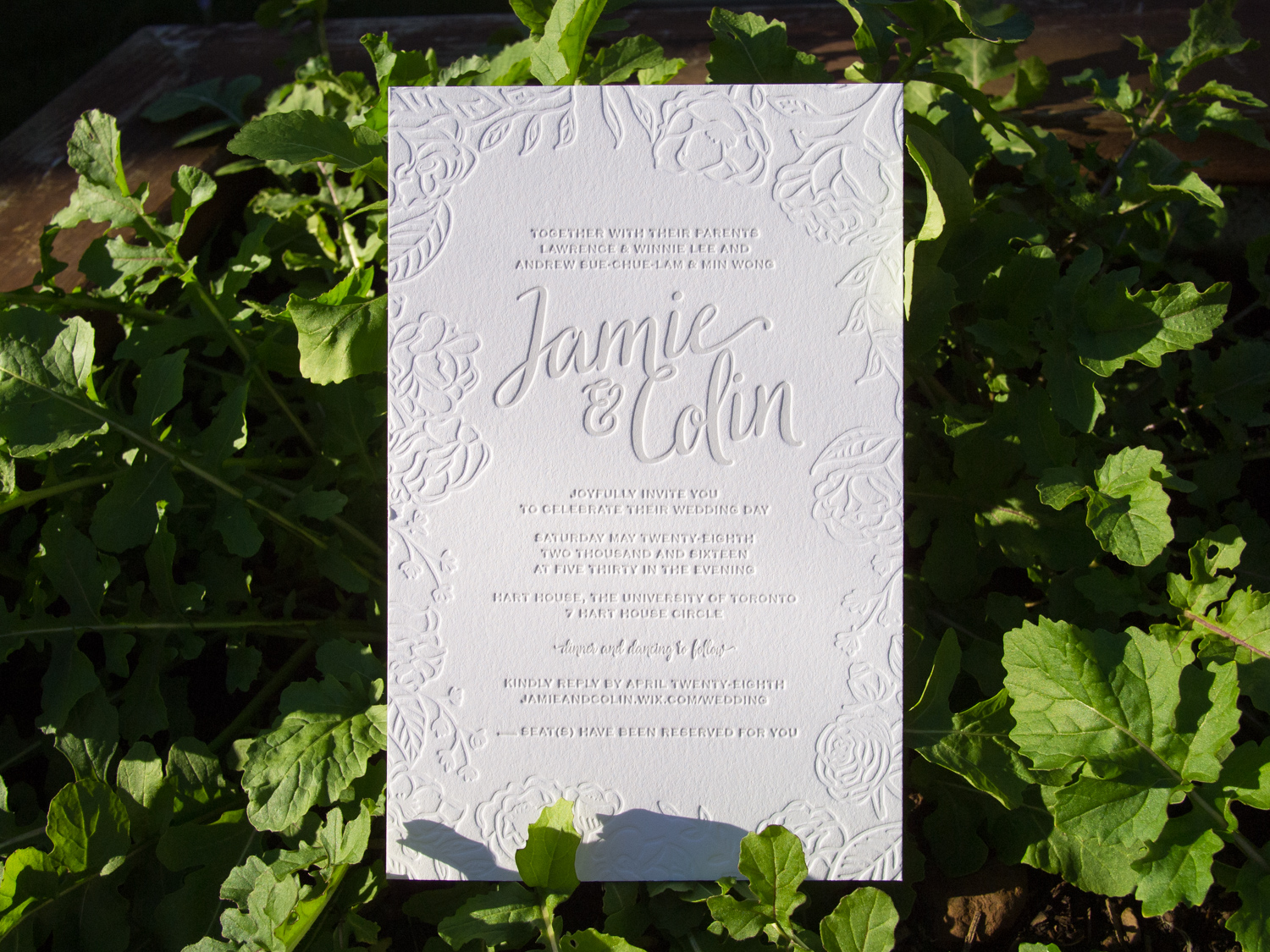
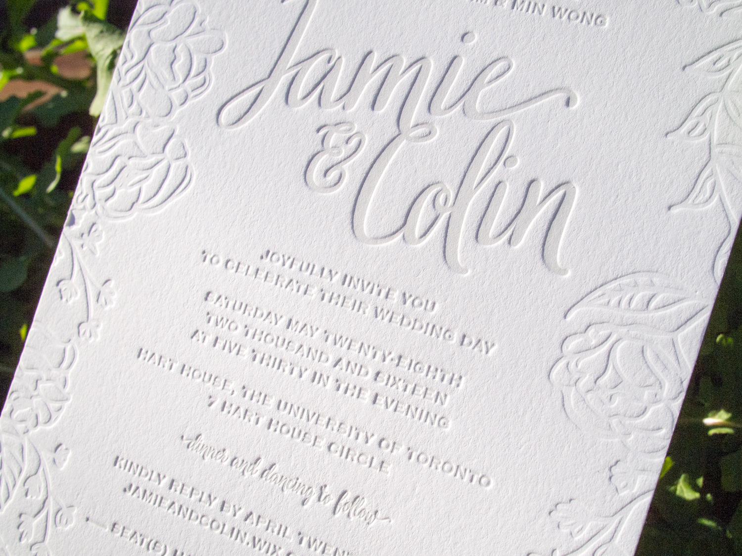
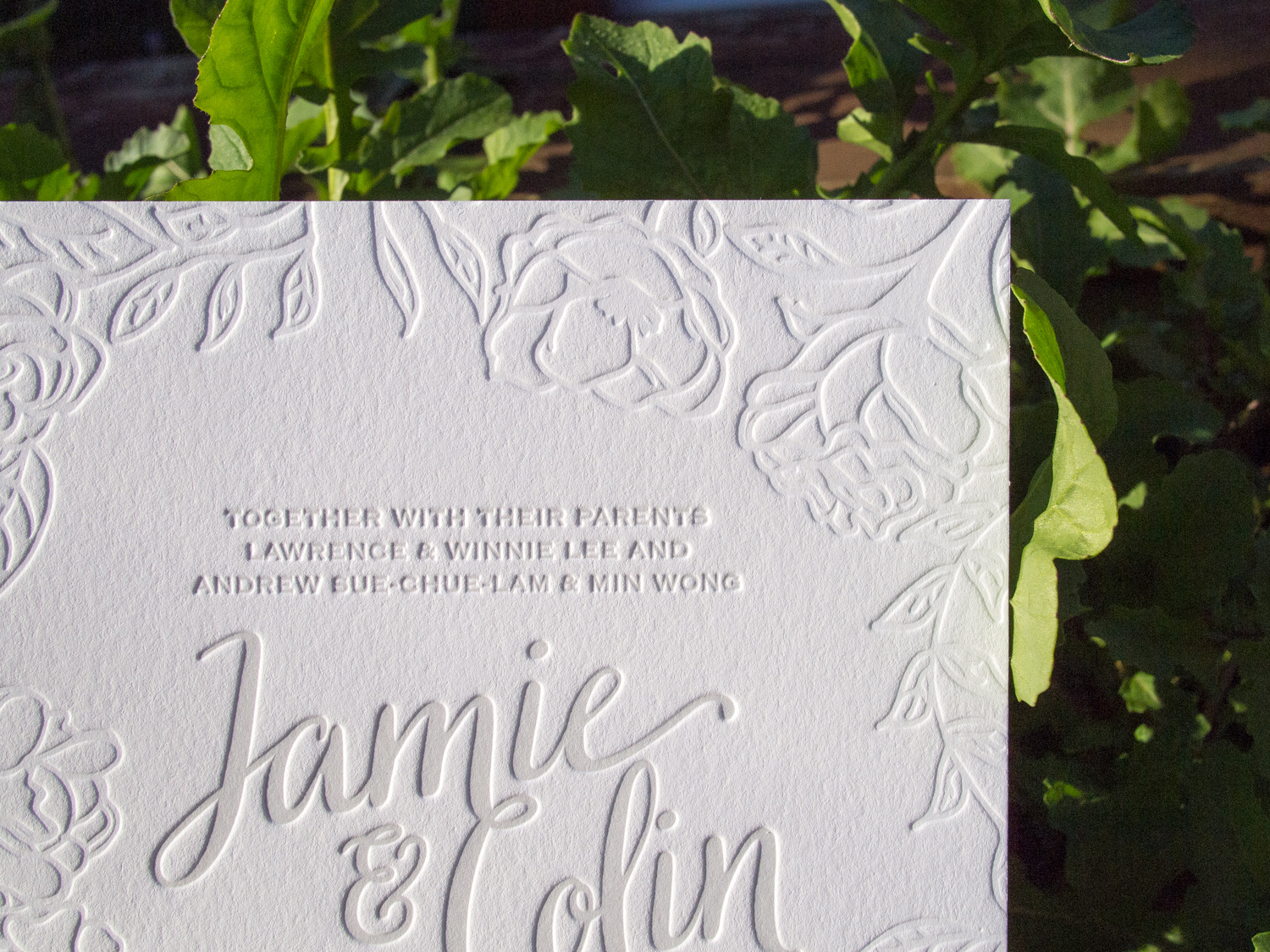
We printed these oversized invites for the friendly folks at Frou Frou House with a very light cool gray ink and a deep blind impression. They're printed on our 600g Fluorescent White stock sized for large A9 envelopes.

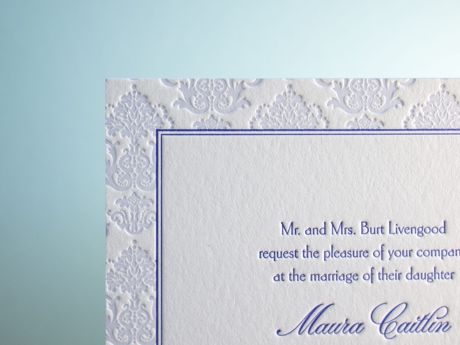
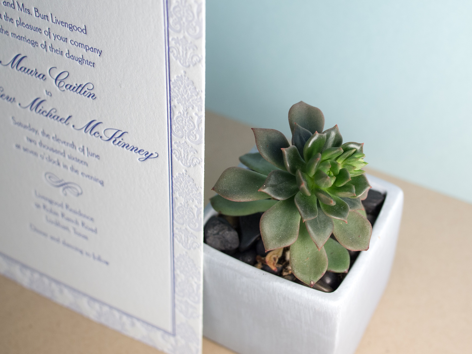
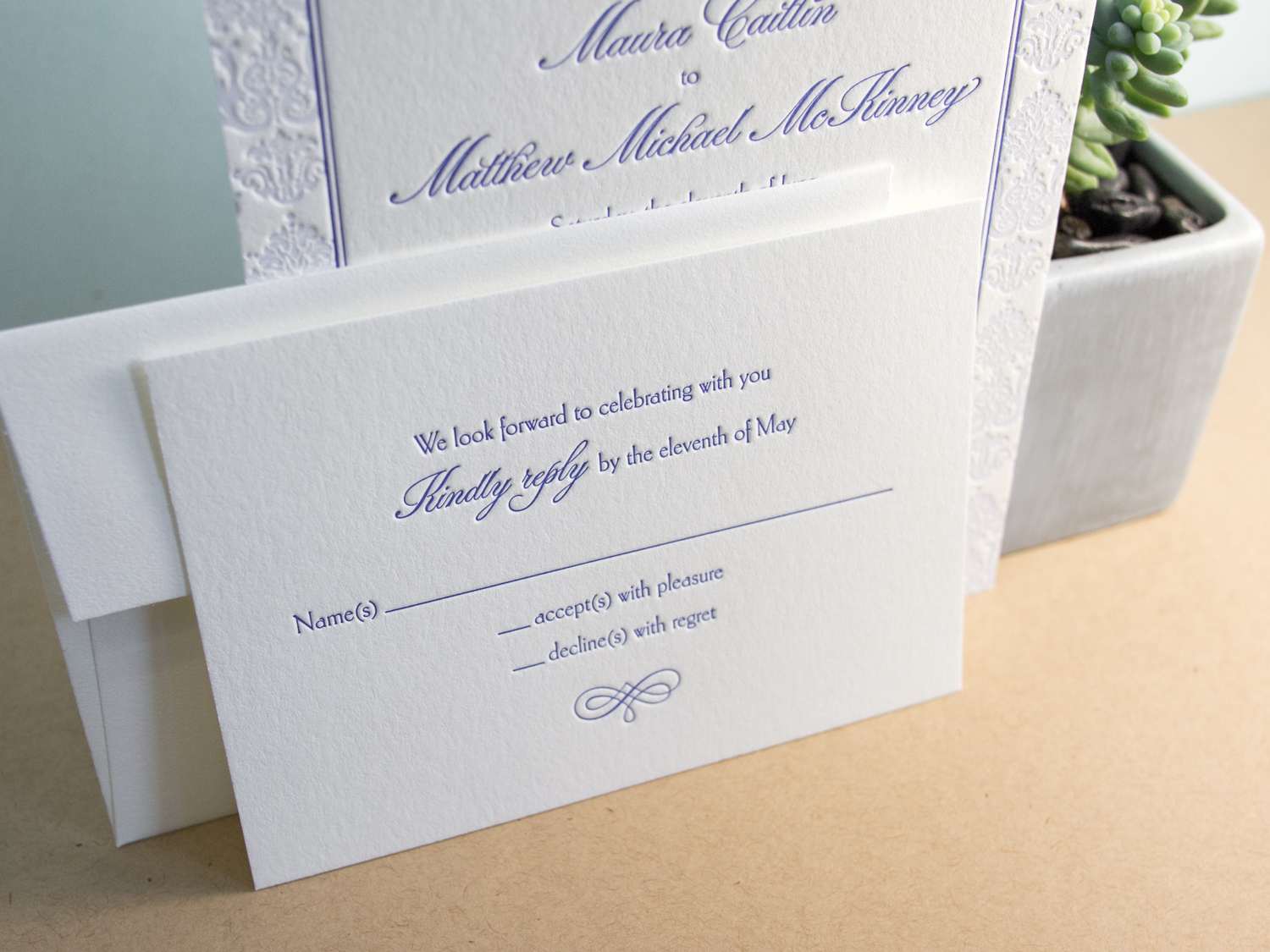
Our Belvedere invitation is traditionally rather formal — printed with a graphite ink and a blind impression for a bold but stark feel. But Maura and Matthew wanted something a little more playful and a touch more Downton Abbey. So we swapped out the Mrs Eaves text and Burgues Script for the more lighthearted combo of Carlton and Parfumerie, punched up the color with two shades of lavender, and opted for a prim and proper flourish motif.