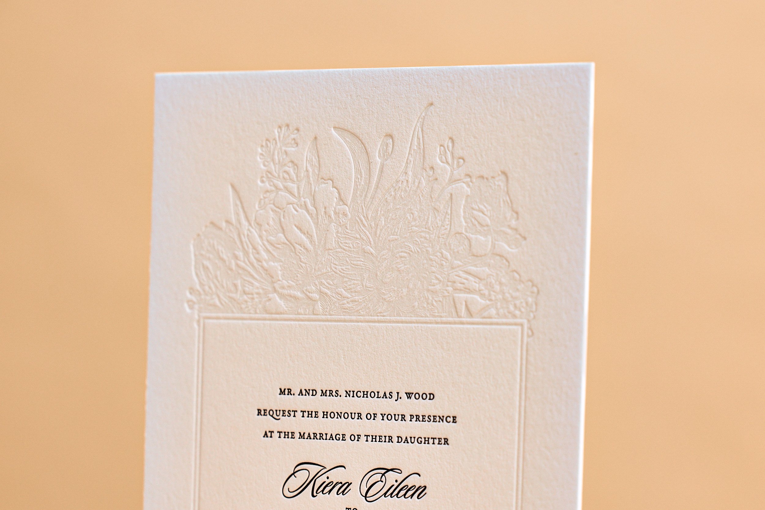
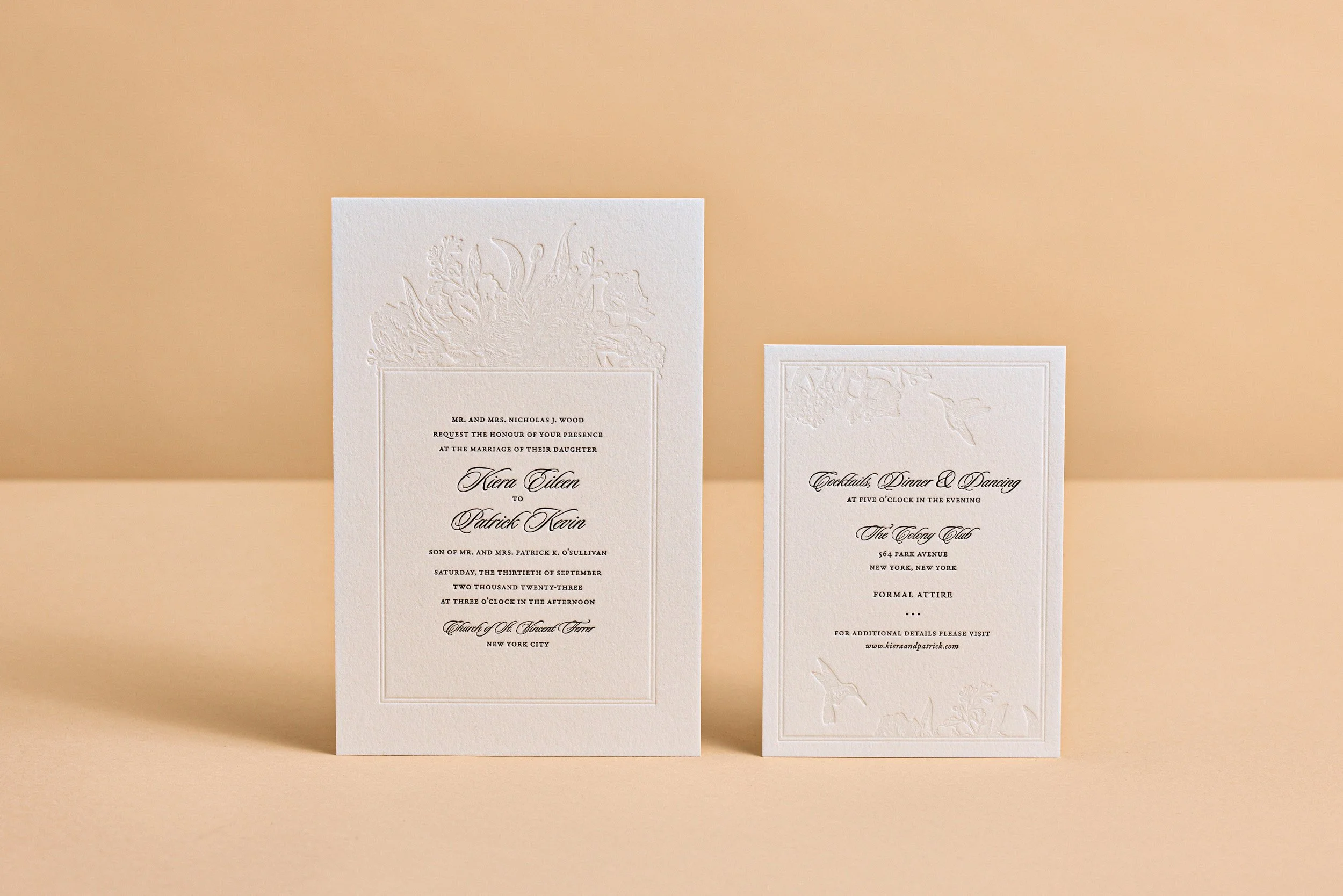
Oversized letterpress wedding invitations for Kiera and Patrick’s fall wedding in NYC. We pressed tined white and black inks on thick 600g Lettra paper. Blind letterpress is an option here too, but the tint really helps the detail pop on the paper.


Oversized letterpress wedding invitations for Kiera and Patrick’s fall wedding in NYC. We pressed tined white and black inks on thick 600g Lettra paper. Blind letterpress is an option here too, but the tint really helps the detail pop on the paper.
For fellow Portlanders Nathan and Liene, we created a customized variation on our Petal invitation. We kept the round corners and multi-tone orchid art, but changed the fonts, orientation, and inks.
Back in April of 2015 we printed some excellent business cards for designer Amanda Benincasa. And then a few months later, she asked us to print her wedding invitations.
The background floral image is actually just Pantone black ink — but when printed on the black Rising Museum Board, it creates a sort of bronze effect (take a look at our tintype photo frames for the same combo in a different setting). And for the text, we did a custom mix of gold and silver to match Envelopments Champagnium stock.
For the reply cards we used the same ink but with our pearl white cotton paper for easier writing.
With our help, they combined the modern typefaces and sleek black / white / silver color scheme of our Ontario style with the classic floral motif from our Blossom design.