Intricate yet simple two-sided client-designed invites for their Victoria, Australia wedding.
PAPER 350g Colorplan Cool Blue
INK Pantone 709 custom mix
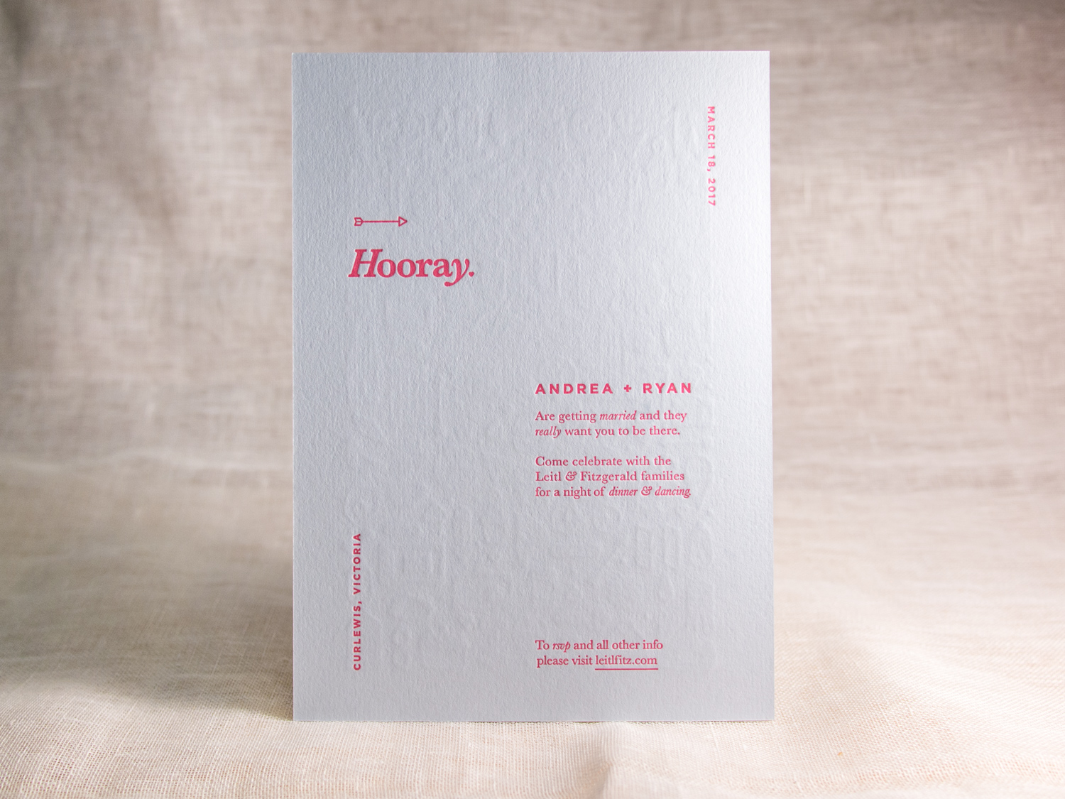
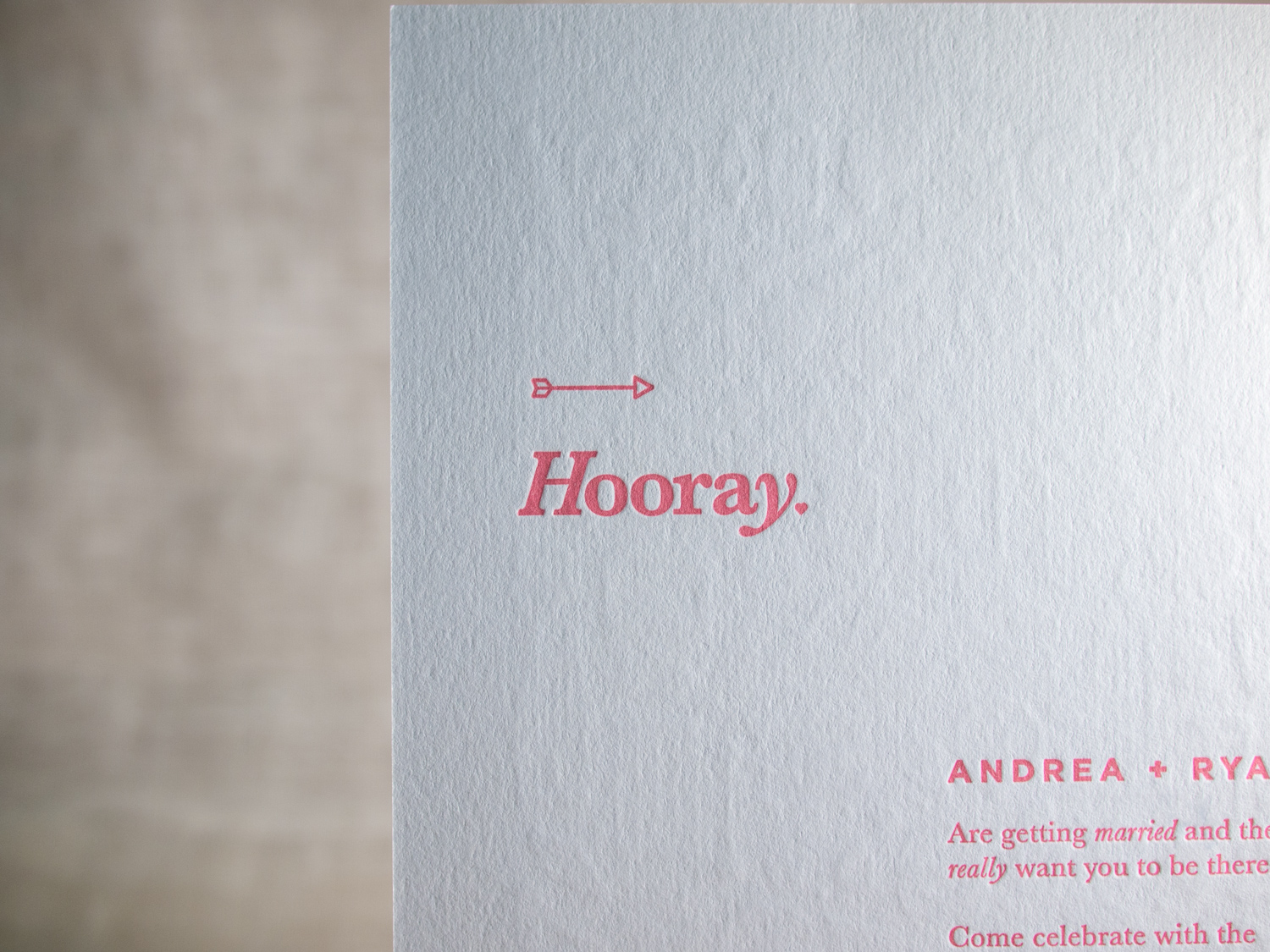
Intricate yet simple two-sided client-designed invites for their Victoria, Australia wedding.
PAPER 350g Colorplan Cool Blue
INK Pantone 709 custom mix
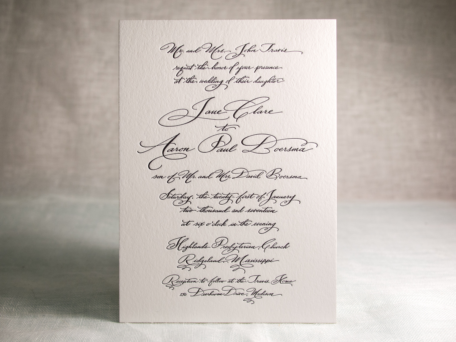
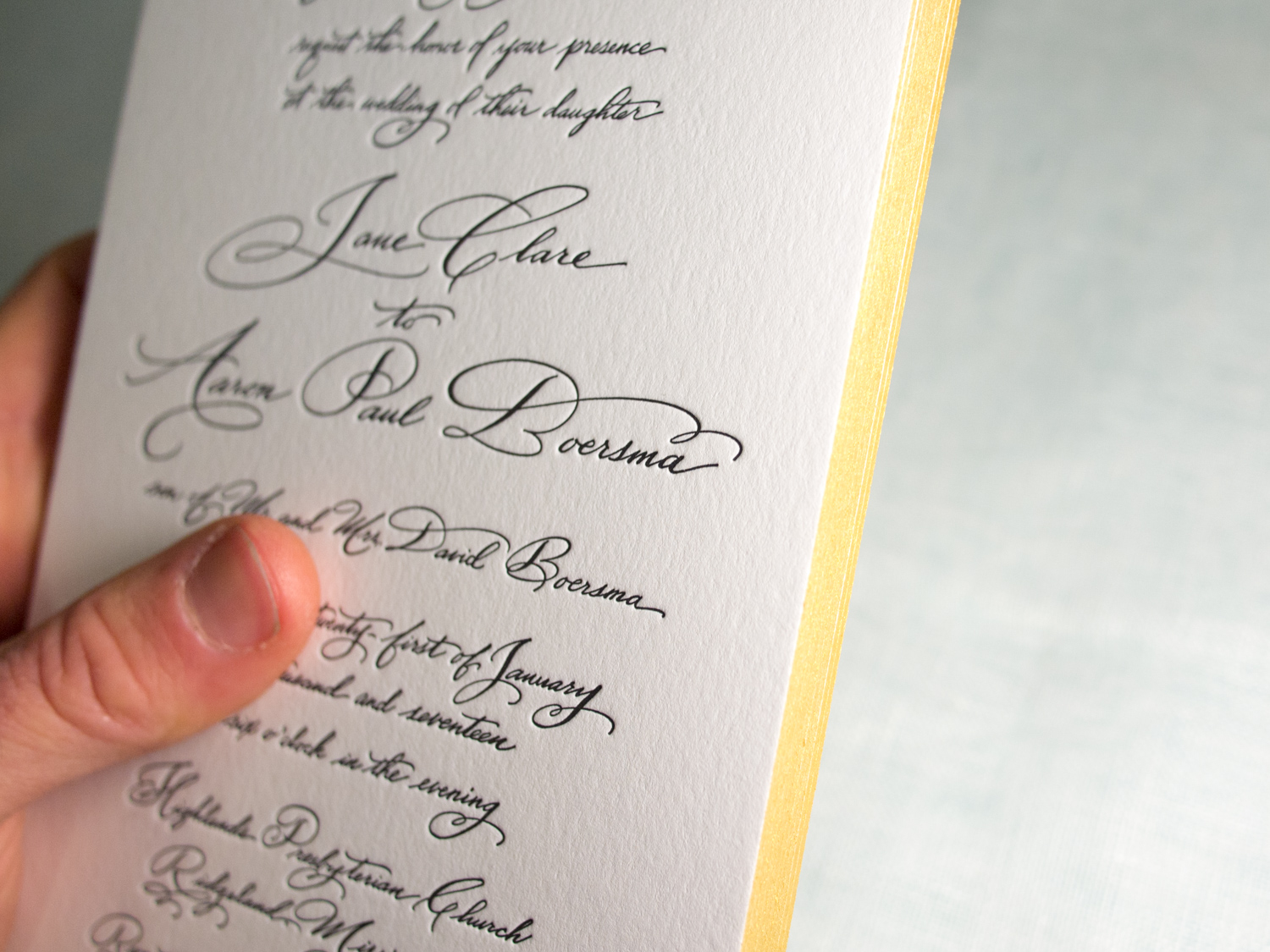
Simple black on white with beautiful calligraphy from Pier Gustafson.
PAPER 600g Fluorescent White
INK Black
EDGES Gold
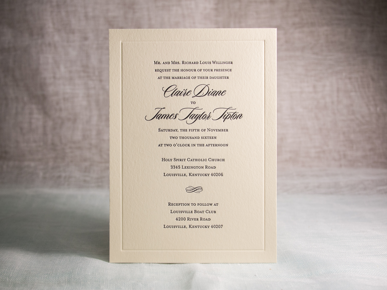
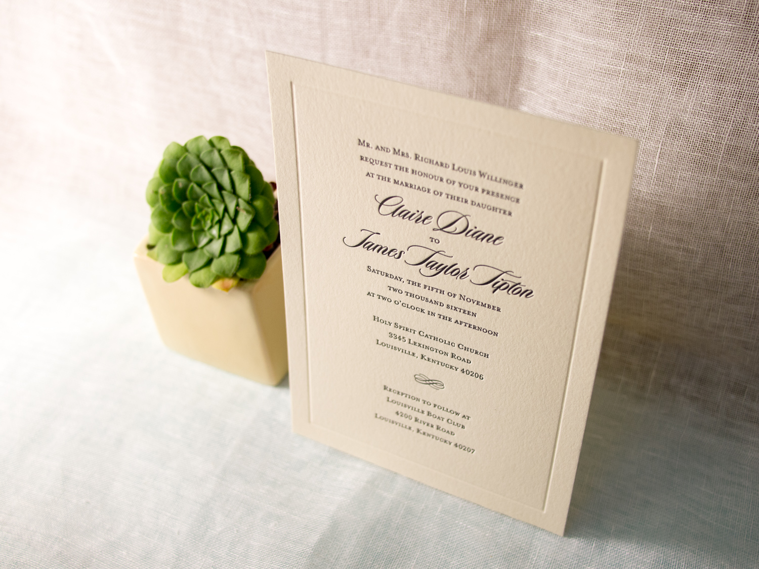
This is a variation on our popular Vignette invitation design featuring black ink and the lovely Duende script font.
PAPER 300g Ecru White
INK Black & Blind Impression
TYPE Duende & Mrs Eaves Small Caps
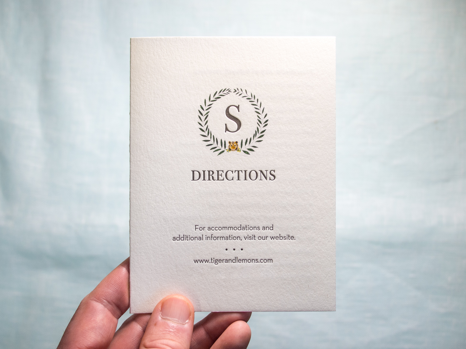
These oversized square invitations feature our Tungsten letterpress ink along with a digitally printed "tigers & lemons" wedding seal provided by the couple.
As they put it, “Tiger” is the bride’s term of endearment for the groom as he is the fourth Shoemaker to hold “Tigert” as his middle name. “Lemons” is the groom’s term of endearment for the bride as she is “the lemon to his lime.”
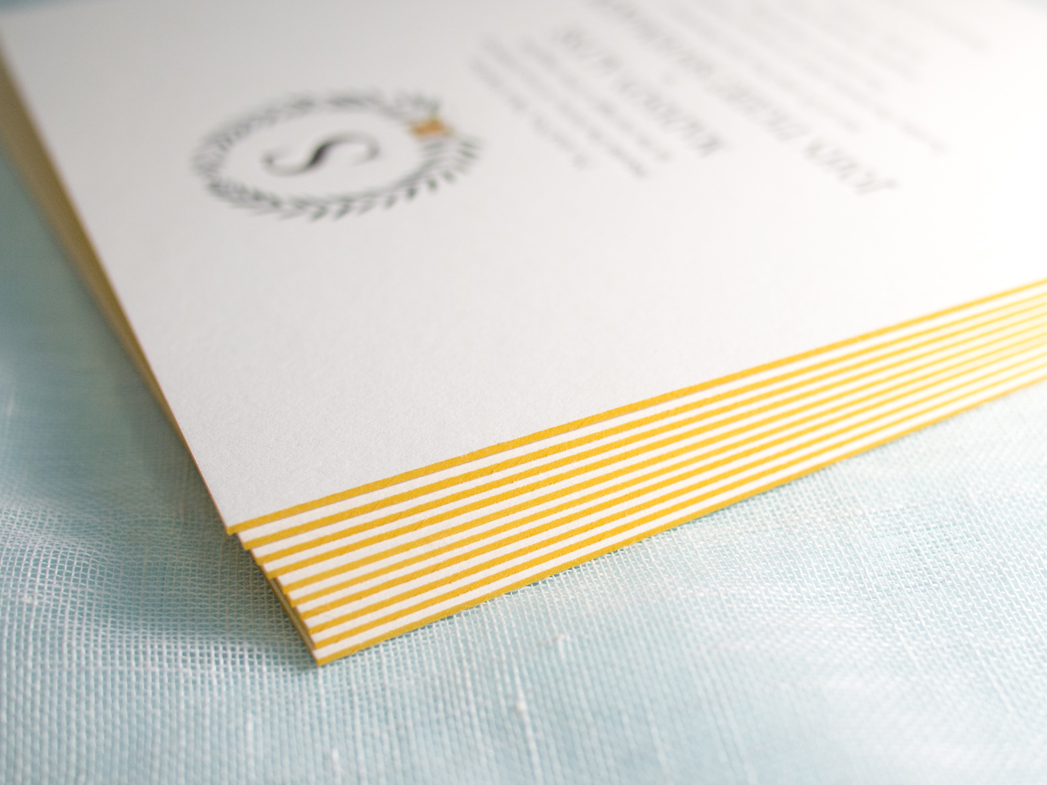
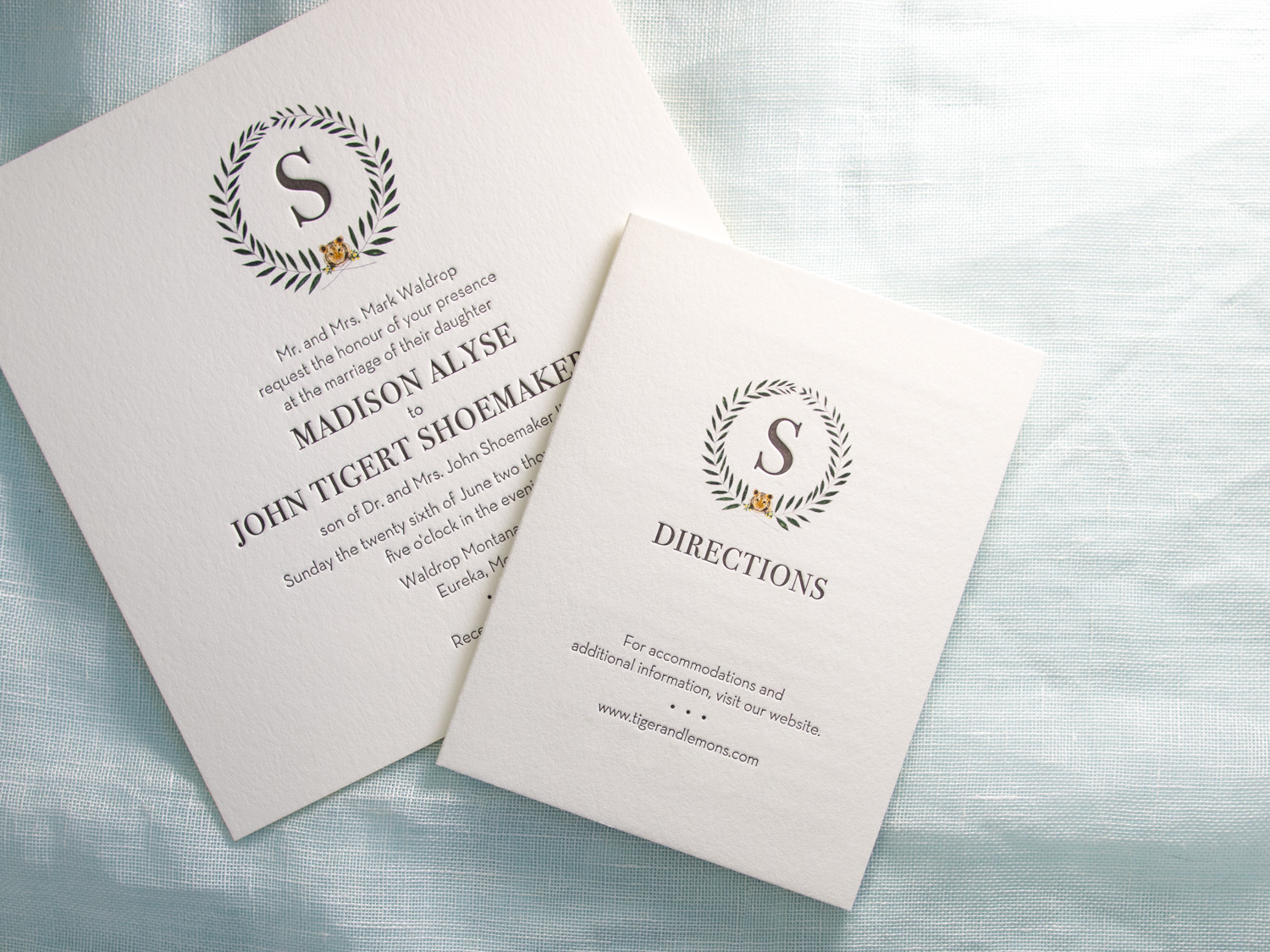
The invitation is printed on our thick 600g Pearl White paper with bright gold edge paint, and it's paired with a metallic gold liner. The typeface combo is great: All caps Bodoni with sans serif Neutra Book.
We also printed mini directions booklets using the same ink combo, but on our lighter-weight 300g stock.
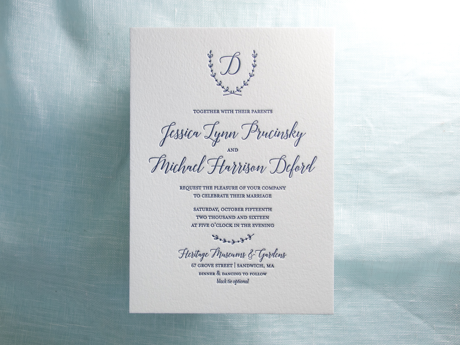
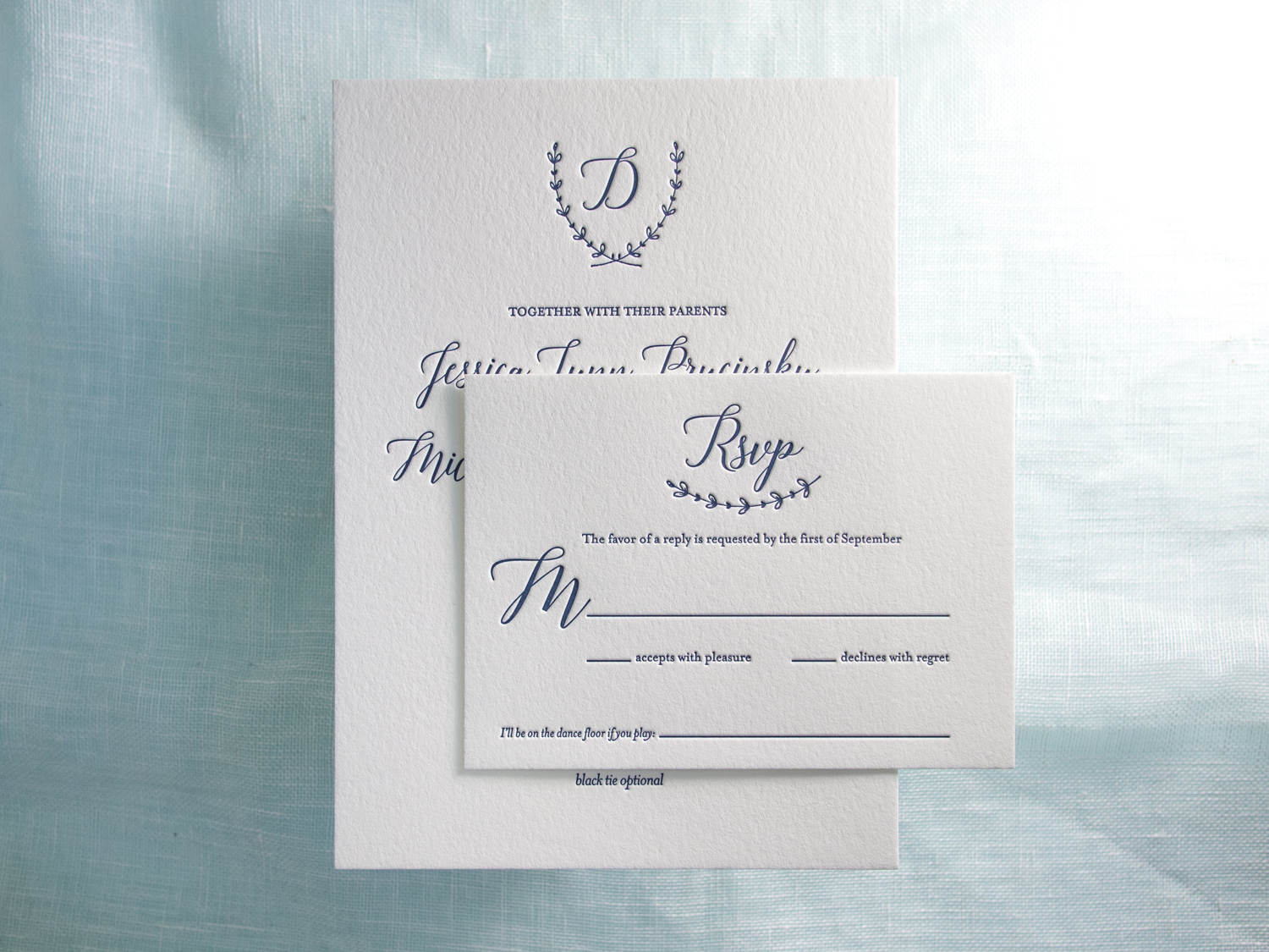
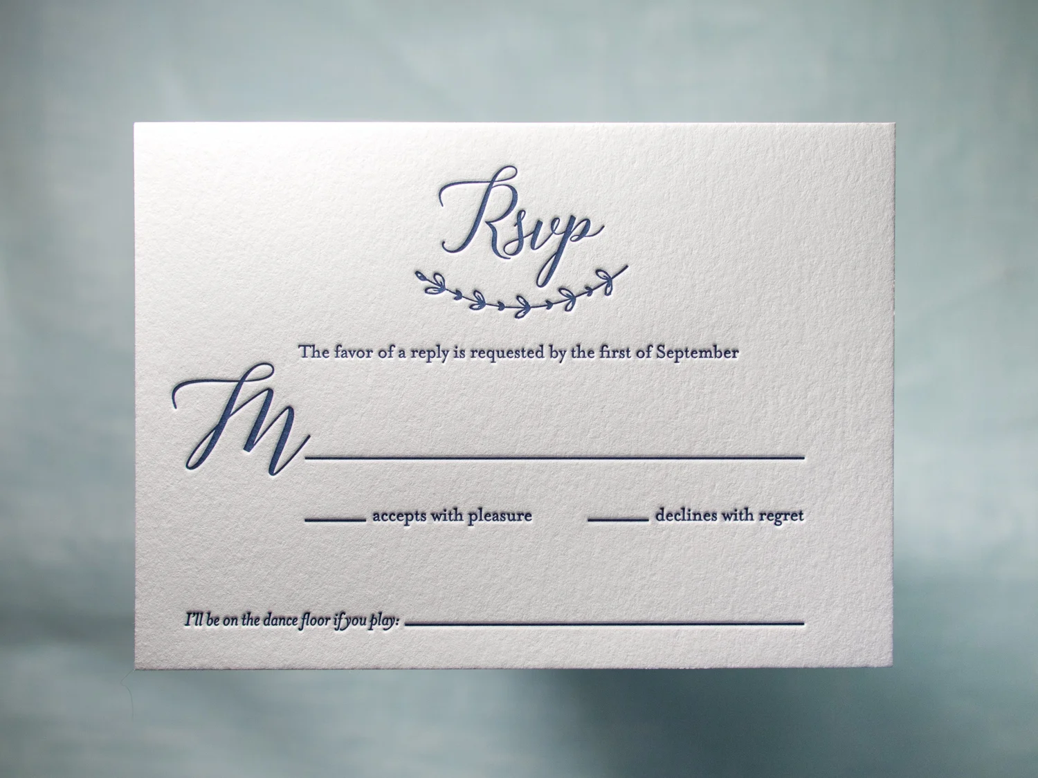
Simple but spectacular one-color invitations designed by the bride, Jessica, and printed by us.
PAPER 300g and 600g Pearl White
INK Midnight
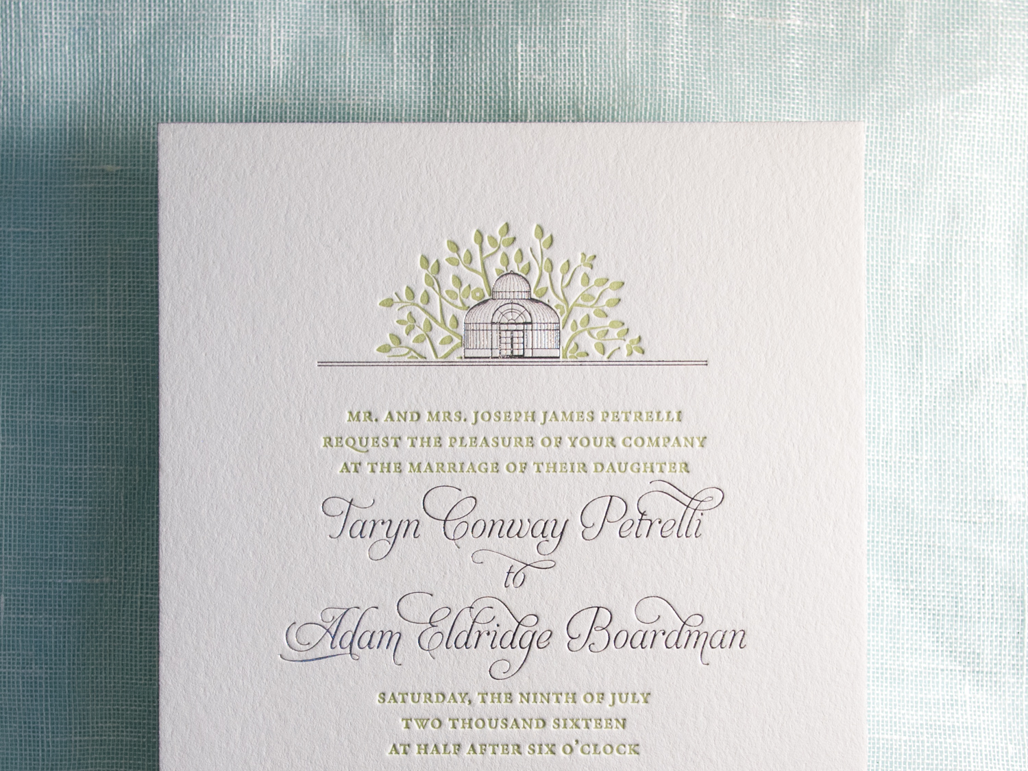
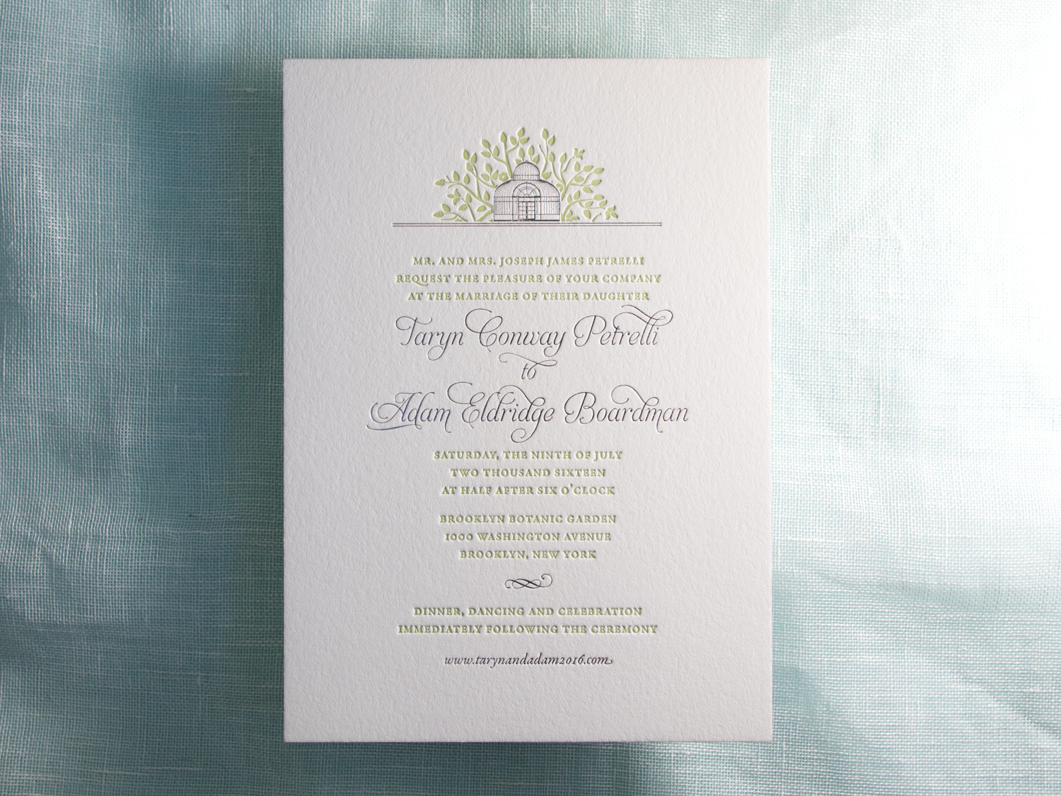
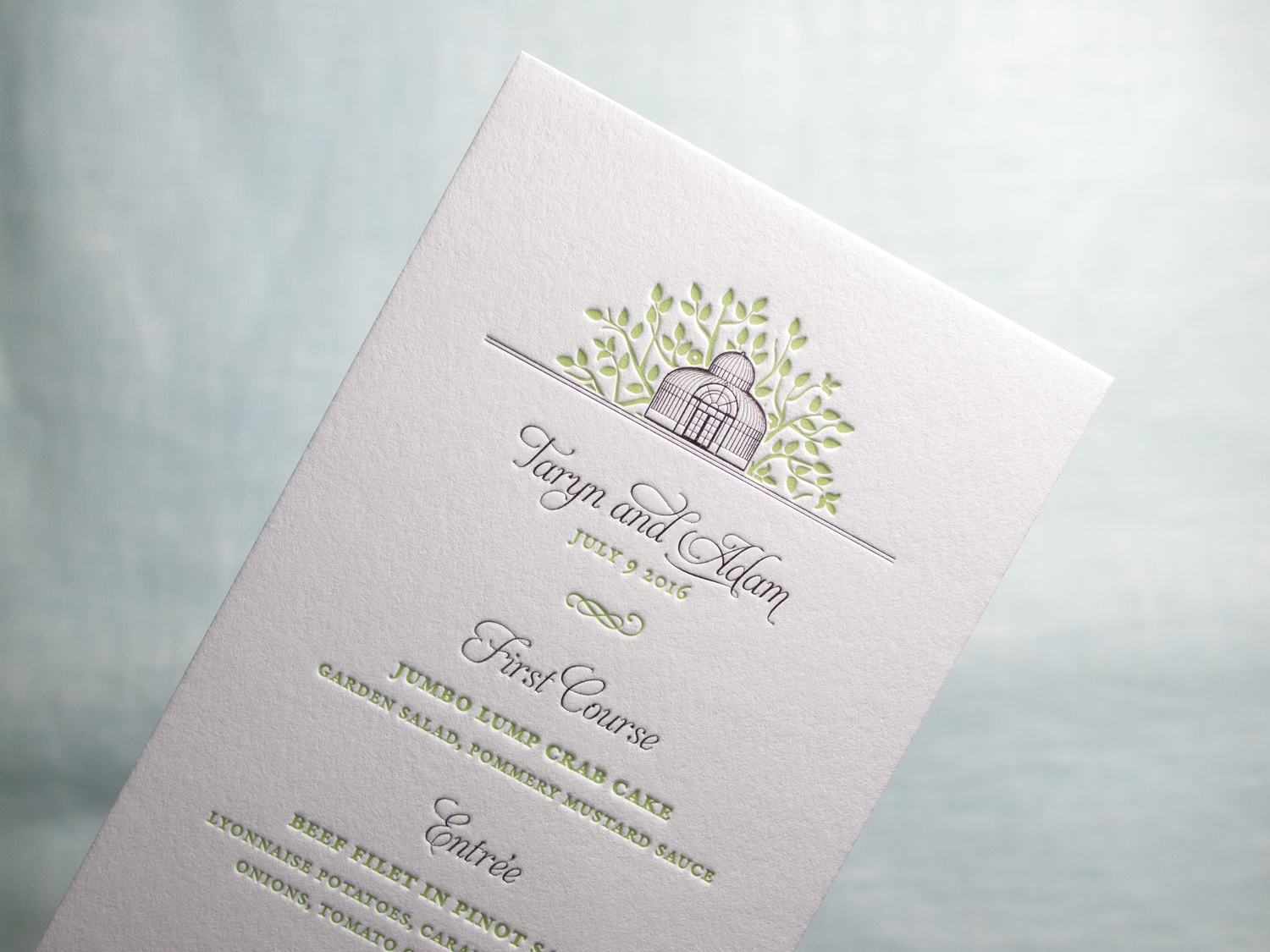
For Taryn and Adam's wedding in the Brooklyn Botanic Garden, we designed a custom foil + letterpress motif based on the garden's Palm House. Take a look at the inspiration:
Photo by Brookelyn Photography
We carried parts of the artwork through to reply cards, menus, programs, and even the envelopes.
PAPER 600g Fluorescent White
INK Light Celadon
FOIL Silver Shine

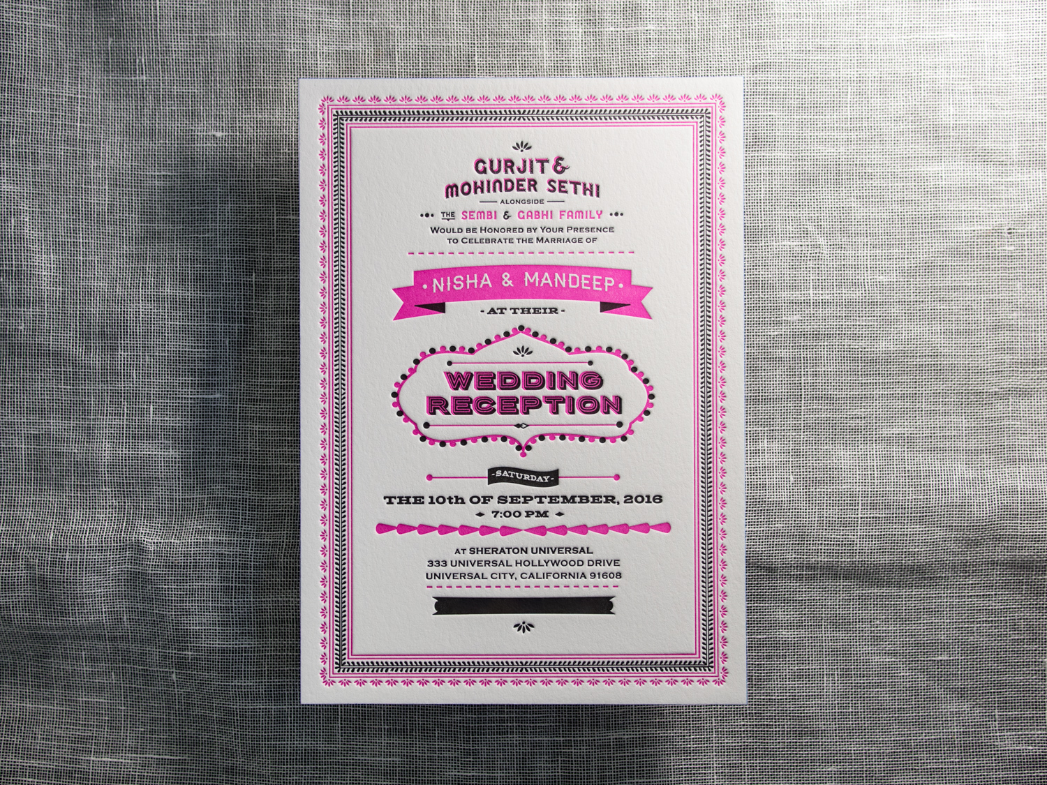
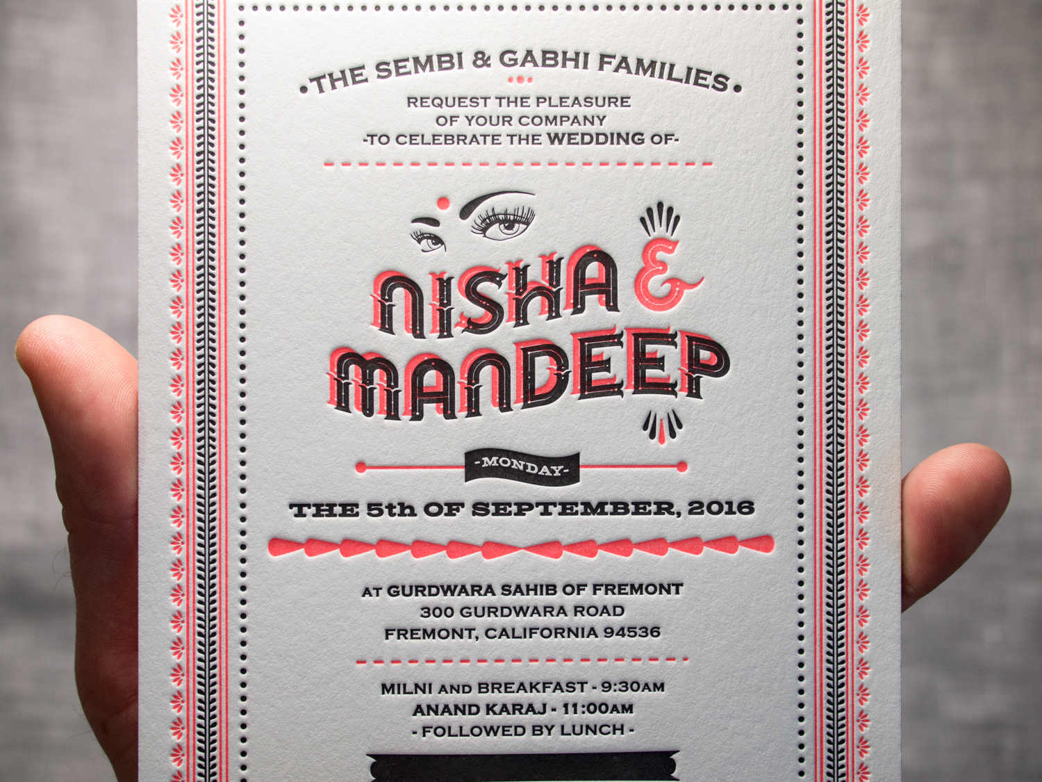
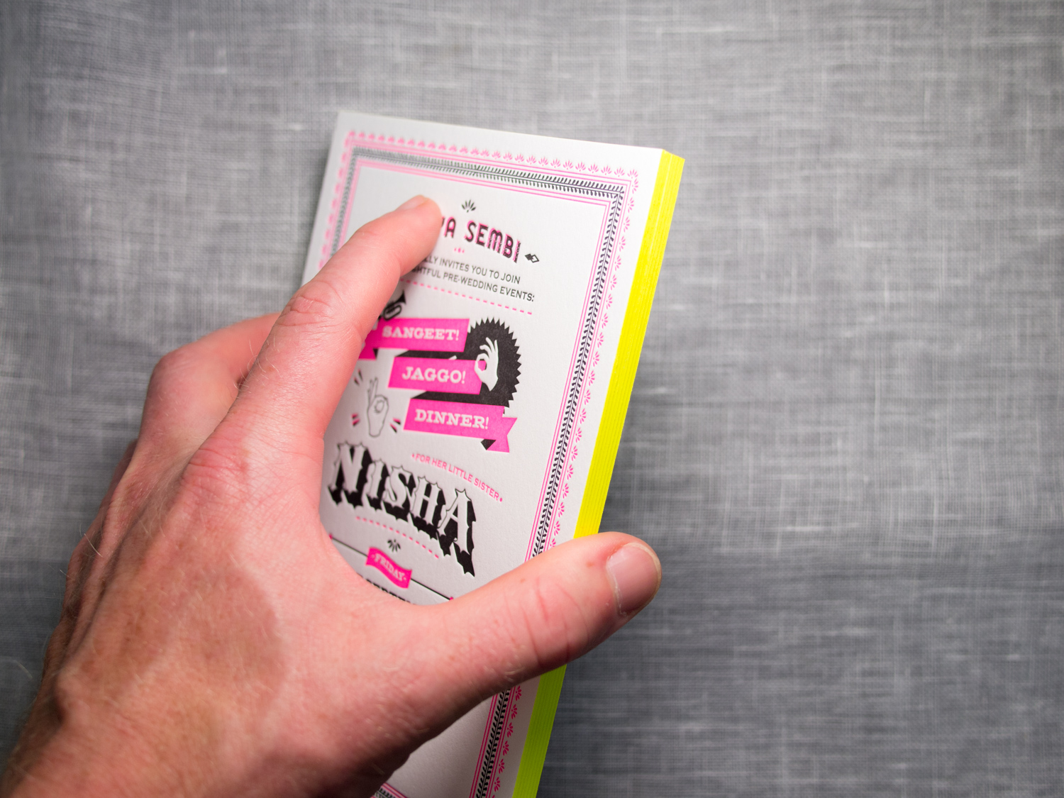
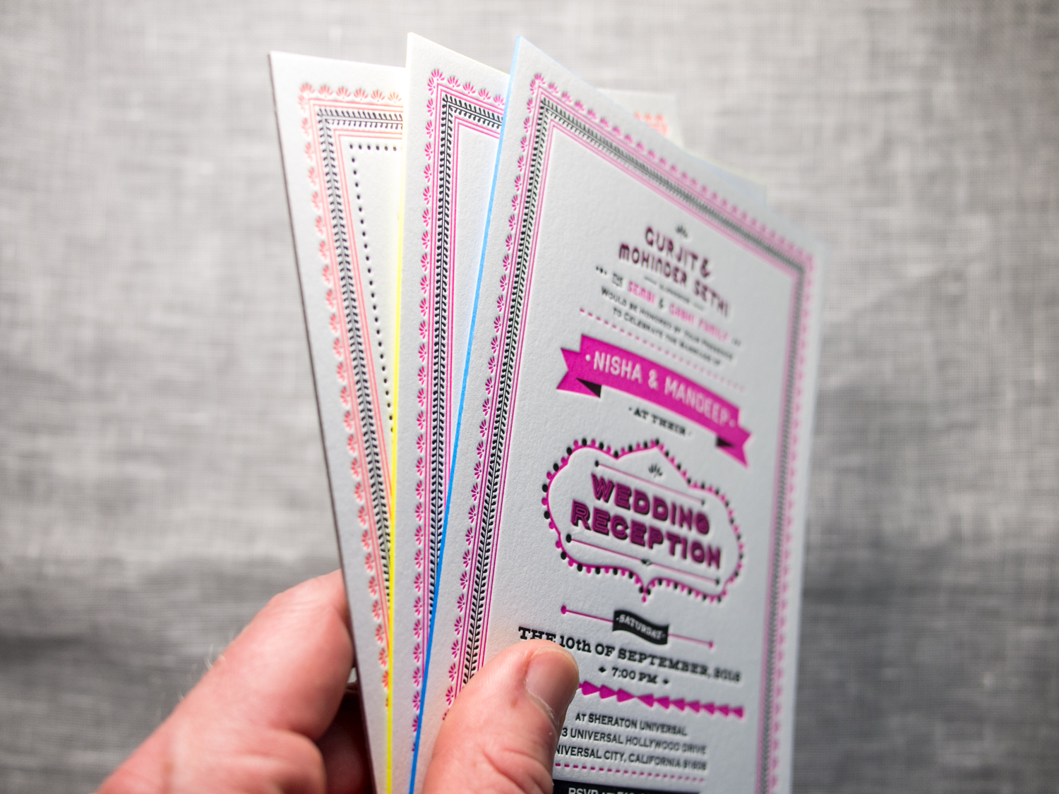
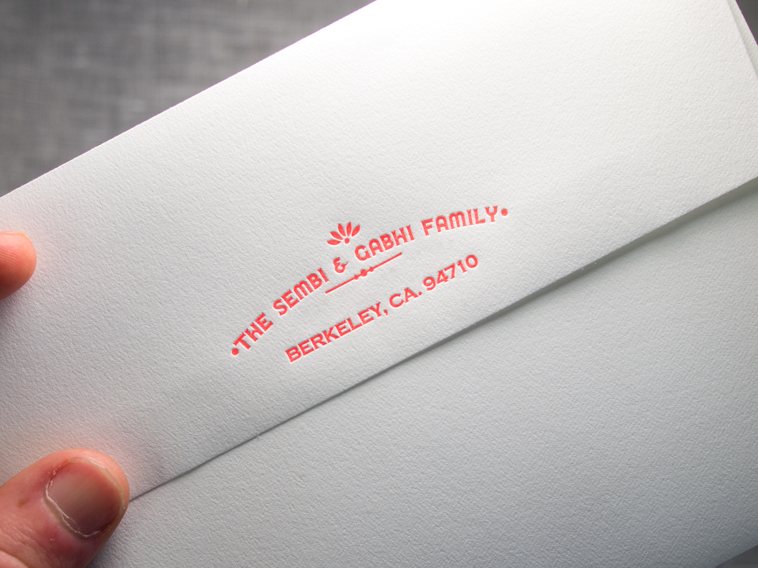
These might be my favorite client-designed invitations this year. The bride, Nisha, designed three different invites for her various California wedding festivities.
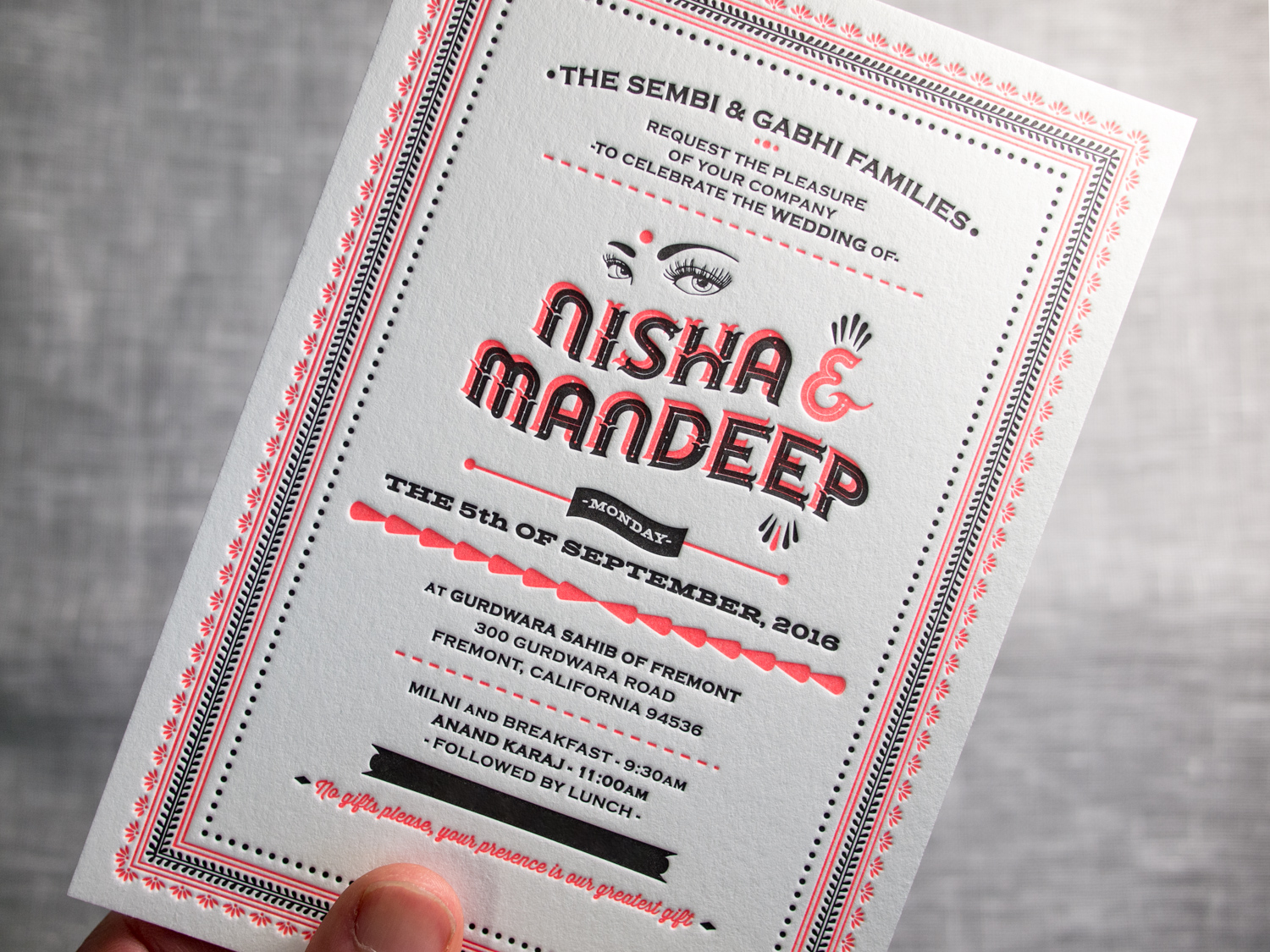
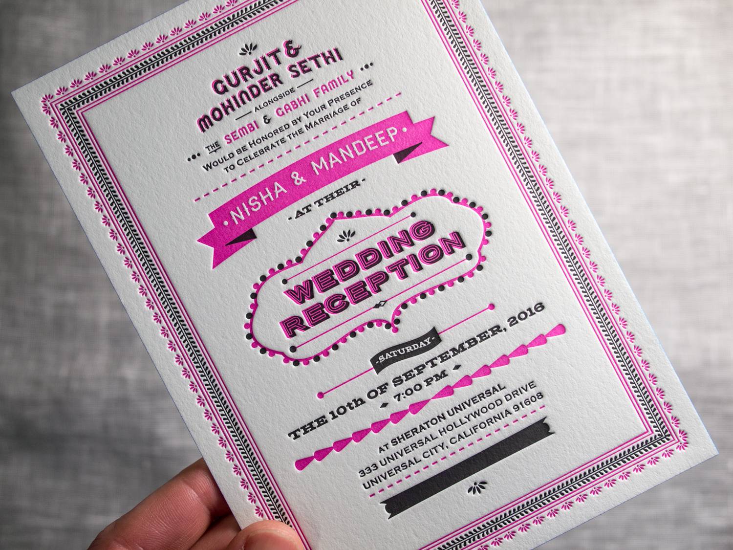
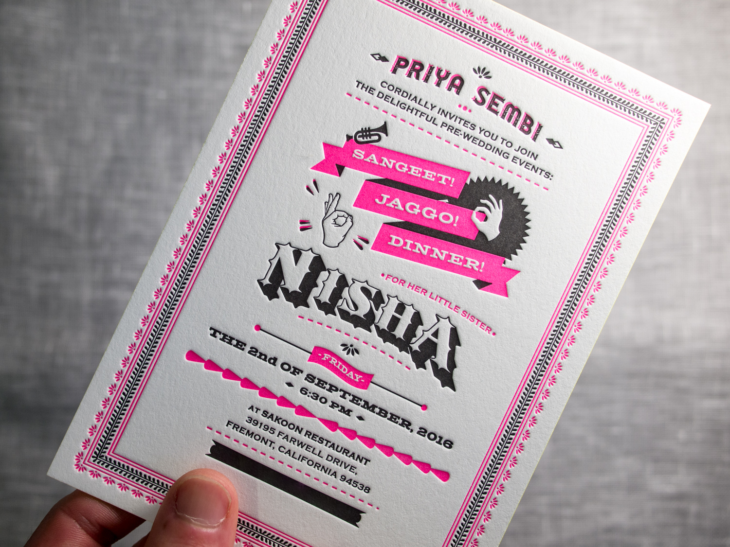
All three have a common feel — employing the same border art, black ink, and copperplate type. But Nisha used different title art for each and we printed them with three different fluorescent letterpress inks — neon orange, deep magenta, a bright pink. We finished each set with three different edge paints — electric blue, highlighter yellow, and metallic silver.
Finally, we used the neon orange ink to print the flap of the fluorescent white envelope.
And what the hell, how about a few more photos...