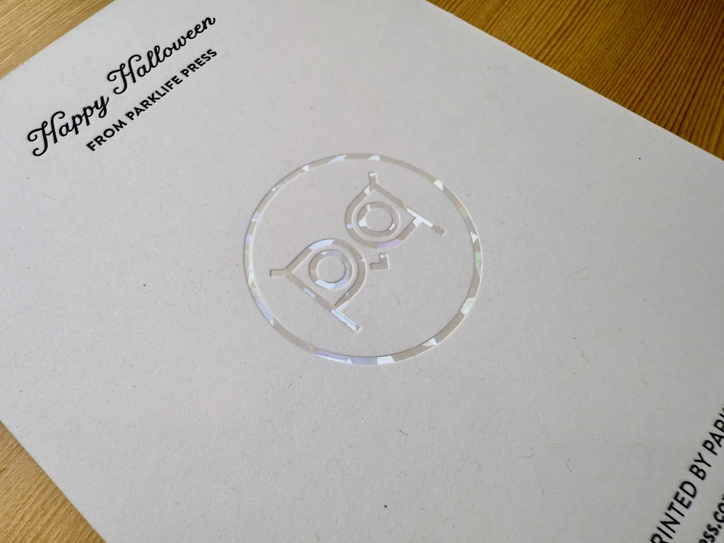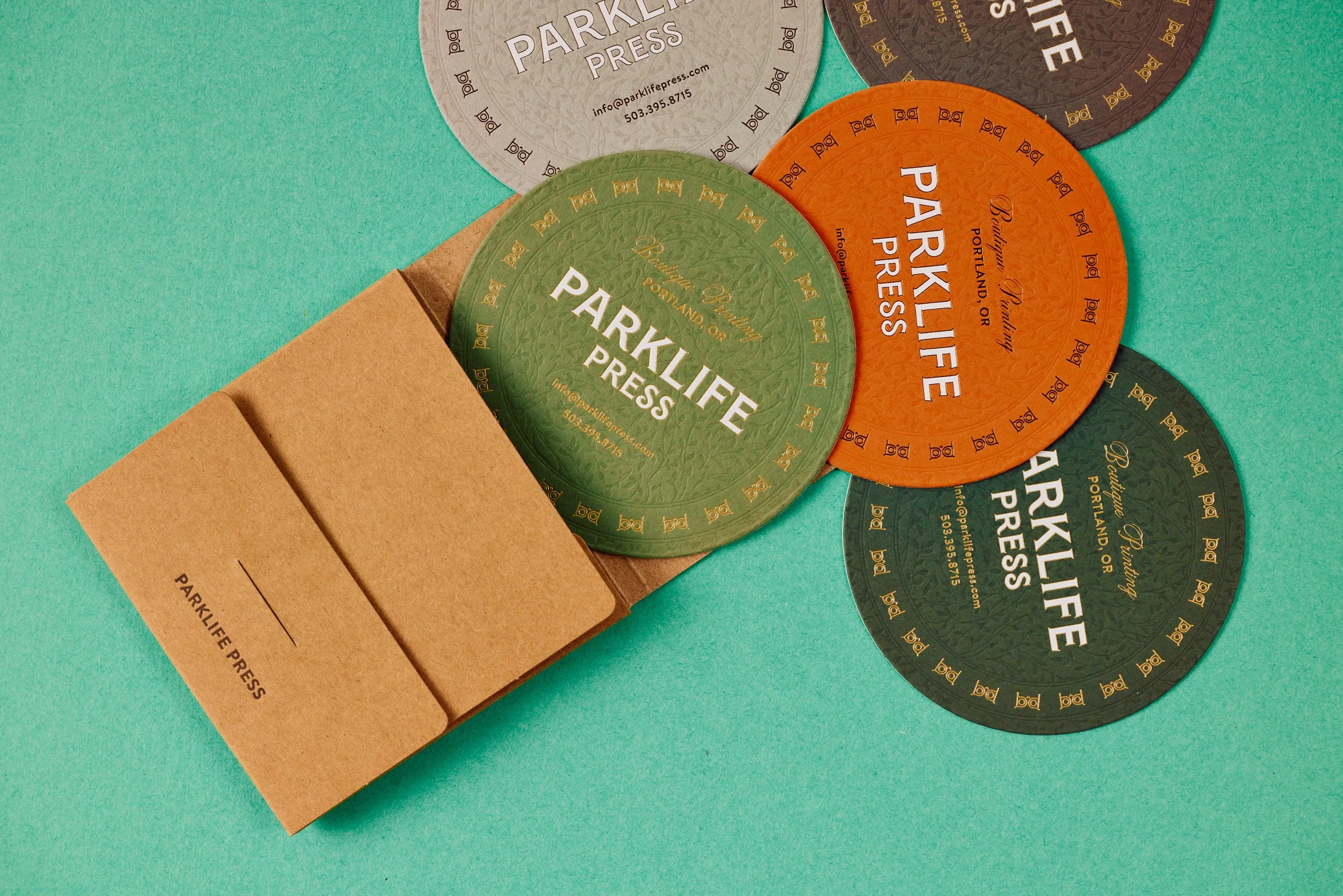
We printed a ton of these amazing coaster last year and it’s not even humid here! If you want to take a few of them off my hands, shoot me an email with your mailing address.
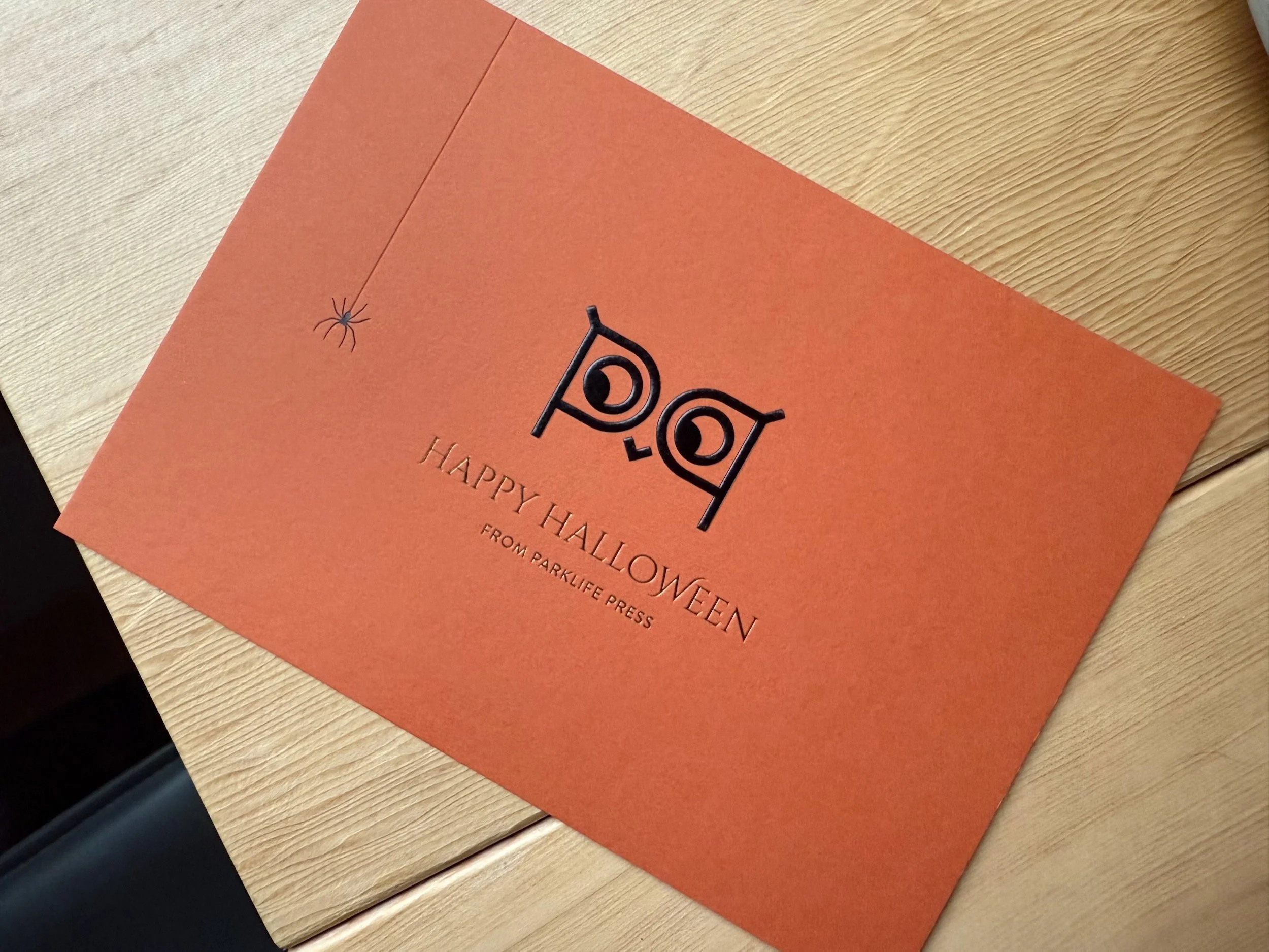
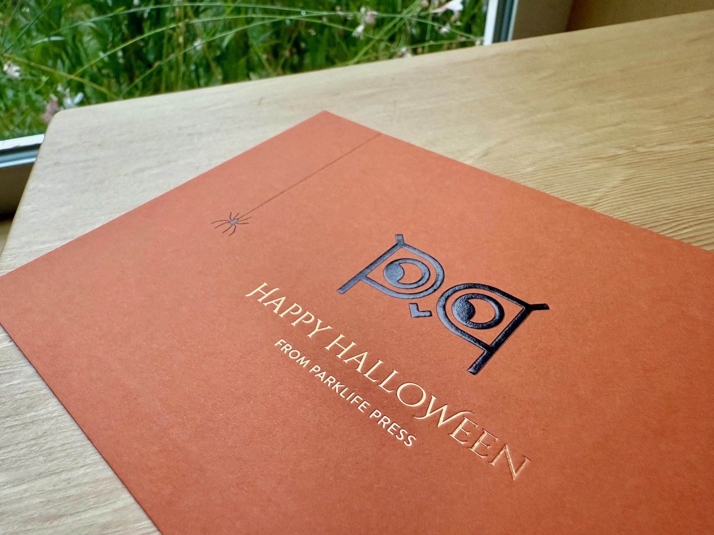
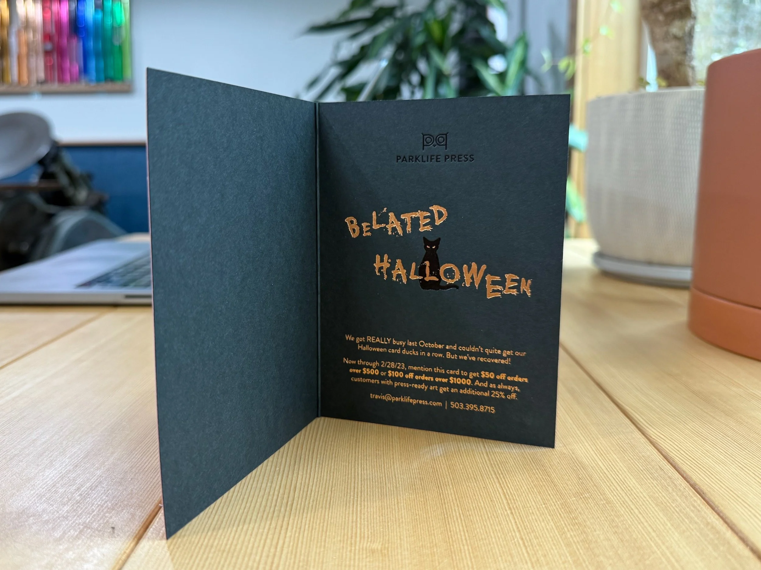
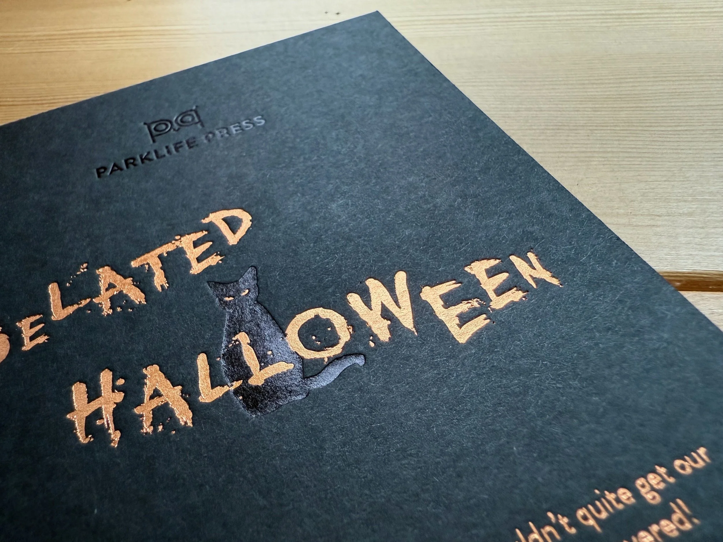
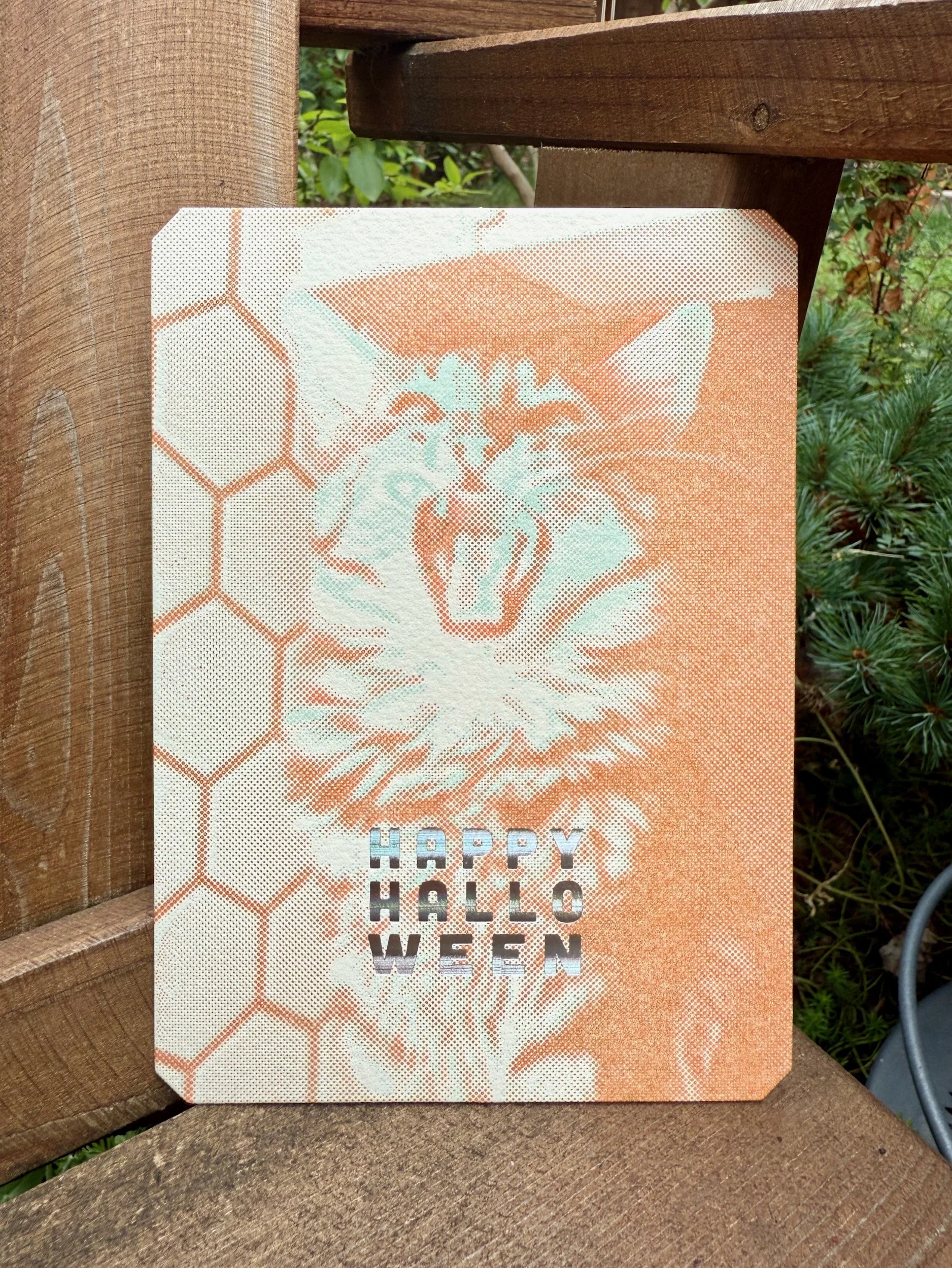
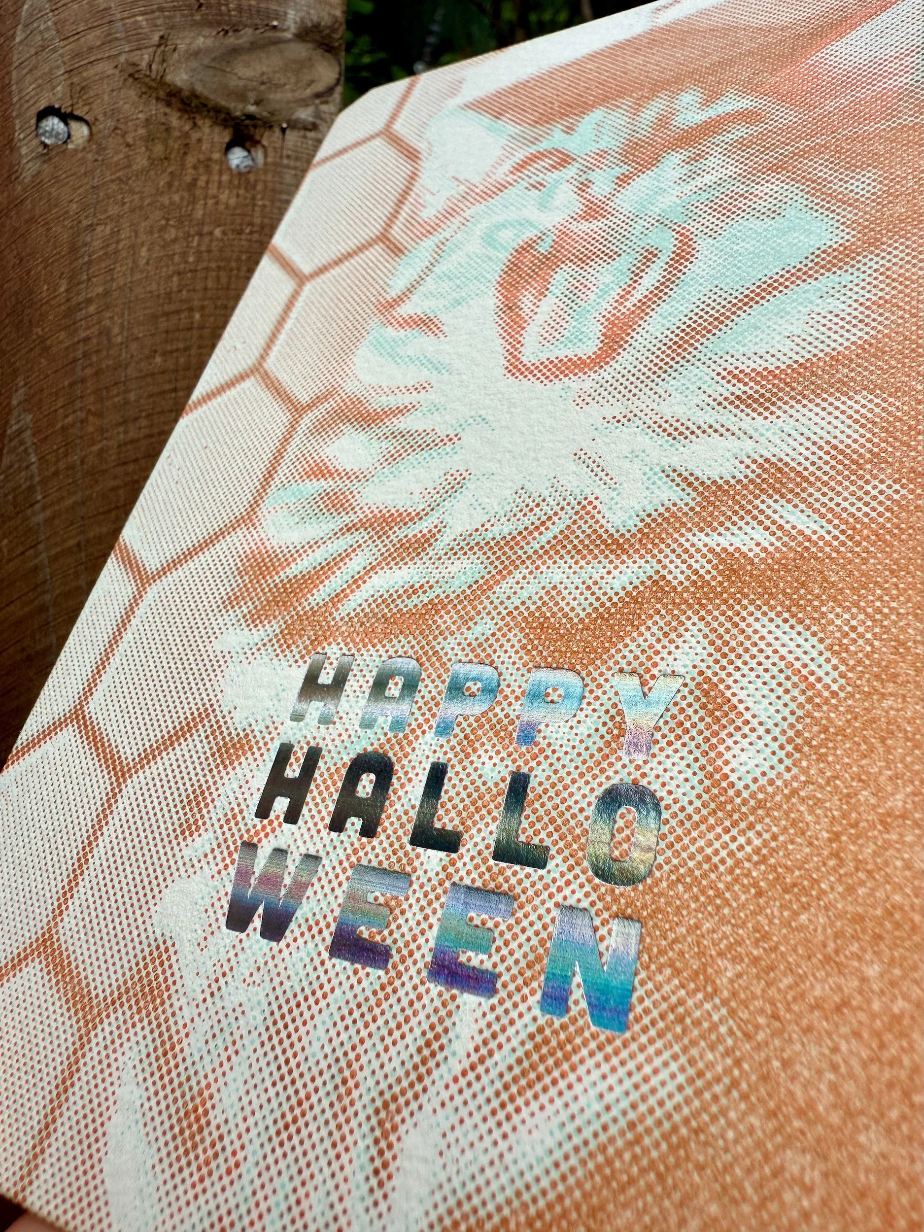
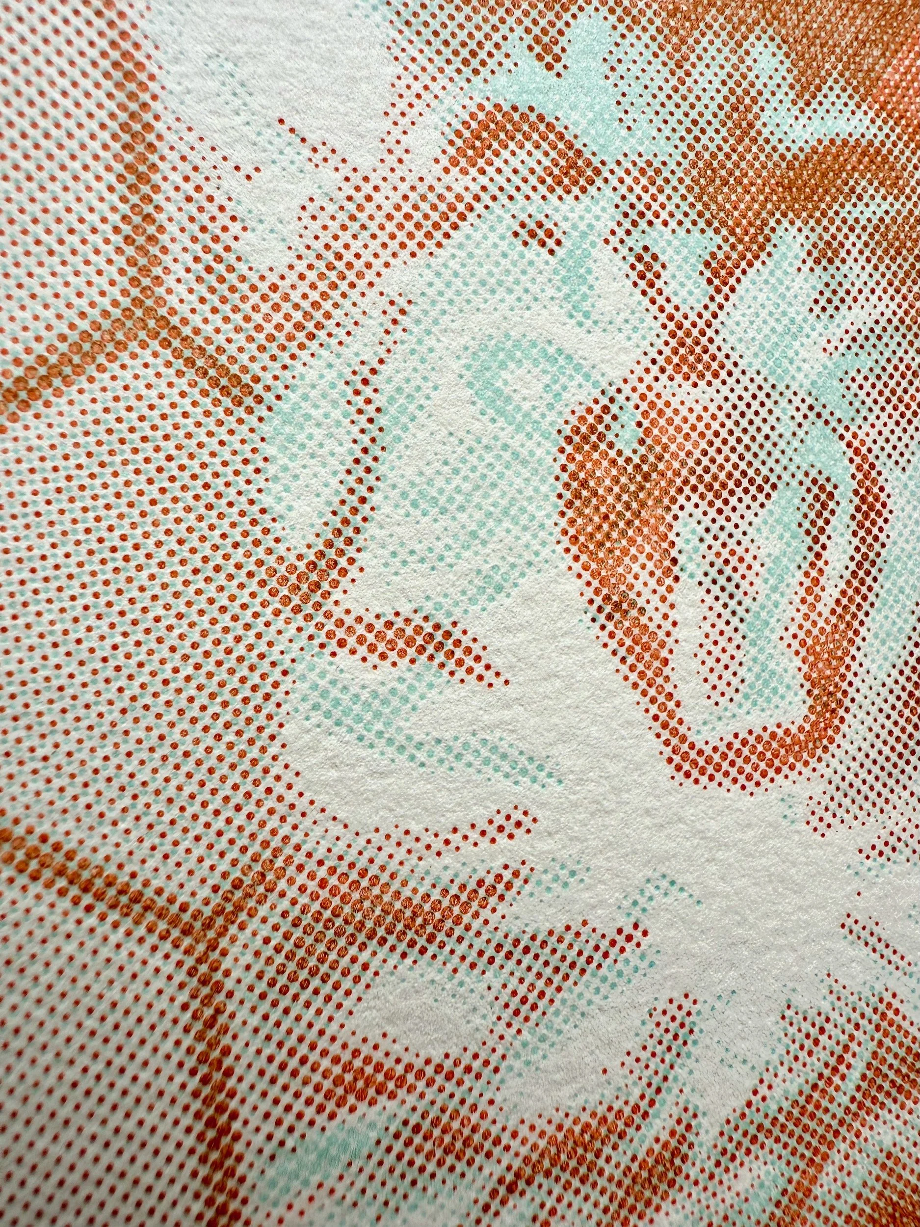
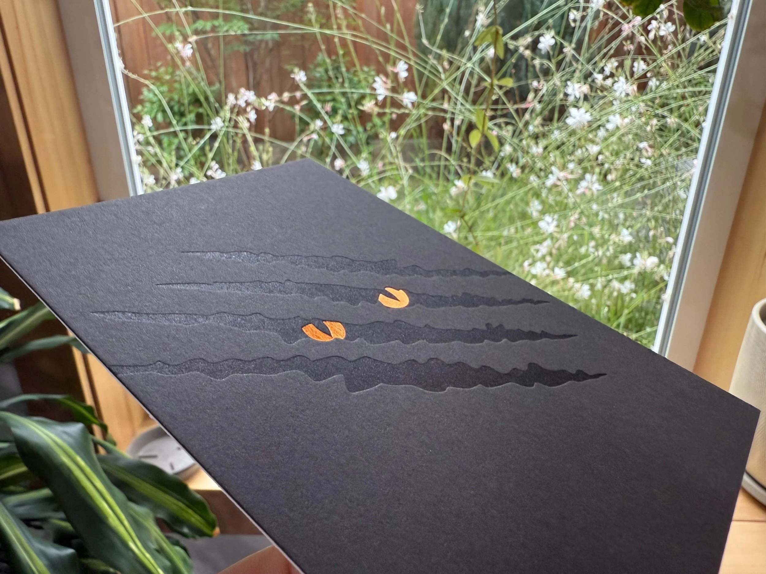
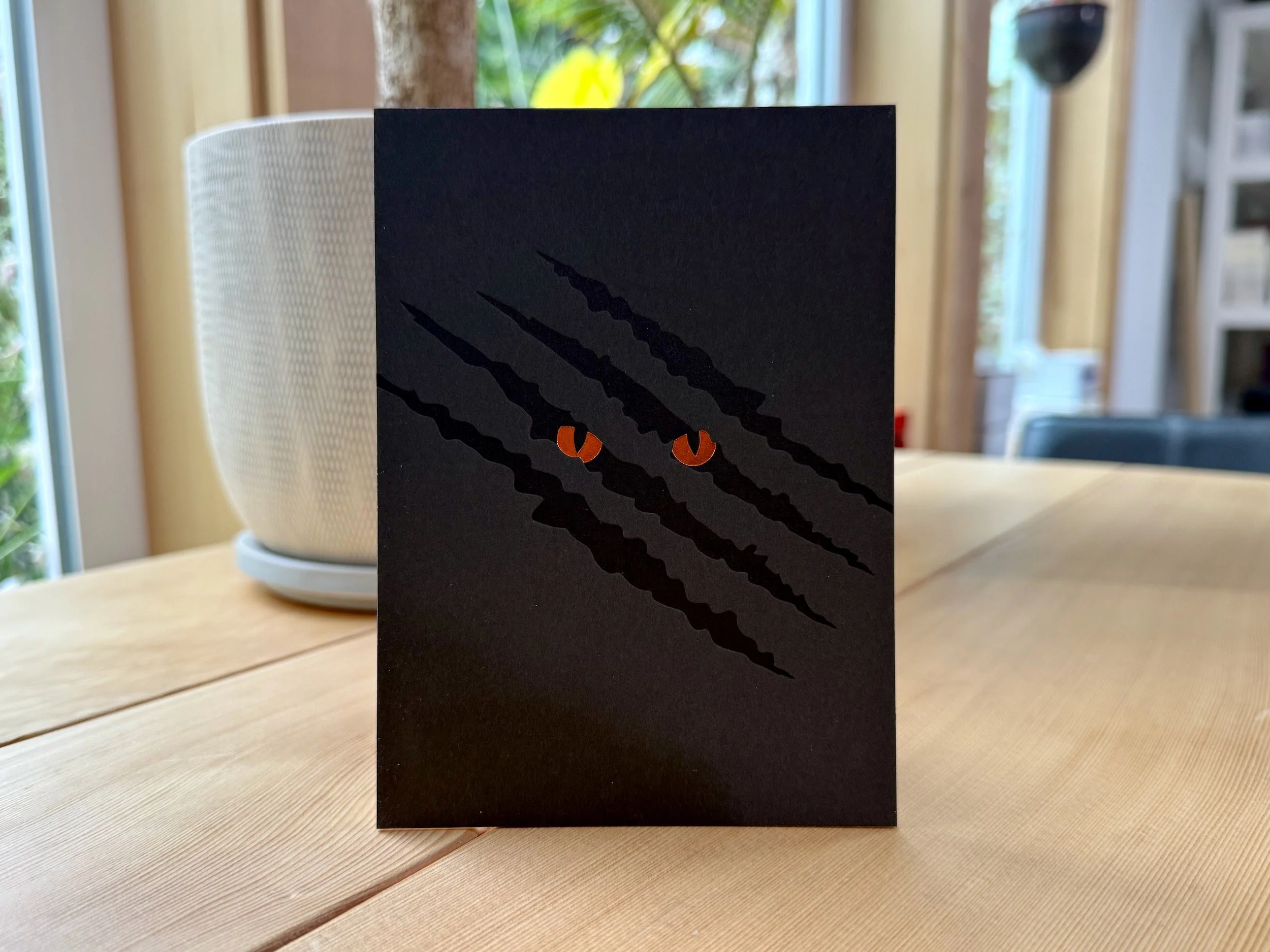
The detail is pretty damn nice. For the front we started with a transparent tinted letterpress background floral pattern, then layered white gloss foil and then a metallic foil — color variable depending on the paper. For the back we used the same floral pattern plus a dark gray letterpress ink on 100% post consumer white folding board.


Oh, and the little chipboard packets are letterpresses as well.