Old World Charm in New York City

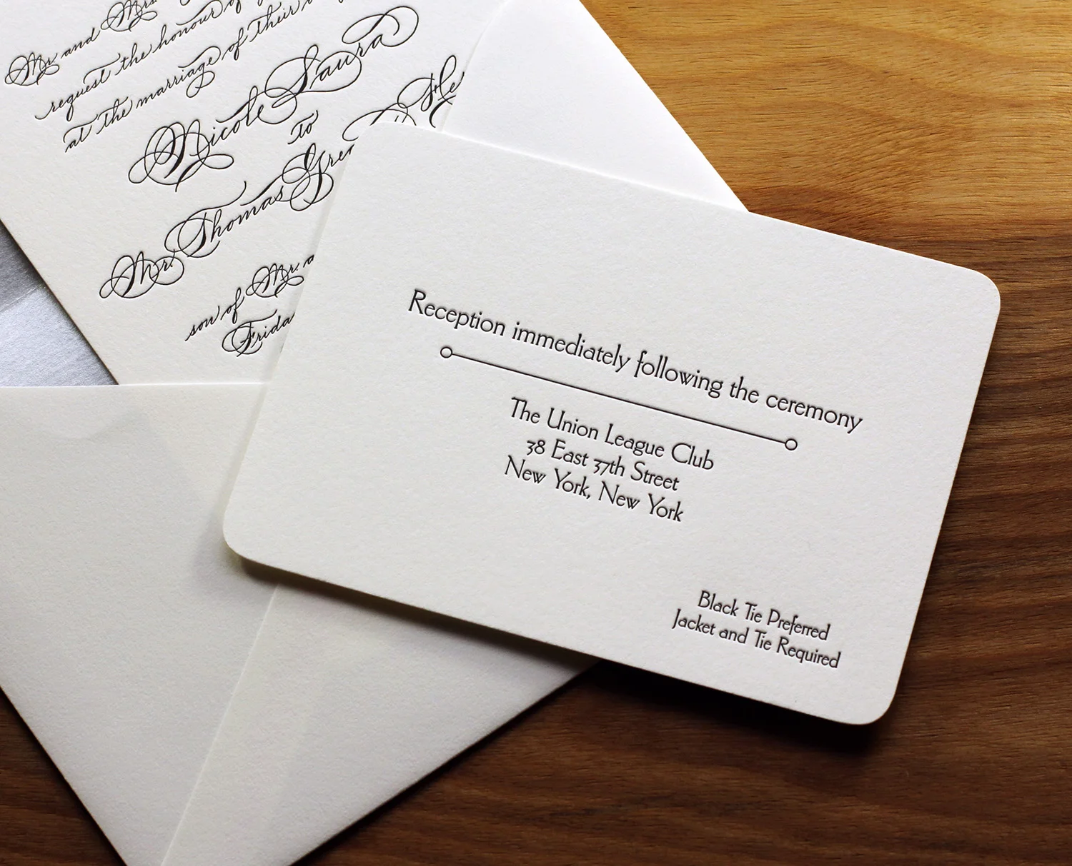
The beauty of a classic, calligraphic invitation puts the emphasis on the writing. Here, in a invitation based on Quill, with custom calligraphy by Monica Rachel Lima, the swirls and flourishes of the text sets the tone for an elegant and festive occasion. The black ink on thick, pearl white paper stock is set off by a metallic silver envelope liner.

The simplicity of the dingbat rule pairs well with dramatic flair of the calligraphic flourishes, and all the rounded corners of all the pieces ties the set together.

Accompanying reception and RSVP cards are done in a understated serif font with a vintage feel. The two styles coordinate to set the tone for a formal wedding in New York City.
Photos by Sarah McCarty Arneson
Ontario Romance on Lake Muskoka

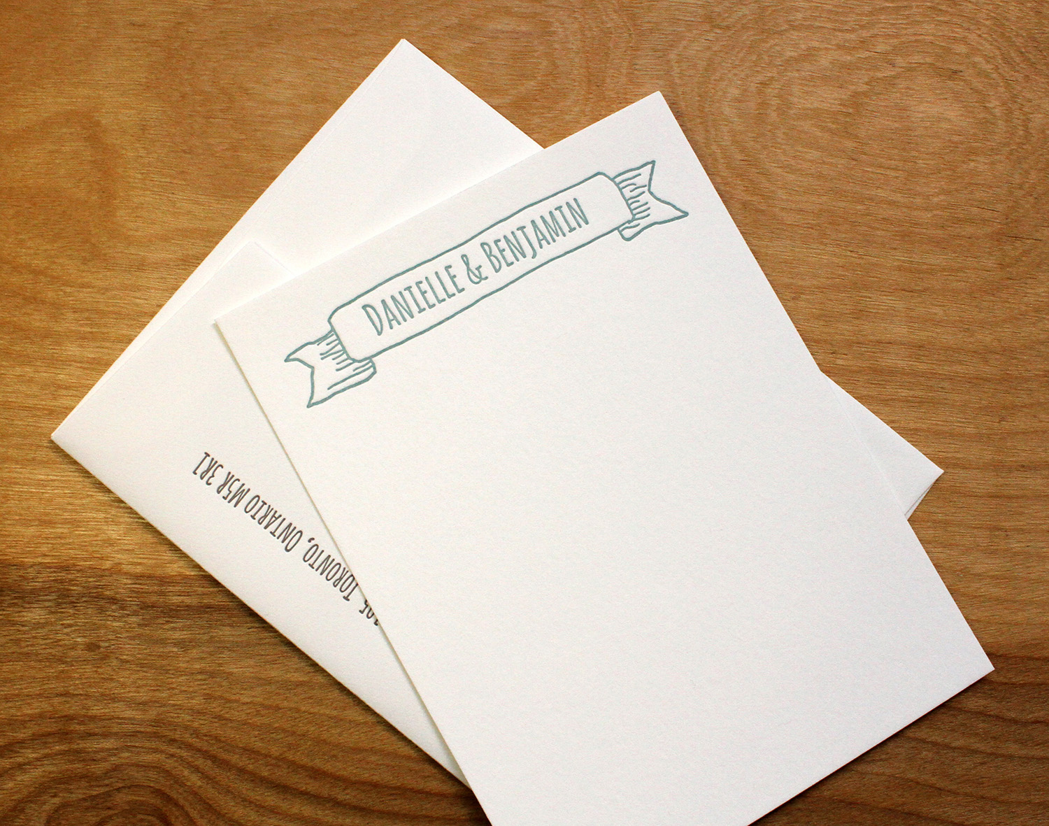
This was a fun set to design, as it featured custom hand-drawn illustrations incorporating many personal details from the day — a cozy cottage on a pebbly lake shore, the family dog, and the couple's name waving in a banner. Printed on pearl white paper in stone and peacock inks, the artwork's color palette had a northern-lake feel. Paired with a handwriting-style font, the set conveys the warmth and personality of the lakeside wedding.

The RSVP card carries on the casual tone of the wedding, featuring the options "see you on the dock" or "stuck in the city." Thinking ahead, Danielle and Benjamin ordered corresponding custom thank you notes cards to thank their family and friends for wedding gifts.

Photos by Sarah McCarty Arneson
Vignette Reboot

Another great set based on the on the Vignette style. The main invitation features beautiful, understated typography printed in stone ink and set off by a custom double border. The pieces are gathered in a belly band featuring the couple's initials printed on gray cotton Pescia paper.

The RSVP card includes a menu choice for the reception dinner.

The swirled dingbat is a design element carried throughout the pieces, appearing on the main invitation, the belly band, and the RSVP card. The belly band also features the couple's wedding website, where guests can find travel and lodging information. The border design is created by a blind deboss — where an impression is made without ink transfer — which subtly highlights the thickness and texture of the paper stock.

Photos by Sarah McCarty Arneson
Grass and Stone

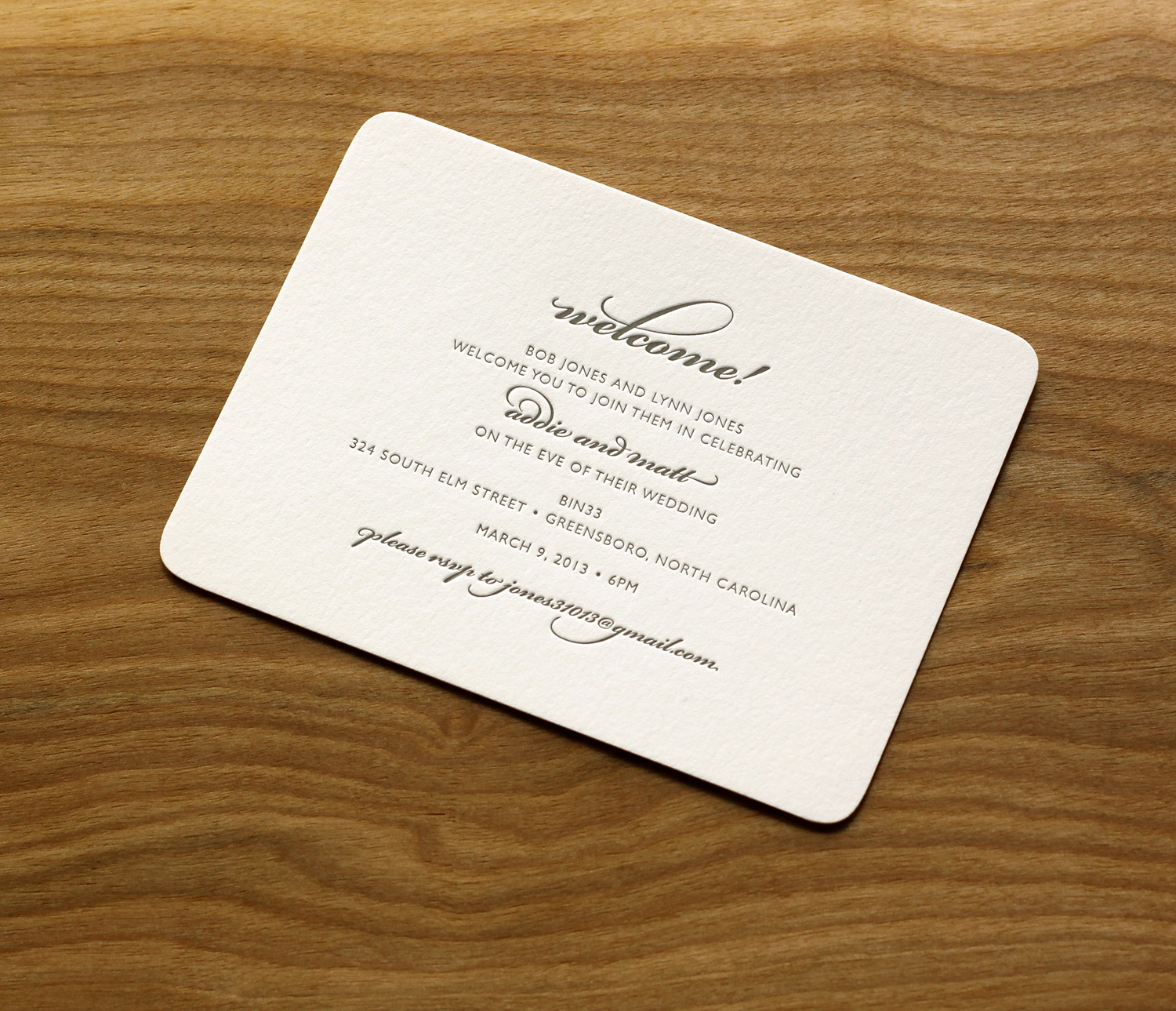
Addie had always been drawn to letterpress. Having few letterpress options in Greensboro, they found Parklife Press when searching for studios in the Durham area. Working under a tight deadline and having little time to spare, they were pleased when Parklife's website showed a "clear design aesthetic as well as up front design details and pricing options," and felt that the format prepared them for a seamless consultation with Travis. They were immediately drawn to the Parker design because it was clean and simple, and they loved its use of typography.

They used grass and stone inks throughout. The green, used sparingly — for their names, the RSVP postcard-style return address, and for the invitation's edge painting — was a nice touch for their not-quite-spring wedding in March. "It felt really fresh and added just enough pop," Addie says. They ended up using the colors and color names as a thematic springboard — "grass and stone" became a motif at their wedding, with centerpieces of planters of grass, and stone-colored bridesmaids dresses.

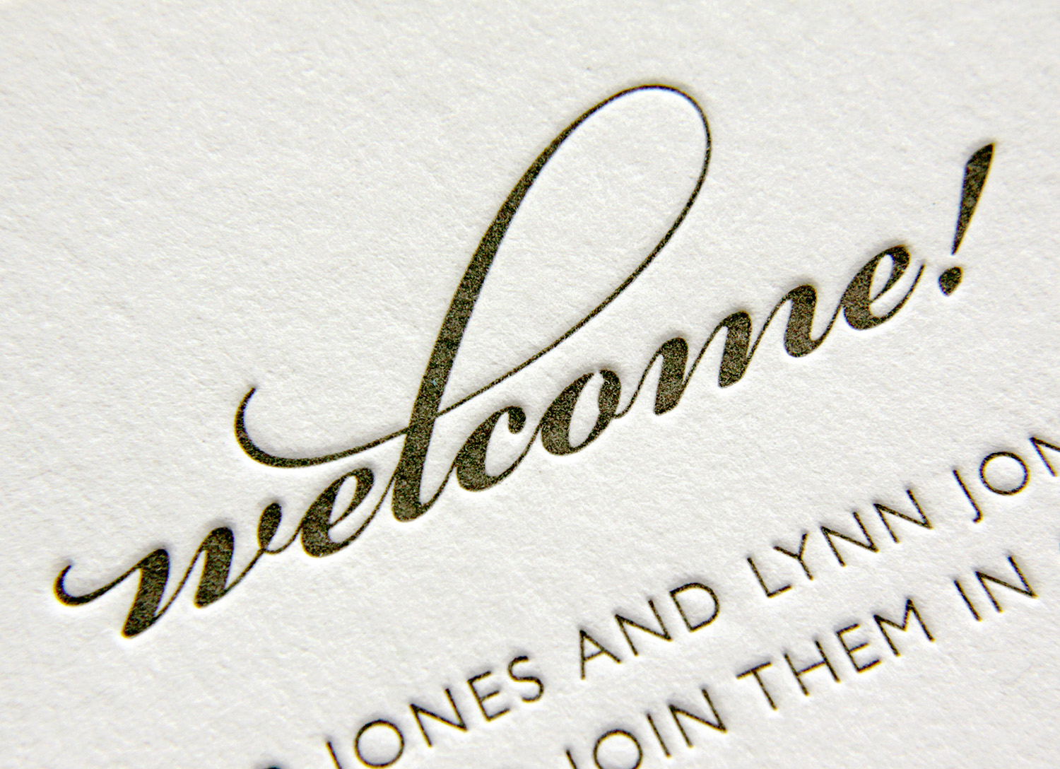
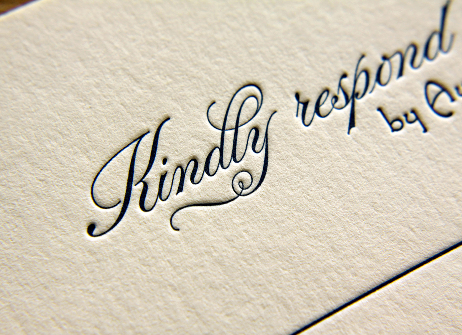
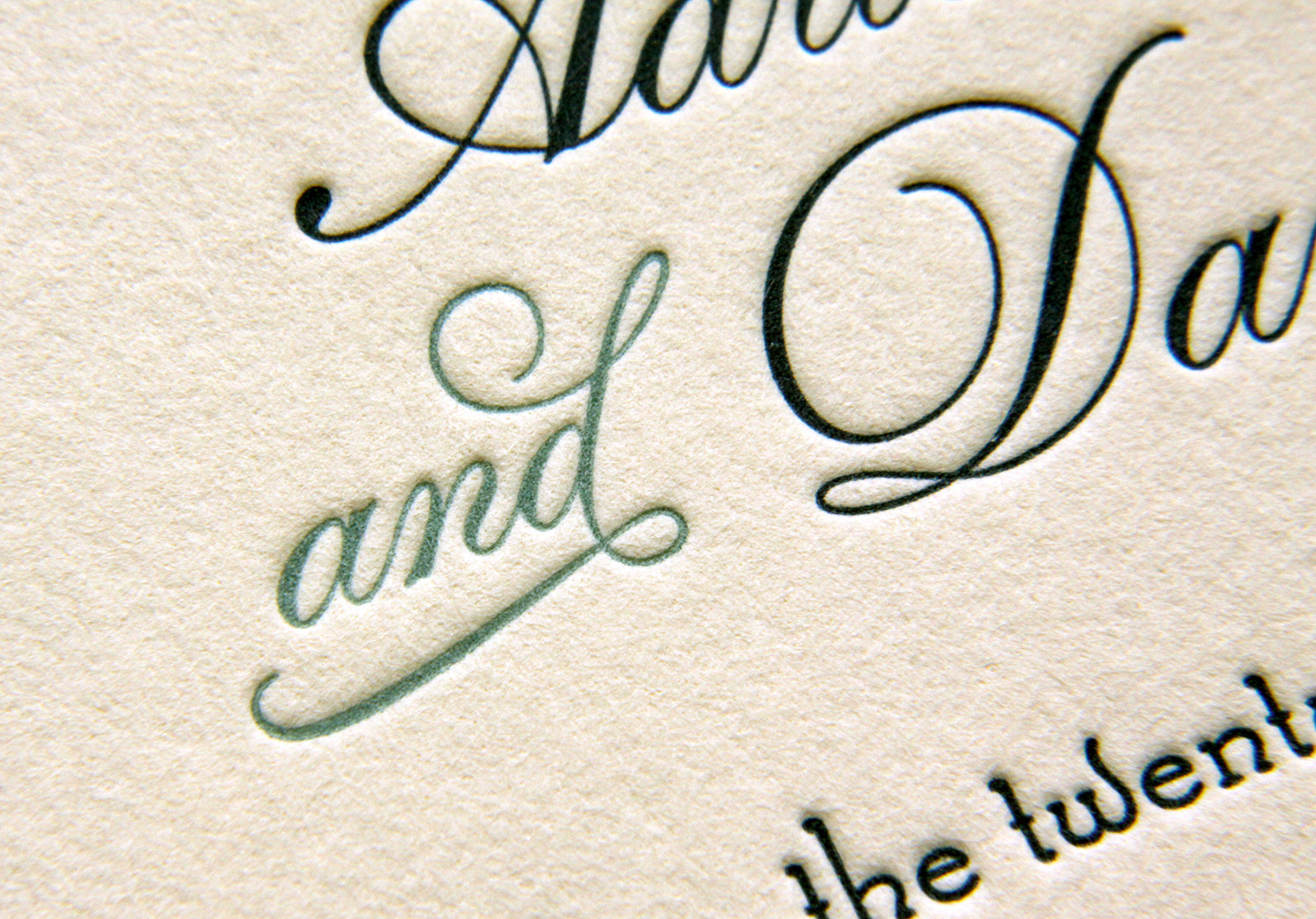
The RSVP and welcome cards provided another showcase for the dramatic pop of typographic embellishment. This particular script font comes with an extensive set of alternative characters and ligatures, providing lots of options for the designer. Choosing which to use and where is key. Addie noted, "Travis gave great suggestions on how and where to add flourish to our names without it being over the top. We trusted him completely!"

Twist of Lime

Meghan and John knew they wanted letterpress invitations for their wedding, and had even seen Parklife's work before — a friend of theirs worked with Travis and used a similar invitation design. So when it came time to plan their wedding, they were a step ahead. Based on Whirl, the design features a conventional text layout with an off-center design bleeding off the corner. The motif is also repeated on the main envelope flap, as well as the RSVP and events schedule cards.

The swirly motif, when printed in pale lime ink, becomes springy and botanical, perfect for a late-spring wedding.

Photos by Sarah McCarty Arneson
(Bar) Harbor-side Wedding

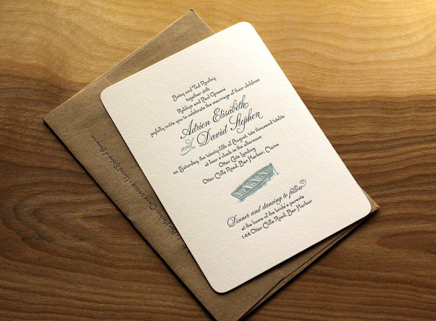
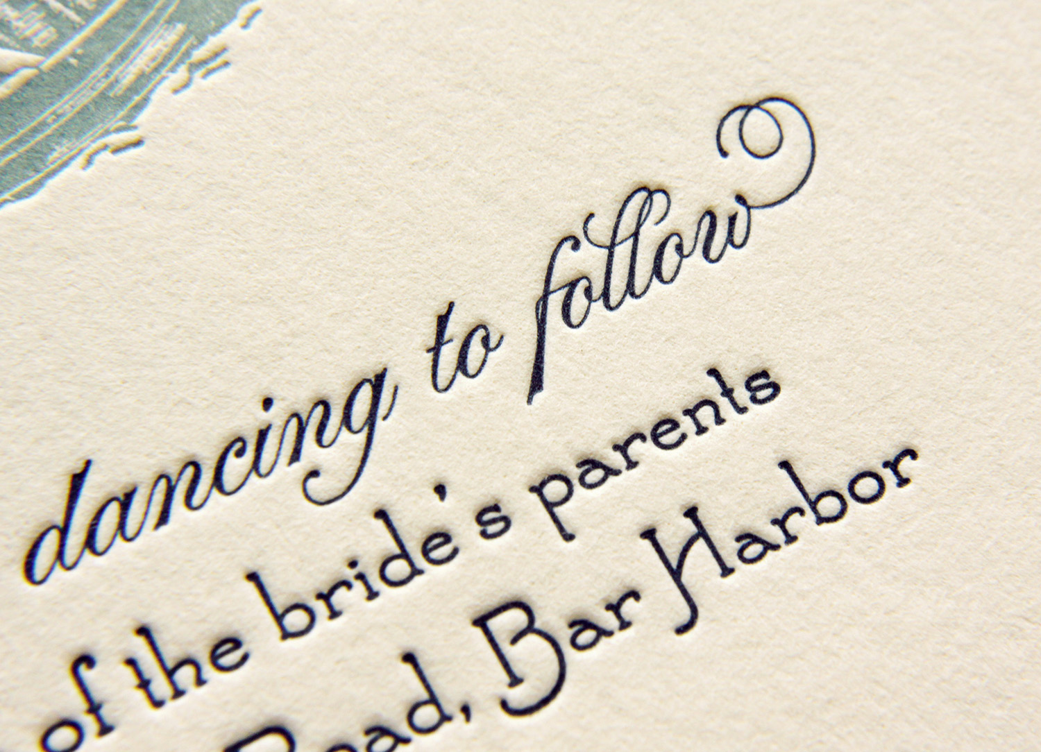
In her words, Adrien and her mother "always had a 'thing' for wedding invitations." When envisioning the big day, invitations were job one — and an important job, at that. According to Adrien: "We believe they fully set the tone for the wedding, long before the actual day arrives. They create all the anticipation for the guests in the days leading up to the party. We were willing to spend the money on custom letterpress invitations because we believe in the art of creating invitations in such an old fashioned way."

The feel for their wedding was old-fashioned, ocean-side, farmhouse. For her own invitations, she said she knew she wanted the feel to evoke a style of "simple, yet classy" and "formality, without pretentiousness." They started with the Sand Dollar design.

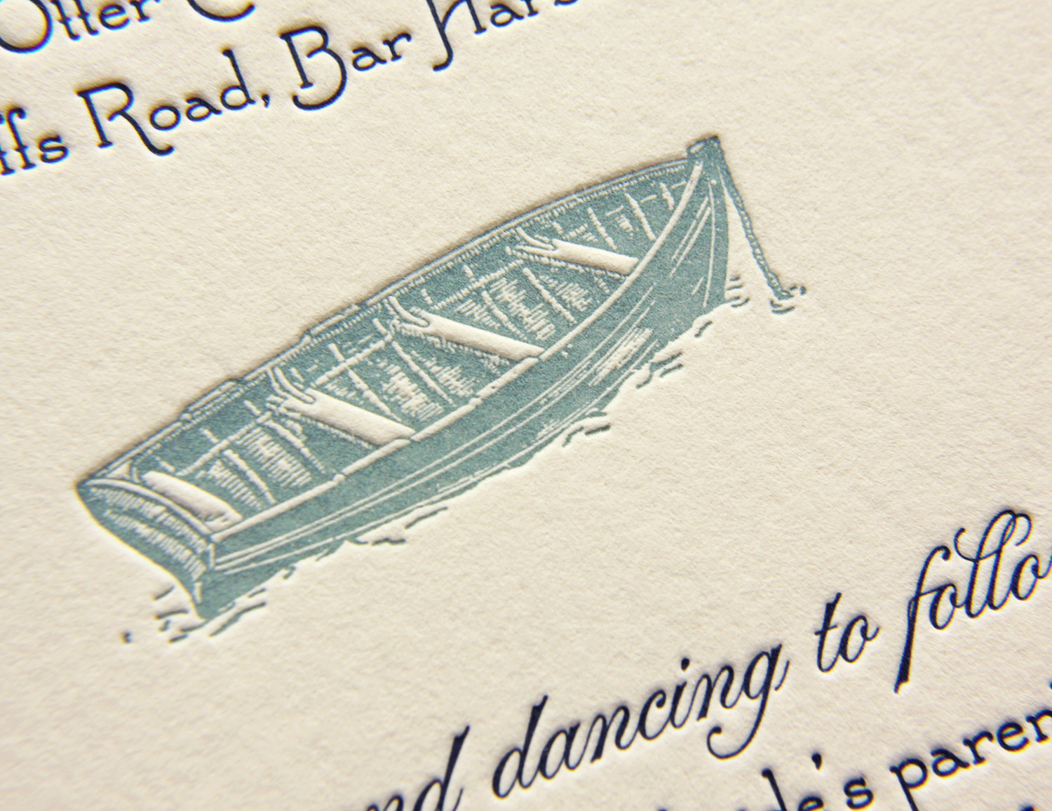
Adrien and David got married at her family's home where she grew up. It was within walking distance to the ocean, and the ceremony was held seaside. The artwork ended up being a simple choice, for in Adrien's words, "We have always been on the water, in the water, around the water.  Dave proposed in a rowboat, and we thought a dory on our invites would be a great icon for that, as well as where we were getting married." She sketched a few ideas and Travis took it from there. 

Having few letterpress options in Maine, Adrien found Parklife Press online. And the oceanside wedding was exactly as personal and distinctive as they had hoped, said Adrien. "We had a wonderful day, it was perfect."

Photos by Sarah McCarty Arneson
Timeless Black on White

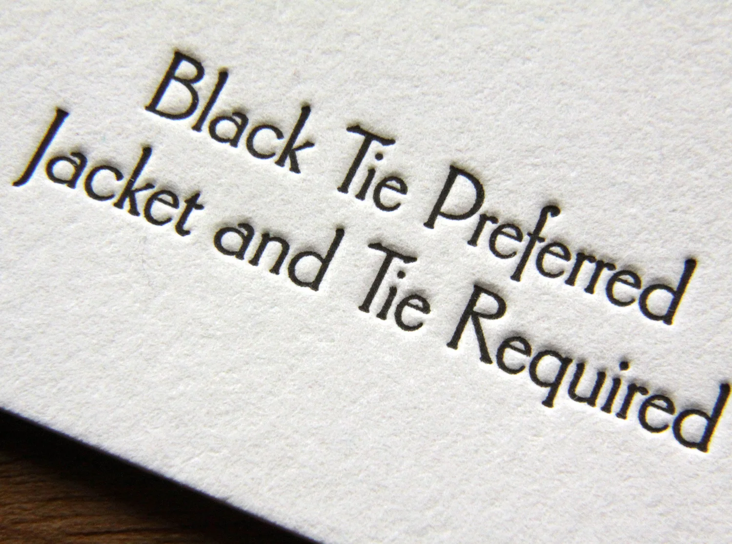
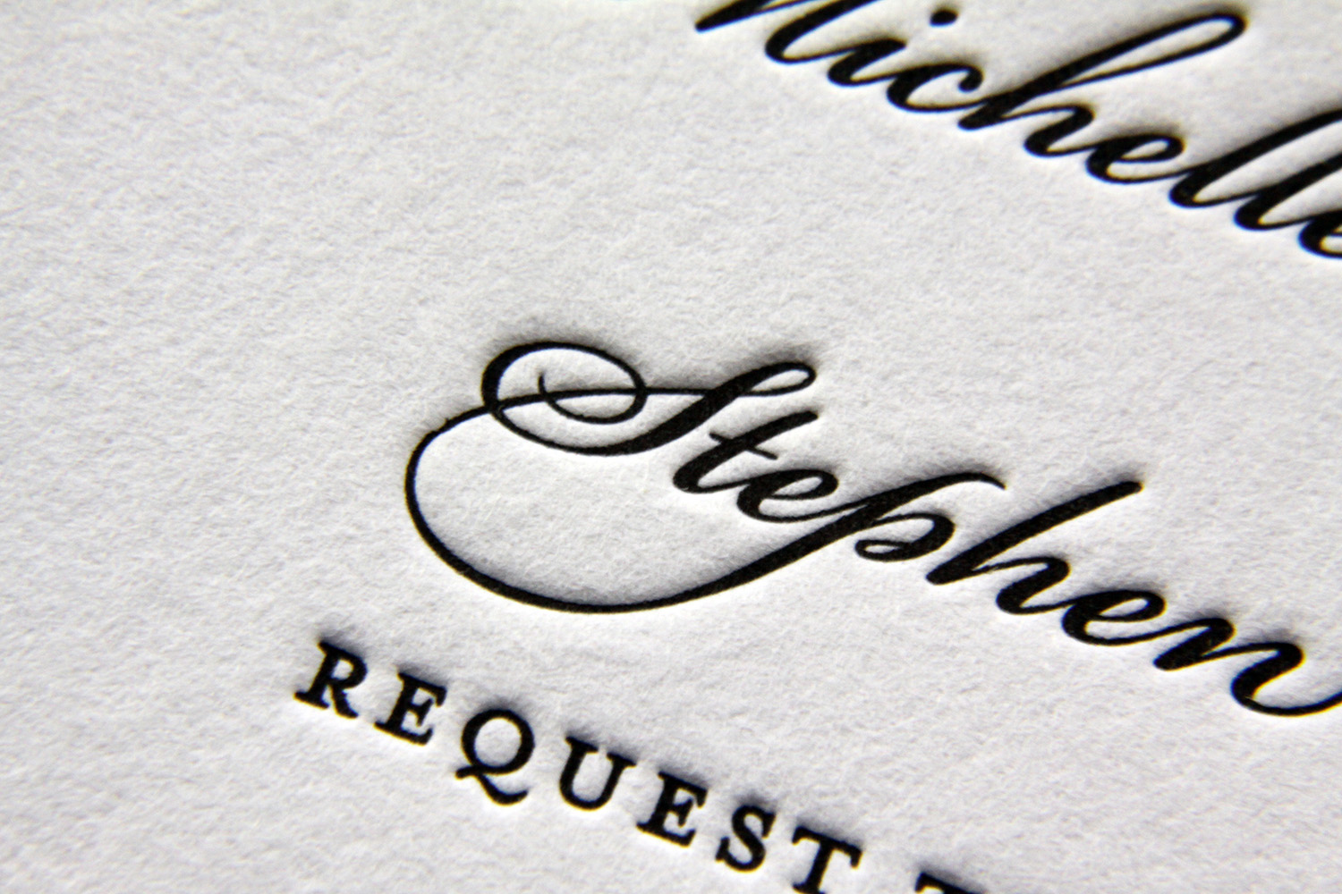
Michelle and Stephen weren't familiar with letterpress when they began planning their black tie wedding, but a love of elegant invitations had been instilled in Michelle an early age. Her grandmother used to frame beautiful invitations she received, and Michelle had always admired those with simple black calligraphy on a white note card. Parklife's Vignette fit that vision perfectly: striking black ink against bright white paper, set off and framed with a blind deboss border.

The script font had a few flourishes, with one particularly unusual and interesting one: the ligtature connecting the cursive capital "S" and "p" in Stephen's name. A classic dingbat was used to add some visual interest and to separate blocks of information. It also tied all the pieces together — it was used on the invitation, the main envelope's return address, the RSVP card, and the accommodation information card.

Photos by Sarah McCarty Arneson