Shades of Blush
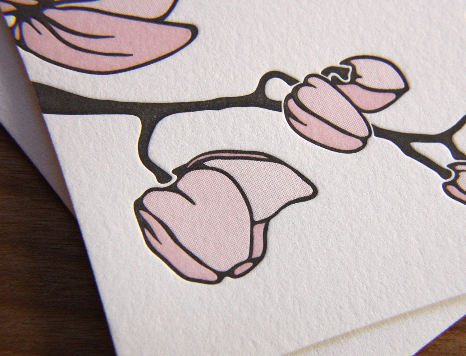
David and Allyson's invitation set was based on Petal, which features an original illustration by Parklife Press. The text, set in all-caps Gill Sans, is set off by the lightly-flourished script of their names. The asymmetry of the single, flowering branch — printed in tungsten and blush inks — provides a fresh and cheerful balance to the clean and modern design.
The branch design from the invitation was carried through on the RSVP card.


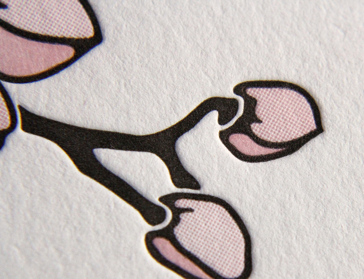
Letterpress is typically created with solid areas of ink impressions using individual, premixed colors. But here, by using halftone screens (read our post about letterpress and the halftone process here), three shades of pink were achieved using only one ink. This branch of blooming buds would still be pretty with solid, 100%-strength blush ink, but the design would lack depth; it wouldn't be as delicate, or as interesting.


