Walt's stationery design is simple, but deceivingly so. We printed the three-color piece on 5x7 cotton paper with a fine halftone screen in the lighter blue ink pass, creating the illusion of a third blue — lighter than the lines that outline the abstract wave shape.
Over the past few years we've worked with Greensboro, NC creative agency STIR on a number of print projects. Today we're featuring some of our favorites — designed by STIR and printed by Parklife.
Holiday Cards for Tom Stringer Design Partners
5.5" x 8.5" card on 600g Pearl White Lettra with Rounded Corners
Matching A9 Lettra Envelope
Event Invitation for Dakota Jackson
6.25" x 4.5" folded card on 300g Pearl White Lettra
Matching A6 Lettra Envelope
Event Invitation for The Trade Source
6.25" x 4.5" folded card on 300g Pearl White Lettra
Matching A6 Lettra Envelope
For Australian freelance makeup artist, Claire Vyverberg, we printed these slick but pillowy cards on 500g Somerset paper.
From Claire's Instagram post about her rebranding...
Freddy Oropeza creates incredibly rich and vibrant photographs. But for his business cards, he opted for a simple, clean, monochrome aesthetic.
We printed these on 600g Gmund Cotton paper with a light tonal ink on the front and a darker gray on the back.
It can be tricky to create a wedding invitation suite that's colorful, playful, and exciting, while still conveying the sophistication of the event itself. While working with Terisa and Tom, the goal of maintaining that balance was always at the front of our minds.
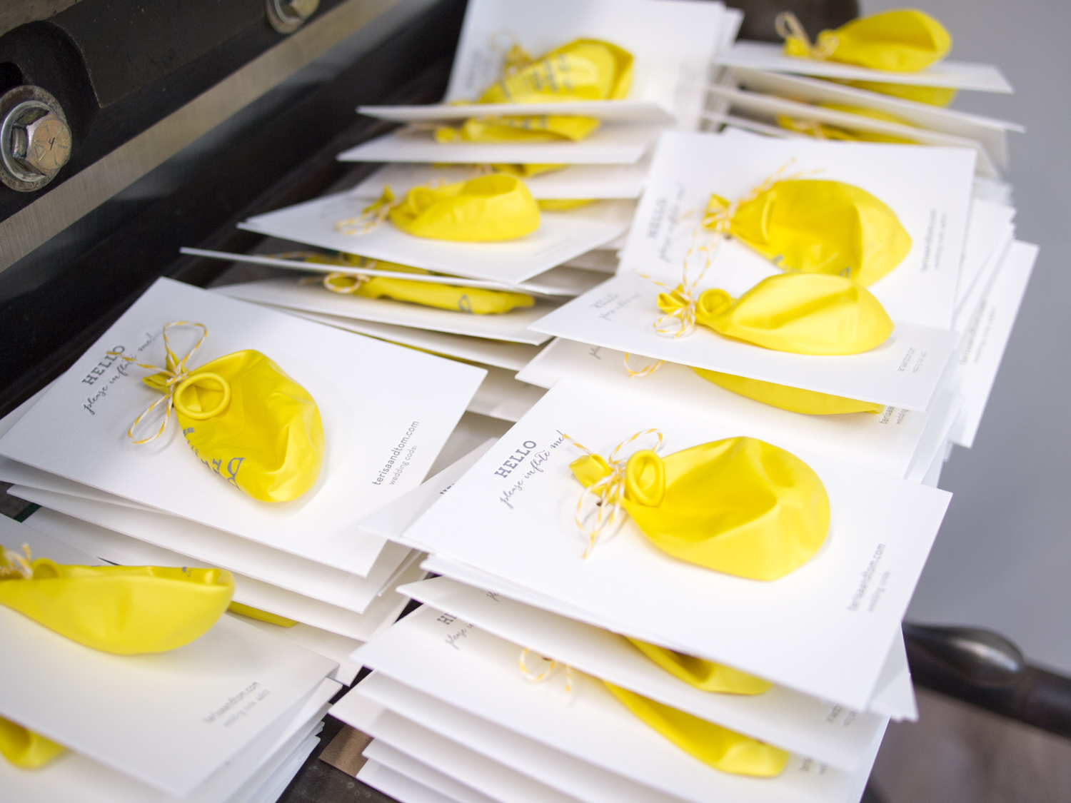
Ok, sure, the save the dates leaned a bit toward the whimsical end. We printed and hole punched a thick 600g note card, and then tied custom-printed balloons for the guests to inflate. Details of the event were on the balloon (and on the website for the faint of breath).
For the invitations we kept the yellow and gray color scheme and the Bombshell / Neutra / Trend Slab typeface combo, but left out the balloons (time to get serious).
We carried a similar look through to the reply card, a custom designed map, and a rehearsal dinner invitation with its own color scheme and tear-off reply card. The set was then placed inside a gray tri-fold pouch, tied with twine, and sealed in a matching gray envelope.
Check out these business cards and display cards for Chad Gorges, a Kansas woodworker and furniture builder. We printed both on thick 600g Fluorescent White Lettra with black ink and a custom Periwinkle.
Chad's work is really amazing. A few photos are below, and a bunch more are at his website, www.chadgorges.com.
We first worked with Jory in January when he asked us to print a display sign for his award winning ping pong table. For that project we used gold ink on 4-ply museum board (about 60pt thick).
A few months later, Jory game to us for business cards. We again went with a gold-on-black look, but this time with thinner 2-ply museum board and metallic gold foil. We finished the cards with a rich orange edge paint.