Posts tagged periwinkle
Artisan Business Cards for Chad Gorges

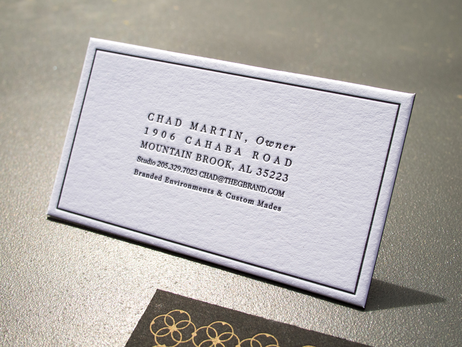
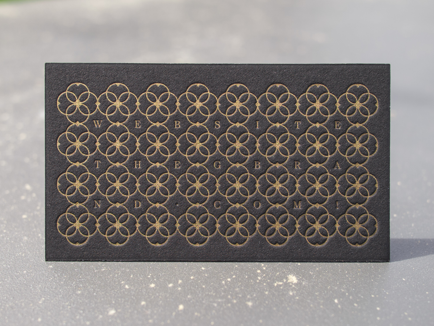
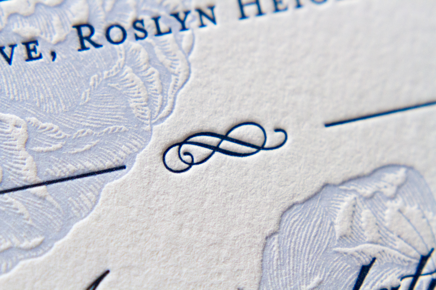
Check out these business cards and display cards for Chad Gorges, a Kansas woodworker and furniture builder. We printed both on thick 600g Fluorescent White Lettra with black ink and a custom Periwinkle.

Chad's work is really amazing. A few photos are below, and a bunch more are at his website, www.chadgorges.com.

Letterpress Business Card Roundup

Time for another business card roundup! After you're done here, you might want to check out previous roundups from 2013, 2014, and just this past January.

Canadian designer and photographer Amanda Benincasa (benincasadesign.com) designed these cards, complete with a letterpress QR code. We printed them with custom green and gray inks on thick 600g Fluorescent White Lettra.

For long-time Parklife collaborator, Chad Martin of The G Brand (see more of his design work here and here), we printed these duplexed business cards with black ink on 300g Lettra for the front and gold ink on 2-ply Rising Museum Board for the back.

Like pretty much everyone (Parklife included), Gritchelle recently relocated to Portland. We printed these cards for our new neighbor on 300g Fluorescent White Lettra.

Some super-deluxe cards for Chapel Hill brand gurus, Immortology: Three inks on 300g Lettra for the front and white foil + a blind deboss on 350g Ebony Colorplan for the back.

Finally, a business card reboot for Dyfari Interiors featuring Espresso and Periwinkle inks with Periwinkle edge paint on 600g Pearl White Lettra. This is the third iteration in a series of cards we've printed for Diane, starting with this version in 2010.

Roses in Rockville Centre

This was a set based on the Franklin design. Printed on 600g Pearl White stock in Marine and Periwinkle inks, the design has striking text printed over a delicate, floral background. The invitation, along with a reception card, RSVP card and envelope, were held together within the outer envelope by a monogrammed belly band in the lighter blue accent color.

The design is of the invitation is traditional, but the off-center artwork bleeding off the bottom edge and the generous white space on the right gives it an unexpected modern feel.

An informational card, giving details the reception, echoes the design of the invitation. Ad graceful dingbat, flanked by to thin rules, divides the reception and accomodations information.

The corresponding response cardand printed return envelope set — text only, without accent art or color — is simple and traditional.

The details of this set are lovely: the fine lines of the floral art; the couple's monogram on the pale blue belly band; the simple, classic wording of the response card; the dingbats and flourishes of the typography. The fresh, bright palette of blues is perfect for a summer wedding on Long Island.

Photos by Sarah McCarty Arneson