Perforation Perfection
This was a really fun set. Designed by graphic designer (and groom) Derek Howles — who, incidentally, also designs these super-cool cartography poster prints — it was interesting and unconventional. And art-y! Which is fitting, since they got married at the North Carolina Museum of Art. The set was comprised of a save the date card and a combination invitation/tear-off RSVP.
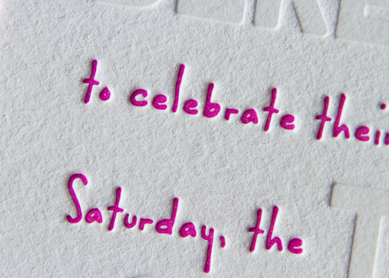
First, the save the date card. The who, where and when details have the blind-deboss look, but they were actually printed with a tinted white ink. This method gives a slightly deeper look to the impression, and sets the text off a bit more than just making an impression alone. The playful pink wording puts the stats in conversational context, and the text concludes with a URL for more information.

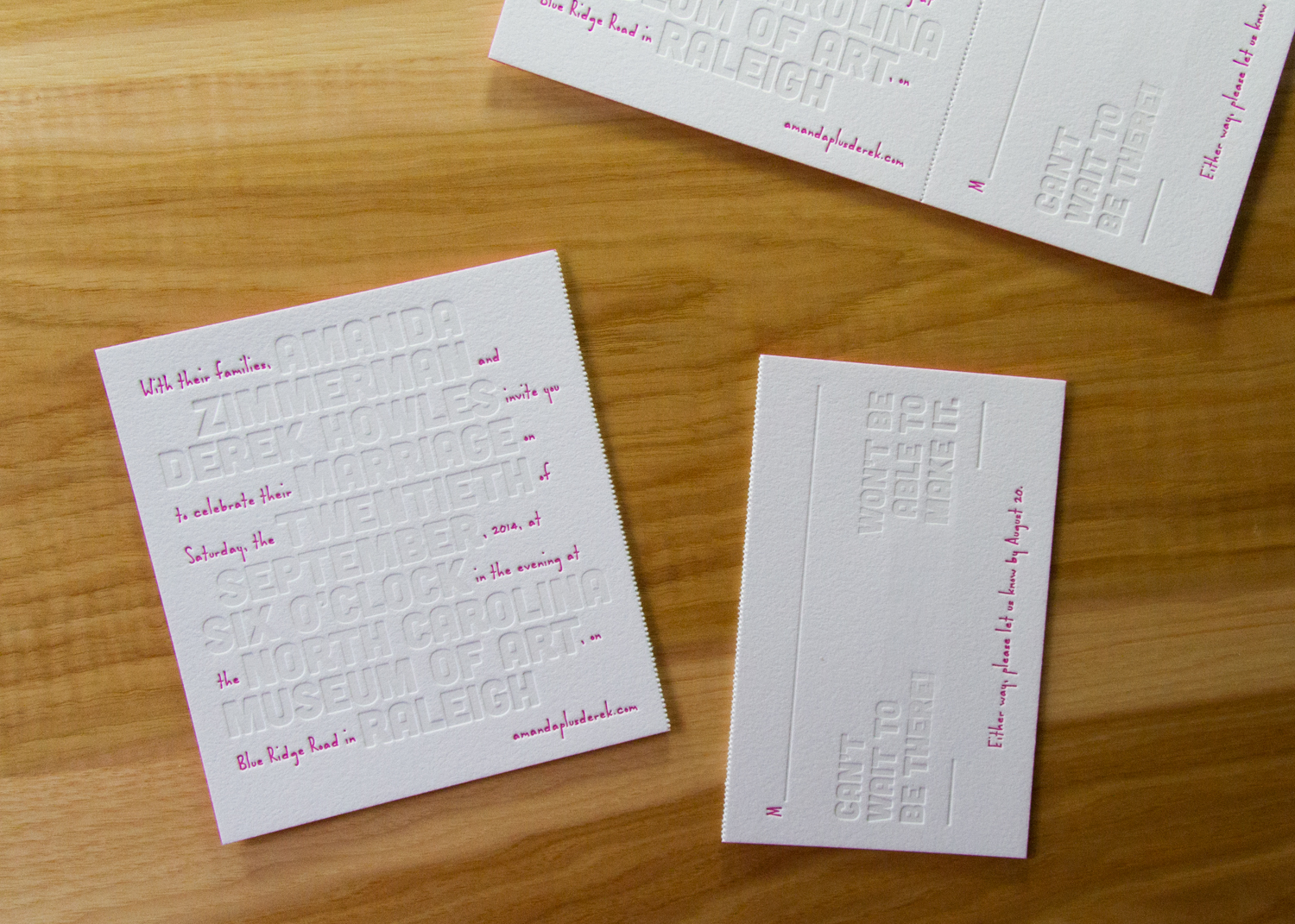
The invitation followed the same format: large, white-tinted block text for the event's pertinent details, and tiny pops of pink filling in the rest of the words. The unconventional style is carried through to the RSVP's wording, with the options "Can't wait to be there!" or "Won't be able to make it."

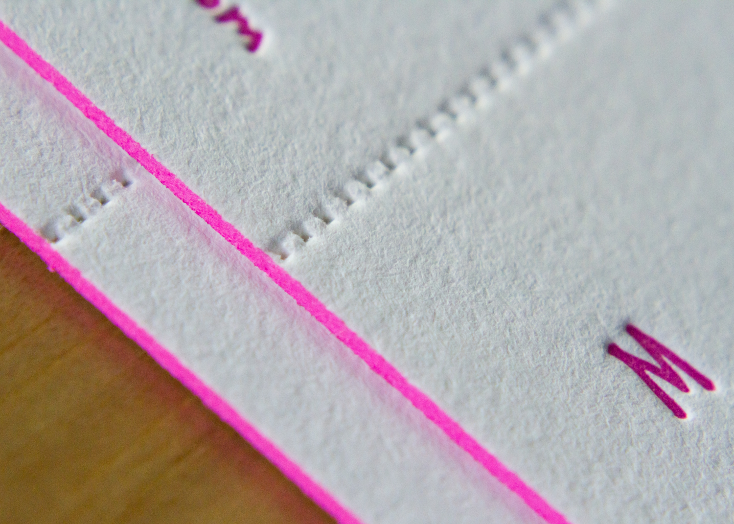


The extra heavy paper stock is a great showcase for the dramatic edge painting, which ties together the set's color palette. The thick stock also helps the perforation stability — the RSVP card easily separates from the invitation for return mailing.