Roses in Rockville Centre
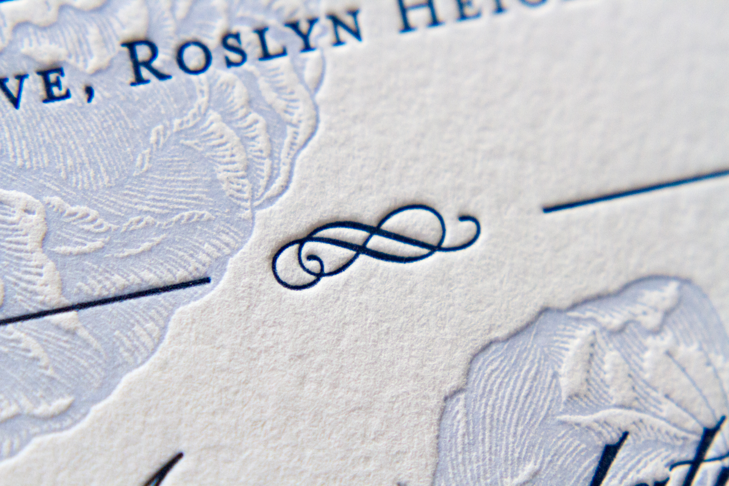
This was a set based on the Franklin design. Printed on 600g Pearl White stock in Marine and Periwinkle inks, the design has striking text printed over a delicate, floral background. The invitation, along with a reception card, RSVP card and envelope, were held together within the outer envelope by a monogrammed belly band in the lighter blue accent color.
The design is of the invitation is traditional, but the off-center artwork bleeding off the bottom edge and the generous white space on the right gives it an unexpected modern feel.
An informational card, giving details the reception, echoes the design of the invitation. Ad graceful dingbat, flanked by to thin rules, divides the reception and accomodations information.
The corresponding response cardand printed return envelope set — text only, without accent art or color — is simple and traditional.
The details of this set are lovely: the fine lines of the floral art; the couple's monogram on the pale blue belly band; the simple, classic wording of the response card; the dingbats and flourishes of the typography. The fresh, bright palette of blues is perfect for a summer wedding on Long Island.