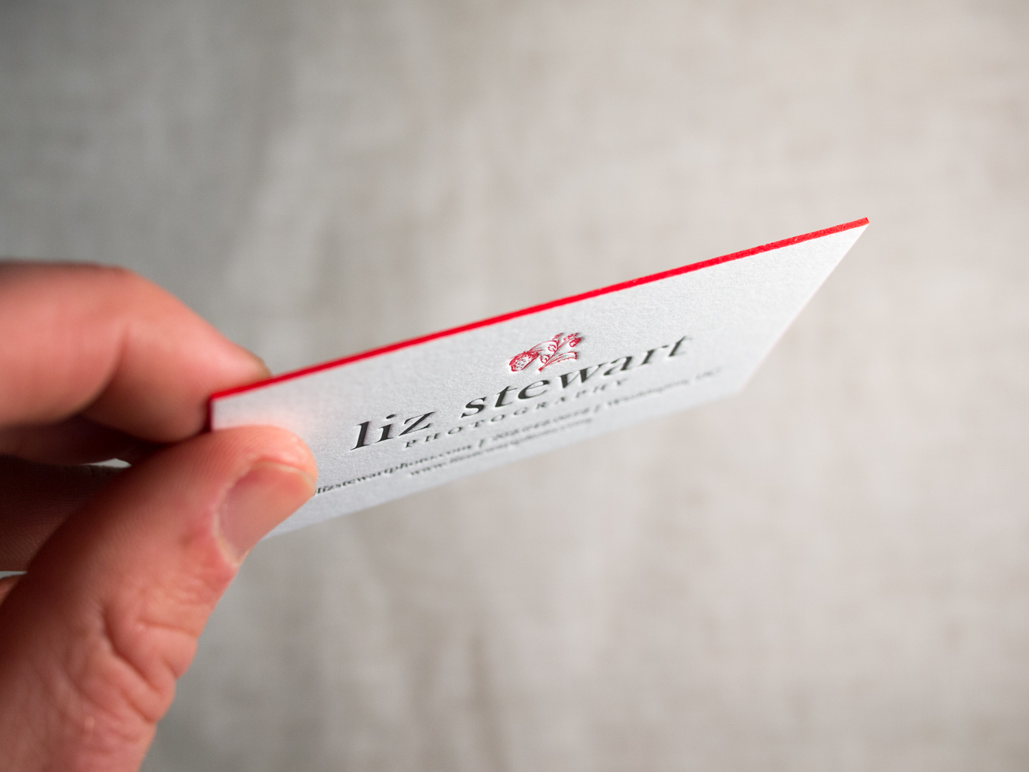
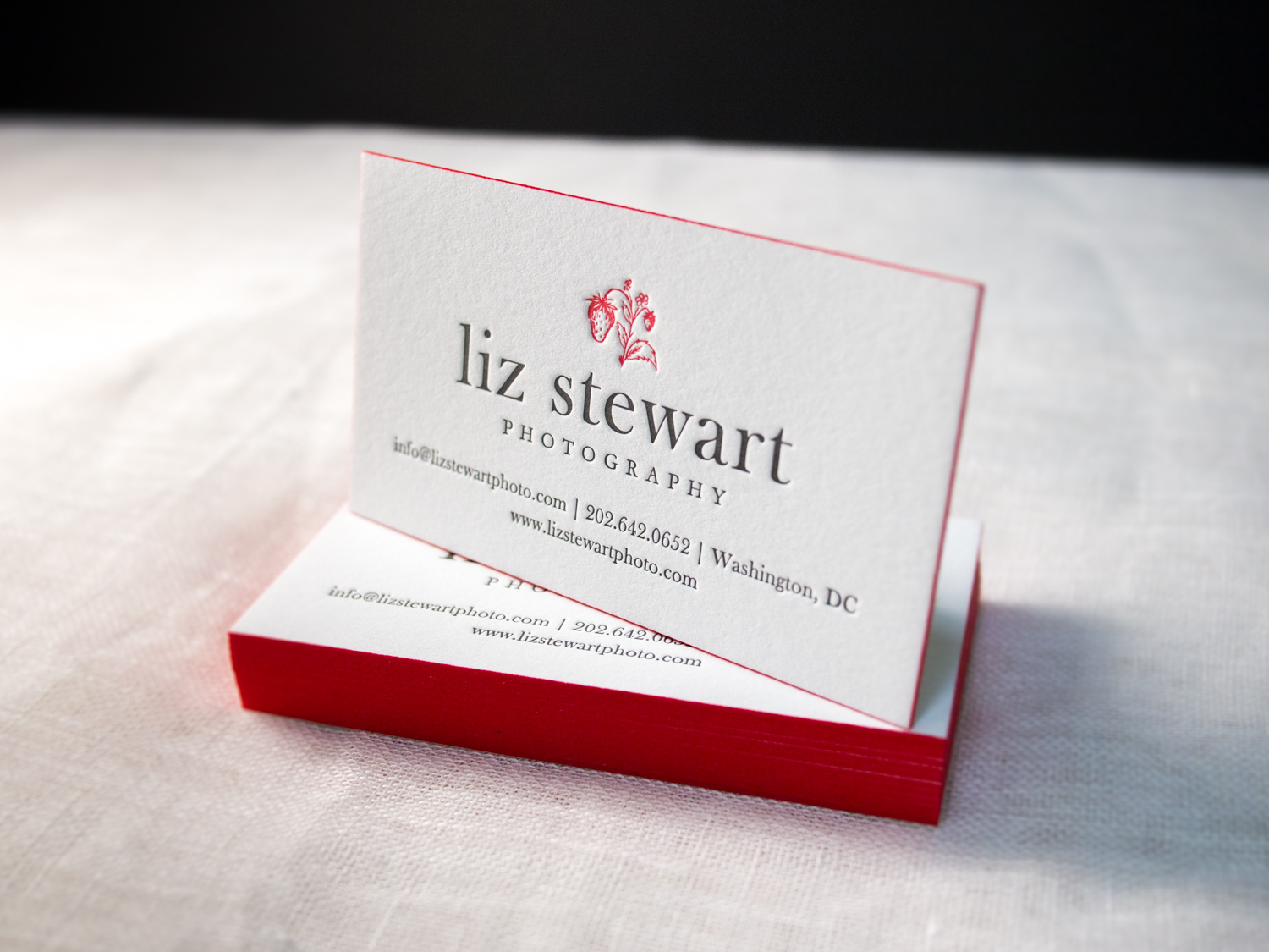
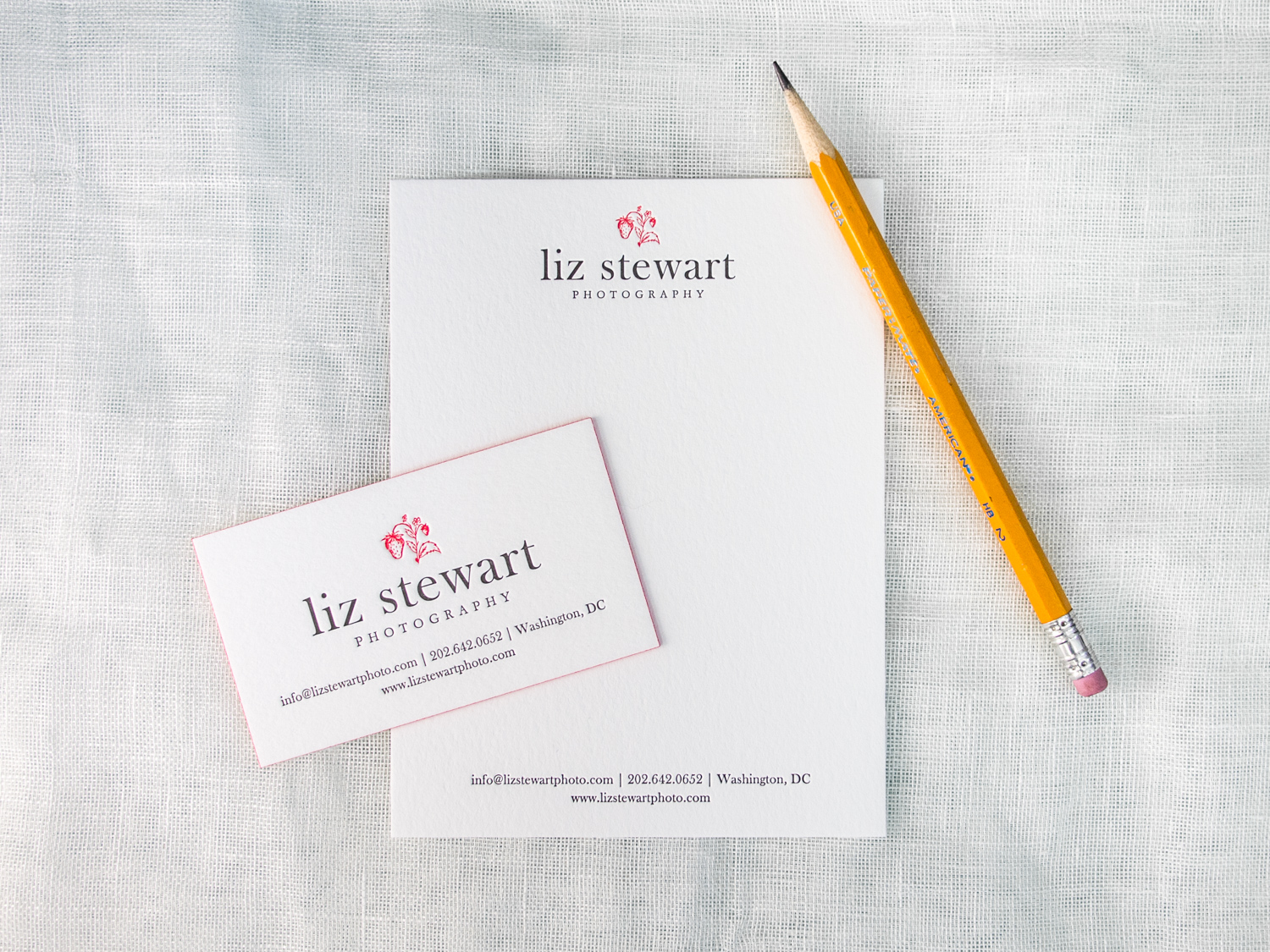
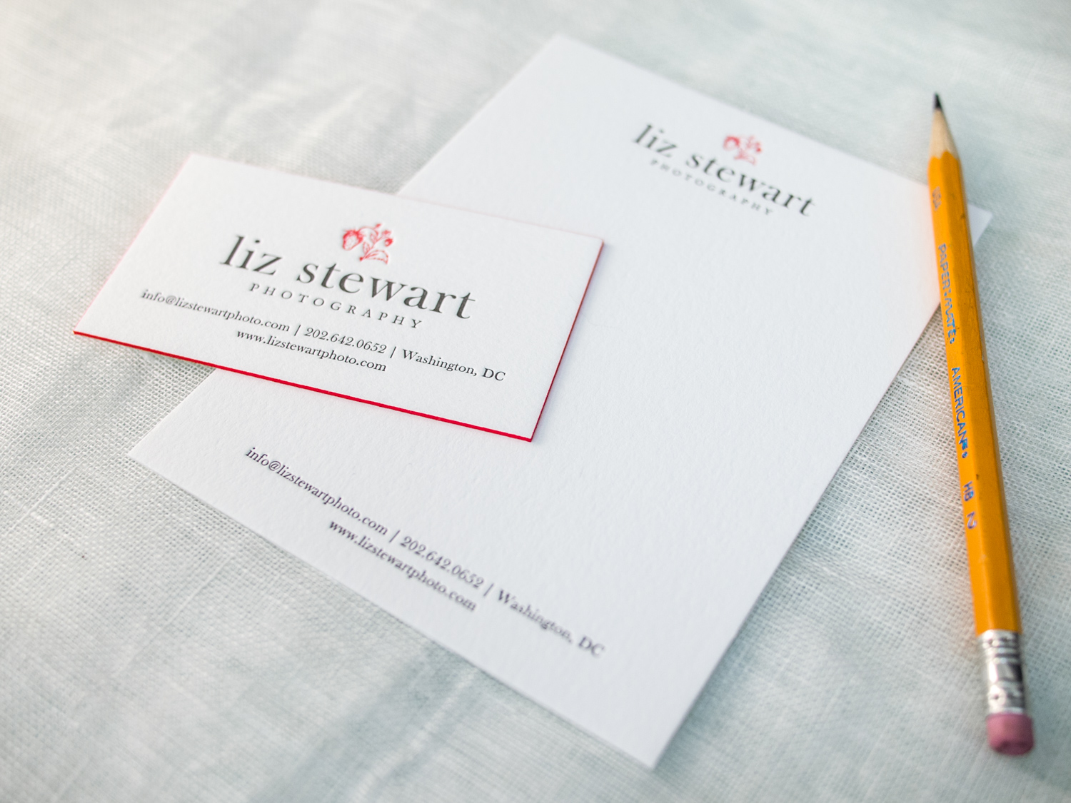
PAPER 300G, 600g Fluorescent White
INK Pantone 2035U (Red) & Pantone Black 7U (Dark Gray)
EDGE PAINT Pantone 2035U (Red)
PAPER 300G, 600g Fluorescent White
INK Pantone 2035U (Red) & Pantone Black 7U (Dark Gray)
EDGE PAINT Pantone 2035U (Red)
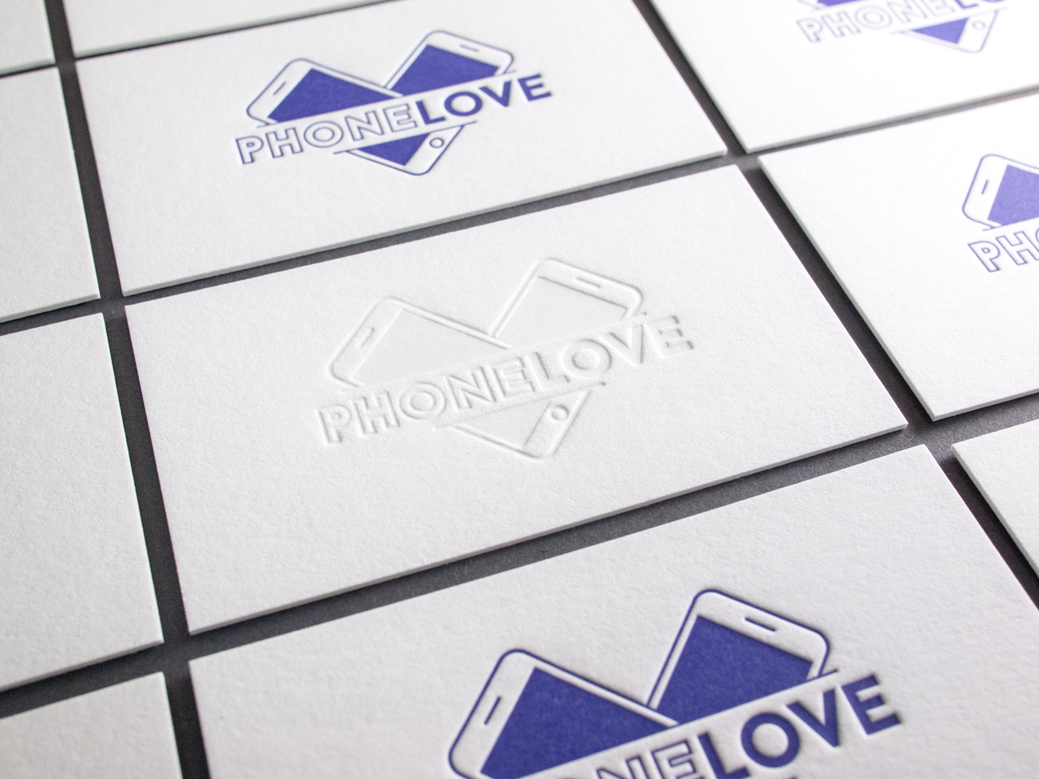
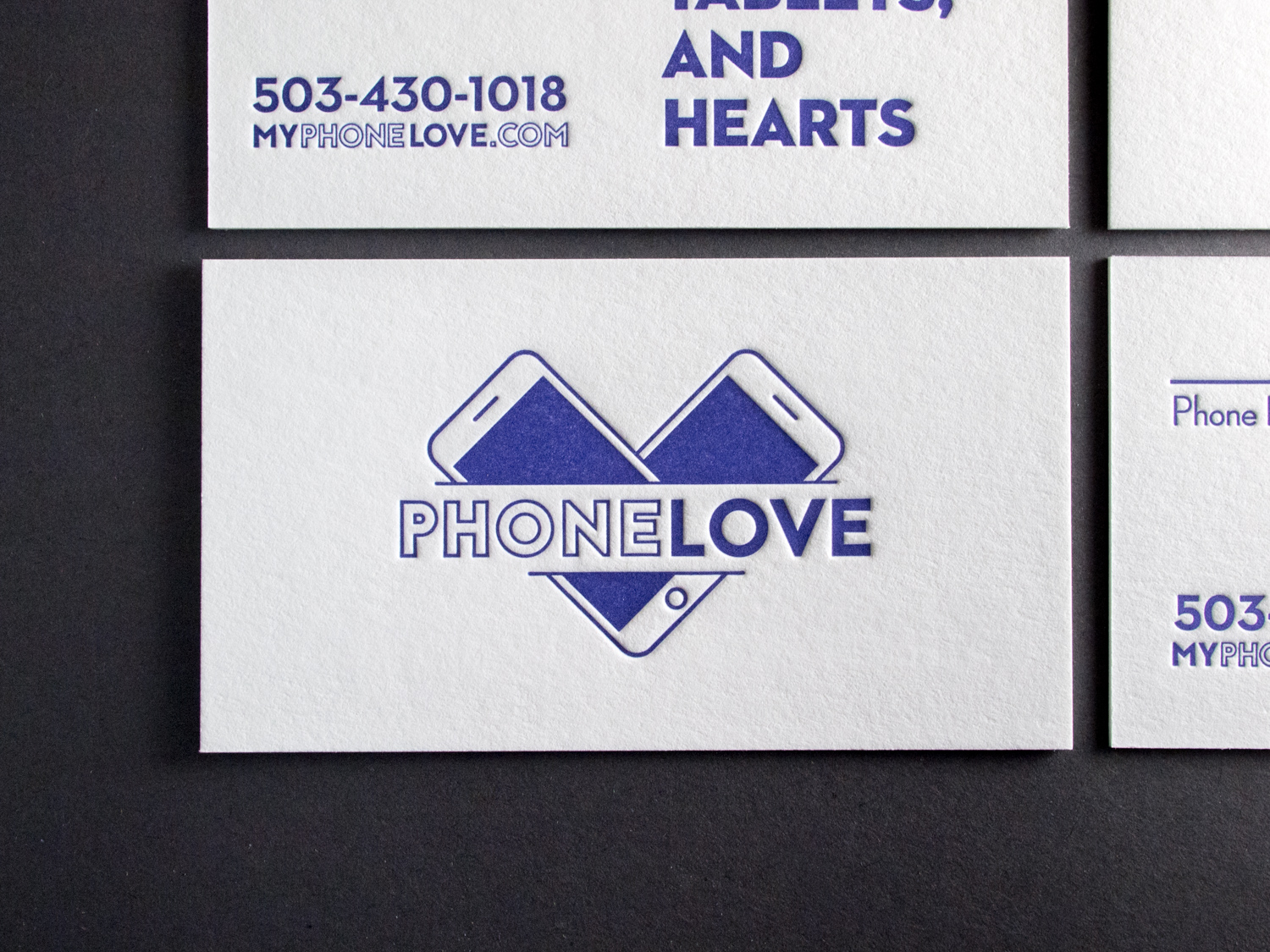
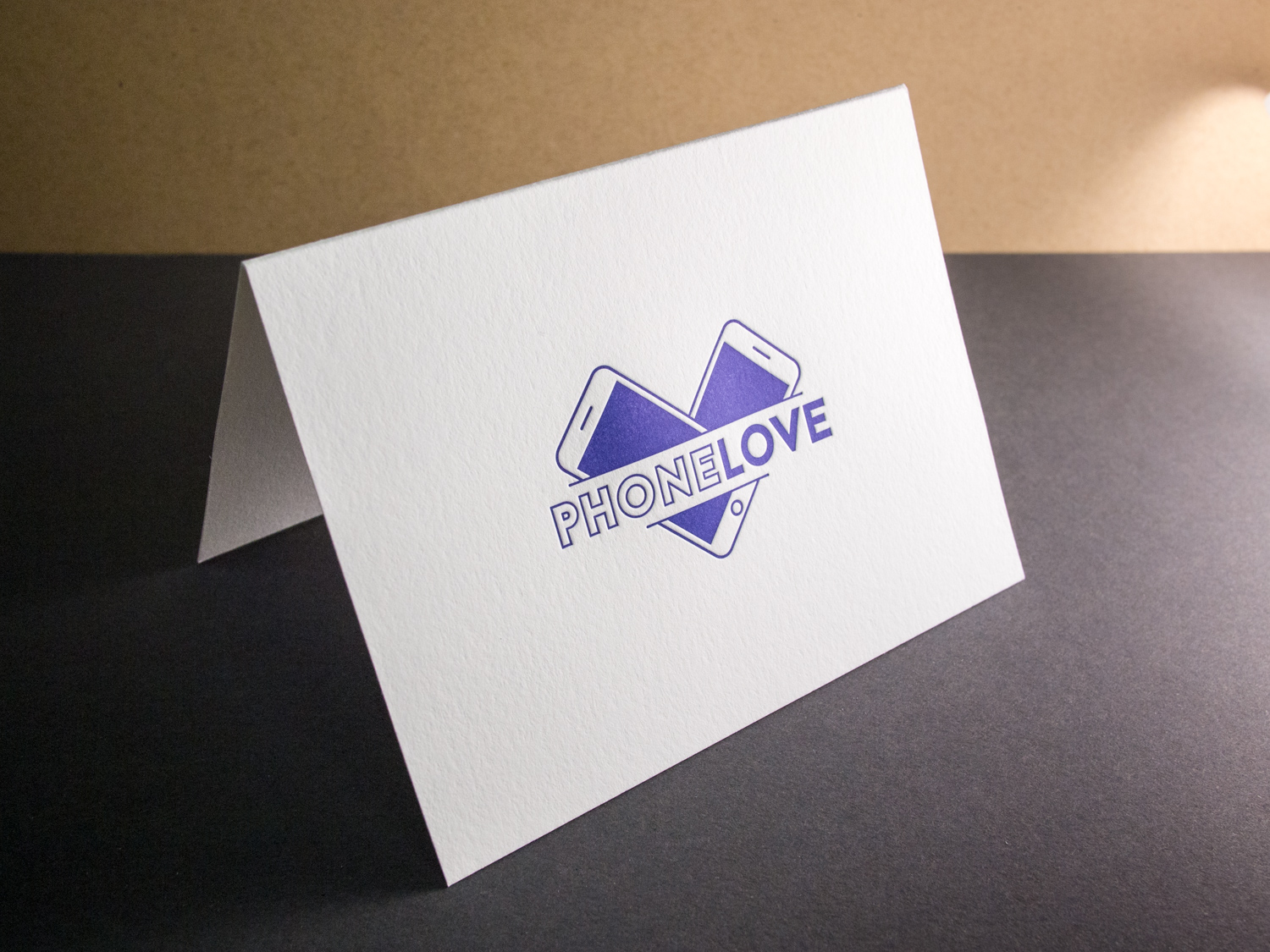
For the Portland-area phone lovers at PhoneLove we printed two-sided business cards on 600g Fluorescent White paper. Most featured purple on both sides, while select folks got a subtle tinted-white logo for a blind-deboss look.
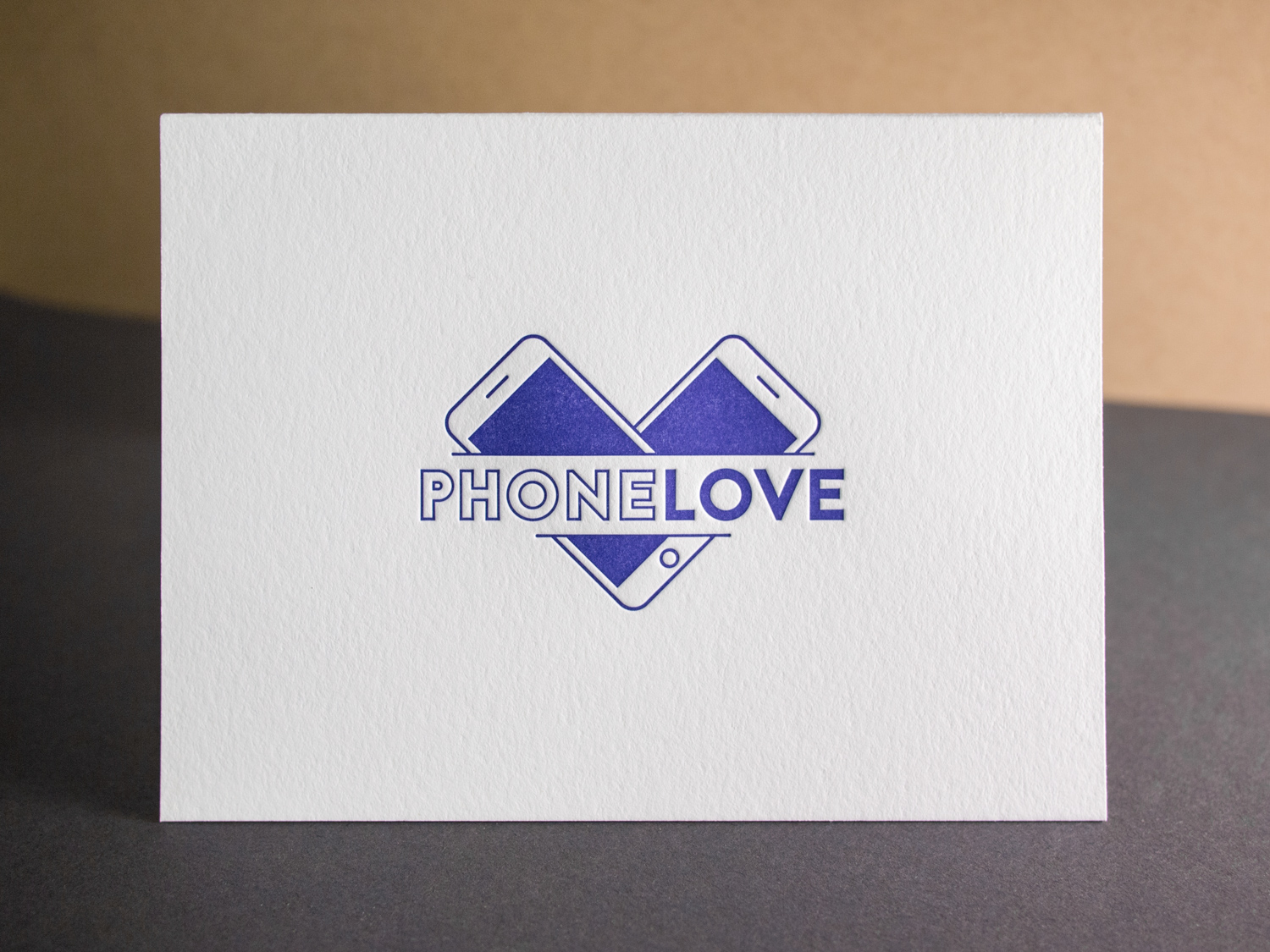
We rounded out the set with some folded notes.
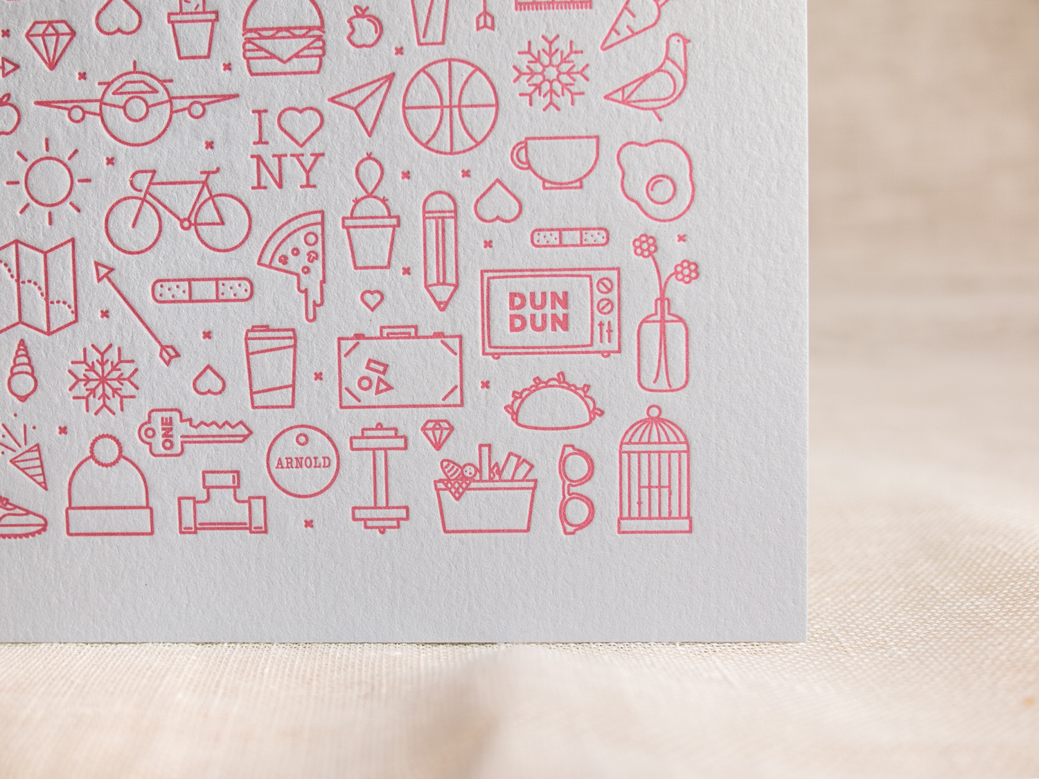
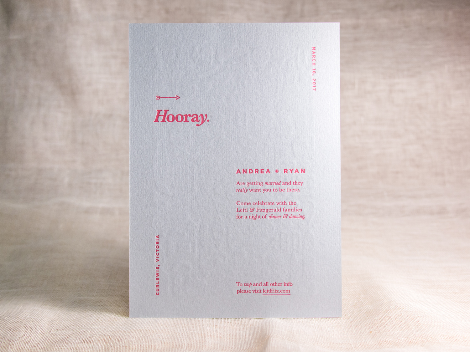
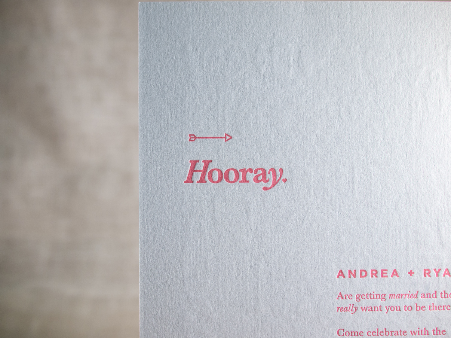
Intricate yet simple two-sided client-designed invites for their Victoria, Australia wedding.
PAPER 350g Colorplan Cool Blue
INK Pantone 709 custom mix
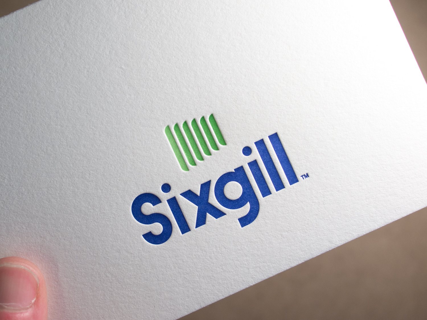
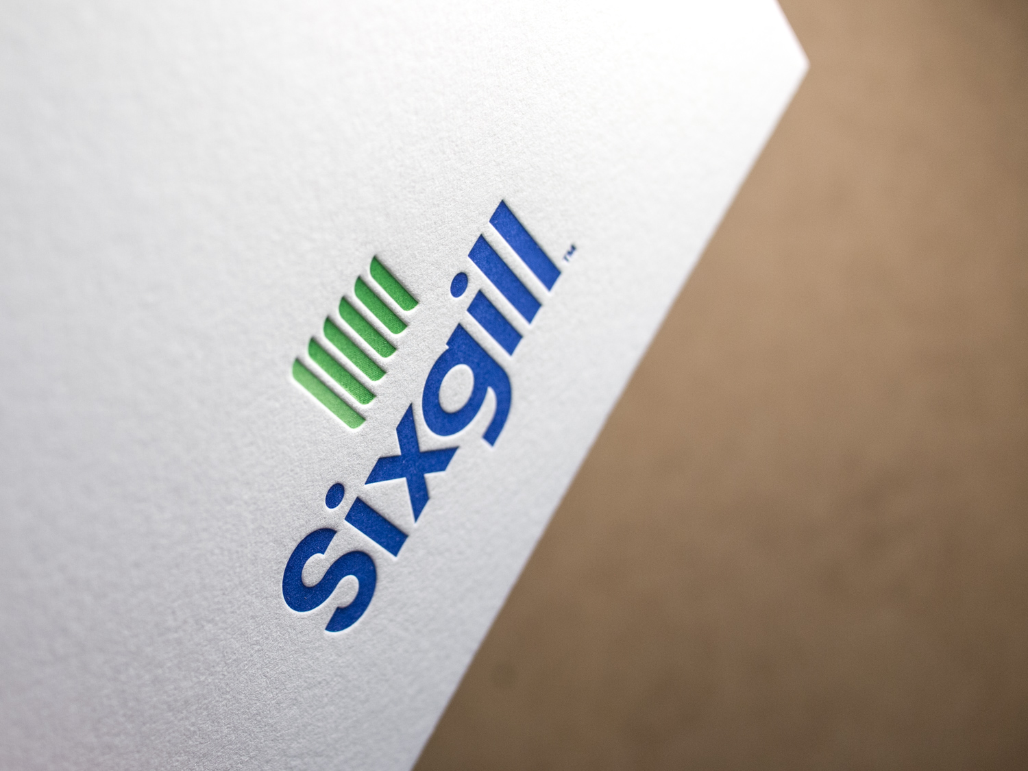
Sixgill's logo uses a gradation of green — from light on the left to dark on the right. Normally that's not the sort of thing letterpress does well. But using a fine halftone screen, we printed two shades of green on top of one another to achieve the gradation effect.
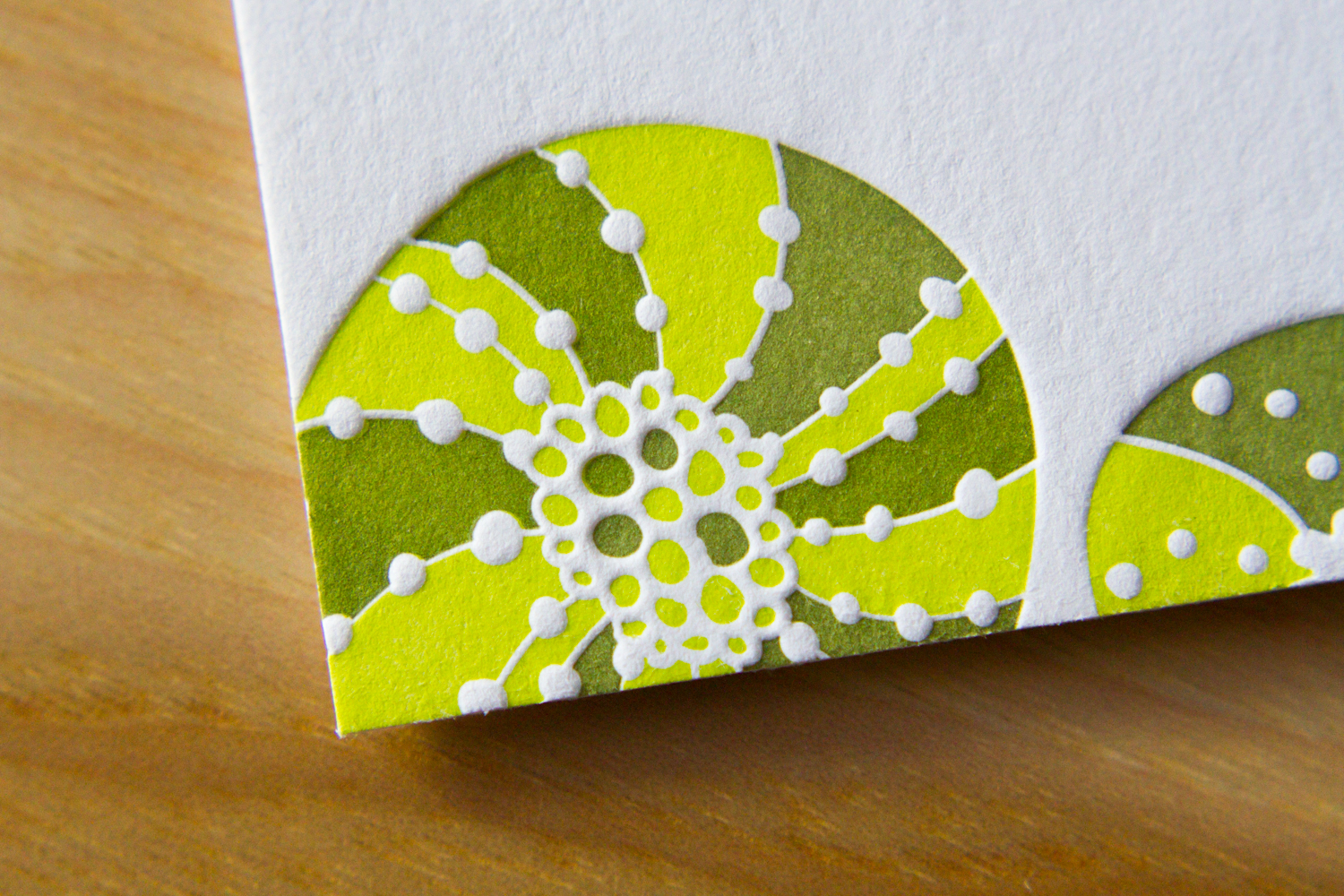
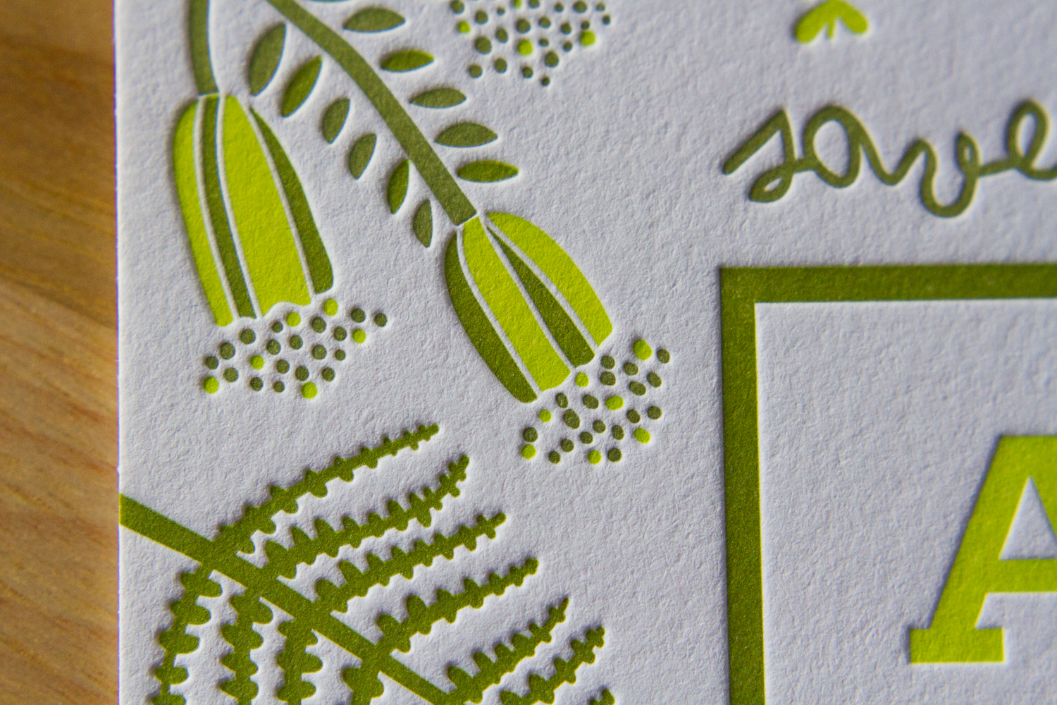
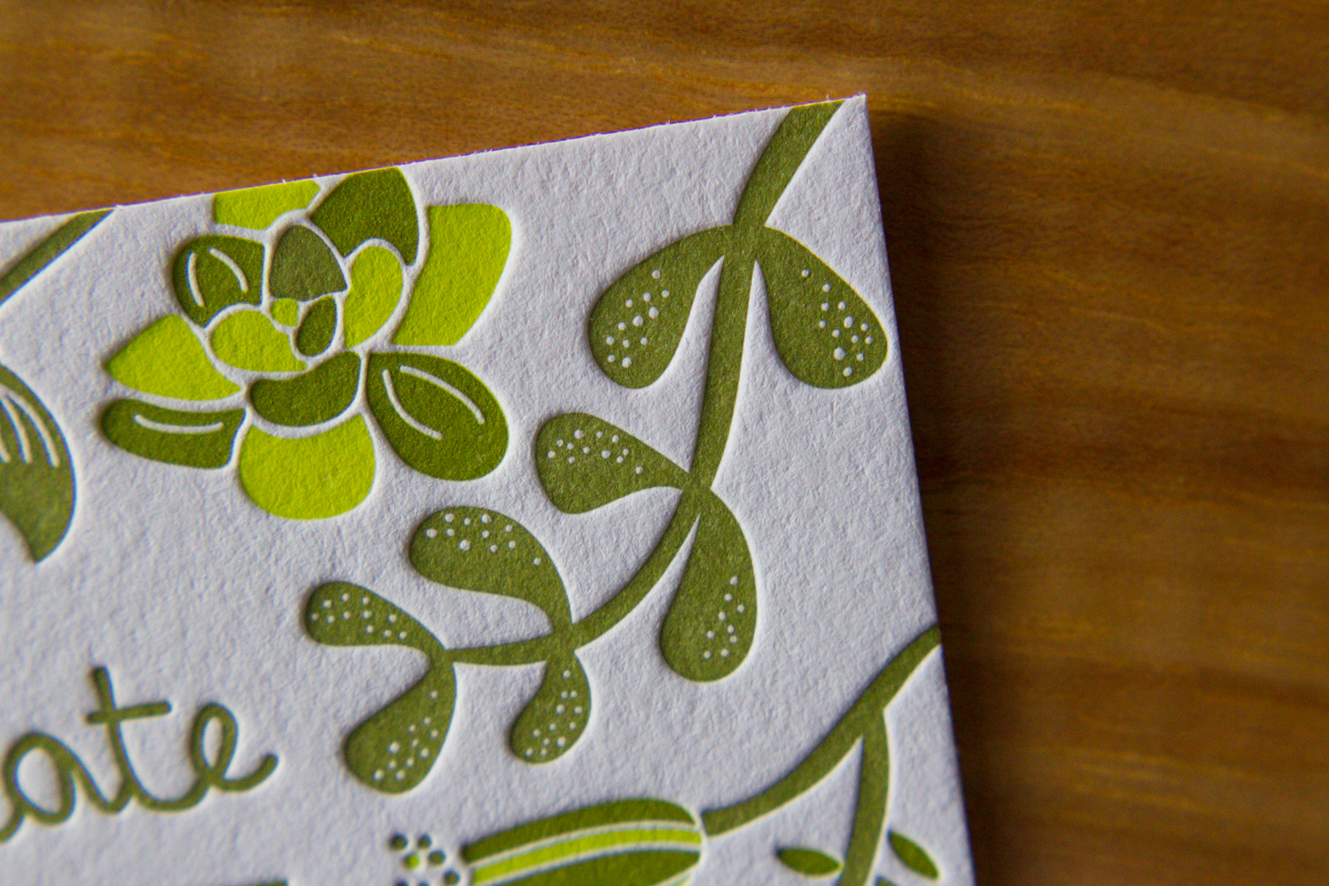
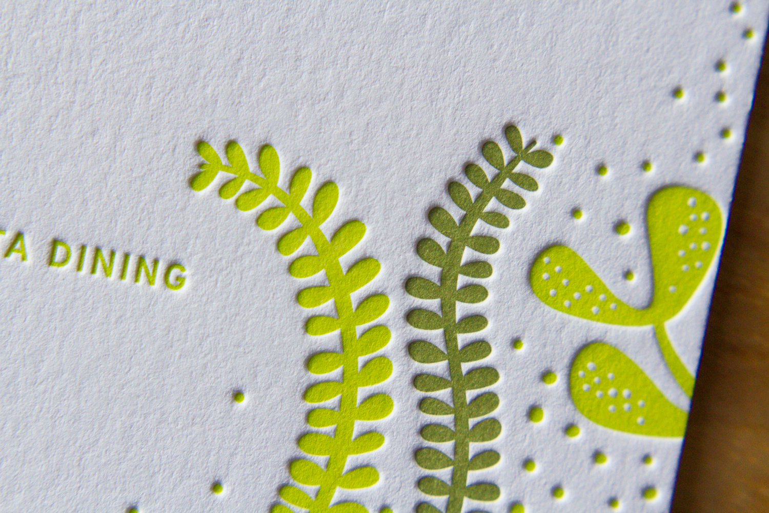
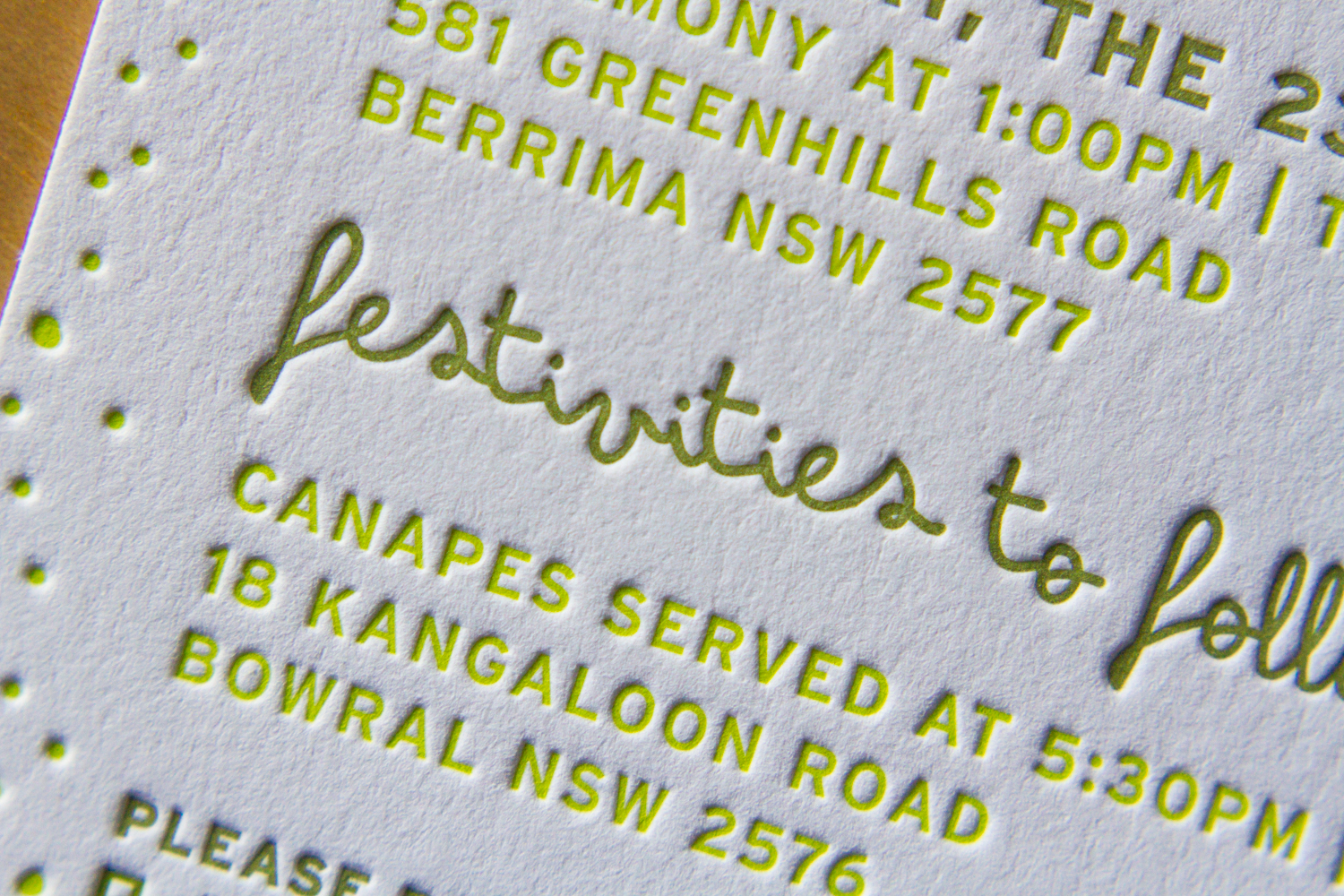
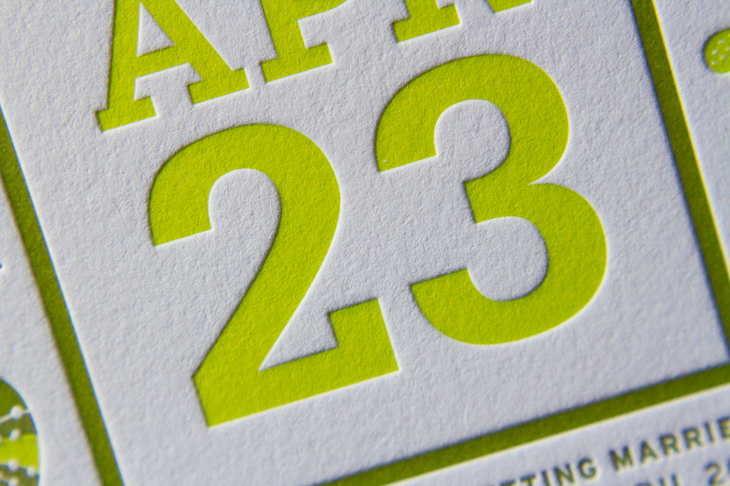
This lively set was based on a 60's style botanical motif printed in two shades of green. Designed by the bride (between her cake-baking sessions), the set was printed with two custom inks on 600g fluorescent white stock.

First, a square save the date card — emphasis on the date. The playful greens grow inwards from all sides. The "save the date" is in a handwritten-style script, and the date is in large bold text.

Next, the invitation itself. The flowers and vines border the top and bottom, giving an appearance of open white space on the sides. On closer inspection, an edge of stippled dots accents the two sides, and the spaces between the flowers, creating a casual but grounded border to the artwork frame.

Finally, an information card, to answer crucial questions about accommodations, dress code, and gift registries. This piece uses only a couple of the floral elements, at top and bottom. Together, these three pieces are great example of how use of color and motif can tie together distinct pieces — each has a different layout, and all are reinforced by the common design elements.

The floral elements of the set's design bring to mind Scandinavian mid-century modern influences. And the lemongrass and avocado colors are similarly evocative of the mid 20th century. All the designs were provided to us by the client, and there are so many parts to love. So here's a collection of detail shots.
One last note, as a brief digression from the design … remember when putting your invitation together that you can say whatever you want to say. This goes especially for information cards. In addition to basic events/travel/lodging details, it's a great place to convey anything you need to the guests. If there are some conditions (a ceremony on a grass lawn, possibility of unpredictable weather, etc.) feel free to say it! Be conversational, be you. We love the way this couple addressed their invitees, and the dress code below is just one example. The warm and chatty tone made it very personal, and goes perfectly with the whimsical graphic style of the artwork.


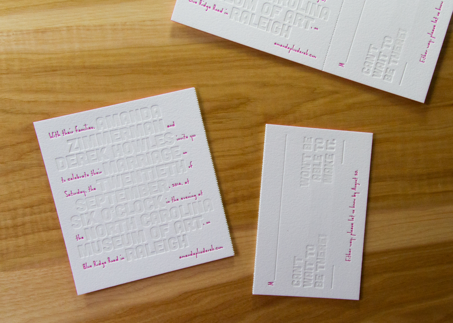
This was a really fun set. Designed by graphic designer (and groom) Derek Howles — who, incidentally, also designs these super-cool cartography poster prints — it was interesting and unconventional. And art-y! Which is fitting, since they got married at the North Carolina Museum of Art. The set was comprised of a save the date card and a combination invitation/tear-off RSVP.
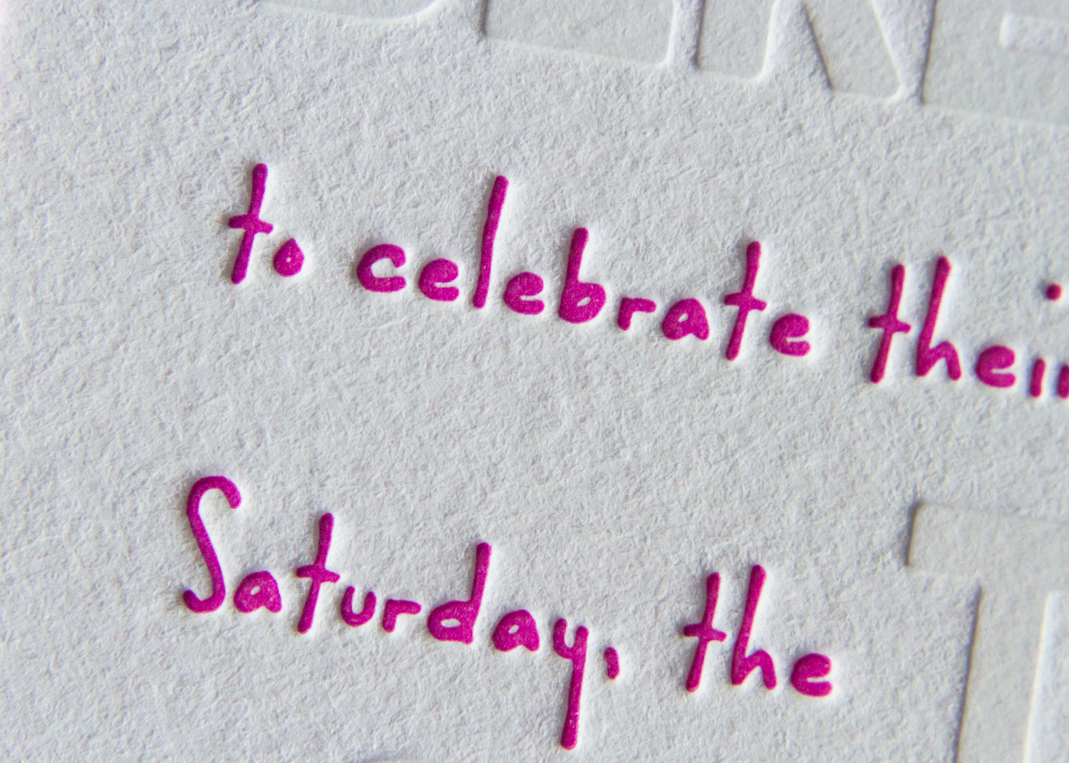
First, the save the date card. The who, where and when details have the blind-deboss look, but they were actually printed with a tinted white ink. This method gives a slightly deeper look to the impression, and sets the text off a bit more than just making an impression alone. The playful pink wording puts the stats in conversational context, and the text concludes with a URL for more information.
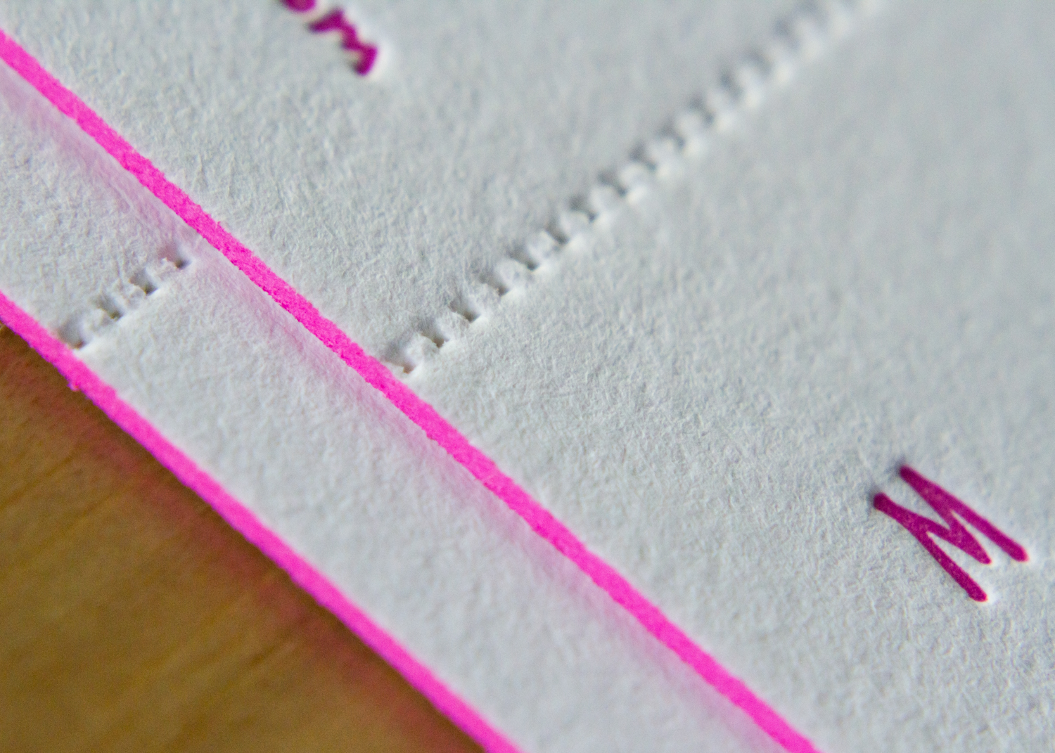
The invitation followed the same format: large, white-tinted block text for the event's pertinent details, and tiny pops of pink filling in the rest of the words. The unconventional style is carried through to the RSVP's wording, with the options "Can't wait to be there!" or "Won't be able to make it."
The extra heavy paper stock is a great showcase for the dramatic edge painting, which ties together the set's color palette. The thick stock also helps the perforation stability — the RSVP card easily separates from the invitation for return mailing.
This was a fun invitation set to print. Designed by graphic designer Sarah Scott, it was a festive and classy way to invite guests to Suman's 70th birthday. Guests opened the outer envelope to find a sleeve — an Envelopments Portable Pocket with charcoal linen exterior and ecru linen interior, overprinted with fog ink – and withdrew the card. The striking invitation was printed in black and a custom green ink on heavy, 600g pearl white stock.
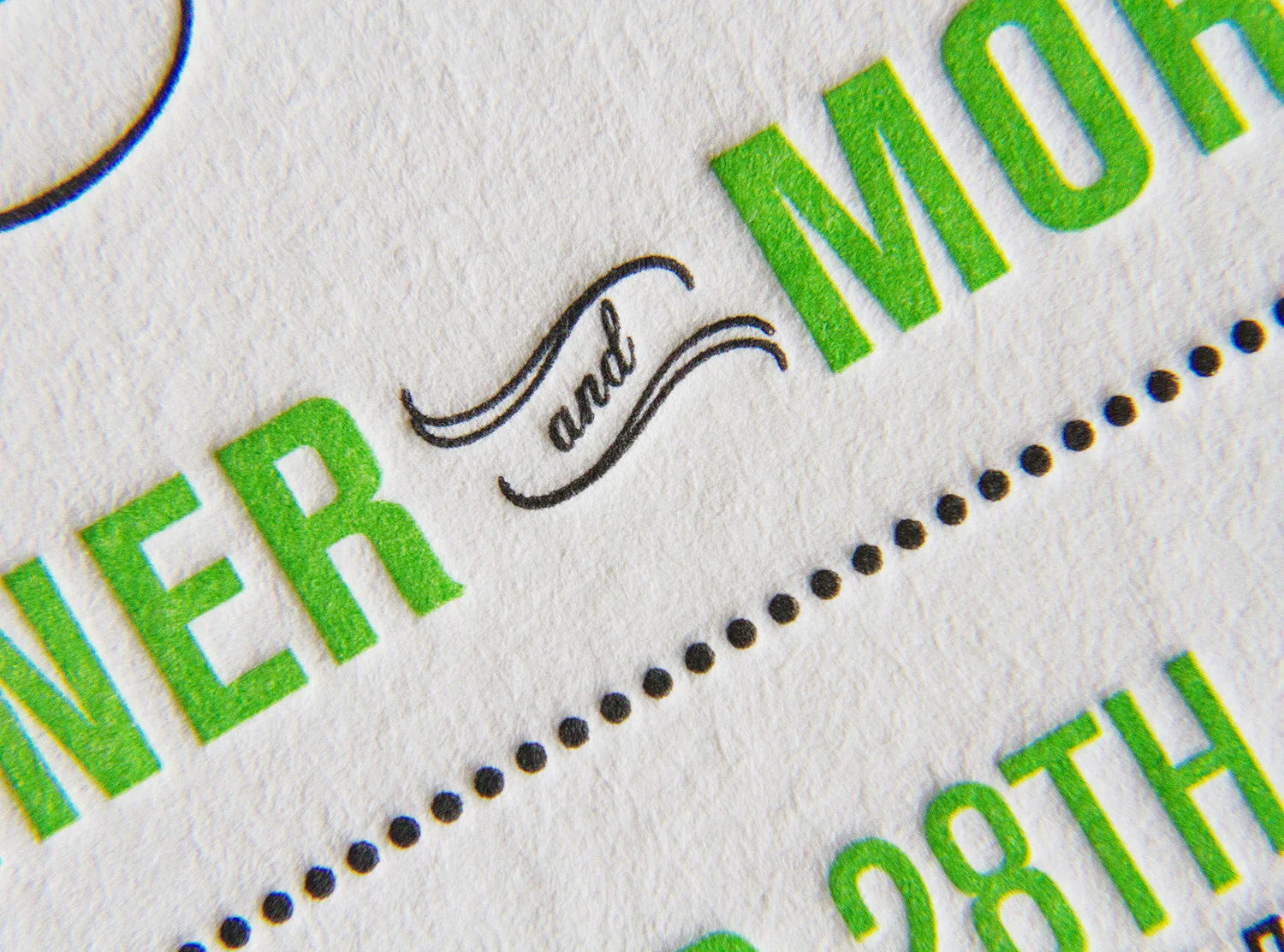
The design's details and touches abound — the v-opening of the pocket, the tiny script "and," the hat on the 70, the tone-on-tone printing over the textured enclosure — and it must surely have set the tone for a great party.