Posts tagged fire truck
Blind Madhouse | Duplexed Business Cards

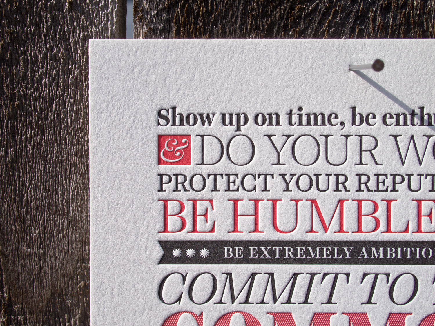
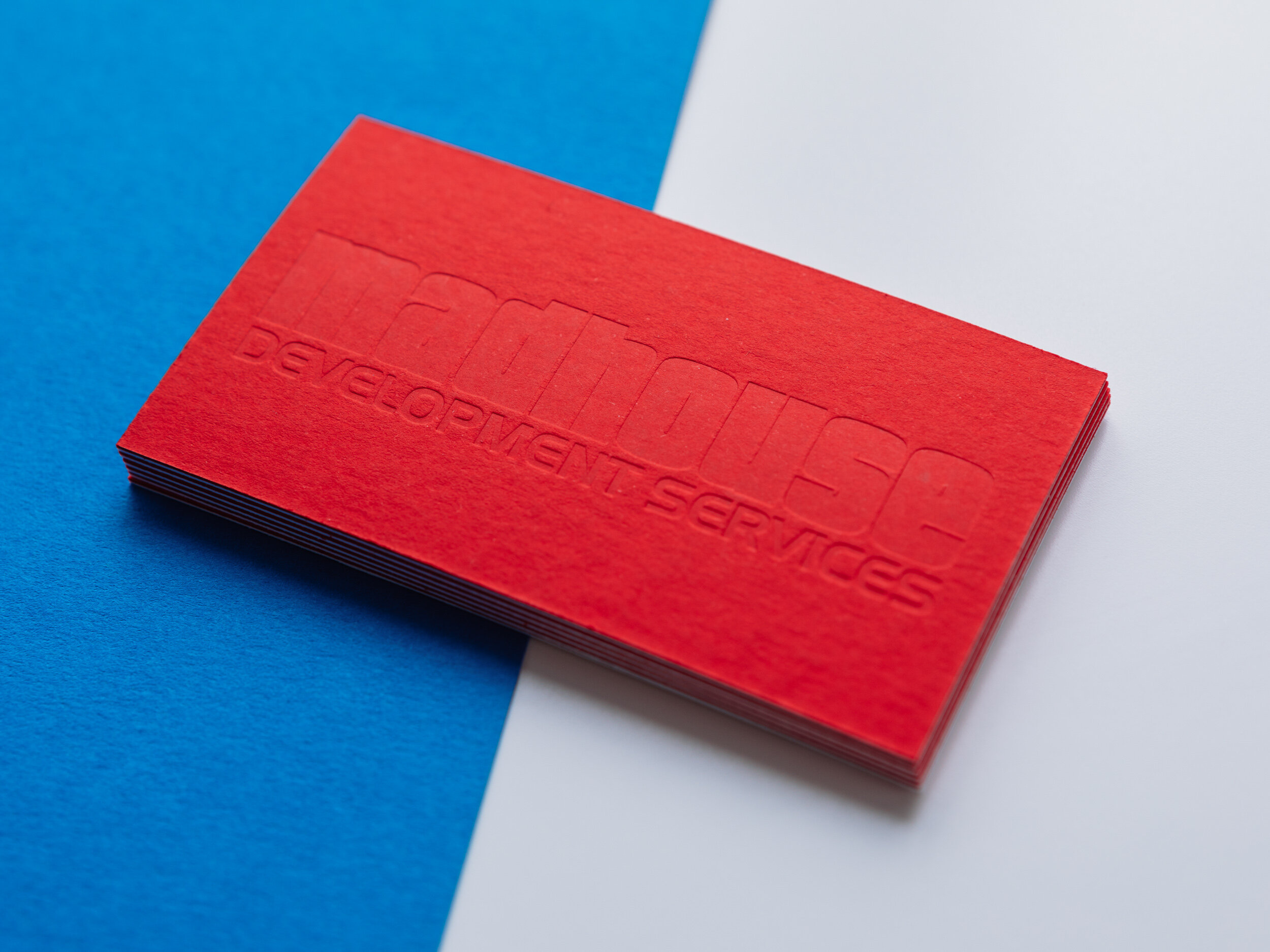
Custom duplexed business cards for Austin’s Madhouse Development Services. On the back, in order to get extra bite into the fairly dense Keaykolour stock, we used a heated copper die rather than the usual polymer plate.

FRONT Pantone 485U and 426U on 300g Lettra Fluorescent White
BACK Blind impression on 300g Keaykolour Chili Pepper

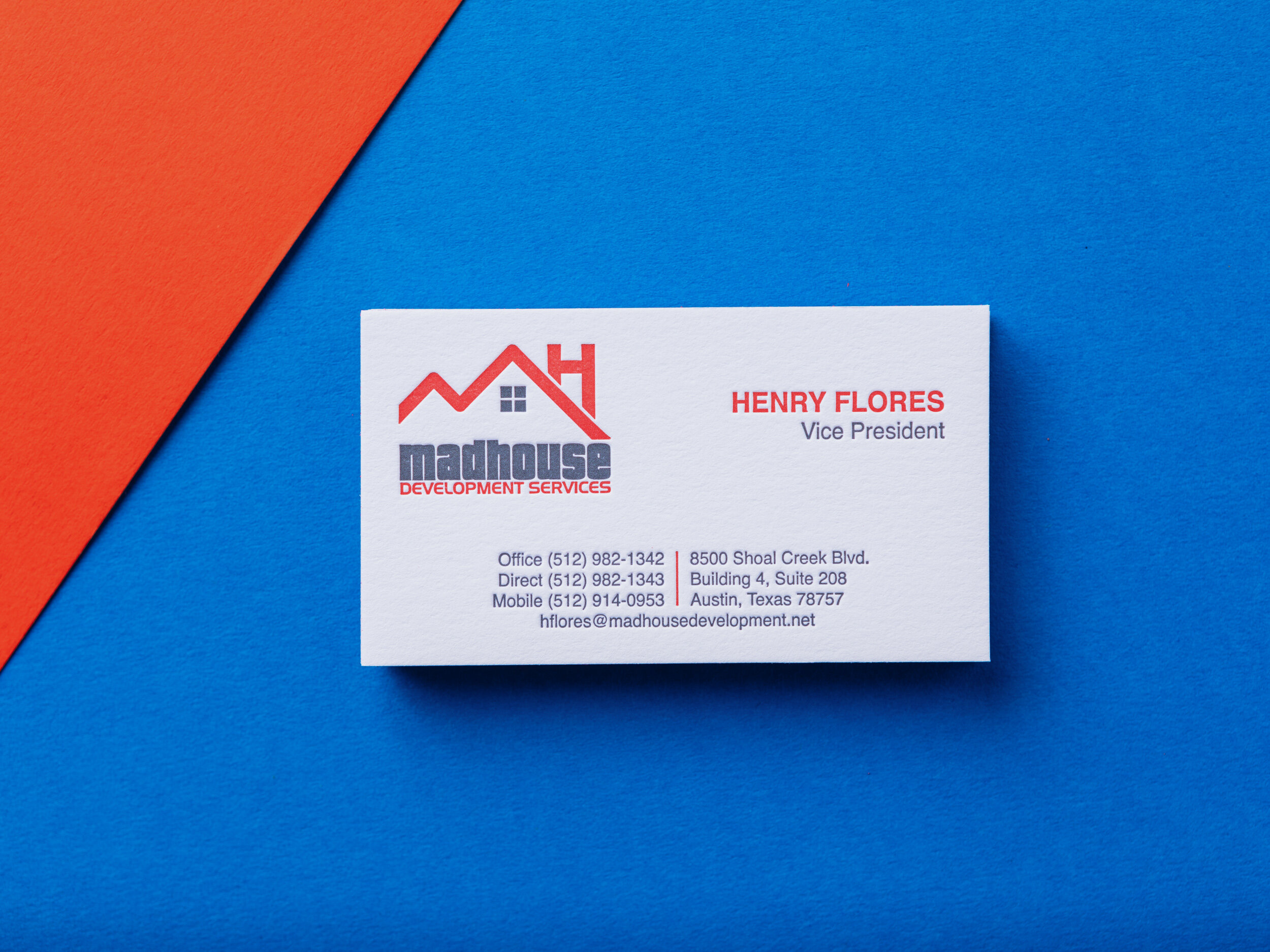
Photos by Gritchelle
Four Inks on Black for Alex Jackson Studio

Letterpress printing on black paper can pose challenges. Most letterpress inks are transparent, so they're not going to show up on a black background. One exception is silver. Silver ink is mostly opaque (about 80%), so if you're sneaky, you can print a silver ink run on the black paper to create a lighter base, then print any color you'd like on top.

For Alex Jackson Studio we started with thick 4-ply black museum board and a silver ink run. Then we added the red rose artwork and a subtle yellow stamen, leaving a super-thin silver outline and tiny silver veins. On top of the red, we printed a gray halftone gradation to create shading (check out our halftone blog post if you're not sure what that is).

animation.gif

This technique requires really tight registration, but it allows for an effect you don't see often with letterpress. Our PDX sports fan coasters were done the same way. More photos of Alex's cards are below.

Letterpress Posters for Bowdoin College

Barry Mills served as president of Maine's Bowdoin College from 2001 until this past July. Upon his departure, the college asked us to print his manifesto as a 6" x 15" letterpress poster.

Since we use a Chandler & Price platen press, which isn't really designed for larger pieces like this, we actually printed this two-color piece in four separate runs. That way we could get a nice even and deep impression into the 600g Lettra paper.

Durham, Via ...

Megan and Ted had a bold, simple look in mind for their invitations. Both loved the clean look of the Futura typeface, which captured the wedding's modern and traditional blend of styles. They first grabbed their guests' attention with a save the date card, featuring a custom illustration by Travis, which traced the couple's route to the altar. Working from a concept Ted sketched on a napkin, the finished artwork diagrams their two paths becoming one shared journey: beginning in L.A. and New Orleans, meeting in N.Y., moving together to Virginia and ultimately, to Durham, North Carolina.

Ted also contributed the "concert poster" concept for the save the date's text layout. They were both very involved in the design process and enjoyed the collaboration, saying that Parklife "did a fantastic job in translating the concept into something that turned out beautifully on letterpress." The invitation itself was focused on clean lines, which were further highlighted by generous white space. Interestingly, the Black and Fire Truck red inks were not their wedding colors — they just really loved how those colors, especially on the bright white paper, made the design pop.

The couple had been big fans of letterpress printing before their wedding planning began — they appreciated, in Megan's words, "the tactile experience of opening up an envelope and experiencing an invitation that not only looked beautiful but FELT beautiful, too." And they valued what she described as "the permanence that letterpress represents. Even if the ink fades, the invite is still permanently there. It's a neat metaphor to accompany a wedding invite."

Photos by Sarah McCarty Arneson