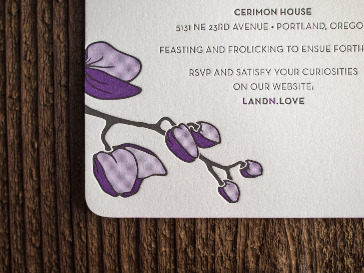
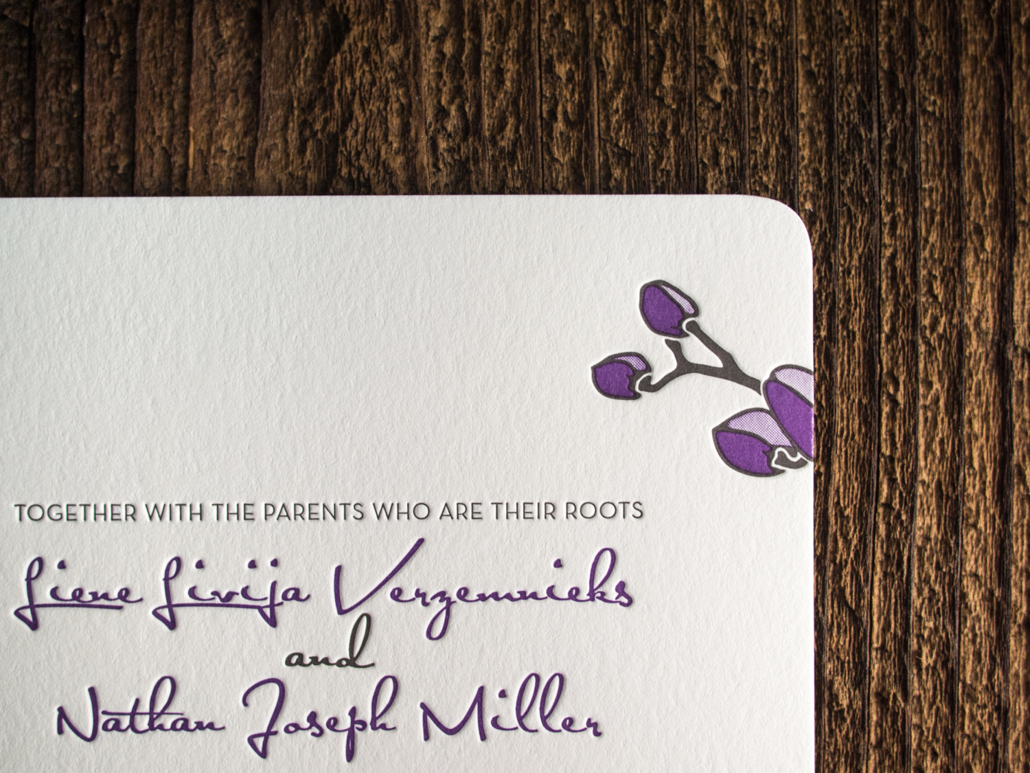
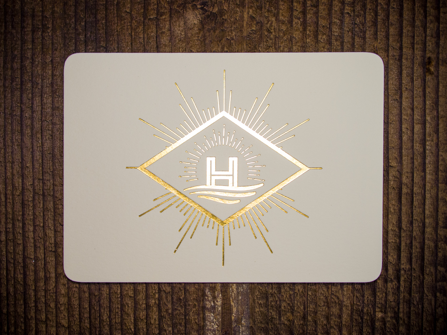
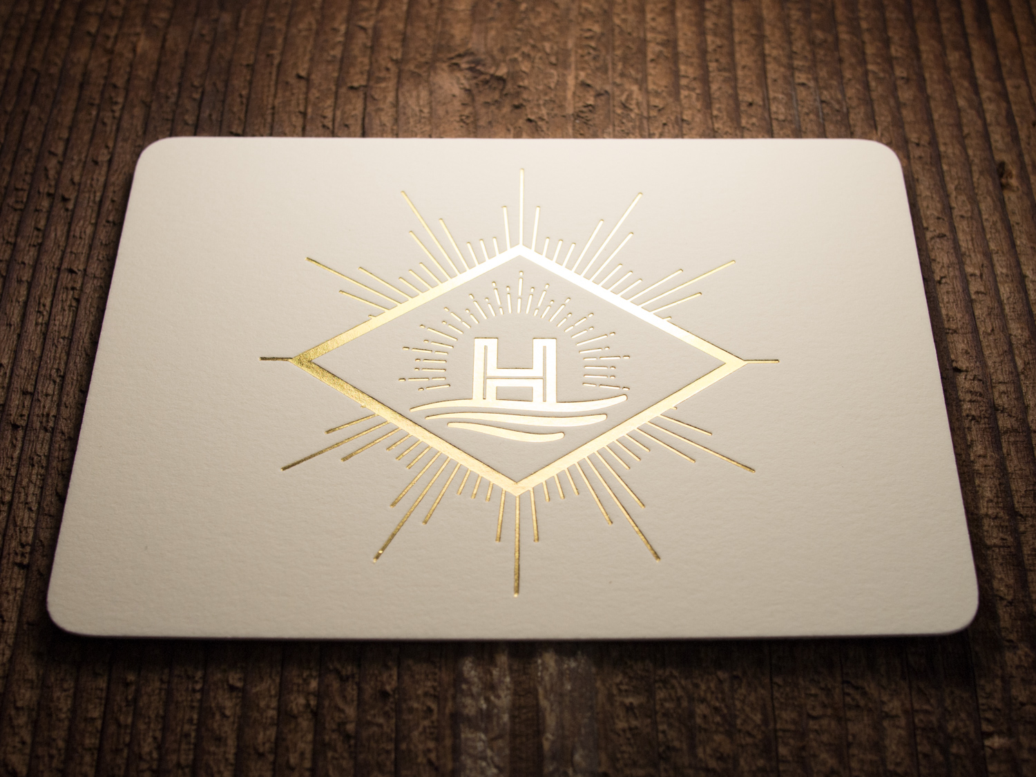
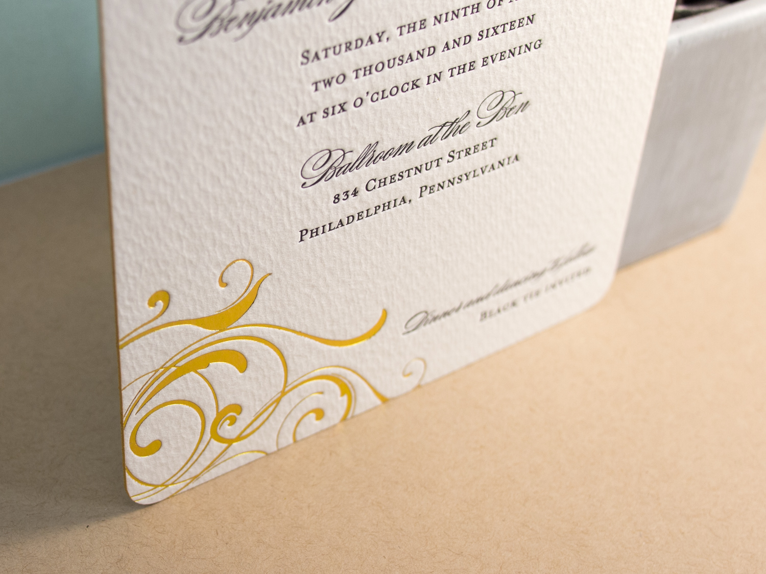
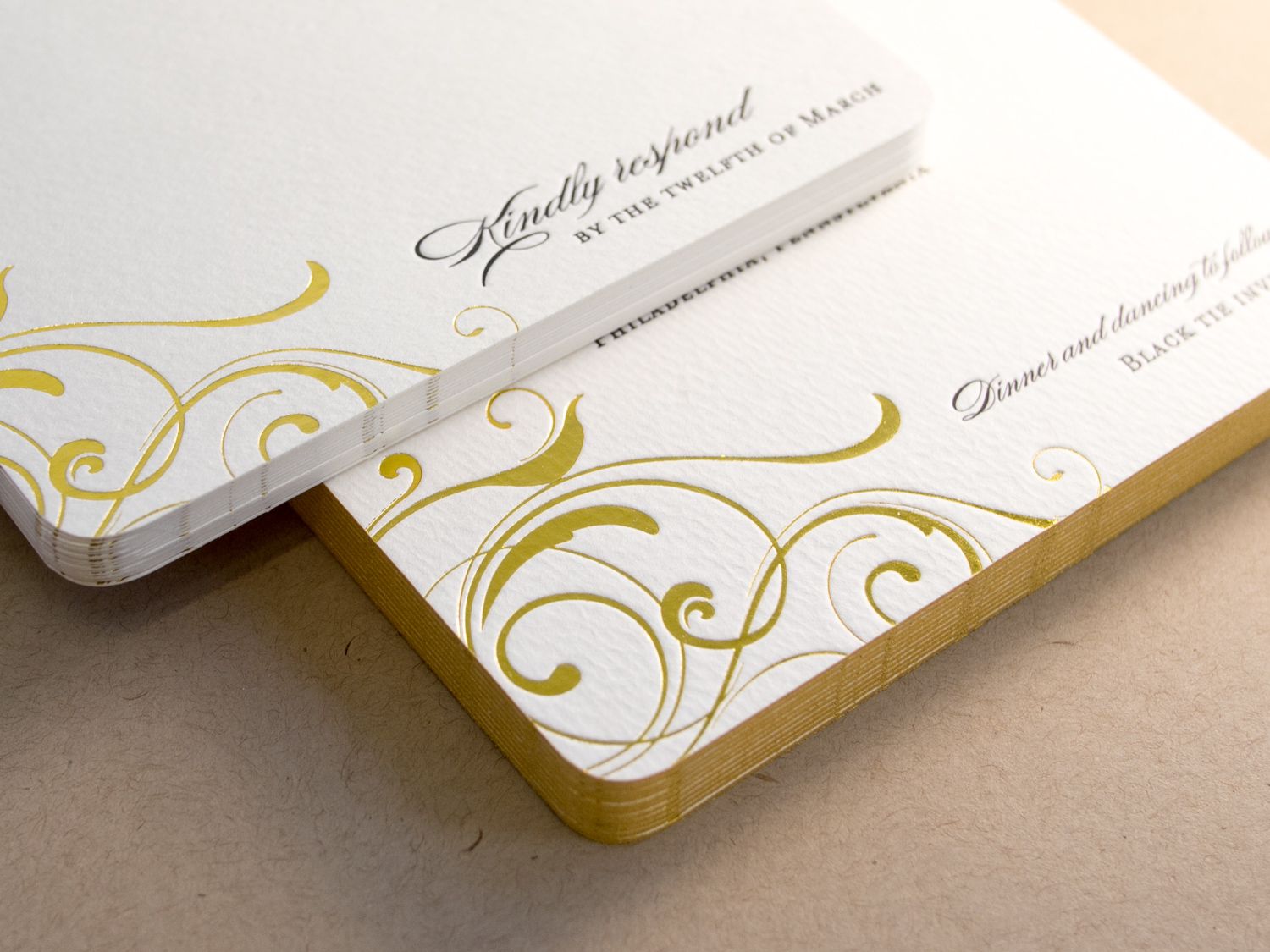
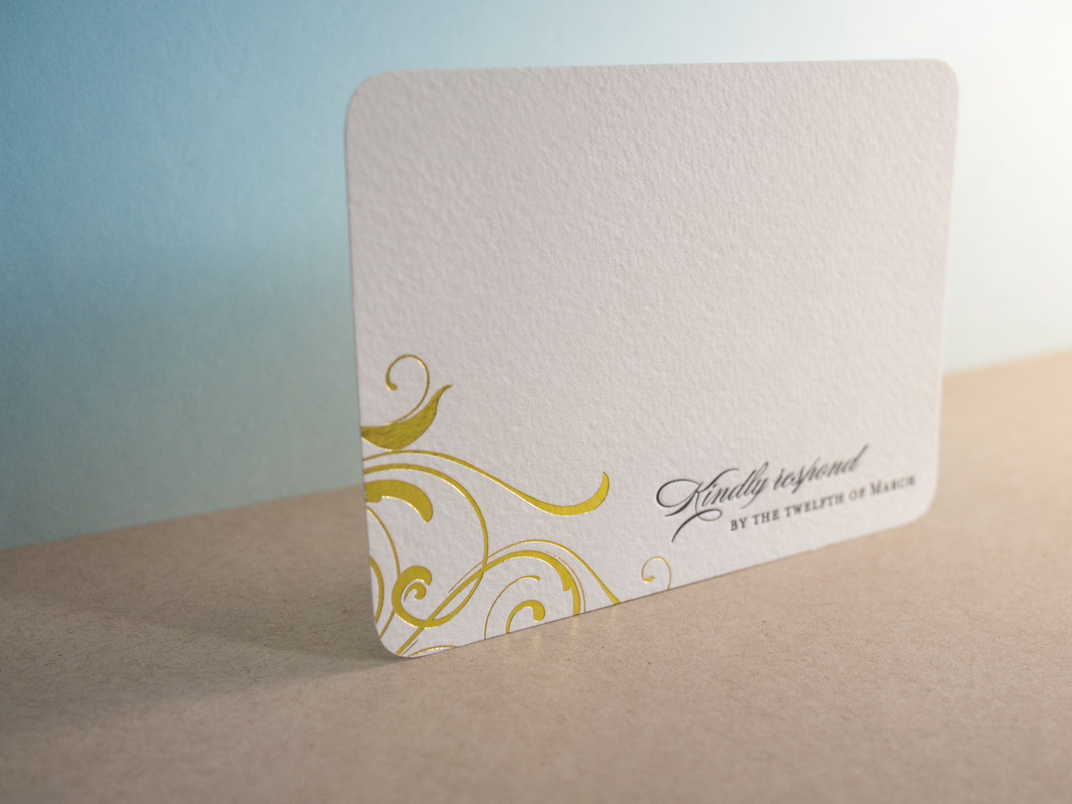
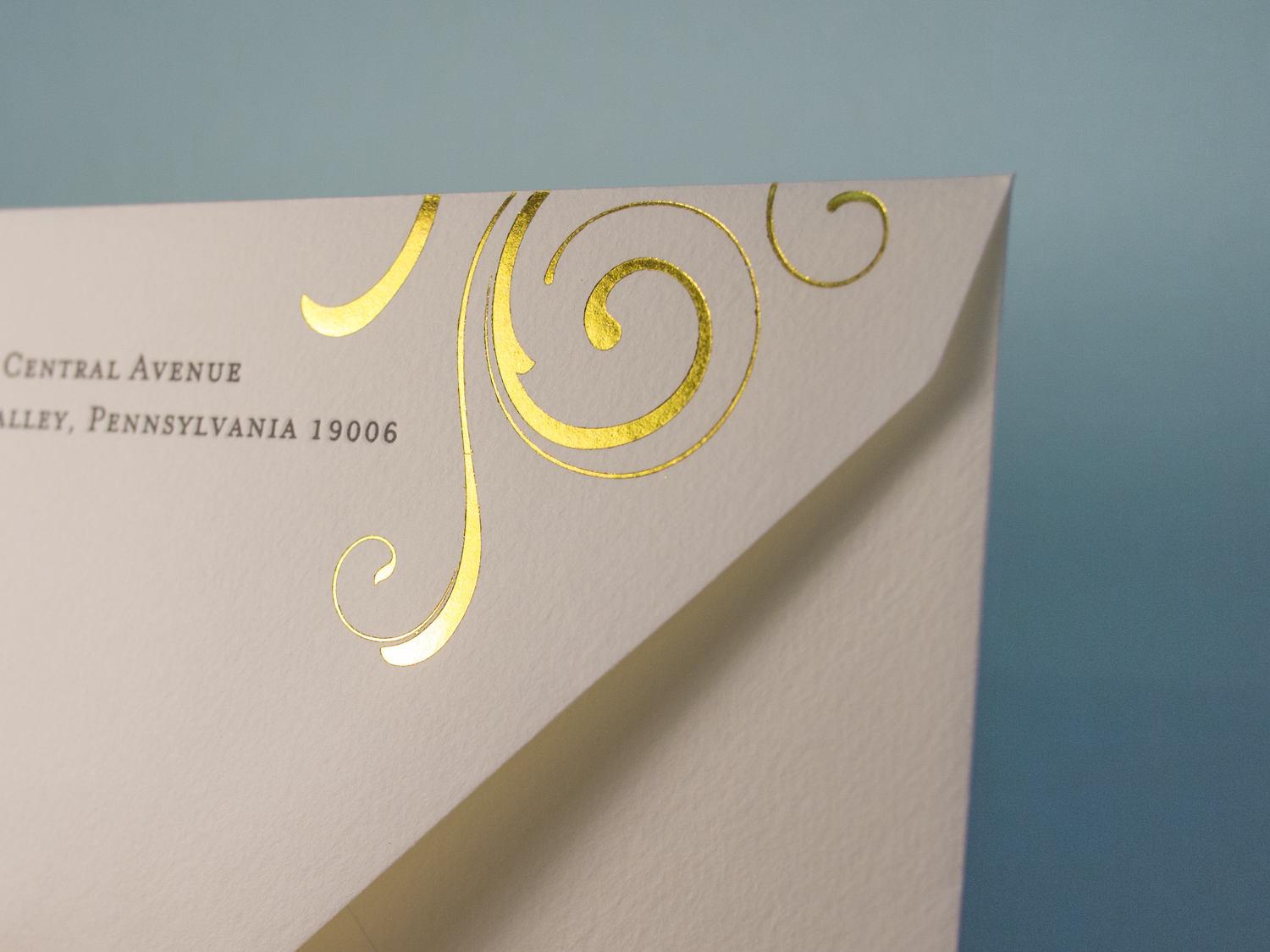
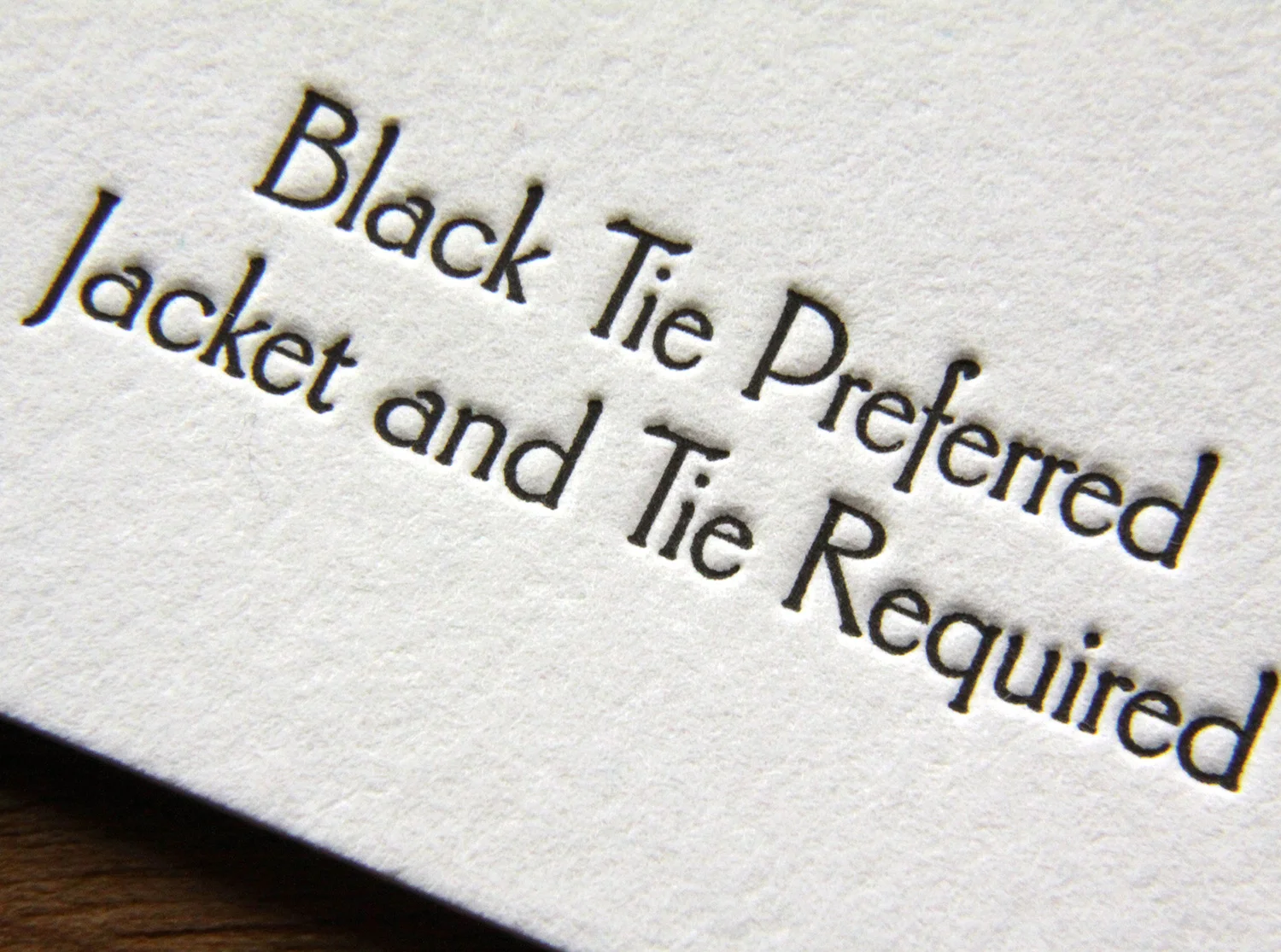
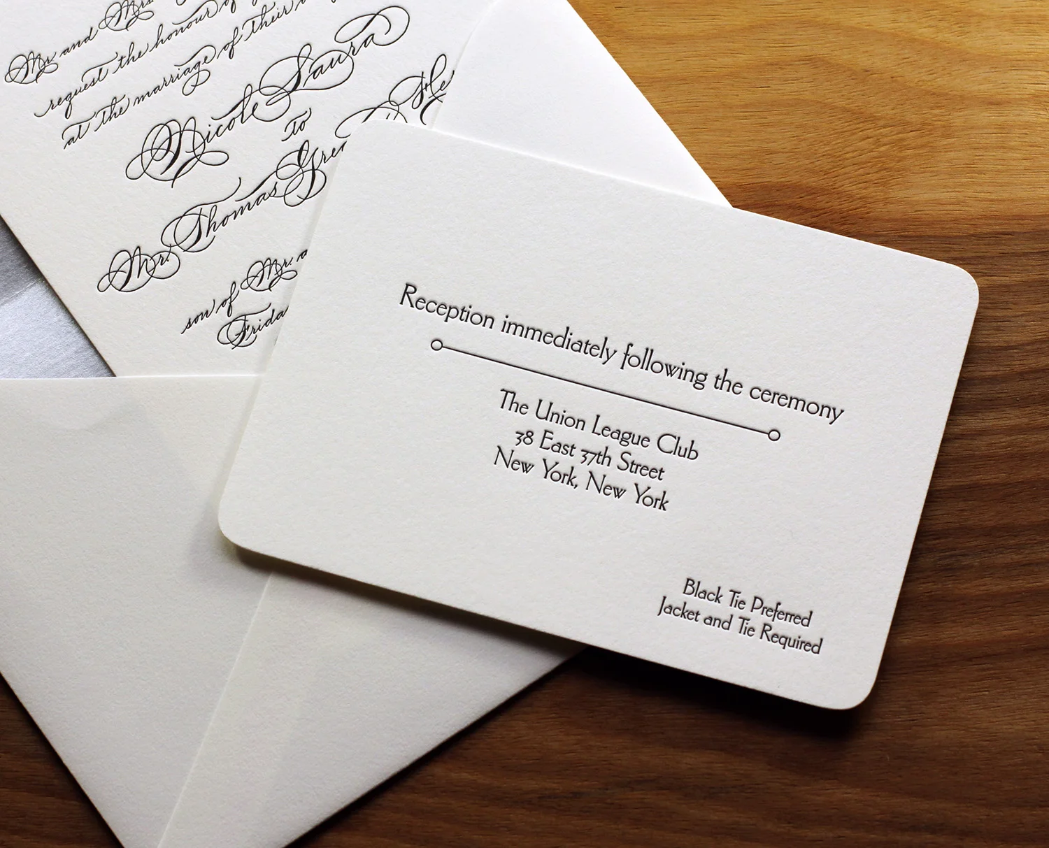
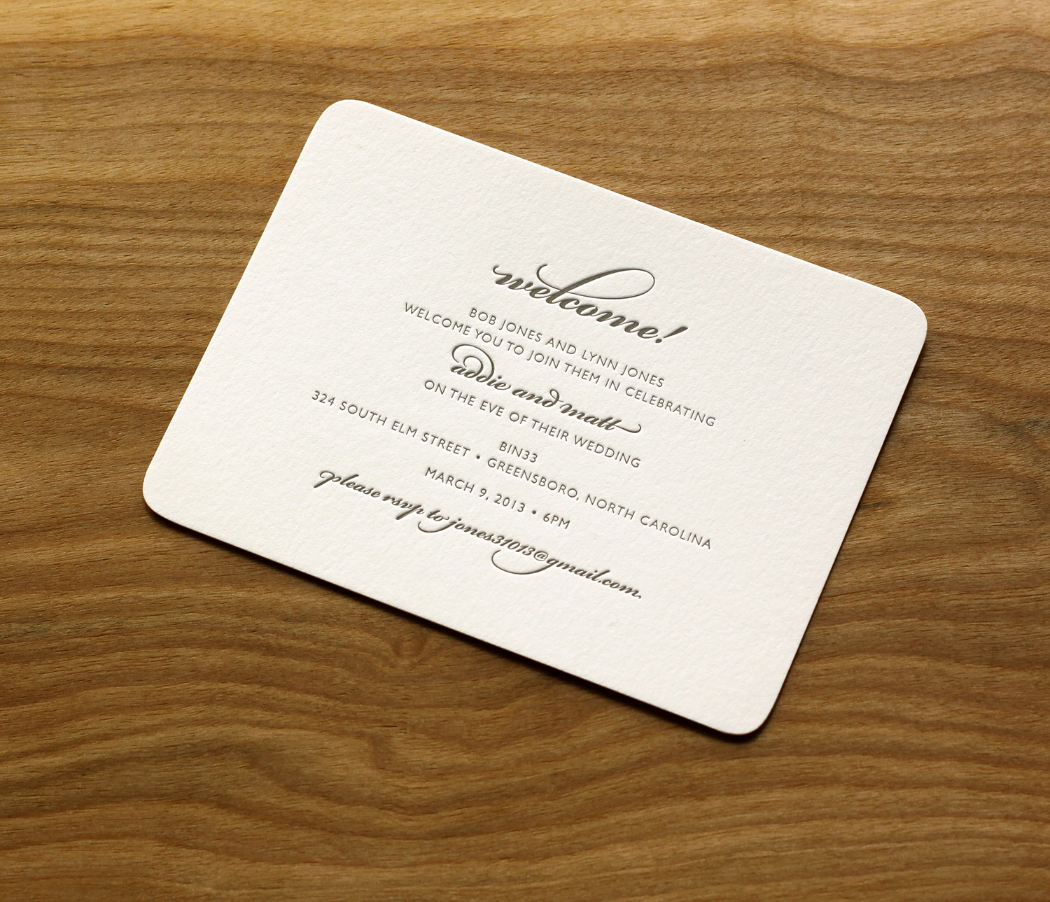
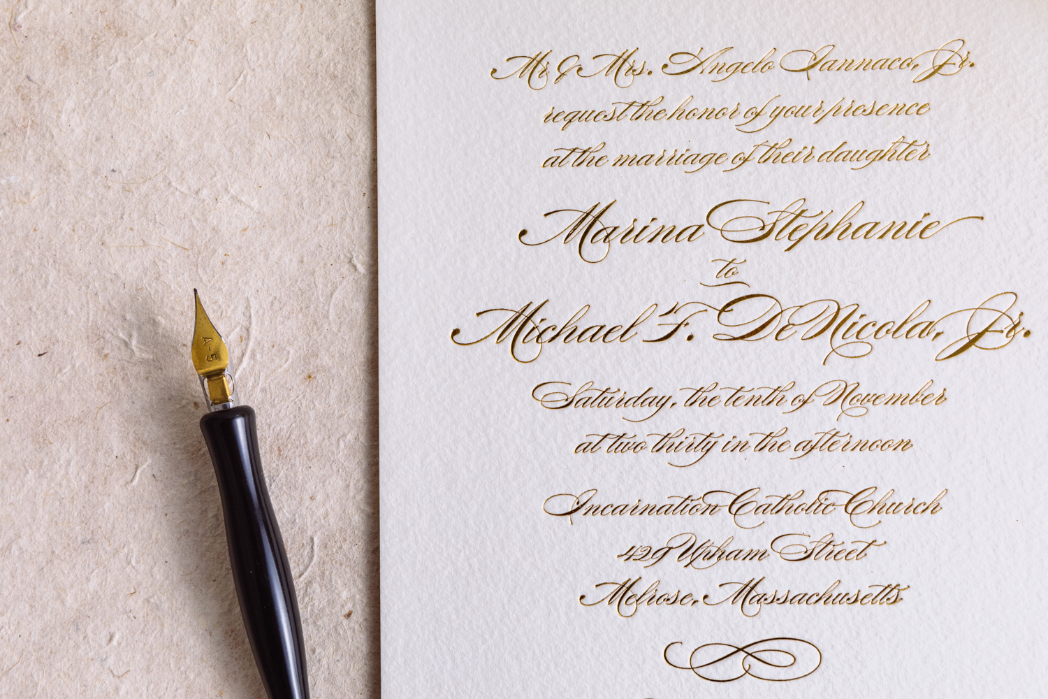
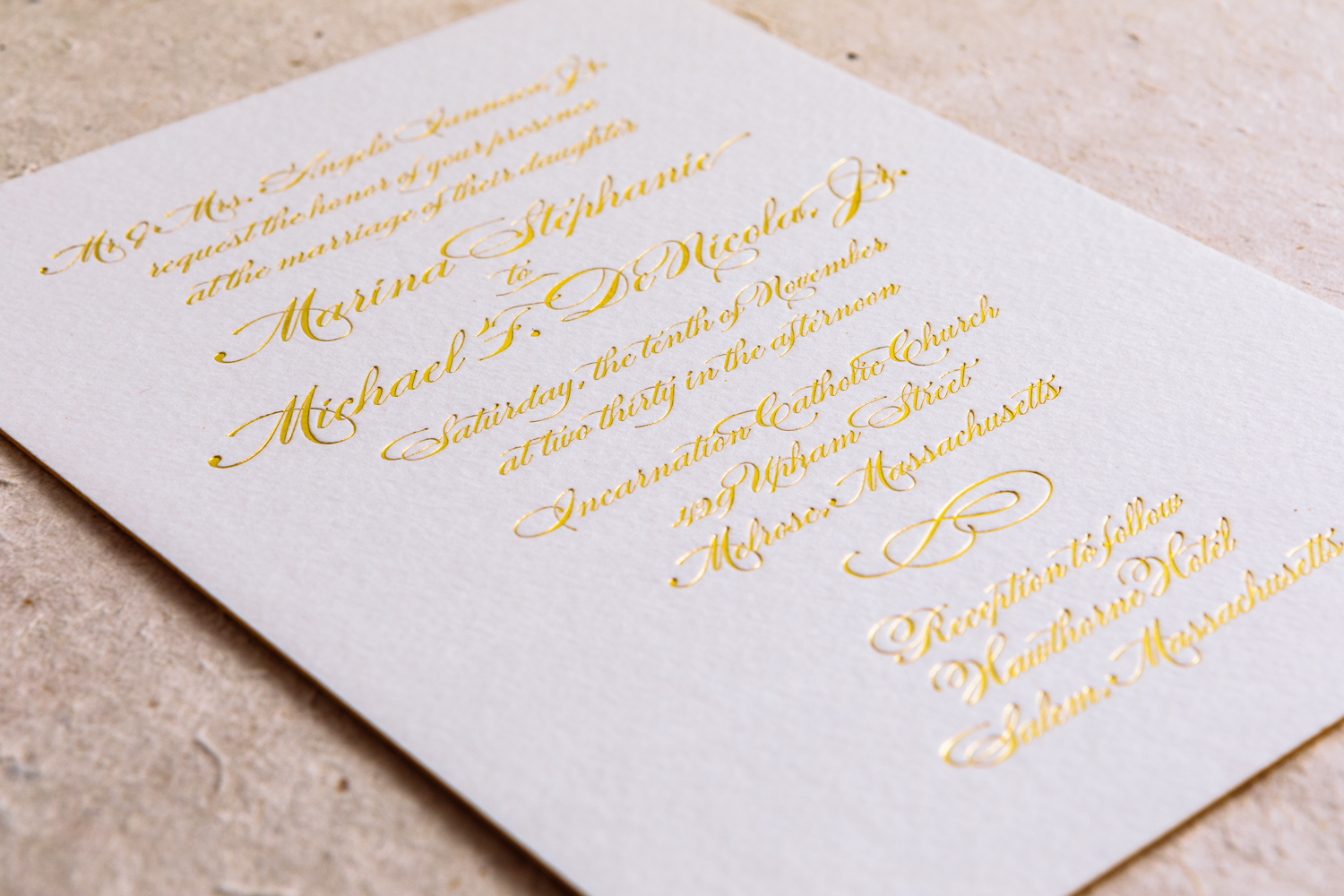
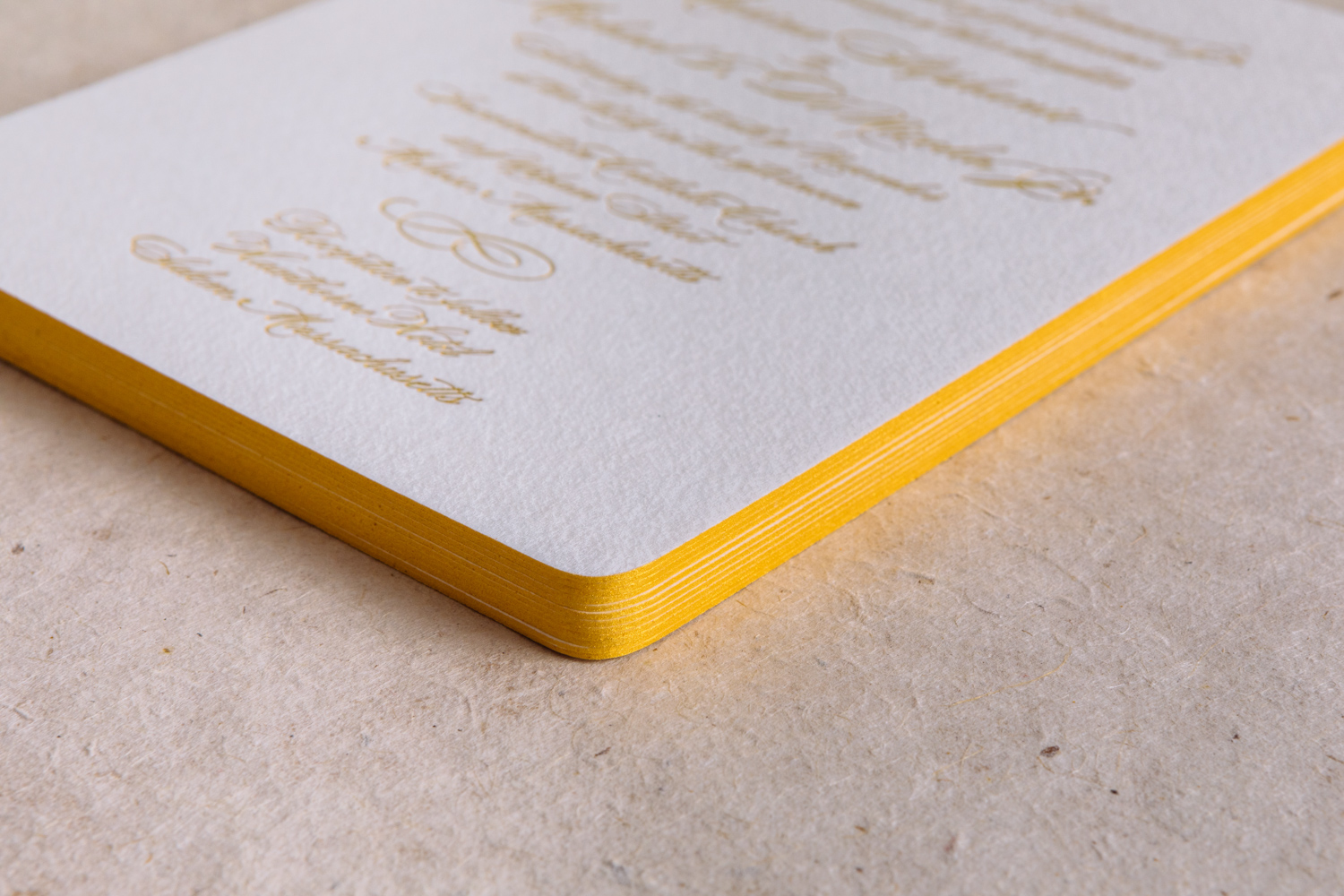
Posts tagged rounded corners
A Gold-foiled Whirl

For Courtney and Ben's set, we started with our popular Whirl invitation, but added gold foil and edge paint for some extra pizzazz.

The original Whirl uses gold ink, which has just the slightest hint of metallic shimmer. But gold foil is something else entirely — it's extremely shiny with a reflective mirrored look. And if you'd like something in between, our gold satin foil is a little less intense than the gold shine used here.

For paper, Courtney and Ben went with our thick and textured soft white 600g Arturo in a 5x7 size with rounded corners. We finished out the set with our euro-flap Arturo envelopes and a gold foil + black letterpress flap.

Letterpress Stationery for Palette & Parlor

As we were moving Parklife Press from North Carolina out to Oregon last summer, Ivy and John were bringing their Chapel Hill furniture studio into full swing. We're no longer in the same town, but that doesn't mean we can't still work together. 

We printed note cards and business cards with custom inks on 300g Fluorescent White Lettra paper with die cut corners and matching A6 envelopes.  A nice complement to P&P's simple aesthetic.

Old World Charm in New York City

The beauty of a classic, calligraphic invitation puts the emphasis on the writing. Here, in a invitation based on Quill, with custom calligraphy by Monica Rachel Lima, the swirls and flourishes of the text sets the tone for an elegant and festive occasion. The black ink on thick, pearl white paper stock is set off by a metallic silver envelope liner.

The simplicity of the dingbat rule pairs well with dramatic flair of the calligraphic flourishes, and all the rounded corners of all the pieces ties the set together.

Accompanying reception and RSVP cards are done in a understated serif font with a vintage feel. The two styles coordinate to set the tone for a formal wedding in New York City.

Photos by Sarah McCarty Arneson
Grass and Stone

Addie had always been drawn to letterpress. Having few letterpress options in Greensboro, they found Parklife Press when searching for studios in the Durham area. Working under a tight deadline and having little time to spare, they were pleased when Parklife's website showed a "clear design aesthetic as well as up front design details and pricing options," and felt that the format prepared them for a seamless consultation with Travis. They were immediately drawn to the Parker design because it was clean and simple, and they loved its use of typography.

They used grass and stone inks throughout. The green, used sparingly — for their names, the RSVP postcard-style return address, and for the invitation's edge painting — was a nice touch for their not-quite-spring wedding in March. "It felt really fresh and added just enough pop," Addie says. They ended up using the colors and color names as a thematic springboard — "grass and stone" became a motif at their wedding, with centerpieces of planters of grass, and stone-colored bridesmaids dresses.

The RSVP and welcome cards provided another showcase for the dramatic pop of typographic embellishment. This particular script font comes with an extensive set of alternative characters and ligatures, providing lots of options for the designer. Choosing which to use and where is key. Addie noted, "Travis gave great suggestions on how and where to add flourish to our names without it being over the top. We trusted him completely!"