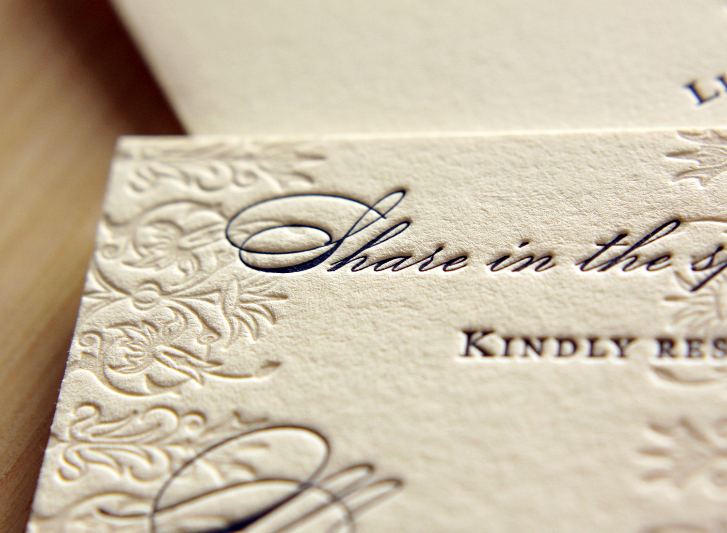
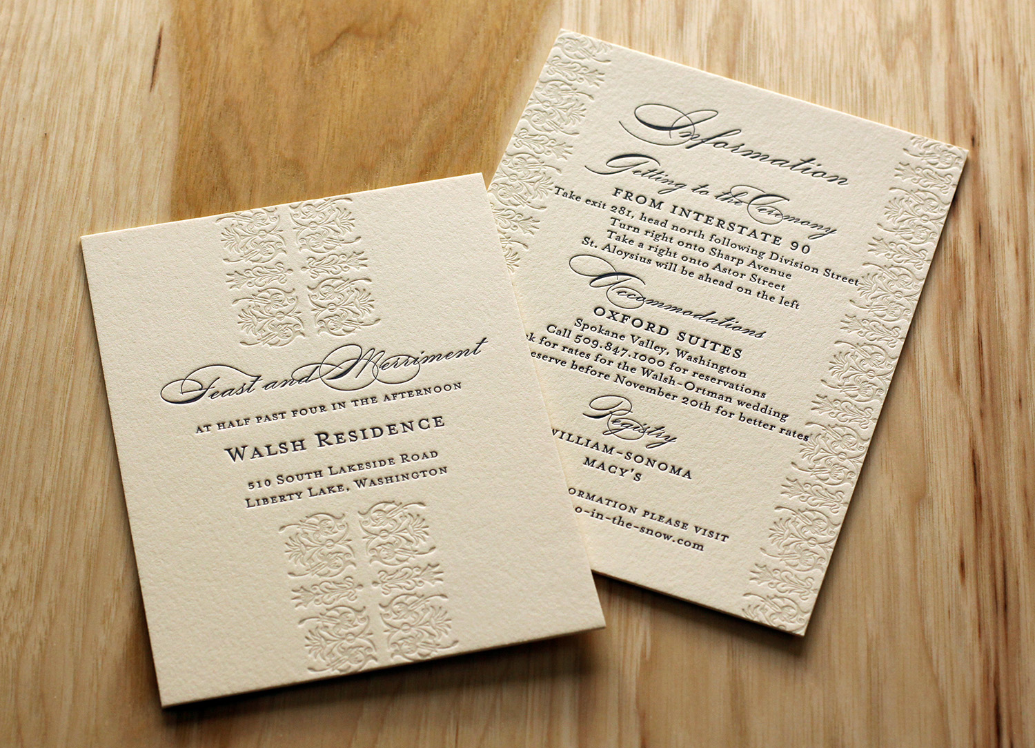
Jennie and Mark found the perfect necktie for him to wear at their autumn wedding — the pattern was a stylized paisley in orange and brown, with some lilac. That purchase turned into the inspiration for their wedding invitation. They loved letterpress, and after searching a bit for a good, independent printer, they found Parklife Press.
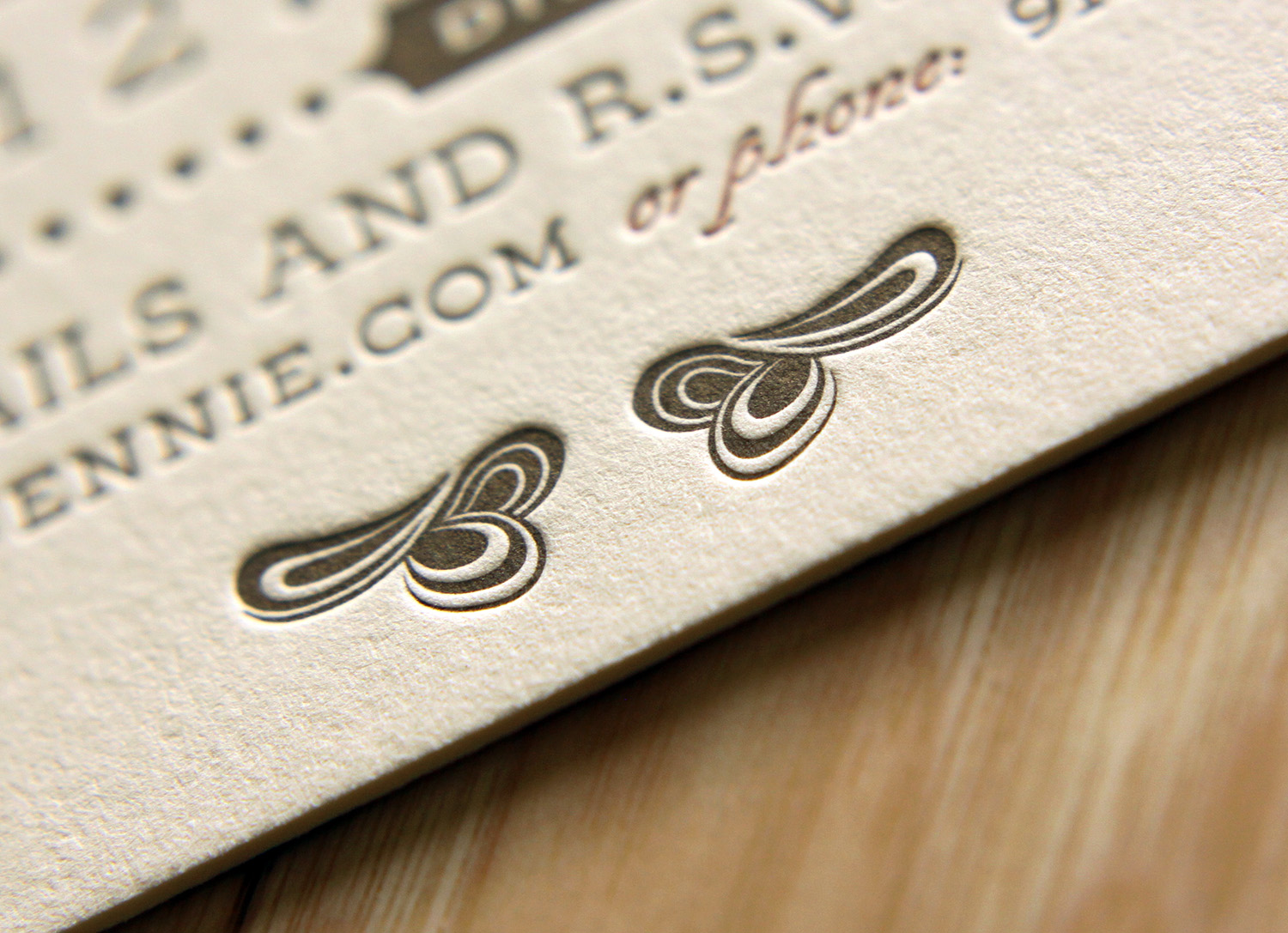
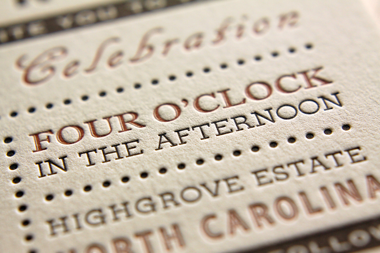
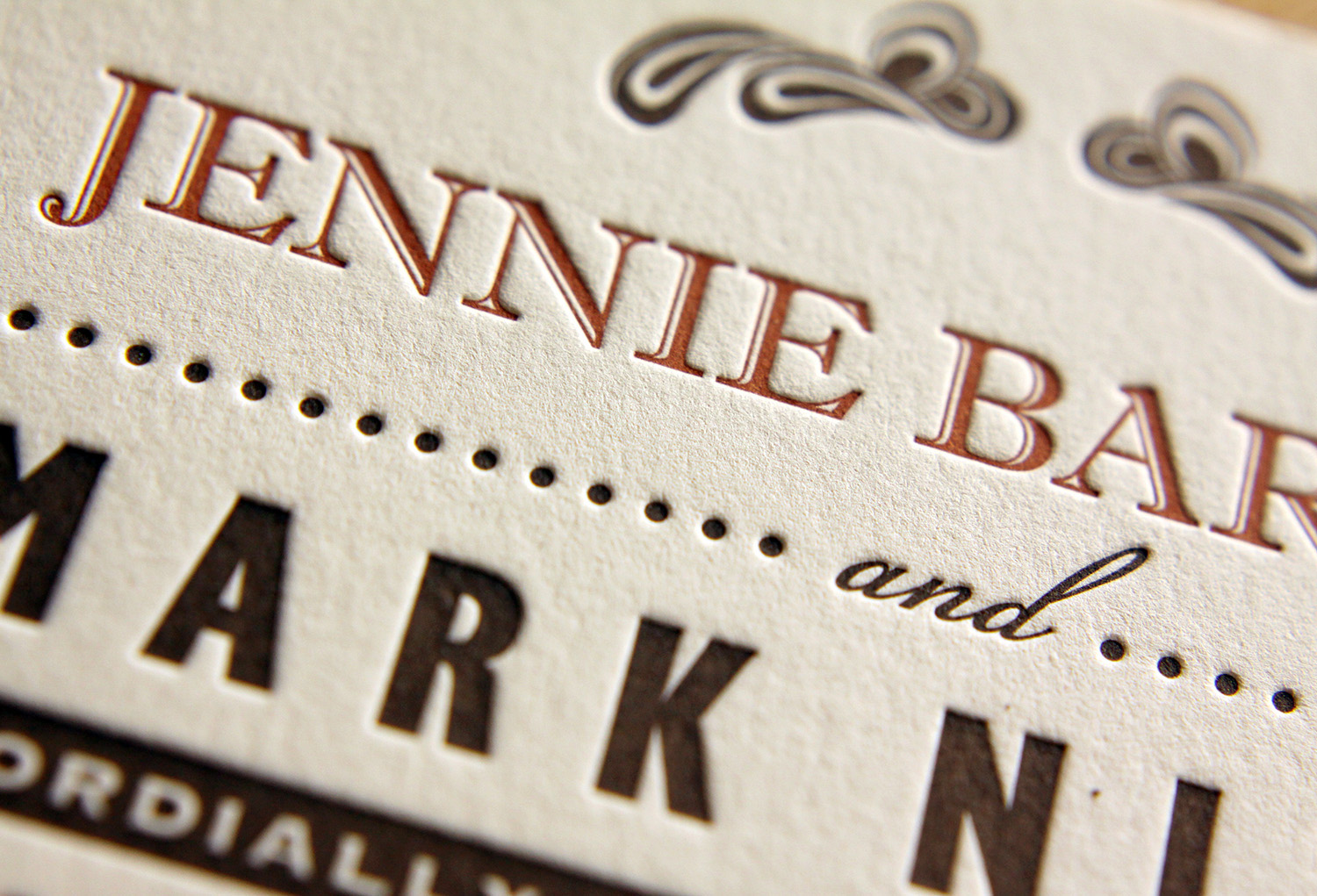
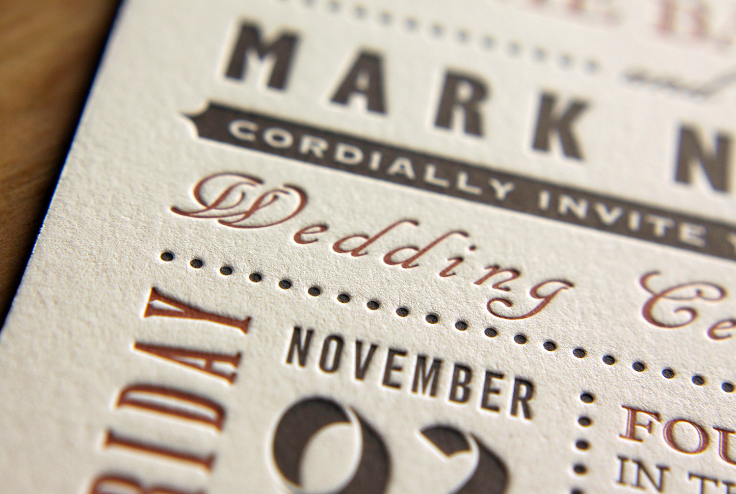
A friend designed the card for them, using the motif of the modern paisley swirl at top and bottom. They were excited about a single-page invitation, which gave guests contact information to RSVP and directed them to their wedding website for details.

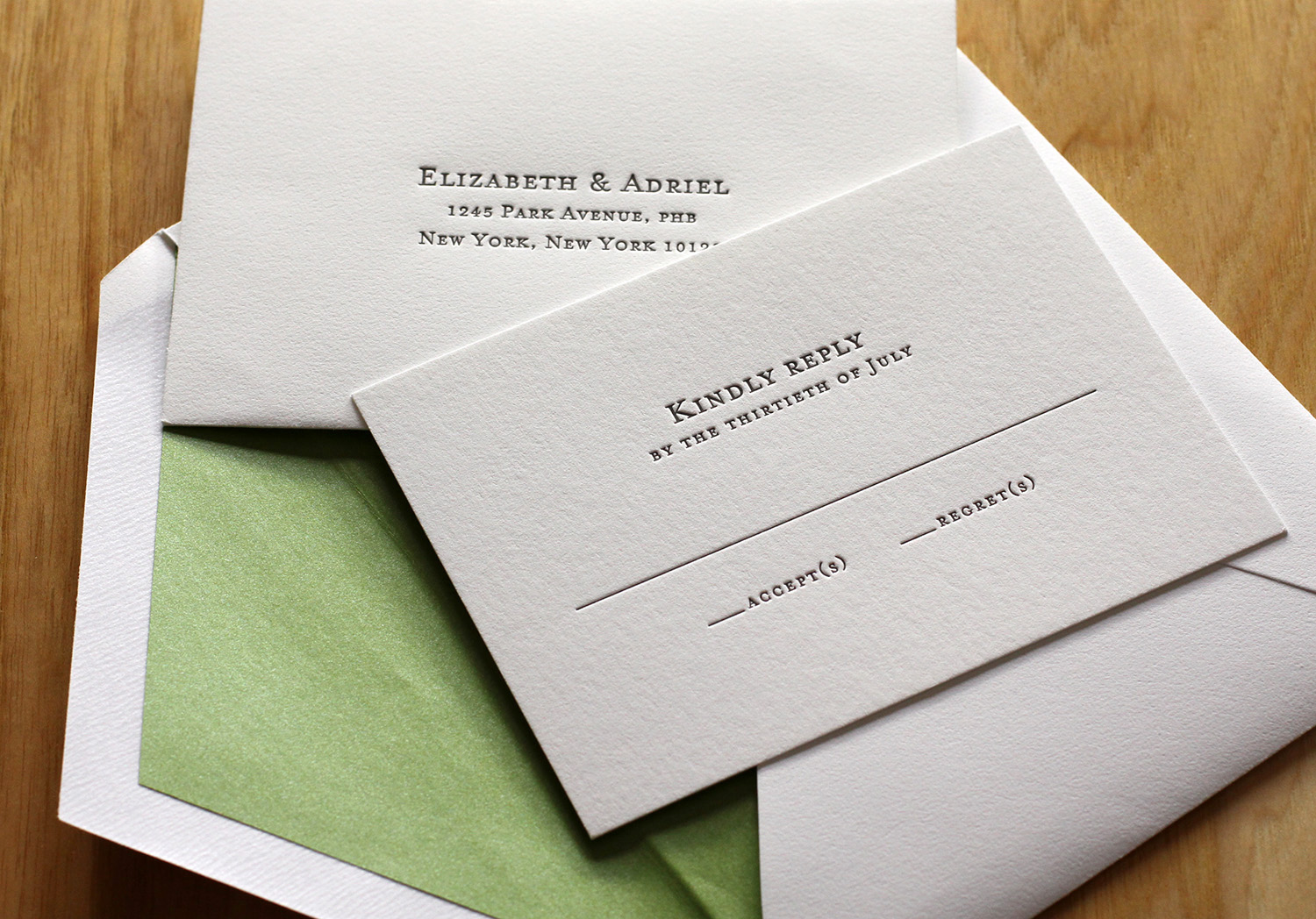
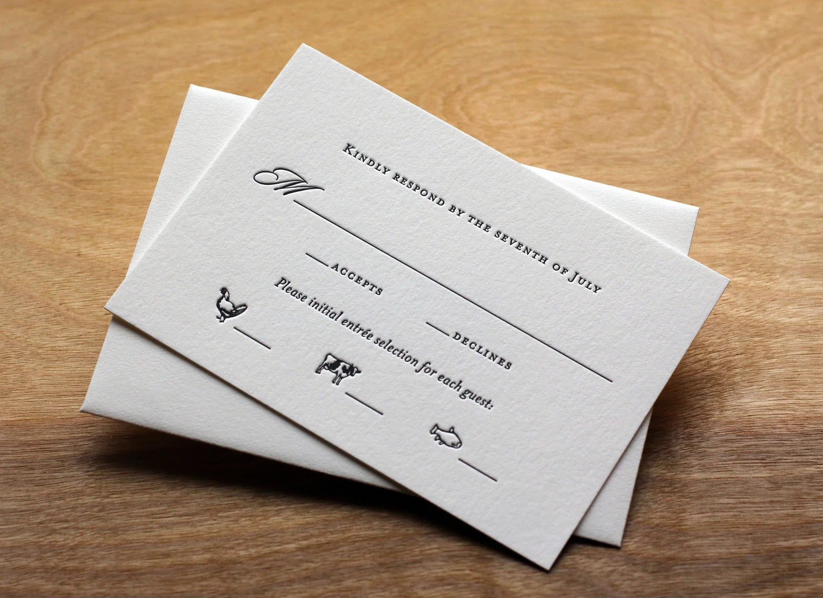
Photos by Sarah McCarty Arneson