Summer Vail

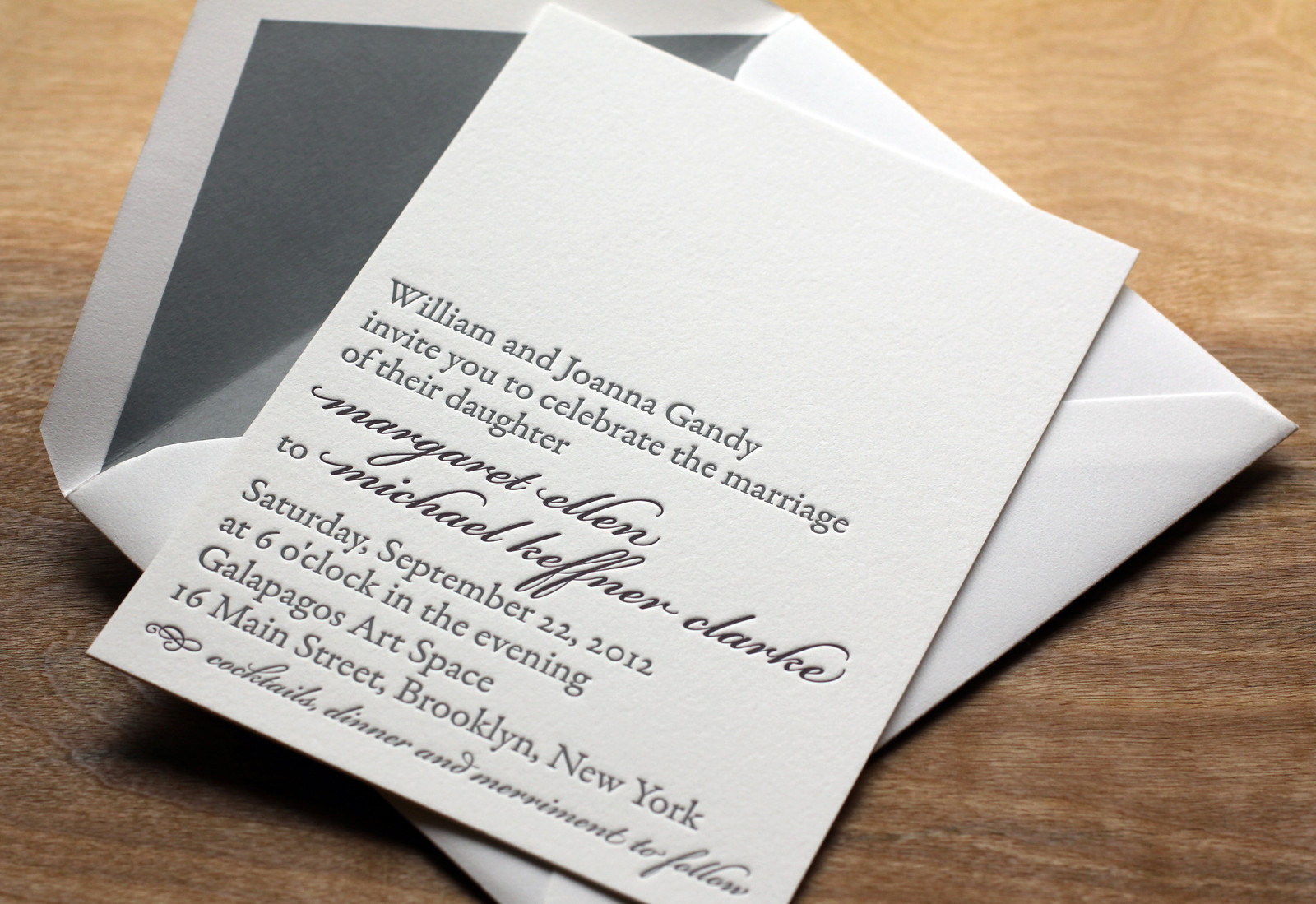
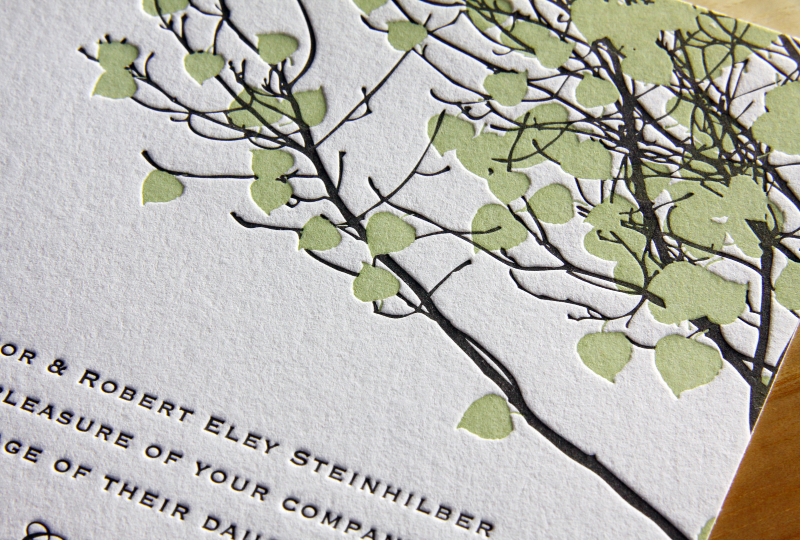
Emily and Dylan's adaptation of our Vail invitation is great. We changed the Tangerine ink to Light Celadon and opted for Fluorescent White paper instead of Ecru and the look, once warm and autumnal, became bright and fresh -- perfect for their summertime wedding.

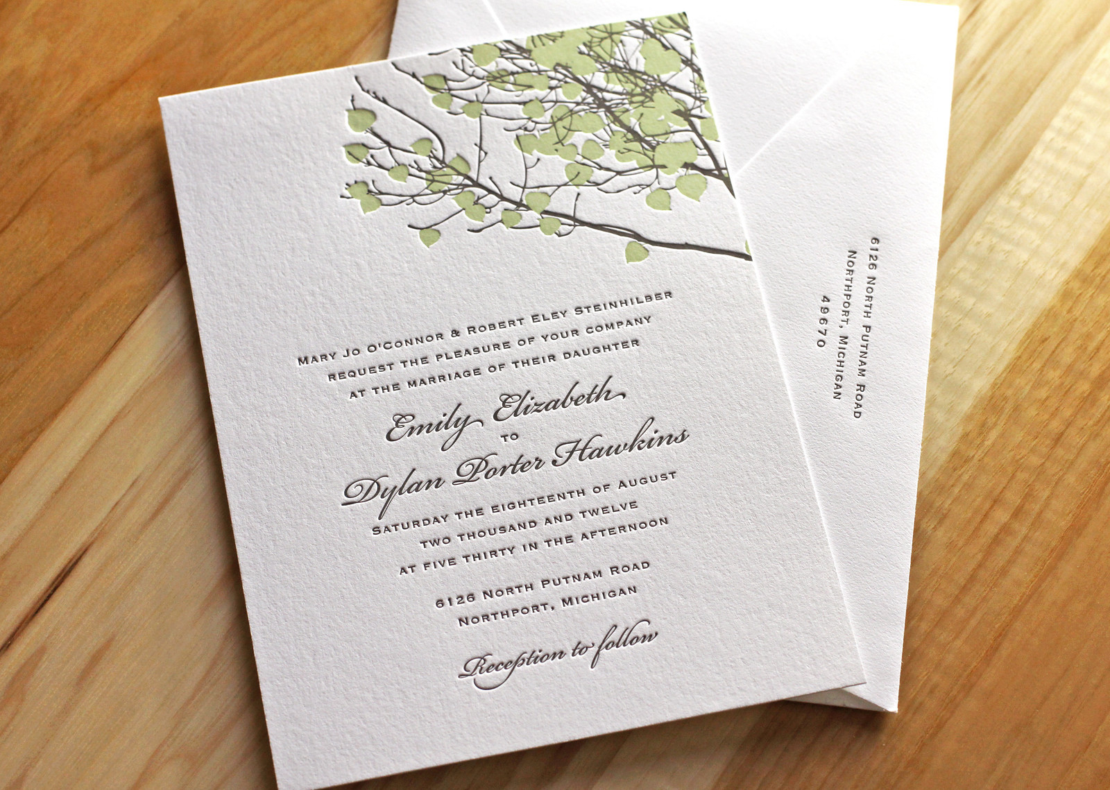
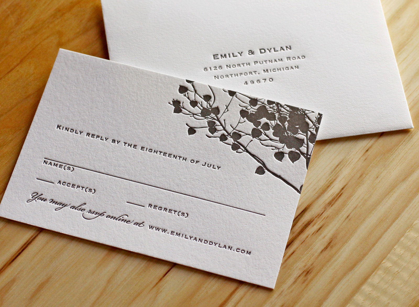
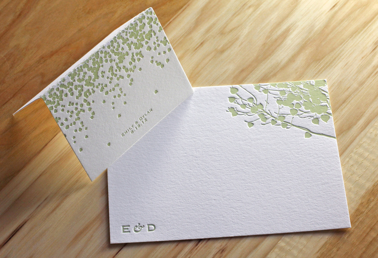
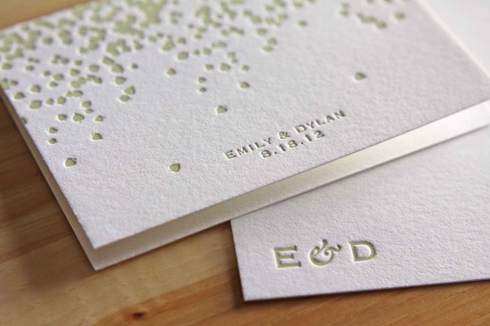
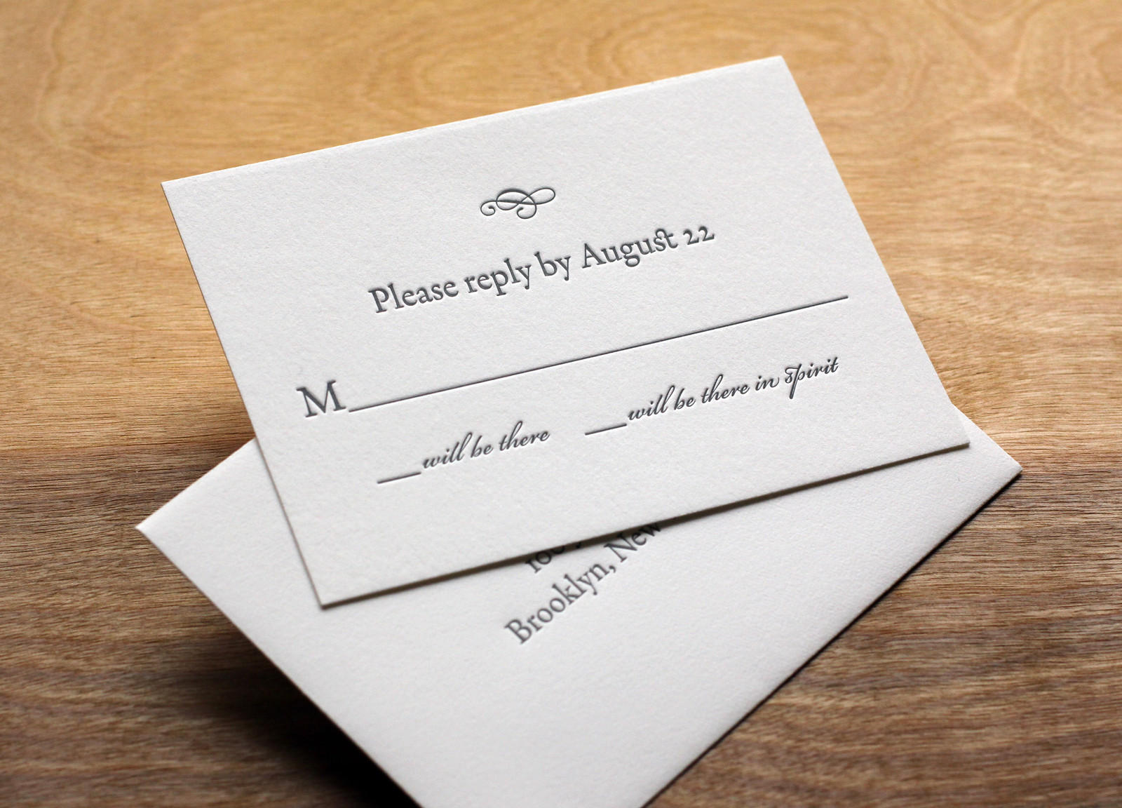
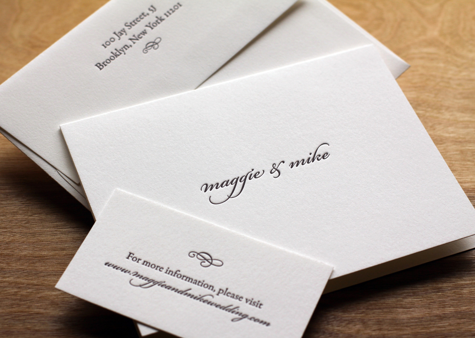
We carried the look through to the place cards and thank you notes as well, keeping the same theme without simply repeating the same artwork.

Photos by Sarah McCarty Arneson
Scripted Bookplate

In this variation on our Bookplate invite Maggie and Mike softened the look a little bit by adding some Bickham Script type in Deep Plum ink for their names and the reception line. Slate envelope liners to match the Slate ink give the set some added polish.

Rather than over-stuff the envelope with accommodations info, directions, etc, the couple opted to keep things simple with a business-sized card directing guests to their wedding website.

Photos by Sarah McCarty Arneson
Fuchsia Baby Announcements

Large blocks of color can be tricky with letterpress. But if you don't mind a little paper show-through, it can be very cool. We printed these announcements for local Chapel Hill designer, Steve Kulp, on 600g Fluorescent White paper with Fuchsia ink and edge paint. Using the extra-thick stock lets us press harder into the sheet without causing it to buckle.

Photos by Sarah McCarty Arneson