Letterpress and Halftone Screens

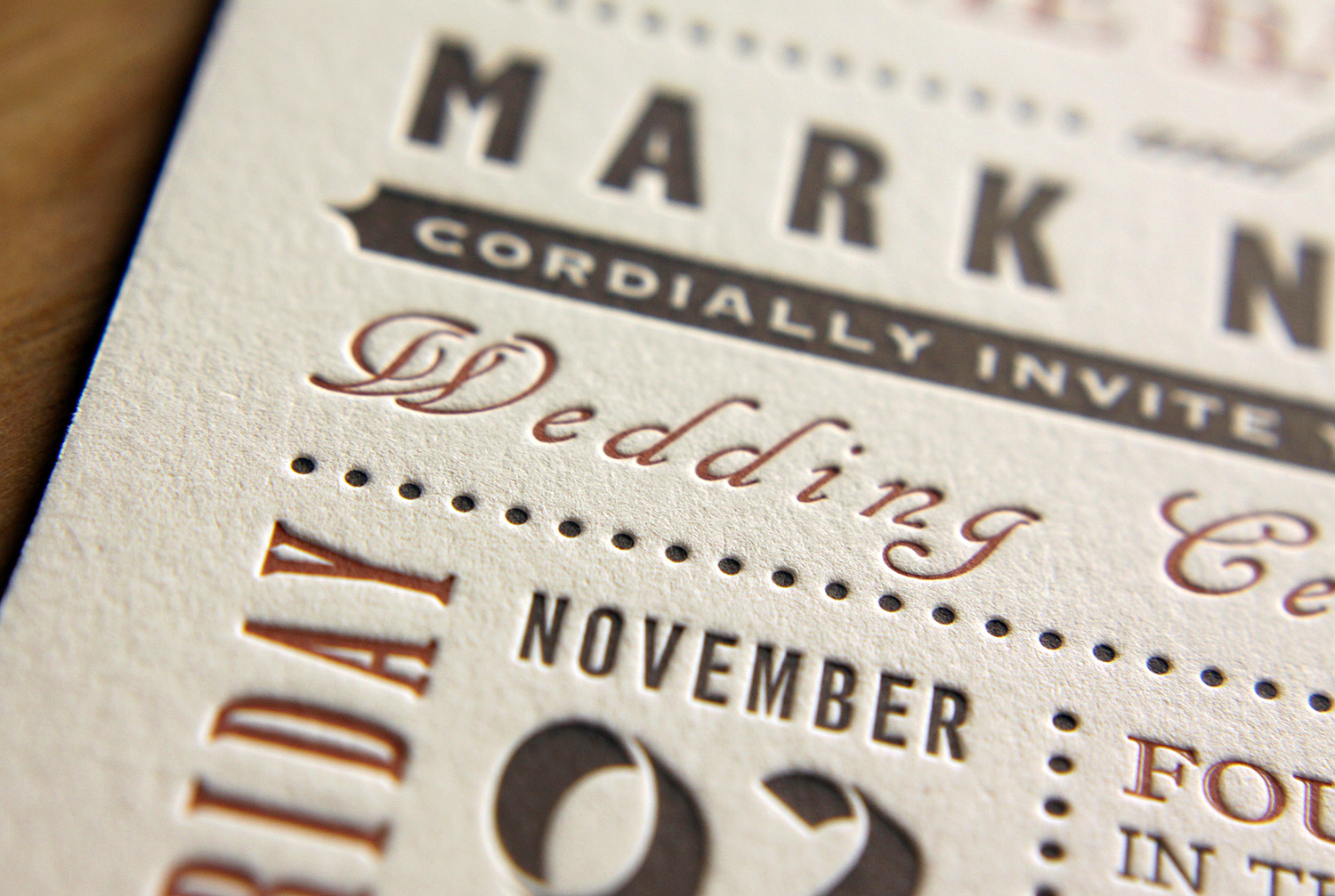
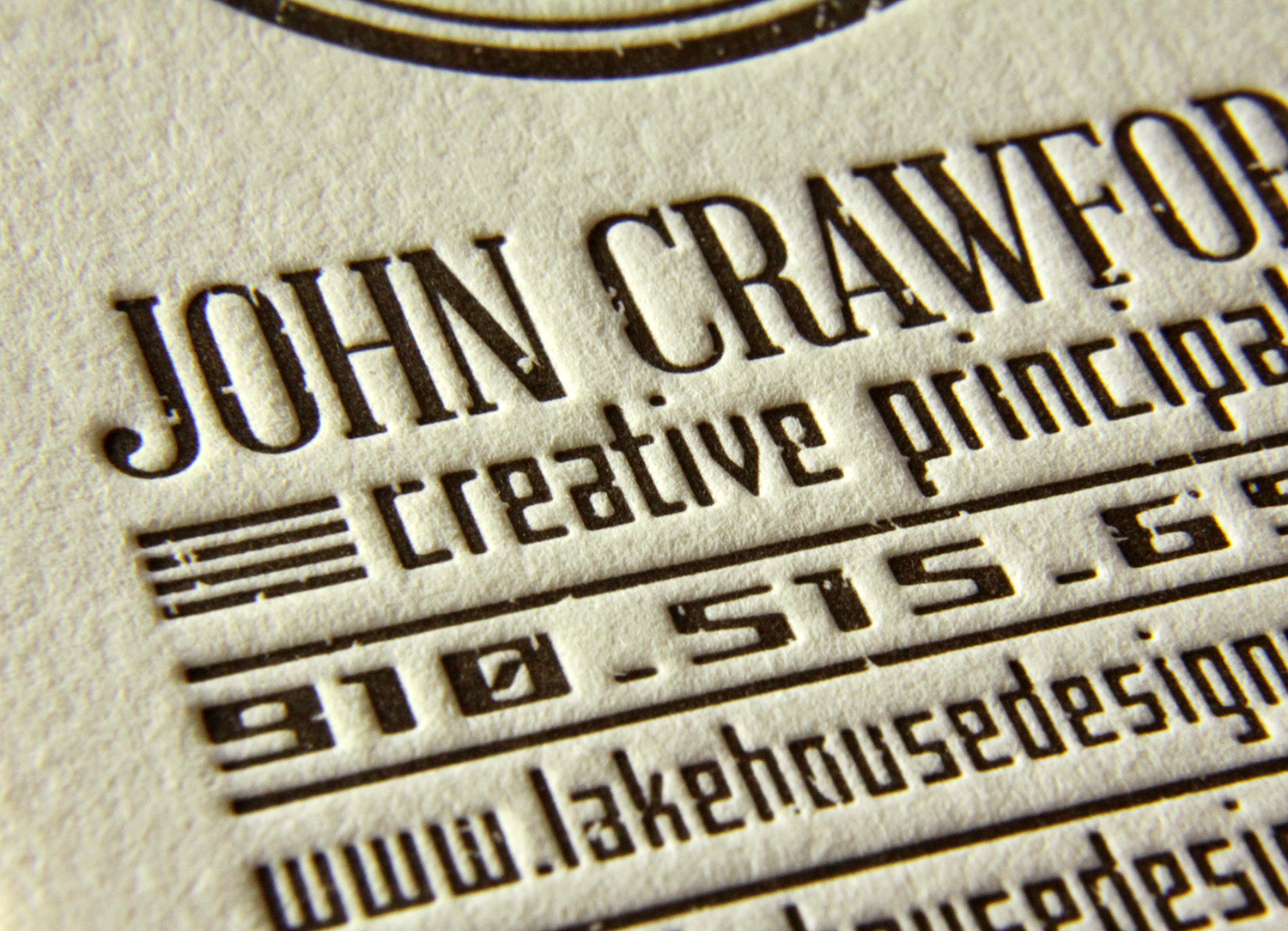
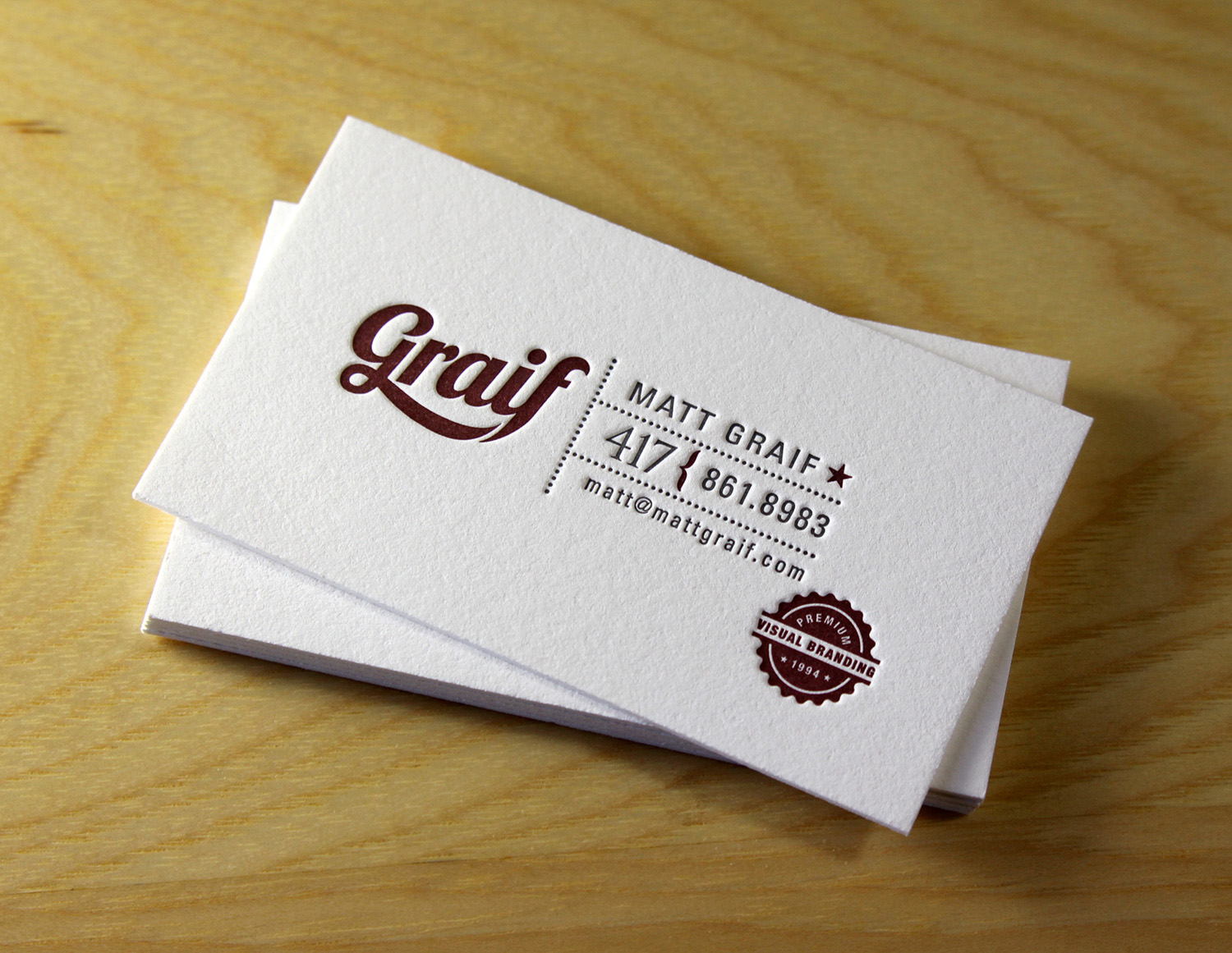
What prints best with letterpress? The short answer is: Text, line art, and fairly small areas of solid color.

A few typical examples...

Does that mean you can't use tints of your chosen ink to create shading within one design? Or do color mixing of any kind? Not at all. It just requires a different kind of printing preparation: a halftone screen. This means taking artwork that has shading or gradations and converting it to a pattern of dots. The patterned screen allows the printer to mimic lighter shades of the same color, or to combine inks in layers to create the appearance of blended colors.

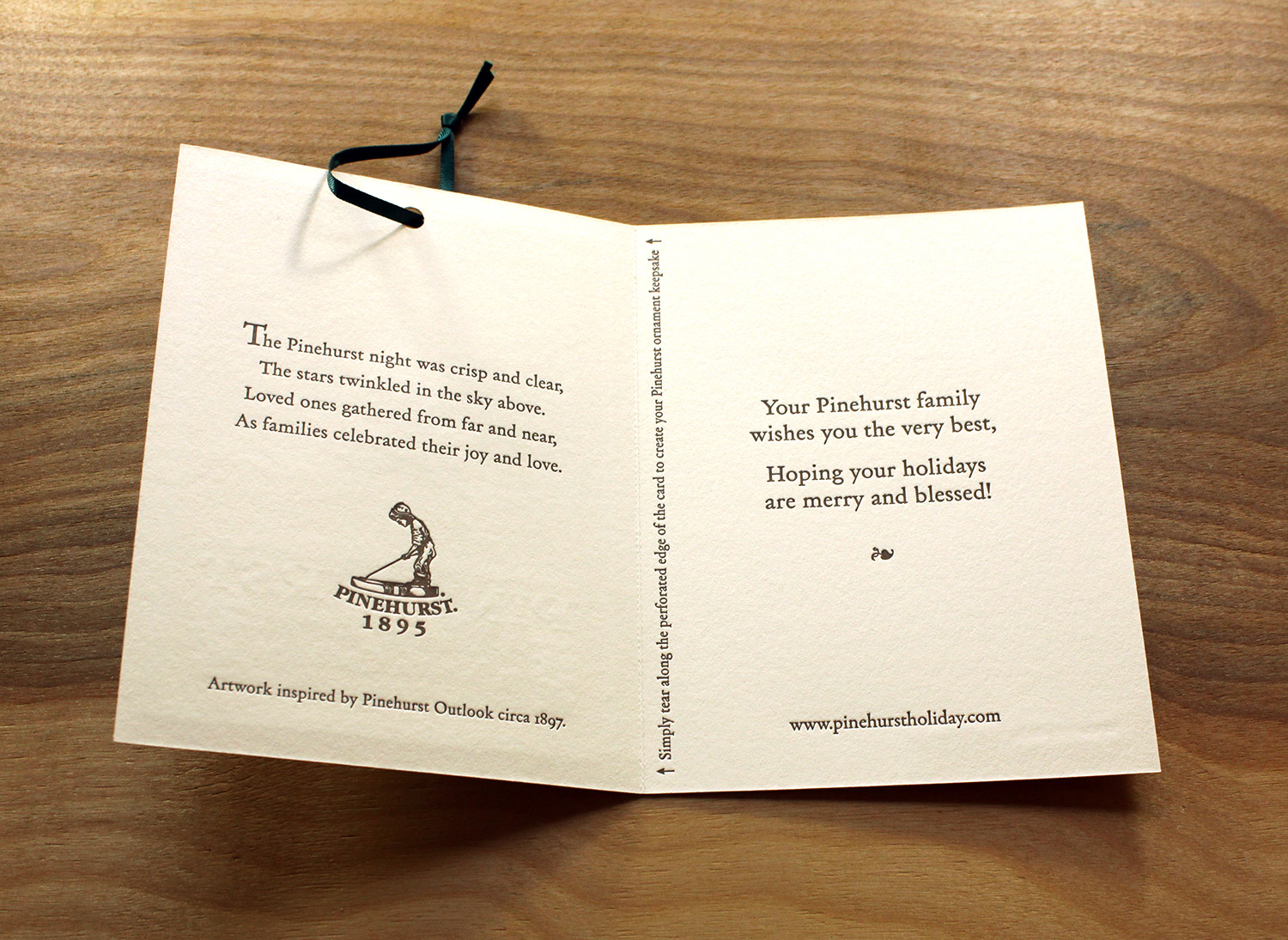
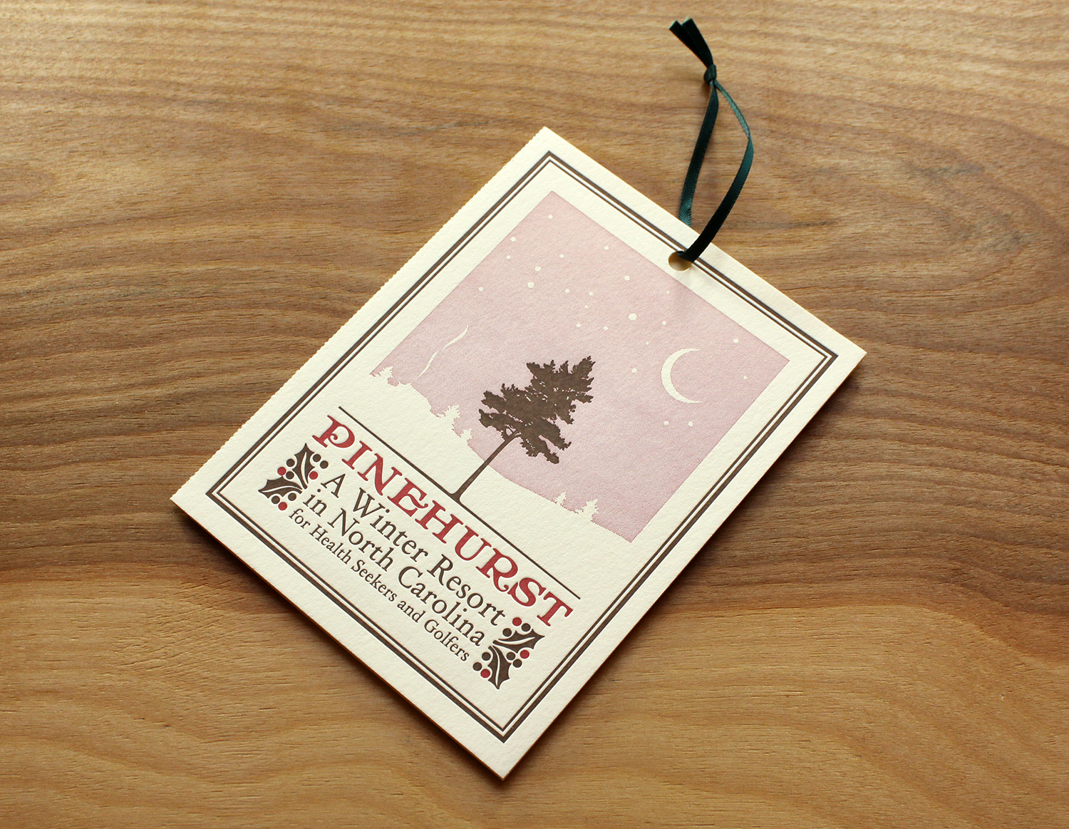
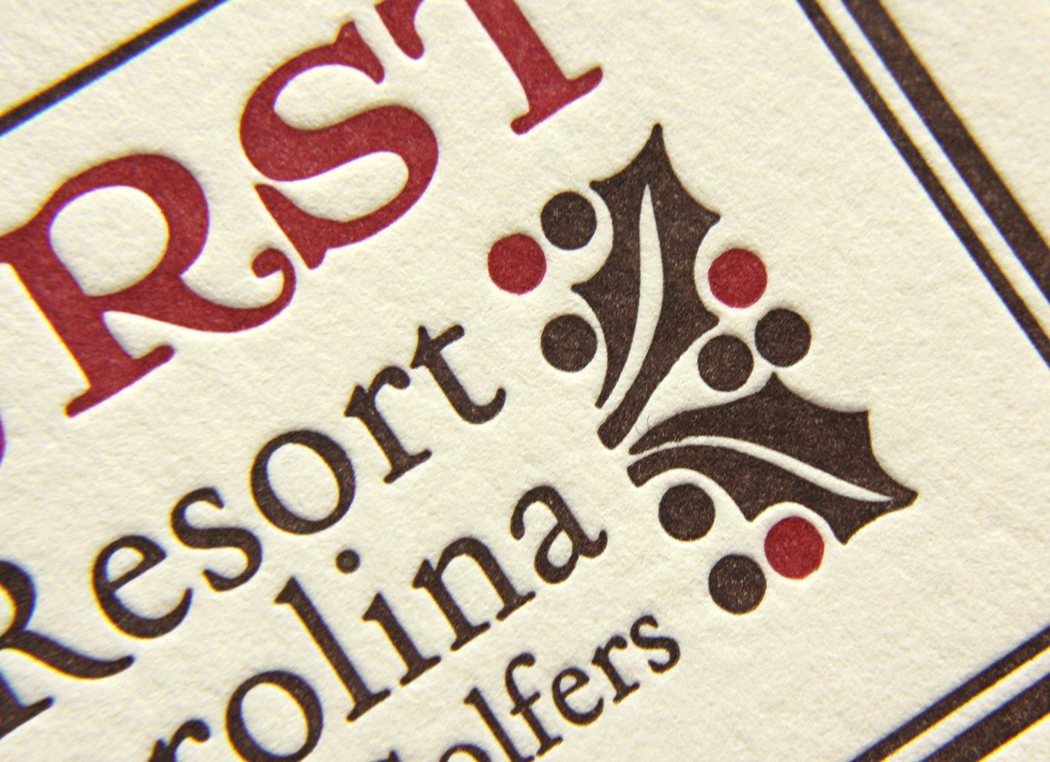
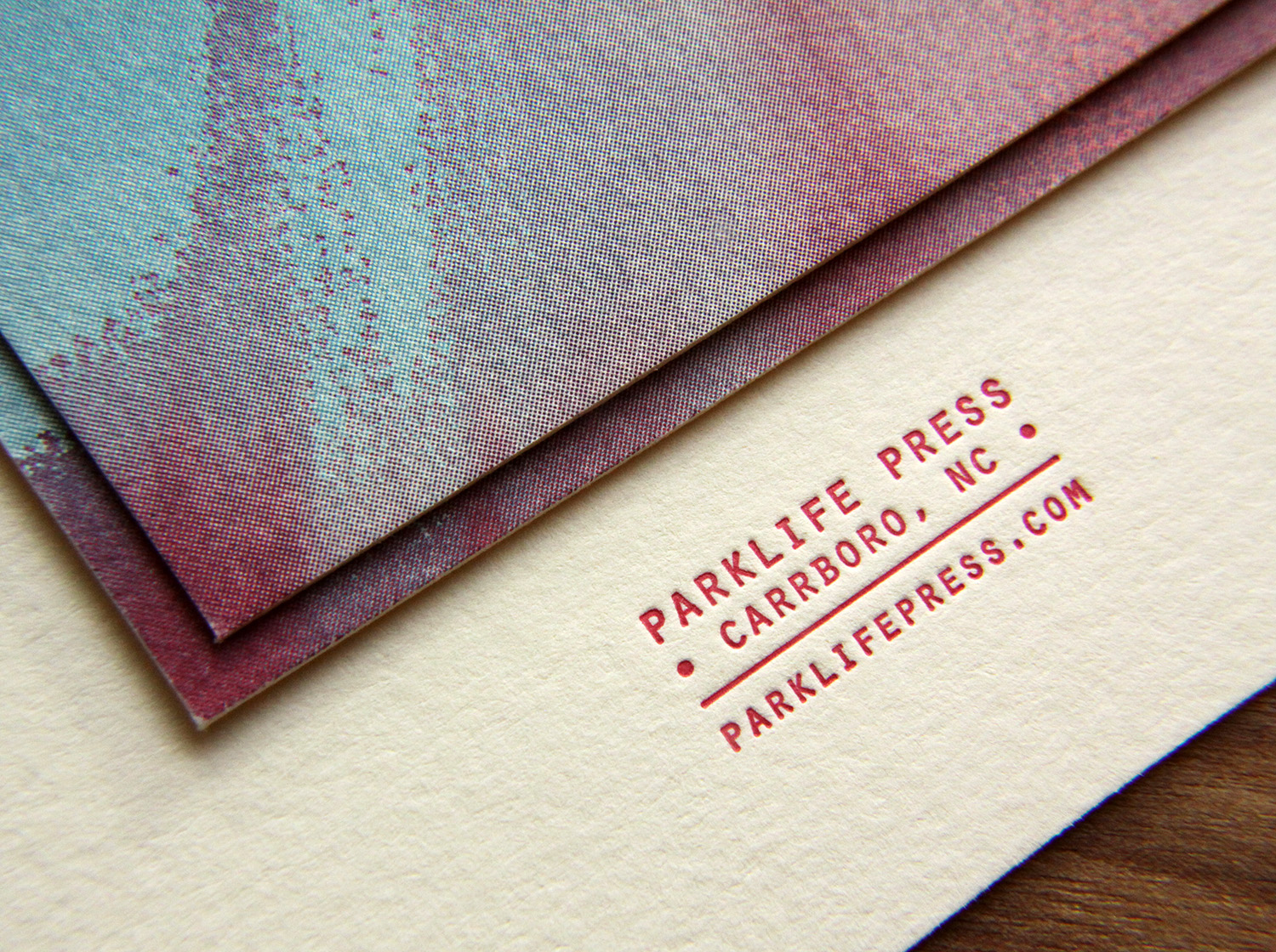
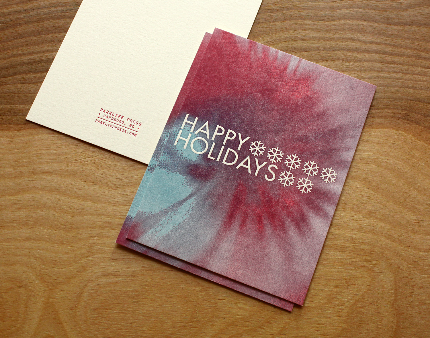
Below, brown and red inks are used for one of Pinehurst's Christmas cards, which is printed each year by Parklife Press. The two inks are used at 100% everywhere except the illustration's background, where a lighter shade of the red was needed to create a soft, peaceful night sky.​ We could have printed this as a third ink color, but it would have added to the cost.

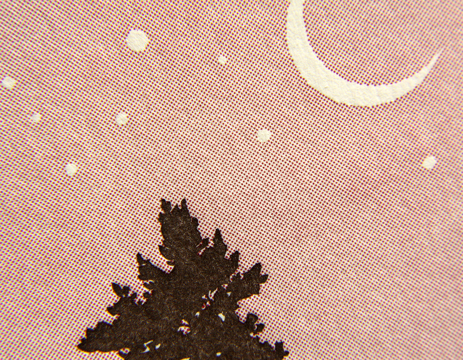
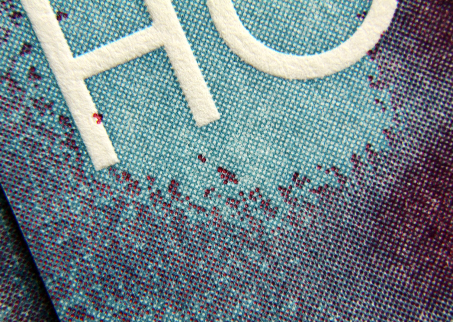
There are many different patterns of halftone screens, but the simplest is a grid of evenly spaced dots. Smaller dots are further away from each other (thus have more white space between them), creating the appearance of a lighter shade of the ink's full color. The dot size changes, but grid stays the same. So the larger the dot is, the closer to each other they appear … like cookies that melt into each other when placed too close together on a pan. The blank space between gets smaller and smaller, resulting in an overall darker appearance of color.

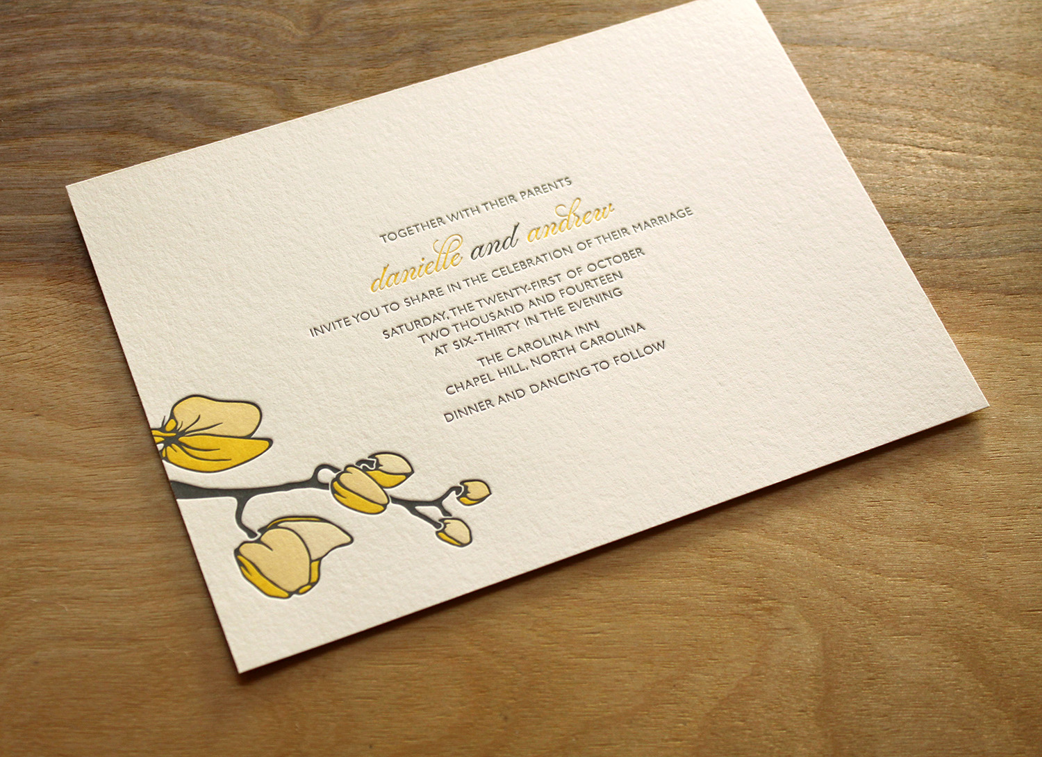
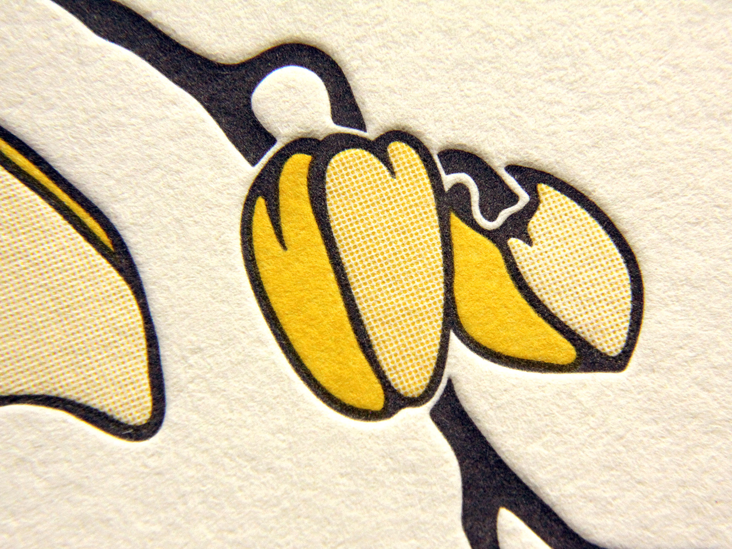
Our new Petal invitation (shown below) uses two inks — yellow and brown — but through halftone screens, it has the appearance of three shades of yellow. The shading gives the artwork a depth and a softness that wouldn't have been possible using only 100% yellow for the blooms.

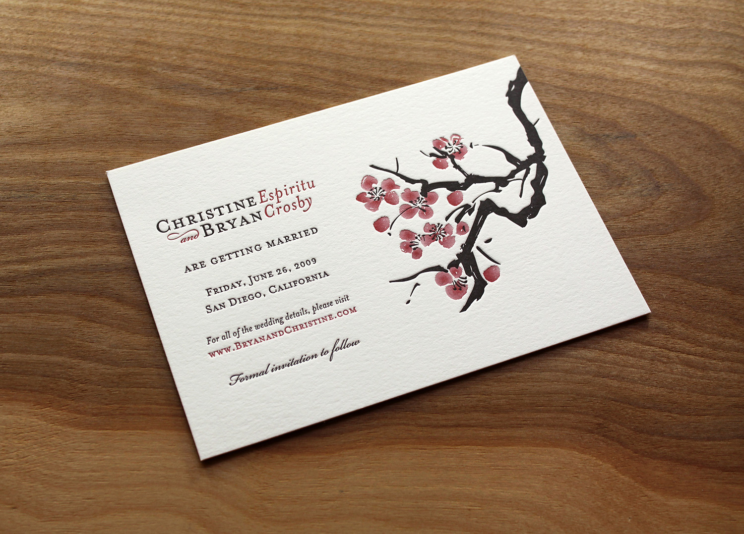
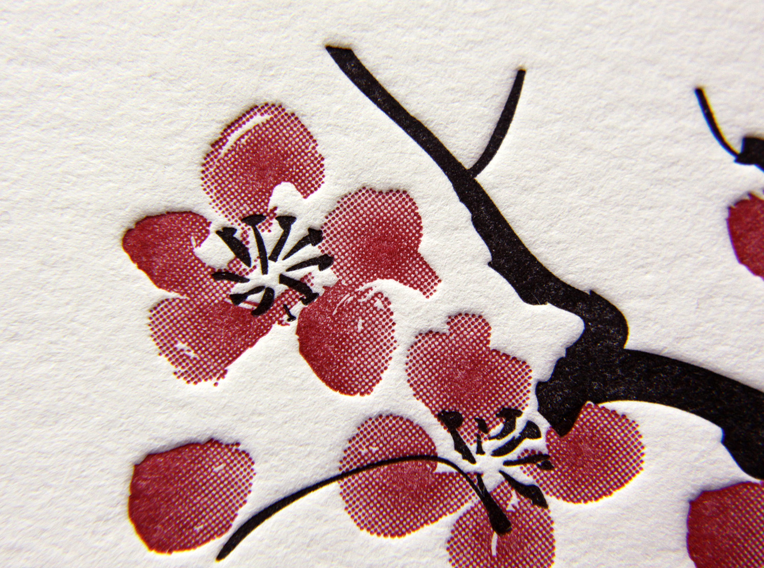
Likewise, this invitation set uses black and a deep red for the text, which looks striking together with the paper color. But the cherry blossom illustration would have lost something if it didn't show a range of pinks in the flowers' petals. 

We all learned in grade school that mixing colors together creates new colors. Halftone screens don't actually mix the colors, but when layered on top of each other, they create the appearance of blended colors, so the artwork looks to have a greater color range than it actually does. It's like a technique used by Impressionist painters (and more specifically, pointillist painters) — laying down adjacent dabs of color, leaving the "mixing" to occur in the eye of the viewer.

Below, blue and red ink screens create a swirl of blue, red and purple shades, suggesting a tie-dye effect.

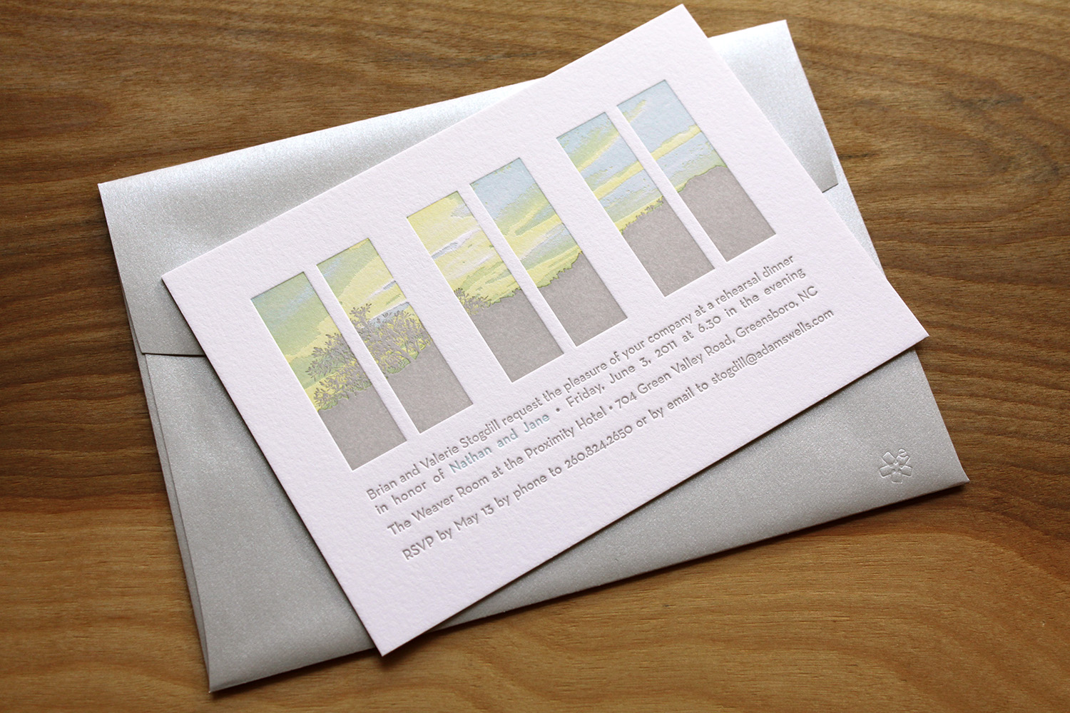
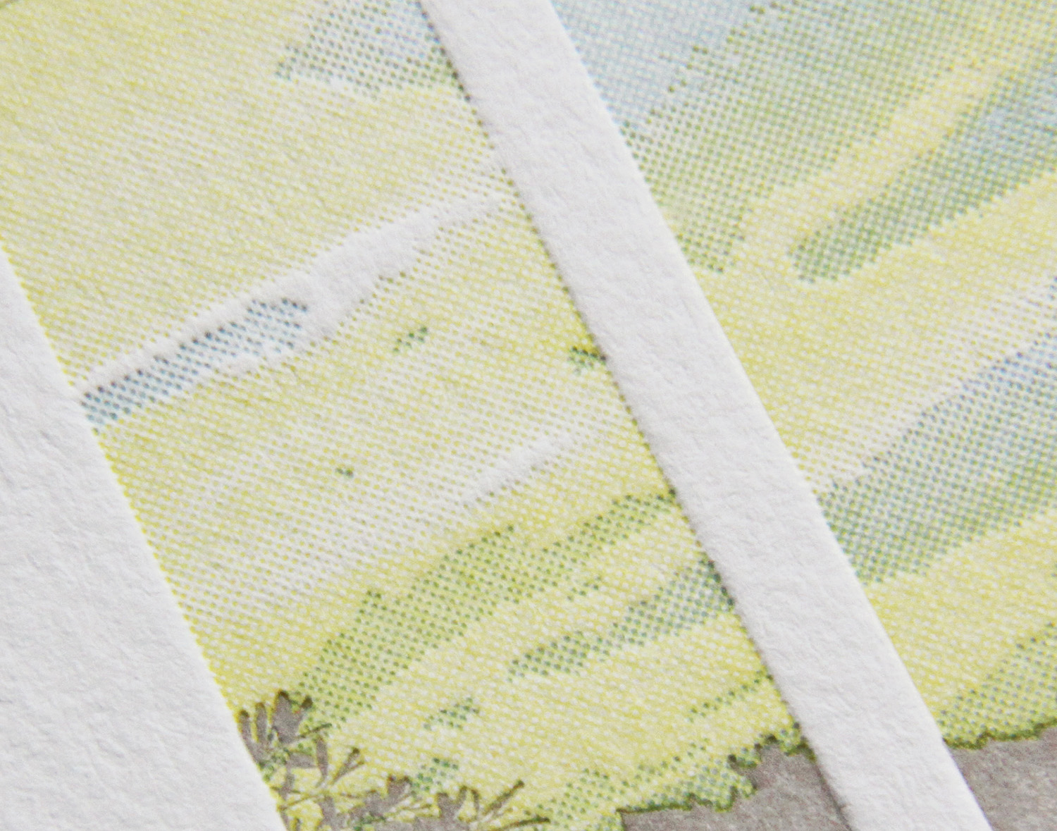
And below, a rehearsal dinner invitation with a windowpane illustration comes to life with just three inks. Using gray ink at 100% for the tree line, and blending the white background with screens of pale blue and yellow, the image captures the the hazy summer sky at twilight — perfect for the couple's evening event.

Letterpress printing was invented in the mid-15th century and remained the standard form of printing until the development of offset printing in the 20th century. Halftone screens came much later — the first successful commercial use wasn't until the 1880s. So while letterpress printing wasn't specifically designed to print shades and gradations of color, you shouldn't let that limit your vision. It can be done — and quite successfully — by incorporating halftone screens.

Photos by Sarah McCarty Arneson
New England Coast

This was a set we printed for a couple in Maine who designed their own invitation. It was printed on Pearl White paper and featured bermuda edge paint. Helkin and Jamie both work in the online world so they planned to provide most of the details on the Web — but they still wanted a "classic, yet unique print piece." The invitation directed guests to RSVP by email and to visit a website for all other wedding-related information.

A final detail: Thai Unryu tissue envelope liners to match the set's midnight ink. The soft, natural look of the tissue evoked wind-rumpled water. Paired with the hand-drawn look of the font, the invitation captured the casual elegance of a seaside wedding.

Photos by Sarah McCarty Arneson
Joyful Blue

Emily found Parklife Press through the wedding-planning site Snippet and Ink. A librarian and archivist by trade ("I totally geek out for all things paper"), she loved the idea of of letterpress for their invites.   ​

She also loved the simplicity of the Bookplate design in particular. She felt the painted edges were "an amazing, thoughtful touch," and that the look "really conveyed everything I wanted our wedding day to be."  

The invitation set featured a simple, text-based design which was printed in the dust ink, with azure accents. The couple carried the dust and azure colors through to the rest of the wedding. One of the bridesmaids, a graphic designer, created programs and menus using the same color scheme. And the bridal party members all were garbed in shades of blue, including the bride — her gown was a very pale tint of their signature color.

Emily adds that she and Sean got "about a billion" compliments on the invitation. "I have a copy of it framed in our apartment. Every time I see it, I get a thrill."

Autumn Paisley

Jennie and Mark found the perfect necktie for him to wear at their autumn wedding — the pattern was a stylized paisley in orange and brown, with some lilac. That purchase turned into the inspiration for their wedding invitation. They loved letterpress, and after searching a bit for a good, independent printer, they found Parklife Press.

A friend designed the card for them, using the motif of the modern paisley swirl at top and bottom. They were excited about a single-page invitation, which gave guests contact information to RSVP and directed them to their wedding website for details.

invite_JennieHIGHGROVE_0233 web.jpg
Photos by Sarah McCarty Arneson
A New Year's Swirl of Silver and Gold

Katie and Seth were getting married on the eve of New Year's Eve, in Portland, Maine. They wanted a simple, elegant look — and getting married so close to holidays, they knew they wanted invitations that looked wintery without looking Christmas-y. They found the Whirl design and knew it would work well with their wedding colors of ivory, gold and silver. Katie was pleased with how, in her words, "Travis took the brief information I gave him about our 'vision' and turned that into our wedding invitations."

They used black text with gold artwork and gold typographic accents on the main invitations and the RSVP card. The wedding party was similarly attired in black tuxedos and floor-length metallic gowns. The set was printed on soft white Somerset paper and paired with oversized Arturo envelopes.

The corresponding invitation for the rehearsal dinner was done in all black. It was simple and a bit more more casual — with a graphic nod to the nautical setting — but the look was tied to the overall design by the type layout and paper stock. Rounding out the long holiday weekend of celebration, another card invited guests to a New Year's Eve party. That piece featured swirls and typographic accents printed in silver.

Katie's mother, who lives in Oklahoma, found Parklife Press through a Google search. Katie and Seth were happy she did; they live in Durham and were happy to support a local business. Katie's reaction when she first saw their invitations: "When I picked them up and saw them, I literally was obsessed with them. They could not have been more perfect!"

Photos by Sarah McCarty Arneson
A Handful of New Letterpress Business Cards

We've added some great new cards to our business gallery. Take a look...

These double-sided cards for Cedarly, a media and web branding company in North Carolina, feature their logo printed with a tinted white ink. We could have just as easily blind-pressed the logo (no ink at all), but the tinted white helps it pop a bit more. This technique works beautifully with the logo's leaves and with its clean typeface, highlighting the deep impression of the thick 600g paper. On the other side of the card, the information is perked up with tiny icons in blue, which help distinguish at a glance the different methods of contact. We finished the card with painted edges, picking up the accent color.

John, the creative principle at Lake House Design Group, designed these rustic but modern cards. The logo style, the palette of the ink and paper colors, and the distressed typeface work together to evoke the familiarity and nostalgia present in the firm's name.

Matt Graif, a graphic designer in Missouri, submitted this excellent design for his business card that we printed for him on 600g fluorescent white Lettra.

This dramatic card for Eli Powell, a photographer in Boulder, Colorado, uses white space to its advantage. With the card's less-common vertical orientation and the artwork bleeding off the bottom, the design focuses squarely on the photographer's name but hints at sweeping landscapes and large, open skies. In blue ink on crisp, fluorescent white card stock, the snow-capped mountains are brought to life with just a few abstract shapes, connecting Powell to his region and to his clientele.

And finally, a card for Jean Woods Madge, a realtor at Distinctive Properties in Durham. Travis worked with her to create a new logo and a new look for her business cards, which were printed on 300g ecru white cardstock. The logo itself is distinctive and interesting, and the card layout was complete with a nice combination of script and serif typefaces.

Photos by Sarah McCarty Arneson
Winter Wedding in Spokane

Sydney and Kramer knew little about letterpress before planning their wedding, but heard that the printing style could make beautiful invitations. After some research, they found Parklife Press and loved the designs. When they got some of our samples in the mail, they were sold — they knew the elegance of the invitations would go perfectly with the winter wedding they were planning.

Kramer searched for different ideas and came up with the basic concept for the invitations. With Travis' help, he found the border design online and put together a basic mockup.

The border design was printed with a very light ink in a warm gray tone. The subtle tone blended well with the paper color, and added texture to the design without appearing as an additional ink color. On each piece of the set — which included an invitation, an RSVP card, a reception invitation and card providing lodging and directions — the border art was used, either on the edges, as a center strip, or both. The text and monogram were printed in a dark blue, which coordinated with the ivory, blue and gray colors used in the wedding. Kramer felt the mixture of small-caps and script typefaces allowed them to showcase the modern elegance of their wedding, and that the invitation design, along with its colors, gave their guests the "perfect preview" of the event.

Photos by Sarah McCarty Arneson