We printed these cards with three inks per side on thick 600g Fluorescent White stock for fellow Portlanders A to Be Partners. Designed by Allison of Allison Arno Design.
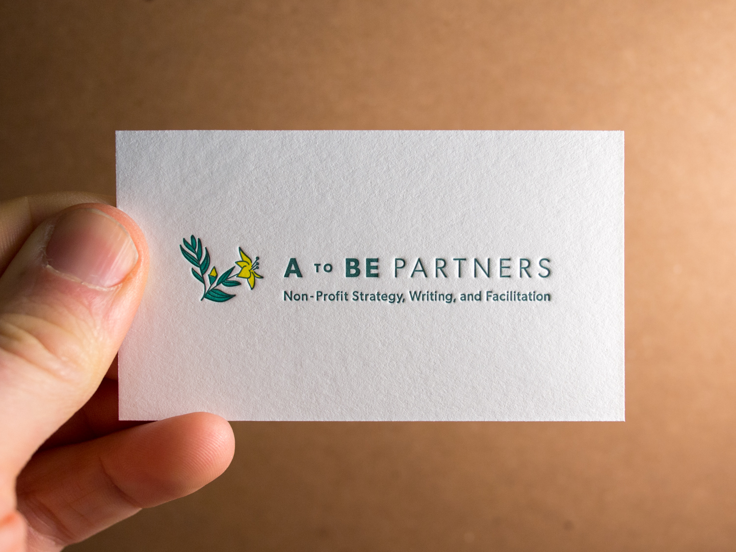
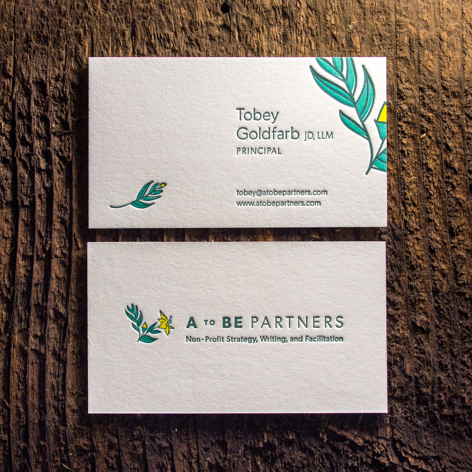
We printed these cards with three inks per side on thick 600g Fluorescent White stock for fellow Portlanders A to Be Partners. Designed by Allison of Allison Arno Design.
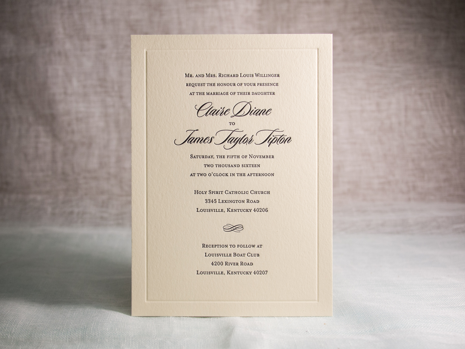
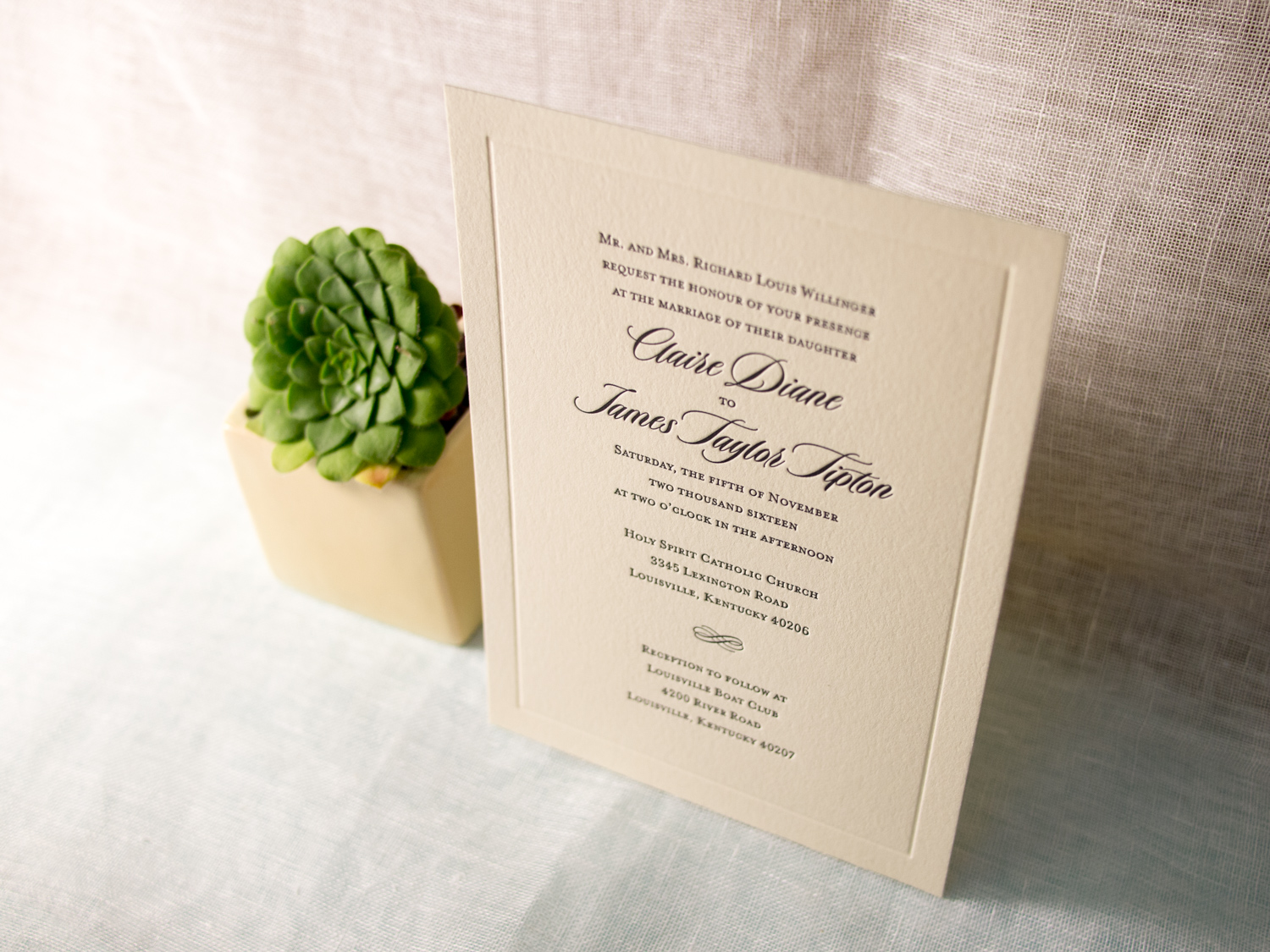
This is a variation on our popular Vignette invitation design featuring black ink and the lovely Duende script font.
PAPER 300g Ecru White
INK Black & Blind Impression
TYPE Duende & Mrs Eaves Small Caps
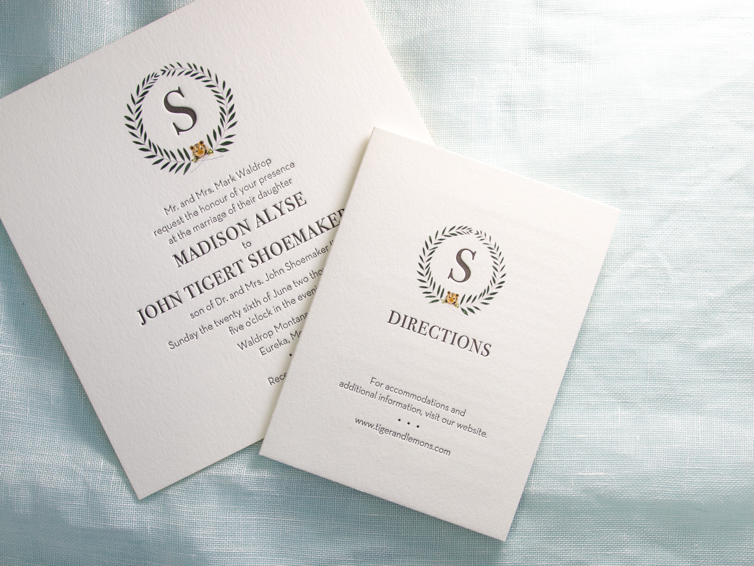
These oversized square invitations feature our Tungsten letterpress ink along with a digitally printed "tigers & lemons" wedding seal provided by the couple.
As they put it, “Tiger” is the bride’s term of endearment for the groom as he is the fourth Shoemaker to hold “Tigert” as his middle name. “Lemons” is the groom’s term of endearment for the bride as she is “the lemon to his lime.”
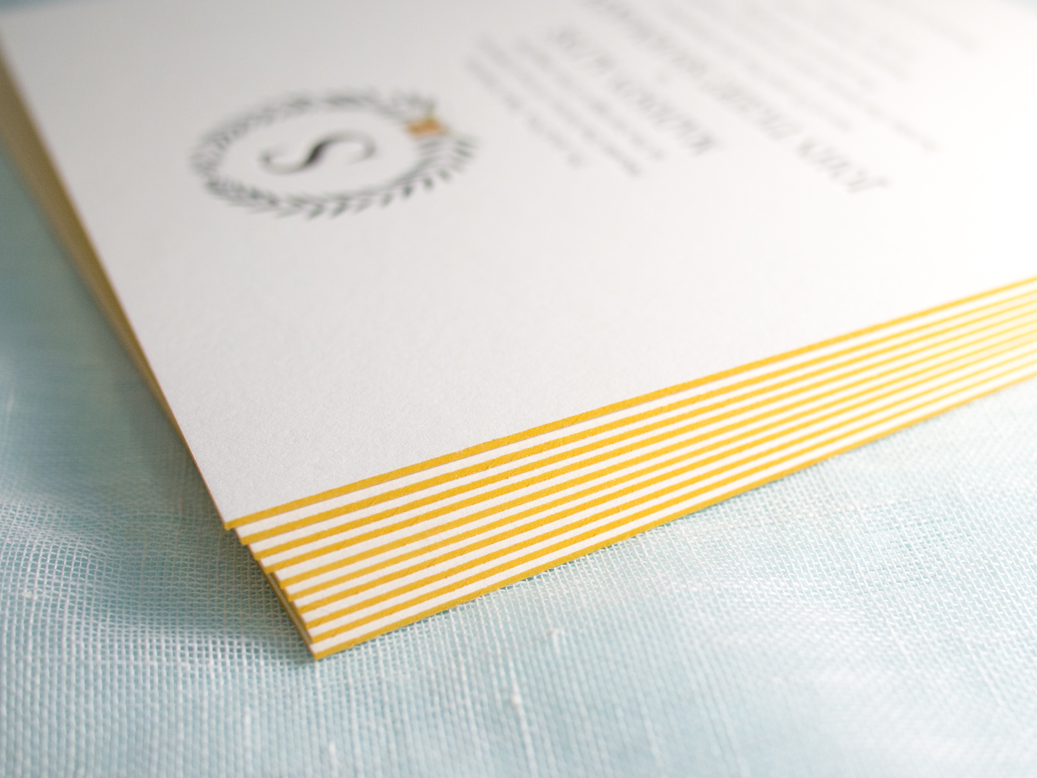
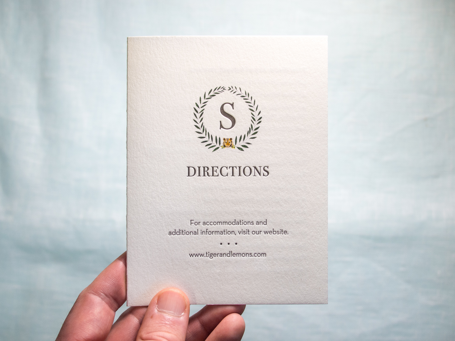
The invitation is printed on our thick 600g Pearl White paper with bright gold edge paint, and it's paired with a metallic gold liner. The typeface combo is great: All caps Bodoni with sans serif Neutra Book.
We also printed mini directions booklets using the same ink combo, but on our lighter-weight 300g stock.
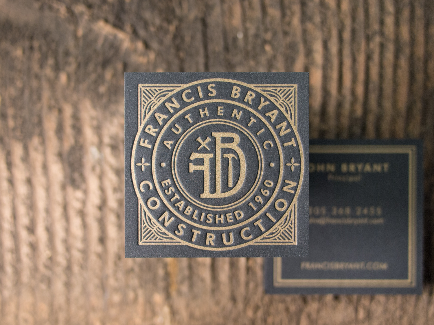
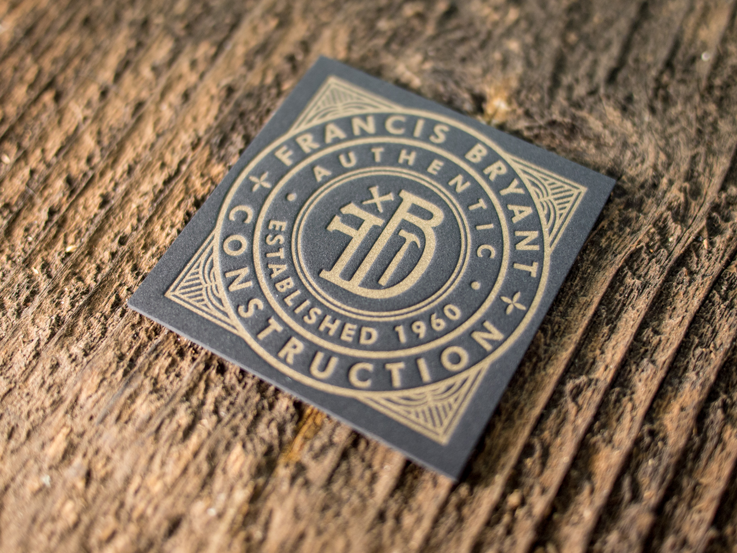
Wonderful logo design by The G Brand. Printed on both sides with gold ink on 60pt black museum board.
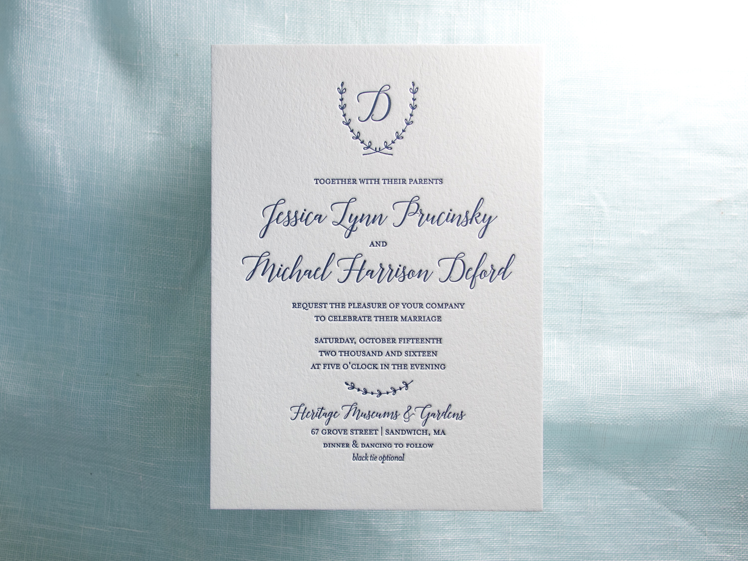
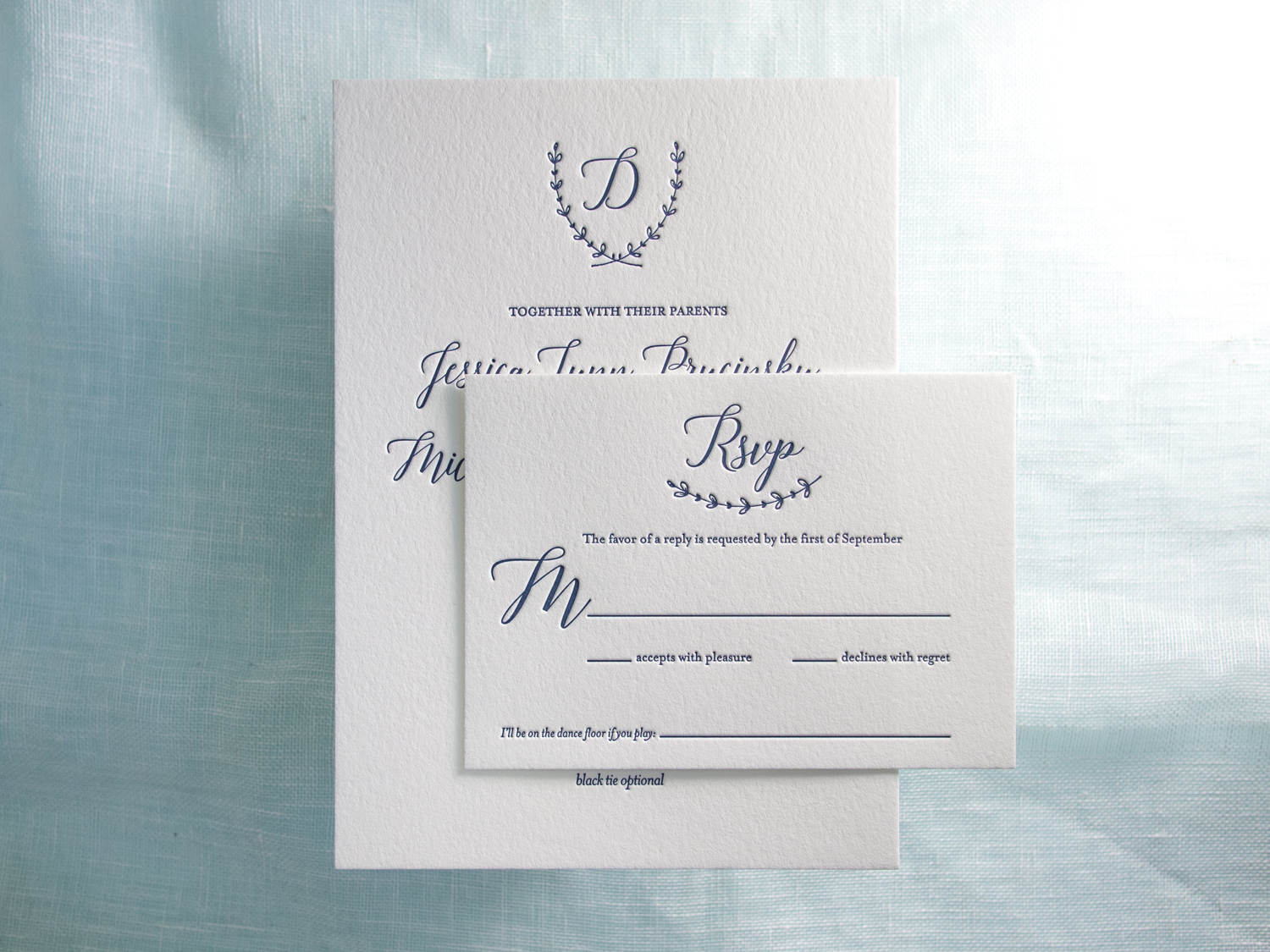
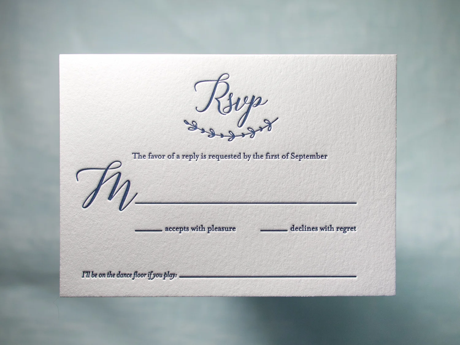
Simple but spectacular one-color invitations designed by the bride, Jessica, and printed by us.
PAPER 300g and 600g Pearl White
INK Midnight
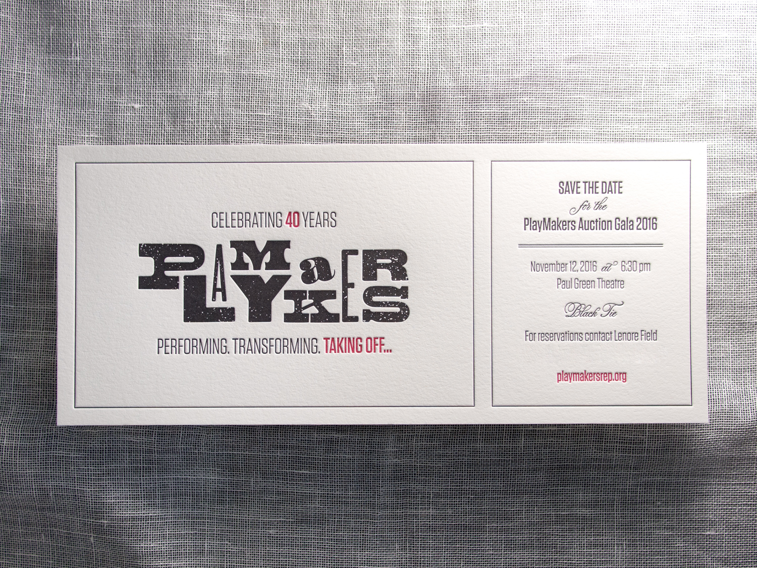
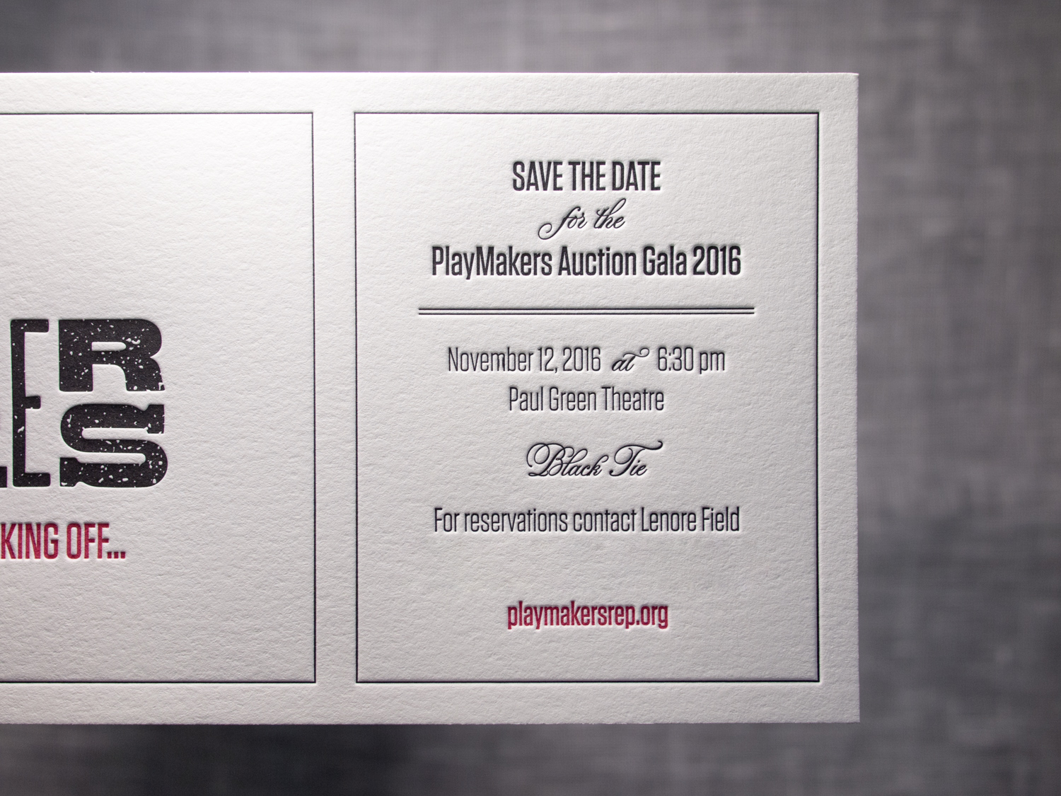
Although we're in Portland now, Parklife Press spent most of its first decade in Chapel Hill, less than a mile from UNC. On the far side of campus, beyond the sea of pastel polo shirts and khaki shorts, was PlayMakers Repertory Company. This year PlayMakers is celebrating its 40th year, and unlike the previously mentioned campus fashion choices, I hope it never goes out of style.