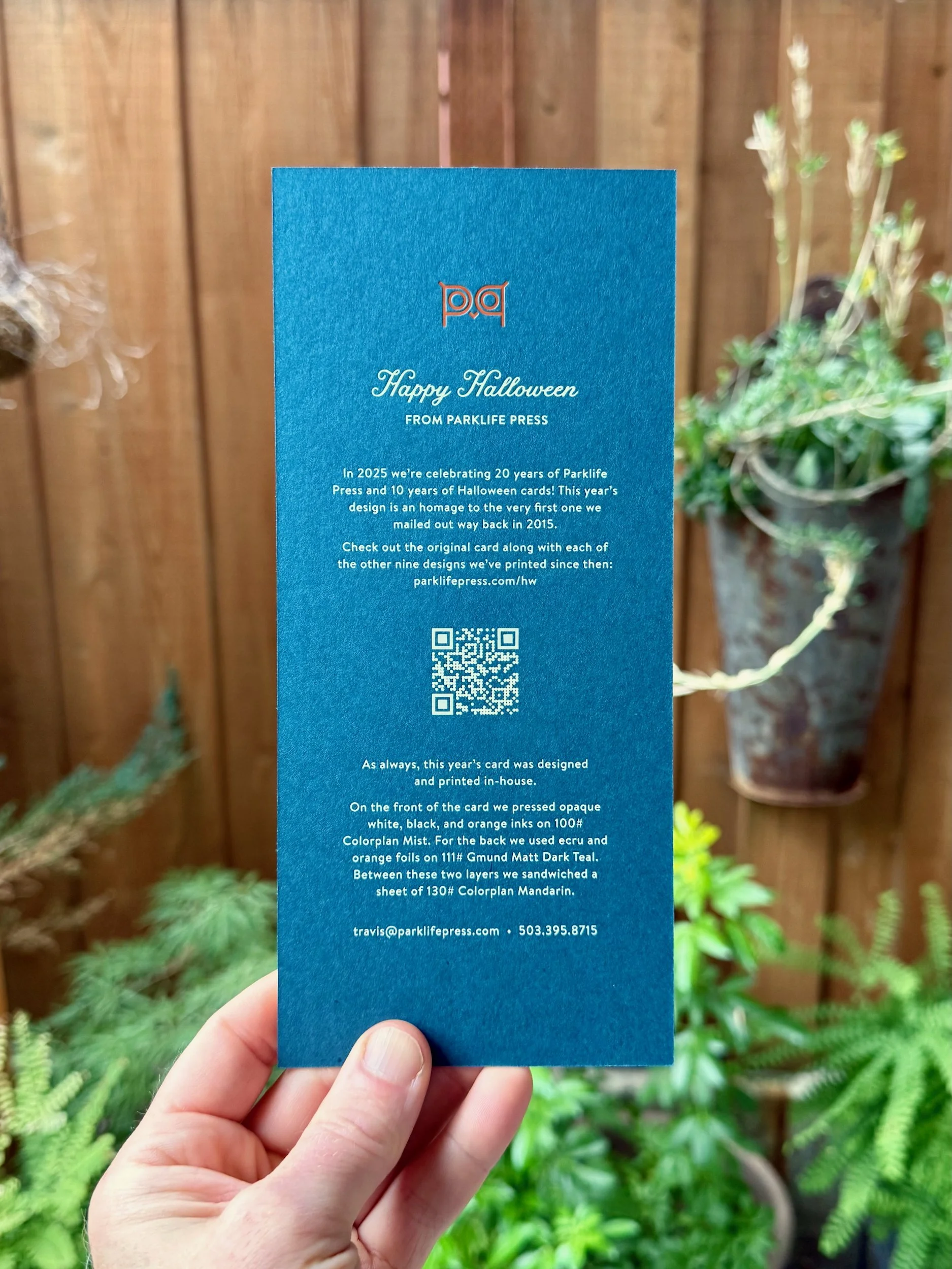
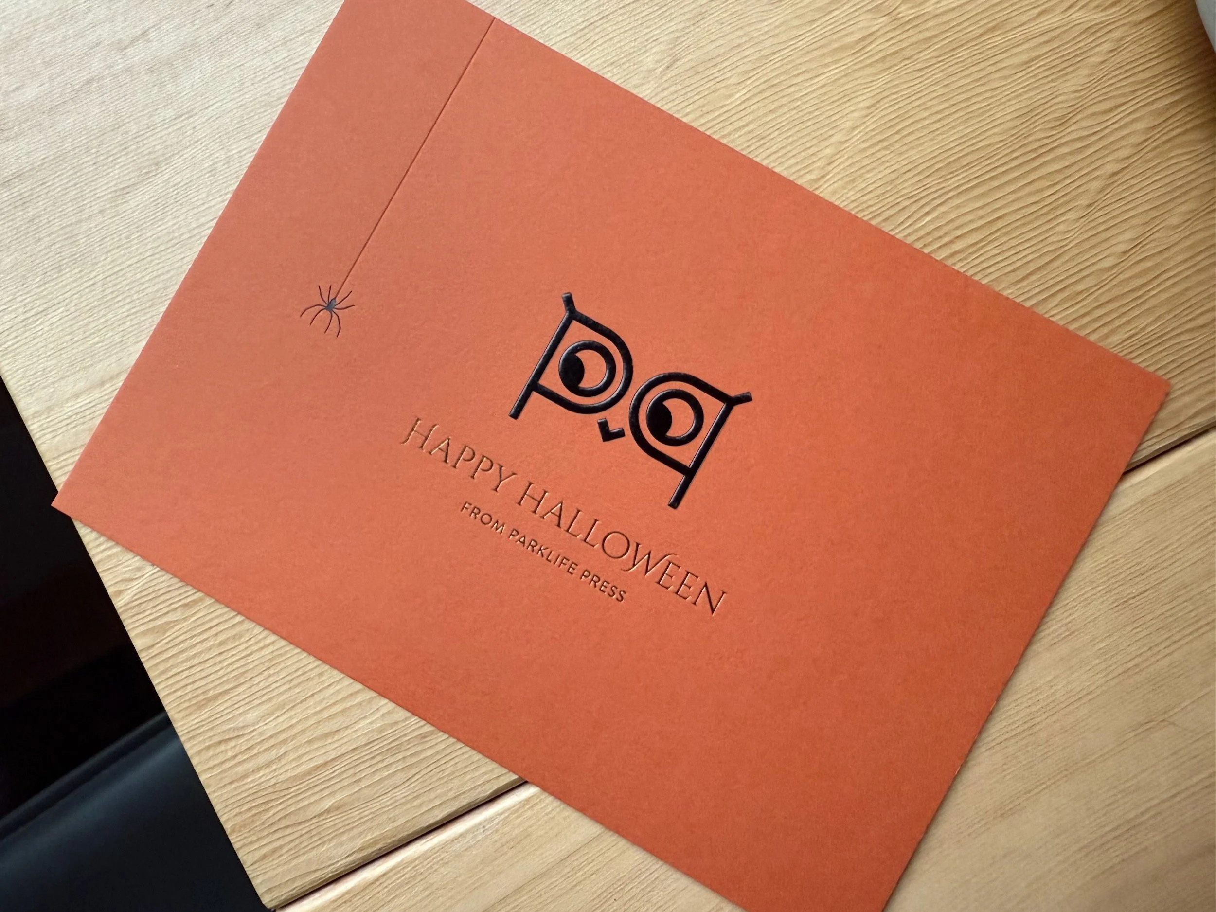
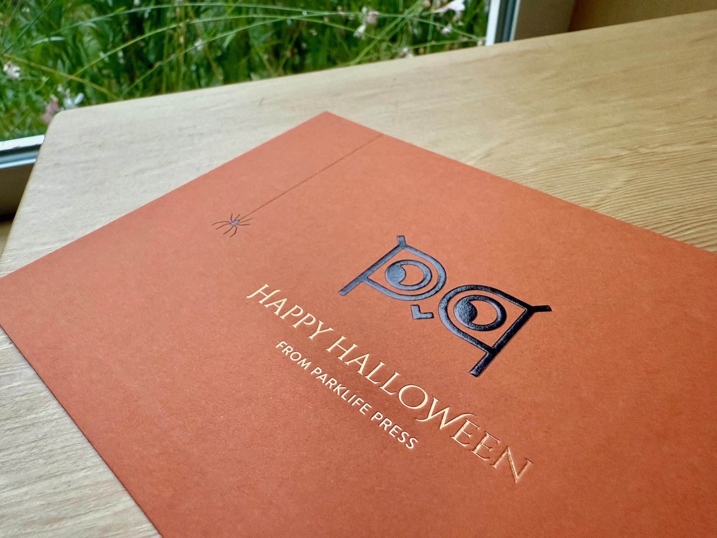
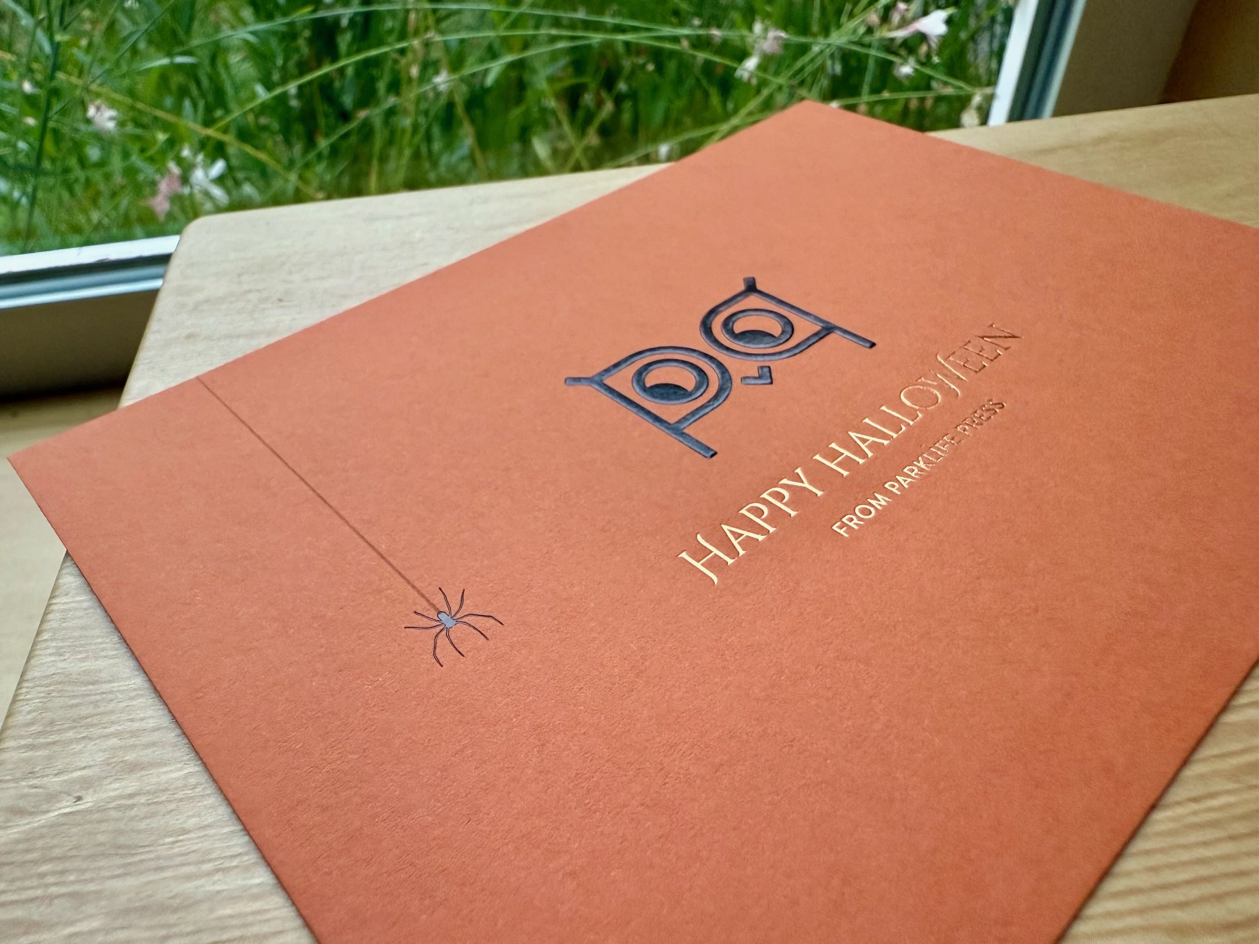
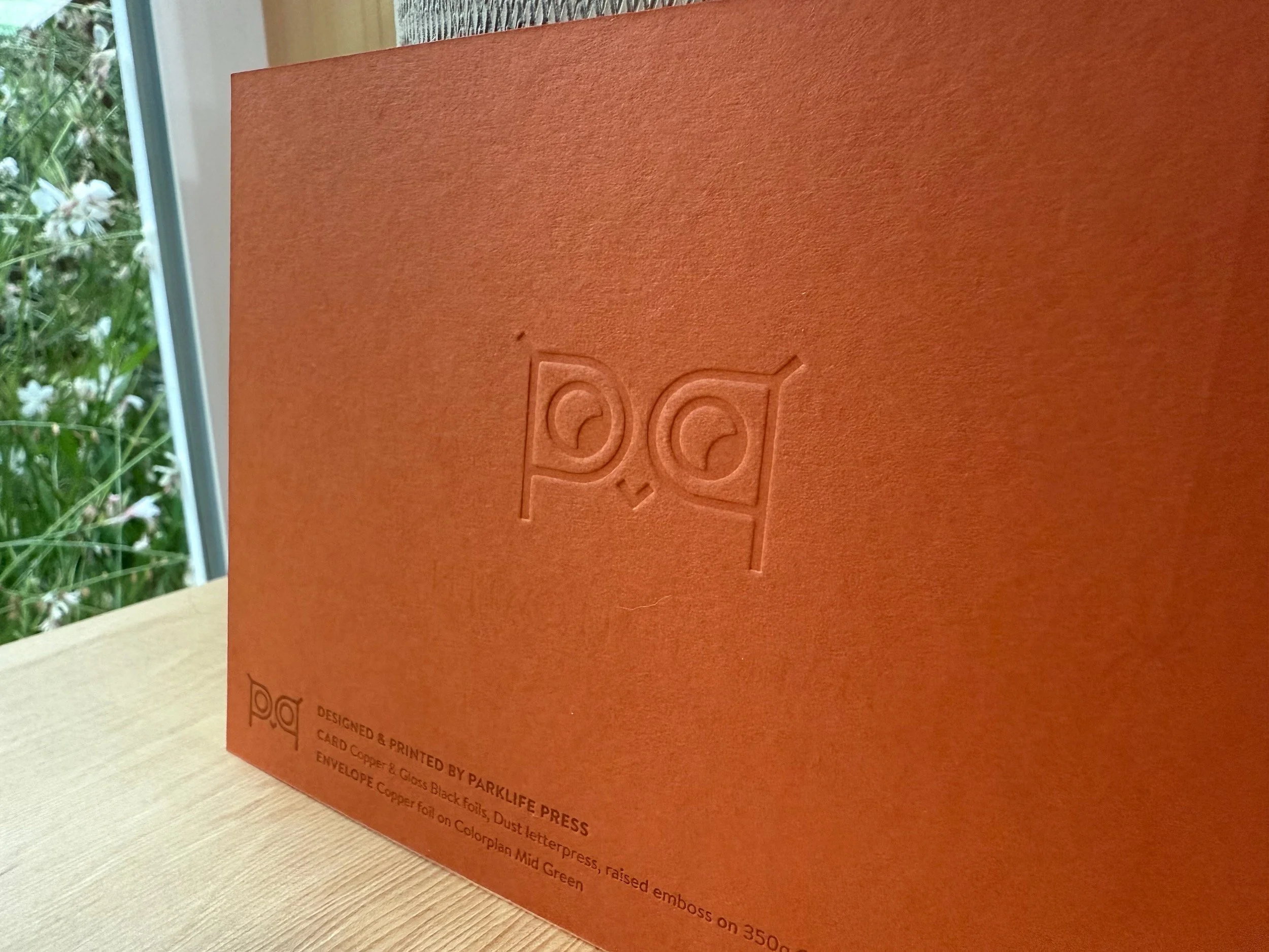
In 2025 we’re celebrating 20 years of Parklife Press and 10 years of letterpress Halloween cards! This year’s design is an homage to the original card that started the tradition back in 2015, but this time with an even longer (!!) lamp cord.
FRONT: Black, Opaque White, and Pantone 1655U letterpress on 270g Colorplan Mist
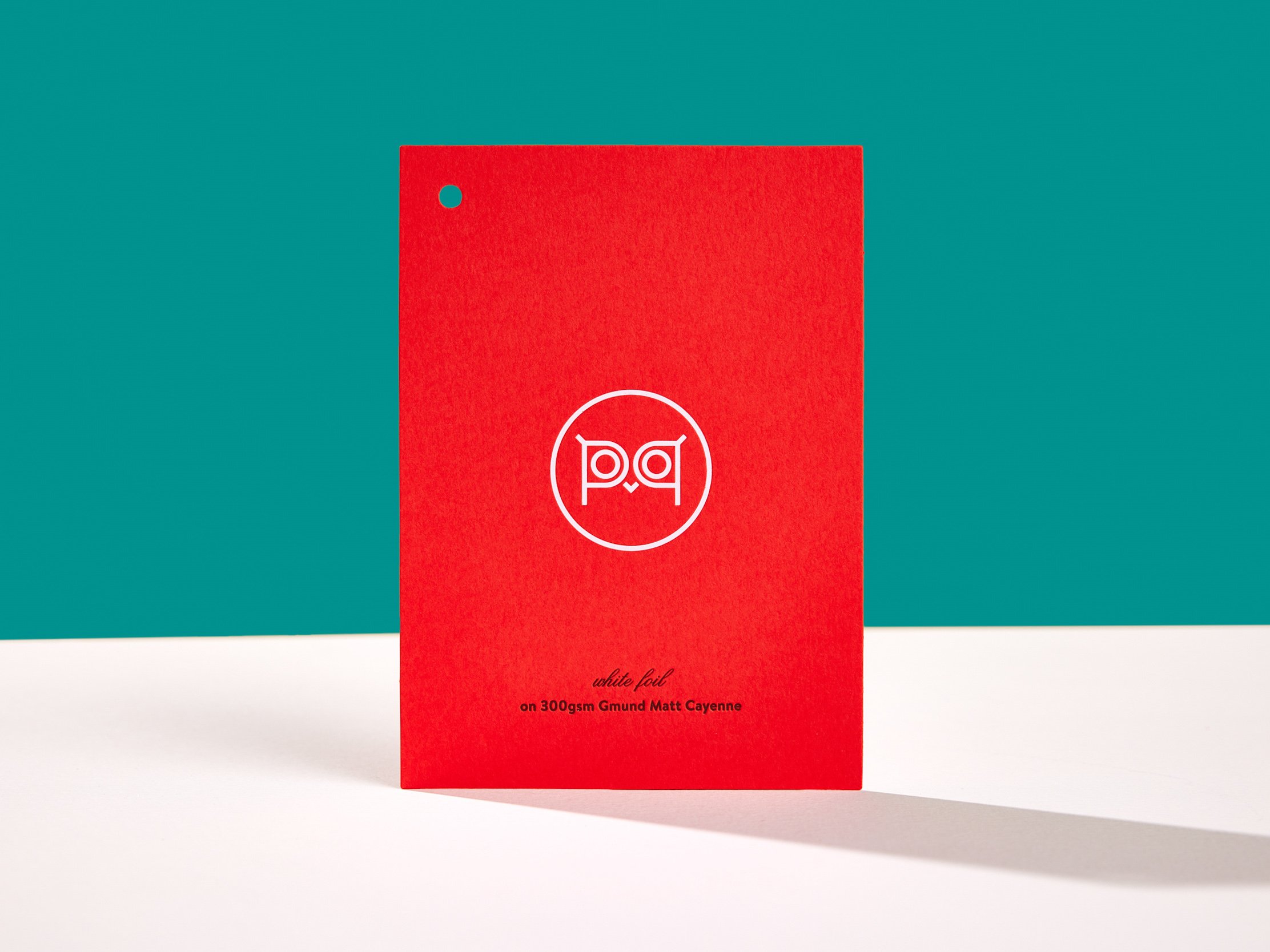
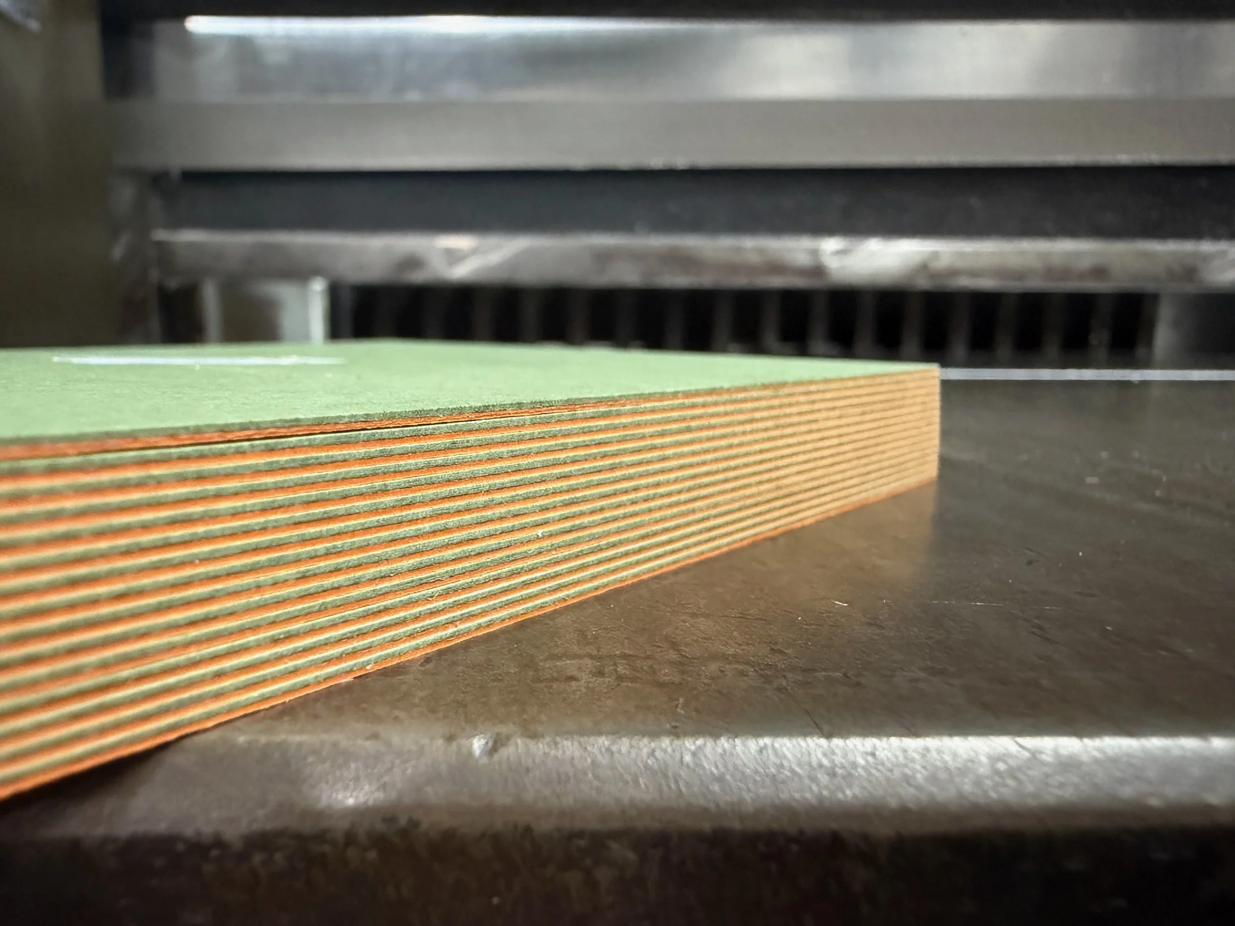
BACK: Gloss Ecru and Gloss Orange foils on 300g Gmund Dark Teal
FINISHING: Triplex with 350g Colorplan Mandarin, trim
Take a look at the 2015 card below as well as every spooky step along the journey…
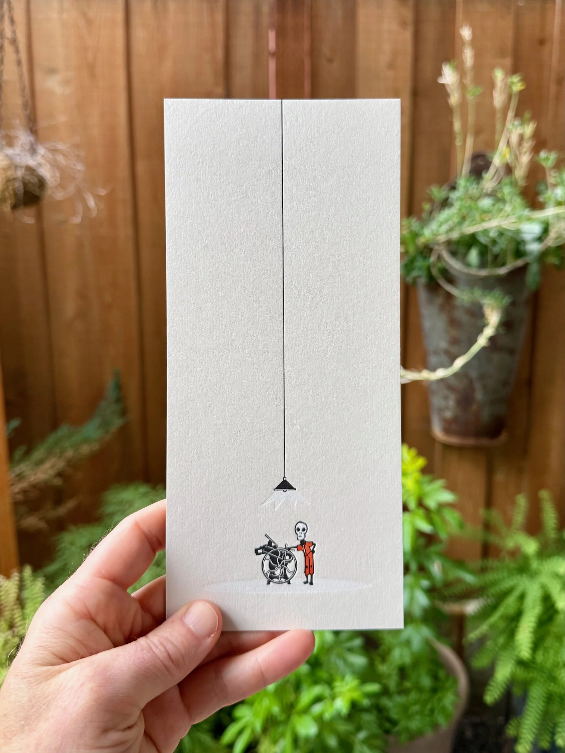
2015: Dead Printer


OUTSIDE: Slate Gray and semi-opaque letterpress on 170g Astrobrights Cosmic Orange
INSIDE: Slate Gray and Tangerine orange letterpress on 245g Lettra Pearl White
FINISHING: Duplex, trim, score, fold
A dramatically long lamp cord, an eerie look from a dead pressman, and an immaculately drawn C&P Old Style just like the one we used to print the card.
2016: Shiny Pumpkin


FRONT: Black letterpress, Antique Gold and Silver Shine foils on 380g French Paper Speckletone Kraft
BACK: Black and Pantone 7500U tan letterpress on 270g French Paper Kraft-Tone Ledger Green
FINISHING: Duplex, trim
This one came with a coupon!… which I’m afraid is now expired (booo) (Halloween pun).
2017: Cat Scratch Fever

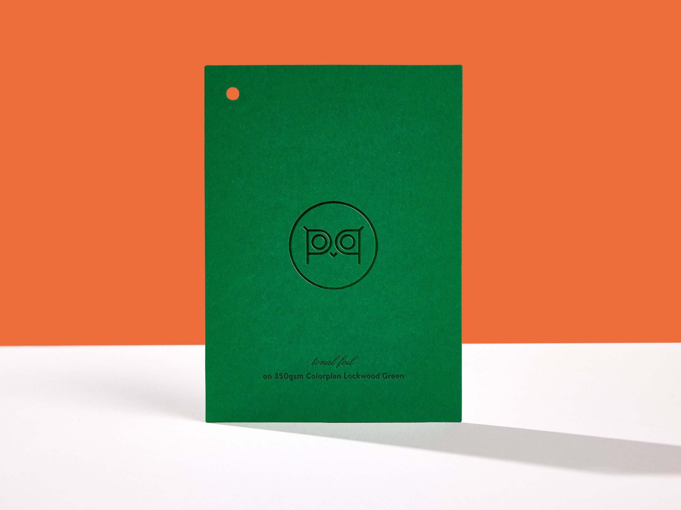
PAPER: 350g Colorplan Lockwood Green
PROCESS: Pantone 356U green letterpress, Green and Gold Shine foils
FINISHING: Trim, score, fold
As frightened cats tend to do, this card has been hiding from us! It’s the only one we can’t seem to find a copy of, but luckily we found a photo. We adapted the artwork for this design from an illustration by T.W. Wood from Charles Darwin’s The Expression of the Emotions in Man and Animals.
2018: Treat, please.
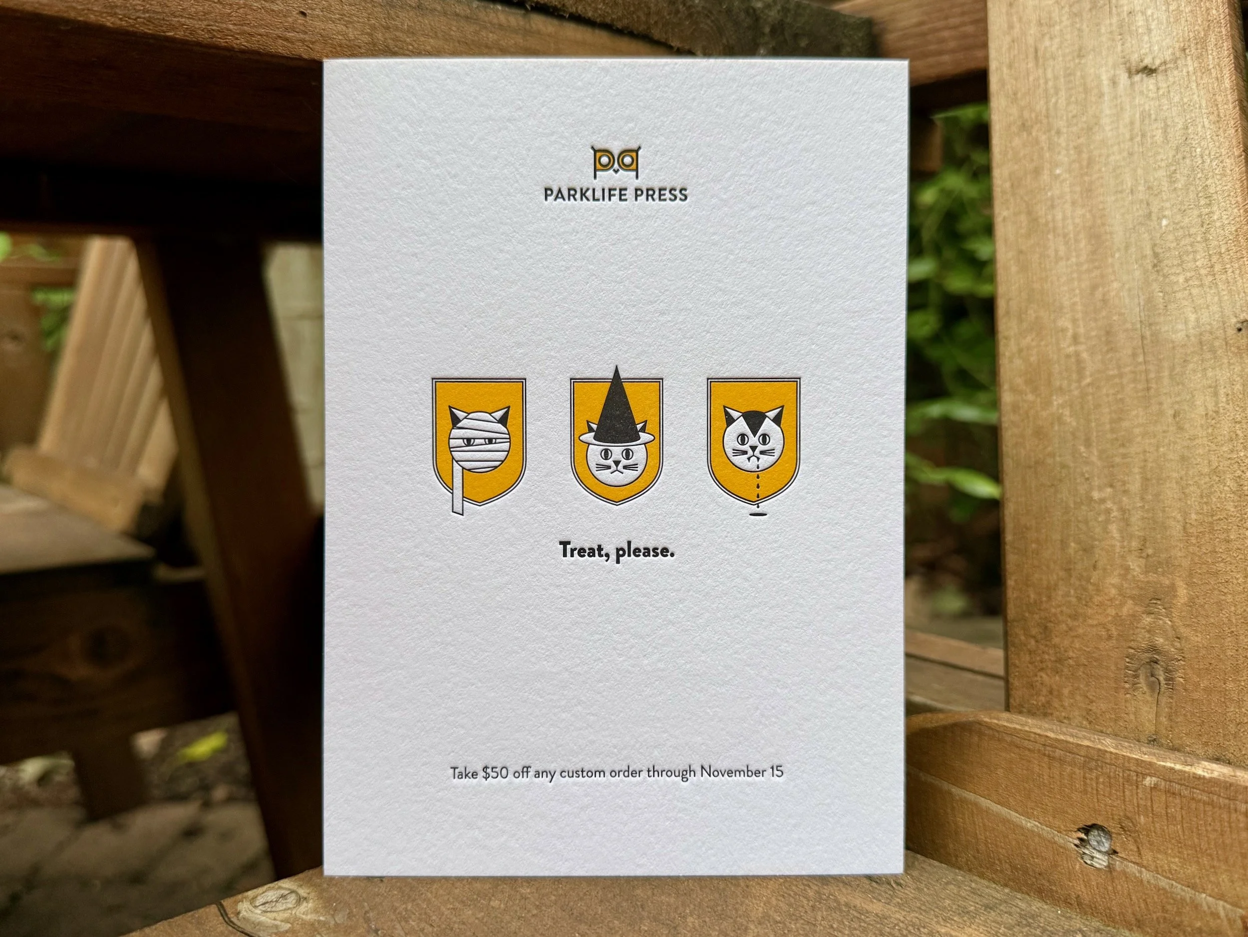
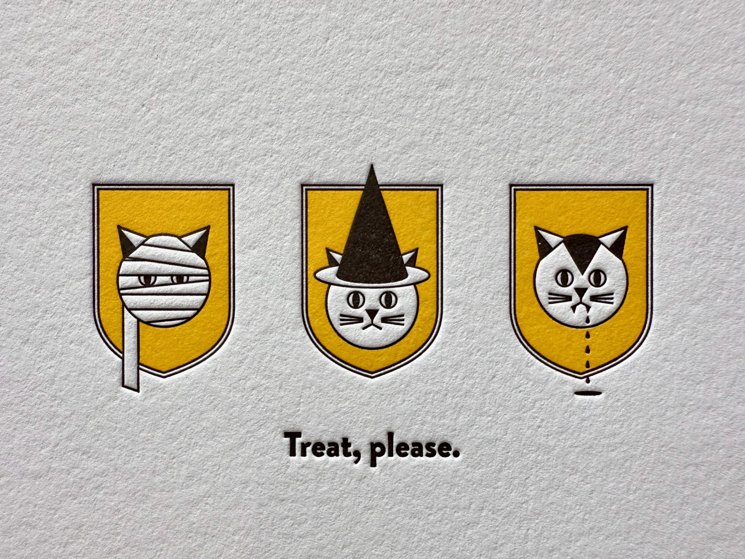
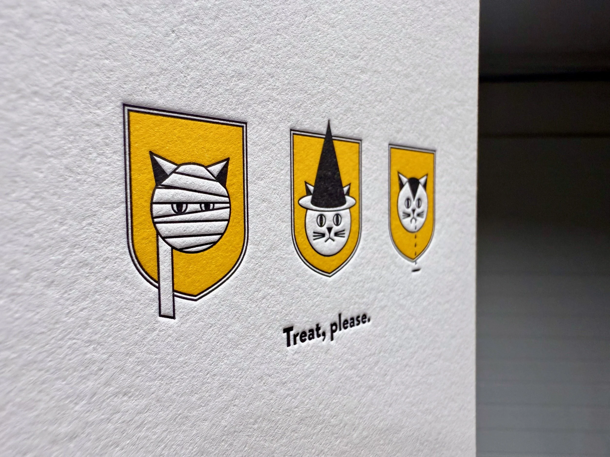
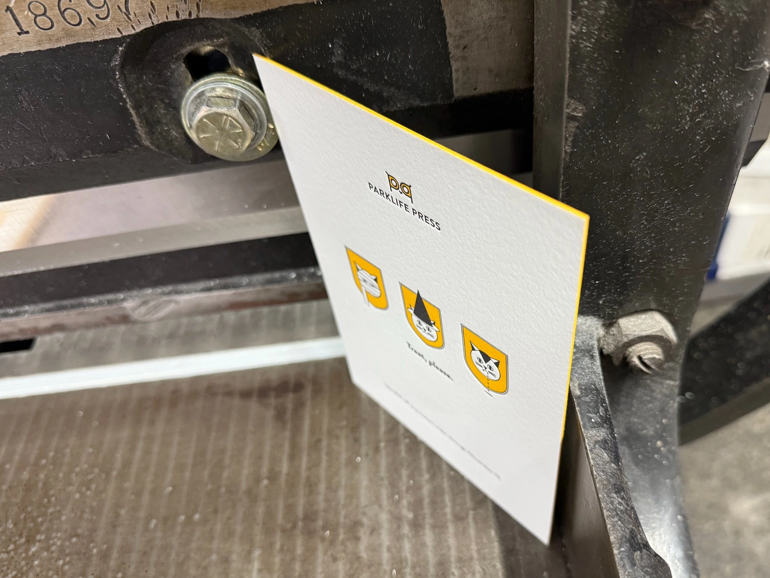
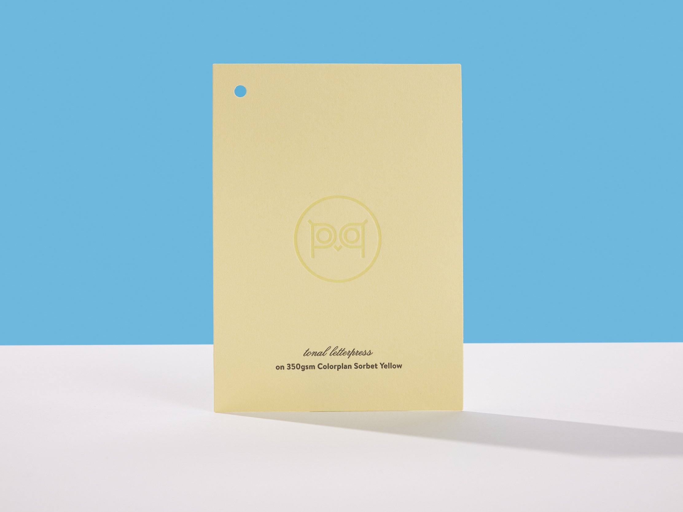
PAPER: 600g Lettra Fluorescent White
INK: Black and Pantone 109U yellow letterpress
EDGE PAINT: Pantone 109U yellow
This one might be my favorite. It’s so simple! But it’s visually clever (if I do say so myself), I like the idea that cats are too smart to give you the option of a trick, and I love the deep saturated yellow and black inks.
2019: Hooooo goes there?
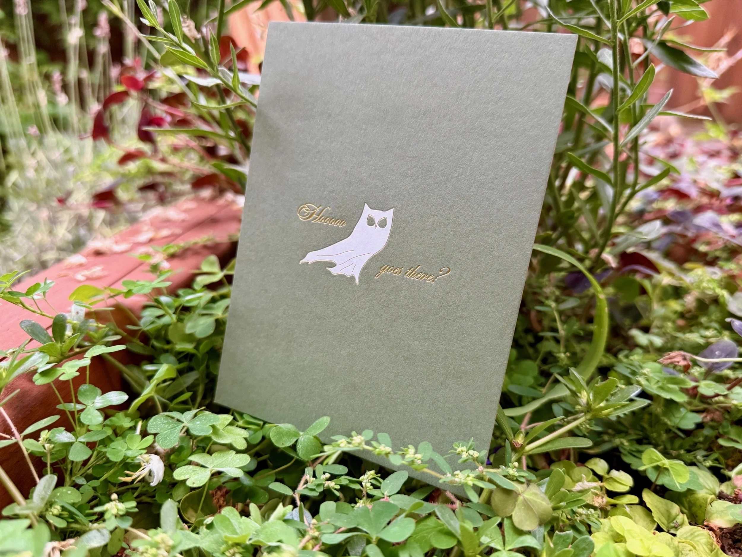
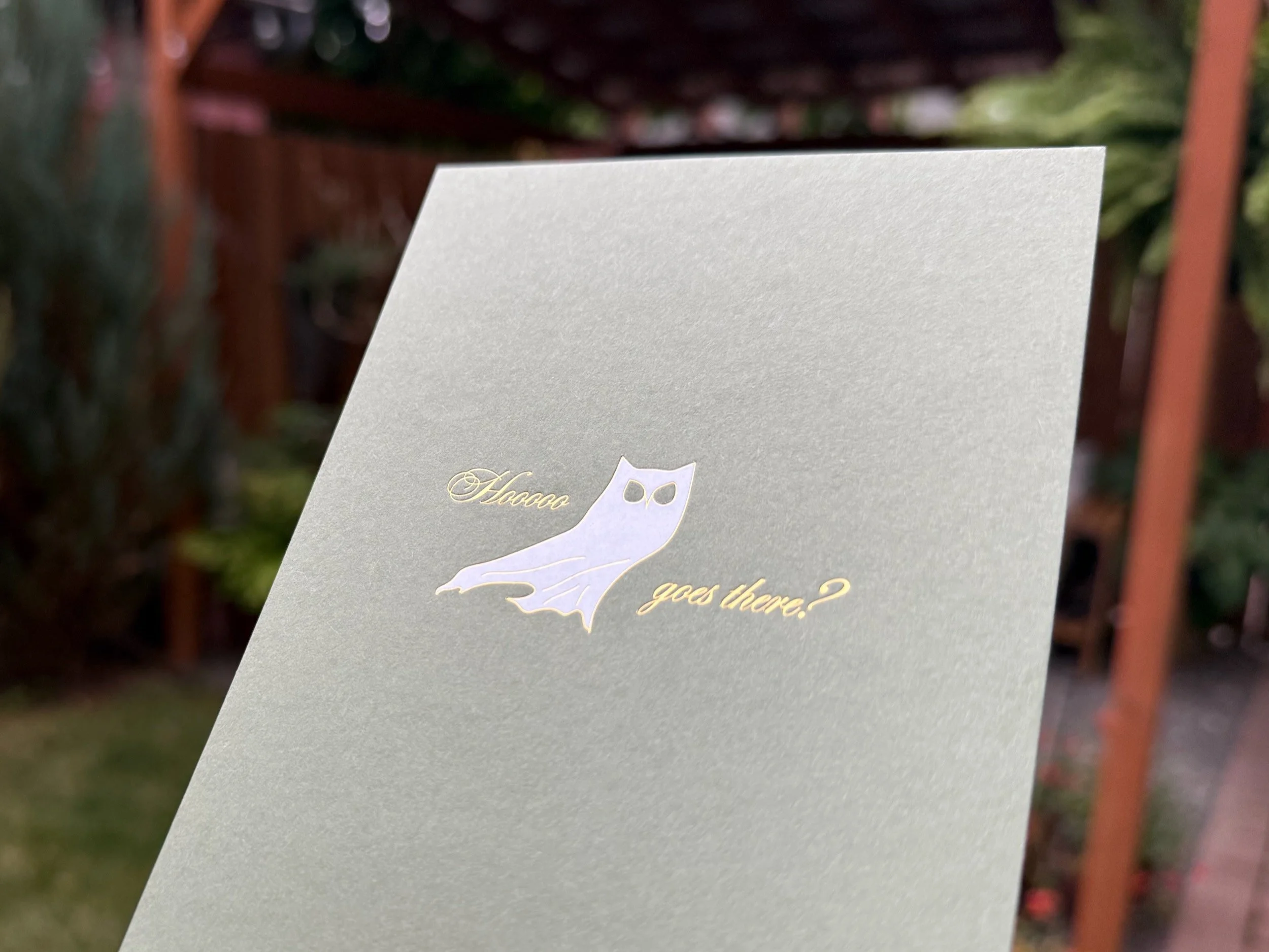
FRONT: Matte White and Gold Shine foils on 350g Colorplan Mist
BACK: Black and Pantone 149U orange letterpress on 300g Keaykolour Pumpkin
FINISHING: Duplex, trim
Maybe my second favorite?? An owl in a ghost costume with another genius(?) Halloween/animal pun.
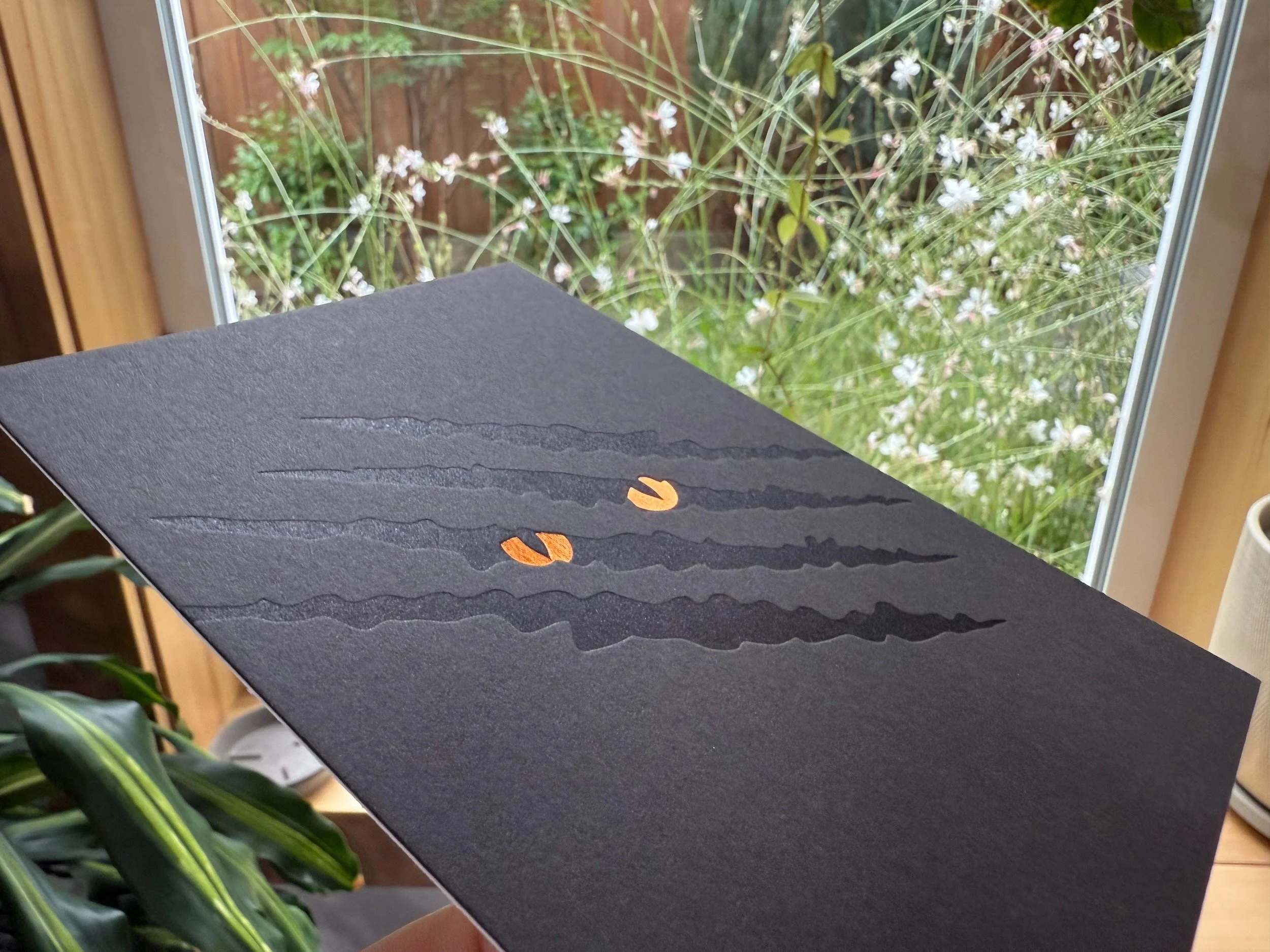
2020: Happy halloween
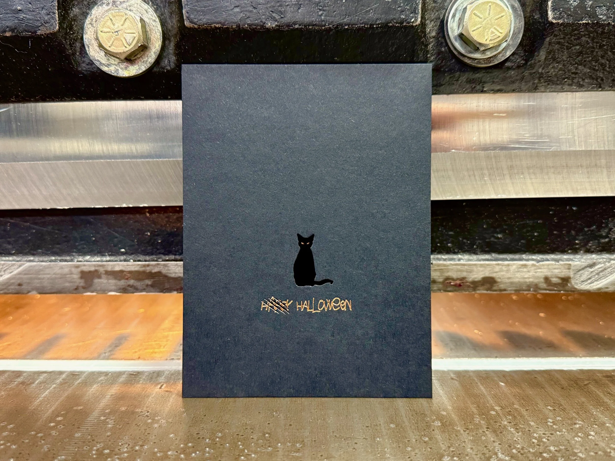
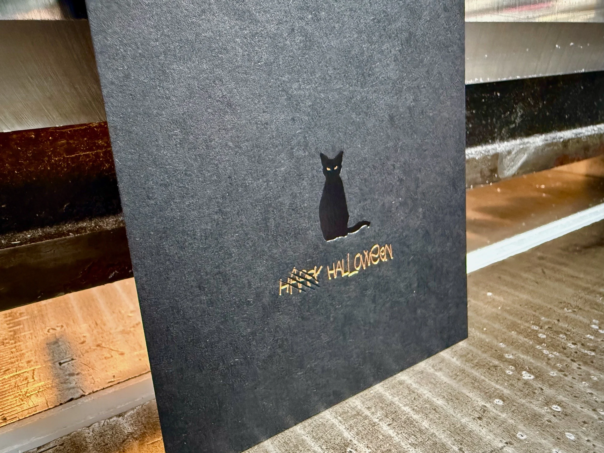
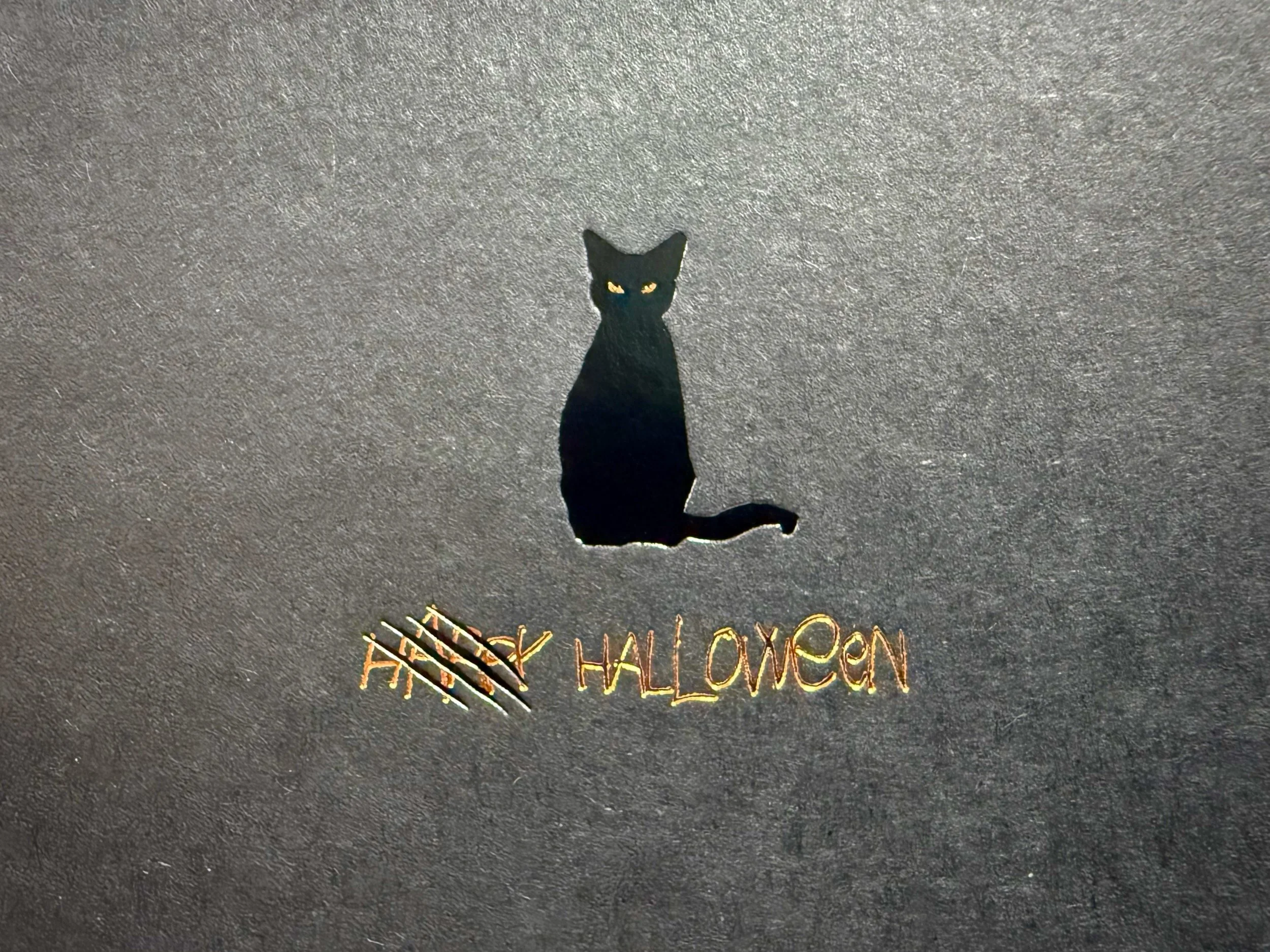
PAPER: 700g Colorplan Ebony Black
PROCESS: Gloss Black and Copper foils
At this point we’ve firmly established an animal theme. Mostly cats, one owl. But this one’s dark (it was 2020 after all) and the cat has decided to remove happiness from Halloween. The black foil on black paper is dramatic as hell and the copper cat eyes might be capable of piercing your soul.
2021: Aracnophobia
PAPER: 350g Colorplan Rust
PROCESS: Pantone Warm Gray 2U letterpress, Gloss Black and Copper foils, raised emboss
It’s never fun to pick a least favorite, but if you held a sack of spiders to my head and made me choose, maybe it would be this one? It’s kinda clever, (making the Parklife logo look scared with just a tiny tweak of the eyes) and the raised foil emboss is cool, but it somehow doesn’t feel as visually cohesive as I’d like. Stiff competition though!
2022: Will you be my valloween?
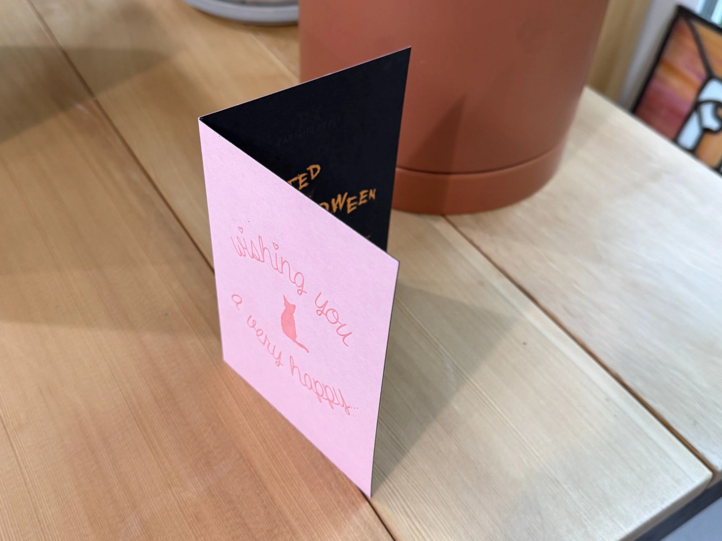
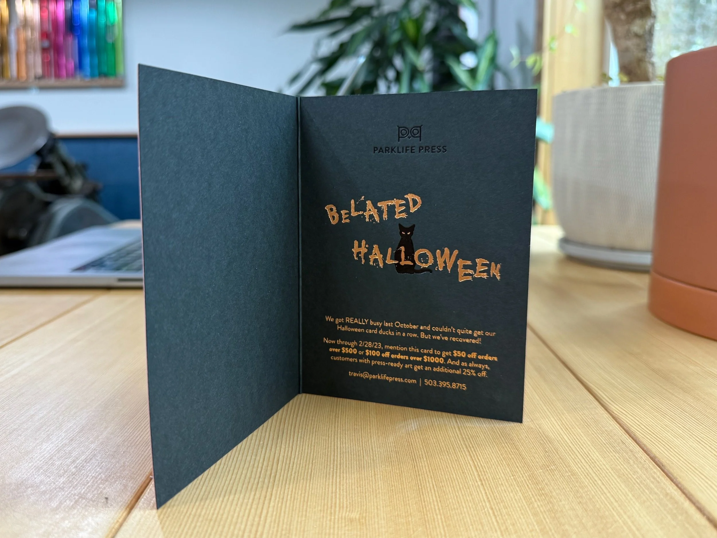
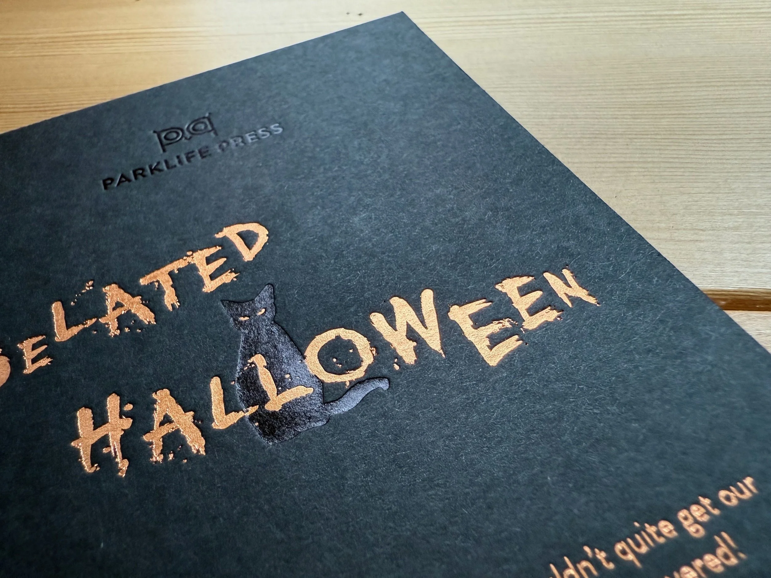
OUTSIDE: Pantone 2337U pink letterpress on 170g French Paper Bubblegum
INSIDE: Gloss Black and Copper foils on 270g French Paper Blacktop
FINISHING: Duplex, trim, score, fold
Now this one is sneaky! In the fall of 2022 we were about as busy as we’ve ever been and we couldn’t manage to put a Halloween card together. But fear not. A few months later in early 2023 we snuck a belated Halloween greeting into the husk of a Valentine’s Day card. Oh, and there’s a cat again.
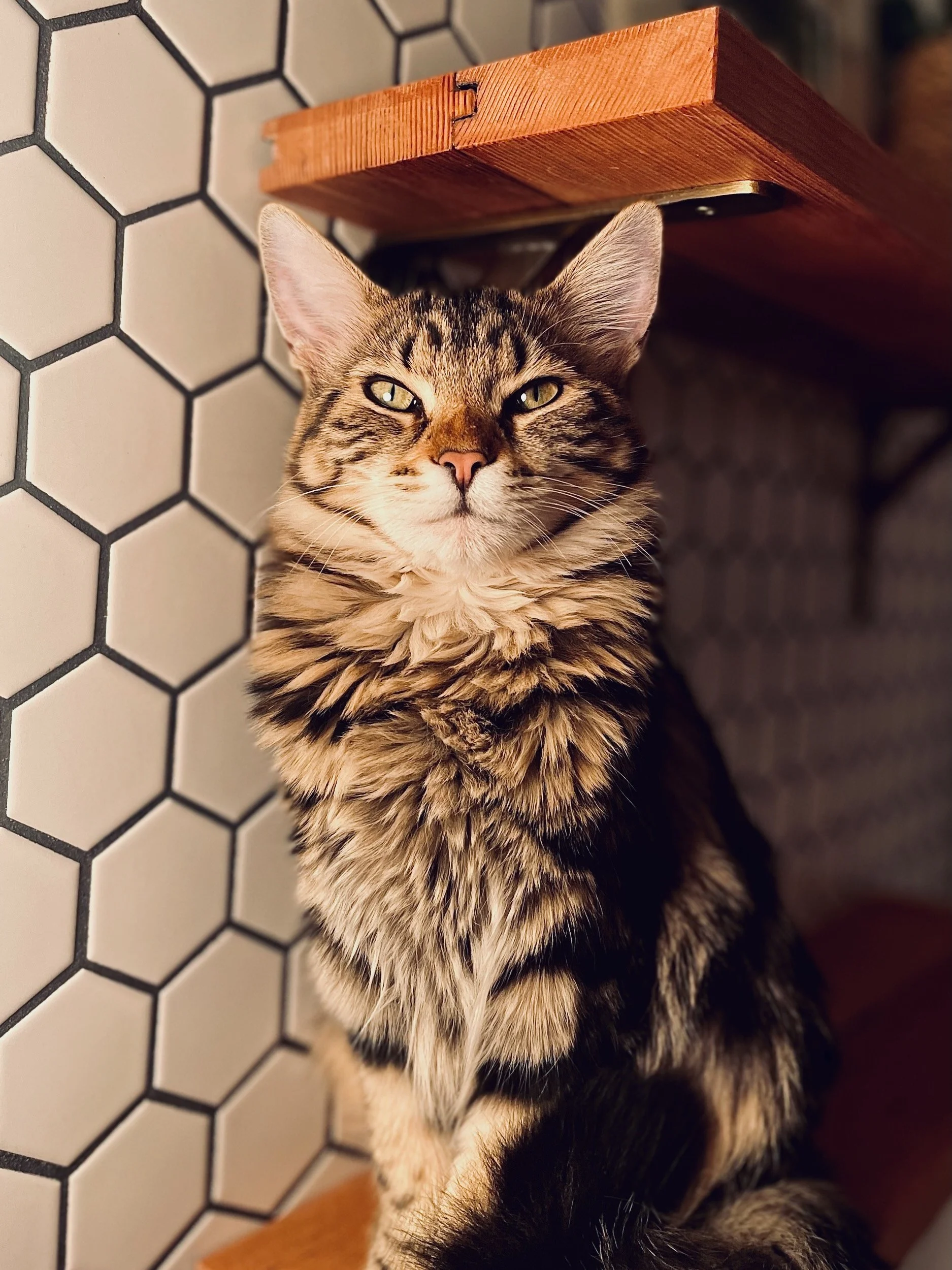
2023: Halftone Hopper
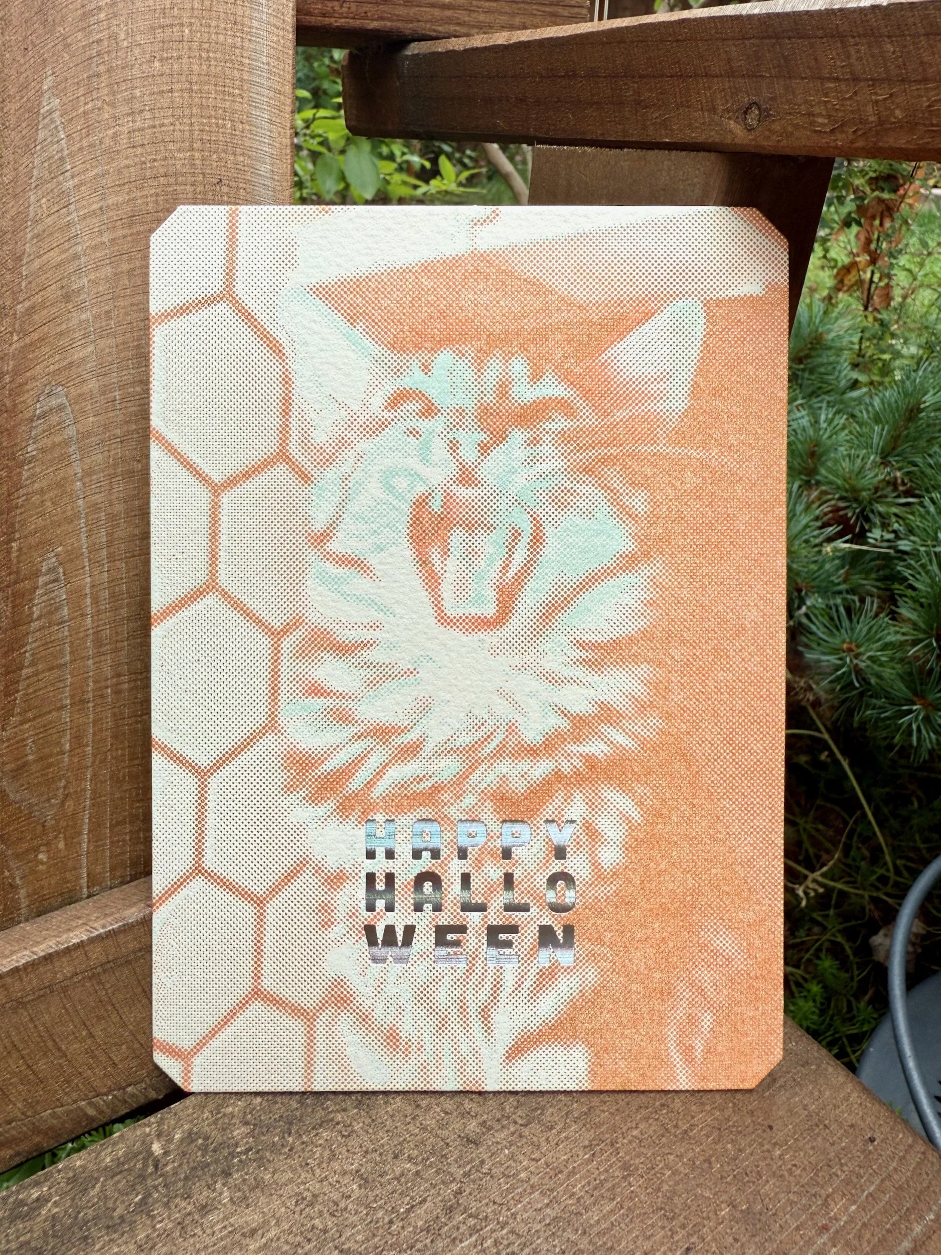
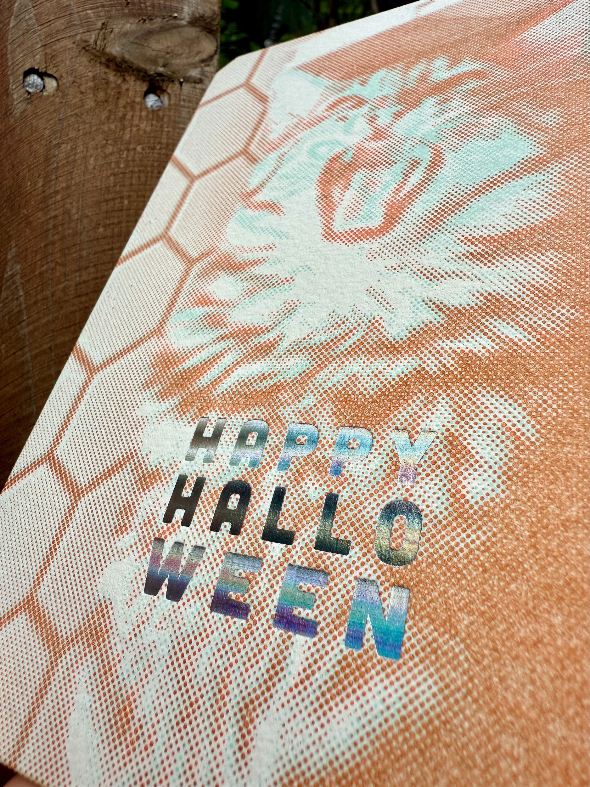
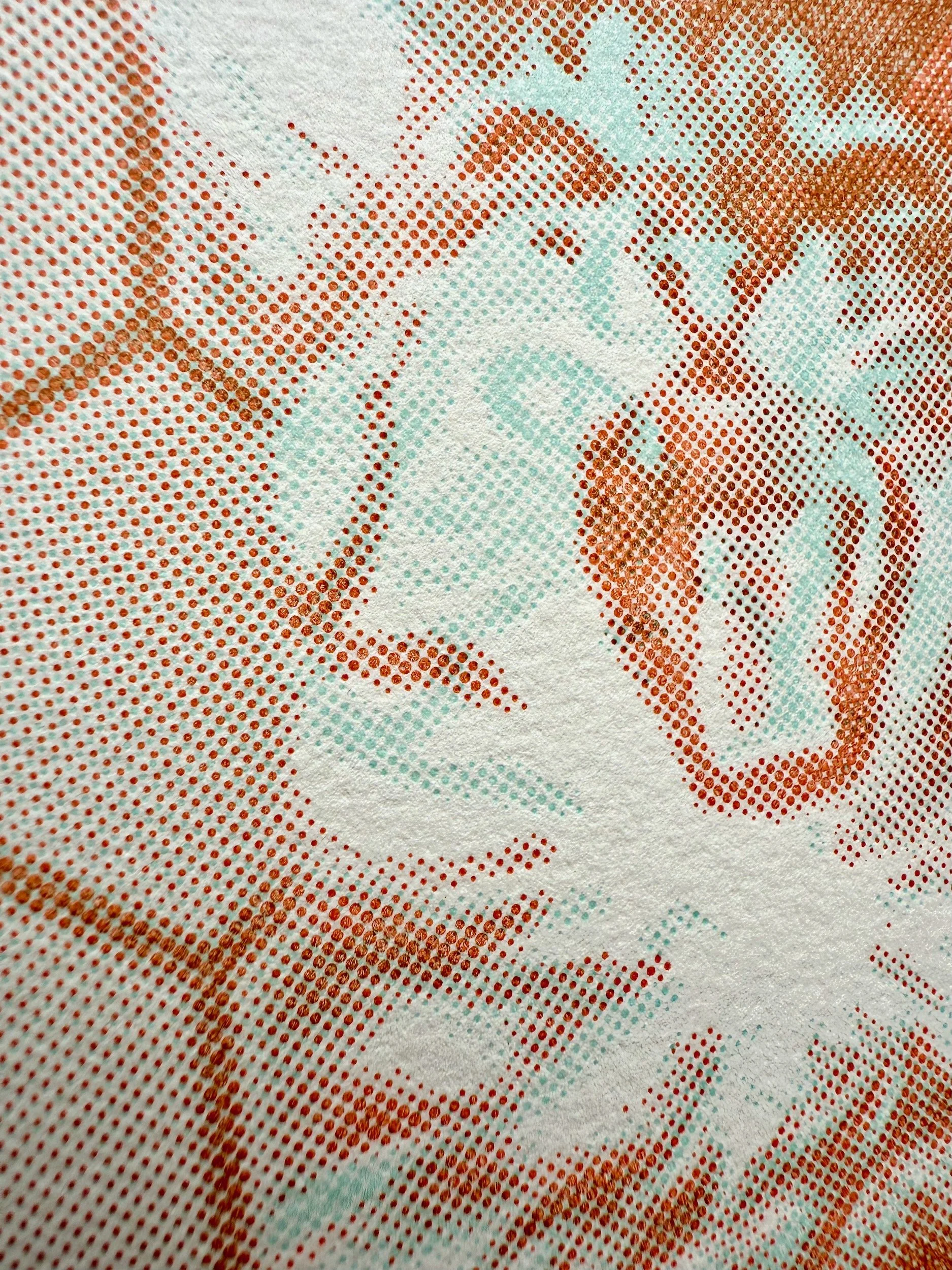


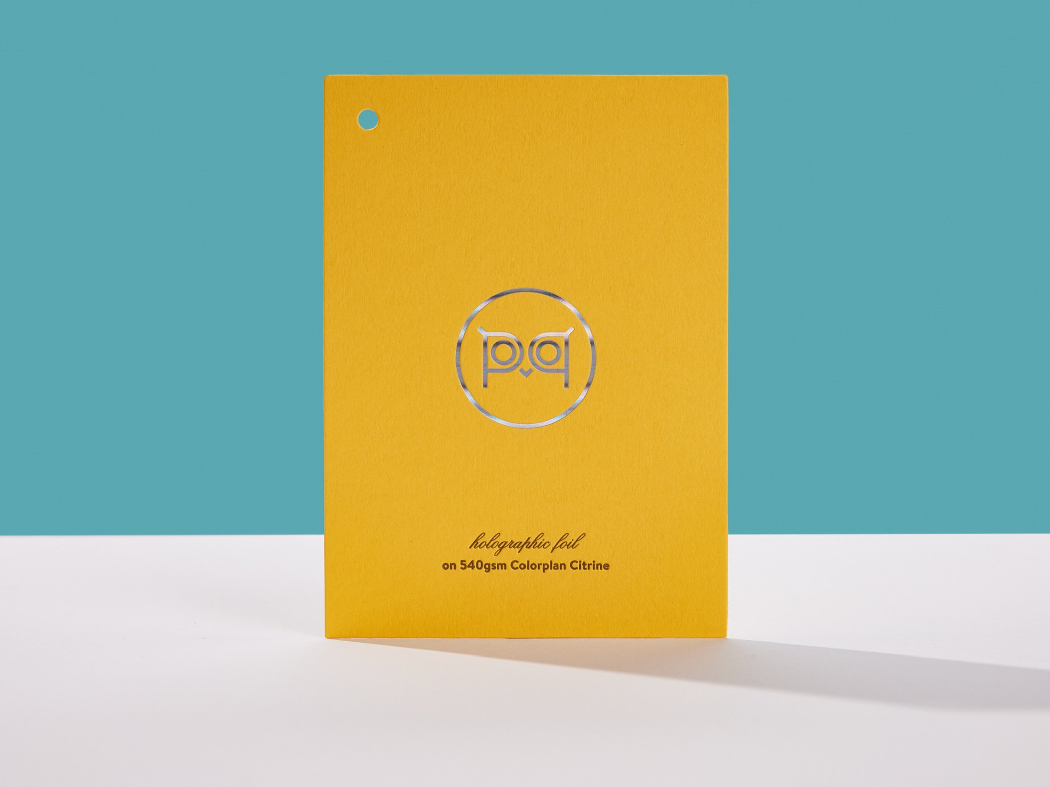
FRONT: Pantone 565U blue and Orange 021U letterpress, Holographic foil on 300g Somerset Velvet Soft White
BACK: Pantone 565U blue and Orange 021U letterpress on 300g Lettra Fluorescent White
FINISHING: Duplex, die-cut
Meet Hopper! (and her big brother, Spritz). Our tabby maine coon mix can go from gentle to ferocious in the blink of an eye. Starting with two photos of her, we created coarse halftone screens of each and printed them on top of each other with blue and orange inks. More on letterpress halftones here.
2024: You’re being watched
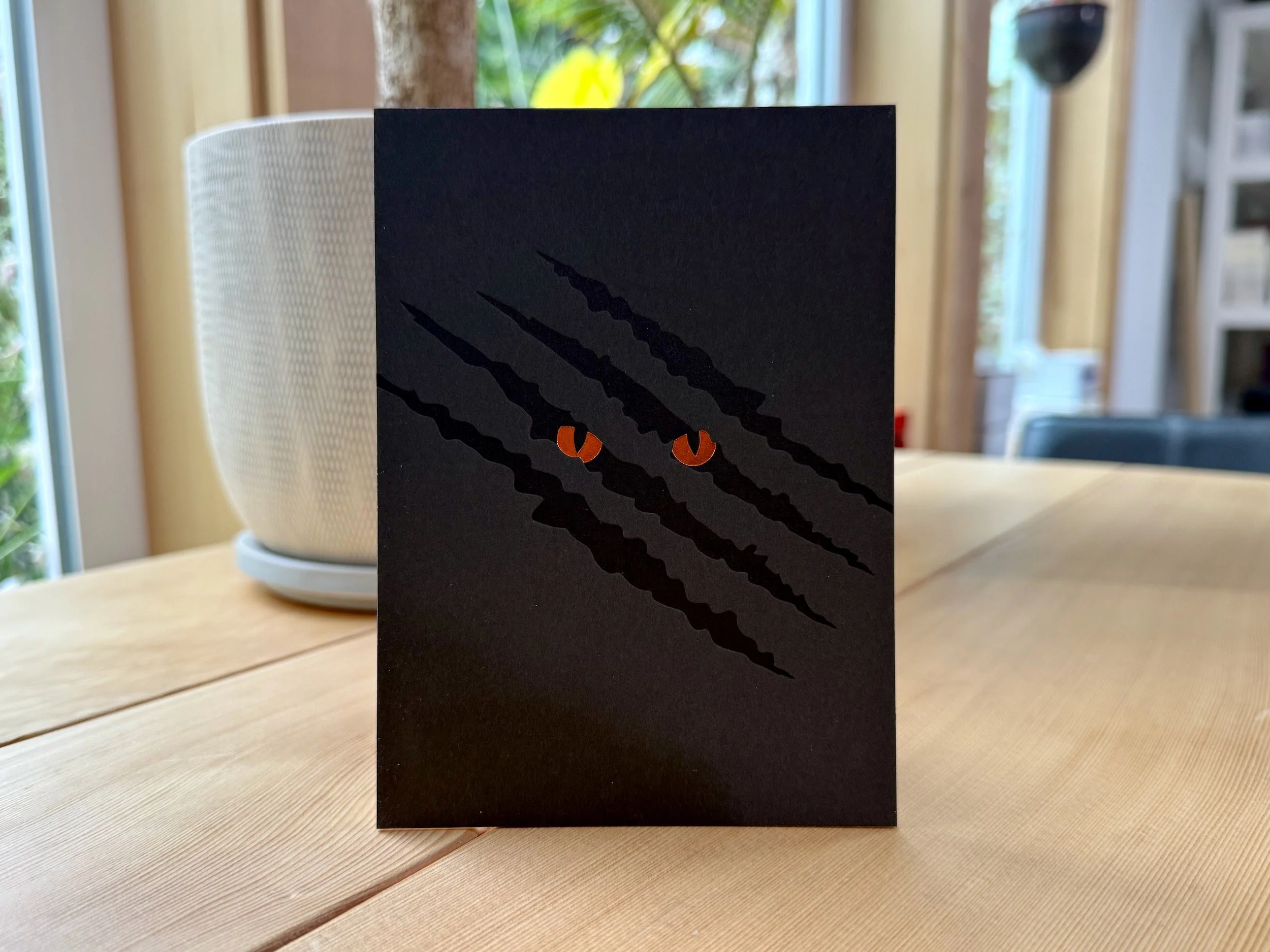
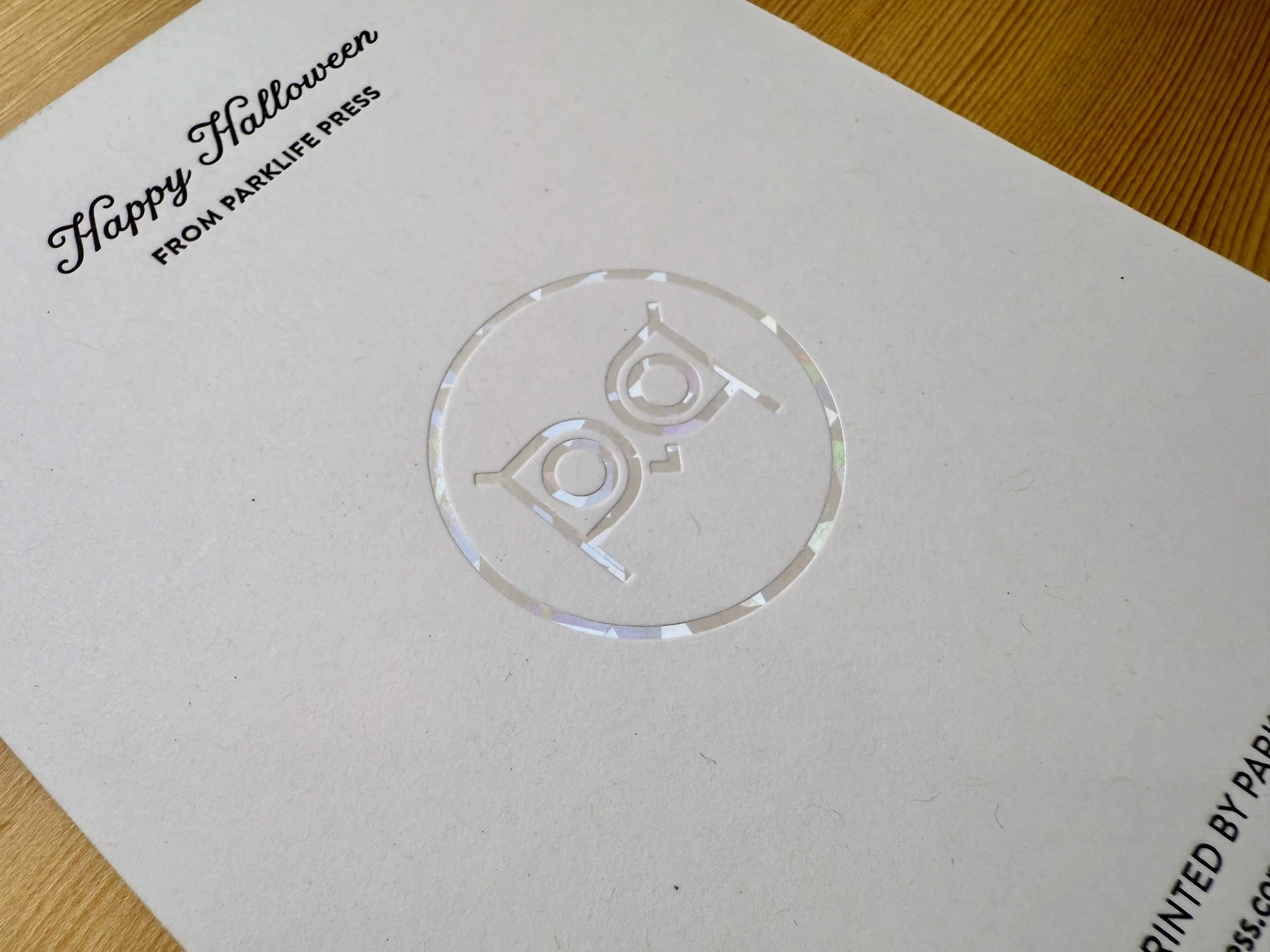
FRONT: Black letterpress and Copper foil on 300g Wild Brown
BACK: Black letterpress and Cracked Ice Clear Holographic foil on 24pt Neenah Folding Board PC100 White
FINISHING: Duplex, trim
More piercing cat eyes! The deep impression into the fluffy Wild paper really adds depth and drama to this simple design. And on the back of the card, the sparkly holographic logo is super crisp on the 100% post-consumer board.