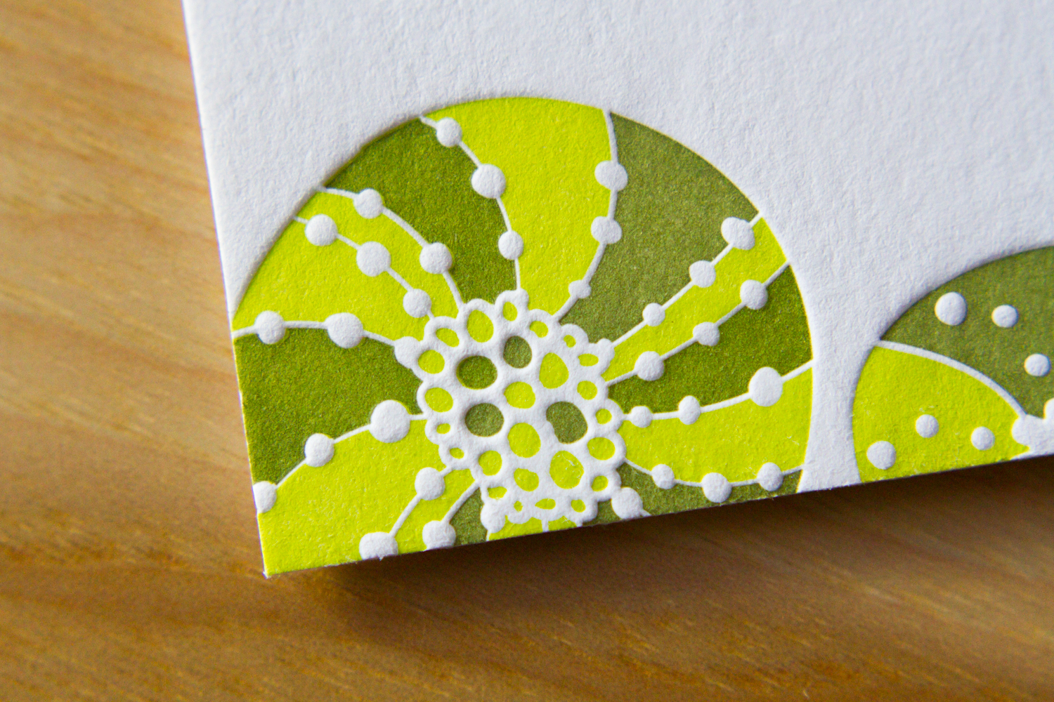
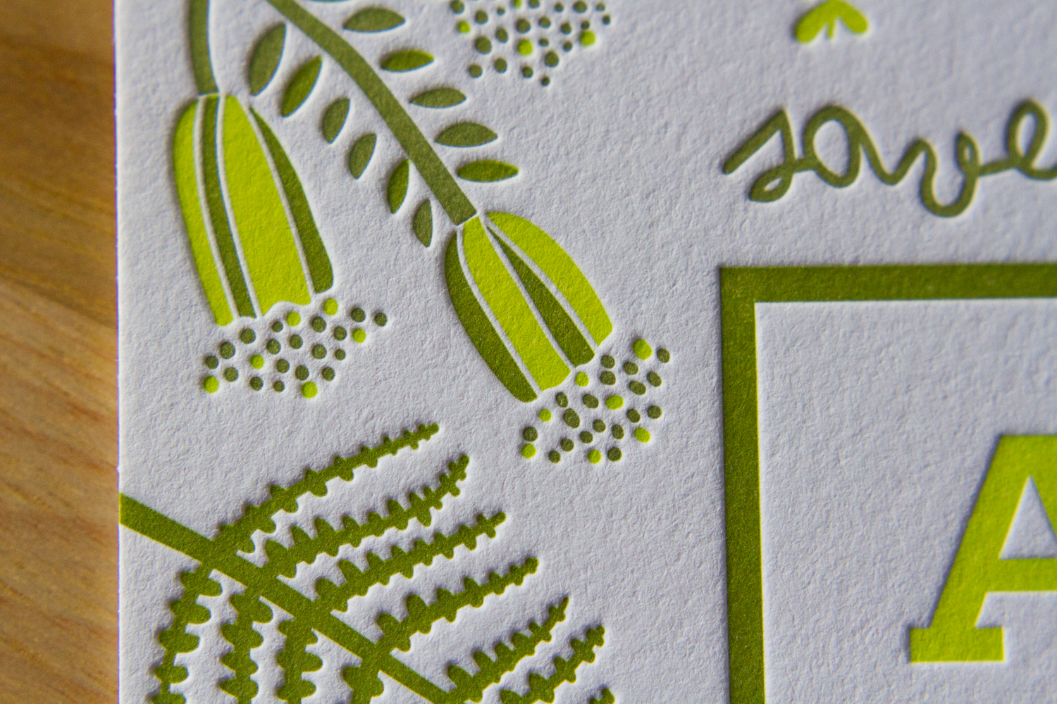
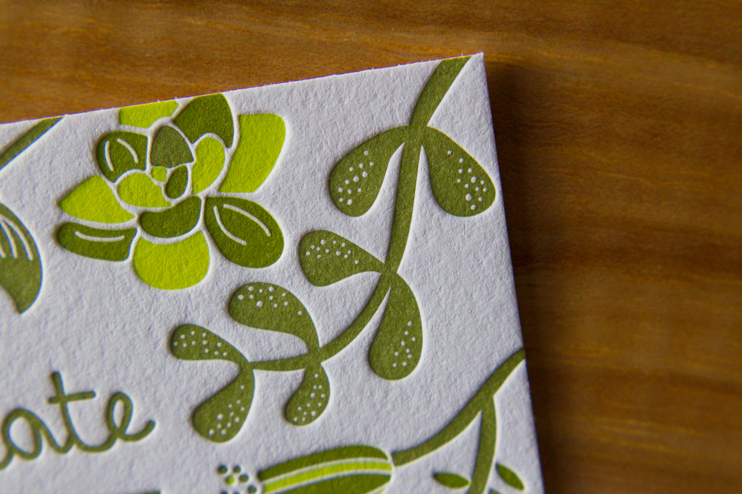
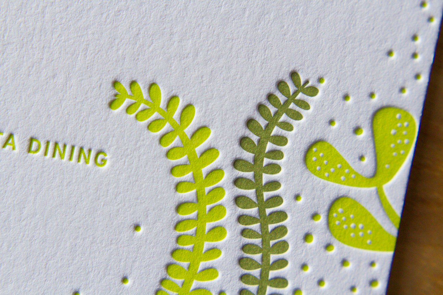
This lively set was based on a 60's style botanical motif printed in two shades of green. Designed by the bride (between her cake-baking sessions), the set was printed with two custom inks on 600g fluorescent white stock.
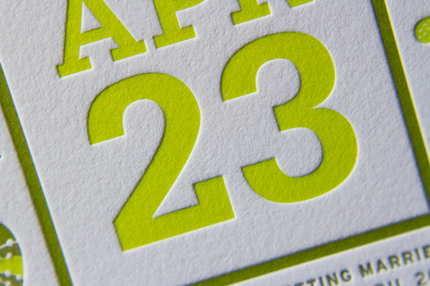
First, a square save the date card — emphasis on the date. The playful greens grow inwards from all sides. The "save the date" is in a handwritten-style script, and the date is in large bold text.
Next, the invitation itself. The flowers and vines border the top and bottom, giving an appearance of open white space on the sides. On closer inspection, an edge of stippled dots accents the two sides, and the spaces between the flowers, creating a casual but grounded border to the artwork frame.
Finally, an information card, to answer crucial questions about accommodations, dress code, and gift registries. This piece uses only a couple of the floral elements, at top and bottom. Together, these three pieces are great example of how use of color and motif can tie together distinct pieces — each has a different layout, and all are reinforced by the common design elements.
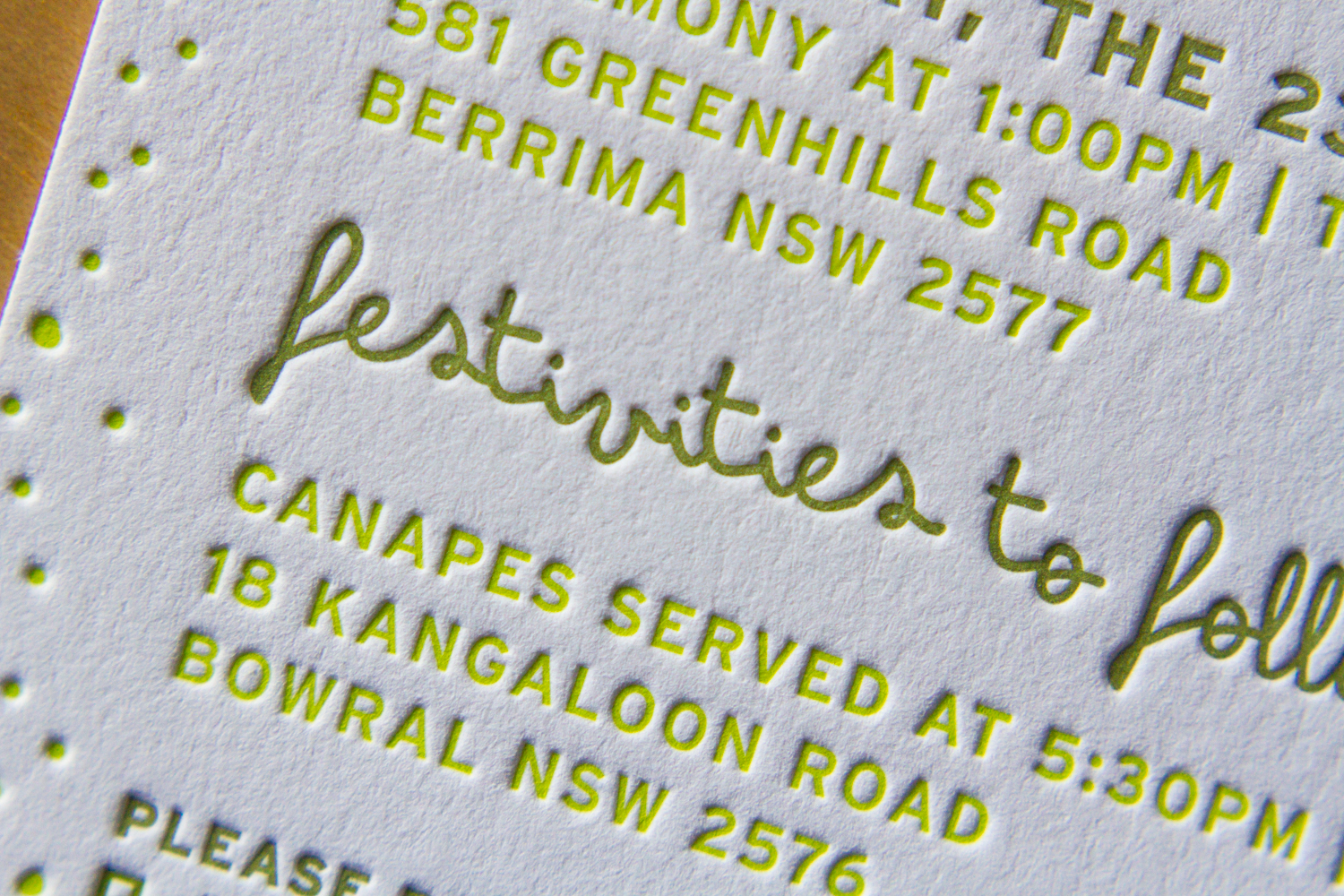
The floral elements of the set's design bring to mind Scandinavian mid-century modern influences. And the lemongrass and avocado colors are similarly evocative of the mid 20th century. All the designs were provided to us by the client, and there are so many parts to love. So here's a collection of detail shots.
One last note, as a brief digression from the design … remember when putting your invitation together that you can say whatever you want to say. This goes especially for information cards. In addition to basic events/travel/lodging details, it's a great place to convey anything you need to the guests. If there are some conditions (a ceremony on a grass lawn, possibility of unpredictable weather, etc.) feel free to say it! Be conversational, be you. We love the way this couple addressed their invitees, and the dress code below is just one example. The warm and chatty tone made it very personal, and goes perfectly with the whimsical graphic style of the artwork.


