Posts tagged thank you notes
A Wedding Between Two Ferns

Last month we featured Luke and Robyn's Mount Hood wedding invitation set. Sticking with the Oregon theme, this time we head south for Julia and Detlev's wedding on the Umpqua River.

Both the wedding ceremony invitation and the rehearsal dinner invite feature fern imagery – somewhat abstractly on the main invite and more realistically and delicately for the rehearsal.

Gold Leaves

Here's a set we did which shows off new technique. (Well, new to this blog … the technique itself is hundreds of years old.) Overall, it's sort of a modified combination of elements from Whirl and Vignette, with a custom, gold-foil-stamped art element. This set included an RSVP card with printed return address envelopes, and — as a nice additional piece — corresponding note cards for the couple's thank you notes.

The custom art motif was inspired by an architectural detail from the wedding venue: a brass inset from a handrail, depicting a golden tumble of leaves, stems and vines. Pretty sweet likeness, huh? The artwork is a perfect re-creation, but to really connect it to the brass original — to make it pop and shine — foil stamping was used throughout the set.

Foil stamping goes back to European Monks in the Middle Ages, but it was possibly inspired by the gold leafing techniques of ancient Egypt. It's a heat-transfer process: an impression is made, pressing metallic foil to the paper surface, and foil is left behind in the impressed design or bits of type. It's a separate process from letterpress (which doesn't apply heat, just pressure and usually pigment), and it creates a look you can't get with ink.

Below is a closer look, showing how the foil reflects light.

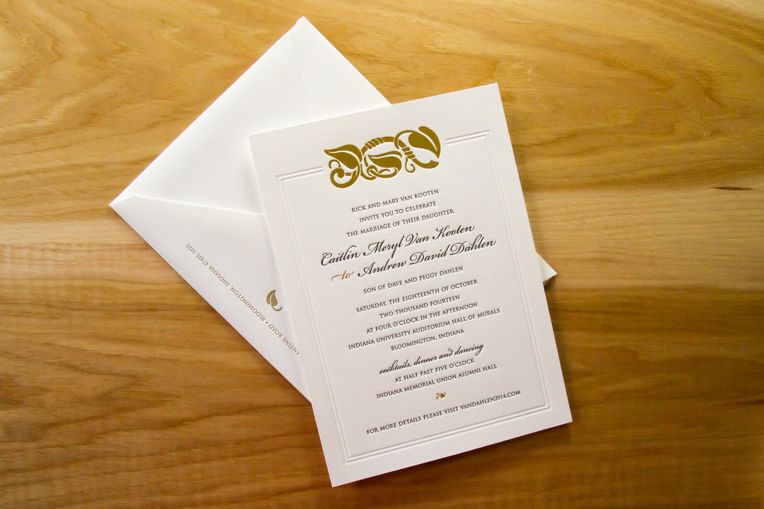
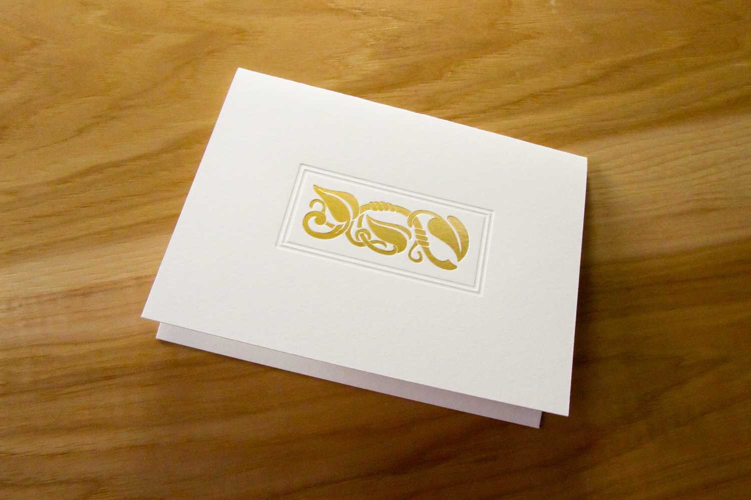
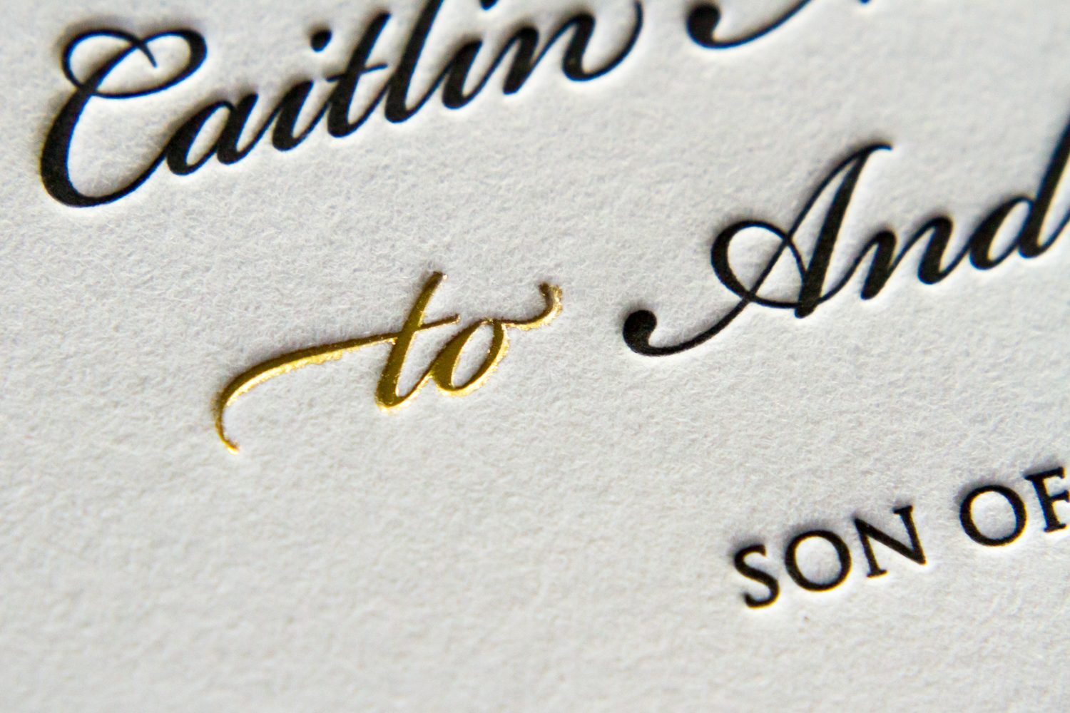
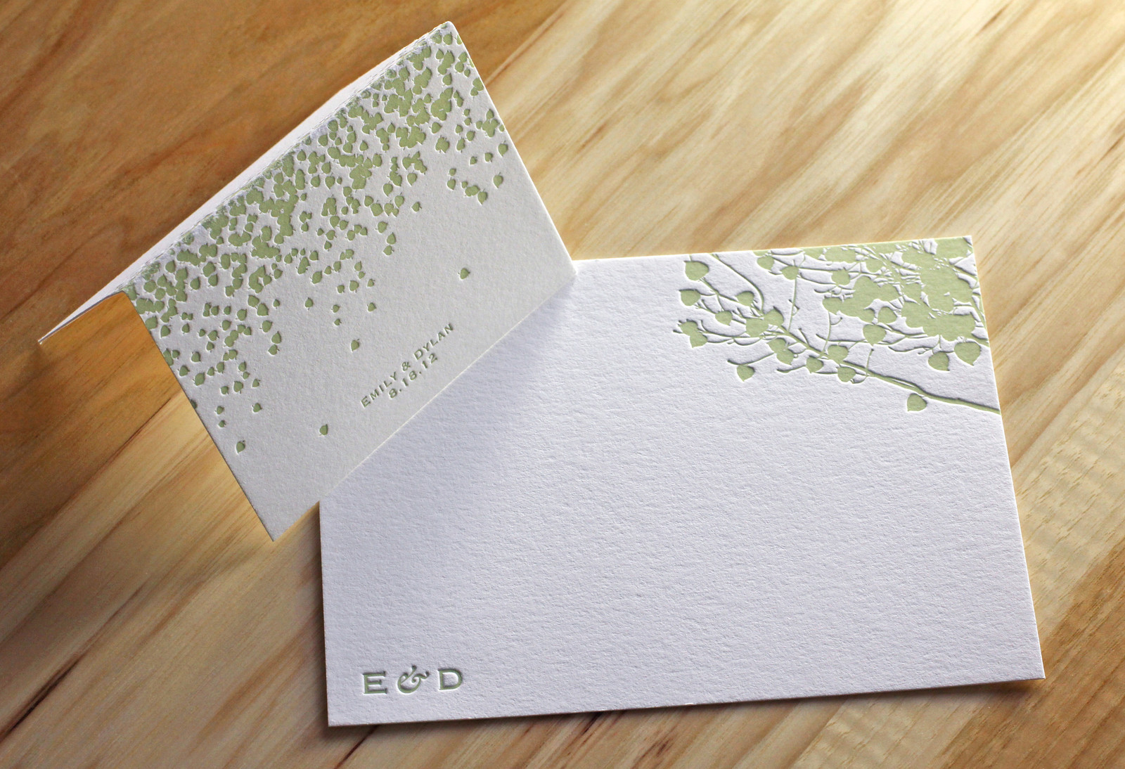
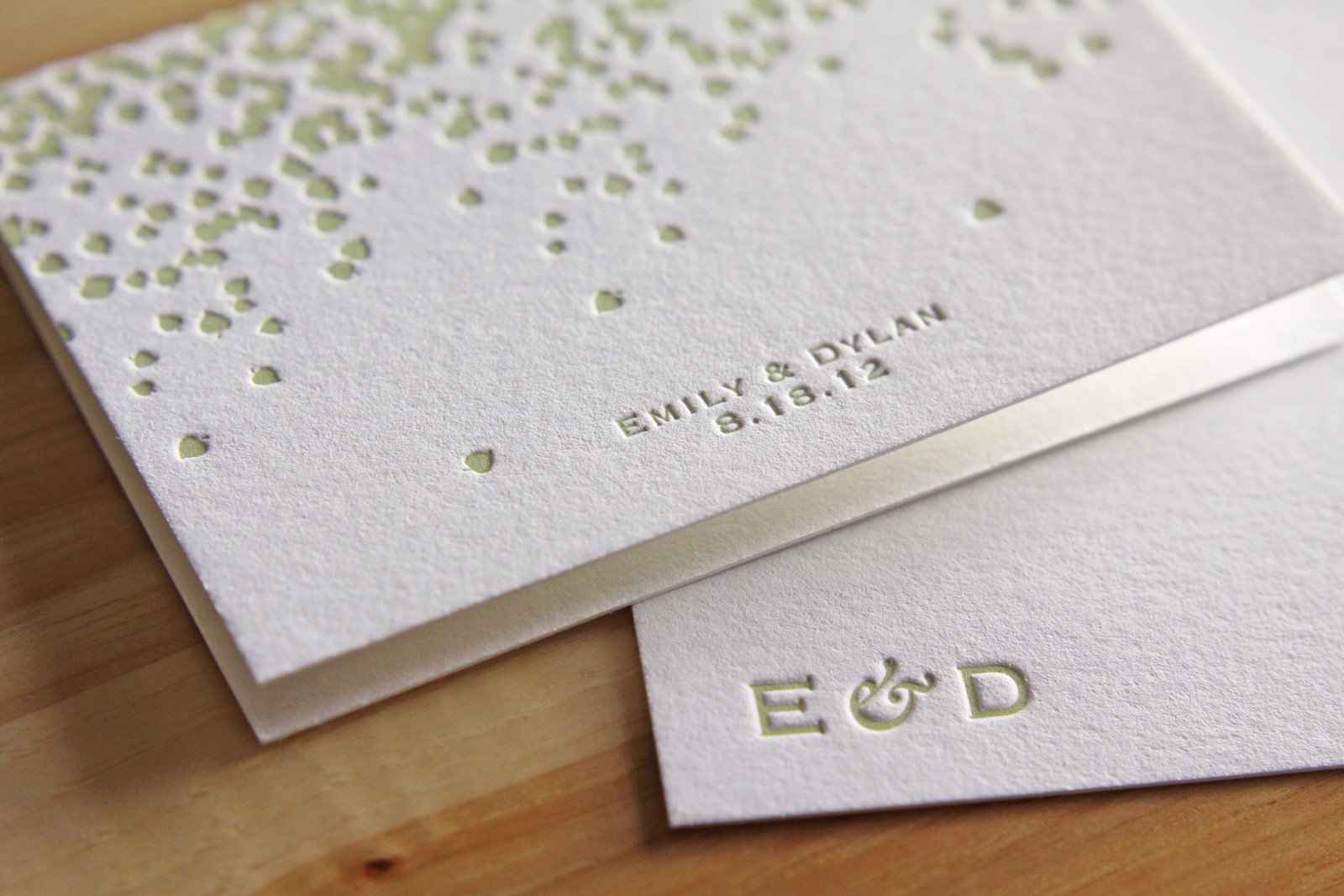
Of course, there are pros and cons to foil stamping, so it's best to use the process thoughtfully. As we've mentioned, it gives a shiny, mirrored look. (Yes, metallic ink is an option — but it usually looks only just slightly metallic when printed on cotton paper.) And because stamped foil is opaque, it can be printed on dark backgrounds; it will appear high in contrast, instead of taking on some of the paper's tone and blending in, as ink would to some degree.

Onto the (yes, inevitable) disadvantages: first, it's more expensive than ink. Not all letterpress printers do foil stamping themselves, so it has to be sent out, which can extend the turnaround time. And from a technical standpoint, the edges don't print as crisply as using the regular letterpress-and-ink process — so fine detail work isn't as clean.

For this job, however, it was the perfect solution. Above, see how the lovely details of the set are carried throughout: from the custom double border used on the invitation and the thank you card, to the gold foil-stamping used for the the  "to" and leaf dingbat, to the leaf motif used with the return address on the envelope flap. (Note the gold ink selected to match the the color of the gold foil accents.)

Letterpress printing with foil stamping, as it's used here, really is something special. And despite the the fact the processes have been around for centuries, most people have probably never seen both techniques used together — nor held in their hands something printed this way. Bits of shiny gold next to crisp, black text on a heavy pearl paper stock: this invitation sets the stage for an elegant, formal wedding.

Photos by Sarah McCarty Arneson
Ontario Romance on Lake Muskoka

This was a fun set to design, as it featured custom hand-drawn illustrations incorporating many personal details from the day — a cozy cottage on a pebbly lake shore, the family dog, and the couple's name waving in a banner. Printed on pearl white paper in stone and peacock inks, the artwork's color palette had a northern-lake feel. Paired with a handwriting-style font, the set conveys the warmth and personality of the lakeside wedding.

The RSVP card carries on the casual tone of the wedding, featuring the options "see you on the dock" or "stuck in the city." Thinking ahead, Danielle and Benjamin ordered corresponding custom thank you notes cards to thank their family and friends for wedding gifts.

Photos by Sarah McCarty Arneson
Minimalist in Long Island City

After seeing the Parker invitation design featured in Martha Stewart Weddings, Liz and Adriel were drawn to the classic look of the invitation. They knew they wanted letterpress invitations; in Liz's words, they were "choosing to send physical invitations in a digital world," so the texture of the imprinted text and the feel of the paper was critical to their selection.

invite_ElizabethLONGISLANDCITY_0274 web.jpg

The couple chose a minimalist response card so that guests could add personal notes and unique replies. They received lovely good wishes, drawings and jokes from loved ones; the response cards became keepsakes. They personalized the design of the invitation by adding their names in Hebrew (offset from the main text in Dust ink). The invitations were edged in Grass and the envelopes were lined with a matching metallic paper. The green and white matched their wedding colors and flowers. Finally, the couple ordered simple, elegant cards to be used as thank you notes after the wedding.

Photos by Sarah McCarty Arneson
Summer Vail

Emily and Dylan's adaptation of our Vail invitation is great. We changed the Tangerine ink to Light Celadon and opted for Fluorescent White paper instead of Ecru and the look, once warm and autumnal, became bright and fresh -- perfect for their summertime wedding.

We carried the look through to the place cards and thank you notes as well, keeping the same theme without simply repeating the same artwork.

Photos by Sarah McCarty Arneson
Scripted Bookplate

In this variation on our Bookplate invite Maggie and Mike softened the look a little bit by adding some Bickham Script type in Deep Plum ink for their names and the reception line. Slate envelope liners to match the Slate ink give the set some added polish.

Rather than over-stuff the envelope with accommodations info, directions, etc, the couple opted to keep things simple with a business-sized card directing guests to their wedding website.

Photos by Sarah McCarty Arneson