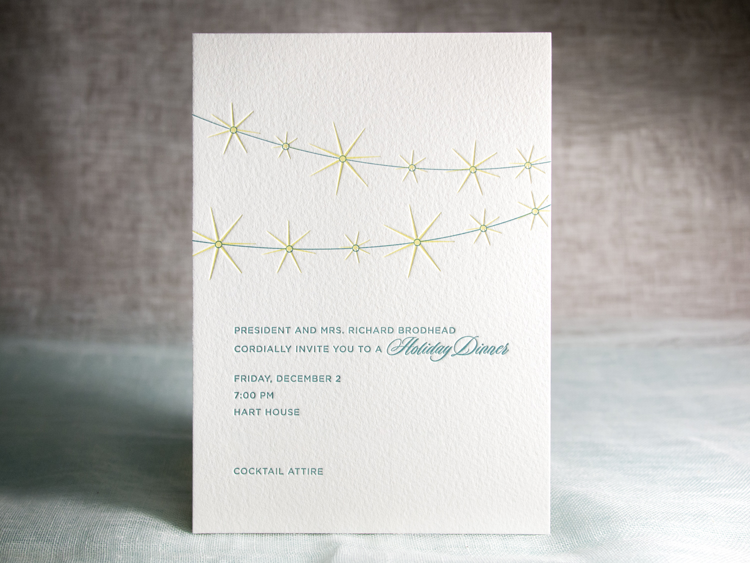
Our Lights Holiday Card, printed for the Parklife alma mater, Duke University.
PAPER 300g Somerset White
INK Peacock & Lemonade
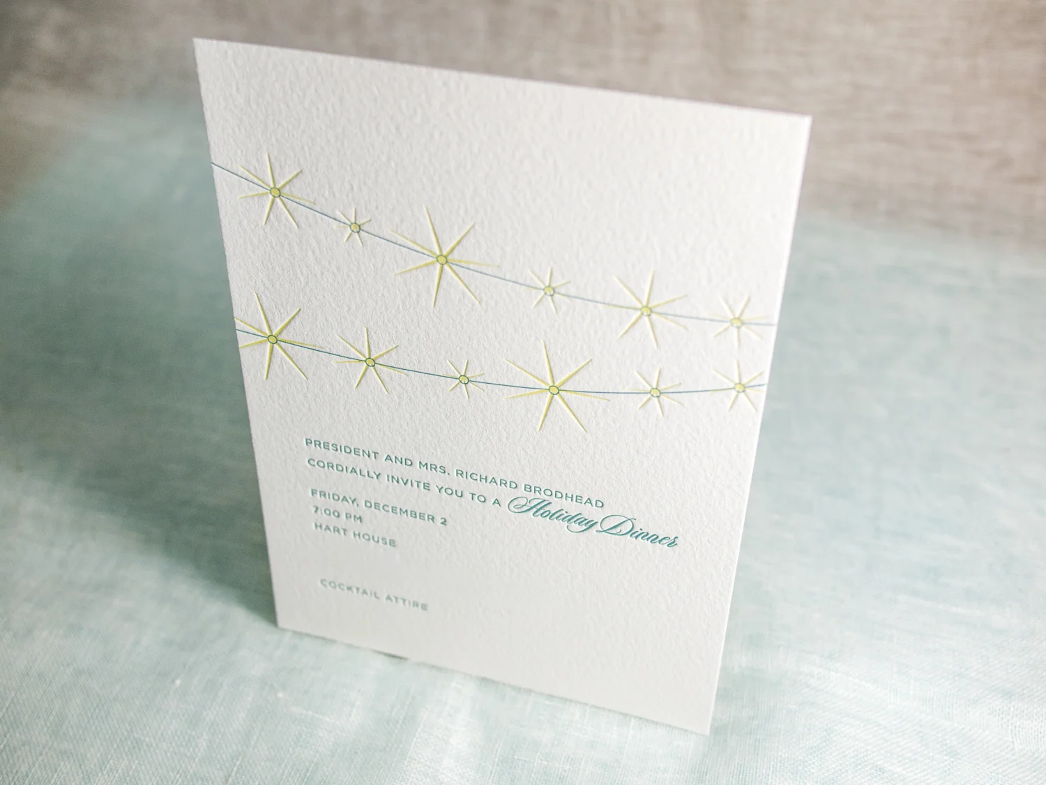

Our Lights Holiday Card, printed for the Parklife alma mater, Duke University.
PAPER 300g Somerset White
INK Peacock & Lemonade
This cheerful set was based on Parklife's Antiquity. It's one of our most popular designs. As we describe on the site, "The overlapping light and dark motifs give this invitation a sense of motion that's unlike anything else in our collection." This version has been modified a bit: the couple chose pearl white paper and a vertical orientation. By the way: we love it when people ask for modifications; our designs are a jumping-off point, but we want our clients to have exactly what they want.
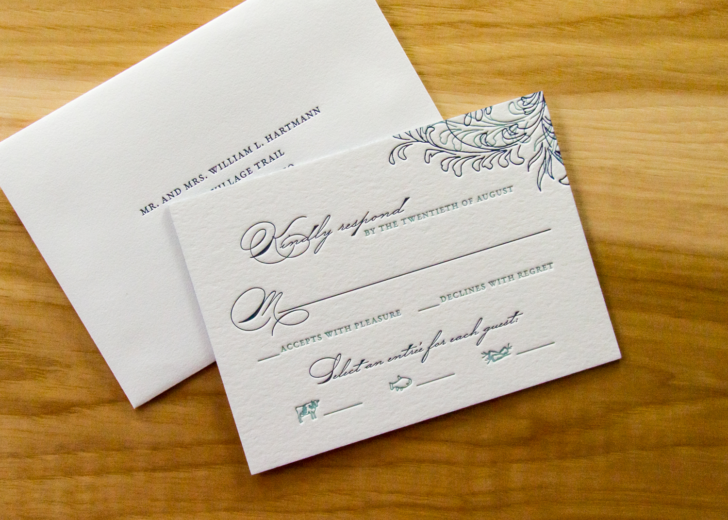
This set had a fun combination of a traditional-looking calligraphic script paired with a modern, expressionistic contour drawing of leaves and garlands.
The thin parts of the script's stroke mirror the line art of the flora design. The two inks, midnight and peacock, compliment each other beautifully, and pop off the pearl white stock. The pieces are edge-painted in midnight.
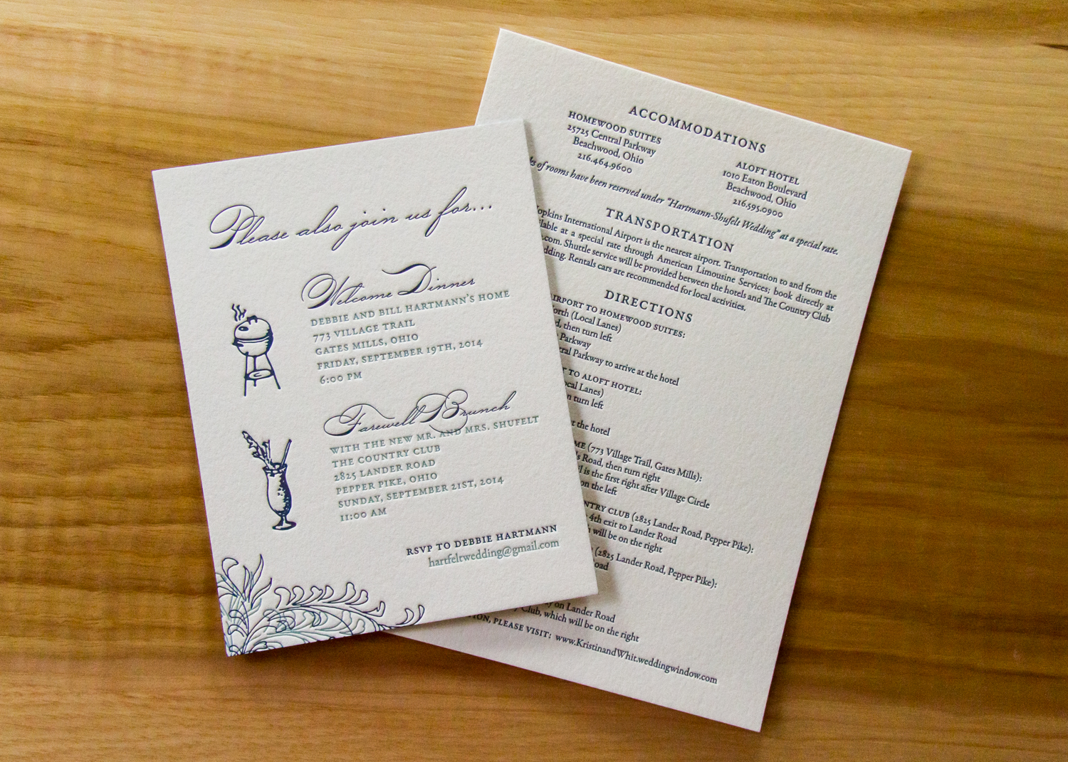
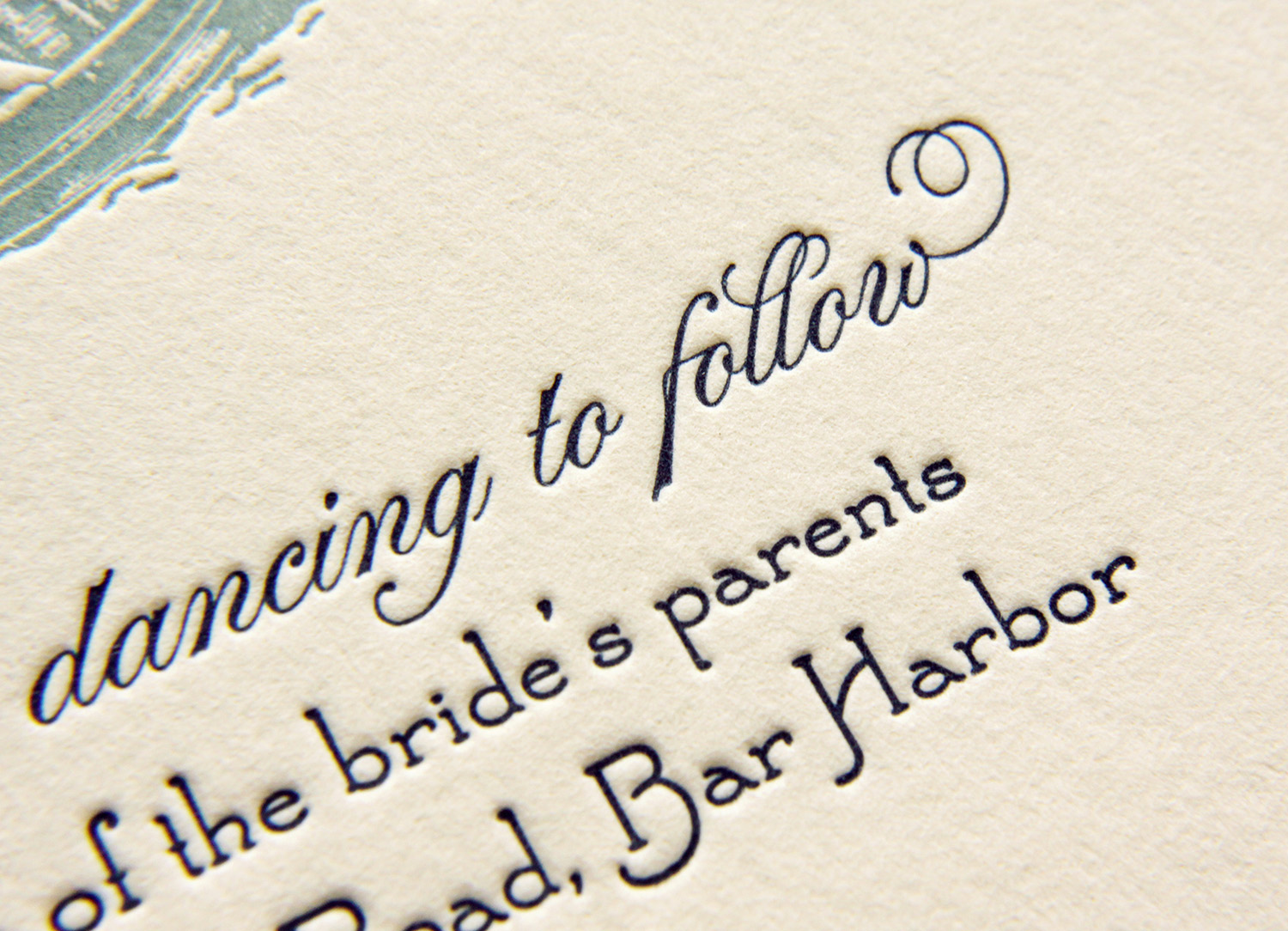
Along with the invitation and RSVP card and printed return envelope, the set included these two additional pieces. An information card detailed directions and accommodations, and a separate card invited guests to a welcome dinner and a farewell brunch.
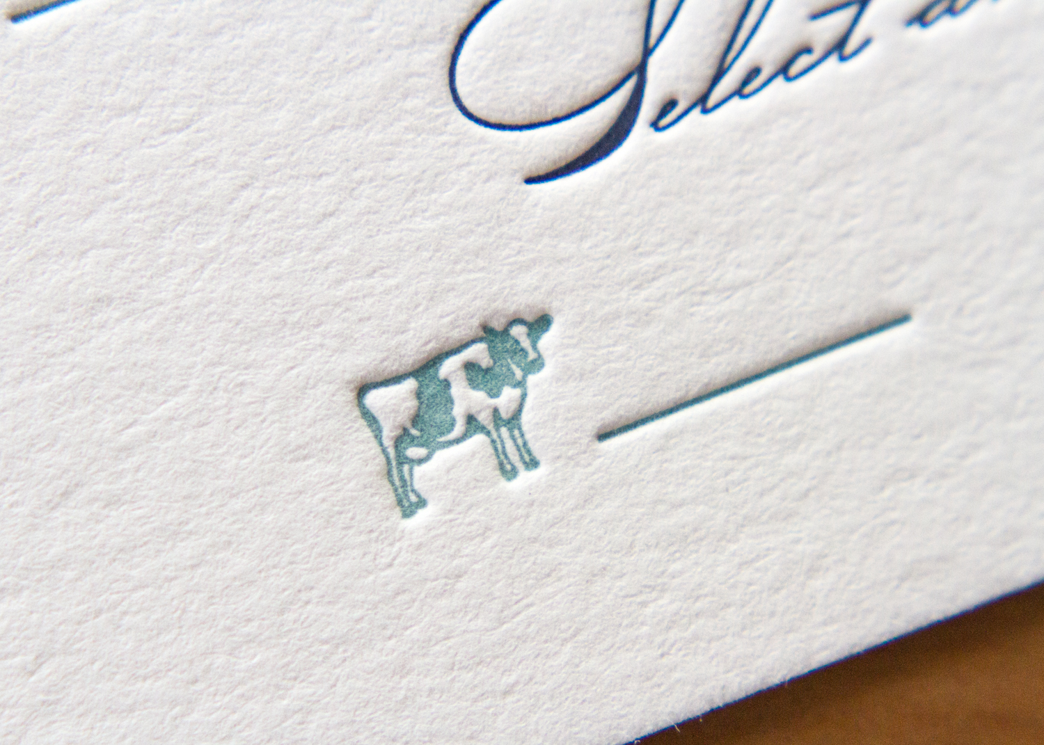
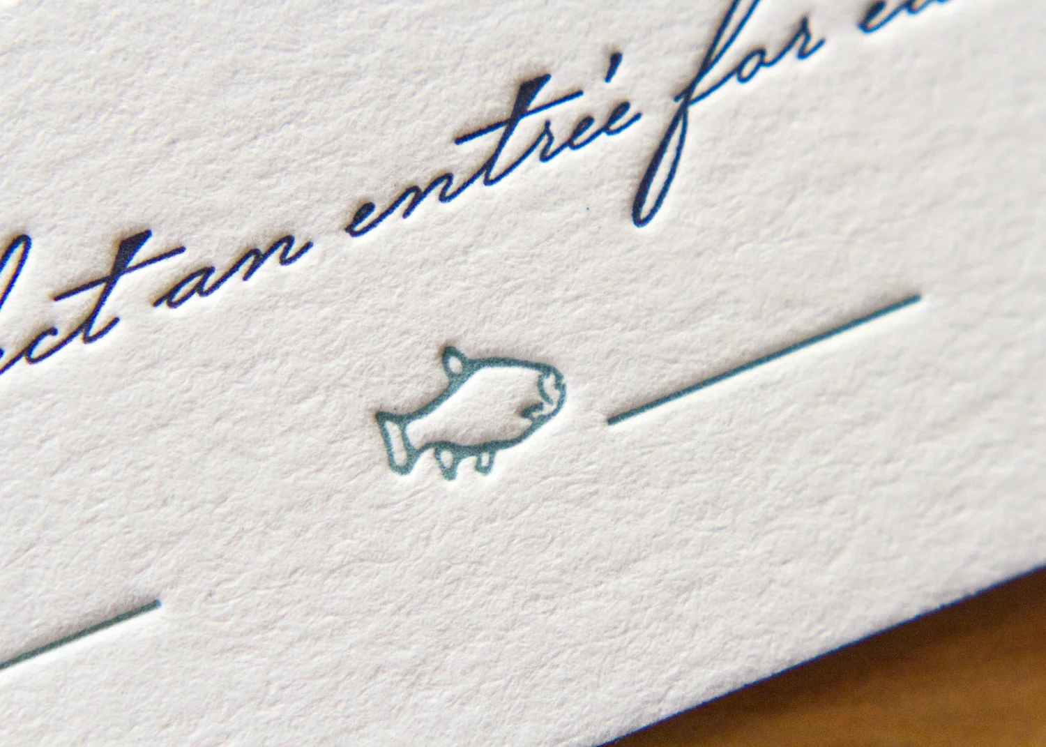
The dancing vines weren't the only graphic elements of this set. The RSVP card used playful icons — a cow, a fish, some carrots — for guests to select either the beef, seafood, or vegetarian dinner options. And, the "additional events" card featured custom illustrations done by Parklife Press. For the welcome dinner: a homey, old-school charcoal barbecue; and for the farewell brunch: a bloody mary, complete with celery stalk.
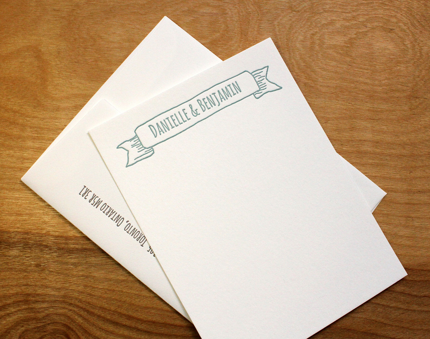
This was a fun set to design, as it featured custom hand-drawn illustrations incorporating many personal details from the day — a cozy cottage on a pebbly lake shore, the family dog, and the couple's name waving in a banner. Printed on pearl white paper in stone and peacock inks, the artwork's color palette had a northern-lake feel. Paired with a handwriting-style font, the set conveys the warmth and personality of the lakeside wedding.
The RSVP card carries on the casual tone of the wedding, featuring the options "see you on the dock" or "stuck in the city." Thinking ahead, Danielle and Benjamin ordered corresponding custom thank you notes cards to thank their family and friends for wedding gifts.
In her words, Adrien and her mother "always had a 'thing' for wedding invitations." When envisioning the big day, invitations were job one — and an important job, at that. According to Adrien: "We believe they fully set the tone for the wedding, long before the actual day arrives. They create all the anticipation for the guests in the days leading up to the party. We were willing to spend the money on custom letterpress invitations because we believe in the art of creating invitations in such an old fashioned way."
The feel for their wedding was old-fashioned, ocean-side, farmhouse. For her own invitations, she said she knew she wanted the feel to evoke a style of "simple, yet classy" and "formality, without pretentiousness." They started with the Sand Dollar design.
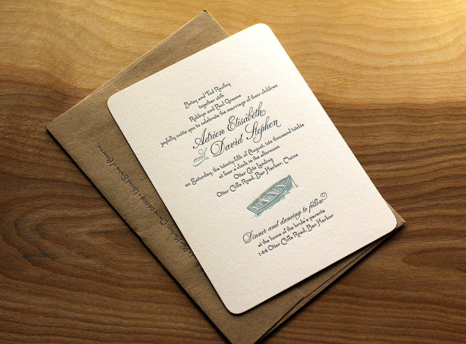
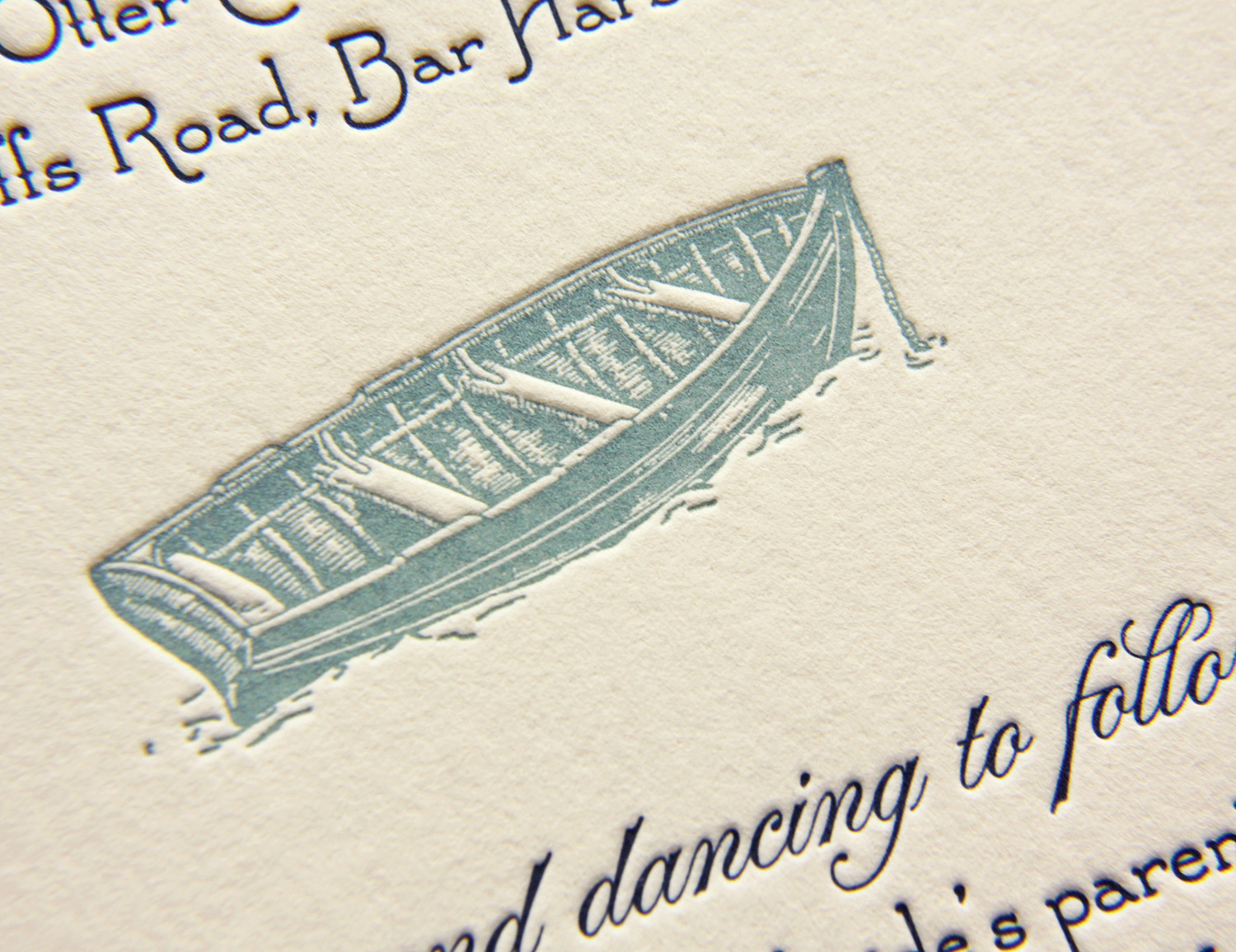
Adrien and David got married at her family's home where she grew up. It was within walking distance to the ocean, and the ceremony was held seaside. The artwork ended up being a simple choice, for in Adrien's words, "We have always been on the water, in the water, around the water. Dave proposed in a rowboat, and we thought a dory on our invites would be a great icon for that, as well as where we were getting married." She sketched a few ideas and Travis took it from there.
Having few letterpress options in Maine, Adrien found Parklife Press online. And the oceanside wedding was exactly as personal and distinctive as they had hoped, said Adrien. "We had a wonderful day, it was perfect."