Posts tagged ecru white paper
(Bar) Harbor-side Wedding

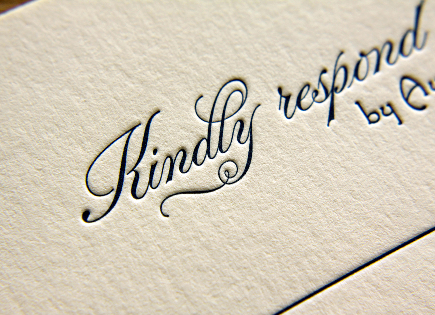
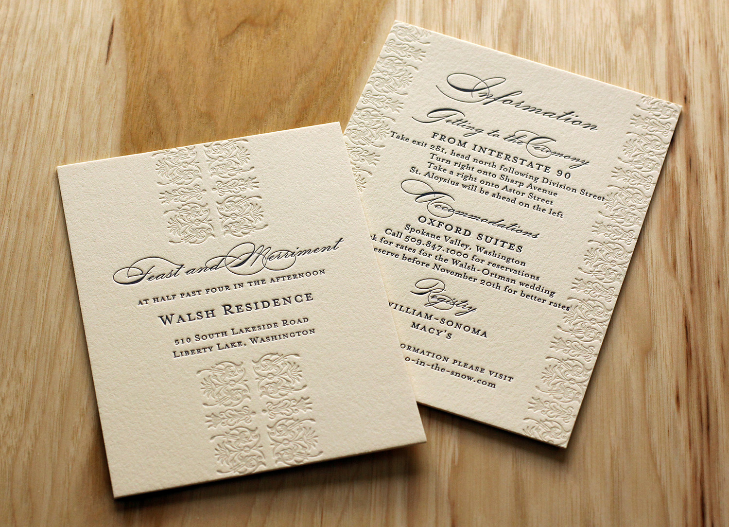
In her words, Adrien and her mother "always had a 'thing' for wedding invitations." When envisioning the big day, invitations were job one — and an important job, at that. According to Adrien: "We believe they fully set the tone for the wedding, long before the actual day arrives. They create all the anticipation for the guests in the days leading up to the party. We were willing to spend the money on custom letterpress invitations because we believe in the art of creating invitations in such an old fashioned way."

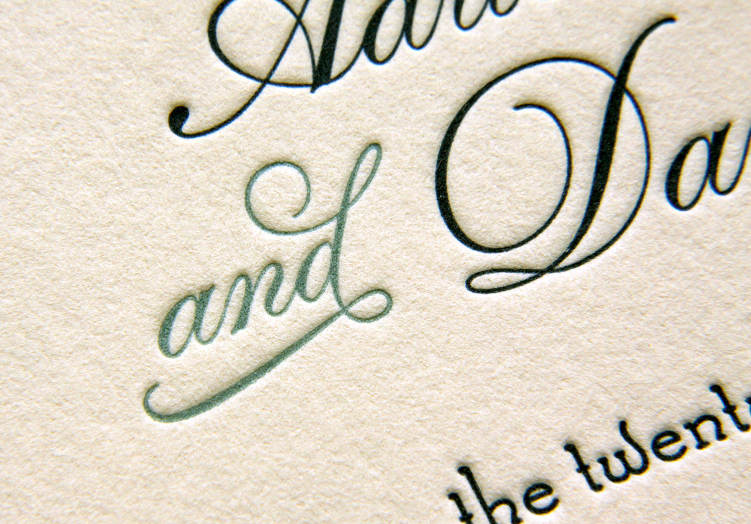
The feel for their wedding was old-fashioned, ocean-side, farmhouse. For her own invitations, she said she knew she wanted the feel to evoke a style of "simple, yet classy" and "formality, without pretentiousness." They started with the Sand Dollar design.

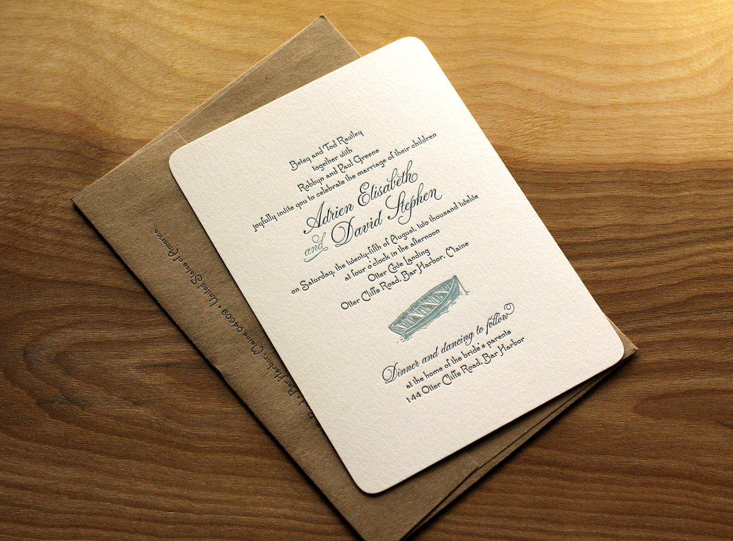
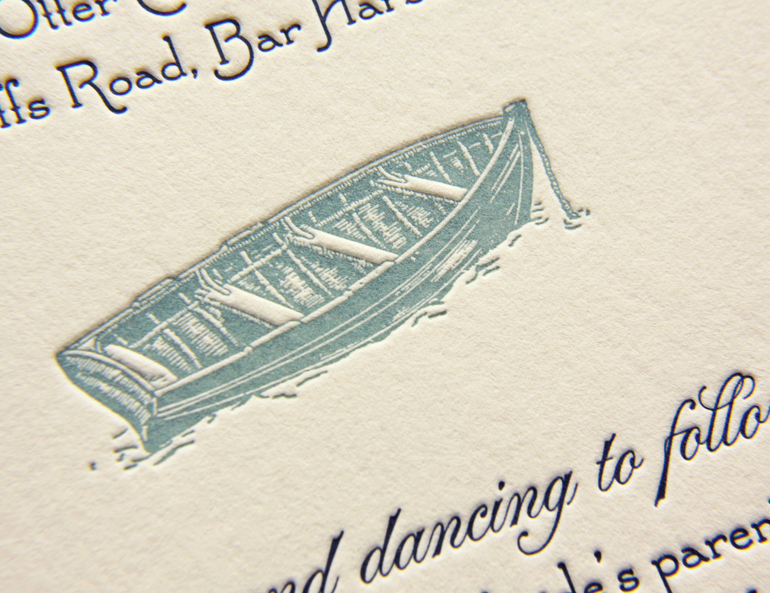
Adrien and David got married at her family's home where she grew up. It was within walking distance to the ocean, and the ceremony was held seaside. The artwork ended up being a simple choice, for in Adrien's words, "We have always been on the water, in the water, around the water.  Dave proposed in a rowboat, and we thought a dory on our invites would be a great icon for that, as well as where we were getting married." She sketched a few ideas and Travis took it from there. 

Having few letterpress options in Maine, Adrien found Parklife Press online. And the oceanside wedding was exactly as personal and distinctive as they had hoped, said Adrien. "We had a wonderful day, it was perfect."

Photos by Sarah McCarty Arneson
Autumn Paisley

Jennie and Mark found the perfect necktie for him to wear at their autumn wedding — the pattern was a stylized paisley in orange and brown, with some lilac. That purchase turned into the inspiration for their wedding invitation. They loved letterpress, and after searching a bit for a good, independent printer, they found Parklife Press.

A friend designed the card for them, using the motif of the modern paisley swirl at top and bottom. They were excited about a single-page invitation, which gave guests contact information to RSVP and directed them to their wedding website for details.

invite_JennieHIGHGROVE_0233 web.jpg
Photos by Sarah McCarty Arneson
Winter Wedding in Spokane

Sydney and Kramer knew little about letterpress before planning their wedding, but heard that the printing style could make beautiful invitations. After some research, they found Parklife Press and loved the designs. When they got some of our samples in the mail, they were sold — they knew the elegance of the invitations would go perfectly with the winter wedding they were planning.

Kramer searched for different ideas and came up with the basic concept for the invitations. With Travis' help, he found the border design online and put together a basic mockup.

The border design was printed with a very light ink in a warm gray tone. The subtle tone blended well with the paper color, and added texture to the design without appearing as an additional ink color. On each piece of the set — which included an invitation, an RSVP card, a reception invitation and card providing lodging and directions — the border art was used, either on the edges, as a center strip, or both. The text and monogram were printed in a dark blue, which coordinated with the ivory, blue and gray colors used in the wedding. Kramer felt the mixture of small-caps and script typefaces allowed them to showcase the modern elegance of their wedding, and that the invitation design, along with its colors, gave their guests the "perfect preview" of the event.

Photos by Sarah McCarty Arneson