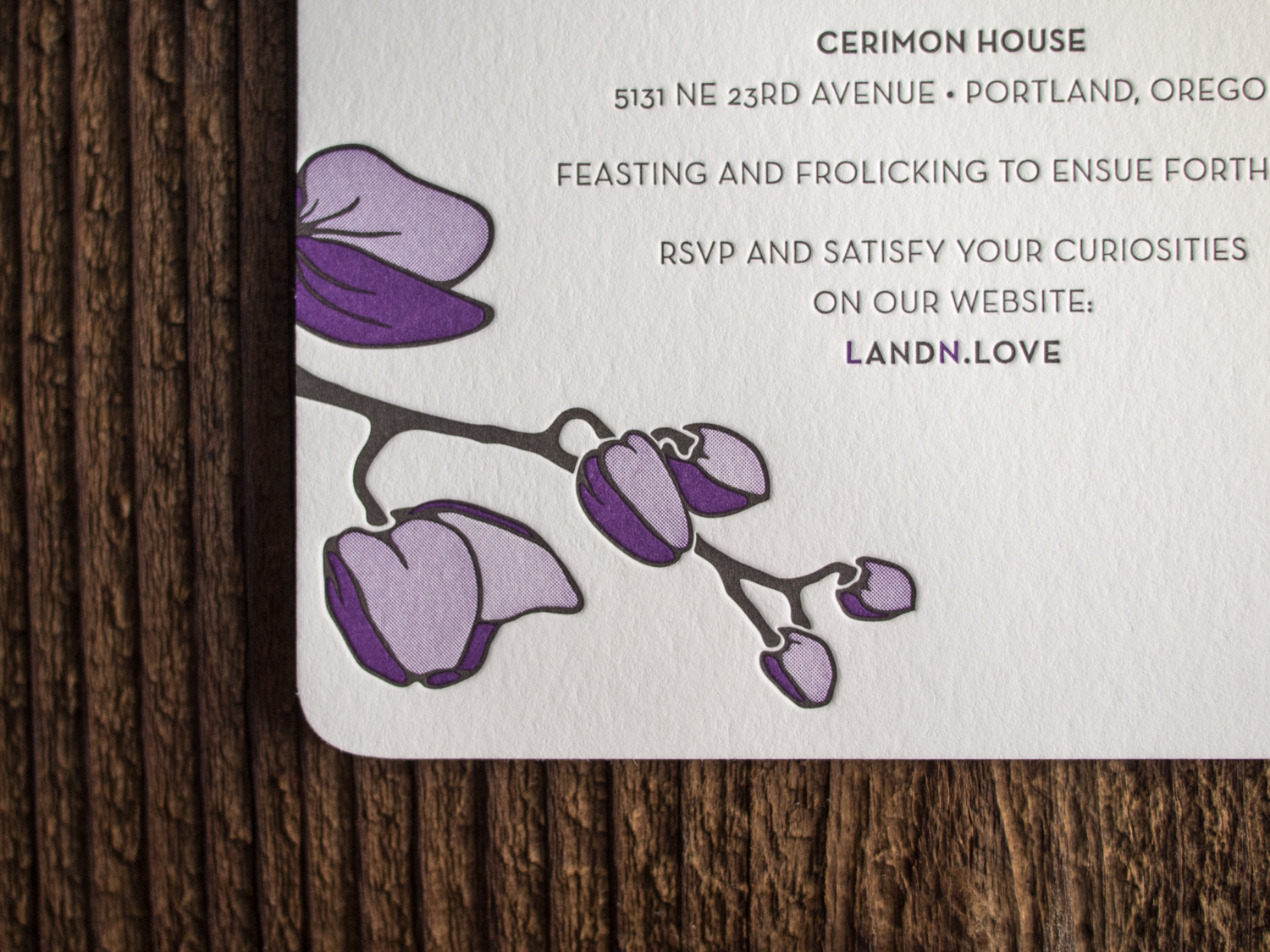
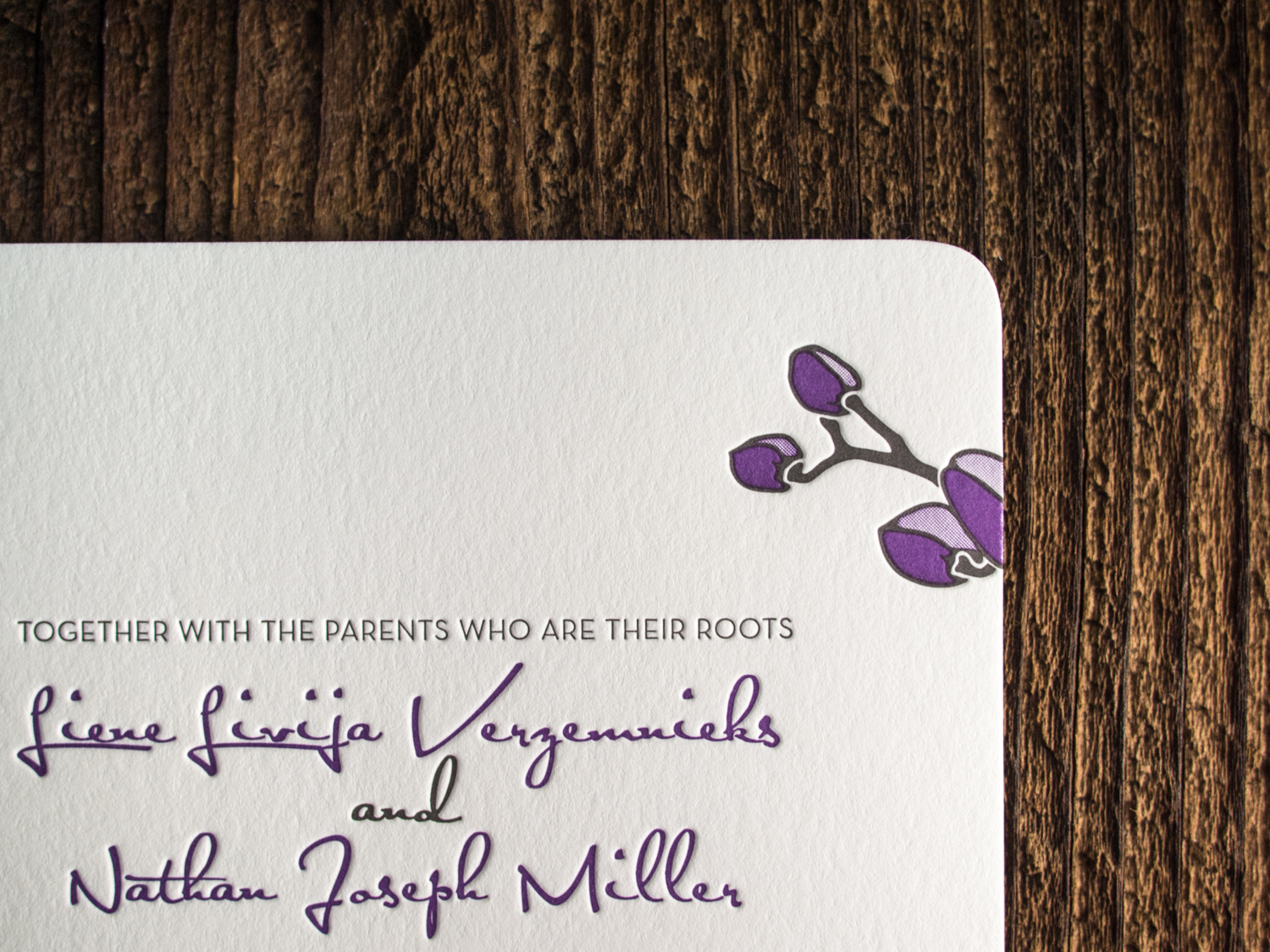
For fellow Portlanders Nathan and Liene, we created a customized variation on our Petal invitation. We kept the round corners and multi-tone orchid art, but changed the fonts, orientation, and inks.


For fellow Portlanders Nathan and Liene, we created a customized variation on our Petal invitation. We kept the round corners and multi-tone orchid art, but changed the fonts, orientation, and inks.
This is one of our favorite client-designed wedding sets of the summer. Elaine and Joseph's invites mimic the lush forest that surrounded their venue in the Santa Cruz Mountains, complete with ferns, pinecones, and slugs.
We mixed a custom dilution of our Light Celadon ink to let the deep impression of the artwork really stand out.
We printed these oversized invites for the friendly folks at Frou Frou House with a very light cool gray ink and a deep blind impression. They're printed on our 600g Fluorescent White stock sized for large A9 envelopes.

Our Belvedere invitation is traditionally rather formal — printed with a graphite ink and a blind impression for a bold but stark feel. But Maura and Matthew wanted something a little more playful and a touch more Downton Abbey. So we swapped out the Mrs Eaves text and Burgues Script for the more lighthearted combo of Carlton and Parfumerie, punched up the color with two shades of lavender, and opted for a prim and proper flourish motif.

For Courtney and Ben's set, we started with our popular Whirl invitation, but added gold foil and edge paint for some extra pizzazz.
The original Whirl uses gold ink, which has just the slightest hint of metallic shimmer. But gold foil is something else entirely — it's extremely shiny with a reflective mirrored look. And if you'd like something in between, our gold satin foil is a little less intense than the gold shine used here.
For paper, Courtney and Ben went with our thick and textured soft white 600g Arturo in a 5x7 size with rounded corners. We finished out the set with our euro-flap Arturo envelopes and a gold foil + black letterpress flap.
At the time of this post, a Google image search for "ostrich wedding invitation" turns up not a single invite with a full ostrich. Ostrich feathers, sure. But no full birds. Chia and Kendall sought to change that, and we were happy to help.
Using our Fountain invitation as a template, we added a confidently-posed custom-drawn ostrich to the top, and carried the artwork through to website cards and thank you notes (notes regrettably not pictured).
Back in April of 2015 we printed some excellent business cards for designer Amanda Benincasa. And then a few months later, she asked us to print her wedding invitations.
The background floral image is actually just Pantone black ink — but when printed on the black Rising Museum Board, it creates a sort of bronze effect (take a look at our tintype photo frames for the same combo in a different setting). And for the text, we did a custom mix of gold and silver to match Envelopments Champagnium stock.
For the reply cards we used the same ink but with our pearl white cotton paper for easier writing.