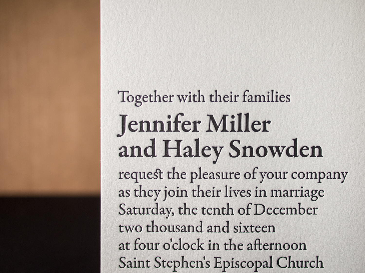
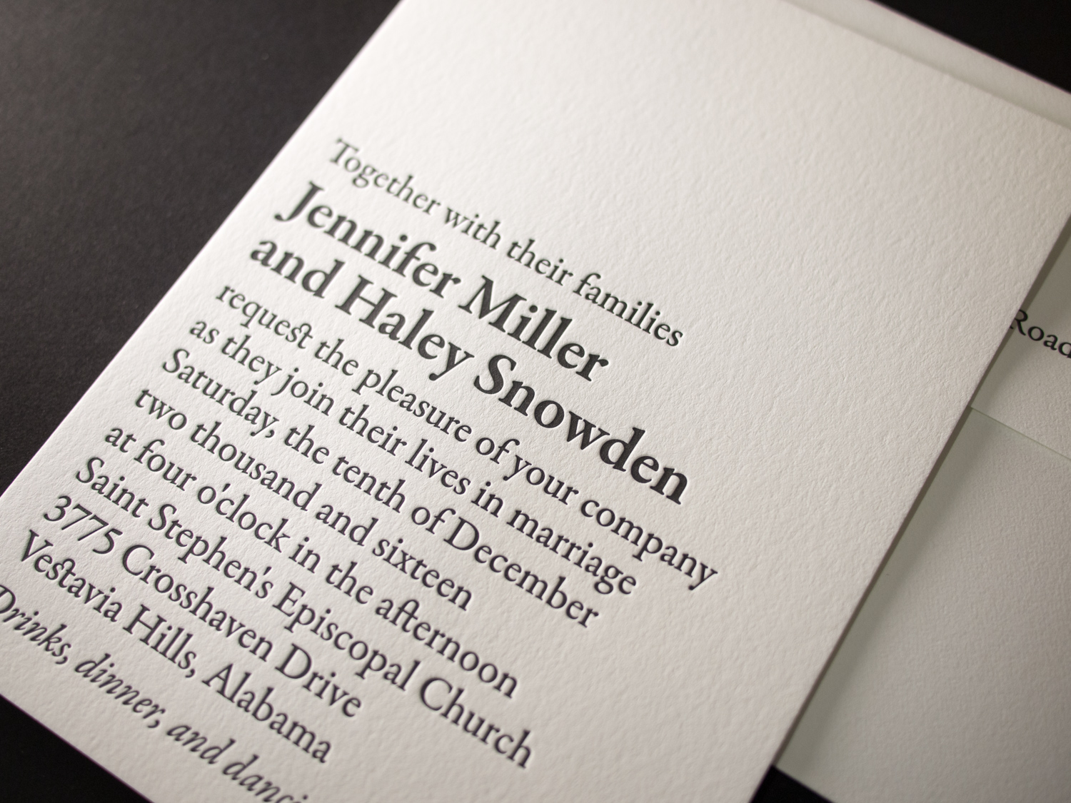
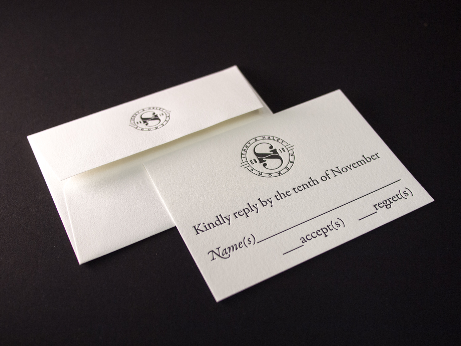
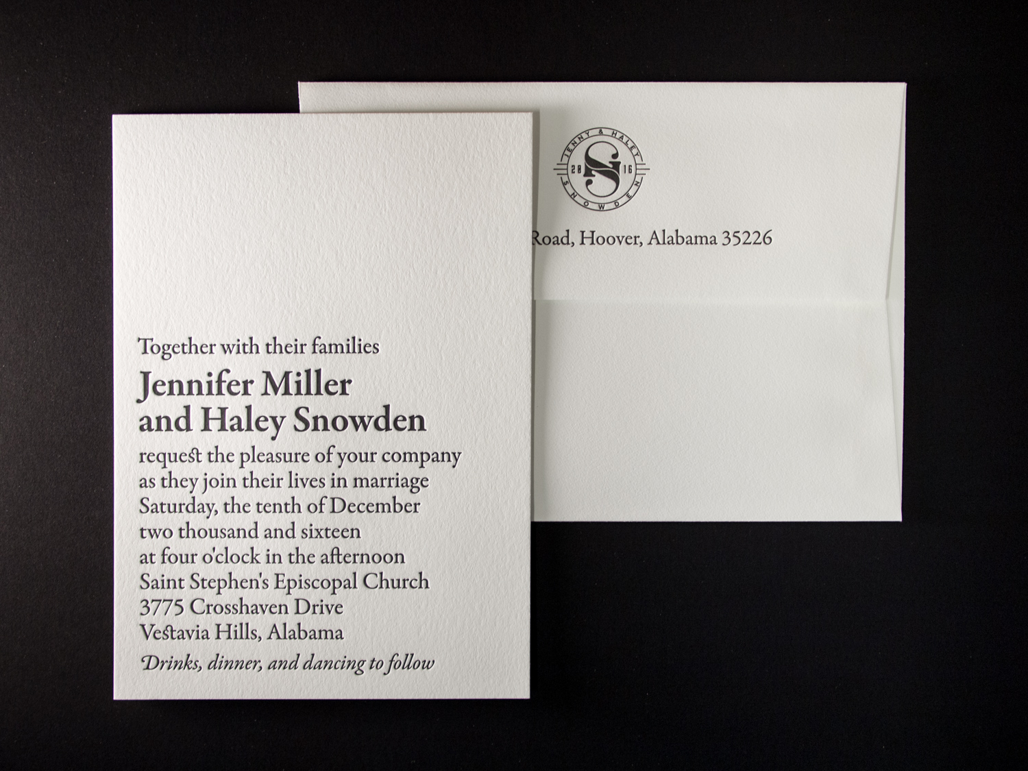
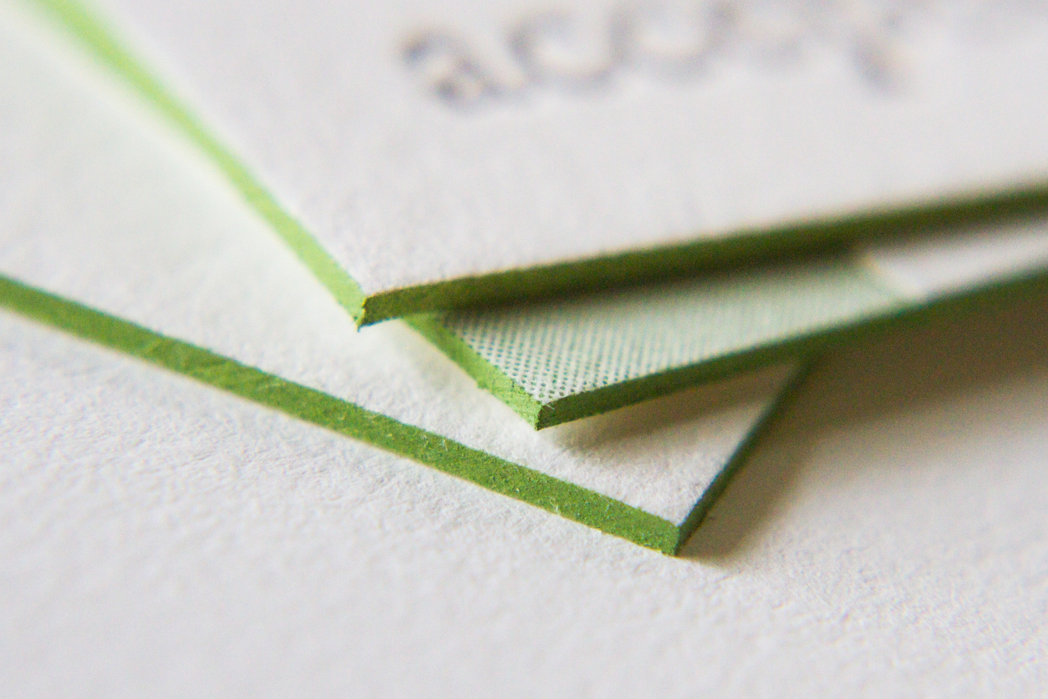
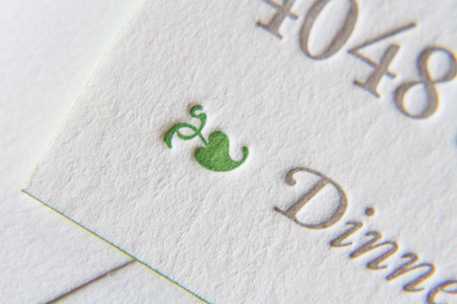
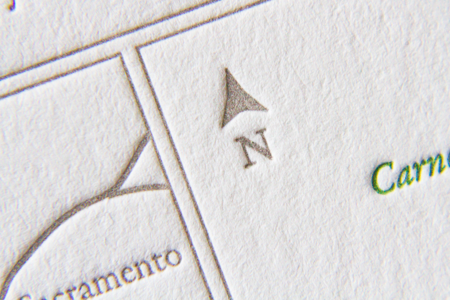
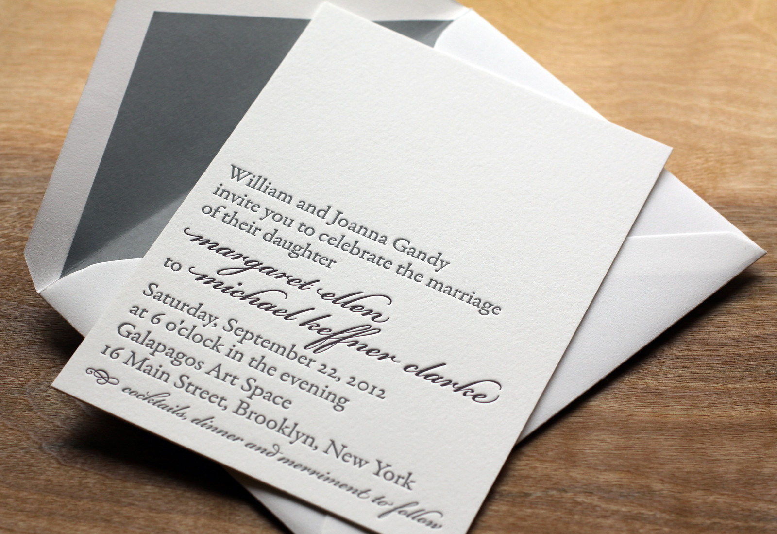
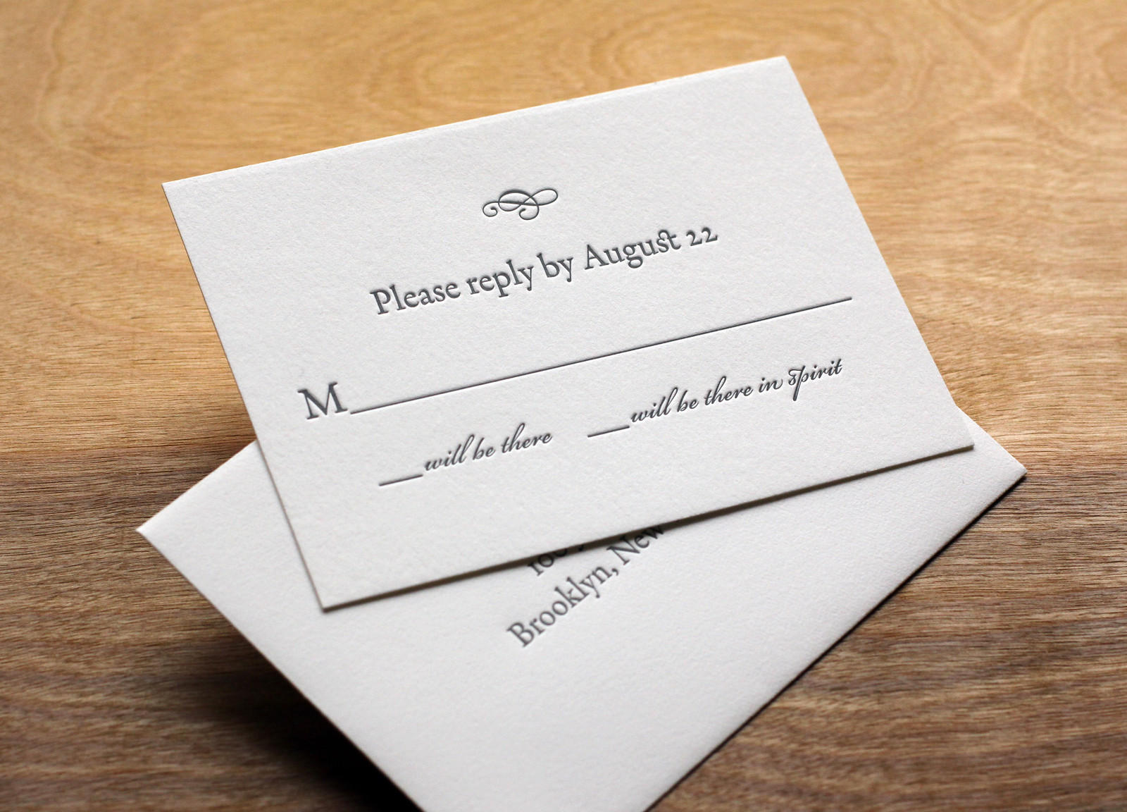
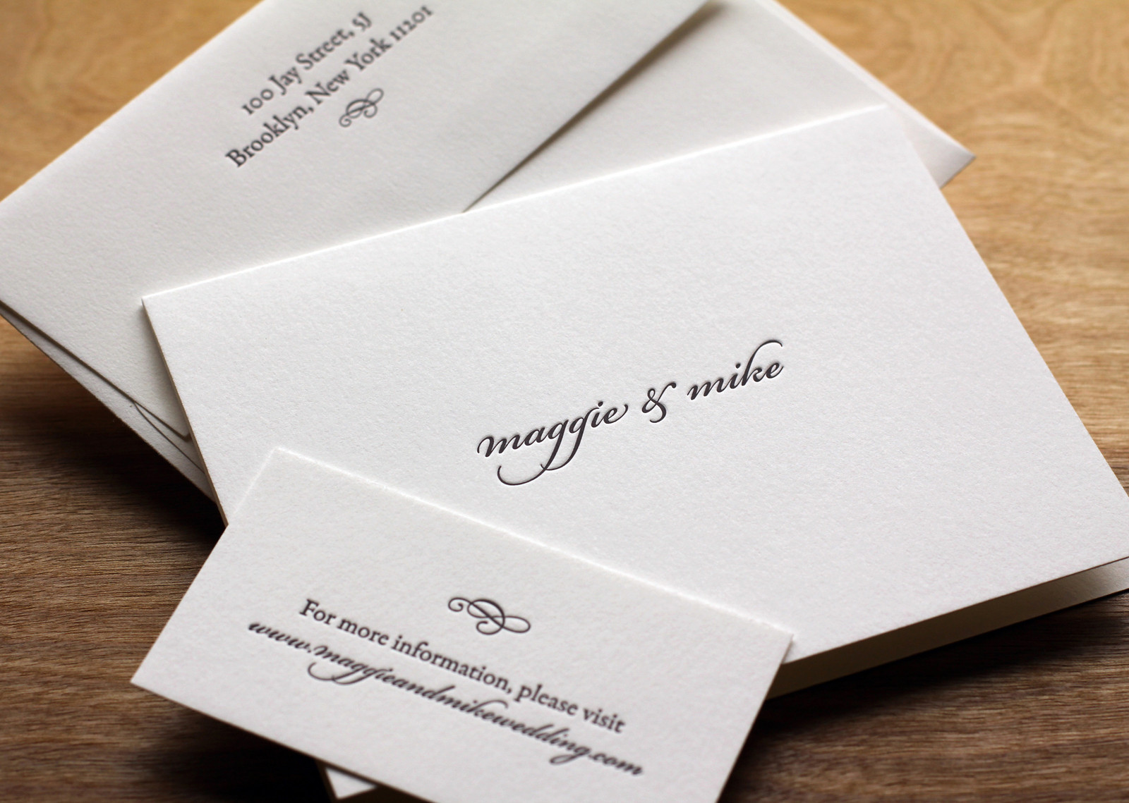
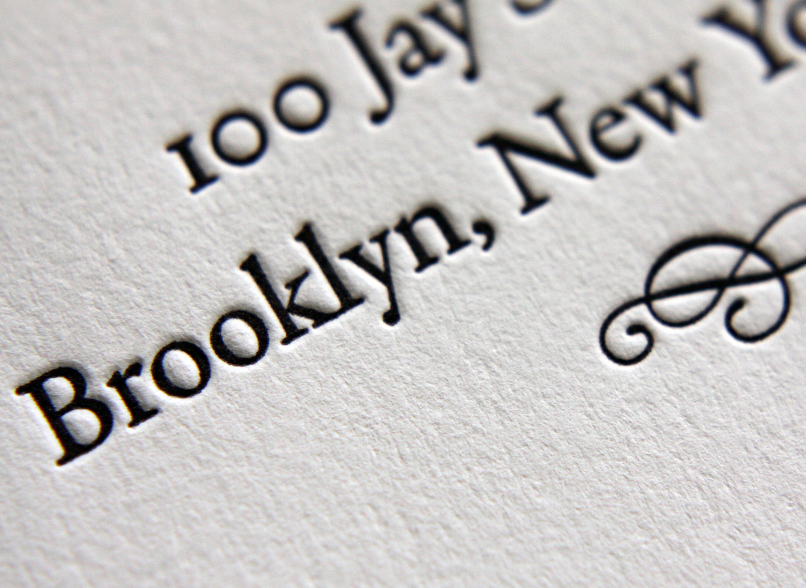
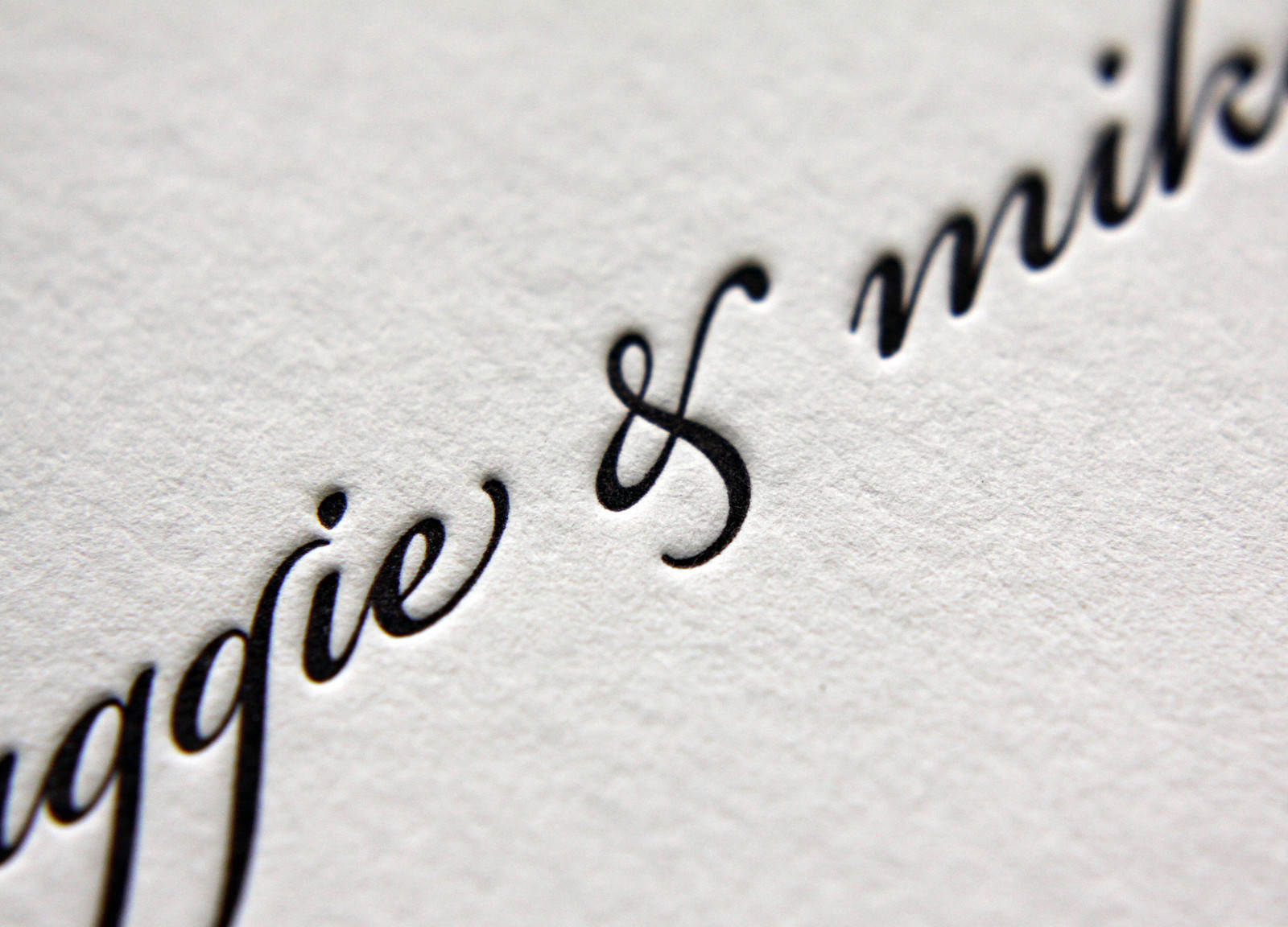
Bookplate has always been a popular style for Parklife Press; its clean, simple design — with plenty of white space — really highlights the beauty of the typography, and the color pop on the couple's names really draws the eye. And perhaps because the design is so elegant and uncluttered, the tiny flourishes pack a (visual) punch. Below, the edge painting on each the piece (the invitation, RSVP card, and map) shows off the extra-thick paper stock and unifies the color theme; the tiny green dingbat preceeding "Dinner to follow" draws attention to the reception note while adding visual interest; the typeface's blink-or-you'll-miss-them ligatures lend an old-world charm to a very modern design; and the extra-thin double rules on the map divide the sections in a beautifully understated way.
