A Handful of New Letterpress Business Cards

We've added some great new cards to our business gallery. Take a look...

These double-sided cards for Cedarly, a media and web branding company in North Carolina, feature their logo printed with a tinted white ink. We could have just as easily blind-pressed the logo (no ink at all), but the tinted white helps it pop a bit more. This technique works beautifully with the logo's leaves and with its clean typeface, highlighting the deep impression of the thick 600g paper. On the other side of the card, the information is perked up with tiny icons in blue, which help distinguish at a glance the different methods of contact. We finished the card with painted edges, picking up the accent color.

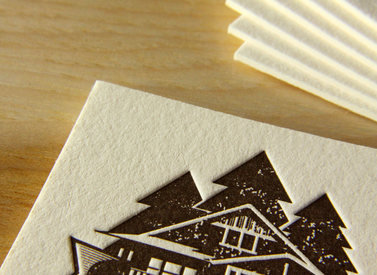
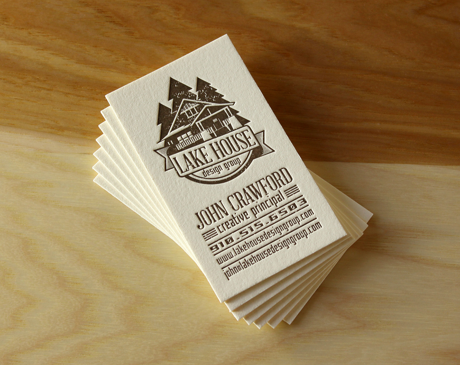
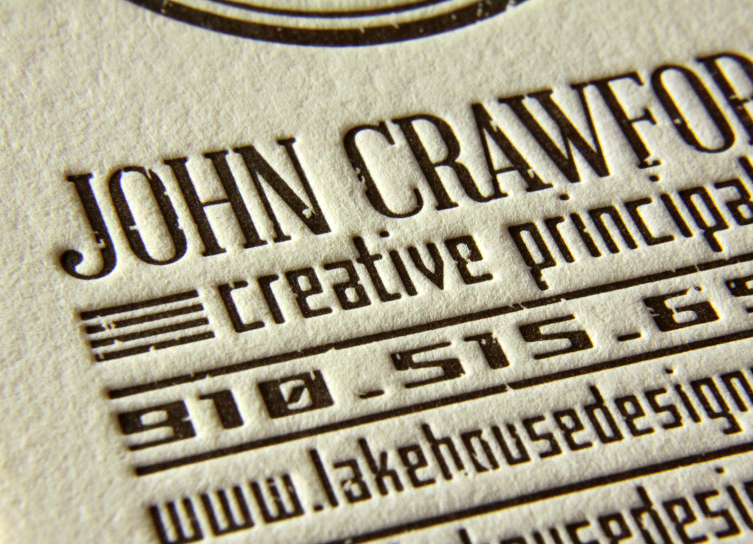
John, the creative principle at Lake House Design Group, designed these rustic but modern cards. The logo style, the palette of the ink and paper colors, and the distressed typeface work together to evoke the familiarity and nostalgia present in the firm's name.
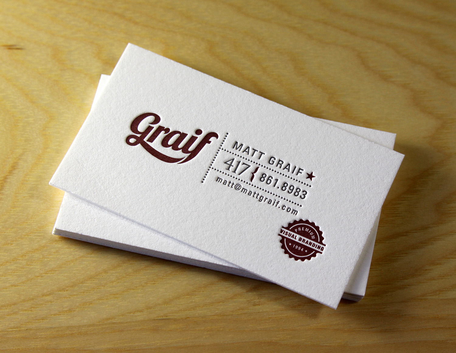
Matt Graif, a graphic designer in Missouri, submitted this excellent design for his business card that we printed for him on 600g fluorescent white Lettra.

This dramatic card for Eli Powell, a photographer in Boulder, Colorado, uses white space to its advantage. With the card's less-common vertical orientation and the artwork bleeding off the bottom, the design focuses squarely on the photographer's name but hints at sweeping landscapes and large, open skies. In blue ink on crisp, fluorescent white card stock, the snow-capped mountains are brought to life with just a few abstract shapes, connecting Powell to his region and to his clientele.

And finally, a card for Jean Woods Madge, a realtor at Distinctive Properties in Durham. Travis worked with her to create a new logo and a new look for her business cards, which were printed on 300g ecru white cardstock. The logo itself is distinctive and interesting, and the card layout was complete with a nice combination of script and serif typefaces.

Photos by Sarah McCarty Arneson
Winter Wedding in Spokane

Sydney and Kramer knew little about letterpress before planning their wedding, but heard that the printing style could make beautiful invitations. After some research, they found Parklife Press and loved the designs. When they got some of our samples in the mail, they were sold — they knew the elegance of the invitations would go perfectly with the winter wedding they were planning.

Kramer searched for different ideas and came up with the basic concept for the invitations. With Travis' help, he found the border design online and put together a basic mockup.

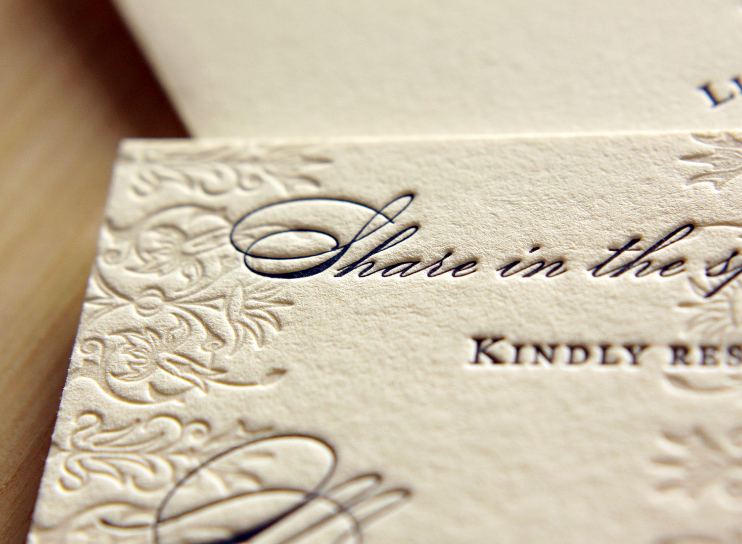
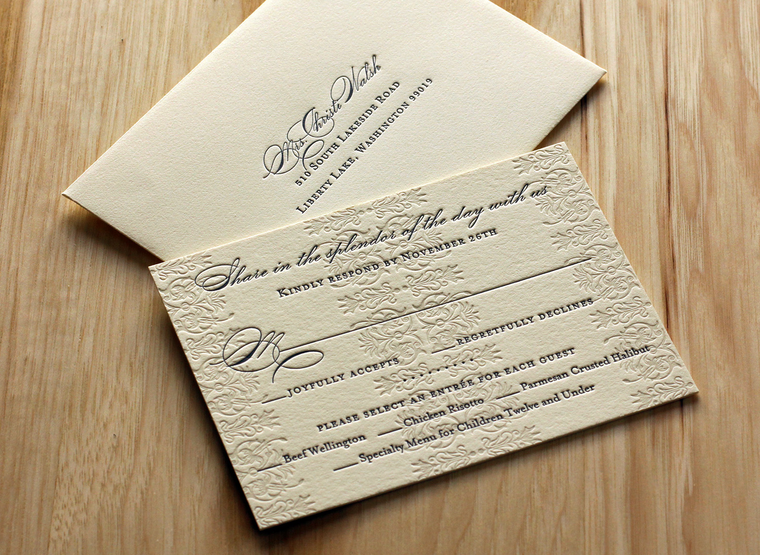
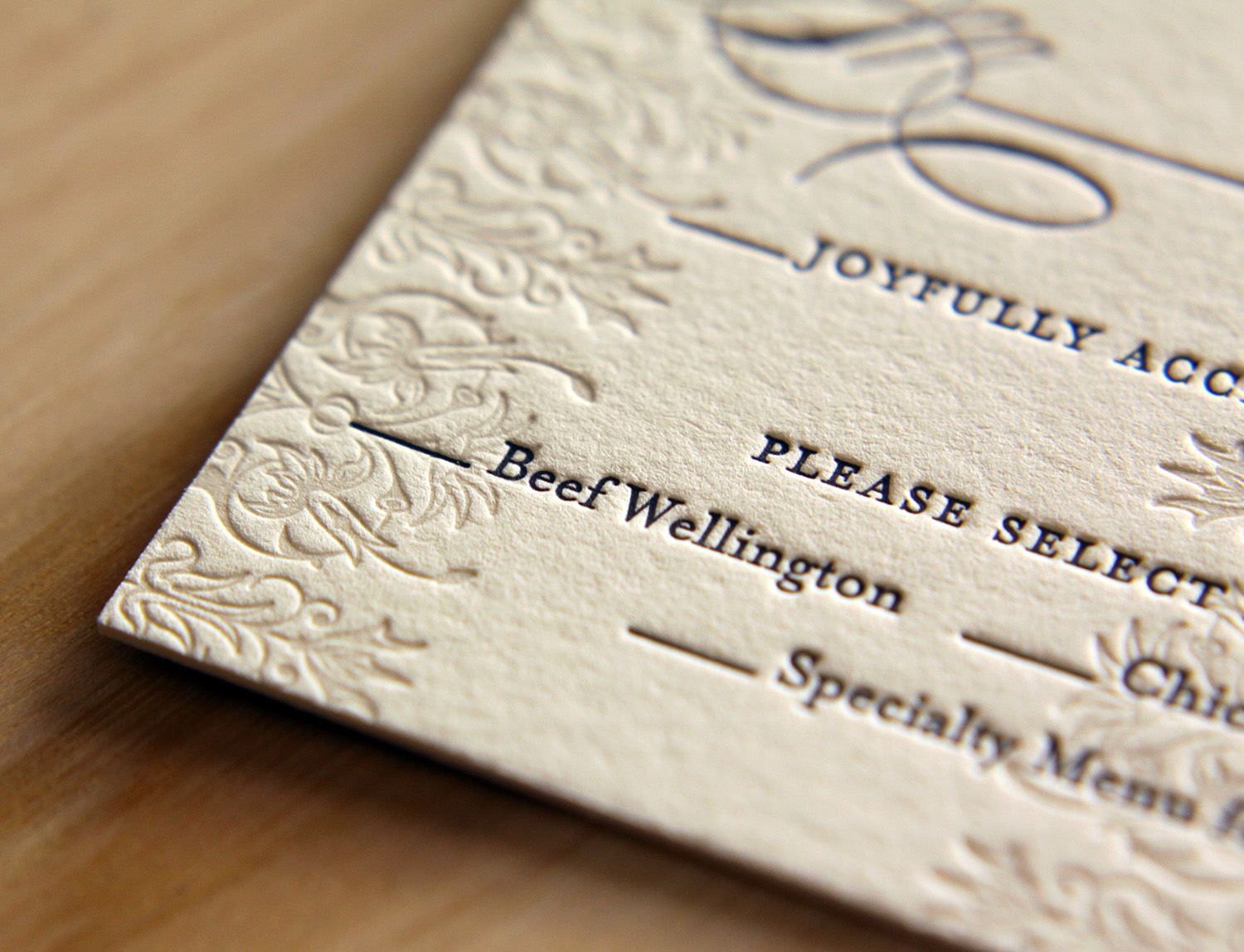
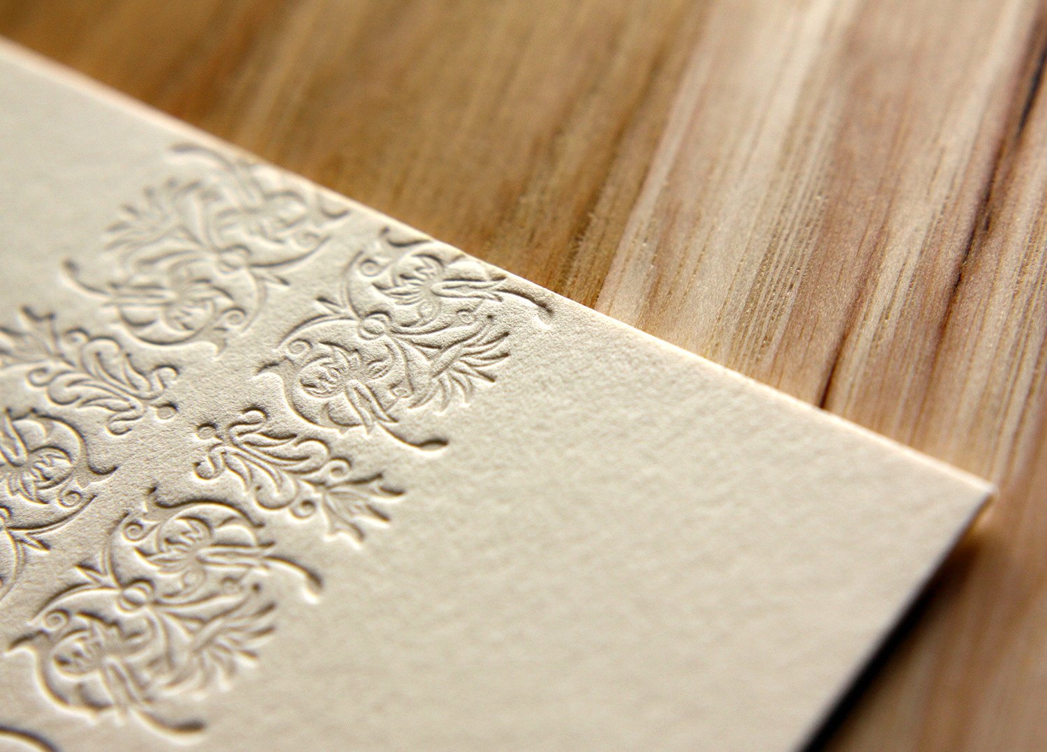
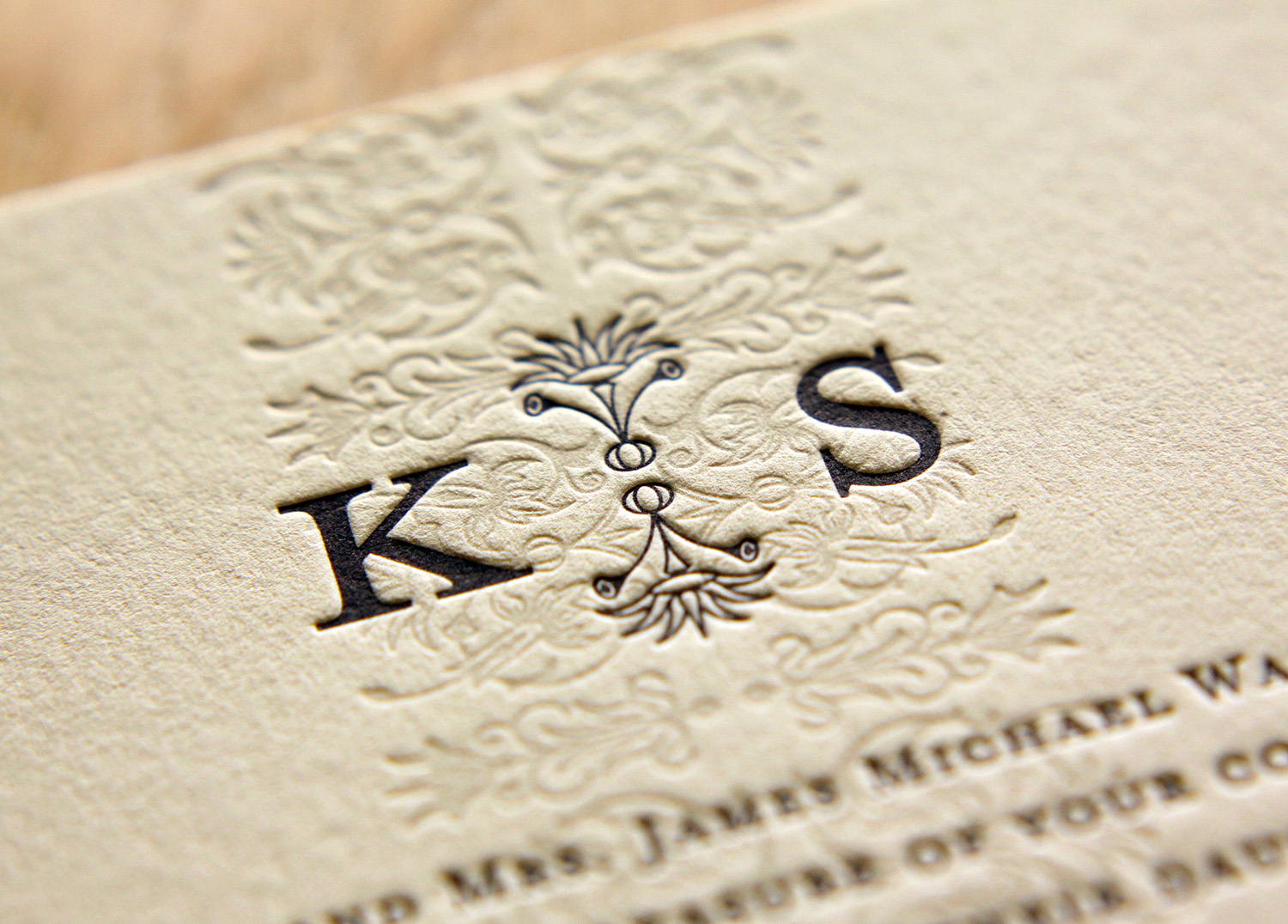
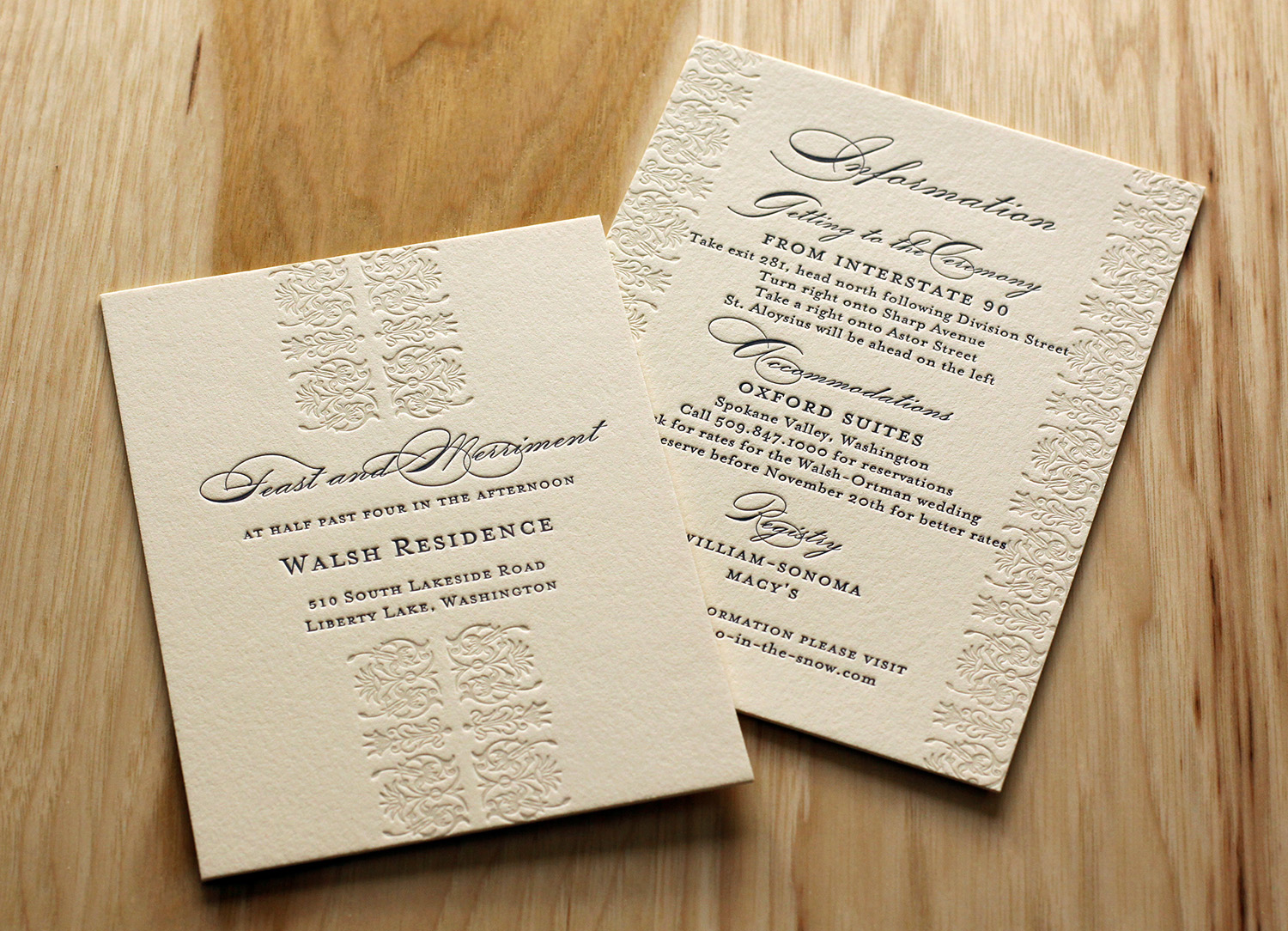
The border design was printed with a very light ink in a warm gray tone. The subtle tone blended well with the paper color, and added texture to the design without appearing as an additional ink color. On each piece of the set — which included an invitation, an RSVP card, a reception invitation and card providing lodging and directions — the border art was used, either on the edges, as a center strip, or both. The text and monogram were printed in a dark blue, which coordinated with the ivory, blue and gray colors used in the wedding. Kramer felt the mixture of small-caps and script typefaces allowed them to showcase the modern elegance of their wedding, and that the invitation design, along with its colors, gave their guests the "perfect preview" of the event.

Photos by Sarah McCarty Arneson
Durham, Via ...

Megan and Ted had a bold, simple look in mind for their invitations. Both loved the clean look of the Futura typeface, which captured the wedding's modern and traditional blend of styles. They first grabbed their guests' attention with a save the date card, featuring a custom illustration by Travis, which traced the couple's route to the altar. Working from a concept Ted sketched on a napkin, the finished artwork diagrams their two paths becoming one shared journey: beginning in L.A. and New Orleans, meeting in N.Y., moving together to Virginia and ultimately, to Durham, North Carolina.
Ted also contributed the "concert poster" concept for the save the date's text layout. They were both very involved in the design process and enjoyed the collaboration, saying that Parklife "did a fantastic job in translating the concept into something that turned out beautifully on letterpress." The invitation itself was focused on clean lines, which were further highlighted by generous white space. Interestingly, the Black and Fire Truck red inks were not their wedding colors — they just really loved how those colors, especially on the bright white paper, made the design pop.

The couple had been big fans of letterpress printing before their wedding planning began — they appreciated, in Megan's words, "the tactile experience of opening up an envelope and experiencing an invitation that not only looked beautiful but FELT beautiful, too." And they valued what she described as "the permanence that letterpress represents. Even if the ink fades, the invite is still permanently there. It's a neat metaphor to accompany a wedding invite."
Photos by Sarah McCarty Arneson
Minimalist in Long Island City

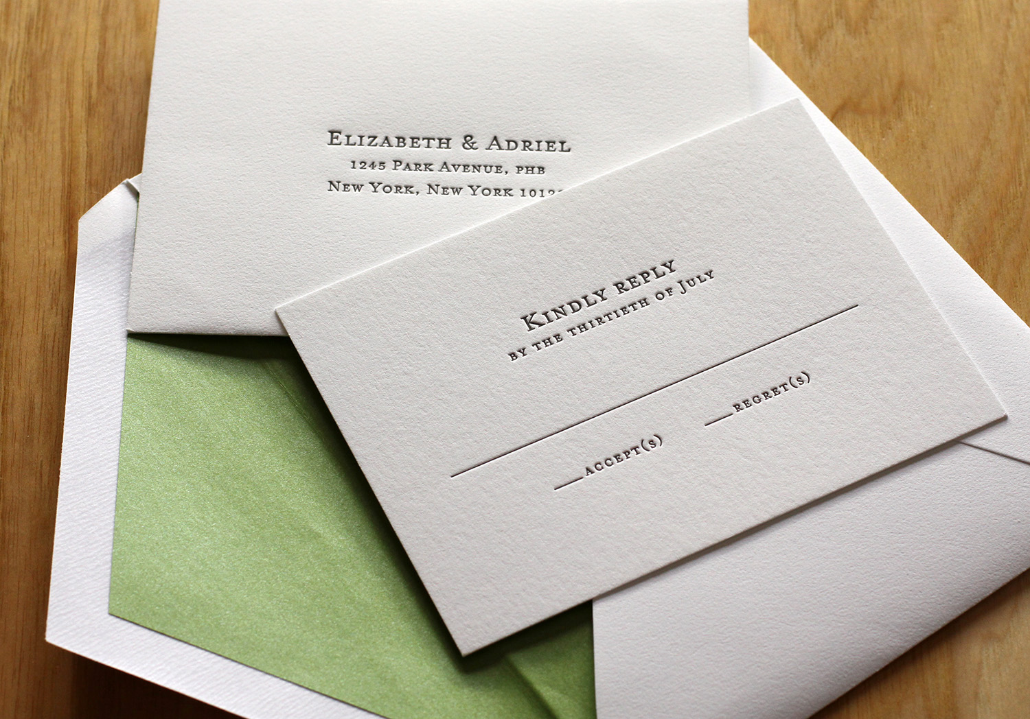
After seeing the Parker invitation design featured in Martha Stewart Weddings, Liz and Adriel were drawn to the classic look of the invitation. They knew they wanted letterpress invitations; in Liz's words, they were "choosing to send physical invitations in a digital world," so the texture of the imprinted text and the feel of the paper was critical to their selection.

invite_ElizabethLONGISLANDCITY_0274 web.jpg

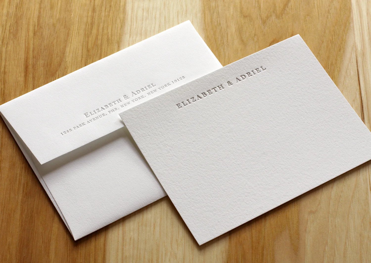
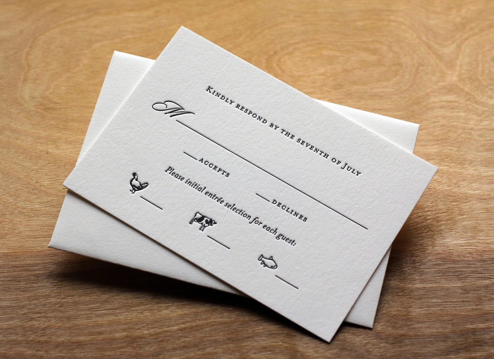
The couple chose a minimalist response card so that guests could add personal notes and unique replies. They received lovely good wishes, drawings and jokes from loved ones; the response cards became keepsakes. They personalized the design of the invitation by adding their names in Hebrew (offset from the main text in Dust ink). The invitations were edged in Grass and the envelopes were lined with a matching metallic paper. The green and white matched their wedding colors and flowers. Finally, the couple ordered simple, elegant cards to be used as thank you notes after the wedding.

Photos by Sarah McCarty Arneson
A Letterpress Wedding in Aurora

Kristin and Alex's set was a lot of fun to print. We started with save the date coasters featuring custom pen and ink drawings (by Travis) of the wedding venue printed on our 600g cotton paper. Save the dates are often less formal and more playful than the actual invitations, so it seemed like the perfect place to use the image.

We modeled the invitation after our Vignette style, but with Black and Deep Plum inks on Pearl White paper. We created an accommodations card with the border from our Belvedere invite and a monogrammed belly band with silver ink on Amethyst card stock from Envelopments.

We finished the set with a chipboard rehearsal dinner invitation and a tear-off reply card.

Photos by Sarah McCarty Arneson
Summer Vail

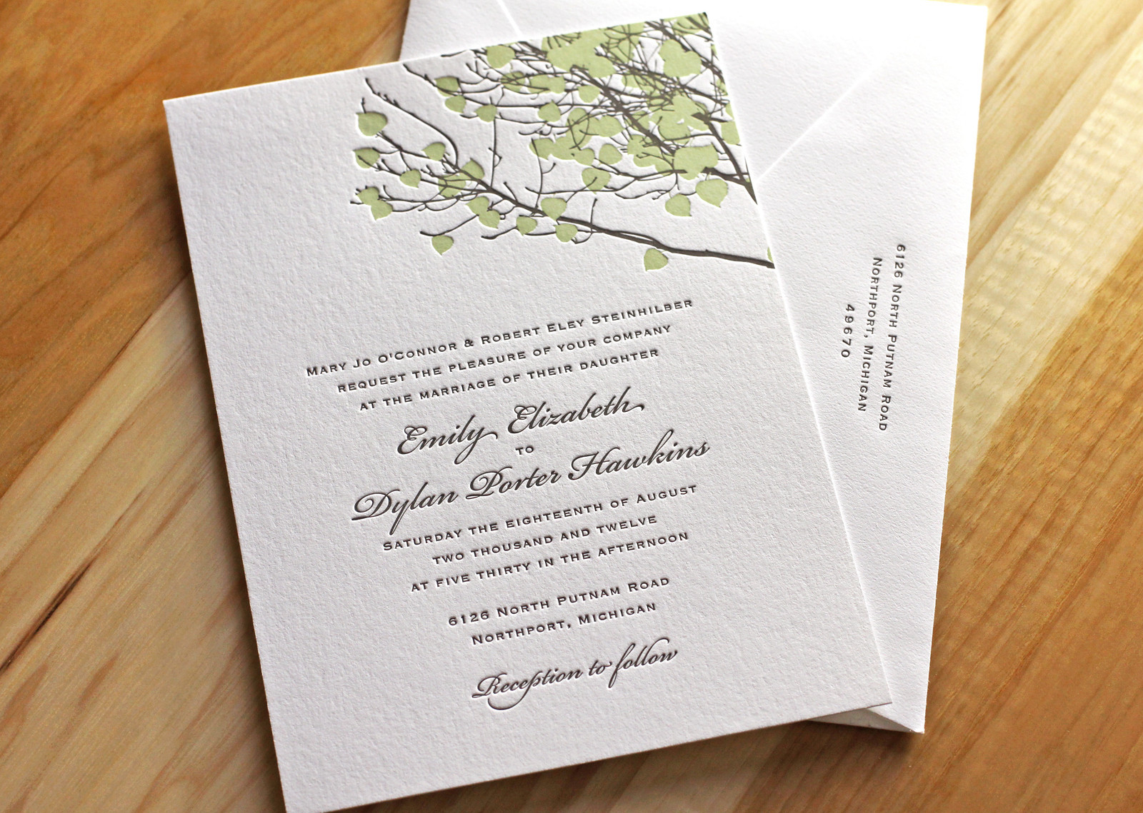
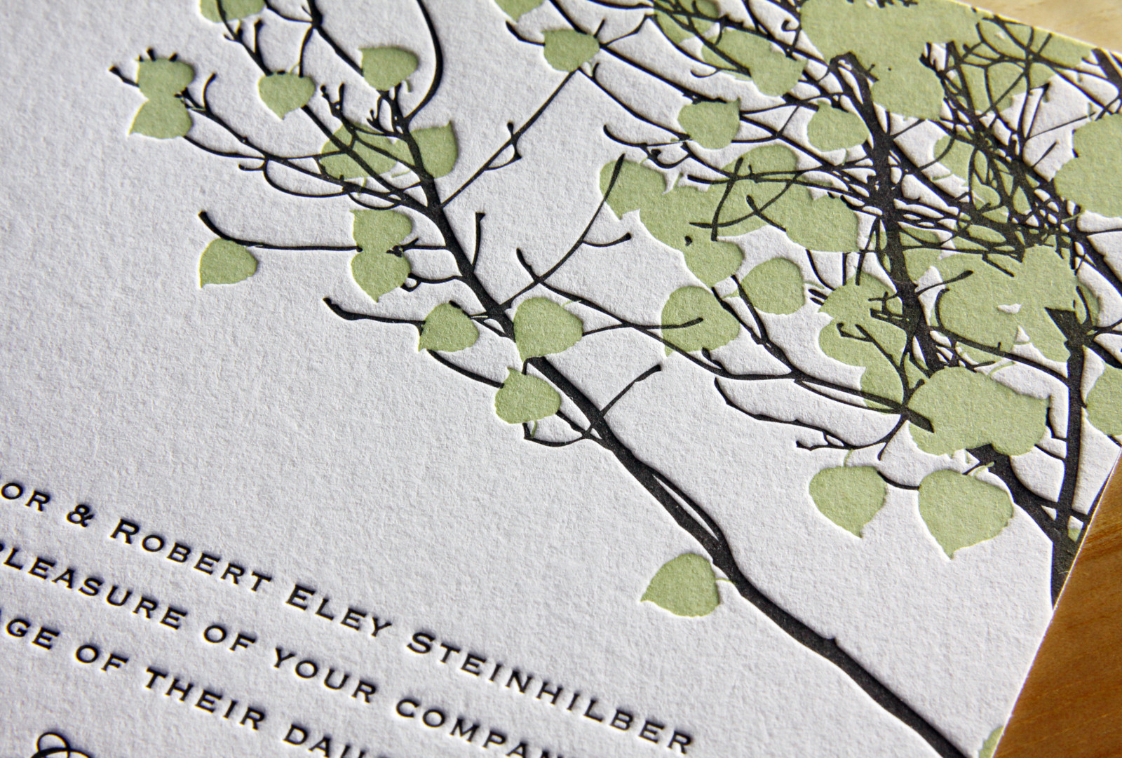
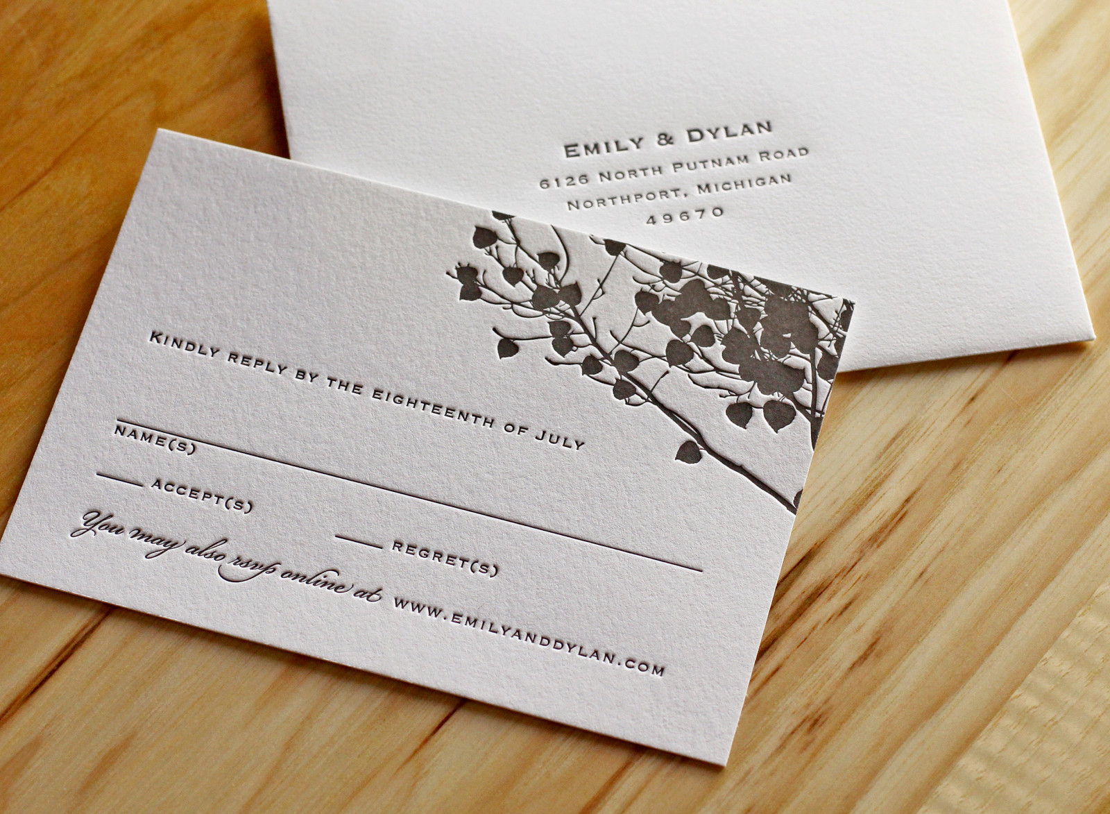
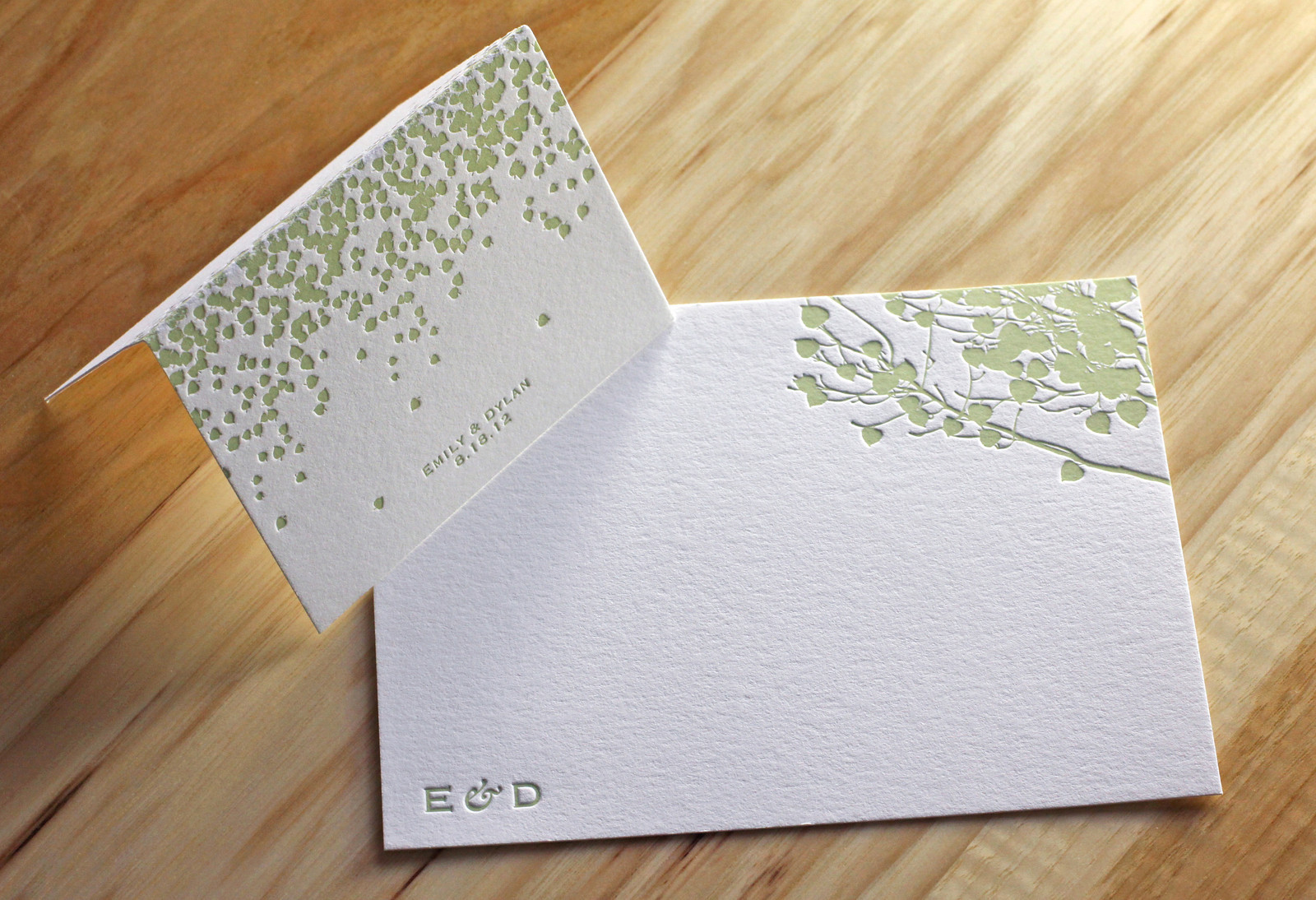
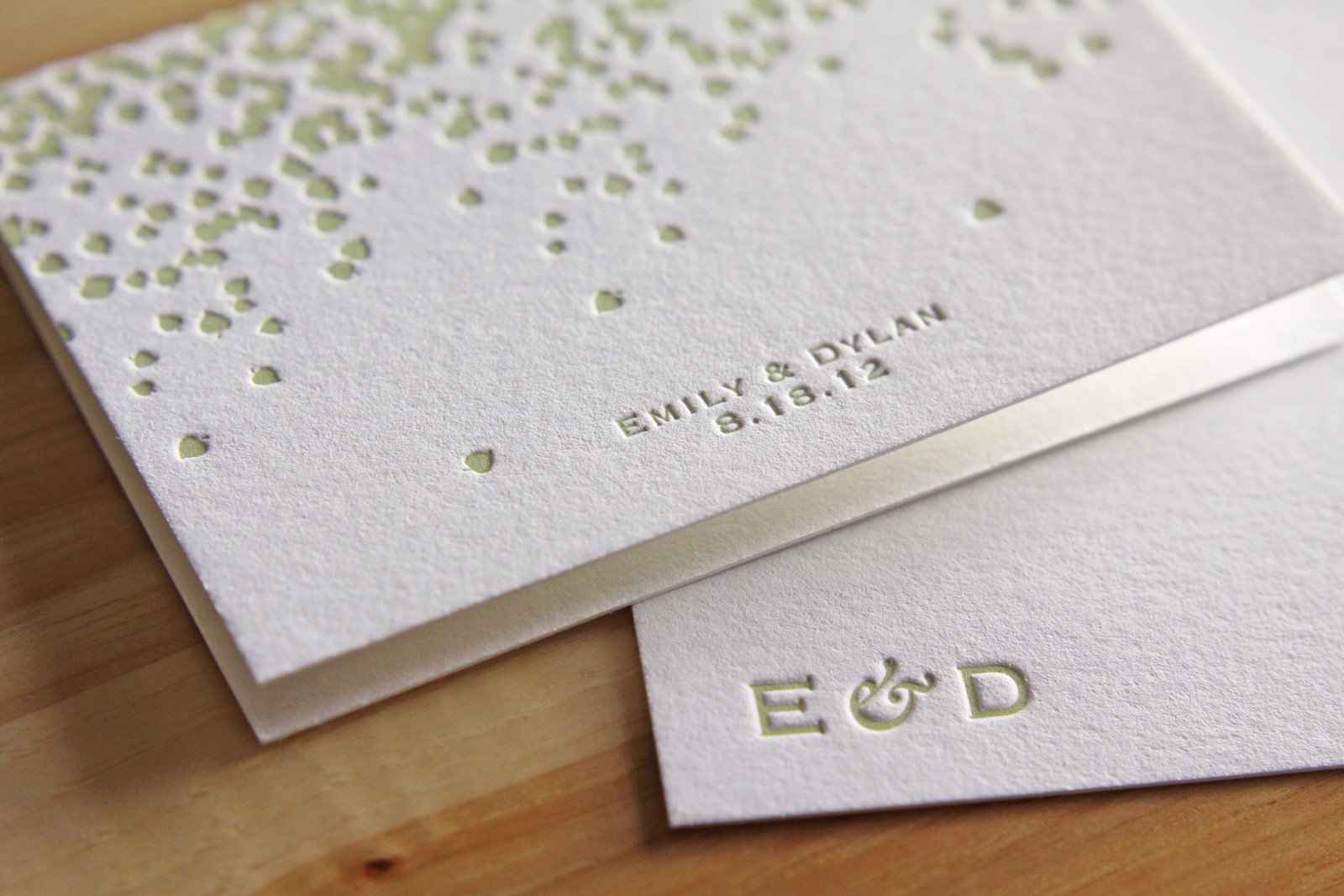
Emily and Dylan's adaptation of our Vail invitation is great. We changed the Tangerine ink to Light Celadon and opted for Fluorescent White paper instead of Ecru and the look, once warm and autumnal, became bright and fresh -- perfect for their summertime wedding.

We carried the look through to the place cards and thank you notes as well, keeping the same theme without simply repeating the same artwork.

Photos by Sarah McCarty Arneson
Scripted Bookplate

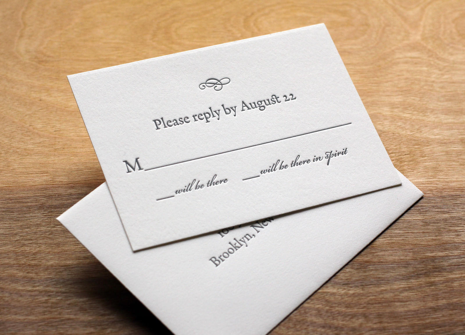
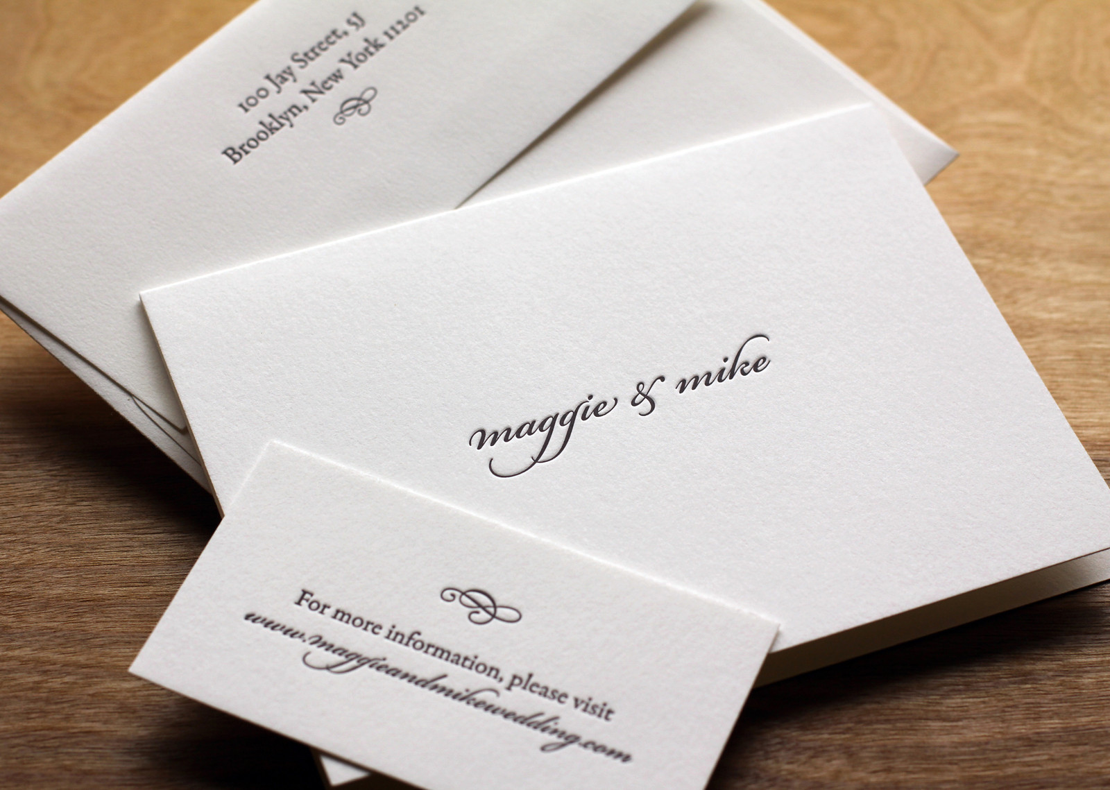
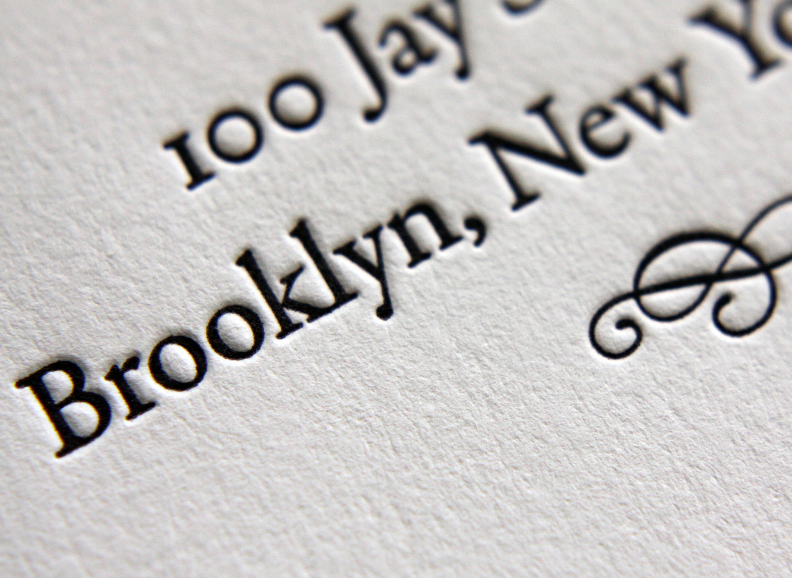
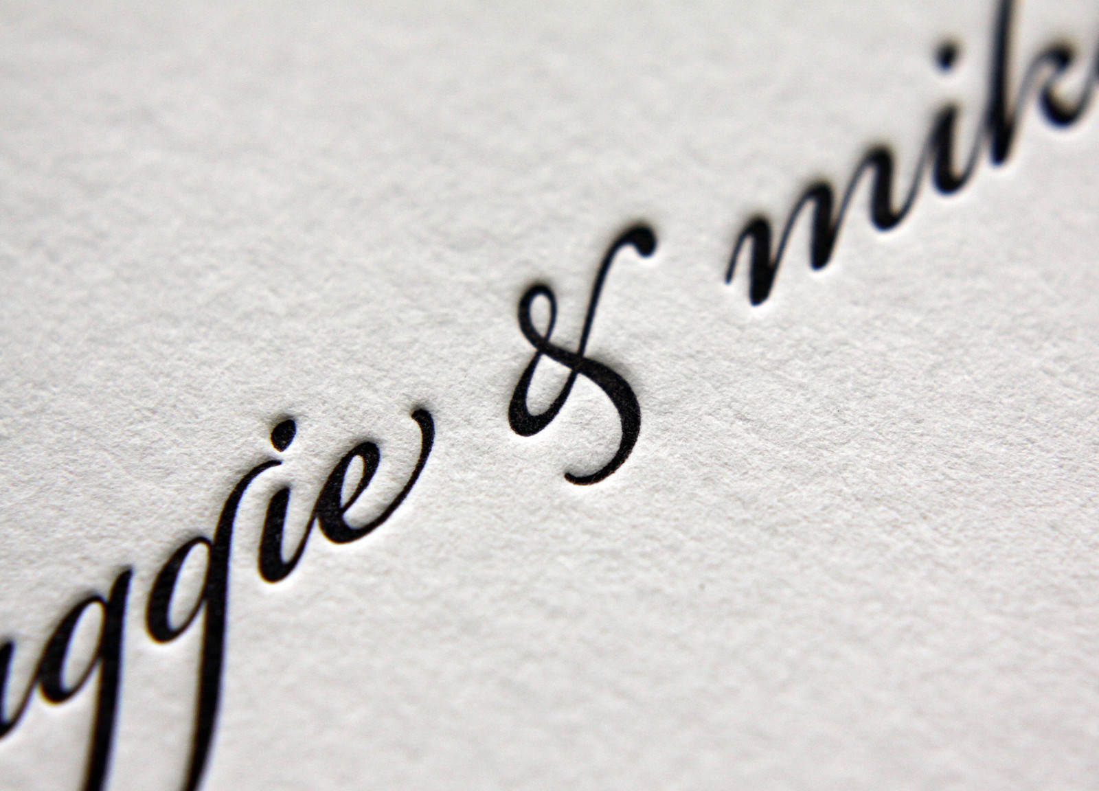
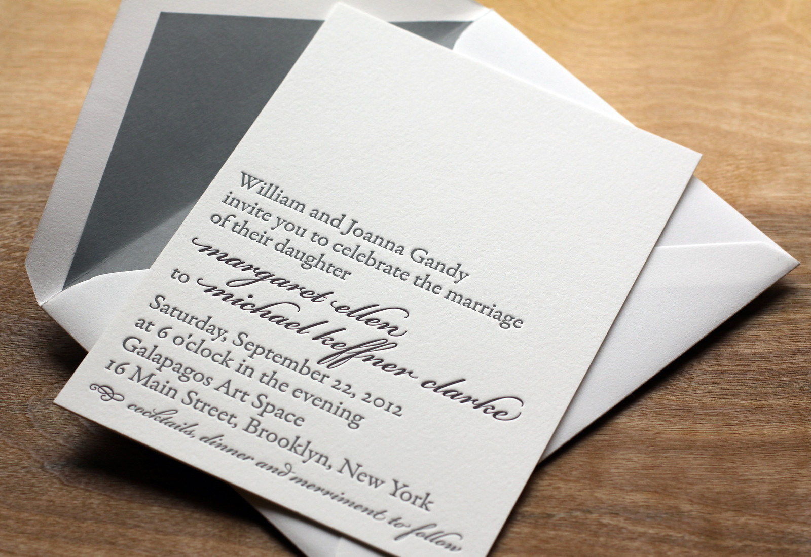
In this variation on our Bookplate invite Maggie and Mike softened the look a little bit by adding some Bickham Script type in Deep Plum ink for their names and the reception line. Slate envelope liners to match the Slate ink give the set some added polish.

Rather than over-stuff the envelope with accommodations info, directions, etc, the couple opted to keep things simple with a business-sized card directing guests to their wedding website.

Photos by Sarah McCarty Arneson