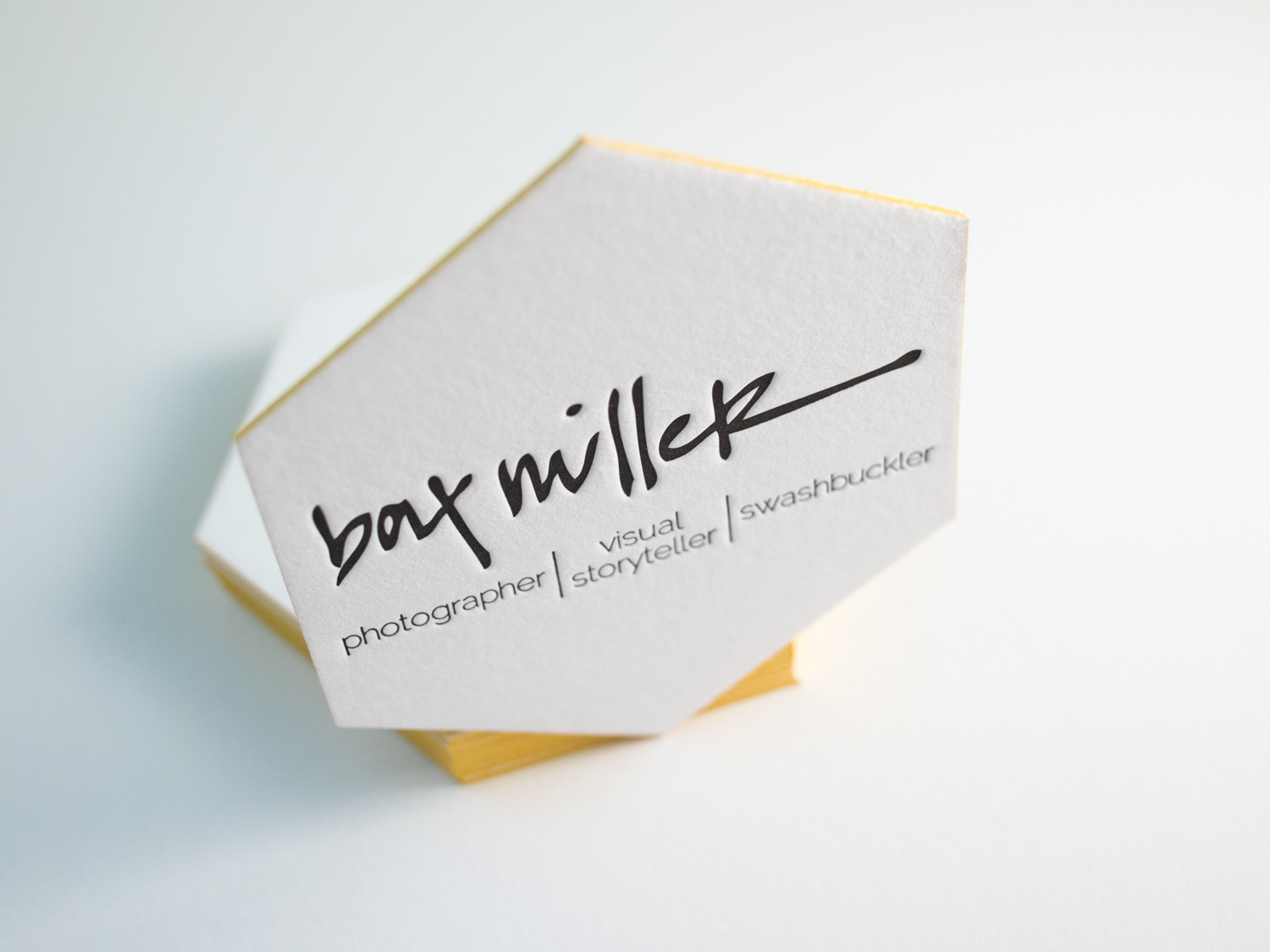
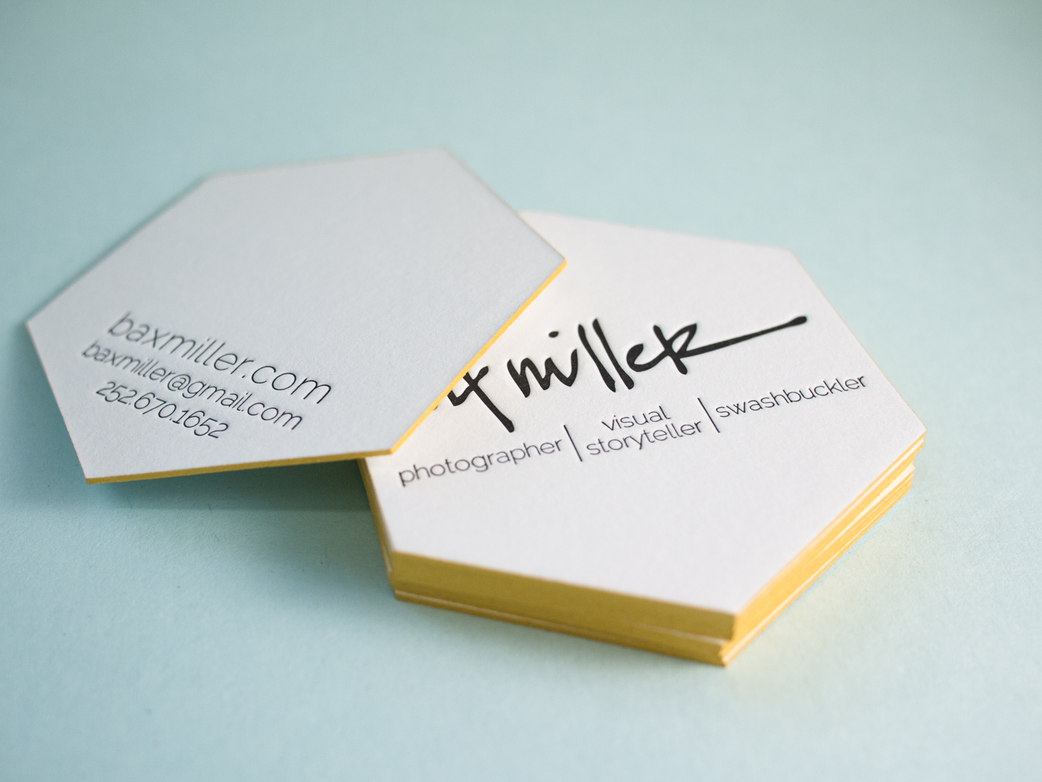
Bax's cards presented a special challenge. Normally, to create an odd shape (basically anything non-rectangular), we'd make a die and die-cut the cards. But Bax wanted edge paint — and a die-cut edge isn't crisp enough to paint cleanly. So we (very carefully) knife-cut these 600g fluorescent white hexagons with our 19th century guillotine cutter, then edged them with metallic gold paint.
Solid floods of color can be tricky with letterpress. But if you play your no-pun-intended cards right, you can get great results. Lighter/brighter colors tend to print more evenly. And die-cutting the cards rather than knife trimming can help keep the raised unprinted paper from getting squished or scuffed.
For these square cards we printed for Birmingham Developer, Ford Waters, we printed on separate sheets of 300g Fluorescent White Lettra, then duplexed and die cut. Design was done by long-time Parklife friend, Chad Martin of The G Brand.
Check out these beautifully understated two-color, two-sided cards for Norfolk's Within Interior Design. For each of the eight women at the firm, we printed turquoise and warm gray inks on thick 600g Fluorescent White Lettra and added turquoise edge paint to match.
For the New Jersey grooming gurus at Virile, we printed these thick two-sided cards on 600g pearl white Lettra with tinted white and black inks. We finished them with a rich brick edge paint.
To help the impression pop, we like to use white ink tinted with a little bit of silver rather than print a completely inkless blind impression.