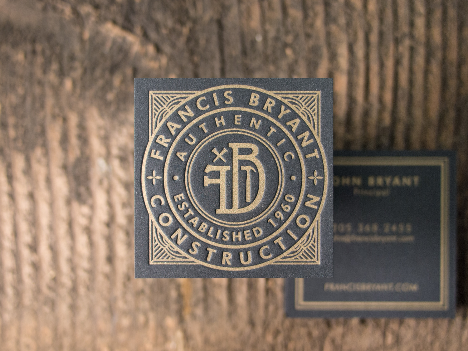
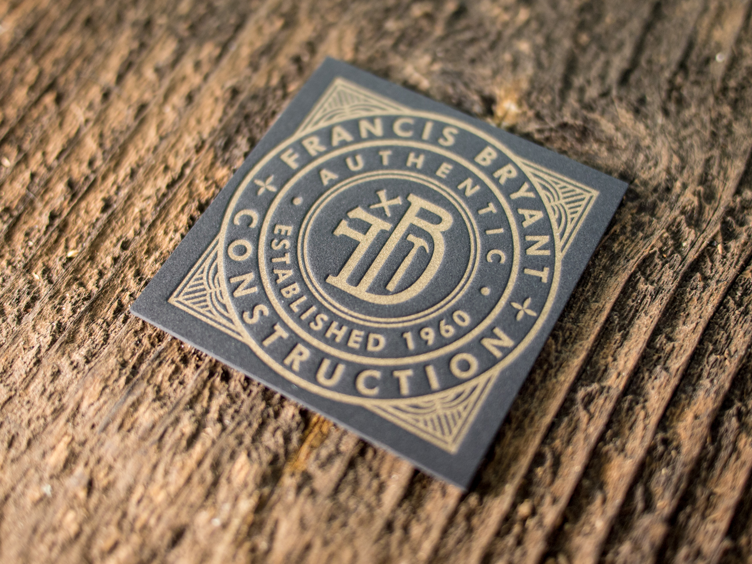
Wonderful logo design by The G Brand. Printed on both sides with gold ink on 60pt black museum board.


Wonderful logo design by The G Brand. Printed on both sides with gold ink on 60pt black museum board.
Simple but spectacular one-color invitations designed by the bride, Jessica, and printed by us.
PAPER 300g and 600g Pearl White
INK Midnight
Although we're in Portland now, Parklife Press spent most of its first decade in Chapel Hill, less than a mile from UNC. On the far side of campus, beyond the sea of pastel polo shirts and khaki shorts, was PlayMakers Repertory Company. This year PlayMakers is celebrating its 40th year, and unlike the previously mentioned campus fashion choices, I hope it never goes out of style.
Sixgill's logo uses a gradation of green — from light on the left to dark on the right. Normally that's not the sort of thing letterpress does well. But using a fine halftone screen, we printed two shades of green on top of one another to achieve the gradation effect.
For Taryn and Adam's wedding in the Brooklyn Botanic Garden, we designed a custom foil + letterpress motif based on the garden's Palm House. Take a look at the inspiration:
Photo by Brookelyn Photography
We carried parts of the artwork through to reply cards, menus, programs, and even the envelopes.
PAPER 600g Fluorescent White
INK Light Celadon
FOIL Silver Shine
Boo! This year's Parklife Halloween card features black ink plus two shades of foil on a duplexed sheet: French Paper Speckletone Kraft for the front and Kraft-Tone Ledger Green for the back.
Oh yeah, there's a discount too. Just mention this post between now and the end of November to get $100 off an order of holiday cards, business cards, letterhead, or stationery.
Hard to compete with last year's card — but I'd say we came pretty close.
Check out these stark and sinister Christmas cards for North Carolina creative agency and long-time Parklife collaborators, Adena Studios.
We printed these with Black and Fuchsia ink on our 300g Fluorescent White cotton paper.