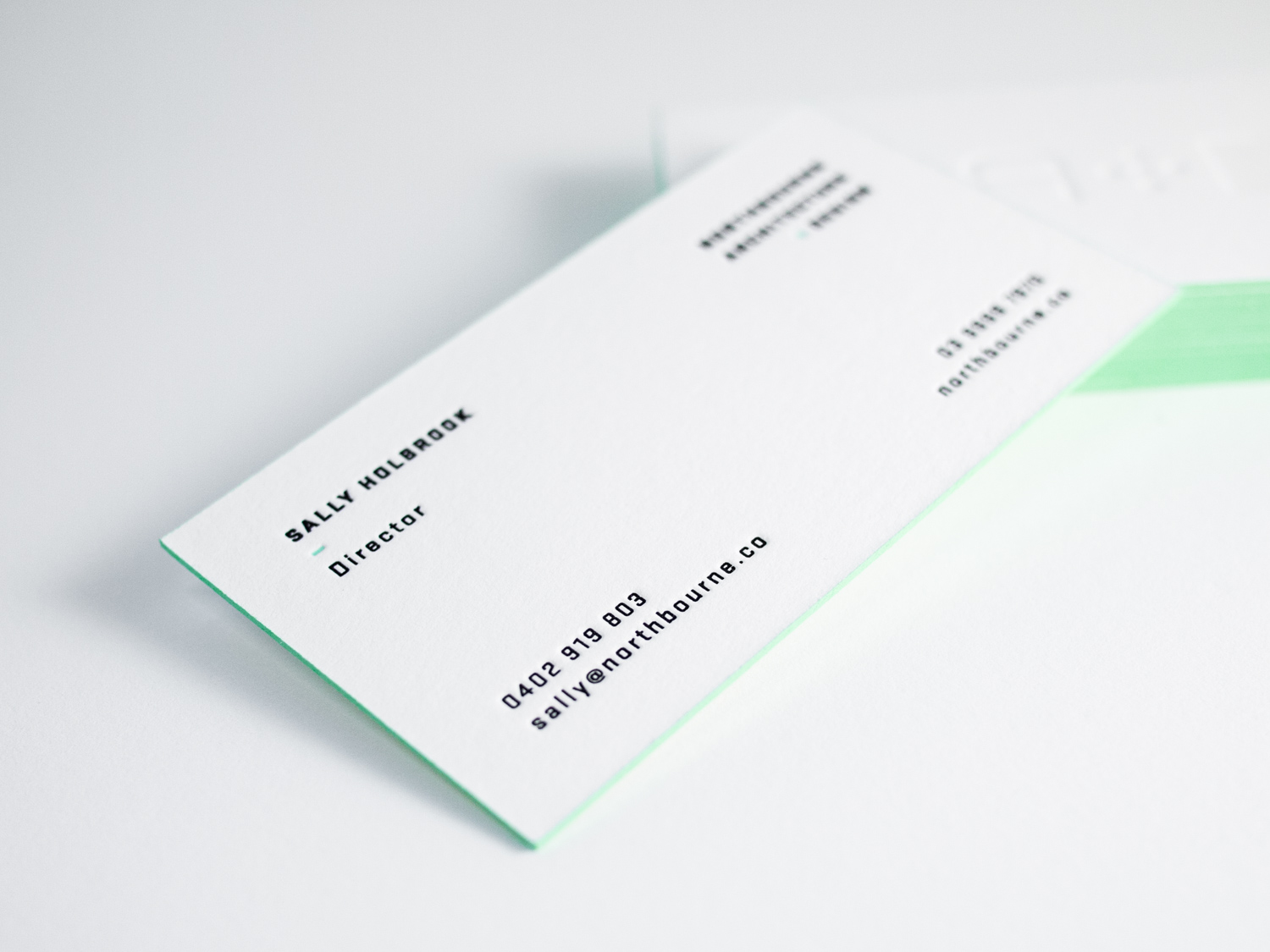
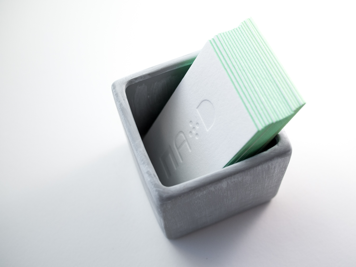
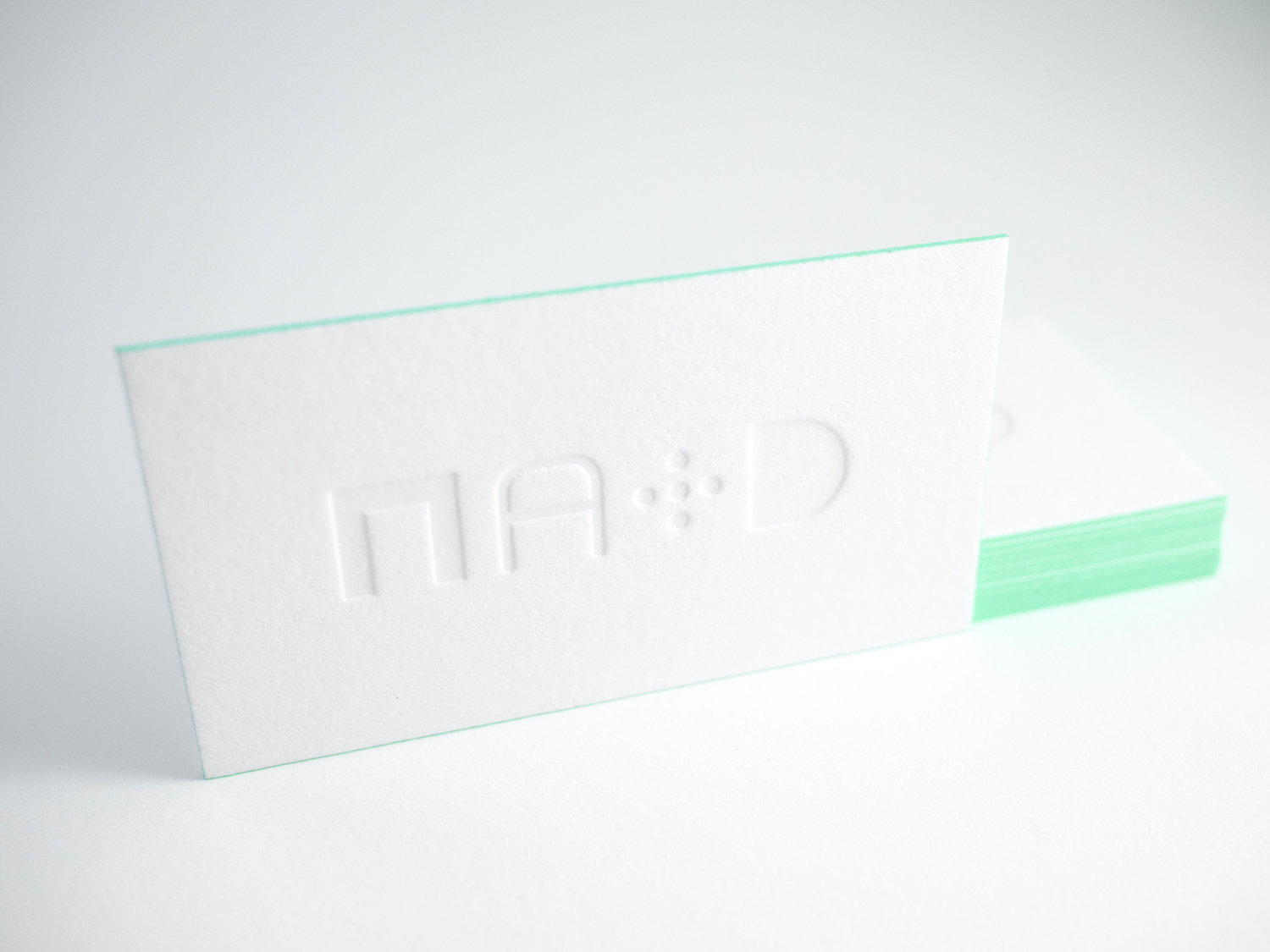
These striking cards for Melbourne architecture firm Northbourne were printed on 600g Fluorescent White Lettra with a blind impression on the front and black and custom mint ink on the back. Finished with mint edges match. Printed by Parklife and designed by JT at A Door Ajar.
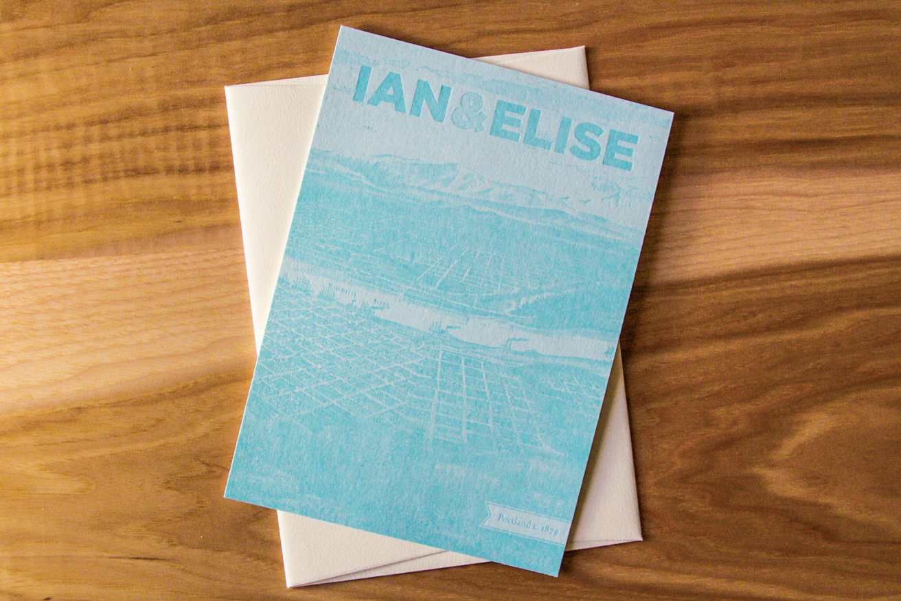
Here's a lovely wedding set for Parklife's favorite brother and his favorite new wife. For the save the date we used two custom inks on thick 600g ecru paper.
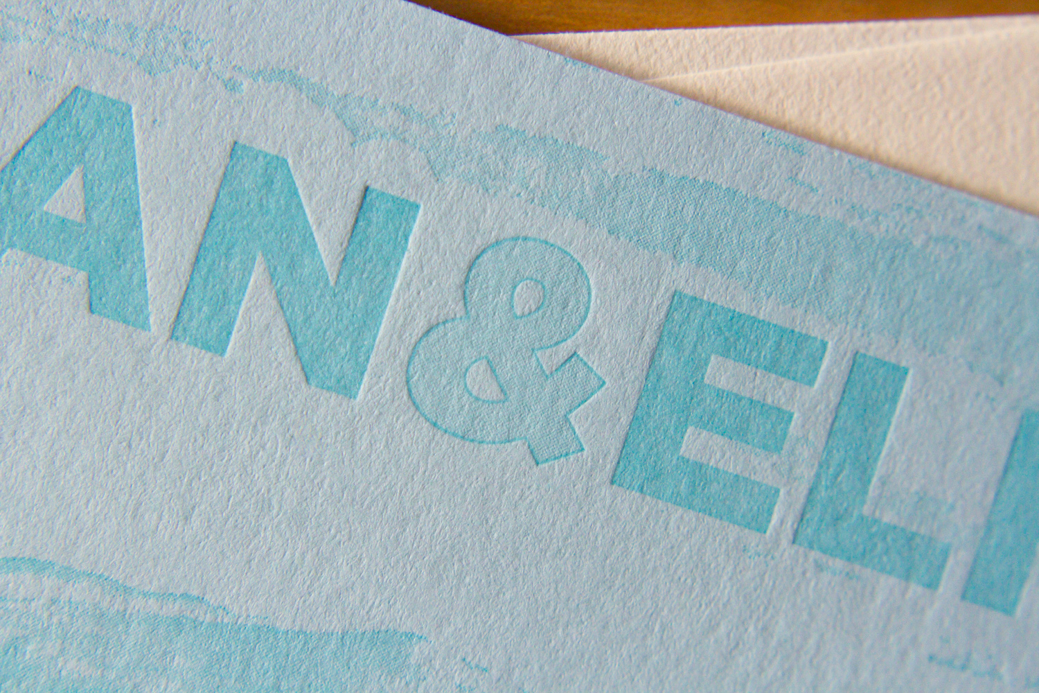
For the invitations, we carried through the same inks, paper, along with a few variations on the Gotham typeface.
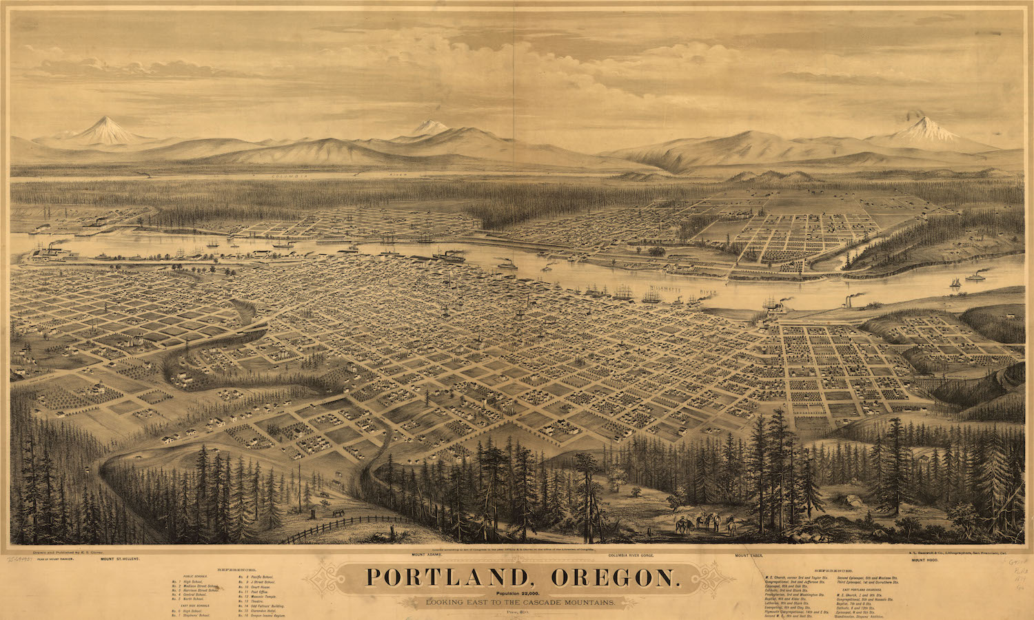
On the back of the invitation we added a hand-duplexed backing that's letterpress printed with a tonal ink and a fine halftone screen. The image is adapted from an early nineteenth century drawing of Portland.
Photos by Sarah Arneson