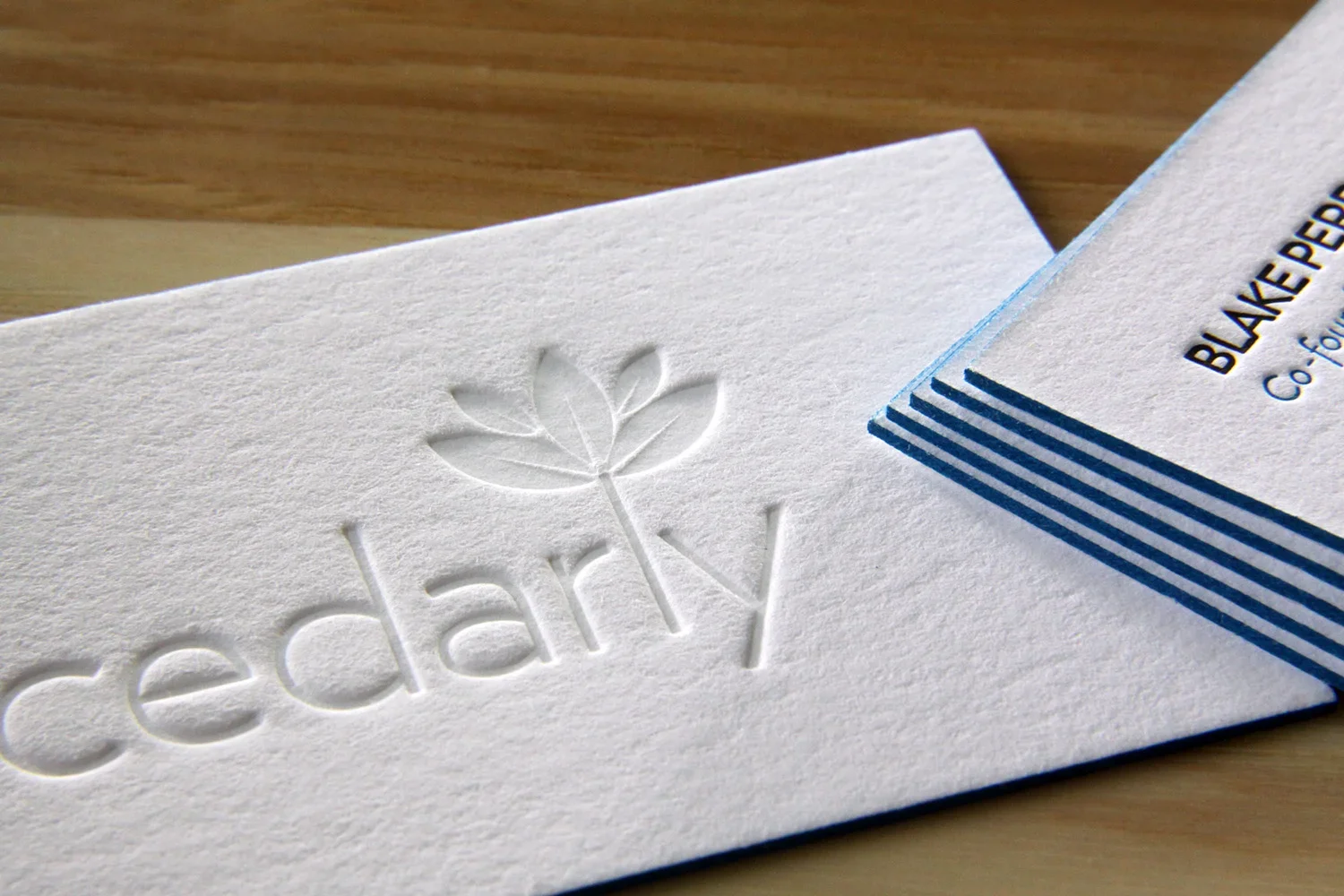
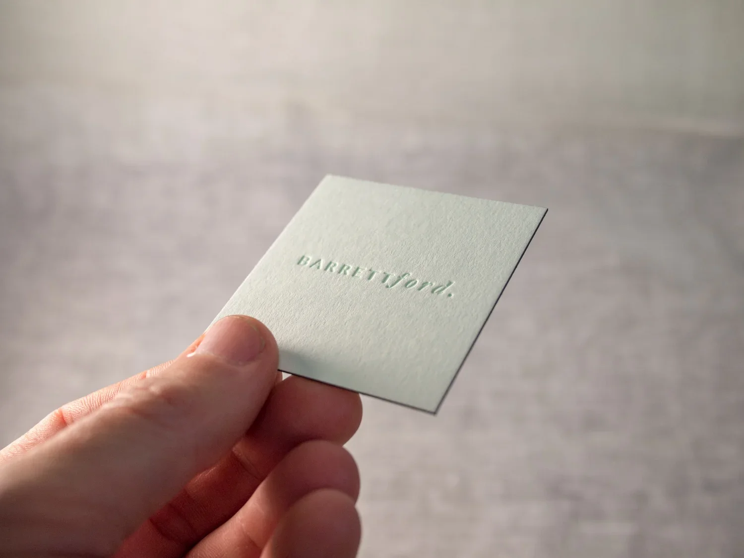
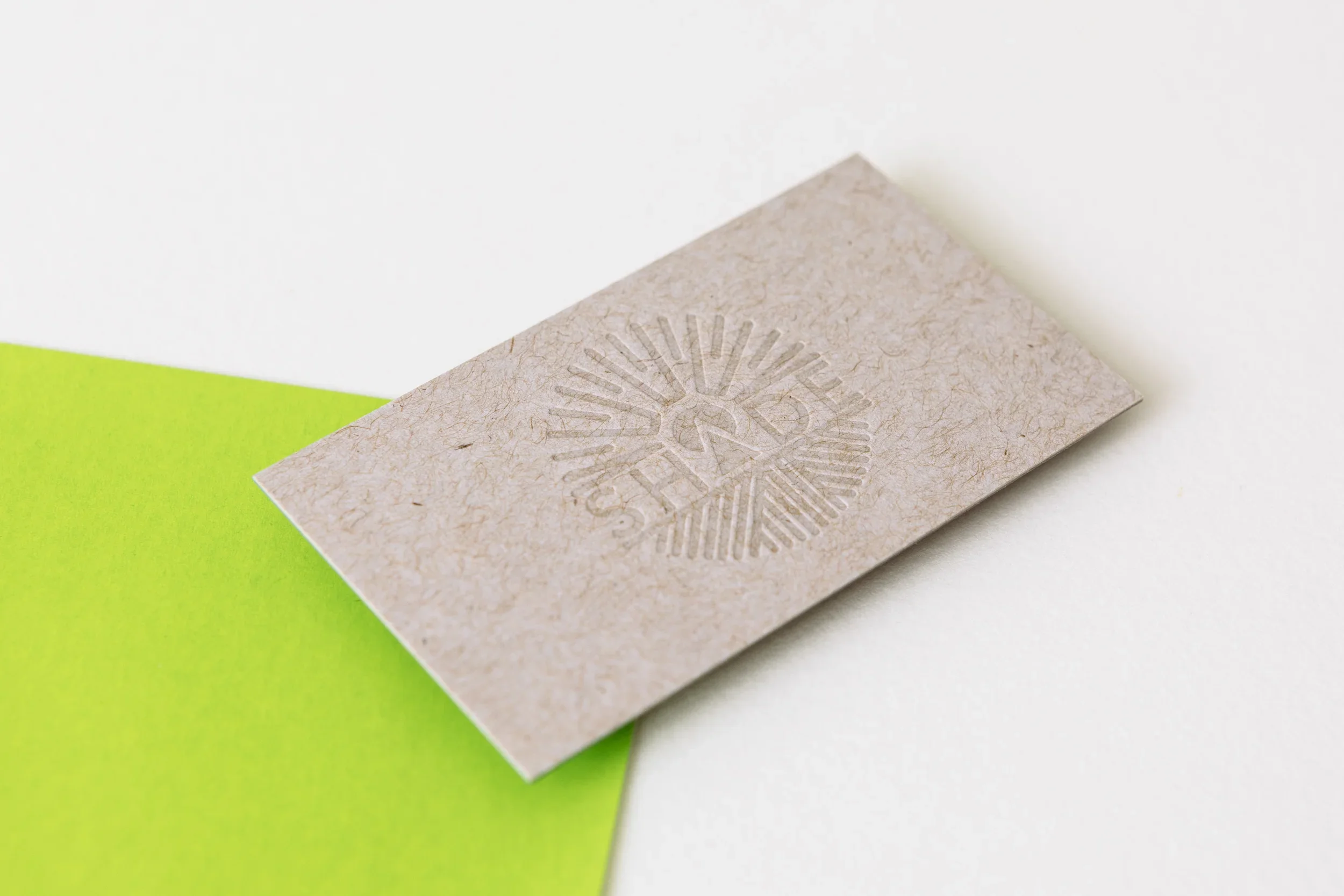
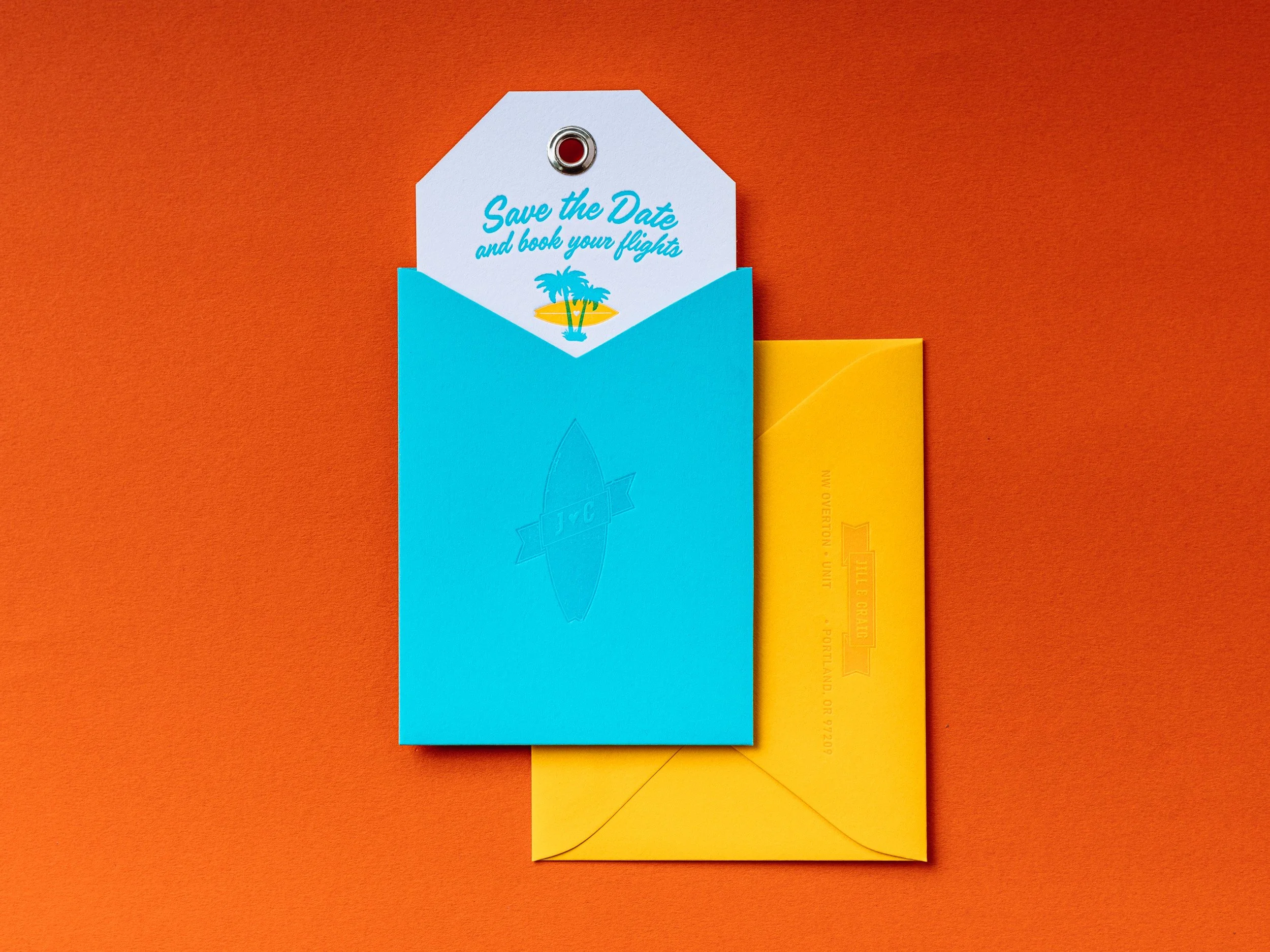
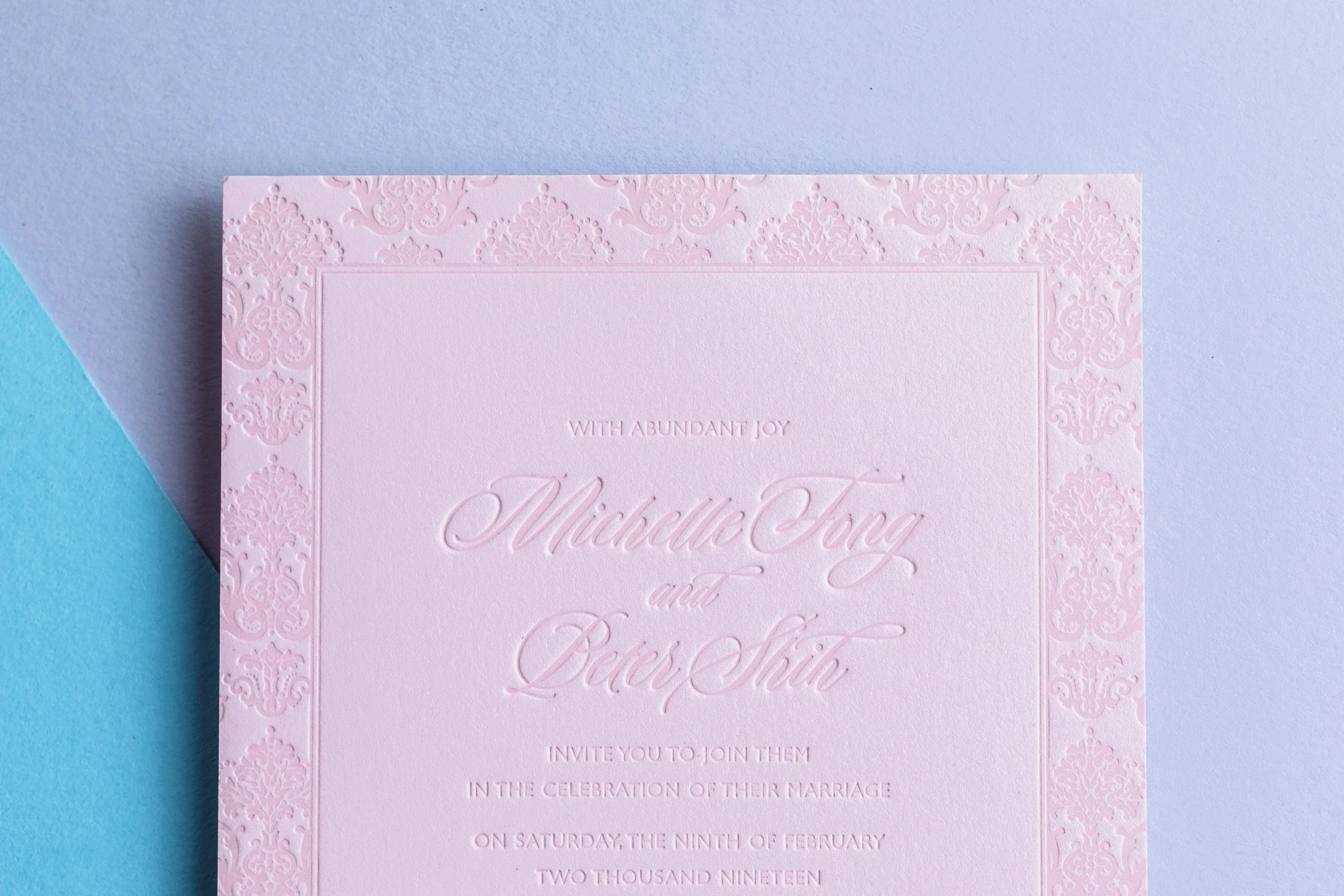
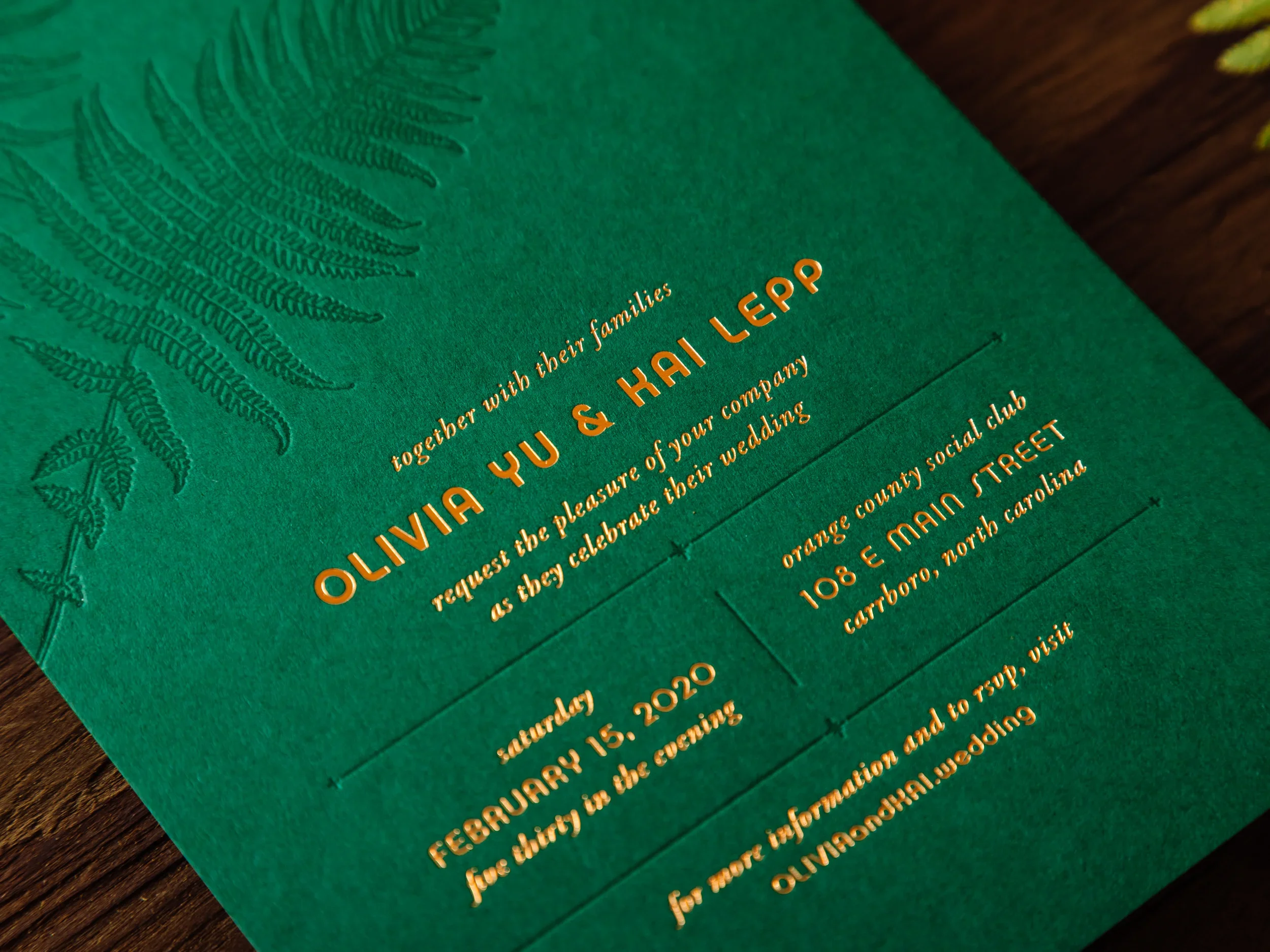
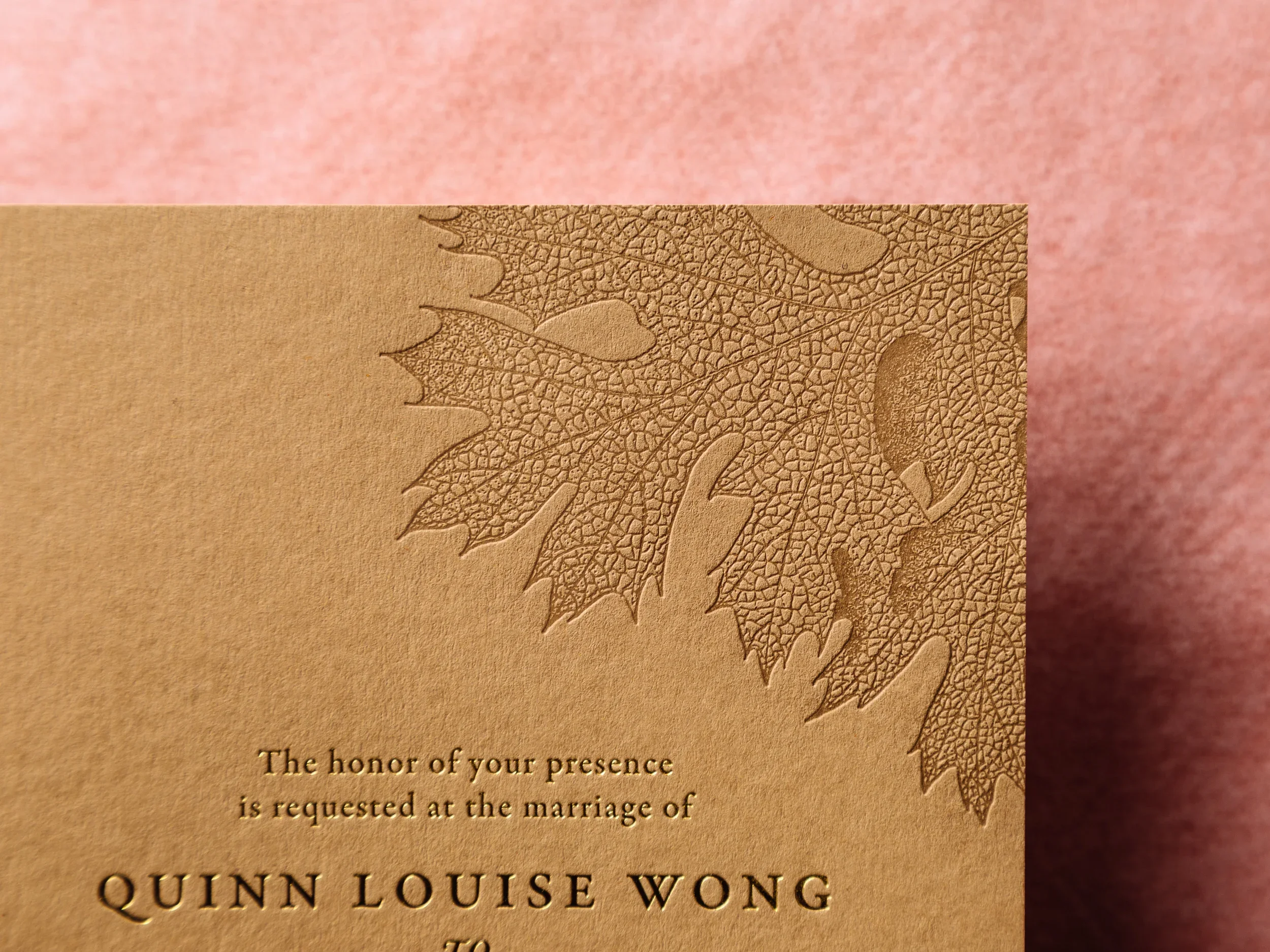
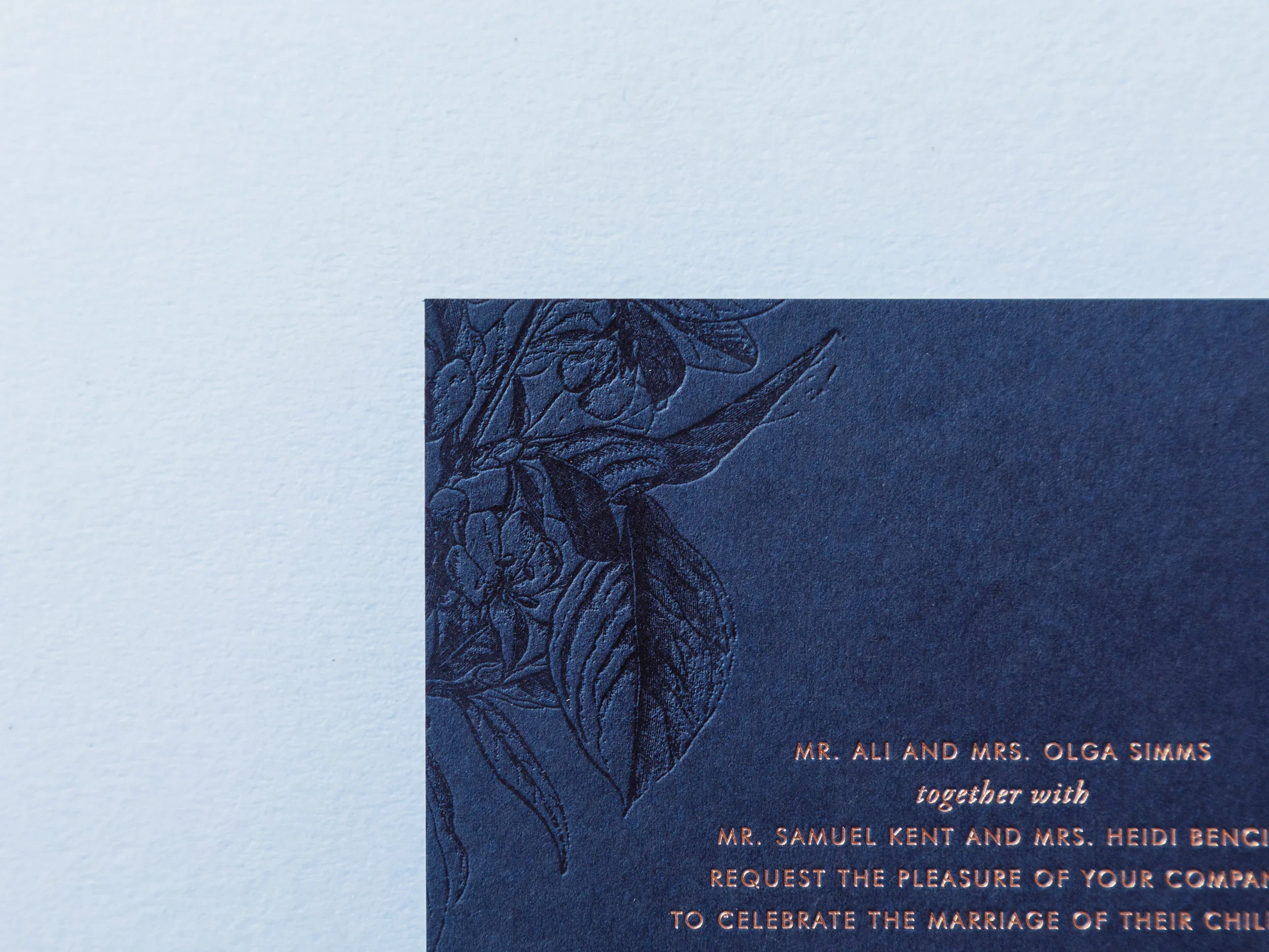
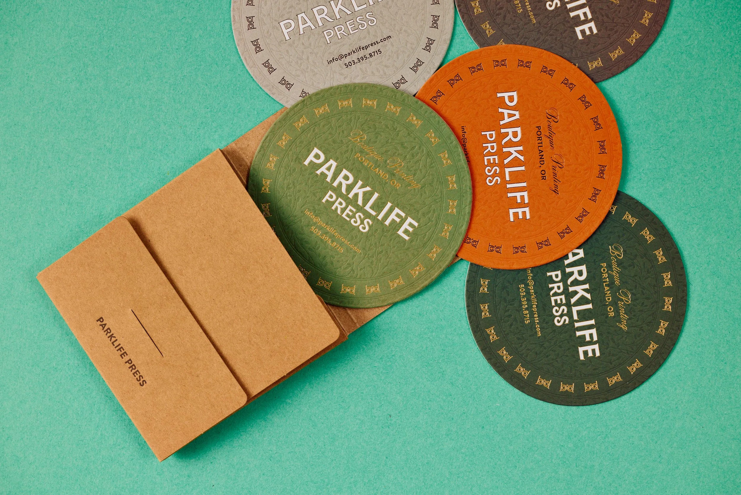
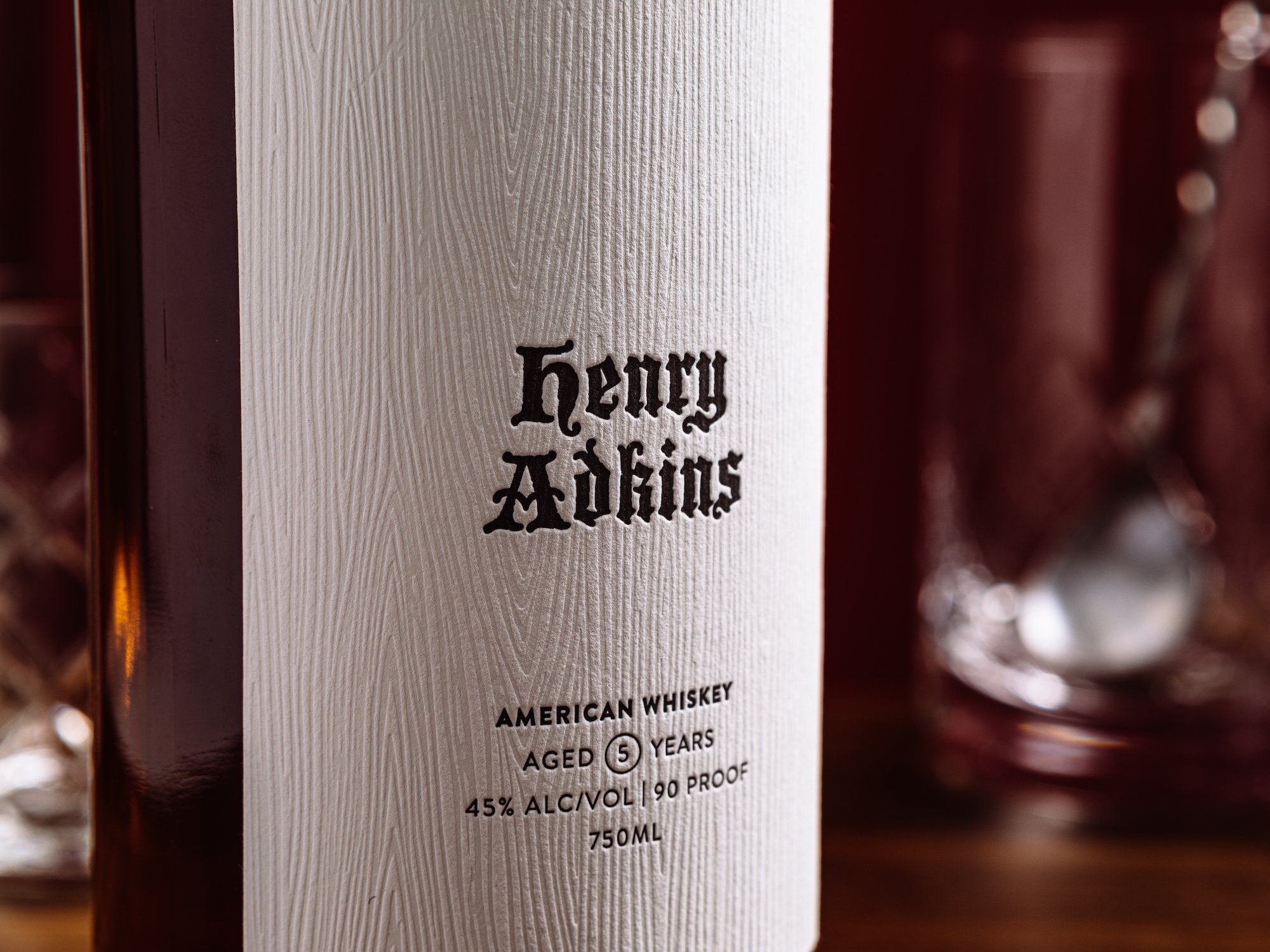
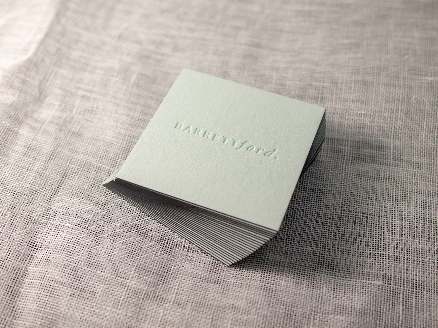
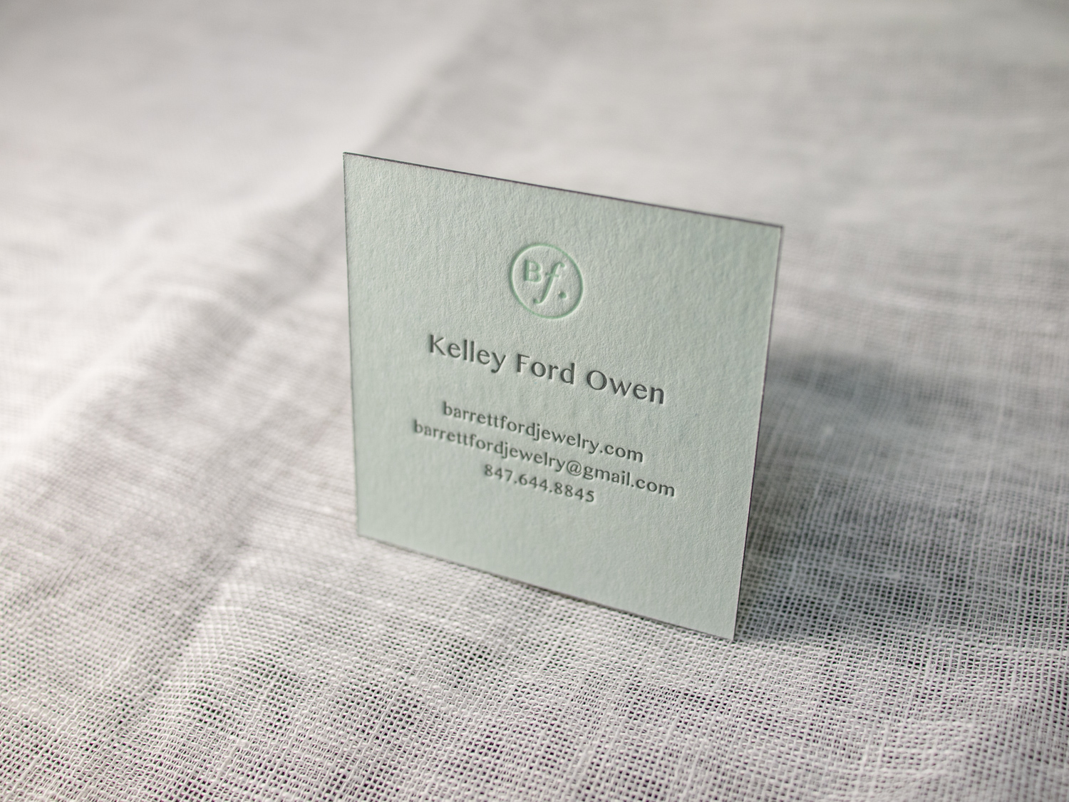
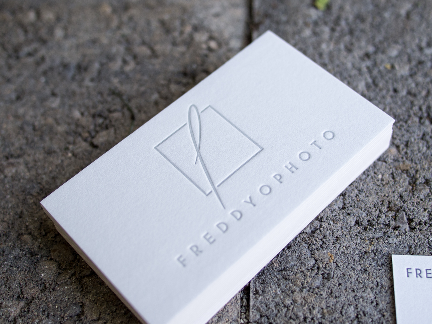
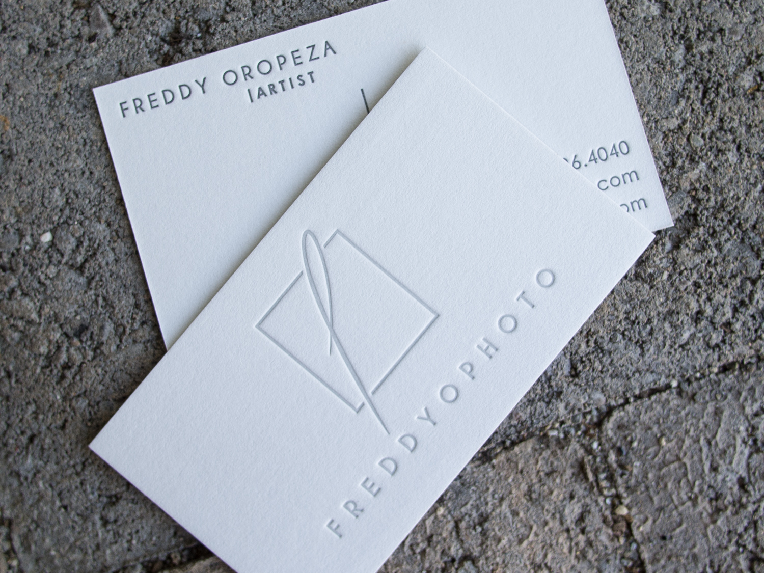
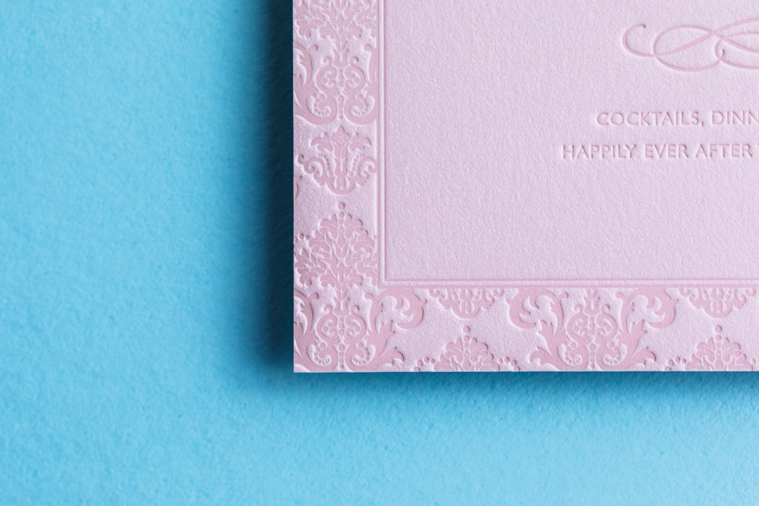
Tonal letterpress! Think of it as the sophisticated cousin to blind letterpress. Rather than use no ink at all, with a tonal letterpress impression we ink the plate with a little bit of color — usually a mix of transparent white ink plus a dab of the paper color. Sometimes it’s barely noticeable (see the Cedarly card below) and sometimes it’s got quite a bit of pop (more like the Harvest wedding invite). Take a look…
We worked closely with Samantha and Devon to come up with this invitation design for their New York Botanical Garden wedding. The color scheme and primary typeface are nice and bold, but the tonal letterpress details are super delicate. We printed on thick custom duplexed Colorplan stock so that it would hold up nicely to the heavy impression.
PAPER Custom duplexed 700g Colorplan Forest
INK Tonal letterpress
FOIL Gold Satin
I never get tired of tonal ink on Colorplan paper. This one's for Kelley of Barrett Ford Jewelry. We printed this little square business cards on 540g stock (not too thin, not too thick) with tonal green ink and gray ink, then finished them with gray edge paint.
PAPER 540g Colorplan Powder Green
INK Custom Pastel Green, Slate
EDGE PAINT Slate
Freddy Oropeza creates incredibly rich and vibrant photographs. But for his business cards, he opted for a simple, clean, monochrome aesthetic.
We printed these on 600g Gmund Cotton paper with a light tonal ink on the front and a darker gray on the back.